
-
AuthorPosts
-
October 3, 2025 at 8:49 am #1489800
I want these similar 3 colored lines at the top of each page. What is the best option to do this so that it looks good on all size screens and mobile view? The lines can be straight also, Just thinking 3 lines somehow.
RIght now it looks ok, but not on mobile.
Thanks!
October 3, 2025 at 11:26 am #1489807try this
( but it looks better if your header does not have shadow )use next css code instead
play with top position – what fits best for you.
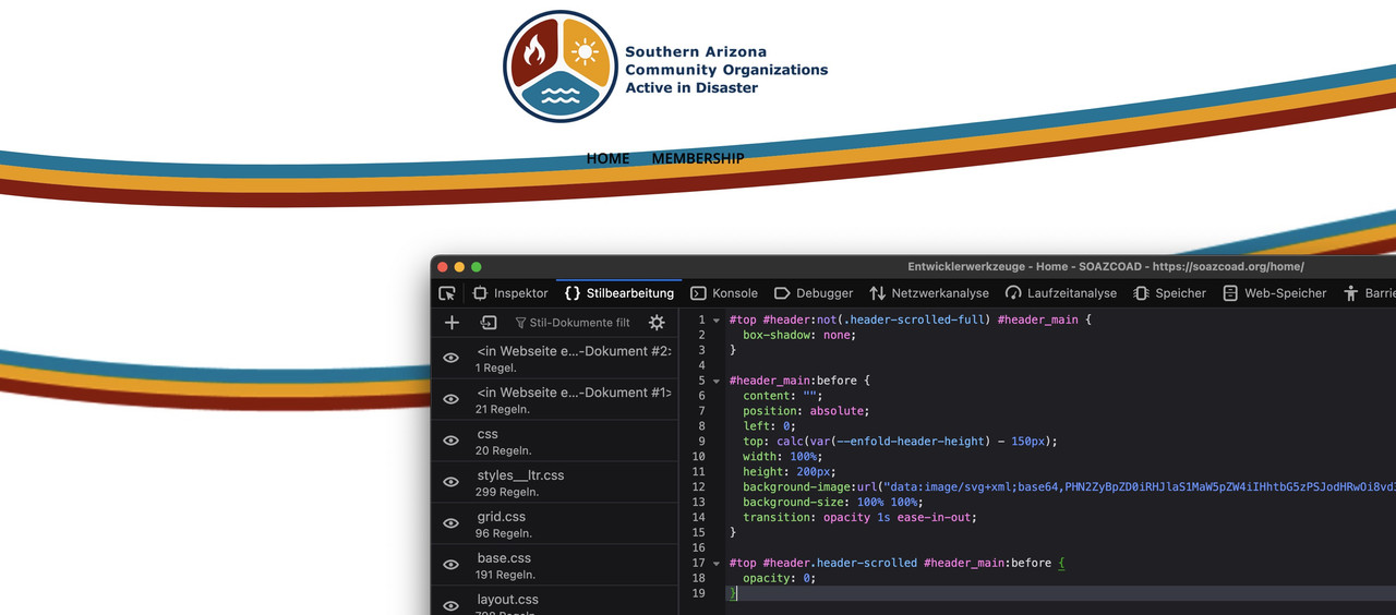
and maybe you set the height of the before pseudo-container to an absolute value ( e.g: height: 120px;) then it will not shrink with the header height.October 3, 2025 at 11:39 am #1489810or a little more elegant:
#top #header:not(.header-scrolled-full) #header_main {
  box-shadow: none;
}

#header_main:before {
  content: "";
  position: absolute;
  left: 0;
  top: calc(var(--enfold-header-height) - 150px);
  width: 100%;
  height: 200px;
  background-image:url("data:image/svg+xml;base64,PHN2ZyBpZD0iRHJlaS1MaW5pZW4iIHhtbG5zPSJodHRwOi8vd3d3LnczLm9yZy8yMDAwL3N2ZyIgdmVyc2lvbj0iMS4xIiB2aWV3Qm94PSIwIDAgODAwIDE4MCIgcHJlc2VydmVBc3BlY3RSYXRpbz0ibm9uZSI+CgogICAgPHN0eWxlPgogICAgICAuc3QwIHsKICAgICAgICBmaWxsOiAjOTQxMDA5OwogICAgICB9CgogICAgICAuc3QxIHsKICAgICAgICBmaWxsOiAjZWZhNDBiOwogICAgICB9CgogICAgICAuc3QyIHsKICAgICAgICBmaWxsOiAjMDA4MGEyOwogICAgICB9CiAgICA8L3N0eWxlPgoKICA8cGF0aCBjbGFzcz0ic3QyIiBkPSJNNjE0Ljg4NSw2My44MzVjLTEwNS4xNzksMjUuNTMxLTI2NC44MDQsNTUuOTY1LTQyNy45NTQsNTUuOTY1LTEwMi4xMjcsMC0xNjAuOTctMTcuODkxLTE4Ni45MzEtMjguNTI5djE0Ljk5MWMyNS45NiwxMC42MzcsODQuODA0LDI4LjUyOSwxODYuOTMxLDI4LjUyOSwxNjMuMTUsMCwzMjIuNzc1LTMwLjQzNCw0MjcuOTU0LTU1Ljk2NSw5NS42MjYtMjMuMjEyLDE2NC43ODItNDYuNjc5LDE4NS4xMTUtNTMuODM1di0xNC45OTFjLTIwLjMzMyw3LjE1NS04OS40ODksMzAuNjIyLTE4NS4xMTUsNTMuODM1WiIvPgogIDxwYXRoIGNsYXNzPSJzdDEiIGQ9Ik02MTQuODg1LDc4LjgyNWMtMTA1LjE3OSwyNS41MzEtMjY0LjgwNCw1NS45NjUtNDI3Ljk1NCw1NS45NjUtMTAyLjEyNywwLTE2MC45Ny0xNy44OTEtMTg2LjkzMS0yOC41Mjl2MTQuOTljMjUuOTYsMTAuNjM3LDg0LjgwNCwyOC41MjksMTg2LjkzMSwyOC41MjksMTYzLjE1LDAsMzIyLjc3NS0zMC40MzQsNDI3Ljk1NC01NS45NjUsOTUuNjI2LTIzLjIxMiwxNjQuNzgyLTQ2LjY3OSwxODUuMTE1LTUzLjgzNXYtMTQuOTljLTIwLjMzMyw3LjE1NS04OS40ODksMzAuNjIyLTE4NS4xMTUsNTMuODM1WiIvPgogIDxwYXRoIGNsYXNzPSJzdDAiIGQ9Ik04MDAsMzkuOTgxYy0yMC4zMzMsNy4xNTUtODkuNDg5LDMwLjYyMi0xODUuMTE1LDUzLjgzNS0xMDUuMTc5LDI1LjUzMS0yNjQuODA0LDU1Ljk2NS00MjcuOTU0LDU1Ljk2NS0xMDIuMTI3LDAtMTYwLjk3LTE3Ljg5MS0xODYuOTMxLTI4LjUyOXYxNy4zMjZjMzAuMDc1LDExLjQ0Miw4OS4yMjgsMjcuMjAyLDE4Ni45MzEsMjcuMjAyLDE2NC44MjUsMCwzMjUuODg0LTMwLjcxMiw0MzEuOTcyLTU2LjQ3Niw4OS4wNC0yMS42MjQsMTU1LjM3LTQzLjQ5MiwxODEuMDk4LTUyLjM4MXYtMTYuOTQzWiIvPgo8L3N2Zz4=");
  background-size: 100% 100%;
  transition: opacity 1s ease-in-out;
}

#top #header.header-scrolled #header_main:before {
  opacity: 0;
}
svg with more convex look.
October 3, 2025 at 6:04 pm #1489825I added this to CSS but nothing happened. How do I test these?
October 3, 2025 at 9:44 pm #1489837I gave you access to site.
Could you take a look at try to add what you think is best? I think you know what I am looking to do.
I want it on every page and tried to also test a SVG divider, but it leaves a big space on mobile view.
Let me know what you can do, you always get me the best solutions.
Thanks!!
October 4, 2025 at 8:46 am #1489844on inserting my code inside developer tools (copy&paste) :
there you can see both – mine and your existing jpg solution.
October 4, 2025 at 8:52 am #1489845if you like to use it as svg separator you had to use a svg file like that
https://webers-testseite.de/button-row/
copy paste the svg code from there.
Link to the svg: Here_____
Incidentally, you should adjust the fixed header rules for responsive behaviour. ( See it on small screens and scrolling down)October 6, 2025 at 3:32 am #1489872I like your svg separator! But I’m just unclear on how to add it. How do I add for every page and how will the menu look, since the wording is right over the lines. Can you help?
October 6, 2025 at 8:51 am #1489879that is why i first tried to give you a header solution.
Then you do not need to add that lines manually to every top section in your content. – and if you got a slider or a gird-row on top no extra solutions are necessary. – But there are different Problems – f.e. what to do when first section got a collered background.The separator solution: As part of next section this should not come into conflict with your menu text. Or do you have on other installations an overlapping first section to header area ?
The problem wil be now – what to do if you got a grid-row or a slider on top.October 6, 2025 at 6:28 pm #1489894I might just go with the curly section divider to make this easier. Question though, why would my logo not update on mobile view, when it is correct on desktop view. This top logo has white wording when open, then switches to blue, when scrolled. But on mobile, they are both blue. Any ideas? I did all the cache already and nothing.
Thanks!
October 6, 2025 at 8:04 pm #1489902This cache thing is killing me. I can’t figure out why desktop looks different than mobile view. Especially the logo and burger icon. The logo is supposed to have white wording and then blue. I have it setup correctly in the theme editor Transparency Options. Let me know if you can help please. I probably need the CSS cleaned up because I exported from another project. I just don’t know the code and what is needed.
Thanks again for all your help.
October 7, 2025 at 6:29 pm #1489936any ideas to clear cache? I tried plugins. looks good on desktop but not right on mobile view
October 7, 2025 at 6:42 pm #1489937Please help if you can. I also have a FTP manager plugin, and tried deleting Cache. And mobile view for logo is still not updated to the white text version.
October 7, 2025 at 6:53 pm #1489938And the CSS seems to be a mess also. The burger icon on mobile view home page is white, but on other pages, it is correct. I don’t know how all this happened. Let me know i fyo ucan help. thanks
October 8, 2025 at 6:28 am #1489942I think I got it, but this cache is crazy. thanks
-
AuthorPosts
- The topic ‘3 lines border options for top header area.’ is closed to new replies.