
Tagged: columns, mobile versione, rows
-
AuthorPosts
-
October 4, 2024 at 5:24 pm #1468442
hello on the site https://www.studiolegalepsicologico.it/supporto-legale-psicologico/ I would like the 10 images after the title “settori di attività” to be seen in rows of two columns only on the mobile version is it possible?
thanks gianlucaOctober 4, 2024 at 6:09 pm #1468446can you please exclude the text-block with the heading to an extra section before that section with all those “Settori”
by the way – why don’t you use for a heading a heading element instead of putting the heading inside a text-block element?after that – we can handle the whole container as a flex container
no need for a second color-section handling the other layouts for responsive design.October 5, 2024 at 10:06 am #1468458If you have looked at my suggestion, I will remove your pictures.
the ID is only for a anchor navigation if you likeOctober 5, 2024 at 10:45 am #1468462hi and thanks for your help I should have done exactly as you told me but I always see the same on mobile while I would like more columns on the same row otherwise the scrolling is infinite
October 5, 2024 at 11:06 am #1468468October 5, 2024 at 8:13 pm #1468484look to the layout image again – the color-section with your columns should have the custom-class : settore-attivita
you gave to it an ID : settore-attivitaIf you like to have only 2 columns beside – even on mobile phone just get rid of last media query rules:
@media only screen and (max-width: 549px) {
  #top .settore-attivita .entry-content-wrapper .flex_column {
    flex: 1 1 100%;
  }
}
October 5, 2024 at 8:41 pm #1468485Hi,
Thanks for your solution Guenni007, when I follow it seems to works good:

Best regards,
MikeOctober 5, 2024 at 9:49 pm #1468486Thanks but I did exactly as you told me:
#top .settore-attivita .entry-content-wrapper {
display: flex;
flex-flow: row wrap;
justify-content: space-between;
}#top .settore-attivita .entry-content-wrapper:before,
#top .settore-attivita .entry-content-wrapper:after {
display: none !important;
}#top .settore-attivita .entry-content-wrapper .flex_column {
flex: 0 1 19%;
width: unset !important;
margin: 0px;
}@media only screen and (max-width: 989px) {
#top .settore-attivita .entry-content-wrapper .flex_column {
flex: 0 1 30%;
}
}@media only screen and (max-width: 767px) {
#top .settore-attivita .entry-content-wrapper .flex_column {
flex: 0 1 48%;
}
}@media only screen and (max-width: 549px) {
#top .settore-attivita .entry-content-wrapper .flex_column {
flex: 1 1 100%;
}
}But on mobile phone I still see one column for each row
October 5, 2024 at 10:23 pm #1468487Thanks but I did exactly as you told me:
no you did not !
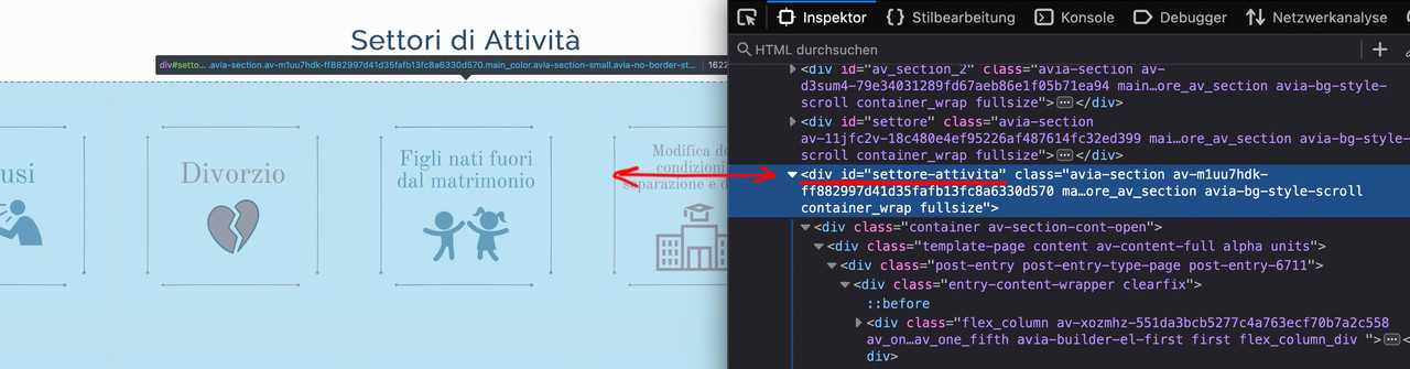
look to the layout image again – the color-section with your columns should have the custom-class : settore-attivita
you gave to it an ID : settore-attivitaAn ID is not a class
Why i choose for it a class:
An ID had to be unique on the page.
If you like to use it on that page again for a different section – you can use that class again. An ID not-
This reply was modified 1 year, 6 months ago by
Guenni007.
October 5, 2024 at 10:27 pm #1468489if you want it 5 columns on desktop and on mobile always 2 column:
#top .settore-attivita .entry-content-wrapper {
  display: flex;
  flex-flow: row wrap;
  justify-content: space-between;
}

#top .settore-attivita .entry-content-wrapper:before,
#top .settore-attivita .entry-content-wrapper:after {
  display: none !important;
}

#top .settore-attivita .entry-content-wrapper .flex_column {
  flex: 0 1 19%;
  width: unset !important;
  margin: 0px;
}

@media only screen and (max-width: 767px) {
  #top .settore-attivita .entry-content-wrapper .flex_column {
    flex: 0 1 48%;
  }
}
}
you see how it works ?
October 6, 2024 at 12:09 am #1468494Ok now I understood and it work perfectly.
Thank you very much for your assistance and your patience too!
GREATOctober 6, 2024 at 2:47 am #1468506non c’è di che
October 6, 2024 at 10:00 am #1468510Hi,
Thanks for the update. Please let us know if you should need any further help on the topic, or if we can close it.
Best regards,
RikardOctober 6, 2024 at 10:16 am #1468512You can close. Wonderful support as usually
-
This reply was modified 1 year, 6 months ago by
-
AuthorPosts
- The topic ‘2 or more columns on a row’ is closed to new replies.