I am trying to isolate an @media code so that my 2 column layout remains 2 columns on mobile devices. But I want to have it only in one section and not the entire site or page. Here is what I have that is working and not working:
WORKING:
@media only screen and (max-width: 767px) {
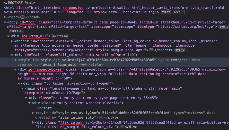
.responsive #top #wrap_all .flex_column {
width: 48% !important;
min-height: 200px !important;
margin-right: 2% !important;
}
NOT WORKING (I want to keep the changes within #impact-boxes):
@media only screen and (max-width: 767px) {
.responsive #impact-boxes #wrap_all .flex_column {
width: 48% !important;
min-height: 200px !important;
margin-right: 2% !important;
}
The “#top” element has been the issue. I’ve tried moving it, removing it, merging it, and nothing seems to work.
