-
AuthorSearch Results
-
January 1, 2025 at 12:34 pm #1474451
Hi,
Thank you for the update.
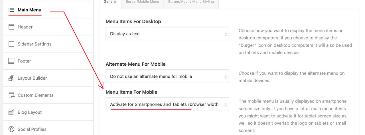
It’s not recommended to enable both the theme’s compression and the plugin’s, as they essentially perform the same function and could potentially create conflicts. You need to choose which compression option to use — the theme’s or the plugin’ — whichever works best for the site setup.
The same can be said about this thread https://kriesi.at/support/topic/mega-menu-goes-left-off-screen-with-css-js-merge-compress-enabled/
Best regards,
IsmaelDecember 31, 2024 at 5:54 pm #1474446In reply to: Video Media Element Does Not Loop
The url you provided did not change anything. Autoplays but no loop.
December 31, 2024 at 4:01 pm #1474437In reply to: Custom Menu-bar Shape – Part 2
you can see here a possible solution – even with shrinking header. https://webers-testseite.de/tribal/
The clou is – that shape goes to header_bg – so it is part of #header: https://webers-testseite.de/wp-content/uploads/konvexe-boegen.svgthis is the used svg – the right (smaller side) had to be of min-height of shrinked header height.

The Rest of the code used – you can see on my page
PS: for the following section it would be good to have enough top padding
PPS: the svg had to be one that fits to its dimensions: preserveAspectRatio=”none”This is not styled to its end usage ( some adjustings had to be made for responsive behaviour!
December 31, 2024 at 11:22 am #1474431In reply to: How to solve header appearance setting
or do you have a faulty setting for padding-top of #main on those pages?
December 31, 2024 at 10:31 am #1474429In reply to: Hamburger icon/ menu always visible on mobile.
Read carefully
“For that add to your child-theme functions.php:”
so both php snippets are needed.____________
on you style.css – remove the code – and then add : Link
@media only screen and (max-width: 989px) {
  .responsive #top #wrap_all #header .container {
    width: 95%;
    max-width: 95%;
  }
  #header {
    position: fixed !important;
    height: 110px !important;
    max-height: 110px !important;
  }
  #top #header.av_header_transparency #header_meta {
    background-color: transparent;
  }
  #header_main {
    border-bottom: none;
  }
  .responsive #top .av-logo-container ,
  .responsive #top .logo a,
  .responsive #top .logo img,
  .responsive #top .logo svg {
    height: 80px;
    max-height: 80px !important;
    line-height: 80px !important;
  }
  .responsive #top .av-main-nav .menu-item-avia-special a {
    height: 80px !important;
    line-height: 80px !important;
  }
  .responsive.html_mobile_menu_tablet #top #wrap_all .av_header_transparency {
    background-color: transparent !important;
  }
  #top .header_bg {
    background-color: transparent !important;
  }
  #top #header:not(.av_header_transparency) .header_bg {
    background-color: #edddc6 !important;
  }
  .responsive.html_mobile_menu_tablet #top .av_header_transparency .logo img.alternate,
  .responsive.html_mobile_menu_tablet #top .av_header_transparency .logo .subtext.avia-svg-logo-sub {
    display: block !important;
  }
  .responsive.html_mobile_menu_tablet #top .av_header_transparency.av_alternate_logo_active .logo a > img,
  .responsive.html_mobile_menu_tablet #top .av_header_transparency.av_alternate_logo_active .logo a > svg {
    opacity: 0;
  }

  /*** depends on your setting  ***/
  #top #header.av_header_transparency #header_meta .phone-info * {
    color: #FFF !important;
  }
  .html_mobile_menu_tablet .header_color  #header.av_header_transparency div .av-hamburger-inner,
  .html_mobile_menu_tablet .header_color  #header.av_header_transparency div .av-hamburger-inner::before,
  .html_mobile_menu_tablet .header_color  #header.av_header_transparency div .av-hamburger-inner::after {
    background-color: #edddc6;
  }
  .html_mobile_menu_tablet .header_color  #header.av_header_transparency .menu-item-search a:before {
    color: #FFF;
  }
  .responsive #top #main {
    padding-top: 110px !important;
  }
  .responsive #top #main .sticky_placeholder {
    height: 0px !important;
  }
  .responsive #top #main .av-submenu-container {
    position : fixed !important;
    top: 110px !important;
  }
}

.responsive #top #wrap_all #header.hide-header,
#header.hide-header + #main #sub_menu1 {
  opacity: 0 !important;
  transition: opacity 1s ease;
}

.responsive #top #wrap_all #header:not(.hide-header),
#header:not(.hide-header) + #main #sub_menu1 {
  transition: opacity 0.5s ease;
}

@media only screen and (max-width: 469px) {
  #header {
    height: 140px !important;
    max-height: 140px !important;
  }
  #header_main {
    height: 80px;
  }
  .header_bg {
    height: 140px;
  }
  .responsive #top #main {
    padding-top: 140px !important;
  }
  .responsive #top .av-logo-container ,
  .responsive #top .logo a,
  .responsive #top .logo img,
  .responsive #top .logo svg {
    height: 60px;
    max-height: 60px !important;
    line-height: 60px !important;
  }
  .responsive #top #main .av-submenu-container {
    position : fixed !important;
    top: 140px !important;
  }

  #top .av-submenu-pos-center .mobile_menu_toggle {
    border: none !important;
  }
}
_______________
i don’t know what is all inside your child-theme functions.php – (this is not readable via the browsers or in dev tools)
both snippets of mine should be there:function hide_header(){ ?> <script> (function($){ 'use strict'; var c, currentScrollTop = 0, header = $('#header'); $(window).scroll(function () { var a = $(window).scrollTop(); var b = header.height(); currentScrollTop = a; if (c < currentScrollTop && a > b ) { header.addClass("hide-header"); } else if (c > currentScrollTop && !(a <= b)) { header.removeClass("hide-header"); } c = currentScrollTop; }); })(jQuery); </script> <?php } add_action('wp_footer', 'hide_header');and:
function close_sub_menu_on_click_items(){ ?> <script type="text/javascript"> (function($) { $('.av-subnav-menu .menu-item a').on('click', function() { $(this).closest('.av-subnav-menu').removeClass('av-open-submenu'); }); })(jQuery); </script> <?php } add_action('wp_footer', 'close_sub_menu_on_click_items');December 30, 2024 at 9:45 pm #1474415In reply to: Hamburger icon/ menu always visible on mobile.
I did remove all old codes, and pasted the ones you suggested.
So now my style.css is:
@media only screen and (max-width: 989px) { .responsive #top #wrap_all #header .container { width: 95%; max-width: 95%; } #header { position: fixed !important; height: 110px !important; max-height: 110px !important; } #top #header.av_header_transparency #header_meta { background-color: transparent; } #header_main { border-bottom: none; } .responsive #top .av-logo-container , .responsive #top .logo a, .responsive #top .logo img, .responsive #top .logo svg { height: 80px !important; max-height: 80px !important; line-height: 80px !important; } .responsive #top .av-main-nav .menu-item-avia-special a { height: 80px !important; line-height: 80px !important; } .responsive.html_mobile_menu_tablet #top #wrap_all .av_header_transparency { background-color: transparent !important; } #top .header_bg { background-color: transparent !important; } #top #header:not(.av_header_transparency) .header_bg { background-color: #edddc6 !important; } .responsive.html_mobile_menu_tablet #top .av_header_transparency .logo img.alternate, .responsive.html_mobile_menu_tablet #top .av_header_transparency .logo .subtext.avia-svg-logo-sub { display: block !important; } .responsive.html_mobile_menu_tablet #top .av_header_transparency.av_alternate_logo_active .logo a > img, .responsive.html_mobile_menu_tablet #top .av_header_transparency.av_alternate_logo_active .logo a > svg { opacity: 0; } /*** depends on your setting ***/ #top #header.av_header_transparency #header_meta .phone-info * { color: #FFF !important; } .html_mobile_menu_tablet .header_color #header.av_header_transparency div .av-hamburger-inner, .html_mobile_menu_tablet .header_color #header.av_header_transparency div .av-hamburger-inner::before, .html_mobile_menu_tablet .header_color #header.av_header_transparency div .av-hamburger-inner::after { background-color: #edddc6; } .html_mobile_menu_tablet .header_color #header.av_header_transparency .menu-item-search a:before { color: #FFF; } .responsive #top #main { padding-top: 110px !important; } .responsive #top #main .sticky_placeholder { height: 0px !important; } } .responsive #top #wrap_all #header.hide-header, #header.hide-header + #main #sub_menu1 { opacity: 0 !important; transition: opacity 1s ease; } .responsive #top #wrap_all #header:not(.hide-header), #header:not(.hide-header) + #main #sub_menu1 { transition: opacity 0.5s ease; }And my functions.php is:
function close_sub_menu_on_click_items(){ ?> <script type="text/javascript"> (function($) { $('.av-subnav-menu .menu-item a').on('click', function() { $(this).closest('.av-subnav-menu').removeClass('av-open-submenu'); }); })(jQuery); </script> <?php } add_action('wp_footer', 'close_sub_menu_on_click_items');That’s what is there. All cache is cleared, browser, wordpress, plugins.
December 30, 2024 at 9:02 pm #1474414Hi,
Thanks for that. Please try the following in Quick CSS under Enfold->General Styling:
.content { padding-top: 0; padding-bottom: 0; }Best regards,
RikardDecember 30, 2024 at 6:01 pm #1474405In reply to: Hamburger icon/ menu always visible on mobile.
Hi Guenni,
Our answers crossed.
I have added the functions code now too.
There are two codes in the functions together now:
function hide_header(){ ?> <script> (function($){ 'use strict'; var c, currentScrollTop = 0, header = $('#header'); $(window).scroll(function () { var a = $(window).scrollTop(); var b = header.height(); currentScrollTop = a; if (c < currentScrollTop && a > b ) { header.addClass("hide-header"); } else if (c > currentScrollTop && !(a <= b)) { header.removeClass("hide-header"); } c = currentScrollTop; }); })(jQuery); </script> <?php } add_action('wp_footer', 'hide_header'); function close_sub_menu_on_click_items(){ ?> <script type="text/javascript"> (function($) { $('.av-subnav-menu .menu-item a').on('click', function() { $(this).closest('.av-subnav-menu').removeClass('av-open-submenu'); }); })(jQuery); </script> <?php } add_action('wp_footer', 'close_sub_menu_on_click_items');It doesn’t seem to do much. Is that because i should have erased the first one? Or is there some tuning to do?
Thanks!
-
This reply was modified 1 year, 2 months ago by
Pietzaa. Reason: spelling
December 30, 2024 at 5:54 pm #1474404In reply to: Hamburger icon/ menu always visible on mobile.
Thanks Guenni,
Ik added the code.
Now:
Wide desktop: perfect.
Narrow desktop: hide/how working fine, no open space. However sub menu is not re-appearing.
Landscape mobile: hide/show working, no open space, However sub menu is not re-appearing.
Portret mobile: secondary menu break up is pushing down logo and scrolling bar. see: https://we.tl/t-5r5CxEoGtN
what should I finetune? Or what are the next steps?
December 30, 2024 at 4:59 pm #1474401In reply to: Hamburger icon/ menu always visible on mobile.
i see that there is only on style.css that code .
So better remove all – and add:@media only screen and (max-width: 989px) { .responsive #top #wrap_all #header .container { width: 95%; max-width: 95%; } #header { position: fixed !important; height: 110px !important; max-height: 110px !important; } #top #header.av_header_transparency #header_meta { background-color: transparent; } #header_main { border-bottom: none; } .responsive #top .av-logo-container , .responsive #top .logo a, .responsive #top .logo img, .responsive #top .logo svg { height: 80px; max-height: 80px !important; line-height: 80px !important; } .responsive #top .av-main-nav .menu-item-avia-special a { height: 80px !important; line-height: 80px !important; } .responsive.html_mobile_menu_tablet #top #wrap_all .av_header_transparency { background-color: transparent !important; } #top .header_bg { background-color: transparent !important; } #top #header:not(.av_header_transparency) .header_bg { background-color: #edddc6 !important; } .responsive.html_mobile_menu_tablet #top .av_header_transparency .logo img.alternate, .responsive.html_mobile_menu_tablet #top .av_header_transparency .logo .subtext.avia-svg-logo-sub { display: block !important; } .responsive.html_mobile_menu_tablet #top .av_header_transparency.av_alternate_logo_active .logo a > img, .responsive.html_mobile_menu_tablet #top .av_header_transparency.av_alternate_logo_active .logo a > svg { opacity: 0; } /*** depends on your setting ***/ #top #header.av_header_transparency #header_meta .phone-info * { color: #FFF !important; } .html_mobile_menu_tablet .header_color #header.av_header_transparency div .av-hamburger-inner, .html_mobile_menu_tablet .header_color #header.av_header_transparency div .av-hamburger-inner::before, .html_mobile_menu_tablet .header_color #header.av_header_transparency div .av-hamburger-inner::after { background-color: #edddc6; } .html_mobile_menu_tablet .header_color #header.av_header_transparency .menu-item-search a:before { color: #FFF; } .responsive #top #main { padding-top: 110px !important; } .responsive #top #main .sticky_placeholder { height: 0px !important; } .responsive #top #main .av-submenu-container { position : fixed !important; top: 110px !important; } } .responsive #top #wrap_all #header.hide-header, #header.hide-header + #main #sub_menu1 { opacity: 0 !important; transition: opacity 1s ease; } .responsive #top #wrap_all #header:not(.hide-header), #header:not(.hide-header) + #main #sub_menu1 { transition: opacity 0.5s ease; } @media only screen and (max-width: 469px) { #header { height: 140px !important; max-height: 140px !important; } #header_main { height: 80px; } .header_bg { height: 140px; } .responsive #top #main { padding-top: 140px !important; } .responsive #top .av-logo-container , .responsive #top .logo a, .responsive #top .logo img, .responsive #top .logo svg { height: 60px; max-height: 60px !important; line-height: 60px !important; } .responsive #top #main .av-submenu-container { position : fixed !important; top: 140px !important; } #top .av-submenu-pos-center .mobile_menu_toggle { border: none !important; } }after that we will go on to start fine-tuning.
-
This reply was modified 1 year, 2 months ago by
Guenni007.
December 30, 2024 at 3:27 pm #1474400Topic: Custom Menu-bar Shape – Part 2
in forum Enfoldtribaleye13
ParticipantThere’s that one year old thread, where Nikko posts a suggestion to change the appearance of the menu bar with a .svg
The thread can be seen here:
https://kriesi.at/support/topic/custom-menu-bar-shape/Unfortunately that thread has been closed and more unfortunately Nikko shows as inactive, so maybe he isn’t a member of Enfold Support anymore.
All in all this solution does fit my needs too – besides of the shape of the .svg.
Nikko seems to have used the custom Enfold svg shape “Mountain”. And after you follow his steps in the above mentioned thread, your menu bar looks like this (I coloured it pink to make it stand out for viewing purposes).
Nikko’s solutionI would like to have a curve instead. And I’d like to place the logo inside of it, so that it would be outside of the menu bar.
See mockup of what I would like to reachCould someone please help me with that?
December 30, 2024 at 3:25 pm #1474399Topic: transparent table
in forum Enfoldsitibus
ParticipantHi, on my site https://www.medmaiora.it/caladelforte/ I would need to have the table containing the white social icons (in the third box immediately under the banner) transparent and without borders… in a previous work I did so:
#top #av_section_1.main_color .av_textblock_section .avia_textblock table,
#top #av_section_1.main_color .av_textblock_section .avia_textblock div,
#top #av_section_1.main_color .av_textblock_section .avia_textblock td {
border-color: transparent;
background: transparent;
}#top #av_section_1.main_color tr:nth-child(odd) {
background: transparent;
}Now I did the same but it doesn’t work.
Where I am wrong?
Tks in advance, Gianluca from Italy
December 30, 2024 at 10:35 am #1474396In reply to: Hamburger icon/ menu always visible on mobile.
Hi Guenni,
Thanks again for your help and codes.
I feel a bit uncomfortable getting back and forth over this. I have no idea how to read codes, what to adjust etc. There might have been 5 perfectly solutions already and i just don’t see them or pasting it wrong, or not clearing cache.
So with the latest code from https://webers-testseite.de/pietzas/
Desktop wide: perfect! no extra space, both secondary menu, main menu and submenu dis- and re-appear beautifully!
Desktop narrow screen: an extra (see through) space is occurring on top of the header on top of the page.
Mobile Portret: because the secondary menu is breaking into two rules, it pushes down the rest of the contant so the logo and progression bar is overlaying the content again.
Mobile landscape: No problems with the secondary menu, however the submenu is not dis and re-appearing in the same behavior as on the desktop variant.
I have the feeling i am asking for a lot or for something seemingly easy, but practically impossible.
I can recognize color codes and some values, but that’s it.
So if someone knows what to to do, and wants to do it, i am happy to pay for somebody who can get this to work, without me having to adjust or copy stuff that I will then butcher again.
Let me know if there is someone willing to put it all in the right place.
December 30, 2024 at 7:34 am #1474394In reply to: Hamburger icon/ menu always visible on mobile.
Opacity has one big advantage – you do not need to find a solution for that sub-menu – because it is not part of #header but of #main it will be a bit complicated to find a solution. Except you go and change some settings on menu.php (sub-menu).
see here my comment on this : https://kriesi.at/support/topic/how-to-make-the-submenu-sticky-on-mobile/#post-1225108
(but do not adopt the alb changings for child-theme menu.php – because that topic is 4years old)
see here sticky submenus on mobile screens : https://webers-testseite.de/transparent-header/
_______
for opacity see demo and code on:
https://webers-testseite.de/pietzas/December 30, 2024 at 1:12 am #1474386In reply to: Hamburger icon/ menu always visible on mobile.
This kind of worked, however: on desktop sites, the header (main menu) slides up out of sight, while the sub menu kind of hoovers in its place, without a header on top of it.
(so the top (menu) is gone, showing content on top of screen now, then sub menu, then content again.
-
This reply was modified 1 year, 2 months ago by
December 29, 2024 at 10:39 pm #1474383Topic: Website-Update
in forum Pre Sale QuestionsMarcel Kappelsberger
GuestSehr geehrte Damen und Herren,
leider habe ich weiterhin keinen Zugriff zum Purchase-Code, da dies der vorherige Website-Administrator nicht überliefert hat. Daher kann ich hier kein Update durchführen.
Siehe hier:
Wie kann ich nun vorgehen?
December 29, 2024 at 7:58 pm #1474380In reply to: Hamburger icon/ menu always visible on mobile.
Simple – look to the header behaviour on desktop screen width.
believe it or not – my first solution with sticky header on every screen width was the best.
Then you can decide to shift the header including sub-menu or to set those two things to opacity : 0shifting is a lot of css – the opacity solution is nice too.
December 29, 2024 at 3:57 pm #1474370In reply to: Hamburger icon/ menu always visible on mobile.
I remember why this space is there. But it might be another topic.
It is a color section that is “hiding on mobile/ on smaller screens”. It is only intended to be a header shown on bigger screens. For smaller screens there is a picture (in a fullwidth slider) that is working better than the setup with a header picture.
The hiding of the color section is leaving a blank space (header color)
Is there a way to get rid of this open space at all? Or just ignore it?
-
This reply was modified 1 year, 2 months ago by
December 29, 2024 at 2:22 pm #1474364Hey Jak73,
Try this CSS in your Enfold Theme Options ▸ General Styling ▸ Quick CSS field:#top.page-id-8462 #header .inner-container { border-bottom: none; } #top.page-id-8462 .av_minimal_header #header_main { border-bottom: 1px solid #000; }Please ensure to copy the code from the forum and not an email notification so the symbols are not converted.
After applying the css, please clear your browser cache and check.Best regards,
MikeDecember 29, 2024 at 2:03 pm #1474362Topic: How to make a border-top full-width (only for one page)?
in forum EnfoldJak73
ParticipantHi,
i added a colour section with a video in background.
I would like to extend the border above the colour section to full width only for that page.How can i do that?
kind regards
JakDecember 29, 2024 at 1:46 pm #1474361In reply to: Hamburger icon/ menu always visible on mobile.
read the post carefully- that script is adding a class to the #header
so you can play with the selector: #header.hide-header to do something with the header – see example page and the code listed there ;)f.e. (less complicated than a shift to top)
#header.hide-header,
#header.hide-header + #main #sub_menu1 {
  opacity: 0;
  transition: opacity 2s ease;
}

#header:not(.hide-header),
#header:not(.hide-header) + #main #sub_menu1 {
  transition: opacity 0.5s ease;
}
December 29, 2024 at 1:33 pm #1474359In reply to: Hamburger icon/ menu always visible on mobile.
by this script inside your child-theme functions.php:
function hide_header(){
?>
<script>
(function($){
  'use strict';
  var c,
  currentScrollTop = 0,
  header = $('#header');
   $(window).scroll(function () {
      var a = $(window).scrollTop();
      var b = header.height();

      currentScrollTop = a;

      if (c < currentScrollTop && a > b  ) {
        header.addClass("hide-header");
      } else if (c > currentScrollTop && !(a <= b)) {
        header.removeClass("hide-header");
      }
      c = currentScrollTop;
  });
})(jQuery);
</script>
<?php
}
add_action('wp_footer', 'hide_header');
what does the script do: after a scrolldistance of the header height a class is added to the header : hide-header
it is up to you to neither the whole header goese to opacity: 0 or to set a translateY value etc.see: https://webers-testseite.de/bemodesign/
css values on that page depends on the given settings.December 29, 2024 at 9:57 am #1474349In reply to: Hamburger icon/ menu always visible on mobile.
Now another problem occurred though.
When putting the phone in landscape mode, the header of course is too big, covering nearly a third of the screen.
So it might be nice to have it do different things on different modes.
Maybe just the header reappearing when scrolling up. So when scrolling down it disappears.
Or when scrolling down just a burger icon in the top right remains. With no background or button, only the three bars in adjustable color.
Is there a code or possibility to that?
December 29, 2024 at 9:48 am #1474347In reply to: Hamburger icon/ menu always visible on mobile.
Cheers,
I managed to fix the problem by playing with the numbers. I have changed height and max height to 140px in the #header part of the code. And also on the bottom of the code i changed 110px to 140px at the “responsive top main” part. On my phone it seems to be working well now. Everything including the scroll progression bar is wrapped in the header now.
`@media only screen and (max-width: 989px) {
.responsive #top #wrap_all #header .container {
width: 95%;
max-width: 95%;
}
#header {
position: fixed !important;
height: 140px !important;
max-height: 140px !important;
}
#top #header.av_header_transparency #header_meta {
background-color: transparent;
}
#header_main {
border-bottom: none;
}
.responsive #top .av-logo-container ,
.responsive #top .logo a,
.responsive #top .logo img,
.responsive #top .logo svg {
height: 80px !important;
max-height: 80px !important;
line-height: 80px !important;
}
.responsive #top .av-main-nav .menu-item-avia-special a {
height: 80px !important;
line-height: 80px !important;
}
.responsive.html_mobile_menu_tablet #top #wrap_all .av_header_transparency {
background-color: transparent !important;
}
#top .header_bg {
background-color: transparent !important;
}
#top #header:not(.av_header_transparency) .header_bg {
background-color: #edddc6 !important;
}
.responsive.html_mobile_menu_tablet #top .av_header_transparency .logo img.alternate,
.responsive.html_mobile_menu_tablet #top .av_header_transparency .logo .subtext.avia-svg-logo-sub {
display: block !important;
}
.responsive.html_mobile_menu_tablet #top .av_header_transparency.av_alternate_logo_active .logo a > img,
.responsive.html_mobile_menu_tablet #top .av_header_transparency.av_alternate_logo_active .logo a > svg {
opacity: 0;
}/*** depends on your setting ***/
#top #header.av_header_transparency #header_meta .phone-info * {
color: #FFF !important;
}
.html_mobile_menu_tablet .header_color #header.av_header_transparency div .av-hamburger-inner,
.html_mobile_menu_tablet .header_color #header.av_header_transparency div .av-hamburger-inner::before,
.html_mobile_menu_tablet .header_color #header.av_header_transparency div .av-hamburger-inner::after {
background-color: #edddc6;
}
.html_mobile_menu_tablet .header_color #header.av_header_transparency .menu-item-search a:before {
color: #FFF;
}
.responsive #top #main {
padding-top: 140px !important;
}
.responsive #top #main .sticky_placeholder {
height: 0px !important;
}
}-
This reply was modified 1 year, 2 months ago by
December 29, 2024 at 9:01 am #1474346In reply to: Centre menu below
it is working – and my snippet is working too. But i wouldn’t make that space between your navigation and the first section not by setting up a margin top/bottom on color section. This looks bad on responsive case.
you could have done this:#header_main_alternate { margin-bottom: 40px; }because header_main_alternate goes to display: none in responsive case – there will be no distance then between header and main.
By the way : nice to have a response on having success with the code ;)
no thanks is needed but just a success reportDecember 29, 2024 at 7:58 am #1474345In reply to: Widget with the content of a page
Are you shure that it is (breadcrumbs) not there? because on inserting that page to header – you had to adjust the padding-top of #main.
December 28, 2024 at 6:20 pm #1474341In reply to: Hamburger icon/ menu always visible on mobile.
ok – then erase the given css code.
But for having the submenue sticky aswell there had to be hardcoded changes to enfold elements. This is not so easy as just css settings.but even 990px are not enought – your menue overlays the logo much earlier.
@media only screen and (max-width: 1080px) {
    #top #header .av-main-nav > li.menu-item:not(.menu-item-search-dropdown)  {
        display: none!important;
    }
    #top #header .av-burger-menu-main {
        cursor: pointer;
        display: block!important;
    }
}
December 28, 2024 at 4:46 pm #1474339In reply to: Hamburger icon/ menu always visible on mobile.
Do you only like to see the burger icon fixed – or do you like to have header too fixed on top?
by the way – if it is the page that belongs to your nick – it would be better to break at 990px to hamburger menu.
Then try this :
@media only screen and (max-width: 989px) {
  .responsive #top #wrap_all #header .container {
    width: 95%;
    max-width: 95%;
  }
  #header {
    position: fixed !important;
    height: 110px !important;
    max-height: 110px !important;
  }
  #top #header.av_header_transparency #header_meta {
    background-color: transparent;
  }
  #header_main {
    border-bottom: none;
  }
  .responsive #top .av-logo-container ,
  .responsive #top .logo a,
  .responsive #top .logo img,
  .responsive #top .logo svg {
    height: 80px !important;
    max-height: 80px !important;
    line-height: 80px !important;
  }
  .responsive #top .av-main-nav .menu-item-avia-special a {
    height: 80px !important;
    line-height: 80px !important;
  }
  .responsive.html_mobile_menu_tablet #top #wrap_all .av_header_transparency {
    background-color: transparent !important;
  }
  #top .header_bg {
    background-color: transparent !important;
  }
  #top #header:not(.av_header_transparency) .header_bg {
    background-color: #edddc6 !important;
  }
  .responsive.html_mobile_menu_tablet #top .av_header_transparency .logo img.alternate,
  .responsive.html_mobile_menu_tablet #top .av_header_transparency .logo .subtext.avia-svg-logo-sub {
    display: block !important;
  }
  .responsive.html_mobile_menu_tablet #top .av_header_transparency.av_alternate_logo_active .logo a > img,
  .responsive.html_mobile_menu_tablet #top .av_header_transparency.av_alternate_logo_active .logo a > svg {
    opacity: 0;
  }

  /*** depends on your setting  ***/
  #top #header.av_header_transparency #header_meta .phone-info * {
    color: #FFF !important;
  }
  .html_mobile_menu_tablet .header_color  #header.av_header_transparency div .av-hamburger-inner,
  .html_mobile_menu_tablet .header_color  #header.av_header_transparency div .av-hamburger-inner::before,
  .html_mobile_menu_tablet .header_color  #header.av_header_transparency div .av-hamburger-inner::after {
    background-color: #edddc6;
  }
  .html_mobile_menu_tablet .header_color  #header.av_header_transparency .menu-item-search a:before {
    color: #FFF;
  }
  .responsive #top #main {
    padding-top: 110px !important;
  }
  .responsive #top #main .sticky_placeholder {
    height: 0px !important;
  }
}
December 28, 2024 at 3:04 pm #1474338Topic: Hamburger icon/ menu always visible on mobile.
in forum EnfoldPietzaa
ParticipantHi Guys,
I tried to find an answer but i didn’t seem to find it.
Question/ wish:
I’d like to have the hamburger icon always visible on mobile. So people can open te menu and (re)navigate) wherever they are on a page.
If that is impossible. Is it then possible to show the header/menu’s when you scroll back up again, even if the scroll is only a milimeter, like just a tiny scroll only to activate te menu again.Because right now, you’d have to go all the way to the top to find the menu again. Which can seem a little unfriendly, not as intuitive or responsive.
Hope to hear from you, thanks!
December 28, 2024 at 9:47 am #1474327In reply to: Centre menu below
give this a try:
@media only screen and (min-width: 990px) {
  .html_header_top.html_logo_center #top #header_main_alternate .main_menu {
    width: 100%
  }

  .html_header_top.html_logo_center #header_main_alternate .main_menu #avia-menu {
    display: flex !important;
    flex-flow: row nowrap;
    justify-content: space-evenly;
  }

  .html_header_top.html_logo_center #header_main_alternate .main_menu  .av-main-nav > li > a {
    padding: 0 !important;
    font-size: 19px !important;
  }
}
i guess you will set the header widget to display none on small screens
@media only screen and (max-width: 989px) {
  #header .widget {
    display: none;
  }
}
by the way: is it intentional that the container width is set to 1130px ?
-
This reply was modified 1 year, 2 months ago by
-
AuthorSearch Results
-
Search Results
-
There’s that one year old thread, where Nikko posts a suggestion to change the appearance of the menu bar with a .svg
The thread can be seen here:
https://kriesi.at/support/topic/custom-menu-bar-shape/Unfortunately that thread has been closed and more unfortunately Nikko shows as inactive, so maybe he isn’t a member of Enfold Support anymore.
All in all this solution does fit my needs too – besides of the shape of the .svg.
Nikko seems to have used the custom Enfold svg shape “Mountain”. And after you follow his steps in the above mentioned thread, your menu bar looks like this (I coloured it pink to make it stand out for viewing purposes).
Nikko’s solutionI would like to have a curve instead. And I’d like to place the logo inside of it, so that it would be outside of the menu bar.
See mockup of what I would like to reachCould someone please help me with that?
Topic: transparent table
Hi, on my site https://www.medmaiora.it/caladelforte/ I would need to have the table containing the white social icons (in the third box immediately under the banner) transparent and without borders… in a previous work I did so:
#top #av_section_1.main_color .av_textblock_section .avia_textblock table,
#top #av_section_1.main_color .av_textblock_section .avia_textblock div,
#top #av_section_1.main_color .av_textblock_section .avia_textblock td {
border-color: transparent;
background: transparent;
}#top #av_section_1.main_color tr:nth-child(odd) {
background: transparent;
}Now I did the same but it doesn’t work.
Where I am wrong?
Tks in advance, Gianluca from Italy
Topic: Website-Update
Sehr geehrte Damen und Herren,
leider habe ich weiterhin keinen Zugriff zum Purchase-Code, da dies der vorherige Website-Administrator nicht überliefert hat. Daher kann ich hier kein Update durchführen.
Siehe hier:
Wie kann ich nun vorgehen?
Hi,
i added a colour section with a video in background.
I would like to extend the border above the colour section to full width only for that page.How can i do that?
kind regards
JakHi Guys,
I tried to find an answer but i didn’t seem to find it.
Question/ wish:
I’d like to have the hamburger icon always visible on mobile. So people can open te menu and (re)navigate) wherever they are on a page.
If that is impossible. Is it then possible to show the header/menu’s when you scroll back up again, even if the scroll is only a milimeter, like just a tiny scroll only to activate te menu again.Because right now, you’d have to go all the way to the top to find the menu again. Which can seem a little unfriendly, not as intuitive or responsive.
Hope to hear from you, thanks!