-
Search Results
-
Hey, I’m trying to get this logo to switch to a different version below 1024px browser width. I’ve been using the filters from https://kriesi.at/support/topic/different-logo-in-the-header-for-mobile-version/ including the addition from @ismael for the screen width support https://kriesi.at/support/topic/different-logo-in-the-header-for-mobile-version/#post-965244 — The logo is switching for mobile but only for iPad mini and below (< 768px).
My situation may be further complicated because this is a Left Sidebar layout and I’m using some css to switch to the Top Header layout below 1024px.
So, here’s the code I’m using and the css below that — can you help me get the logo switching at 1024 so the big vertical logo doesn’t show on iPad Air and Pro? Thanks and lmk if you have any questions.
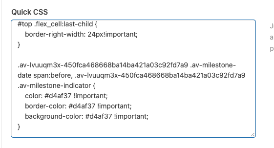
/* USE ALTERNATE LOGO FOR MOBILE HEADERS */
add_filter('avf_logo','av_change_logo');
function av_change_logo($logo) {
	if(wp_is_mobile()) {
	    $logo = "https://deserttortoise.org/wp-content/uploads/desert-tortoise-council-50th-ann-logo-hor.png";
	}
	return $logo;
}
add_action('wp_footer', 'ava_custom_script');
function ava_custom_script(){
	?>
	<script type="text/javascript">
		(function($)) {
			$(document).ready( function() {
				if($(window).innerWidth() <= 1024){
					$('.logo img').attr('src', 'https://deserttortoise.org/wp-content/uploads/desert-tortoise-council-50th-ann-logo-hor.png');
				}
			});
		})(jQuery);
	</script>
	<?php
}
/* SWITCH LEFT COLUMN TO TOP HEADER AT 1024 */ @media only screen and (min-width: 768px) and (max-width: 1024px) { .html_header_sidebar .av-sidebar-social-container { display: none; } .responsive #top .av_header_transparency.av_alternate_logo_active .logo a > img { opacity:1 } .responsive #top .av_header_transparency .logo img.alternate { display:none; } .responsive #top #wrap_all #header { position: relative; width:100%; float:none; height:auto; margin:0 !important; opacity: 1; min-height:0; } .responsive #top #main { padding-top:0 !important; margin:0; } #header .avia-custom-sidebar-widget-area { display:none; } .responsive.html_header_sidebar .logo { padding: inherit; } .html_header_sidebar .logo img { padding: 10px 10px 10px 30px; } #top #header .av-main-nav > li { display: none; } #top #header .av-main-nav > li#menu-item-search { display: block; } #top #header .av-main-nav > li.av-burger-menu-main.menu-item-avia-special { display: block; } .html_header_sidebar .main_menu { position: absolute; margin: 6%; } .html_header_sidebar #header .av-main-nav { padding: 0; } .html_header_sidebar .logo { width: 40%; } } @media only screen and (max-width: 1024px) { #search-3.widget, #custom_post_widget-2.widget { padding: 0 40px 40px 40px; display: none; } } @media only screen and (max-width: 1140px) { .avia-button.avia-size-small { padding: 10px 10px 8px; font-size: 13px; min-width: 65px; } } @media print { .html_header_left #top #header { display: none; } .html_header_left #main { margin-left: 0; } } @media only screen and (min-device-width: 1024px) and (max-device-width: 1366px) and (-webkit-min-device-pixel-ratio: 2) and (orientation: landscape) { #search-4, #custom_post_widget-7 { display:none; } }See here https://kriesi.at/support/topic/metadata-element-possible-to-add-default-settings/
Its a filter to change the defaults.function custom_avf_sync_sc_defaults_array( $defaults, $sc_class, $is_modal_item, $content ) { if(get_class($sc_class) == "avia_sc_hr") { $log .= "Filter wurde aufgerufen\n"; $defaults['height'] = '30'; $defaults['class'] = 'invisible'; } return $defaults; } add_filter( 'avf_sync_sc_defaults_array', 'custom_avf_sync_sc_defaults_array', 10, 4 );This code changes the detault HR hight to 30 and to invisible. And that does work when you check that the defaults get changed. But that doesnt affect anything at the end, as it seams the defaults get ignored, or with that particular element they are not working.
How chan I change the default values correctly that they are used?
Thanks
Hey there,
We love the Icon Circle element for the site we’re making now, but nearly nobody hover over the icon circle and therefore doesn’t view the content of each circle.
Is there a way to set an timed autodisplay of the Icon circles content automatically, while scrolling the page?
Here’s a screenshot of the page I mean:

Ideally, this would be the behaviour:
1. logo shows in the center, then after 2-3 seconds
2. First dot on top animates and shows up content in the center, then 2 seconds later,
3. Second dot on the right animates and shows up content in the center, then 2 seconds later,
4. Third and last dot on the left animates and show up content in the center.Maybe also on loop, so it continues.
Is it possible?
Thank you for your help.
Antonio
Viewing 30 results - 2,701 through 2,730 (of 142,850 total)