Hi,
The script will work on already existing pages, not just new pages, this is the only way we have.
Otherwise you can choose the ALB option and save the page as you edit each page in the future, this is how the script works.
Best regards,
Mike
Good morning guys, I have always wondered how to make dynamic block layouts like the one shown in the example. Title h1 on the left and blocks on the left. I have tried grid and block layouts but find it difficult to manage the right-hand side. These blocks then from mobile or tablet can be seen in full screen, while on the desktop they are aligned as in the picture.
Thank you very much
Hey Diana,
Thank you for your patience, for the video on: https://mp-audioproductions.de/mona-bumes/
to remove the black bars, try this css:
@media only screen and (min-width: 990px) and (max-width: 1360px) {
	#top .av-video-slide .avia-slide-wrap, #top .av-video-slide iframe {
    background: #fff;
}
#top .av-video-slide .avia-slide-wrap {
    height: 84%;
}
#top .flex_column.avia-builder-el-5.column-top-margin {
	margin-top: 0px;
}
#top #wrap_all .av-special-heading.av-m6wqj69t-b4e1d140677e492efdf2d8c0f9797c34 .av-special-heading-tag {
    line-height: 115px;
}
}
After applying the css, please clear your browser cache and check.
Please note that testing with iPads & iPhones can be hard to clear the cache, often you need to also clear the history to fully purge the cache, following these steps for Safari and note Step 4 where you will Clear the History.
Best regards,
Mike
Hi,
apply a unique class name (av-black-vertical-line) to the column that you want the black line on, please examine the column that Ismael did for you.
To move the column up use the setting to add a negative top margin.
Best regards,
Mike
Hi,
The css that goes with that script sets the background color of the popup box, if you don’t want the color then change the css
.mfp_popup_content {
	position: relative;
	background: #ffffff;
	padding: 40px;
	width: auto;
	max-width: 600px;
	margin: 100px auto;
	overflow: auto;
  }
also your code above has two add actions: add_action('wp_footer', 'inline_popup_enabler', 9999);add_action('wp_footer', 'inline_popup_enabler');
you should only have one add_action('wp_footer', 'inline_popup_enabler', 9999);
this is probably why you see an error, or you have curly quotes in your code.
Best regards,
Mike
Hi,
Add this CSS
@media only screen and (max-width: 989px) {
#top.home #service .avia-builder-el-49 p {
	margin-bottom: 1.85em;
}
#top.home .flex_column_table.av-equal-height-column-flextable.av-9pa8e-8f916ca769a4d466ee08dbf3fddc5a77:not(:first-child) {
    margin-top: 40px;
}
}
Best regards,
Mike
Hey MarcusJeroch,
Try this CSS in your Enfold Theme Options ▸ General Styling ▸ Quick CSS field:
#top #wrap_all .post-entry .post-title {
    text-transform: none;
}
If this doesn’t help, please link to your page with this title.
Best regards,
Mike
Hi,
i added a self hosted video (2.35:1 ratio). I added the ratio in the settings.
It shows black bars on top and bottom.
How can i remove the bars or change the colour of the bars?
Could not find a solution at yet.
kind regards
Jak
Hey Jak73,
Try this CSS in your Enfold Theme Options ▸ General Styling ▸ Quick CSS field:
@media only screen and (max-width: 989px) {
#top.home #leistungen .avia-builder-el-8 p {
	margin-bottom: 1.85em;
}
}
adjust to suit.
Best regards,
Mike
Hi,
Try adding this CSS in your Enfold Theme Options ▸ General Styling ▸ Quick CSS field:
@media only screen and (min-width: 990px) {
.logo .avia-standard-logo-sub img.alternate {
  position: relative;
}
}
@media only screen and (max-width: 989px) {
.responsive .logo a {
    display: table-cell;
    vertical-align: middle;
    height: 90px;
}
}
 @media only screen and (min-width: 990px) {
 	#header:not(.av_header_transparency) .logo {
 		top: 36%;
 	}
 }
Best regards,
Mike
Hi,
In your screenshot:

the image is not all the way to the top, the top bar background color is white because of the Safari Website Tinting option:

from the site background color.
This color is not customizable beyond setting a solid color that matches the theme color of your website
and you cannot overlay an image or extend the background of your website into the status bar area

Best regards,
Mike
footer, buttons und andere Elemente sind über diese Grundeinstellungen ( Allgemeines Styling ) gesetzt, aber diese Trenner werden wohl im Element (grid-row und dann die Zellen) gesetzt sein. Auch einige Sections HIntergrundfarben werden wohl im Element festgelegt sein.
Die Textlichen Hervorhebungen sind über :
#top .all_colors u, #top .all_colors span[style*="underline;"] {
  color: #719430;
  line-height: 1.4em;
  font-family: 'caveat',Helvetica,Arial,sans-serif;
  text-decoration: none !important;
  display: inline-block;
}
gesetzt.
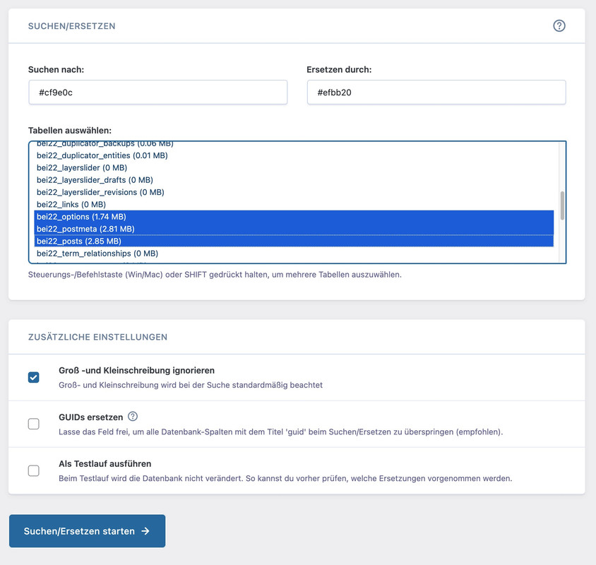
Wenn du eine Liste hast welche Farbe du gegen eine andere austauschen willst, könntest du es auch über die Datenbank machen.
Tools wie https://de.wordpress.org/plugins/better-search-replace/ könnten da helfen.
Im Grunde betrifft es wohl nur 3 Tabellen (wobei ich in dem Fall Groß/Kleinschreibung misachten würde):
on https://kriesi.at/themes/enfold-2017/elements/magazine/ you want to preserve the bigger image post and have on the smaller images a two column view?
to have:
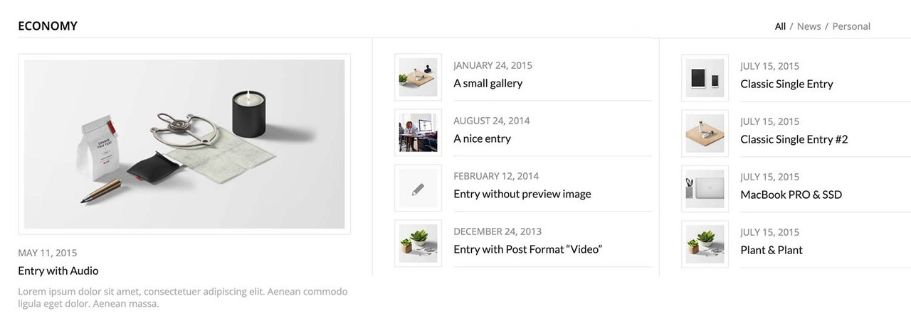
you can have this by css only – but you had to break earlier to responsive case to have enough space for showing the articles with smaller images:
#top .av-magazine-sideshow:before,
#top .av-magazine-sideshow:after {
  display: none;
}

#top .av-magazine-sideshow {
  display: flex;
  flex-flow: row wrap;
  justify-content: space-between;
}

#top .av-magazine-sideshow .av-magazine-entry {
  flex: 0 1 48%;
  width: unset;
}
Hi Ismael,
thank your for your help. Then I will create two separated sliders – one for desktop and tablet device and one other slider for smartphone version. And disable the other one for the specific device type.
Best regards
Hi,
i added a color section, with 3 columns per row and two rows.
When the screen-size (tablet) is reduced, there is too much space between the 3rd and the 4th row. Please see screenshot 1.
Mike helped me with this, so I added his code:
@media only screen and (max-width: 989px) {
#top.home .flex_column_table.av-equal-height-column-flextable:not(:first-child) {
    margin-top: 0;
}
}
This works well, but now also the space of my headline on the top of the color section is now reduced, which should not.
How can I fix that?
kind regards Jak
Hi,
Try this CSS in your Enfold Theme Options ▸ General Styling ▸ Quick CSS field:
@media only screen and (max-width: 479px) {
#top.home .slideshow_inner_caption {
    width: 50%;
}
    #top.home .avia-slideshow .av-slideshow-caption .avia-caption-content p {
        font-size: 9px;
        line-height: 9px;
        margin-bottom: 0;
    }
   #top.home .avia-slideshow .avia-slideshow-button {
   	margin-top: 10px;
   	font-size: 9px;
   }
}

Best regards,
Mike
HI
A couple of questions
I would like to show the excerpt in the magazine element.
I found the code here: https://kriesi.at/support/topic/magazine-excerpt-2/ but it’s not working for me.
I have the magazine.php in a child theme. Can you take a look at my code?
I would also like to be able to have it display in 2 columns? is that possible?
I know I can use the portfolio grid, but that puts the image at the top instead of on the side.
Is it possible to modify that? On the page below I have 2 magazine elements shown by date, but maybe there is a better way to do it?
Thanks
Hi Ismael,
thanks for your answer.
I did not. That’s the part which is strange.
I put this quick css in – see below. .
Before I put anything new into quick css – I’d like to get into the bottom of this problem.
KR
Tanju
.main_color tr:hover
{
color:#FFF;
background: #000 !important;
}
.slideshow_caption { width: 60%;}
.avia-caption-title {
position: relative;
top: -40px;
}
.avia-caption-content {
position: relative;
top: -40px;
}
@media only screen and (max-width: 767px) {
.responsive #top #scroll-top-link {
display: block;
}
}
#header_meta .avia_wpml_language_switch { display: none; }
@media only screen and (max-width: 1112px) {
.menu-item {
display: none;
}
.main_menu {
display: block !important;
}
.av-burger-menu-main.menu-item-avia-special {
display: block;
}
}
div .av_one_fourth {
margin-left: 2%;
width: 34%;
}
.avia-promocontent * {
font-size: 20px!important;
}
#top .av_promobox .avia-button .avia_iconbox_title {
font-size: 20px;
}
#footer .container {
max-width: 95% !important;
}
#top .av-large-testimonial-slider .avia-testimonial-meta {
float: left;
}
.special-heading-border {
display:none !important;
}
Hi Ismael,
thanks, I’ve tried that on a separate test page [private content] using the settings you’ve mentioned. The source video isn’t 16:9 though but I’ve selected stretch regardless which only results in the fall back image being stretched. Isn’t there a way to define the height of the slider? – can’t find that. On top of that I’ll need to place the text plus box on top of the slider as in shown my color section.
Kind regards.
Hey cktanju,
Thank you for the inquiry.
Did you add this css code?
.logo img.alternate {
    position: absolute;
    z-index: 1;
    top: 0;
    left: 0;
    opacity: 0;
}
You can override it with:
.av_header_transparency .logo img.alternate {
    top: 30px;
}
This should adjust the position of the logo.
Best regards,
Ismael
Hi,
We applied a unique class name (av-black-vertical-line) to the first column with the feather image, then added this css code to create the black line.
.av-black-vertical-line:before {
    content: '';
    width: 1px;
    height: 200px;
    position: absolute;
    background: #000000;
    top: -100px;
    left: 100px;
    display: block;
    z-index: 1000;
    visibility: visible;
}
We also added a separator/whitespace element to the first section to create a huge space at the bottom, then added this css to pull the columns upward.
.av-grid-with-black-border {
    position: relative;
    z-index: 100;
}

.av-grid-pull-black-border {
   margin-bottom: -324px;
}
Best regards,
Ismael
Hi there
I have the Mailchimp form widget in the first column of a footer – however the order of form fields is incorrect – should be 1) Email address, 2 Frist name, 3) Last Name.
Its incorrect on both mobile and desktop (showing email, last name then first name).
Also how can I change the font size of the text in each form field to be smaller – Ive adjusted the form in Mailchimp but is still showing larger.
Hey Jak73,
Try this CSS in your Enfold Theme Options ▸ General Styling ▸ Quick CSS field:
@media only screen and (max-width: 989px) {
#top.home .flex_column_table.av-equal-height-column-flextable:not(:first-child) {
    margin-top: 0;
}
}
Please ensure to copy the code from the forum and not an email notification so the symbols are not converted.
After applying the css, please clear your browser cache and check.
Best regards,
Mike
426 / 5.000
Hello Rikard,
sorry, a bit late – thanks for your answer.
I had already tried your suggestion. It looks very good on iPhones; but unfortunately on Android phones I saw this distorted image.
Everything is great on the desktop and on the iPad; I also adjusted the tab for the different devices.
Do you perhaps have another idea for me??
Thanks for your effort and kind regards
Andrea
Nothing is helping the photo image go all the way to the top of mobile device. It used to be able to.
Hi Guys,
I know that it should work by default but it isn’t working, that the Logo out vertically centered with the menu at the desktop. Mobile is everything fine. Can you look into it? Thanks.
Hi,
Thanks for the update. Please let us know if you should need any further help on the topic, or if we can close it.
Best regards,
Rikard
Dear Support Team,
on the following page I have a problem with a few sections in the display on the tablet landscape format – all other devices are displayed correctly with a few settings, but for the ipad landscape, I just can’t get it to work:
1. start section: Enter – movie in the background of the section
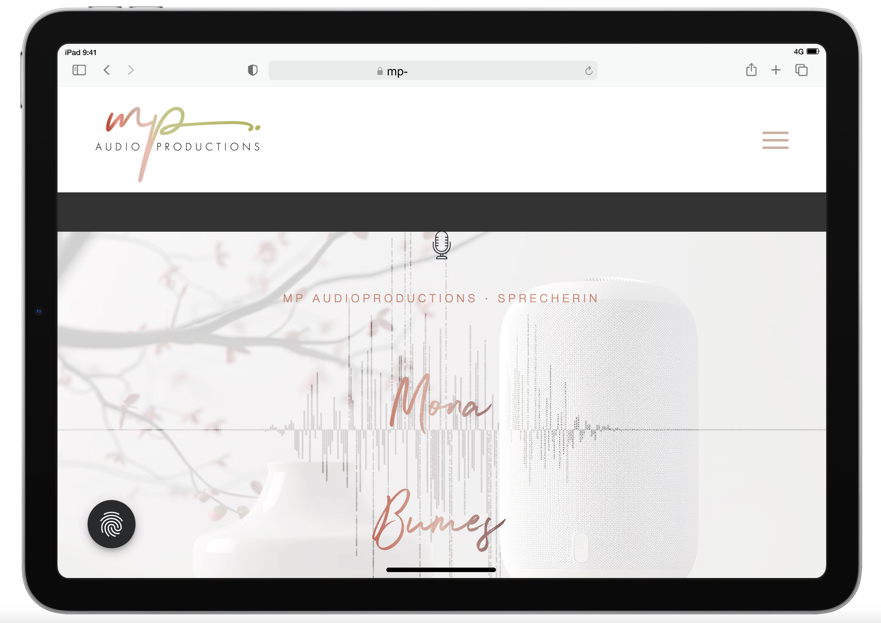
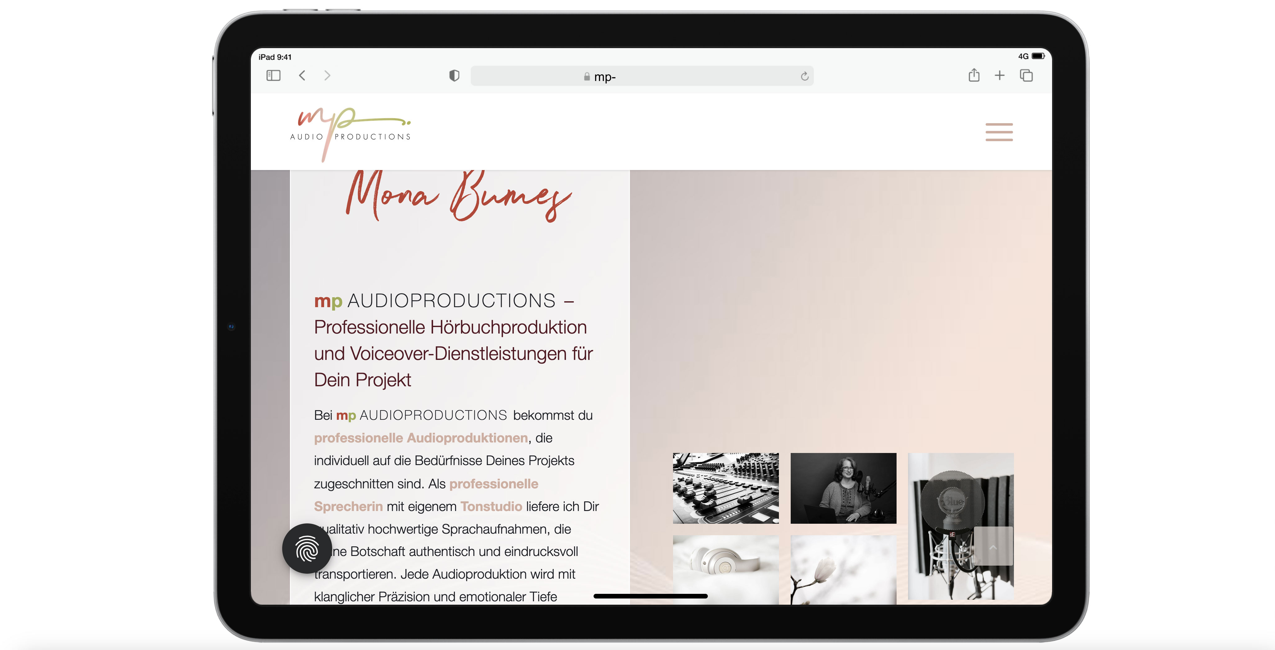
The Enter section exists twice: once only for the desktop version with the movie, and once with a still image in the background for the mobile devices. However, the desktop version is still displayed on the i-pad even though I have also hidden tablets in the settings. Here is a screenshot of the display on the tablet: https://mp-audioproductions.de/support/3.jpg > the movie doesn’t work, it looks messy with the black bars – or is there a way to scale the movie across the entire screen width? If not, then it would be good to switch to the section with the still image: Is that possible?
2nd section Offers: https://mp-audioproductions.de/mona-bumes/#angebote
This also does not work correctly on the tablet: The cells are displayed next to each other (instead of below each other, as in other mobile versions): see screenshot: https://mp-audioproductions.de/support/1.jpg
> What setting do I need so that the cells are also displayed one below the other on the tablet landscape?
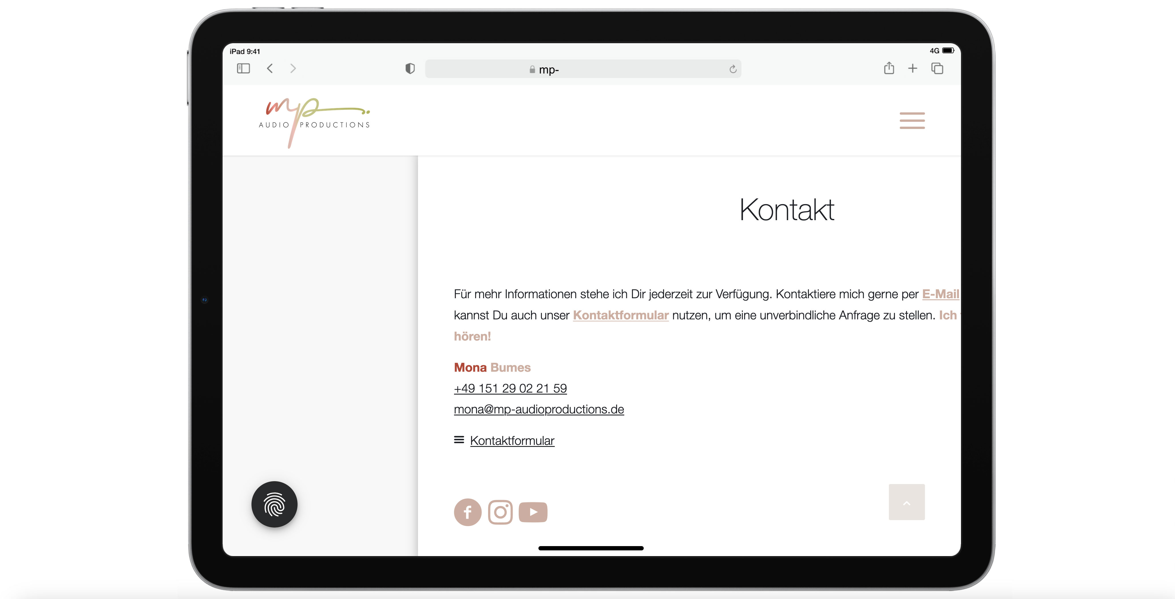
3. contact section (last section): https://mp-audioproductions.de/mona-bumes/#kontakt
Display tablet landscape: truncated text on the right: https://mp-audioproductions.de/support/2.jpg
> In all other mobile versions, the cell with the contact details is displayed correctly centered, but not on the tablet landscape. What setting do I need here?
With a request for support, best regards, Diana
Hi Kriesi,
You recommend moving all quick CSS to “custom.css” if you have CSS alterations to “major portions of the theme”.
Questions:
• We implemented the CSS you see in privat6e content. Would you advice us to move this to /wp-content/themes/enfold/css/custom.css?
• Will changes in custom.css occur instantly in the frontend, like it does when I add/alter quick CSS in General Styling/Quick CSS?
• Can I just copy the CSS as it is, or “do I have to” structure it as suggested in the custom.css file? (the splitting of general, desktop and mobile rules)
Hope you can advice us on this topic :)
Best,
Frederik