Hi,
It looks like you have this custom css in your child this preventing clicks on your topbar sub-menu:
#top #menu-item-1302 a {
    pointer-events: none;
}
I assume that you want to remove the click on the main item “Partenaires de séjours de vacances” but want the click on the sub-menu items, so remove your css and use this instead:
.menu-item-1302 {
	height: 30px;
}
#top #header_meta #menu-item-1302 > a {
   pointer-events: none;
}
#top #header_meta #menu-item-1302 .sub-menu a {
   pointer-events: auto;
}
Please ensure to copy the code from the forum and not an email notification so the symbols are not converted.
After applying the css, please clear your browser cache and check.
Best regards,
Mike
Hi,
Glad to hear that you have this sorted out, please note that when you double minify with either two plugins or a plugin and the theme settings it will typically cause errors due to how minify works. Minify removes spaces and other characters from CSS, when it is double minified needed characters are sometimes removed causing errors. So the best approach is to minify only once with either the theme settings or a plugin.
TTFB is a server response time, your test above is for a mobile device which is throttled and not using true mobile 5G speed, typically most test mobile at 3G and 5G for desktop.
Best regards,
Mike
Hi,
Thanks for the update. If you have further questions which is not on the original topic, then please open a new thread and try to explain the problem that you are having a bit further. We’ll close this thread for now.
Best regards,
Rikard
as a participant i do not see your private content messages – but do you use WPML?
WPML does handle your language Settings even for those enfold options.
you got on top your lang flags :
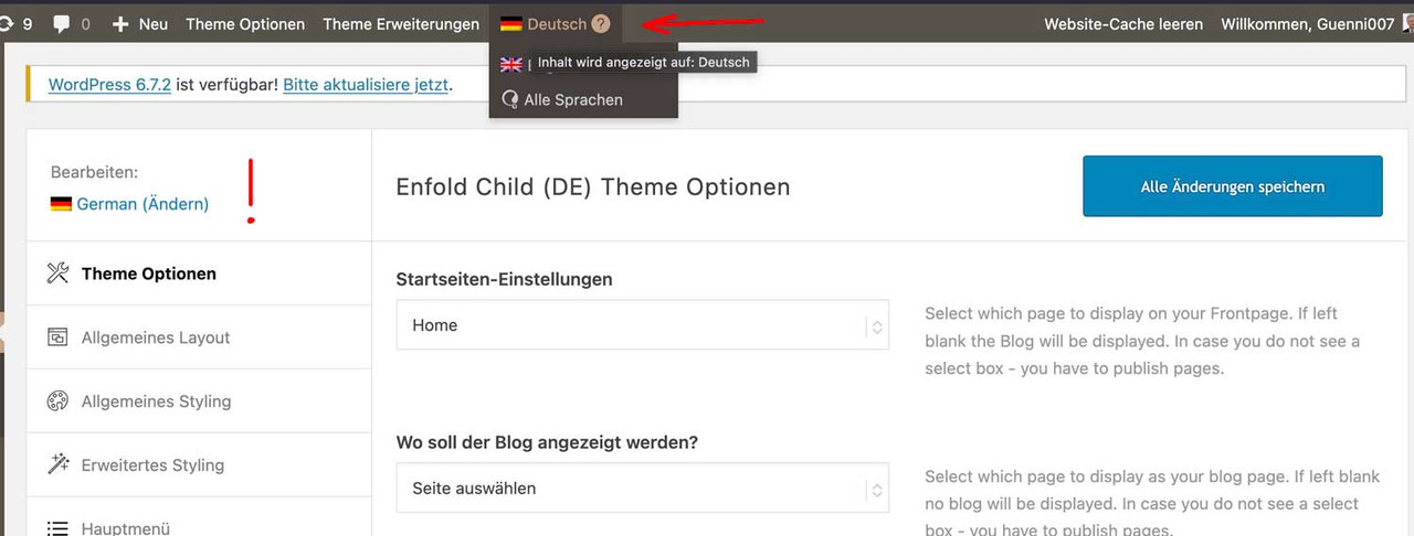
so if you like to have the same look – you had to synchronise these settings for each language.
read here https://kriesi.at/support/topic/implementing-the-same-theme-setting-to-all-languages-using-enfoldwpml/
My advice: first style the page completely in your native language, then go via the theme settings. ( see link above)
First: how did you embed/activate that Sacramento Font to Enfold?
Next: what is common to those headings that should use the Sacramento Font? (maybe there is something we can use as selector)
_______
If there is no commonality for these headings, you will need to do this manually.
You should give a custom class to those heading elements. (f.e. sacramento – why not?)
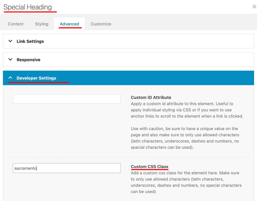
then you will have that custom class at the parent of your h-tags (av-special-heading-tag)
#top .av-special-heading.sacramento .av-special-heading-tag {
  font-family: 'sacramento';
  font-weight: 700
}
It may be necessary to force the font family by adding !important to this declaration.
ich habe dir jetzt zwei wege aufgezeigt.
zum Einen könntest du mit dem bisher erreichten ja den Code von Link mal einsetzen.
Dann sieht die seite so aus:

zum Anderen – und ja klar wäre das ein Neuansatz – die Lösung über das Grid Layout.
Dazu wäre dann nötig den bisherigen Code zu entfernen, und den neuen Ansatz auszuprobieren.
@Ismael,
I have another issue linked here for which I need assistance. I’m assuming you’ll likely be the one to respond to it since most of modifications I made to tabs section was from CSS you’ve posted in previous forum posts. Please let me know if I need to create a new issue, or what the enfold moderators need to move forward with the issue. LINK is here. – https://kriesi.at/support/topic/pill-tab-section-not-working-as-expected/
Thank you!
Hi,
I have a large monitor/screen so had to zoom out to screen shot the contrast between the full width content at the top vs. the boxed/not full width color section at the bottom of screen.
Thanks for the suggested fix! I set Maximum Container Width to 100% and the color section looks as expected on my large screen. I need to test that other screen sizes and all layouts (regular desktop, tablet)are OK before I close this out. Will be in touch in 3-4 days after testing.
Hello Ismael,
thank you very much – that worked! :-)
There are just three little things:
1) the search icon is not visible on large screens like laptop (is it blue?) – it should be white.
2) the menue should be in burger style when it is too long – the client has added one big menue item and now it is too big…
3) the italic text which is shown when the search field gives no entry “Bitte verwende einen anderen Suchbegriff” should be in white, too.
Can you help, please?
Kind regards,
Kati
Just to clarify, should I delete this:
@media only screen and (max-width: 479px) {
.responsive #top #wrap_all #main .products .product {
margin: 0 1% 1% 0;
width: 49%;
}
}
And replace it with this?
.responsive #top #main .products .product {
margin: 0 0 20px 0;
width: 100%;
}
Das Phänomen existiert auch ohne die ID “superlat” und kann auch auf frischen Installationen reproduziert werden.
Hier ist der Code um es zu reproduzieren:
<div id=’main’ class=’all_colors’ data-scroll-offset=’88’>
<div class=’main_color container_wrap_first container_wrap fullsize’ ><div class=’container av-section-cont-open’ ><main role=”main” itemprop=”mainContentOfPage” class=’template-page content av-content-full alpha units’><div class=’post-entry post-entry-type-page post-entry-2′><div class=’entry-content-wrapper clearfix’><section id=”” class=’av_textblock_section av-m0exh7bk-f420021c8c6e7a2c36feb8c4b82214e7 ‘ itemscope=”itemscope” itemtype=”https://schema.org/CreativeWork” ><div class=’av-desktop-hide av-medium-hide av-small-hide avia_textblock’ itemprop=”text” ><p>SIMPLE TEXTin TEXTELEMENT</p>
</div></section>
</div></div></main>
m.
Ok Mike, gotcha.
What about my last question?
Since I’ve settup a main mega menu, I cannot access the items of the top menu any more.
How can I fix that?
Hey Katja,
Thank you for the inquiry.
Please add this css code to adjust the color of the active mobile menu items and the search icon:
.html_av-overlay-side #top #wrap_all div .av-burger-overlay-scroll #av-burger-menu-ul a:hover {
    color: #000000;
}

.header_color .main_menu ul:first-child > #menu-item-search > a svg:first-child {
    stroke: #fff;
    fill: #fff;
}
You may need to toggle or temporarily disable the Enfold > Performance > File Compression settings.
Best regards,
Ismael
Hi,
We remember adding it to the Quick CSS field, but it’s not there anymore. The css you posted above is being overridden by this rule in the woocommerce-mod.css file.
.responsive #top #main .products .product {
	margin: 0 0 20px 0;
	width: 100%;
}
You can also add the same css manually in the live site if necessary.
View post on imgur.com
Best regards,
Ismael
Hey jonroot,
Thank you for the inquiry.
You can add use the following css code to adjust the size of the arrow-down element.
.avia_transform .av-extra-border-element.border-extra-arrow-down .av-extra-border-inner {
    position: absolute;
    left: 50%;
    width: 200px;
    height: 200px;
    -webkit-transform: translateX(-50%) rotate(45deg);
    transform: translateX(-50%) rotate(45deg);
    top: -120px;
}

.avia_transform .av-extra-border-element.border-extra-arrow-down {
    position: relative;
    width: 300px;
    height: 200px;
    left: 50%;
    margin-left: -52px;
    margin-top: -1px;
    z-index: 25;
    margin-bottom: -200px;
    clear: both;
}
You may need to insert a Separator/Whitespace element to the succeeding sections to push the content away from the larger arrow.
Best regards,
Ismael
Hi Kresi Team,
I just made my website public today and noticed that the header logo is missing in the mobile view. Previously, it appeared black with a white background on mobile and white with a transparent background on desktop.
Could you please assist me in resolving this as soon as possible? I need it to be visible urgently.
I’ve attached a screenshot of the mobile view and included the login details in the private content.
Thank you so much!
Ok, now I get a Bad Gateway error 502 with cloudflare udner that line. . . however when I refresh, it loads fine adn the sliders are there.
Not sure what’s up with the bad gateway, but I did see it with my last blog post but thought it was just a glitch . . I have refreshed all pages except Counseling Services > Personal Development Counseling, and Helpful Resources (on main menu across the top, by the magnifying glass). I’m guessing you won’t get the 502 bad gateway error except on those 2 pages (helpful resources is a top level page that is not under Counseling Services).
-
This reply was modified 1 year, 1 month ago by
 gatehealing.
Hi,
Unfortunately, there is not a way to add images to the top bar menu like the mega menu.
Best regards,
Mike
Warum nimmt die Sektion mit der ID #superlat auf grosseren & mittleren Bildschirmen optisch Raum ein, obwohl die responsive Settings so eingestellt sind, das es nur auf sehr kleinen Bildschirmen angezeigt werden soll?
(Auch eine extra angelegte CSS Anweisung hat keine Wirkung. Das ist grotesk)
<div id=’main’ class=’all_colors’ data-scroll-offset=’88’>
<div class=’main_color container_wrap_first container_wrap fullsize’ ><div class=’container av-section-cont-open’ ><main role=”main” itemprop=”mainContentOfPage” class=’template-page content av-content-full alpha units’><div class=’post-entry post-entry-type-page post-entry-2′><div class=’entry-content-wrapper clearfix’><section id=”superlat” class=’av_textblock_section av-m0exh7bk-f420021c8c6e7a2c36feb8c4b82214e7 ‘ itemscope=”itemscope” itemtype=”https://schema.org/CreativeWork” ><div class=’av-desktop-hide av-medium-hide av-small-hide avia_textblock’ itemprop=”text” ><p>SIMPLE TEXTin TEXTELEMENT</p>
</div></section>
</div></div></main>
My top of page sliders are not appearing, so there are larget blank spots at the top of each page.
I have put an example of the problem in the private box. I have already deleted the easy slider on my homepage, but I would prefer to put it back and not have to go completely re-vamp all of my pages.
Any idea what happened? I have not changed anything since the last time I checked my site.
Thanks!
Jon
There are some other themes that have similar issues. It appears it is the <picture> tag causing the issue. For me I just stopped using image plugins and let the host’s CDN handle it.
Hi – I can’t see where this has been done..
@media only screen and (max-width: 479px) {
.responsive #top #wrap_all #main .products .product {
margin: 0 1% 1% 0;
width: 49%;
}
}
I could only see this in the Theme Options?
Sorry, this is far more than my knowledge of CSS can comprehend. I really don’t understand what you are talking about. All I want is the layout of the header on the mobile view to function. The Desktop view is ok.
Could you please be so kind to rewrite and replace the complete CSS file on the site directly then?
-
This reply was modified 1 year, 1 month ago by
 ausgesonnen.
-
This reply was modified 1 year, 1 month ago by ausgesonnen.
if you like to use a different font then it is better to use the image id
function avia_replace_default_icons($icons){
	$icons['svg__search'] =  array( 'font' =>'svg_wp-media-library', 'icon' => '40720');
		return $icons;
	}
add_filter('avf_default_icons','avia_replace_default_icons', 10, 1);
that above is an example with the new “font” of uploaded svg files to media-library
https://kriesi.at/support/topic/how-to-replace-standard-icons/
Advantage use media library multicolor svgs too.
Hi,
Thanks for the update. Please let us know if you should need any further help on the topic, or if we can close it.
Best regards,
Rikard
Hi,
Thank you for the inquiry.
Is the avia_title override still active? What happens when you disable it? The filter provided in the following threads might help:
— https://kriesi.at/support/topic/change-blog-latest-news-title/#post-1467939
— https://kriesi.at/support/topic/change-blog-latest-news-title/#post-1467959
You may need to update this condition and use the actual title of your blog page.
if ( $args['title'] == 'Blog - Latest News' ) {
Best regards,
Ismael
Hi,
You can add this css code to adjust the padding around the gallery images.
#top div .avia-gallery img {
    padding: 0;
}
Make sure to upload images with the same size and aspect ratio to create a consistent grid without unwanted spaces or gaps.
Best regards,
Ismael