-
AuthorSearch Results
-
March 12, 2025 at 6:28 am #1479126
In reply to: Background Image of color section
Hi,
But now there are 2 short black horizontal lines left and right. What are they? How to get rid of them?
That is the border of the color section inside the footer page. Please refer to this thread: https://kriesi.at/support/topic/new-bug/#post-1479123
Best regards,
IsmaelMarch 12, 2025 at 6:09 am #1479125In reply to: Header structure
Hi,
Try to add this css code:
body #header_main .av-logo-container {
    position: absolute;
    top: 0;
}
There might be other css rules applied to the original language but not to the EN version.
Best regards,
IsmaelMarch 12, 2025 at 5:47 am #1479122In reply to: 3 over 2 centered
Hi,
Thank you for the inquiry.
Have you tried using 1/3 Column elements? To center align the items in the second row, you can apply a left margin to the first item/column in the second row.
#top .flex_column.av-akkm-b2445ebeda64d34ec76acb1a0564417e { margin-left: 16.5%; }Best regards,
IsmaelMarch 11, 2025 at 9:15 pm #1479112In reply to: Help with some shop elements
Also, just realized something. The Sale thing category shows up at the top on desktop, but not on mobile for some reason. Not sure why.
March 11, 2025 at 5:09 pm #1479103Hi Ismael
Thank you.
In the steps that Mike added I stopped after adding the code snippet to a code snippet plugin.
I now went to this product: https://labhuset.no/product/fiocchetti-plasma-freezer-10-20c-glass-door/ and in the backend ALB I clicked the main image and went to Advanced -> Animation -> Parallax Rules and Image Hover Effect and switched it to “Fade to another image”. I see there is no option to which image it should switch to though.
Went to check out the product on the frontend and noticed no hover effect.
March 11, 2025 at 4:53 pm #1479097In reply to: Burger menu icon to be black
Change means not add !
you placed it on top of the quick css.but my settings are after your (top) insertion so the code is overwritten by mine.
i changed that code as mentioned.March 11, 2025 at 2:52 pm #1479088In reply to: Burger menu icon to be black
you said change this:
“so change the css rules for that too.@media only screen and (max-width: 989px) {
.responsive.html_header_top #top #main {
/* padding-top: 320px !important; */
padding-top: 400px !important;
}
}@media only screen and (min-width: 768px) and (max-width: 989px) {
.responsive.html_mobile_menu_tablet.html_header_top #top #main {
/* padding-top: 320px !important; */
padding-top: 420px !important;
}
}So I understand that it is already there? Correct? but I could not find this in my CSS anywhere? So I just added it but it doesn’T seem to do anything.
March 11, 2025 at 1:23 pm #1479082In reply to: Burger menu icon to be black
if you enlarge the logo (as mentioned on the other post ) you had to correct the padding-top of #main ( for that screen-width)
#top .header_color .av-hamburger-inner,
#top .header_color .av-hamburger-inner::before,
#top .header_color .av-hamburger-inner::after {
  background-color: #000;
}
so change the css rules for that too:
@media only screen and (max-width: 989px) {
  .responsive.html_header_top #top #main {
    /* padding-top: 320px !important; */
    padding-top: 400px !important;
  }
}

@media only screen and (min-width: 768px) and (max-width: 989px) {
  .responsive.html_mobile_menu_tablet.html_header_top #top #main {
    /* padding-top: 320px !important; */
    padding-top: 420px !important;
  }
}
March 11, 2025 at 11:26 am #1479073Hi,
That is probably due to this css code:
.responsive #top #main .avia-product-slider-container .products .product {
    margin: 0 0 20px 0;
    width: 100%;
}
We no longer see this issue when we checked the site live.
If the issue persists on your end, you can include this code in the css media query:
.responsive #top #main .avia-product-slider-container .products .product {
    margin: 0 1% 1% 0;
    width: 49%;
}
Best regards,
IsmaelMarch 11, 2025 at 11:20 am #1479069In reply to: Page speed using section color overlay
Hey dradoering,
Thank you for the inquiry.
Have you done any page speed optimization to the site? If you haven’t, please review the following articles:
— https://kriesi.at/support/topic/pagespeed-100100/
— https://gtmetrix.com/wordpress-optimization-guide.htmlYou can start by installing a cache plugin such as WP Super Cache or WP Rocket and compressing the images. The LCP should improve once you’ve completed the steps above.
Best regards,
IsmaelMarch 11, 2025 at 11:02 am #1479067In reply to: Mobile screen result (image)
Hi,
We modified the code in the Quick CSS field:
@media only screen and (max-width: 768px) {
  #top .avia-slideshow.av-lu5z97j3-d1f957c8c38e449b8b56e5cb4753112f .avia-slideshow-slide img {
    min-height: 500px;
    object-fit: cover;
  }

  #top .av-m7nj2xd7-f8dc5edf704b129f594536c49dabd9b8.avia-slideshow li img,
  #top .av-m8474mmq-b8b082188475e1a03955aab66d3e8639 li img,
  #top .av-m7utj0fm-55a4085e08fb8dd95eeb6325426a31b7 li img
   {
    height: 300px;
    object-fit: cover;
    object-position: right;
  }
}
Result:
We also disabled the Enfold > Performance > File Compression settings temporarily. You can enable it back when you’re done editing the site.
Best regards,
IsmaelMarch 11, 2025 at 4:52 am #1479057In reply to: Category and Product Alignment
Hey ballindigital,
Thank you for the inquiry.
You could apply a minimum height to the special heading element:
@media only screen and (max-width: 767px) { #top .av-special-heading { min-height: 61px; } }Please note that the modification above will apply to every Special Heading element. You may need to apply a custom css class to the elements where you want this to be applied.
— https://kriesi.at/documentation/enfold/add-custom-css/#enable-custom-css-class-name-support
Best regards,
IsmaelMarch 11, 2025 at 4:45 am #1479056In reply to: Product Image Size
Hey ballindigital,
Thank you for the inquiry.
It looks like you have already applied the adjustments. If you’d like to increase the image size further, you can add this css code:
#top.single .single-product-main-image {
    width: 50%;
    float: left;
    margin-right: 50px;
    overflow: hidden;
    padding-bottom: 50px;
}

#top.single .product div.images img {
    width: 100%;
    height: auto;
    max-height: unset;
    margin: 0 auto;
}
Best regards,
IsmaelMarch 11, 2025 at 4:26 am #1479054In reply to: Header structure
Hi,
Thank you for the info.
In the style.css file, you have the following css rules that target specific widgets using #custom_html-2 or #custom_html-3. These rules don’t apply to the EN version because the widget there has a different ID, #custom_html-4.
body #header_main #custom_html-2 .col.btn a, body #header_main #custom_html-3 .col.btn a {
    display: block;
    background-image: linear-gradient(#d9c596, #b39b60);
    padding: 0 25px 0 25px;
    color: #050607;
    font-size: 14px;
    font-weight: 700;
    border-radius: 25px;
    max-height: 40px;
    line-height: 40px;
    text-transform: uppercase;
    margin-top: 5px;
}
Please update the css to include the widgets in the EN version.
Best regards,
IsmaelMarch 10, 2025 at 7:47 pm #1479045In reply to: Different space above menu and below menu?
Hey Jak73,
Please try the following in Quick CSS under Enfold->General Styling:
#top #header_main .av-main-nav > li > a {
  line-height: 0;
}
Best regards,
RikardMarch 10, 2025 at 6:12 pm #1479040In reply to: Pill Tab Section not working as expected
Hi,
1. Try this CSS and change the values to your liking:
.avia_transform .av-active-tab-title .av-tab-arrow-container span {
  top: -5px;
}

.av-tab-arrow-container {
  height: 21px;
}
2. Try this CSS:
.CF-av-pill-tabs .av-active-tab-title {
  background: red;
}
3. Try setting the width to 100%:
.CF-av-pill-tabs .av-inner-tab-title {
  color: #FFFFFF;
  font-family: 'roboto';
  font-weight: 500;
  font-size: 36px !important;
  width: 80%;
  text-align: left;
  margin-left: 5% !important;
  margin-bottom: 0px !important;
  padding: 10px 0px 0px 0px !important;
}
Best regards,
RikardMarch 10, 2025 at 4:53 pm #1479036In reply to: Custom fonts for certain instances of headings
With my first question, I just wanted to make sure that the font also works with your method. So you used the Enfold support for Google Fonts (something we should actually avoid in Europe because of GDPR requirements) and activated the font that way.
The second question is about whether you can avoid using the custom class if these headings could have something in common. For example, that you want to have all blog post titles with this font.Now – make shure that the custom class input field is filled without that dot for classes. On the heading element this custom class goes (as mentioned already) to the parent of the h tag. So the code will work for all heading tags (h1, h2 etc. ) with:
#top .av-special-heading.extralargedisplayfont .av-special-heading-tag { font-family: 'sacramento'; }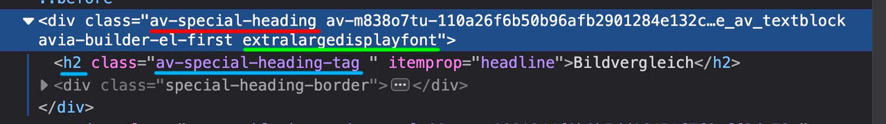 March 10, 2025 at 3:35 pm #1479030
Hey Mike
Thank you for the code walk through here but it is not what I have been asking about.
1.
The client does not want the gallery image to show on the frontend.2.
The client wants to be able to hover the product image and have it switch to the first gallery image which is not seen on the frontend. The gallery image is only added to the backend product screen.They want it seen like this: https://www.fiocchetti.com/en/products/bloodbanks-4degc?e=275 (on the Single Product image screen.)
There is this older support thread here: https://kriesi.at/support/topic/change-single-product-image-on-hover-with-gallery-first-image/
If Ismael is around can he add the needed code to the older support thread and also add the needed code in this thread?
-
This reply was modified 1 year, 1 month ago by
SHR Design. Reason: Adjusting
March 10, 2025 at 1:38 pm #1479021Topic: Different space above menu and below menu?
in forum EnfoldJak73
ParticipantMarch 10, 2025 at 12:20 pm #1479017In reply to: Layout possible with Enfold?
Thank you, topic can be closed
March 10, 2025 at 12:19 pm #1479016In reply to: Full-with slider cropping
Thank you, Topic can be closed
March 10, 2025 at 7:05 am #1478994Hi,
Try to include this css rule inside the media query (max-width: 479px) to adjust the width of the items in the product slider:
.responsive #top #main .avia-product-slider-container .products .product {
    margin: 0 0 20px 0;
    width: 100%;
}

.responsive #top #main .av-19u5brg-c8bf1da9222c2acf3c8412eb09911916 .products .product {
    margin: 0 1% 1% 0;
     width: 49%;
}
This should maintain the layout of the items in the “Our Best Selling Products” section.
Best regards,
IsmaelMarch 10, 2025 at 4:36 am #1478978In reply to: Mobile screen result (image)
Hi,
For the “Livraison en Afrique” page, please add this css code to adjust the size of the slider image on mobile view:
#top .av-m7utj0fm-55a4085e08fb8dd95eeb6325426a31b7 li img {
    height: 300px;
    object-fit: cover;
    object-position: right;
}
Best regards,
IsmaelMarch 10, 2025 at 2:34 am #1478975In reply to: Logo missing mobile view – header menu
Hi Ismael,
Thanks for your response.
I checked and reuploaded the logos, but the logo still doesn’t appear in the mobile view. It used to show up before but suddenly disappeared.
Could you let me know how to display the black logo on mobile and the white one on desktop?
Thank you so much!
March 9, 2025 at 3:27 pm #1478943Hi,
Sorry I don’t understand your request, Please note that we ask that each thread stays “on topic” and different threads are used for multiple questions, this helps future users find solutions easier and multiple Moderators assist you with a solution, thank you for understanding.
Please open a new thread and explain fully, perhaps a screenshot would help.Best regards,
MikeMarch 9, 2025 at 3:14 pm #1478939In reply to: Problem with font color in menu on mobiles
Hi,
1) for the search icon try this css in your quick css:#top #header .av-main-nav > li#menu-item-search > a { background-color: unset; }2) don’t understand how burger menu is too long, perhaps a screenshot would help.
3) try this css:.header_color .av_ajax_search_title { color: #fff; }Best regards,
MikeHi,
We don’t have experience with your plugin and it is unlikely that we can connect your plugin to the theme, but I do recall a Reading Time that was working with the masonry element. Please see this thread, perhaps you can modify it for your needs. I’m not sure, but we are limited with such customizations and third party plugins.Best regards,
MikeMarch 8, 2025 at 10:22 pm #1478920In reply to: Easy Slider broken
When I disable the Super Minify plugin and use the Enfold theme minify/merge CSS/JS options, I get the broken Easy slider again. I think it is because a JS error is recurring with your minify/merge tools.
I’m not sure what other tool to use to assess my performance . . . I think y’all had suggested DebugBear a while back, so that’s why I use theirs. Is there a better option for me to check?
Current desktop with Super Minfy plugin (enfold minify disabled): https://www.debugbear.com/test/website-speed/C7ILxl13/overview
Current mobile with Super Minify plugin (enfold minify disabled): https://www.debugbear.com/test/website-speed/iBNTHJck/overviewWhen I make changes, I typically delete the cache in WP, then delete my browser cache/history as well . . . this seems to trigger that 502 Bad Gateway cloudflare that I’ll get on their forum and with my host support to troubleshoot, but if y’all see anything I should point out to them, I’ll appreciate the info. . . I have to go visit every page and refresh it . . . though blog posts are not impacted.
March 8, 2025 at 8:44 pm #1478919In reply to: Center Logo on Mobile
Hey nancyT,
Try this CSS in your Enfold Theme Options ▸ General Styling ▸ Quick CSS field:@media only screen and (max-width: 767px) { .responsive.html_header_top.html_logo_center #top .logo { left: 10%; position: relative; float: right; } }After applying the css, please clear your browser cache and check.

Best regards,
MikeMarch 8, 2025 at 5:49 pm #1478908Hey Tim,
Try this CSS in your Enfold Theme Options ▸ General Styling ▸ Quick CSS field:@media only screen and (max-width: 767px) { .responsive #top .av_header_transparency.av_alternate_logo_active .logo a>svg { opacity: 0; } .responsive #top .av_header_transparency .logo .subtext.avia-svg-logo-sub { display: block; } }Please ensure to copy the code from the forum and not an email notification so the symbols are not converted.
After applying the css, please clear your browser cache and check.Best regards,
Mike -
This reply was modified 1 year, 1 month ago by
-
AuthorSearch Results
Viewing 30 results - 2,191 through 2,220 (of 142,946 total)
-
Search Results