-
AuthorSearch Results
-
March 29, 2025 at 4:39 pm #1480454
In reply to: How to put responsive video on top of homepage
Hi Mike, thanks so much for replying!
I would like the user to have a more pleasant experience when entering the site, with a video running on the page without the visual pollution that appears with the vimeo or youtube player.
Simply the video running, and a phrase on top of it, for the 20 or 30 seconds that it is, until the loop.
I haven’t managed to do this yet. Even in the slide layer.
Any other tips?
Thanks!March 29, 2025 at 1:18 pm #1480438Topic: How to put responsive video on top of homepage
in forum Enfoldmruthalvarez
ParticipantHi. I need to put a video at the top of the site’s homepage, and I can’t find a solution that works on both desktop and smartphone. I’ve tried colorsection with backgroud, just the video, all types of slides. I need this video to work responsively, I don’t want to replace it with a fallback image. Does anyone have any suggestions for me?
Thank you so much!March 28, 2025 at 9:02 pm #1480417In reply to: Urgent! Slider images not displaying
Found the problem! Topic can be closed *LOL*
March 28, 2025 at 5:33 pm #1480407In reply to: Add logo to Full Screen Slider
just like on :
https://kriesi.at/support/topic/add-logo-to-full-screen-slider/#post-1480358
f.e.:
(and maybe a small drop-shadow to the png#top .avia-fullwidth-slider::after { position: absolute; display: block; content: ""; width: 18vw; height: 15.3vw; max-width: 411px; max-height: 349px; min-width: 200px; min-height: 170px; top: 120px; left: 80px; background-image: url(/wp-content/uploads/2025/03/Gathering-Barn-Banner-Logo-.png); background-repeat: no-repeat; background-size: calc(100% - 40px) calc(100% - 40px); background-position:center center; filter: drop-shadow(1px 1px 2px #666); } @media only screen and (max-width: 767px) { #top .avia-fullwidth-slider::after { top: 2vw; left: 2vw; } }but i see that the slider is not shown on mobile? And we had to place always a fallback image for videos?
dear mods – has this always been the case with Enfold?
It is unfortunate that we do not have the opportunity to decide for ourselves.March 28, 2025 at 5:30 pm #1480405Hey nancyT,
I don’t have a iPhone, do you mean this:

If so try this css:@media only screen and (max-width: 450px) { #top #payment div.payment_box { width: 100%; padding: 0; } }After applying the css, please clear your browser cache and check.

Best regards,
MikeMarch 28, 2025 at 5:02 pm #1480400In reply to: spacing between blocks
Hi,
Try this CSS in your Enfold Theme Options ▸ General Styling ▸ Quick CSS field:.avia-icon-list .iconlist_icon svg:first-child, .avia-icon-list .iconlist_icon img[is-svg-img="true"] { margin-top: 11px; margin-left: -6px; } .avia-svg-icon svg:first-child, .avia-svg-icon img[is-svg-img="true"] { height: 1em; width: 2em; }After applying the css, please clear your browser cache and check.
Best regards,
MikeMarch 28, 2025 at 4:56 pm #1480399In reply to: Second menu colour
Hi,
Try adding this CSS in your Enfold Theme Options ▸ General Styling ▸ Quick CSS field:#top.page-id-1424 .header_color.av_header_transparency .avia-menu-fx { background: #7d8286; }After applying the css, please clear your browser cache and check.
please note the page ID in the csspage-id-1424Best regards,
MikeMarch 28, 2025 at 3:36 pm #1480392Topic: Icon List Blank
in forum Pre Sale QuestionsLee Germeroth
GuestI saw the response to my request here: https://kriesi.at/support/topic/icon-list-blank/?avia_support_contact=avs_67e6a88e031722.10305165_1480385
I can’t respond to the ticket because I don’t have an account to be able to respond.
I had upgraded to the 7.1 version, but that is when the issues started so I restored it back to the 6.0.9 version which is what it was when I inherited the site.
If I got you the admin login information, would you be able to look in there to figure it out?
Thanks!
-LeeMarch 28, 2025 at 2:27 pm #1480382In reply to: Second menu colour
Hi,
Try this CSS in your Enfold Theme Options ▸ General Styling ▸ Quick CSS field:#top.page-id-1424 #header.header_color.av_header_transparency .av-main-nav > li > a .avia-menu-text { color: #7d8286; }please note the page ID in the css
page-id-1424Best regards,
MikeMarch 28, 2025 at 2:11 pm #1480371In reply to: Mobile menu doesn´t work
Hey GaWi,
It looks like for each menu item you have two sections on your page with the same ID, one for desktops, and one for mobile.
So on mobile the links are pointing to the hidden section.
It is a standard HTML rule to use each ID only once on your page, please change the mobile IDs to something else that is unique and then create a new menu for mobile use.
Then go to Enfold Theme Options ▸ Main Menu ▸ General ▸ Alternate Menu For Mobile and choose your mobile menu.Best regards,
MikeMarch 28, 2025 at 2:03 pm #1480370In reply to: Add logo to Full Screen Slider
Yes I would like it on small screens – how do I use relative width / height combinations?
This is what I changed css to to get it looking right:#top .avia-fullwidth-slider::after { position: absolute; display: block; content: ""; width: 300px; height: 255px; top: 50px; left: 60px; background-image: url(/wp-content/uploads/2025/03/Gathering-Barn-Banner-Logo-.png); background-repeat: no-repeat; background-size: 300px; background-position:center center; background-color: rgba(0,0,0,0); border-radius:20px; }Thanks
March 28, 2025 at 12:59 pm #1480358In reply to: Add logo to Full Screen Slider
now we had top better find settings for relative dimension for your overlay image. …
and maybe it is better to have that only on bigger screens?@media only screen and (min-width: 768px) { #top .avia-fullwidth-slider::after { position: absolute; display: block; content: ""; width: 18vw; height: 15.3vw; max-width: 300px; max-height: 255px; top: 80px; left: 5vw; background-image: url(/wp-content/uploads/2025/03/Gathering-Barn-Banner-Logo-.png); background-repeat: no-repeat; background-size: calc(100% - 40px) calc(100% - 40px); background-position:center center; background-color: rgba(159, 171, 154, 0.5); backdrop-filter: blur(4px); border-radius:20px; border: 2px solid #9fab9a; } }and for extra large screens it might be best to have a max-width/-height
always stay the aspect ratio of your inserted image (in your case 1/0.85)March 28, 2025 at 12:52 pm #1480353In reply to: Testimonals on mobile
Thank you! It’s working :)
Topic can be closedMarch 28, 2025 at 12:49 pm #1480351In reply to: Add logo to Full Screen Slider
but you did not set the custom class!
use for now – only to see that it is workiing
and f.e. better with a dark background:#top .avia-fullwidth-slider::after { position: absolute; display: block; content: ""; width: 350px; height: 250px; top: 100px; left: 100px; background-image: url(/wp-content/uploads/2025/03/Gathering-Barn-Banner-Logo-.png); background-repeat: no-repeat; background-size: 240px; background-position:center center; background-color: rgba(0,0,0,0.2); backdrop-filter: blur(4px); border-radius:20px; }and perhaps use instead this rgba background
rgba(159, 171, 154, 0.5)March 28, 2025 at 12:36 pm #1480348In reply to: Add logo to Full Screen Slider
Tried this from your link but not showing:
#top .avia-fullwidth-slider.logo-over-video::after {
position: absolute;
display: block;
content: “”;
width: 280px;
height: 120px;
top: 150px;
left: 100px;
background-image: url(https://www.thegatheringbarn.co.uk/wp-content/uploads/2025/03/Gathering-Barn-Banner-Logo-.png);
background-repeat: no-repeat;
background-size: 240px;
background-position:center center;
background-color: rgba(255,255,255,0.3);
backdrop-filter: blur(4px);
border-radius:20px;
}March 28, 2025 at 12:15 pm #1480341In reply to: Add logo to Full Screen Slider
Sorry – now i see that you used the fullscreen slider! why?
Anyway – this is similiar to the other slider – but then the video is cropped on some screen width.because your png isn’t transparent it does not make sense to have a limit of after pseudo-container:
#top .avia-fullscreen-slider:after {
  position: absolute;
  display: block;
  content: "";
  width: 100%;
  height: 100%;
  top: 150px;
  left: 50px;
  background-image: url(https://www.thegatheringbarn.co.uk/wp-content/uploads/2017/04/logo2.png);
  background-repeat: no-repeat;
  background-size: 200px;
  background-position: 20px 10px;
}
as menitoned above – use a custom class to better select.
PS: this page is transparent? why don’t you use the logo instead for “branding”
March 28, 2025 at 12:12 pm #1480339In reply to: Add logo to Full Screen Slider
first of all – enter the aspect ratio of your video to :
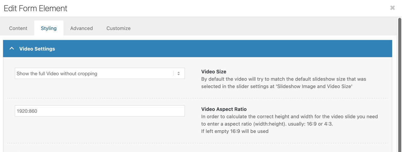
then you will not have the black bars on bottom/top.
Maybe give a custom class to your fullwidth slider – e.g.: logo-over-video
then see here full css code and example: https://webers-testseite.de/video-element/
March 28, 2025 at 9:57 am #1480327In reply to: magnific popup missing form
The form shows up without the plugin, but it makes the page scroll to the top when I open it.
I see a problem also if I click on the link and then close it, if I click on it again the form doesn’t show up./*sizing for popup tilmeld form*/ @media only screen and (min-width: 768px) { #top .mfp-inline-holder .mfp-content { width: 50%!important; }} /*@media only screen and (max-width: 768px) { #top .mfp-iframe-scaler { height: 90vh; }}*/ @media only screen and (min-width: 768px) { #top .mfp-iframe-scaler { width: 60%; margin: 0 auto; }}Is there a way to center align the form in the popup if I wanted the whole thing centered?
or else make the popup narrower so it doesn’t look like this on larger screens?The plugin is what was giving me the widget that I use in the iframe link in the active footer, which is disabled now.
thanks for the help
Nancy-
This reply was modified 1 year, 1 month ago by
Munford.
-
This reply was modified 1 year, 1 month ago by
-
This reply was modified 1 year, 1 month ago by
-
This reply was modified 1 year, 1 month ago by
-
This reply was modified 1 year, 1 month ago by
-
This reply was modified 1 year, 1 month ago by
March 28, 2025 at 8:08 am #1480323In reply to: Transparent header on mobile
Hi,
Thank you for the info.
The breadcrumb container is present but is being covered by the header. Try to add this css code to adjust the top padding of the main container.
@media only screen and (max-width: 768px) {

  /* Add your Mobile Styles here */
  .html_header_top.html_header_sticky #top #wrap_all #main {
    padding-top: 65px !important;
  }
}
(removed screenshot)
Best regards,
IsmaelMarch 28, 2025 at 5:51 am #1480310In reply to: Testimonals on mobile
Hi,
Looks like the nav animation doesn’t run on mobile view, rendering it invisible. Try to include this css code:
.responsive #top #wrap_all .av-flex-cells .avia-slideshow-arrows a {
    opacity: 1;
}
Best regards,
IsmaelMarch 28, 2025 at 5:44 am #1480308In reply to: social media icons header and footer
Hey rixi,
Thank you for the inquiry.
You can try this css code:
#top #wrap_all .social_bookmarks li {
    color: #000;
    background-color: #fff !important;
}

#top #wrap_all .social_bookmarks li a {
    color: #000;
}
Screenshot: https://imgur.com/cCzmGAe
Best regards,
IsmaelMarch 28, 2025 at 5:08 am #1480304In reply to: Overlay on Columns
Hi,
Glad to know it’s working. Yes, you can use it with the Grid Row element, but you may need to adjust the css a bit.
#top #wrap_all .av-custom-gradient-section {
  background-color: transparent;
  background-image: linear-gradient(180deg, #FFFFFF21 23%, #FFCBA4 93%);
  opacity: 1;
  transition: background 0.3s, border-radius 0.3s, opacity 0.3s;
}
To apply different gradient colors, add another Custom CSS Class name to the element, such as “av-custom-gradient-section av-gradient-black-to-white” or “av-custom-gradient-section av-gradient-red-to-white”, then specify the gradient with this css:
#top #wrap_all .av-gradient-black-to-white {
  background: rgb(0,0,0);
  background: linear-gradient(0deg, rgba(0,0,0,1) 0%, rgba(255,255,255,1) 65%);
}

#top #wrap_all .av-gradient-red-to-white {
  background: rgb(255,0,0);
  background: linear-gradient(0deg, rgba(255,0,0,1) 0%, rgba(255,255,255,1) 65%);
}
You can use this tool to generate the gradient CSS properties: https://cssgradient.io/
To apply a background image with a gradient, you’ll need to use the Color Section element. As instructed above, you need to enable the color overlay.
Best regards,
IsmaelMarch 27, 2025 at 8:01 pm #1480287In reply to: Adjusting Flip Box height
Hi,
Thanks for the update. Please let us know if you should need any further help on the topic, or if we can close it.
Best regards,
RikardMarch 27, 2025 at 2:24 pm #1480272In reply to: Testimonals on mobile
Hi,
I’ve switched it to “column” for the mobile version on the live site for now so that visitors can read all the testimonials. But I’d really like to have the issue fixed, because at the moment I have one testimonial section for desktop and a separate one for mobile.I’ve created a test page here: https://www.hirnharmonie.de/test/
Best regards,
YvonneMarch 27, 2025 at 12:45 pm #1480270Topic: Second menu colour
in forum Enfoldfanlokbun
ParticipantIs there a way of having a second menu the same but different colours on some pages? I have white over the top of layer slider so it stands out but on pages with no layer slider I need it grey.
ThanksMarch 27, 2025 at 10:24 am #1480258In reply to: Pricing boxes – align button at bottom of box
RE: ALIGNING PRICING BOX BUTTON.
Ismael, the styling you gave me for the pricing boxes below was PERFECT… I have just had a big problem and I’ve HAD TO GO BACK TO A PREVIOUS VERSION of pricing boxes which means I have lost the specific “av-otzhdc”…coding in your style BELOW. I can’t see it with debug to put in the new reference… could you brilliant guys help as the client has now released the page for buying tickets!
WEBPAGE LINK – SHAOLINCAMP.DK#top .av-otzhdc-f6e6fb6737c9d94574c2e623c4aab5bf .avia-button-wrap {
position: absolute;
width: 100%;
bottom: 0;
}
#top .av-otzhdc-f6e6fb6737c9d94574c2e623c4aab5bf .flex_column_table .flex_column {
padding-bottom: 100px;
}March 27, 2025 at 5:43 am #1480239In reply to: Scroll to bottom icon higher
Hey hisdi,
Thanks for reaching out.
You can add this css code to adjust the position of the scroll down arrow:
#top .scroll-down-link {
    bottom: 100px;
    margin: 0;
}

#top .av-section-color-overlay-wrap {
    position: relative;
}
Best regards,
IsmaelMarch 27, 2025 at 5:24 am #1480233In reply to: post delimiter
Hi,
The width of the meta info is limited to 40em. To adjust it, you can add the following css code:
#top .fullsize .template-blog .post .entry-content-wrapper > * {
    max-width: 100%;
    margin-left: auto;
    margin-right: auto;
}
Best regards,
IsmaelMarch 26, 2025 at 4:34 pm #1480211In reply to: Sticky element
Hi,
Thanks for the update. Please let us know if you should need any further help on the topic, or if we can close it.
Best regards,
RikardMarch 26, 2025 at 2:11 pm #1480203In reply to: post delimiter
-
This reply was modified 1 year, 1 month ago by
-
AuthorSearch Results
-
Search Results
-
Hi. I need to put a video at the top of the site’s homepage, and I can’t find a solution that works on both desktop and smartphone. I’ve tried colorsection with backgroud, just the video, all types of slides. I need this video to work responsively, I don’t want to replace it with a fallback image. Does anyone have any suggestions for me?
Thank you so much!Topic: Icon List Blank
I saw the response to my request here: https://kriesi.at/support/topic/icon-list-blank/?avia_support_contact=avs_67e6a88e031722.10305165_1480385
I can’t respond to the ticket because I don’t have an account to be able to respond.
I had upgraded to the 7.1 version, but that is when the issues started so I restored it back to the 6.0.9 version which is what it was when I inherited the site.
If I got you the admin login information, would you be able to look in there to figure it out?
Thanks!
-LeeTopic: Second menu colour