Dear Mike & Guenni,
thx a lot for your infos. If this was not clear, sorry: I want to have a defined set of different page IDs which are triggering a different logo color. So we are not talking about the home page only:
-> page ID 1,2,3 -> logo red
-> page ID 4,5,6 -> logo green
In addition:
-> would it be possible to change in a similar way the color of top navigation items as well – and if so, how?
Same logic with same page IDs as trigger
thx again & best regards Tilman
Hey Jorge,
The update to 7.1.4 has to be done manually from the version you are running, please refer to my replies in this thread: https://kriesi.at/support/topic/enfold-4-5-theme-update-update-failed-download-failed-a-valid-url-was-not-pro/#post-1021541
You can either update manually via FTP: https://kriesi.at/documentation/enfold/how-to-install-enfold-theme/#theme-update, or upload the theme as if it was new under Appearance->Themes->Add New Theme.
If that doesn’t work then please try to delete the whole theme folder, then replace it with the new version. Make sure that you have backups of the site before starting updating.
Also please read this after you have updated: https://kriesi.at/documentation/enfold/theme-registration/
Best regards,
Rikard
This reply has been marked as private.
I did it. Actually I tried the same thing in other websites. At a moment I thought that the problem was caused by some plugin, but I deactivated or checked in other websites I have the same thing. Also I thought it could be Enfold 7.1.3 the problem, but I found it also with Enfold 6.0.8 (on a website where I didn’t update the theme).
I am not sure what you say about shortcodes. Here is the debug log form another website all updated
[24-Feb-2026 09:11:10 UTC] PHP Notice:  Function WP_Styles::add was called <strong>incorrectly</strong>. The style with the handle "avia-module-audioplayer" was enqueued with dependencies that are not registered: avia-layout. Please see <a href="https://developer.wordpress.org/advanced-administration/debug/debug-wordpress/">Debugging in WordPress</a> for more information. (This message was added in version 6.9.1.) in /home/hidgvei/marinemammalhabitat/wp-includes/functions.php on line 6131
[24-Feb-2026 09:11:10 UTC] PHP Notice:  Function WP_Styles::add was called <strong>incorrectly</strong>. The style with the handle "avia-module-blog" was enqueued with dependencies that are not registered: avia-layout. Please see <a href="https://developer.wordpress.org/advanced-administration/debug/debug-wordpress/">Debugging in WordPress</a> for more information. (This message was added in version 6.9.1.) in /home/hidgvei/marinemammalhabitat/wp-includes/functions.php on line 6131
[24-Feb-2026 09:11:10 UTC] PHP Notice:  Function WP_Styles::add was called <strong>incorrectly</strong>. The style with the handle "avia-module-postslider" was enqueued with dependencies that are not registered: avia-layout. Please see <a href="https://developer.wordpress.org/advanced-administration/debug/debug-wordpress/">Debugging in WordPress</a> for more information. (This message was added in version 6.9.1.) in /home/hidgvei/marinemammalhabitat/wp-includes/functions.php on line 6131
[24-Feb-2026 09:11:10 UTC] PHP Notice:  Function WP_Styles::add was called <strong>incorrectly</strong>. The style with the handle "avia-module-button" was enqueued with dependencies that are not registered: avia-layout. Please see <a href="https://developer.wordpress.org/advanced-administration/debug/debug-wordpress/">Debugging in WordPress</a> for more information. (This message was added in version 6.9.1.) in /home/hidgvei/marinemammalhabitat/wp-includes/functions.php on line 6131
[24-Feb-2026 09:11:10 UTC] PHP Notice:  Function WP_Styles::add was called <strong>incorrectly</strong>. The style with the handle "avia-module-buttonrow" was enqueued with dependencies that are not registered: avia-layout. Please see <a href="https://developer.wordpress.org/advanced-administration/debug/debug-wordpress/">Debugging in WordPress</a> for more information. (This message was added in version 6.9.1.) in /home/hidgvei/marinemammalhabitat/wp-includes/functions.php on line 6131
[24-Feb-2026 09:11:10 UTC] PHP Notice:  Function WP_Styles::add was called <strong>incorrectly</strong>. The style with the handle "avia-module-button-fullwidth" was enqueued with dependencies that are not registered: avia-layout. Please see <a href="https://developer.wordpress.org/advanced-administration/debug/debug-wordpress/">Debugging in WordPress</a> for more information. (This message was added in version 6.9.1.) in /home/hidgvei/marinemammalhabitat/wp-includes/functions.php on line 6131
[24-Feb-2026 09:11:10 UTC] PHP Notice:  Function WP_Styles::add was called <strong>incorrectly</strong>. The style with the handle "avia-module-catalogue" was enqueued with dependencies that are not registered: avia-layout. Please see <a href="https://developer.wordpress.org/advanced-administration/debug/debug-wordpress/">Debugging in WordPress</a> for more information. (This message was added in version 6.9.1.) in /home/hidgvei/marinemammalhabitat/wp-includes/functions.php on line 6131
[24-Feb-2026 09:11:10 UTC] PHP Notice:  Function WP_Styles::add was called <strong>incorrectly</strong>. The style with the handle "avia-module-comments" was enqueued with dependencies that are not registered: avia-layout. Please see <a href="https://developer.wordpress.org/advanced-administration/debug/debug-wordpress/">Debugging in WordPress</a> for more information. (This message was added in version 6.9.1.) in /home/hidgvei/marinemammalhabitat/wp-includes/functions.php on line 6131
[24-Feb-2026 09:11:10 UTC] PHP Notice:  Function WP_Styles::add was called <strong>incorrectly</strong>. The style with the handle "avia-module-contact" was enqueued with dependencies that are not registered: avia-layout. Please see <a href="https://developer.wordpress.org/advanced-administration/debug/debug-wordpress/">Debugging in WordPress</a> for more information. (This message was added in version 6.9.1.) in /home/hidgvei/marinemammalhabitat/wp-includes/functions.php on line 6131
[24-Feb-2026 09:11:10 UTC] PHP Notice:  Function WP_Styles::add was called <strong>incorrectly</strong>. The style with the handle "avia-module-slideshow" was enqueued with dependencies that are not registered: avia-layout. Please see <a href="https://developer.wordpress.org/advanced-administration/debug/debug-wordpress/">Debugging in WordPress</a> for more information. (This message was added in version 6.9.1.) in /home/hidgvei/marinemammalhabitat/wp-includes/functions.php on line 6131
[24-Feb-2026 09:11:10 UTC] PHP Notice:  Function WP_Styles::add was called <strong>incorrectly</strong>. The style with the handle "avia-module-countdown" was enqueued with dependencies that are not registered: avia-layout. Please see <a href="https://developer.wordpress.org/advanced-administration/debug/debug-wordpress/">Debugging in WordPress</a> for more information. (This message was added in version 6.9.1.) in /home/hidgvei/marinemammalhabitat/wp-includes/functions.php on line 6131
[24-Feb-2026 09:11:10 UTC] PHP Notice:  Function WP_Styles::add was called <strong>incorrectly</strong>. The style with the handle "avia-module-dynamic-field" was enqueued with dependencies that are not registered: avia-layout. Please see <a href="https://developer.wordpress.org/advanced-administration/debug/debug-wordpress/">Debugging in WordPress</a> for more information. (This message was added in version 6.9.1.) in /home/hidgvei/marinemammalhabitat/wp-includes/functions.php on line 6131
[24-Feb-2026 09:11:10 UTC] PHP Notice:  Function WP_Styles::add was called <strong>incorrectly</strong>. The style with the handle "avia-module-gallery" was enqueued with dependencies that are not registered: avia-layout. Please see <a href="https://developer.wordpress.org/advanced-administration/debug/debug-wordpress/">Debugging in WordPress</a> for more information. (This message was added in version 6.9.1.) in /home/hidgvei/marinemammalhabitat/wp-includes/functions.php on line 6131
[24-Feb-2026 09:11:10 UTC] PHP Notice:  Function WP_Styles::add was called <strong>incorrectly</strong>. The style with the handle "avia-module-maps" was enqueued with dependencies that are not registered: avia-layout. Please see <a href="https://developer.wordpress.org/advanced-administration/debug/debug-wordpress/">Debugging in WordPress</a> for more information. (This message was added in version 6.9.1.) in /home/hidgvei/marinemammalhabitat/wp-includes/functions.php on line 6131
[24-Feb-2026 09:11:10 UTC] PHP Notice:  Function WP_Styles::add was called <strong>incorrectly</strong>. The style with the handle "avia-module-gridrow" was enqueued with dependencies that are not registered: avia-layout. Please see <a href="https://developer.wordpress.org/advanced-administration/debug/debug-wordpress/">Debugging in WordPress</a> for more information. (This message was added in version 6.9.1.) in /home/hidgvei/marinemammalhabitat/wp-includes/functions.php on line 6131
[24-Feb-2026 09:11:10 UTC] PHP Notice:  Function WP_Styles::add was called <strong>incorrectly</strong>. The style with the handle "avia-module-heading" was enqueued with dependencies that are not registered: avia-layout. Please see <a href="https://developer.wordpress.org/advanced-administration/debug/debug-wordpress/">Debugging in WordPress</a> for more information. (This message was added in version 6.9.1.) in /home/hidgvei/marinemammalhabitat/wp-includes/functions.php on line 6131
[24-Feb-2026 09:11:10 UTC] PHP Notice:  Function WP_Styles::add was called <strong>incorrectly</strong>. The style with the handle "avia-module-rotator" was enqueued with dependencies that are not registered: avia-layout. Please see <a href="https://developer.wordpress.org/advanced-administration/debug/debug-wordpress/">Debugging in WordPress</a> for more information. (This message was added in version 6.9.1.) in /home/hidgvei/marinemammalhabitat/wp-includes/functions.php on line 6131
[24-Feb-2026 09:11:10 UTC] PHP Notice:  Function WP_Styles::add was called <strong>incorrectly</strong>. The style with the handle "avia-module-hr" was enqueued with dependencies that are not registered: avia-layout. Please see <a href="https://developer.wordpress.org/advanced-administration/debug/debug-wordpress/">Debugging in WordPress</a> for more information. (This message was added in version 6.9.1.) in /home/hidgvei/marinemammalhabitat/wp-includes/functions.php on line 6131
[24-Feb-2026 09:11:10 UTC] PHP Notice:  Function WP_Styles::add was called <strong>incorrectly</strong>. The style with the handle "avia-module-icon" was enqueued with dependencies that are not registered: avia-layout. Please see <a href="https://developer.wordpress.org/advanced-administration/debug/debug-wordpress/">Debugging in WordPress</a> for more information. (This message was added in version 6.9.1.) in /home/hidgvei/marinemammalhabitat/wp-includes/functions.php on line 6131
[24-Feb-2026 09:11:10 UTC] PHP Notice:  Function WP_Styles::add was called <strong>incorrectly</strong>. The style with the handle "avia-module-icon-circles" was enqueued with dependencies that are not registered: avia-layout. Please see <a href="https://developer.wordpress.org/advanced-administration/debug/debug-wordpress/">Debugging in WordPress</a> for more information. (This message was added in version 6.9.1.) in /home/hidgvei/marinemammalhabitat/wp-includes/functions.php on line 6131
[24-Feb-2026 09:11:10 UTC] PHP Notice:  Function WP_Styles::add was called <strong>incorrectly</strong>. The style with the handle "avia-module-iconbox" was enqueued with dependencies that are not registered: avia-layout. Please see <a href="https://developer.wordpress.org/advanced-administration/debug/debug-wordpress/">Debugging in WordPress</a> for more information. (This message was added in version 6.9.1.) in /home/hidgvei/marinemammalhabitat/wp-includes/functions.php on line 6131
[24-Feb-2026 09:11:10 UTC] PHP Notice:  Function WP_Styles::add was called <strong>incorrectly</strong>. The style with the handle "avia-module-icongrid" was enqueued with dependencies that are not registered: avia-layout. Please see <a href="https://developer.wordpress.org/advanced-administration/debug/debug-wordpress/">Debugging in WordPress</a> for more information. (This message was added in version 6.9.1.) in /home/hidgvei/marinemammalhabitat/wp-includes/functions.php on line 6131
[24-Feb-2026 09:11:10 UTC] PHP Notice:  Function WP_Styles::add was called <strong>incorrectly</strong>. The style with the handle "avia-module-iconlist" was enqueued with dependencies that are not registered: avia-layout. Please see <a href="https://developer.wordpress.org/advanced-administration/debug/debug-wordpress/">Debugging in WordPress</a> for more information. (This message was added in version 6.9.1.) in /home/hidgvei/marinemammalhabitat/wp-includes/functions.php on line 6131
[24-Feb-2026 09:11:10 UTC] PHP Notice:  Function WP_Styles::add was called <strong>incorrectly</strong>. The style with the handle "avia-module-image" was enqueued with dependencies that are not registered: avia-layout. Please see <a href="https://developer.wordpress.org/advanced-administration/debug/debug-wordpress/">Debugging in WordPress</a> for more information. (This message was added in version 6.9.1.) in /home/hidgvei/marinemammalhabitat/wp-includes/functions.php on line 6131
[24-Feb-2026 09:11:10 UTC] PHP Notice:  Function WP_Styles::add was called <strong>incorrectly</strong>. The style with the handle "avia-module-image-diff" was enqueued with dependencies that are not registered: avia-layout. Please see <a href="https://developer.wordpress.org/advanced-administration/debug/debug-wordpress/">Debugging in WordPress</a> for more information. (This message was added in version 6.9.1.) in /home/hidgvei/marinemammalhabitat/wp-includes/functions.php on line 6131
[24-Feb-2026 09:11:10 UTC] PHP Notice:  Function WP_Styles::add was called <strong>incorrectly</strong>. The style with the handle "avia-module-hotspot" was enqueued with dependencies that are not registered: avia-layout. Please see <a href="https://developer.wordpress.org/advanced-administration/debug/debug-wordpress/">Debugging in WordPress</a> for more information. (This message was added in version 6.9.1.) in /home/hidgvei/marinemammalhabitat/wp-includes/functions.php on line 6131
[24-Feb-2026 09:11:10 UTC] PHP Notice:  Function WP_Styles::add was called <strong>incorrectly</strong>. The style with the handle "avia-module-sc-lottie-animation" was enqueued with dependencies that are not registered: avia-layout. Please see <a href="https://developer.wordpress.org/advanced-administration/debug/debug-wordpress/">Debugging in WordPress</a> for more information. (This message was added in version 6.9.1.) in /home/hidgvei/marinemammalhabitat/wp-includes/functions.php on line 6131
[24-Feb-2026 09:11:10 UTC] PHP Notice:  Function WP_Styles::add was called <strong>incorrectly</strong>. The style with the handle "avia-module-magazine" was enqueued with dependencies that are not registered: avia-layout. Please see <a href="https://developer.wordpress.org/advanced-administration/debug/debug-wordpress/">Debugging in WordPress</a> for more information. (This message was added in version 6.9.1.) in /home/hidgvei/marinemammalhabitat/wp-includes/functions.php on line 6131
[24-Feb-2026 09:11:10 UTC] PHP Notice:  Function WP_Styles::add was called <strong>incorrectly</strong>. The style with the handle "avia-module-masonry" was enqueued with dependencies that are not registered: avia-layout. Please see <a href="https://developer.wordpress.org/advanced-administration/debug/debug-wordpress/">Debugging in WordPress</a> for more information. (This message was added in version 6.9.1.) in /home/hidgvei/marinemammalhabitat/wp-includes/functions.php on line 6131
[24-Feb-2026 09:11:10 UTC] PHP Notice:  Function WP_Styles::add was called <strong>incorrectly</strong>. The style with the handle "avia-siteloader" was enqueued with dependencies that are not registered: avia-layout. Please see <a href="https://developer.wordpress.org/advanced-administration/debug/debug-wordpress/">Debugging in WordPress</a> for more information. (This message was added in version 6.9.1.) in /home/hidgvei/marinemammalhabitat/wp-includes/functions.php on line 6131
[24-Feb-2026 09:11:10 UTC] PHP Notice:  Function WP_Styles::add was called <strong>incorrectly</strong>. The style with the handle "avia-module-menu" was enqueued with dependencies that are not registered: avia-layout. Please see <a href="https://developer.wordpress.org/advanced-administration/debug/debug-wordpress/">Debugging in WordPress</a> for more information. (This message was added in version 6.9.1.) in /home/hidgvei/marinemammalhabitat/wp-includes/functions.php on line 6131
[24-Feb-2026 09:11:10 UTC] PHP Notice:  Function WP_Styles::add was called <strong>incorrectly</strong>. The style with the handle "avia-module-notification" was enqueued with dependencies that are not registered: avia-layout. Please see <a href="https://developer.wordpress.org/advanced-administration/debug/debug-wordpress/">Debugging in WordPress</a> for more information. (This message was added in version 6.9.1.) in /home/hidgvei/marinemammalhabitat/wp-includes/functions.php on line 6131
[24-Feb-2026 09:11:10 UTC] PHP Notice:  Function WP_Styles::add was called <strong>incorrectly</strong>. The style with the handle "avia-module-numbers" was enqueued with dependencies that are not registered: avia-layout. Please see <a href="https://developer.wordpress.org/advanced-administration/debug/debug-wordpress/">Debugging in WordPress</a> for more information. (This message was added in version 6.9.1.) in /home/hidgvei/marinemammalhabitat/wp-includes/functions.php on line 6131
[24-Feb-2026 09:11:10 UTC] PHP Notice:  Function WP_Styles::add was called <strong>incorrectly</strong>. The style with the handle "avia-module-portfolio" was enqueued with dependencies that are not registered: avia-layout. Please see <a href="https://developer.wordpress.org/advanced-administration/debug/debug-wordpress/">Debugging in WordPress</a> for more information. (This message was added in version 6.9.1.) in /home/hidgvei/marinemammalhabitat/wp-includes/functions.php on line 6131
[24-Feb-2026 09:11:10 UTC] PHP Notice:  Function WP_Styles::add was called <strong>incorrectly</strong>. The style with the handle "avia-module-post-metadata" was enqueued with dependencies that are not registered: avia-layout. Please see <a href="https://developer.wordpress.org/advanced-administration/debug/debug-wordpress/">Debugging in WordPress</a> for more information. (This message was added in version 6.9.1.) in /home/hidgvei/marinemammalhabitat/wp-includes/functions.php on line 6131
[24-Feb-2026 09:11:10 UTC] PHP Notice:  Function WP_Styles::add was called <strong>incorrectly</strong>. The style with the handle "avia-module-progress-bar" was enqueued with dependencies that are not registered: avia-layout. Please see <a href="https://developer.wordpress.org/advanced-administration/debug/debug-wordpress/">Debugging in WordPress</a> for more information. (This message was added in version 6.9.1.) in /home/hidgvei/marinemammalhabitat/wp-includes/functions.php on line 6131
[24-Feb-2026 09:11:10 UTC] PHP Notice:  Function WP_Styles::add was called <strong>incorrectly</strong>. The style with the handle "avia-module-promobox" was enqueued with dependencies that are not registered: avia-layout. Please see <a href="https://developer.wordpress.org/advanced-administration/debug/debug-wordpress/">Debugging in WordPress</a> for more information. (This message was added in version 6.9.1.) in /home/hidgvei/marinemammalhabitat/wp-includes/functions.php on line 6131
[24-Feb-2026 09:11:10 UTC] PHP Notice:  Function WP_Styles::add was called <strong>incorrectly</strong>. The style with the handle "avia-sc-search" was enqueued with dependencies that are not registered: avia-layout. Please see <a href="https://developer.wordpress.org/advanced-administration/debug/debug-wordpress/">Debugging in WordPress</a> for more information. (This message was added in version 6.9.1.) in /home/hidgvei/marinemammalhabitat/wp-includes/functions.php on line 6131
[24-Feb-2026 09:11:10 UTC] PHP Notice:  Function WP_Styles::add was called <strong>incorrectly</strong>. The style with the handle "avia-module-slideshow-accordion" was enqueued with dependencies that are not registered: avia-layout. Please see <a href="https://developer.wordpress.org/advanced-administration/debug/debug-wordpress/">Debugging in WordPress</a> for more information. (This message was added in version 6.9.1.) in /home/hidgvei/marinemammalhabitat/wp-includes/functions.php on line 6131
[24-Feb-2026 09:11:10 UTC] PHP Notice:  Function WP_Styles::add was called <strong>incorrectly</strong>. The style with the handle "avia-module-social" was enqueued with dependencies that are not registered: avia-layout. Please see <a href="https://developer.wordpress.org/advanced-administration/debug/debug-wordpress/">Debugging in WordPress</a> for more information. (This message was added in version 6.9.1.) in /home/hidgvei/marinemammalhabitat/wp-includes/functions.php on line 6131
[24-Feb-2026 09:11:10 UTC] PHP Notice:  Function WP_Styles::add was called <strong>incorrectly</strong>. The style with the handle "avia-module-tabsection" was enqueued with dependencies that are not registered: avia-layout. Please see <a href="https://developer.wordpress.org/advanced-administration/debug/debug-wordpress/">Debugging in WordPress</a> for more information. (This message was added in version 6.9.1.) in /home/hidgvei/marinemammalhabitat/wp-includes/functions.php on line 6131
[24-Feb-2026 09:11:10 UTC] PHP Notice:  Function WP_Styles::add was called <strong>incorrectly</strong>. The style with the handle "avia-module-table" was enqueued with dependencies that are not registered: avia-layout. Please see <a href="https://developer.wordpress.org/advanced-administration/debug/debug-wordpress/">Debugging in WordPress</a> for more information. (This message was added in version 6.9.1.) in /home/hidgvei/marinemammalhabitat/wp-includes/functions.php on line 6131
[24-Feb-2026 09:11:10 UTC] PHP Notice:  Function WP_Styles::add was called <strong>incorrectly</strong>. The style with the handle "avia-module-tabs" was enqueued with dependencies that are not registered: avia-layout. Please see <a href="https://developer.wordpress.org/advanced-administration/debug/debug-wordpress/">Debugging in WordPress</a> for more information. (This message was added in version 6.9.1.) in /home/hidgvei/marinemammalhabitat/wp-includes/functions.php on line 6131
[24-Feb-2026 09:11:10 UTC] PHP Notice:  Function WP_Styles::add was called <strong>incorrectly</strong>. The style with the handle "avia-module-team" was enqueued with dependencies that are not registered: avia-layout. Please see <a href="https://developer.wordpress.org/advanced-administration/debug/debug-wordpress/">Debugging in WordPress</a> for more information. (This message was added in version 6.9.1.) in /home/hidgvei/marinemammalhabitat/wp-includes/functions.php on line 6131
[24-Feb-2026 09:11:10 UTC] PHP Notice:  Function WP_Styles::add was called <strong>incorrectly</strong>. The style with the handle "avia-module-testimonials" was enqueued with dependencies that are not registered: avia-layout. Please see <a href="https://developer.wordpress.org/advanced-administration/debug/debug-wordpress/">Debugging in WordPress</a> for more information. (This message was added in version 6.9.1.) in /home/hidgvei/marinemammalhabitat/wp-includes/functions.php on line 6131
[24-Feb-2026 09:11:10 UTC] PHP Notice:  Function WP_Styles::add was called <strong>incorrectly</strong>. The style with the handle "avia-module-timeline" was enqueued with dependencies that are not registered: avia-layout. Please see <a href="https://developer.wordpress.org/advanced-administration/debug/debug-wordpress/">Debugging in WordPress</a> for more information. (This message was added in version 6.9.1.) in /home/hidgvei/marinemammalhabitat/wp-includes/functions.php on line 6131
[24-Feb-2026 09:11:10 UTC] PHP Notice:  Function WP_Styles::add was called <strong>incorrectly</strong>. The style with the handle "avia-module-toggles" was enqueued with dependencies that are not registered: avia-layout. Please see <a href="https://developer.wordpress.org/advanced-administration/debug/debug-wordpress/">Debugging in WordPress</a> for more information. (This message was added in version 6.9.1.) in /home/hidgvei/marinemammalhabitat/wp-includes/functions.php on line 6131
[24-Feb-2026 09:11:10 UTC] PHP Notice:  Function WP_Styles::add was called <strong>incorrectly</strong>. The style with the handle "avia-module-video" was enqueued with dependencies that are not registered: avia-layout. Please see <a href="https://developer.wordpress.org/advanced-administration/debug/debug-wordpress/">Debugging in WordPress</a> for more information. (This message was added in version 6.9.1.) in /home/hidgvei/marinemammalhabitat/wp-includes/functions.php on line 6131
[24-Feb-2026 09:11:10 UTC] PHP Notice:  Function WP_Scripts::add was called <strong>incorrectly</strong>. The script with the handle "avia-module-audioplayer" was enqueued with dependencies that are not registered: avia-shortcodes. Please see <a href="https://developer.wordpress.org/advanced-administration/debug/debug-wordpress/">Debugging in WordPress</a> for more information. (This message was added in version 6.9.1.) in /home/hidgvei/marinemammalhabitat/wp-includes/functions.php on line 6131
[24-Feb-2026 09:11:10 UTC] PHP Notice:  Function WP_Scripts::add was called <strong>incorrectly</strong>. The script with the handle "avia-module-chart-js" was enqueued with dependencies that are not registered: avia-shortcodes. Please see <a href="https://developer.wordpress.org/advanced-administration/debug/debug-wordpress/">Debugging in WordPress</a> for more information. (This message was added in version 6.9.1.) in /home/hidgvei/marinemammalhabitat/wp-includes/functions.php on line 6131
[24-Feb-2026 09:11:10 UTC] PHP Notice:  Function WP_Scripts::add was called <strong>incorrectly</strong>. The script with the handle "avia-module-chart" was enqueued with dependencies that are not registered: avia-shortcodes. Please see <a href="https://developer.wordpress.org/advanced-administration/debug/debug-wordpress/">Debugging in WordPress</a> for more information. (This message was added in version 6.9.1.) in /home/hidgvei/marinemammalhabitat/wp-includes/functions.php on line 6131
[24-Feb-2026 09:11:10 UTC] PHP Notice:  Function WP_Scripts::add was called <strong>incorrectly</strong>. The script with the handle "avia-module-contact" was enqueued with dependencies that are not registered: avia-shortcodes. Please see <a href="https://developer.wordpress.org/advanced-administration/debug/debug-wordpress/">Debugging in WordPress</a> for more information. (This message was added in version 6.9.1.) in /home/hidgvei/marinemammalhabitat/wp-includes/functions.php on line 6131
[24-Feb-2026 09:11:10 UTC] PHP Notice:  Function WP_Scripts::add was called <strong>incorrectly</strong>. The script with the handle "avia-module-slideshow" was enqueued with dependencies that are not registered: avia-shortcodes. Please see <a href="https://developer.wordpress.org/advanced-administration/debug/debug-wordpress/">Debugging in WordPress</a> for more information. (This message was added in version 6.9.1.) in /home/hidgvei/marinemammalhabitat/wp-includes/functions.php on line 6131
[24-Feb-2026 09:11:10 UTC] PHP Notice:  Function WP_Scripts::add was called <strong>incorrectly</strong>. The script with the handle "avia-module-countdown" was enqueued with dependencies that are not registered: avia-shortcodes. Please see <a href="https://developer.wordpress.org/advanced-administration/debug/debug-wordpress/">Debugging in WordPress</a> for more information. (This message was added in version 6.9.1.) in /home/hidgvei/marinemammalhabitat/wp-includes/functions.php on line 6131
[24-Feb-2026 09:11:10 UTC] PHP Notice:  Function WP_Scripts::add was called <strong>incorrectly</strong>. The script with the handle "avia-module-gallery" was enqueued with dependencies that are not registered: avia-shortcodes. Please see <a href="https://developer.wordpress.org/advanced-administration/debug/debug-wordpress/">Debugging in WordPress</a> for more information. (This message was added in version 6.9.1.) in /home/hidgvei/marinemammalhabitat/wp-includes/functions.php on line 6131
[24-Feb-2026 09:11:10 UTC] PHP Notice:  Function WP_Scripts::add was called <strong>incorrectly</strong>. The script with the handle "avia-module-gallery-hor" was enqueued with dependencies that are not registered: avia-shortcodes. Please see <a href="https://developer.wordpress.org/advanced-administration/debug/debug-wordpress/">Debugging in WordPress</a> for more information. (This message was added in version 6.9.1.) in /home/hidgvei/marinemammalhabitat/wp-includes/functions.php on line 6131
[24-Feb-2026 09:11:10 UTC] PHP Notice:  Function WP_Scripts::add was called <strong>incorrectly</strong>. The script with the handle "avia-module-rotator" was enqueued with dependencies that are not registered: avia-shortcodes. Please see <a href="https://developer.wordpress.org/advanced-administration/debug/debug-wordpress/">Debugging in WordPress</a> for more information. (This message was added in version 6.9.1.) in /home/hidgvei/marinemammalhabitat/wp-includes/functions.php on line 6131
[24-Feb-2026 09:11:10 UTC] PHP Notice:  Function WP_Scripts::add was called <strong>incorrectly</strong>. The script with the handle "avia-module-icon-circles" was enqueued with dependencies that are not registered: avia-shortcodes. Please see <a href="https://developer.wordpress.org/advanced-administration/debug/debug-wordpress/">Debugging in WordPress</a> for more information. (This message was added in version 6.9.1.) in /home/hidgvei/marinemammalhabitat/wp-includes/functions.php on line 6131
[24-Feb-2026 09:11:10 UTC] PHP Notice:  Function WP_Scripts::add was called <strong>incorrectly</strong>. The script with the handle "avia-module-icongrid" was enqueued with dependencies that are not registered: avia-shortcodes. Please see <a href="https://developer.wordpress.org/advanced-administration/debug/debug-wordpress/">Debugging in WordPress</a> for more information. (This message was added in version 6.9.1.) in /home/hidgvei/marinemammalhabitat/wp-includes/functions.php on line 6131
[24-Feb-2026 09:11:10 UTC] PHP Notice:  Function WP_Scripts::add was called <strong>incorrectly</strong>. The script with the handle "avia-module-iconlist" was enqueued with dependencies that are not registered: avia-shortcodes. Please see <a href="https://developer.wordpress.org/advanced-administration/debug/debug-wordpress/">Debugging in WordPress</a> for more information. (This message was added in version 6.9.1.) in /home/hidgvei/marinemammalhabitat/wp-includes/functions.php on line 6131
[24-Feb-2026 09:11:10 UTC] PHP Notice:  Function WP_Scripts::add was called <strong>incorrectly</strong>. The script with the handle "avia-module-image-diff" was enqueued with dependencies that are not registered: avia-shortcodes. Please see <a href="https://developer.wordpress.org/advanced-administration/debug/debug-wordpress/">Debugging in WordPress</a> for more information. (This message was added in version 6.9.1.) in /home/hidgvei/marinemammalhabitat/wp-includes/functions.php on line 6131
[24-Feb-2026 09:11:10 UTC] PHP Notice:  Function WP_Scripts::add was called <strong>incorrectly</strong>. The script with the handle "avia-module-hotspot" was enqueued with dependencies that are not registered: avia-shortcodes. Please see <a href="https://developer.wordpress.org/advanced-administration/debug/debug-wordpress/">Debugging in WordPress</a> for more information. (This message was added in version 6.9.1.) in /home/hidgvei/marinemammalhabitat/wp-includes/functions.php on line 6131
[24-Feb-2026 09:11:10 UTC] PHP Notice:  Function WP_Scripts::add was called <strong>incorrectly</strong>. The script with the handle "avia-module-magazine" was enqueued with dependencies that are not registered: avia-shortcodes. Please see <a href="https://developer.wordpress.org/advanced-administration/debug/debug-wordpress/">Debugging in WordPress</a> for more information. (This message was added in version 6.9.1.) in /home/hidgvei/marinemammalhabitat/wp-includes/functions.php on line 6131
[24-Feb-2026 09:11:10 UTC] PHP Notice:  Function WP_Scripts::add was called <strong>incorrectly</strong>. The script with the handle "avia-module-isotope" was enqueued with dependencies that are not registered: avia-shortcodes. Please see <a href="https://developer.wordpress.org/advanced-administration/debug/debug-wordpress/">Debugging in WordPress</a> for more information. (This message was added in version 6.9.1.) in /home/hidgvei/marinemammalhabitat/wp-includes/functions.php on line 6131
[24-Feb-2026 09:11:10 UTC] PHP Notice:  Function WP_Scripts::add was called <strong>incorrectly</strong>. The script with the handle "avia-module-menu" was enqueued with dependencies that are not registered: avia-shortcodes. Please see <a href="https://developer.wordpress.org/advanced-administration/debug/debug-wordpress/">Debugging in WordPress</a> for more information. (This message was added in version 6.9.1.) in /home/hidgvei/marinemammalhabitat/wp-includes/functions.php on line 6131
[24-Feb-2026 09:11:10 UTC] PHP Notice:  Function WP_Scripts::add was called <strong>incorrectly</strong>. The script with the handle "avia-module-notification" was enqueued with dependencies that are not registered: avia-shortcodes. Please see <a href="https://developer.wordpress.org/advanced-administration/debug/debug-wordpress/">Debugging in WordPress</a> for more information. (This message was added in version 6.9.1.) in /home/hidgvei/marinemammalhabitat/wp-includes/functions.php on line 6131
[24-Feb-2026 09:11:10 UTC] PHP Notice:  Function WP_Scripts::add was called <strong>incorrectly</strong>. The script with the handle "avia-module-numbers" was enqueued with dependencies that are not registered: avia-shortcodes. Please see <a href="https://developer.wordpress.org/advanced-administration/debug/debug-wordpress/">Debugging in WordPress</a> for more information. (This message was added in version 6.9.1.) in /home/hidgvei/marinemammalhabitat/wp-includes/functions.php on line 6131
[24-Feb-2026 09:11:10 UTC] PHP Notice:  Function WP_Scripts::add was called <strong>incorrectly</strong>. The script with the handle "avia-module-portfolio" was enqueued with dependencies that are not registered: avia-shortcodes. Please see <a href="https://developer.wordpress.org/advanced-administration/debug/debug-wordpress/">Debugging in WordPress</a> for more information. (This message was added in version 6.9.1.) in /home/hidgvei/marinemammalhabitat/wp-includes/functions.php on line 6131
[24-Feb-2026 09:11:10 UTC] PHP Notice:  Function WP_Scripts::add was called <strong>incorrectly</strong>. The script with the handle "avia-module-progress-bar" was enqueued with dependencies that are not registered: avia-shortcodes. Please see <a href="https://developer.wordpress.org/advanced-administration/debug/debug-wordpress/">Debugging in WordPress</a> for more information. (This message was added in version 6.9.1.) in /home/hidgvei/marinemammalhabitat/wp-includes/functions.php on line 6131
[24-Feb-2026 09:11:10 UTC] PHP Notice:  Function WP_Scripts::add was called <strong>incorrectly</strong>. The script with the handle "avia-module-slideshow-video" was enqueued with dependencies that are not registered: avia-shortcodes. Please see <a href="https://developer.wordpress.org/advanced-administration/debug/debug-wordpress/">Debugging in WordPress</a> for more information. (This message was added in version 6.9.1.) in /home/hidgvei/marinemammalhabitat/wp-includes/functions.php on line 6131
[24-Feb-2026 09:11:10 UTC] PHP Notice:  Function WP_Scripts::add was called <strong>incorrectly</strong>. The script with the handle "avia-module-slideshow-accordion" was enqueued with dependencies that are not registered: avia-shortcodes. Please see <a href="https://developer.wordpress.org/advanced-administration/debug/debug-wordpress/">Debugging in WordPress</a> for more information. (This message was added in version 6.9.1.) in /home/hidgvei/marinemammalhabitat/wp-includes/functions.php on line 6131
[24-Feb-2026 09:11:10 UTC] PHP Notice:  Function WP_Scripts::add was called <strong>incorrectly</strong>. The script with the handle "avia-module-tabsection" was enqueued with dependencies that are not registered: avia-shortcodes. Please see <a href="https://developer.wordpress.org/advanced-administration/debug/debug-wordpress/">Debugging in WordPress</a> for more information. (This message was added in version 6.9.1.) in /home/hidgvei/marinemammalhabitat/wp-includes/functions.php on line 6131
[24-Feb-2026 09:11:10 UTC] PHP Notice:  Function WP_Scripts::add was called <strong>incorrectly</strong>. The script with the handle "avia-module-tabs" was enqueued with dependencies that are not registered: avia-shortcodes. Please see <a href="https://developer.wordpress.org/advanced-administration/debug/debug-wordpress/">Debugging in WordPress</a> for more information. (This message was added in version 6.9.1.) in /home/hidgvei/marinemammalhabitat/wp-includes/functions.php on line 6131
[24-Feb-2026 09:11:10 UTC] PHP Notice:  Function WP_Scripts::add was called <strong>incorrectly</strong>. The script with the handle "avia-module-testimonials" was enqueued with dependencies that are not registered: avia-shortcodes. Please see <a href="https://developer.wordpress.org/advanced-administration/debug/debug-wordpress/">Debugging in WordPress</a> for more information. (This message was added in version 6.9.1.) in /home/hidgvei/marinemammalhabitat/wp-includes/functions.php on line 6131
[24-Feb-2026 09:11:10 UTC] PHP Notice:  Function WP_Scripts::add was called <strong>incorrectly</strong>. The script with the handle "avia-module-timeline" was enqueued with dependencies that are not registered: avia-shortcodes. Please see <a href="https://developer.wordpress.org/advanced-administration/debug/debug-wordpress/">Debugging in WordPress</a> for more information. (This message was added in version 6.9.1.) in /home/hidgvei/marinemammalhabitat/wp-includes/functions.php on line 6131
[24-Feb-2026 09:11:10 UTC] PHP Notice:  Function WP_Scripts::add was called <strong>incorrectly</strong>. The script with the handle "avia-module-toggles" was enqueued with dependencies that are not registered: avia-shortcodes. Please see <a href="https://developer.wordpress.org/advanced-administration/debug/debug-wordpress/">Debugging in WordPress</a> for more information. (This message was added in version 6.9.1.) in /home/hidgvei/marinemammalhabitat/wp-includes/functions.php on line 6131
[24-Feb-2026 09:11:10 UTC] PHP Notice:  Function WP_Scripts::add was called <strong>incorrectly</strong>. The script with the handle "avia-module-video" was enqueued with dependencies that are not registered: avia-shortcodes. Please see <a href="https://developer.wordpress.org/advanced-administration/debug/debug-wordpress/">Debugging in WordPress</a> for more information. (This message was added in version 6.9.1.) in /home/hidgvei/marinemammalhabitat/wp-includes/functions.php on line 6131
[24-Feb-2026 09:11:10 UTC] PHP Notice:  Function WP_Scripts::add was called <strong>incorrectly</strong>. The script with the handle "avia_analytics_js" was enqueued with dependencies that are not registered: avia_builder_js. Please see <a href="https://developer.wordpress.org/advanced-administration/debug/debug-wordpress/">Debugging in WordPress</a> for more information. (This message was added in version 6.9.1.) in /home/hidgvei/marinemammalhabitat/wp-includes/functions.php on line 6131
It seems that it detects all avia modules are enqueued with dependencies that are not registered
Hi,
Thank you for the inquiry.
You can add this css code to apply rounded corners to the outline and colored menu items in the header.
#top #wrap_all .header_color .av-menu-button-colored > a .avia-menu-text, #top #wrap_all .header_color .av-menu-button-bordered > a .avia-menu-text {
    border-radius: 90px;
}
Please make sure to purge the cache after adding the css. Let us know the result.
Best regards,
Ismael
Hey dreyerjm,
Thank you for the inquiry.
Are you referring to the white bottom border? Please try to add the following css code to remove it.
#top .av-submenu-container {
    border-bottom: 0;
}
Best regards,
Ismael
Hey dreyerjm,
Thank you for the inquiry.
You can add this css code to apply a background, border and padding to the icon box. Simply replace the selector “iconbox” with your own custom css class name.
#top .iconbox {
    background: white;
    padding: 20px;
    border: 1px solid gray;
}

Best regards,
Ismael
Hi,
We couldn’t find a “programcolumn” column anywhere in the elements, so we used the default element ID instead. Please remove the previous css code and use the following code instead.
#top .flex_column_table.av-1bilfvb-acaaf518a56045ca4bfe6b9c9a40283f.sc-av_one_fourth.av-equal-height-column-flextable .avia-button-wrap {
    position: absolute;
    bottom: 0;
    width: 100%;
}

#top .flex_column_table.av-1bilfvb-acaaf518a56045ca4bfe6b9c9a40283f.sc-av_one_fourth.av-equal-height-column-flextable .flex_column {
    padding-bottom: 50px;
}
Best regards,
Ismael
Hi, The issue im having is on the programs page.
Thank I tried this from another thread but it did not work.
I added the class to the color section programcolumn
and added this quick css #top .programcolumn .av-special-heading {
min-height: 100px;
}
Hi, How would i make a framed box around the icon on left side icon element. I would like the entire element to have a background color the like the icon at the top style. I would like this only on specific instances of the elements so I would need to add a css class i believe.
Hi there,
I’m facing problems with scrolling on enfold websites since a bit of time.
Not quite sure which version it started, but two of my customer websites are not possible to be scrolled for now with Enfold versions 7.1.4 and 7.0 on my other site.
I wasn’t able to find any information towards that and was hoping that’s an interference of a plugin which is installed on both pages. But I couldn’t find any.
Could you please doublecheck and maybe fix that in a quick release or so? Of course when you find the problem…
Seems like, that it isn’t working on phones and also on my desktop computer. On Desktop, I only can scroll the page with the sidebar of the website and when hovering the mouse cursor to the header or within the “scroll to top”-Button. Every other area seems to be blocked to do that.
Please have a look on the both websites I will link in the private content area!
Thanks for your quick help!!
Best,
Martin
Dear Team,
on this page https://www.eth-solutions.de/ we would like to change the logo color top left depending on teh active menu item:
The main logo (red) you see top left.
-> If a user clicks this page https://www.eth-solutions.de/garten-und-landschaftsbau/ and related subpages, there shall be a different logo.
Is there a way to realize this?
Thanks a lot and best regards
Tilman
Hi,
We adjusted the code a bit.
add_action( 'wp_enqueue_scripts', function() {
  if ( is_admin() && ! wp_style_is( 'avia-layout', 'registered' ) ) {
      wp_register_style( 'avia-layout', false );
  }
}, 5 );
Please let us now how it goes.
@elenapoliti: Please continue here: https://kriesi.at/support/topic/not-registered-dependencies-for-enfold-css-and-js/
Best regards,
Ismael
Hi,
Try this css in your Quick CSS field:
.slide-entry-excerpt.entry-content {
	top: -20px;
  position: relative;
}
Best regards,
Mike
Hey es.design.ma,
It looks like somewhere you have this css:
#top .avia-svg-icon.avia-font-svg_entypo-fontello svg:first-child {
    stroke: unset !important;
}
#top .menu-item-search-dropdown>a.avia-svg-icon svg:first-child {
    width: auto;
    height: 1em;
    position: relative;
    z-index: -1;
}
The stroke is needed for the color, and the z-index needs to be 1
You can try this css to override this:
#top #menu-item-search .avia-svg-icon.avia-font-svg_entypo-fontello svg:first-child {
    stroke: #515f77 !important;
    fill: #515f77;
    z-index: 1;
}
#top #menu-item-search .avia-svg-icon.avia-font-svg_entypo-fontello {
padding-right: 13px;
}
#top #header .av-main-nav>li:hover>a>svg:first-child {
	stroke: #d6d6db !important;
}
Then clear your siteground cache & your browser cache.
Best regards,
Mike
Hi,
The “Reset all options” button will reset all, it is not recommended to use unless you want to remove all options & style.
.avia-caption-title {text-transform:none;}
did not work for you because it doesn’t have high enough specificity, the correct css would be:
#top .slideshow_caption h2.avia-caption-title {
    text-transform: none;
}
!important is not required, just enough classes and/or IDs to override the theme css, nearly no theme css is a single class like in your css: .avia-caption-title
Best regards,
Mike
Hi,
Thanks for your patience, I only asked for access to your test page so we would be looking at the same thing and so I would not need to recreate your layout on my site, nonetheless I created 1/5 + 3/5 + 1/5 columns with a gallery with large image on top and thumbnails below, and a color section with 100% min-height below that to simulate the rest of the page.
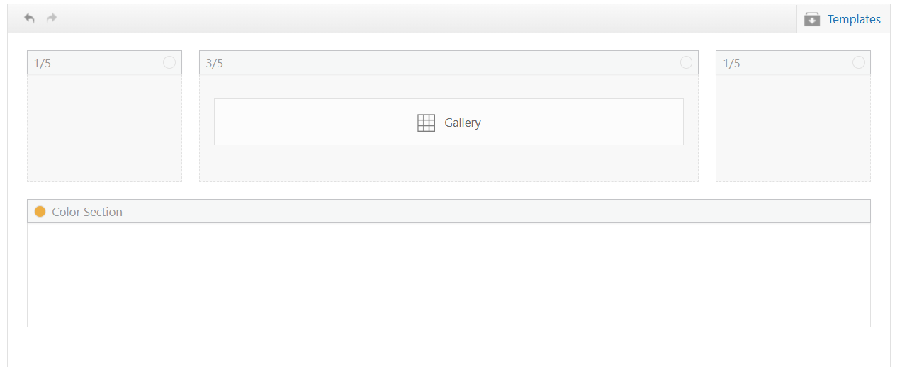
My sticky header is 90px, although I see yours is 157px.
My first impression of the layout is that the large gallery image on top is almost the full height of the screen, so the thumbnails are not really seen, I added 50px right & left padding to the 3/5 column and that helped a little
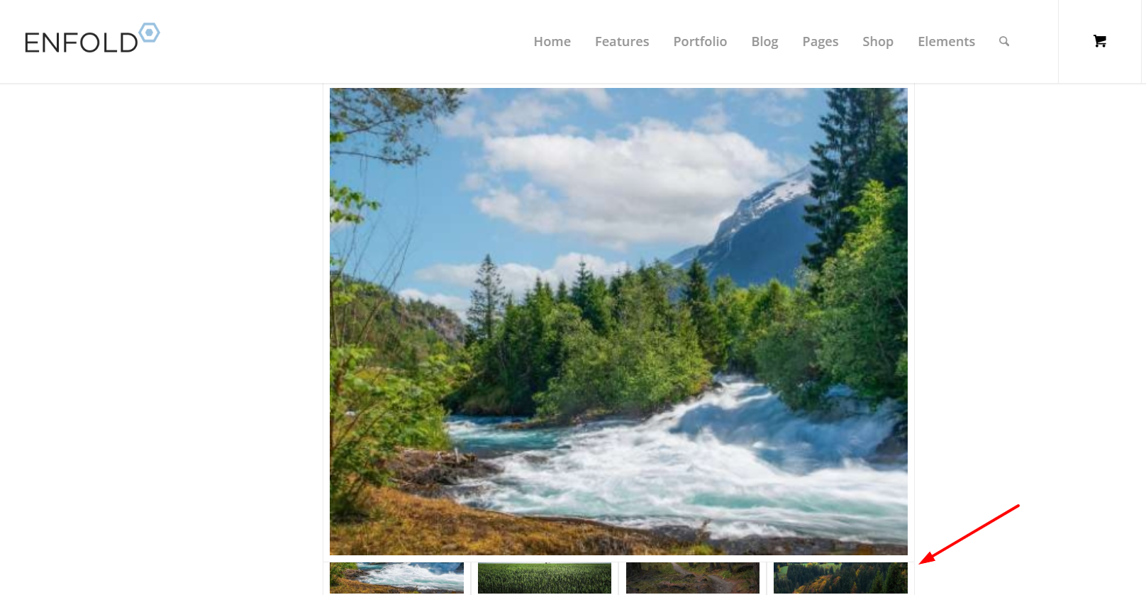
Adding 150px right & left padding to the 3/5 column was better
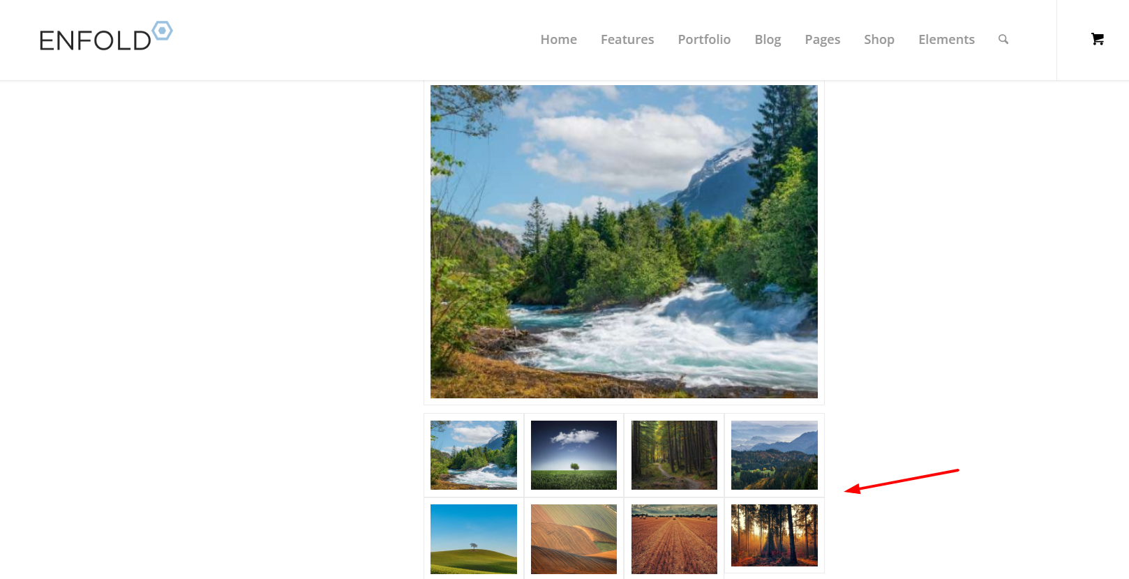
but I get the feeling that you want the large image to be as large as possible, and not so much empty space on the sides, so having it sticky would make the thumbnails hard to see. I tested Guenni007’s solution at: https://webers-testseite.de/ajax-gallery/#av_section_2 and other than adjusting the top: 70px to match my header it seems to work well.
But ypur current masonry layout https://www.thomashenthorne.com/26-mooring-road-san-rafael-ca/#av_section_42
seems much better because the user can see the thumbnails, it fills the page and the user can easily navigate the lightbox images (slideshow).
Best regards,
Mike
I have been editing a website all day yesterday, and all was fine. First thing today, I updated Enfold to 7.1.4, and I am having elements disappear when editing a page after “updating” the changes. I only excerpted this on one page, and I stopped editing. I don’t have the time to test all on the staging sites for the different websites built with Enfold right now. Below is the page, as you can see, very simple.
When doing simple text editing in the text box, the portfolio container disappeared below it when saving the page. I tried the same thing on a duplicate page with a new text box, and it happened again. I can no longer edit this site safely and cannot rollback the Enfold version.
No new plugins or code implemented that might cause a conflict.
I have many websites that we manage built with Enfold. Can you please advise on this issue? It needs to be resolved.
Thank you.
— Michael
Thank I tried this from another thread but it did not work.
I added the class to the color section programcolumn
and added this quick css #top .programcolumn .av-special-heading {
min-height: 100px;
}
I’m still having a problem with Store page. Somehow we have three Store pages; two are correct, but the Menu keeps pointing to the wrong Store page, Store-2, which is just a listing of all our products. The correct page has a Welcome message at the top and a separate Spanish section. I’d like to delete the wrong one, but when I did that I lost the whole Store, and I can’t find a way to redirect the Menu. Thanks for your help.
The search icon in my menu is not showing up on the desktop is not displaying, however it shows on the mobile view. I looked through the color settings to see if it’s somehow set as the menu bar color, but it’s not. I added the following css to help resolve the issue but it’s not changing:
#top #menu-item-search a {
color: #515f77; /* Change the icon color */
}
#top #menu-item-search a:hover {
color: #515f77; /* Change color on hover */
}
I’ve flushed the cache, rebooted, and looked on alternate browers but I still don’t see the icon (should be in blue) in the menu. What am I missing?
Thank you!
Erin
This works – But can we remove the hard coded rule or add conditional logic to it to stop the builder modals failing on large woocommerce or large blog sites?
I have encountering an issue with Enfold 7.1.3 in various websites. The debug_log has the following errors, exactly as reported by another user here https://kriesi.at/support/topic/multiple-errors-on-pages-and-posts-analysis-included/
[20-Feb-2026 10:37:32 UTC] PHP Notice:  Function WP_Styles::add was called <strong>incorrectly</strong>. The style with the handle "avia-module-audioplayer" was enqueued with dependencies that are not registered: avia-layout. Please see <a href="https://developer.wordpress.org/advanced-administration/debug/debug-wordpress/">Debugging in WordPress</a> for more information. (This message was added in version 6.9.1.) in /home/www/public/isea-development/wp-includes/functions.php on line 6131
[20-Feb-2026 10:37:32 UTC] PHP Notice:  Function WP_Styles::add was called <strong>incorrectly</strong>. The style with the handle "avia-module-blog" was enqueued with dependencies that are not registered: avia-layout. Please see <a href="https://developer.wordpress.org/advanced-administration/debug/debug-wordpress/">Debugging in WordPress</a> for more information. (This message was added in version 6.9.1.) in /home/www/public/isea-development/wp-includes/functions.php on line 6131
[20-Feb-2026 10:37:32 UTC] PHP Notice:  Function WP_Styles::add was called <strong>incorrectly</strong>. The style with the handle "avia-module-postslider" was enqueued with dependencies that are not registered: avia-layout. Please see <a href="https://developer.wordpress.org/advanced-administration/debug/debug-wordpress/">Debugging in WordPress</a> for more information. (This message was added in version 6.9.1.) in /home/www/public/isea-development/wp-includes/functions.php on line 6131
[20-Feb-2026 10:37:32 UTC] PHP Notice:  Function WP_Styles::add was called <strong>incorrectly</strong>. The style with the handle "avia-module-button" was enqueued with dependencies that are not registered: avia-layout. Please see <a href="https://developer.wordpress.org/advanced-administration/debug/debug-wordpress/">Debugging in WordPress</a> for more information. (This message was added in version 6.9.1.) in /home/www/public/isea-development/wp-includes/functions.php on line 6131
[20-Feb-2026 10:37:32 UTC] PHP Notice:  Function WP_Styles::add was called <strong>incorrectly</strong>. The style with the handle "avia-module-buttonrow" was enqueued with dependencies that are not registered: avia-layout. Please see <a href="https://developer.wordpress.org/advanced-administration/debug/debug-wordpress/">Debugging in WordPress</a> for more information. (This message was added in version 6.9.1.) in /home/www/public/isea-development/wp-includes/functions.php on line 6131
[20-Feb-2026 10:37:32 UTC] PHP Notice:  Function WP_Styles::add was called <strong>incorrectly</strong>. The style with the handle "avia-module-button-fullwidth" was enqueued with dependencies that are not registered: avia-layout. Please see <a href="https://developer.wordpress.org/advanced-administration/debug/debug-wordpress/">Debugging in WordPress</a> for more information. (This message was added in version 6.9.1.) in /home/www/public/isea-development/wp-includes/functions.php on line 6131
[20-Feb-2026 10:37:32 UTC] PHP Notice:  Function WP_Styles::add was called <strong>incorrectly</strong>. The style with the handle "avia-module-catalogue" was enqueued with dependencies that are not registered: avia-layout. Please see <a href="https://developer.wordpress.org/advanced-administration/debug/debug-wordpress/">Debugging in WordPress</a> for more information. (This message was added in version 6.9.1.) in /home/www/public/isea-development/wp-includes/functions.php on line 6131
[20-Feb-2026 10:37:32 UTC] PHP Notice:  Function WP_Styles::add was called <strong>incorrectly</strong>. The style with the handle "avia-module-comments" was enqueued with dependencies that are not registered: avia-layout. Please see <a href="https://developer.wordpress.org/advanced-administration/debug/debug-wordpress/">Debugging in WordPress</a> for more information. (This message was added in version 6.9.1.) in /home/www/public/isea-development/wp-includes/functions.php on line 6131
[20-Feb-2026 10:37:32 UTC] PHP Notice:  Function WP_Styles::add was called <strong>incorrectly</strong>. The style with the handle "avia-module-contact" was enqueued with dependencies that are not registered: avia-layout. Please see <a href="https://developer.wordpress.org/advanced-administration/debug/debug-wordpress/">Debugging in WordPress</a> for more information. (This message was added in version 6.9.1.) in /home/www/public/isea-development/wp-includes/functions.php on line 6131
[20-Feb-2026 10:37:32 UTC] PHP Notice:  Function WP_Styles::add was called <strong>incorrectly</strong>. The style with the handle "avia-module-slideshow" was enqueued with dependencies that are not registered: avia-layout. Please see <a href="https://developer.wordpress.org/advanced-administration/debug/debug-wordpress/">Debugging in WordPress</a> for more information. (This message was added in version 6.9.1.) in /home/www/public/isea-development/wp-includes/functions.php on line 6131
[20-Feb-2026 10:37:32 UTC] PHP Notice:  Function WP_Styles::add was called <strong>incorrectly</strong>. The style with the handle "avia-module-countdown" was enqueued with dependencies that are not registered: avia-layout. Please see <a href="https://developer.wordpress.org/advanced-administration/debug/debug-wordpress/">Debugging in WordPress</a> for more information. (This message was added in version 6.9.1.) in /home/www/public/isea-development/wp-includes/functions.php on line 6131
[20-Feb-2026 10:37:32 UTC] PHP Notice:  Function WP_Styles::add was called <strong>incorrectly</strong>. The style with the handle "avia-module-dynamic-field" was enqueued with dependencies that are not registered: avia-layout. Please see <a href="https://developer.wordpress.org/advanced-administration/debug/debug-wordpress/">Debugging in WordPress</a> for more information. (This message was added in version 6.9.1.) in /home/www/public/isea-development/wp-includes/functions.php on line 6131
[20-Feb-2026 10:37:32 UTC] PHP Notice:  Function WP_Styles::add was called <strong>incorrectly</strong>. The style with the handle "avia-module-gallery" was enqueued with dependencies that are not registered: avia-layout. Please see <a href="https://developer.wordpress.org/advanced-administration/debug/debug-wordpress/">Debugging in WordPress</a> for more information. (This message was added in version 6.9.1.) in /home/www/public/isea-development/wp-includes/functions.php on line 6131
[20-Feb-2026 10:37:32 UTC] PHP Notice:  Function WP_Styles::add was called <strong>incorrectly</strong>. The style with the handle "avia-module-maps" was enqueued with dependencies that are not registered: avia-layout. Please see <a href="https://developer.wordpress.org/advanced-administration/debug/debug-wordpress/">Debugging in WordPress</a> for more information. (This message was added in version 6.9.1.) in /home/www/public/isea-development/wp-includes/functions.php on line 6131
[20-Feb-2026 10:37:32 UTC] PHP Notice:  Function WP_Styles::add was called <strong>incorrectly</strong>. The style with the handle "avia-module-gridrow" was enqueued with dependencies that are not registered: avia-layout. Please see <a href="https://developer.wordpress.org/advanced-administration/debug/debug-wordpress/">Debugging in WordPress</a> for more information. (This message was added in version 6.9.1.) in /home/www/public/isea-development/wp-includes/functions.php on line 6131
[20-Feb-2026 10:37:32 UTC] PHP Notice:  Function WP_Styles::add was called <strong>incorrectly</strong>. The style with the handle "avia-module-heading" was enqueued with dependencies that are not registered: avia-layout. Please see <a href="https://developer.wordpress.org/advanced-administration/debug/debug-wordpress/">Debugging in WordPress</a> for more information. (This message was added in version 6.9.1.) in /home/www/public/isea-development/wp-includes/functions.php on line 6131
[20-Feb-2026 10:37:32 UTC] PHP Notice:  Function WP_Styles::add was called <strong>incorrectly</strong>. The style with the handle "avia-module-rotator" was enqueued with dependencies that are not registered: avia-layout. Please see <a href="https://developer.wordpress.org/advanced-administration/debug/debug-wordpress/">Debugging in WordPress</a> for more information. (This message was added in version 6.9.1.) in /home/www/public/isea-development/wp-includes/functions.php on line 6131
[20-Feb-2026 10:37:32 UTC] PHP Notice:  Function WP_Styles::add was called <strong>incorrectly</strong>. The style with the handle "avia-module-hr" was enqueued with dependencies that are not registered: avia-layout. Please see <a href="https://developer.wordpress.org/advanced-administration/debug/debug-wordpress/">Debugging in WordPress</a> for more information. (This message was added in version 6.9.1.) in /home/www/public/isea-development/wp-includes/functions.php on line 6131
[20-Feb-2026 10:37:32 UTC] PHP Notice:  Function WP_Styles::add was called <strong>incorrectly</strong>. The style with the handle "avia-module-icon" was enqueued with dependencies that are not registered: avia-layout. Please see <a href="https://developer.wordpress.org/advanced-administration/debug/debug-wordpress/">Debugging in WordPress</a> for more information. (This message was added in version 6.9.1.) in /home/www/public/isea-development/wp-includes/functions.php on line 6131
[20-Feb-2026 10:37:32 UTC] PHP Notice:  Function WP_Styles::add was called <strong>incorrectly</strong>. The style with the handle "avia-module-icon-circles" was enqueued with dependencies that are not registered: avia-layout. Please see <a href="https://developer.wordpress.org/advanced-administration/debug/debug-wordpress/">Debugging in WordPress</a> for more information. (This message was added in version 6.9.1.) in /home/www/public/isea-development/wp-includes/functions.php on line 6131
[20-Feb-2026 10:37:32 UTC] PHP Notice:  Function WP_Styles::add was called <strong>incorrectly</strong>. The style with the handle "avia-module-iconbox" was enqueued with dependencies that are not registered: avia-layout. Please see <a href="https://developer.wordpress.org/advanced-administration/debug/debug-wordpress/">Debugging in WordPress</a> for more information. (This message was added in version 6.9.1.) in /home/www/public/isea-development/wp-includes/functions.php on line 6131
[20-Feb-2026 10:37:32 UTC] PHP Notice:  Function WP_Styles::add was called <strong>incorrectly</strong>. The style with the handle "avia-module-icongrid" was enqueued with dependencies that are not registered: avia-layout. Please see <a href="https://developer.wordpress.org/advanced-administration/debug/debug-wordpress/">Debugging in WordPress</a> for more information. (This message was added in version 6.9.1.) in /home/www/public/isea-development/wp-includes/functions.php on line 6131
[20-Feb-2026 10:37:32 UTC] PHP Notice:  Function WP_Styles::add was called <strong>incorrectly</strong>. The style with the handle "avia-module-iconlist" was enqueued with dependencies that are not registered: avia-layout. Please see <a href="https://developer.wordpress.org/advanced-administration/debug/debug-wordpress/">Debugging in WordPress</a> for more information. (This message was added in version 6.9.1.) in /home/www/public/isea-development/wp-includes/functions.php on line 6131
[20-Feb-2026 10:37:32 UTC] PHP Notice:  Function WP_Styles::add was called <strong>incorrectly</strong>. The style with the handle "avia-module-image" was enqueued with dependencies that are not registered: avia-layout. Please see <a href="https://developer.wordpress.org/advanced-administration/debug/debug-wordpress/">Debugging in WordPress</a> for more information. (This message was added in version 6.9.1.) in /home/www/public/isea-development/wp-includes/functions.php on line 6131
[20-Feb-2026 10:37:32 UTC] PHP Notice:  Function WP_Styles::add was called <strong>incorrectly</strong>. The style with the handle "avia-module-image-diff" was enqueued with dependencies that are not registered: avia-layout. Please see <a href="https://developer.wordpress.org/advanced-administration/debug/debug-wordpress/">Debugging in WordPress</a> for more information. (This message was added in version 6.9.1.) in /home/www/public/isea-development/wp-includes/functions.php on line 6131
[20-Feb-2026 10:37:32 UTC] PHP Notice:  Function WP_Styles::add was called <strong>incorrectly</strong>. The style with the handle "avia-module-hotspot" was enqueued with dependencies that are not registered: avia-layout. Please see <a href="https://developer.wordpress.org/advanced-administration/debug/debug-wordpress/">Debugging in WordPress</a> for more information. (This message was added in version 6.9.1.) in /home/www/public/isea-development/wp-includes/functions.php on line 6131
[20-Feb-2026 10:37:32 UTC] PHP Notice:  Function WP_Styles::add was called <strong>incorrectly</strong>. The style with the handle "avia-module-sc-lottie-animation" was enqueued with dependencies that are not registered: avia-layout. Please see <a href="https://developer.wordpress.org/advanced-administration/debug/debug-wordpress/">Debugging in WordPress</a> for more information. (This message was added in version 6.9.1.) in /home/www/public/isea-development/wp-includes/functions.php on line 6131
[20-Feb-2026 10:37:32 UTC] PHP Notice:  Function WP_Styles::add was called <strong>incorrectly</strong>. The style with the handle "avia-module-magazine" was enqueued with dependencies that are not registered: avia-layout. Please see <a href="https://developer.wordpress.org/advanced-administration/debug/debug-wordpress/">Debugging in WordPress</a> for more information. (This message was added in version 6.9.1.) in /home/www/public/isea-development/wp-includes/functions.php on line 6131
[20-Feb-2026 10:37:32 UTC] PHP Notice:  Function WP_Styles::add was called <strong>incorrectly</strong>. The style with the handle "avia-module-masonry" was enqueued with dependencies that are not registered: avia-layout. Please see <a href="https://developer.wordpress.org/advanced-administration/debug/debug-wordpress/">Debugging in WordPress</a> for more information. (This message was added in version 6.9.1.) in /home/www/public/isea-development/wp-includes/functions.php on line 6131
[20-Feb-2026 10:37:32 UTC] PHP Notice:  Function WP_Styles::add was called <strong>incorrectly</strong>. The style with the handle "avia-siteloader" was enqueued with dependencies that are not registered: avia-layout. Please see <a href="https://developer.wordpress.org/advanced-administration/debug/debug-wordpress/">Debugging in WordPress</a> for more information. (This message was added in version 6.9.1.) in /home/www/public/isea-development/wp-includes/functions.php on line 6131
[20-Feb-2026 10:37:32 UTC] PHP Notice:  Function WP_Styles::add was called <strong>incorrectly</strong>. The style with the handle "avia-module-menu" was enqueued with dependencies that are not registered: avia-layout. Please see <a href="https://developer.wordpress.org/advanced-administration/debug/debug-wordpress/">Debugging in WordPress</a> for more information. (This message was added in version 6.9.1.) in /home/www/public/isea-development/wp-includes/functions.php on line 6131
[20-Feb-2026 10:37:32 UTC] PHP Notice:  Function WP_Styles::add was called <strong>incorrectly</strong>. The style with the handle "avia-module-notification" was enqueued with dependencies that are not registered: avia-layout. Please see <a href="https://developer.wordpress.org/advanced-administration/debug/debug-wordpress/">Debugging in WordPress</a> for more information. (This message was added in version 6.9.1.) in /home/www/public/isea-development/wp-includes/functions.php on line 6131
[20-Feb-2026 10:37:32 UTC] PHP Notice:  Function WP_Styles::add was called <strong>incorrectly</strong>. The style with the handle "avia-module-numbers" was enqueued with dependencies that are not registered: avia-layout. Please see <a href="https://developer.wordpress.org/advanced-administration/debug/debug-wordpress/">Debugging in WordPress</a> for more information. (This message was added in version 6.9.1.) in /home/www/public/isea-development/wp-includes/functions.php on line 6131
[20-Feb-2026 10:37:32 UTC] PHP Notice:  Function WP_Styles::add was called <strong>incorrectly</strong>. The style with the handle "avia-module-portfolio" was enqueued with dependencies that are not registered: avia-layout. Please see <a href="https://developer.wordpress.org/advanced-administration/debug/debug-wordpress/">Debugging in WordPress</a> for more information. (This message was added in version 6.9.1.) in /home/www/public/isea-development/wp-includes/functions.php on line 6131
[20-Feb-2026 10:37:32 UTC] PHP Notice:  Function WP_Styles::add was called <strong>incorrectly</strong>. The style with the handle "avia-module-post-metadata" was enqueued with dependencies that are not registered: avia-layout. Please see <a href="https://developer.wordpress.org/advanced-administration/debug/debug-wordpress/">Debugging in WordPress</a> for more information. (This message was added in version 6.9.1.) in /home/www/public/isea-development/wp-includes/functions.php on line 6131
[20-Feb-2026 10:37:32 UTC] PHP Notice:  Function WP_Styles::add was called <strong>incorrectly</strong>. The style with the handle "avia-module-progress-bar" was enqueued with dependencies that are not registered: avia-layout. Please see <a href="https://developer.wordpress.org/advanced-administration/debug/debug-wordpress/">Debugging in WordPress</a> for more information. (This message was added in version 6.9.1.) in /home/www/public/isea-development/wp-includes/functions.php on line 6131
[20-Feb-2026 10:37:32 UTC] PHP Notice:  Function WP_Styles::add was called <strong>incorrectly</strong>. The style with the handle "avia-module-promobox" was enqueued with dependencies that are not registered: avia-layout. Please see <a href="https://developer.wordpress.org/advanced-administration/debug/debug-wordpress/">Debugging in WordPress</a> for more information. (This message was added in version 6.9.1.) in /home/www/public/isea-development/wp-includes/functions.php on line 6131
[20-Feb-2026 10:37:32 UTC] PHP Notice:  Function WP_Styles::add was called <strong>incorrectly</strong>. The style with the handle "avia-sc-search" was enqueued with dependencies that are not registered: avia-layout. Please see <a href="https://developer.wordpress.org/advanced-administration/debug/debug-wordpress/">Debugging in WordPress</a> for more information. (This message was added in version 6.9.1.) in /home/www/public/isea-development/wp-includes/functions.php on line 6131
[20-Feb-2026 10:37:32 UTC] PHP Notice:  Function WP_Styles::add was called <strong>incorrectly</strong>. The style with the handle "avia-module-slideshow-accordion" was enqueued with dependencies that are not registered: avia-layout. Please see <a href="https://developer.wordpress.org/advanced-administration/debug/debug-wordpress/">Debugging in WordPress</a> for more information. (This message was added in version 6.9.1.) in /home/www/public/isea-development/wp-includes/functions.php on line 6131
[20-Feb-2026 10:37:32 UTC] PHP Notice:  Function WP_Styles::add was called <strong>incorrectly</strong>. The style with the handle "avia-module-slideshow-ls" was enqueued with dependencies that are not registered: avia-layout. Please see <a href="https://developer.wordpress.org/advanced-administration/debug/debug-wordpress/">Debugging in WordPress</a> for more information. (This message was added in version 6.9.1.) in /home/www/public/isea-development/wp-includes/functions.php on line 6131
[20-Feb-2026 10:37:32 UTC] PHP Notice:  Function WP_Styles::add was called <strong>incorrectly</strong>. The style with the handle "avia-module-social" was enqueued with dependencies that are not registered: avia-layout. Please see <a href="https://developer.wordpress.org/advanced-administration/debug/debug-wordpress/">Debugging in WordPress</a> for more information. (This message was added in version 6.9.1.) in /home/www/public/isea-development/wp-includes/functions.php on line 6131
[20-Feb-2026 10:37:32 UTC] PHP Notice:  Function WP_Styles::add was called <strong>incorrectly</strong>. The style with the handle "avia-module-tabsection" was enqueued with dependencies that are not registered: avia-layout. Please see <a href="https://developer.wordpress.org/advanced-administration/debug/debug-wordpress/">Debugging in WordPress</a> for more information. (This message was added in version 6.9.1.) in /home/www/public/isea-development/wp-includes/functions.php on line 6131
[20-Feb-2026 10:37:32 UTC] PHP Notice:  Function WP_Styles::add was called <strong>incorrectly</strong>. The style with the handle "avia-module-table" was enqueued with dependencies that are not registered: avia-layout. Please see <a href="https://developer.wordpress.org/advanced-administration/debug/debug-wordpress/">Debugging in WordPress</a> for more information. (This message was added in version 6.9.1.) in /home/www/public/isea-development/wp-includes/functions.php on line 6131
[20-Feb-2026 10:37:32 UTC] PHP Notice:  Function WP_Styles::add was called <strong>incorrectly</strong>. The style with the handle "avia-module-tabs" was enqueued with dependencies that are not registered: avia-layout. Please see <a href="https://developer.wordpress.org/advanced-administration/debug/debug-wordpress/">Debugging in WordPress</a> for more information. (This message was added in version 6.9.1.) in /home/www/public/isea-development/wp-includes/functions.php on line 6131
[20-Feb-2026 10:37:32 UTC] PHP Notice:  Function WP_Styles::add was called <strong>incorrectly</strong>. The style with the handle "avia-module-team" was enqueued with dependencies that are not registered: avia-layout. Please see <a href="https://developer.wordpress.org/advanced-administration/debug/debug-wordpress/">Debugging in WordPress</a> for more information. (This message was added in version 6.9.1.) in /home/www/public/isea-development/wp-includes/functions.php on line 6131
[20-Feb-2026 10:37:32 UTC] PHP Notice:  Function WP_Styles::add was called <strong>incorrectly</strong>. The style with the handle "avia-module-testimonials" was enqueued with dependencies that are not registered: avia-layout. Please see <a href="https://developer.wordpress.org/advanced-administration/debug/debug-wordpress/">Debugging in WordPress</a> for more information. (This message was added in version 6.9.1.) in /home/www/public/isea-development/wp-includes/functions.php on line 6131
[20-Feb-2026 10:37:32 UTC] PHP Notice:  Function WP_Styles::add was called <strong>incorrectly</strong>. The style with the handle "avia-module-timeline" was enqueued with dependencies that are not registered: avia-layout. Please see <a href="https://developer.wordpress.org/advanced-administration/debug/debug-wordpress/">Debugging in WordPress</a> for more information. (This message was added in version 6.9.1.) in /home/www/public/isea-development/wp-includes/functions.php on line 6131
[20-Feb-2026 10:37:32 UTC] PHP Notice:  Function WP_Styles::add was called <strong>incorrectly</strong>. The style with the handle "avia-module-toggles" was enqueued with dependencies that are not registered: avia-layout. Please see <a href="https://developer.wordpress.org/advanced-administration/debug/debug-wordpress/">Debugging in WordPress</a> for more information. (This message was added in version 6.9.1.) in /home/www/public/isea-development/wp-includes/functions.php on line 6131
[20-Feb-2026 10:37:32 UTC] PHP Notice:  Function WP_Styles::add was called <strong>incorrectly</strong>. The style with the handle "avia-module-video" was enqueued with dependencies that are not registered: avia-layout. Please see <a href="https://developer.wordpress.org/advanced-administration/debug/debug-wordpress/">Debugging in WordPress</a> for more information. (This message was added in version 6.9.1.) in /home/www/public/isea-development/wp-includes/functions.php on line 6131
[20-Feb-2026 10:37:32 UTC] PHP Notice:  Function WP_Scripts::add was called <strong>incorrectly</strong>. The script with the handle "avia-module-audioplayer" was enqueued with dependencies that are not registered: avia-shortcodes. Please see <a href="https://developer.wordpress.org/advanced-administration/debug/debug-wordpress/">Debugging in WordPress</a> for more information. (This message was added in version 6.9.1.) in /home/www/public/isea-development/wp-includes/functions.php on line 6131
[20-Feb-2026 10:37:32 UTC] PHP Notice:  Function WP_Scripts::add was called <strong>incorrectly</strong>. The script with the handle "avia-module-chart-js" was enqueued with dependencies that are not registered: avia-shortcodes. Please see <a href="https://developer.wordpress.org/advanced-administration/debug/debug-wordpress/">Debugging in WordPress</a> for more information. (This message was added in version 6.9.1.) in /home/www/public/isea-development/wp-includes/functions.php on line 6131
[20-Feb-2026 10:37:32 UTC] PHP Notice:  Function WP_Scripts::add was called <strong>incorrectly</strong>. The script with the handle "avia-module-chart" was enqueued with dependencies that are not registered: avia-shortcodes. Please see <a href="https://developer.wordpress.org/advanced-administration/debug/debug-wordpress/">Debugging in WordPress</a> for more information. (This message was added in version 6.9.1.) in /home/www/public/isea-development/wp-includes/functions.php on line 6131
[20-Feb-2026 10:37:32 UTC] PHP Notice:  Function WP_Scripts::add was called <strong>incorrectly</strong>. The script with the handle "avia-module-contact" was enqueued with dependencies that are not registered: avia-shortcodes. Please see <a href="https://developer.wordpress.org/advanced-administration/debug/debug-wordpress/">Debugging in WordPress</a> for more information. (This message was added in version 6.9.1.) in /home/www/public/isea-development/wp-includes/functions.php on line 6131
[20-Feb-2026 10:37:32 UTC] PHP Notice:  Function WP_Scripts::add was called <strong>incorrectly</strong>. The script with the handle "avia-module-slideshow" was enqueued with dependencies that are not registered: avia-shortcodes. Please see <a href="https://developer.wordpress.org/advanced-administration/debug/debug-wordpress/">Debugging in WordPress</a> for more information. (This message was added in version 6.9.1.) in /home/www/public/isea-development/wp-includes/functions.php on line 6131
[20-Feb-2026 10:37:32 UTC] PHP Notice:  Function WP_Scripts::add was called <strong>incorrectly</strong>. The script with the handle "avia-module-countdown" was enqueued with dependencies that are not registered: avia-shortcodes. Please see <a href="https://developer.wordpress.org/advanced-administration/debug/debug-wordpress/">Debugging in WordPress</a> for more information. (This message was added in version 6.9.1.) in /home/www/public/isea-development/wp-includes/functions.php on line 6131
[20-Feb-2026 10:37:32 UTC] PHP Notice:  Function WP_Scripts::add was called <strong>incorrectly</strong>. The script with the handle "avia-module-gallery" was enqueued with dependencies that are not registered: avia-shortcodes. Please see <a href="https://developer.wordpress.org/advanced-administration/debug/debug-wordpress/">Debugging in WordPress</a> for more information. (This message was added in version 6.9.1.) in /home/www/public/isea-development/wp-includes/functions.php on line 6131
[20-Feb-2026 10:37:32 UTC] PHP Notice:  Function WP_Scripts::add was called <strong>incorrectly</strong>. The script with the handle "avia-module-gallery-hor" was enqueued with dependencies that are not registered: avia-shortcodes. Please see <a href="https://developer.wordpress.org/advanced-administration/debug/debug-wordpress/">Debugging in WordPress</a> for more information. (This message was added in version 6.9.1.) in /home/www/public/isea-development/wp-includes/functions.php on line 6131
[20-Feb-2026 10:37:32 UTC] PHP Notice:  Function WP_Scripts::add was called <strong>incorrectly</strong>. The script with the handle "avia-module-rotator" was enqueued with dependencies that are not registered: avia-shortcodes. Please see <a href="https://developer.wordpress.org/advanced-administration/debug/debug-wordpress/">Debugging in WordPress</a> for more information. (This message was added in version 6.9.1.) in /home/www/public/isea-development/wp-includes/functions.php on line 6131
[20-Feb-2026 10:37:32 UTC] PHP Notice:  Function WP_Scripts::add was called <strong>incorrectly</strong>. The script with the handle "avia-module-icon-circles" was enqueued with dependencies that are not registered: avia-shortcodes. Please see <a href="https://developer.wordpress.org/advanced-administration/debug/debug-wordpress/">Debugging in WordPress</a> for more information. (This message was added in version 6.9.1.) in /home/www/public/isea-development/wp-includes/functions.php on line 6131
[20-Feb-2026 10:37:32 UTC] PHP Notice:  Function WP_Scripts::add was called <strong>incorrectly</strong>. The script with the handle "avia-module-icongrid" was enqueued with dependencies that are not registered: avia-shortcodes. Please see <a href="https://developer.wordpress.org/advanced-administration/debug/debug-wordpress/">Debugging in WordPress</a> for more information. (This message was added in version 6.9.1.) in /home/www/public/isea-development/wp-includes/functions.php on line 6131
[20-Feb-2026 10:37:32 UTC] PHP Notice:  Function WP_Scripts::add was called <strong>incorrectly</strong>. The script with the handle "avia-module-iconlist" was enqueued with dependencies that are not registered: avia-shortcodes. Please see <a href="https://developer.wordpress.org/advanced-administration/debug/debug-wordpress/">Debugging in WordPress</a> for more information. (This message was added in version 6.9.1.) in /home/www/public/isea-development/wp-includes/functions.php on line 6131
[20-Feb-2026 10:37:32 UTC] PHP Notice:  Function WP_Scripts::add was called <strong>incorrectly</strong>. The script with the handle "avia-module-image-diff" was enqueued with dependencies that are not registered: avia-shortcodes. Please see <a href="https://developer.wordpress.org/advanced-administration/debug/debug-wordpress/">Debugging in WordPress</a> for more information. (This message was added in version 6.9.1.) in /home/www/public/isea-development/wp-includes/functions.php on line 6131
[20-Feb-2026 10:37:32 UTC] PHP Notice:  Function WP_Scripts::add was called <strong>incorrectly</strong>. The script with the handle "avia-module-hotspot" was enqueued with dependencies that are not registered: avia-shortcodes. Please see <a href="https://developer.wordpress.org/advanced-administration/debug/debug-wordpress/">Debugging in WordPress</a> for more information. (This message was added in version 6.9.1.) in /home/www/public/isea-development/wp-includes/functions.php on line 6131
[20-Feb-2026 10:37:32 UTC] PHP Notice:  Function WP_Scripts::add was called <strong>incorrectly</strong>. The script with the handle "avia-module-magazine" was enqueued with dependencies that are not registered: avia-shortcodes. Please see <a href="https://developer.wordpress.org/advanced-administration/debug/debug-wordpress/">Debugging in WordPress</a> for more information. (This message was added in version 6.9.1.) in /home/www/public/isea-development/wp-includes/functions.php on line 6131
[20-Feb-2026 10:37:32 UTC] PHP Notice:  Function WP_Scripts::add was called <strong>incorrectly</strong>. The script with the handle "avia-module-isotope" was enqueued with dependencies that are not registered: avia-shortcodes. Please see <a href="https://developer.wordpress.org/advanced-administration/debug/debug-wordpress/">Debugging in WordPress</a> for more information. (This message was added in version 6.9.1.) in /home/www/public/isea-development/wp-includes/functions.php on line 6131
[20-Feb-2026 10:37:32 UTC] PHP Notice:  Function WP_Scripts::add was called <strong>incorrectly</strong>. The script with the handle "avia-module-menu" was enqueued with dependencies that are not registered: avia-shortcodes. Please see <a href="https://developer.wordpress.org/advanced-administration/debug/debug-wordpress/">Debugging in WordPress</a> for more information. (This message was added in version 6.9.1.) in /home/www/public/isea-development/wp-includes/functions.php on line 6131
[20-Feb-2026 10:37:32 UTC] PHP Notice:  Function WP_Scripts::add was called <strong>incorrectly</strong>. The script with the handle "avia-module-notification" was enqueued with dependencies that are not registered: avia-shortcodes. Please see <a href="https://developer.wordpress.org/advanced-administration/debug/debug-wordpress/">Debugging in WordPress</a> for more information. (This message was added in version 6.9.1.) in /home/www/public/isea-development/wp-includes/functions.php on line 6131
[20-Feb-2026 10:37:32 UTC] PHP Notice:  Function WP_Scripts::add was called <strong>incorrectly</strong>. The script with the handle "avia-module-numbers" was enqueued with dependencies that are not registered: avia-shortcodes. Please see <a href="https://developer.wordpress.org/advanced-administration/debug/debug-wordpress/">Debugging in WordPress</a> for more information. (This message was added in version 6.9.1.) in /home/www/public/isea-development/wp-includes/functions.php on line 6131
[20-Feb-2026 10:37:32 UTC] PHP Notice:  Function WP_Scripts::add was called <strong>incorrectly</strong>. The script with the handle "avia-module-portfolio" was enqueued with dependencies that are not registered: avia-shortcodes. Please see <a href="https://developer.wordpress.org/advanced-administration/debug/debug-wordpress/">Debugging in WordPress</a> for more information. (This message was added in version 6.9.1.) in /home/www/public/isea-development/wp-includes/functions.php on line 6131
[20-Feb-2026 10:37:32 UTC] PHP Notice:  Function WP_Scripts::add was called <strong>incorrectly</strong>. The script with the handle "avia-module-progress-bar" was enqueued with dependencies that are not registered: avia-shortcodes. Please see <a href="https://developer.wordpress.org/advanced-administration/debug/debug-wordpress/">Debugging in WordPress</a> for more information. (This message was added in version 6.9.1.) in /home/www/public/isea-development/wp-includes/functions.php on line 6131
[20-Feb-2026 10:37:32 UTC] PHP Notice:  Function WP_Scripts::add was called <strong>incorrectly</strong>. The script with the handle "avia-module-slideshow-video" was enqueued with dependencies that are not registered: avia-shortcodes. Please see <a href="https://developer.wordpress.org/advanced-administration/debug/debug-wordpress/">Debugging in WordPress</a> for more information. (This message was added in version 6.9.1.) in /home/www/public/isea-development/wp-includes/functions.php on line 6131
[20-Feb-2026 10:37:32 UTC] PHP Notice:  Function WP_Scripts::add was called <strong>incorrectly</strong>. The script with the handle "avia-module-slideshow-accordion" was enqueued with dependencies that are not registered: avia-shortcodes. Please see <a href="https://developer.wordpress.org/advanced-administration/debug/debug-wordpress/">Debugging in WordPress</a> for more information. (This message was added in version 6.9.1.) in /home/www/public/isea-development/wp-includes/functions.php on line 6131
[20-Feb-2026 10:37:32 UTC] PHP Notice:  Function WP_Scripts::add was called <strong>incorrectly</strong>. The script with the handle "avia-module-slideshow-ls" was enqueued with dependencies that are not registered: avia-shortcodes. Please see <a href="https://developer.wordpress.org/advanced-administration/debug/debug-wordpress/">Debugging in WordPress</a> for more information. (This message was added in version 6.9.1.) in /home/www/public/isea-development/wp-includes/functions.php on line 6131
[20-Feb-2026 10:37:32 UTC] PHP Notice:  Function WP_Scripts::add was called <strong>incorrectly</strong>. The script with the handle "avia-module-tabsection" was enqueued with dependencies that are not registered: avia-shortcodes. Please see <a href="https://developer.wordpress.org/advanced-administration/debug/debug-wordpress/">Debugging in WordPress</a> for more information. (This message was added in version 6.9.1.) in /home/www/public/isea-development/wp-includes/functions.php on line 6131
[20-Feb-2026 10:37:32 UTC] PHP Notice:  Function WP_Scripts::add was called <strong>incorrectly</strong>. The script with the handle "avia-module-tabs" was enqueued with dependencies that are not registered: avia-shortcodes. Please see <a href="https://developer.wordpress.org/advanced-administration/debug/debug-wordpress/">Debugging in WordPress</a> for more information. (This message was added in version 6.9.1.) in /home/www/public/isea-development/wp-includes/functions.php on line 6131
[20-Feb-2026 10:37:32 UTC] PHP Notice:  Function WP_Scripts::add was called <strong>incorrectly</strong>. The script with the handle "avia-module-testimonials" was enqueued with dependencies that are not registered: avia-shortcodes. Please see <a href="https://developer.wordpress.org/advanced-administration/debug/debug-wordpress/">Debugging in WordPress</a> for more information. (This message was added in version 6.9.1.) in /home/www/public/isea-development/wp-includes/functions.php on line 6131
[20-Feb-2026 10:37:32 UTC] PHP Notice:  Function WP_Scripts::add was called <strong>incorrectly</strong>. The script with the handle "avia-module-timeline" was enqueued with dependencies that are not registered: avia-shortcodes. Please see <a href="https://developer.wordpress.org/advanced-administration/debug/debug-wordpress/">Debugging in WordPress</a> for more information. (This message was added in version 6.9.1.) in /home/www/public/isea-development/wp-includes/functions.php on line 6131
[20-Feb-2026 10:37:32 UTC] PHP Notice:  Function WP_Scripts::add was called <strong>incorrectly</strong>. The script with the handle "avia-module-toggles" was enqueued with dependencies that are not registered: avia-shortcodes. Please see <a href="https://developer.wordpress.org/advanced-administration/debug/debug-wordpress/">Debugging in WordPress</a> for more information. (This message was added in version 6.9.1.) in /home/www/public/isea-development/wp-includes/functions.php on line 6131
[20-Feb-2026 10:37:32 UTC] PHP Notice:  Function WP_Scripts::add was called <strong>incorrectly</strong>. The script with the handle "avia-module-video" was enqueued with dependencies that are not registered: avia-shortcodes. Please see <a href="https://developer.wordpress.org/advanced-administration/debug/debug-wordpress/">Debugging in WordPress</a> for more information. (This message was added in version 6.9.1.) in /home/www/public/isea-development/wp-includes/functions.php on line 6131
I tried the function suggested in the above mentioned post, but it messed up the custom css I created in my child theme.
In private content details
Try this to put the issue to bed:
in your child theme functions.php file:
// Increase the silly post memory limit set in Enfold
add_filter('avf_alb_linkpicker_memory_limit', function() {
    return '1024M'; // Adjust if your host allows less
});

// Limit the posts returned to stop the memory limit being exceeded
// Limit posts returned to just posts and pages not products
add_filter('avf_linkpicker_args', function($args) {

    $args['posts_per_page'] = 500;
    $args['post_type'] = isset($args['post_type'])
        ? array_intersect((array) $args['post_type'], ['post','page'])
        : ['post','page'];

    $args['orderby'] = 'date';
    $args['order']   = 'DESC';

    return $args;
});
I am currently testing this solution.
-
This reply was modified 1 month, 1 week ago by
 thinkjarvis.
we have almost 250,000 product variations on this website.
Can you add a filter to stop it listing all of the woocommerce products?
We have to do the same with Divi4 and Divi5 by Elegant themes. They have given me a snippet to stop their library system trying to load the template for every single product.
Hey dreyerjm,
Thank you for the inquiry.
Try adding this code in the Quick CSS field.
#top .av-equal-height-column .avia-button-wrap {
    position: absolute;
    bottom: 0;
    width: 100%;
}

#top .av-equal-height-column {
    padding-bottom: 50px;
}
You can also replace av-equal-height-column with a custom css class name if you want this applied only to specific columns.
— https://kriesi.at/documentation/enfold/add-custom-css/#enable-custom-css-class-name-support
Result:
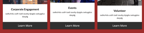
Best regards,
Ismael
Hey dreyerjm,
Try this css in your Quick CSS field in the theme options:
body #intro .column-top-margin {
    margin-top: 20px;
}
Best regards,
Mike
Hi, how would i get my columns to all line up uniform – picture at the top and button at the bottom.
Thanks again Guenni!
The issue is resolved, using your first piece of code and code I found here:
The z-index rules you suggested didn’t make a difference.
In the end, I made the PNG unclickable with your code and made it the same color as the overlay, using this code:
.av-burger-overlay-active .logo > a {
  pointer-events: none;
}

.av-burger-overlay-active .logo > a {
  overflow: hidden;
  filter: drop-shadow(0px 1000px 0 #151515);
  transform: translateY(-1000px);
}
Thanks alot!
This topic can be marked as resolved.
Best regards,
Maarten