Hi,
Thank you for the screenshot.
You can use this css code to adjust the height of the title in the breadcrumb container.
@media only screen and (max-width: 767px) {

  /* Add your Mobile Styles here */
  #top .title_container .main-title {
    line-height: 0.8em;
    margin-bottom: 20px;
  }
}
View post on imgur.com
Best regards,
Ismael
Hi,
Do I need to add soms z-index code to ensure it’s always shown on top?
Yes, you have to adjust the z-index of the widget containing the search icon.
Best regards,
Ismael
Hey Tilman,
Thank you for the inquiry.
You can use the following css code to adjust the height of the burger menu items and the width of the overlay container.
.html_av-overlay-side #top #wrap_all .av-burger-overlay li a {
    line-height: 2em;
    height: auto;
    padding: 15px 50px;
}

.html_av-overlay-side #top #wrap_all .av-burger-overlay-scroll {
    width: calc(100vw - 65%);
}
Best regards,
Ismael
The blue box marks the container, which you set to 1500px in the Enfold settings – see my comment above : link
Since the font is set to centered, it will be placed in the middle of the container. If the size is smaller, there will be a gap to the outer edges of the blue box.
Originally, you can see in the first screenshot that there is a manually placed line break (<br>) at the point marked in red.
(click to enlarge the images)

In the second screenshot, I have removed this manual line break in my browser’s dev tools to show you that when there are no line breaks, these lines have the said 1500px width.

Where you are now reporting the lack of smaller widths, you have simply not set manual breaks as above inside the text-block elements.
Hi Ismael,
thanks for your quick response.
You can find links to screenshots in the private content section of this message.
I discovered one more bug: The “X” Close Button of the Burger Menu is displayed correctly when the burger menu is opened from the top of the page, but is white (and not visible – because color is white) when opened from the middle of a page (problem might occur because of the transparent header) how can I change the color of the “X” close button of the burger menu?
Thanks for your help!
Best, Konrad
you do not need to have multiple layersliders. On each layer you got on content tab :
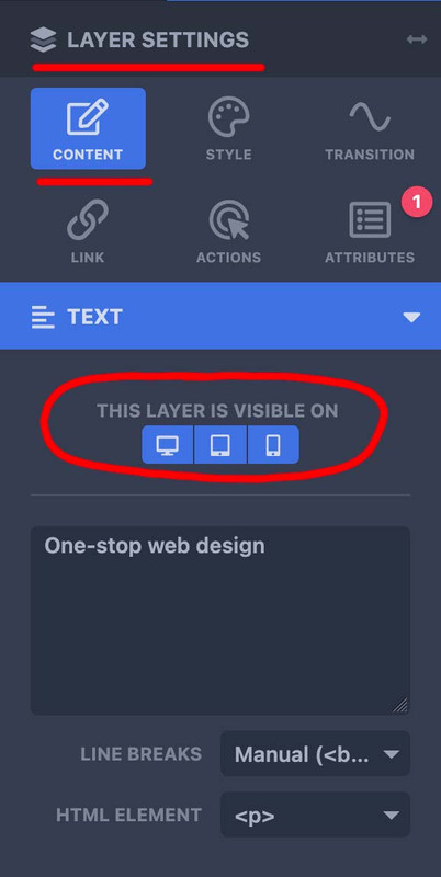
– so for mobile content – duplicate that layer you like to have in a different way or position – and select your visibility option ( desktop, tablett, mobile)
– the first one you show on desktop and tablett – the copy – show on mobile.
now – if you like to change the way they look : – on top there is the preview mode:

select your mode – mobile (now all layers that belong to this mode are only editable and visible) – and edit now the content for that mobile layer.
sorry i did not read the whole text here on that topic; but if i see something with inline-svg : did you have any css rule managing the width or height of svg’s ?
__________________
so this might be offtopic – but that was one reason why some of my svg icons seems not to be in place
On former installations of mine – i use a snippet to convert all img tags that are svgs to inline svgs. those svg’s that do not have a width and height definition inside the svg code ( only viewport settings ) need an absolute width to be shown. Otherwise these svgs are listed as 0x0 dimension.
For those svgs i have set in my quick css a rule like:
#top #main svg {width: 1500px}
with those new svg icons we have on iconbox.css this rule:
.iconbox_icon.avia-svg-icon img[is-svg-img=true],
.iconbox_icon.avia-svg-icon svg:first-child {
  height:1em;
  width:1em;
  margin-top:3px
}
so my setting for inline svgs is more selective – and wins the game!
to avoid that :
.iconbox_icon.avia-svg-icon img[is-svg-img=true],
.iconbox_icon.avia-svg-icon svg:first-child {
  height:1em !important;
  width:1em !important;
  margin-top:3px
}
Liebes Support Team,
ich habe einen Thread aus 10/2024 gefunden, in dem das Barrierefreiheitsstärkungsgesetz (BFSG) bereits thematisiert wurde. Siehe Post #1469165. Günter schrieb, dass ihr diesem Thema höchste Priorität gebt. Ab dem 28.6.2025 ist es ja dann so weit, dass das Gesetz greift, wenn ich es richtig verstehe. Wie sieht derzeit eure Umsetzung der gewünschten Funktionen aus? Freue mich über eine kurze Einschätzung. Danke!
Viele Grüße,
Daniel
_ _ _ _ _
Dear Support Team,
I found a thread from 10/2024 in which the Barrierefreiheitsstärkungsgesetz (BFSG) was already discussed. See post #1469165. Günter wrote that you are giving this topic top priority. If I understand correctly, the law will come into force on June 28, 2025. How are you currently implementing the desired functions? I look forward to a brief assessment. Thank you very much!
Best regards,
Daniel
Hi Ismail,
Thanks for the hint, I implemented this now and it works. However the pop up layer is shown below the menu in terms of layering. Do I need to add soms z-index code to ensure it’s always shown on top?
Regards,
S
p.s. Pasted the link in the private content section
Hi,
You can adjust the value for all breakpoints, including the first one, which applies to desktops or large screens. To adjust the style of the slider buttons on smaller screens, you can add the following css code:
/*
Mobile Styles
================================================== */
/* Note: Add new css to the media query below that you want to only effect the Mobile and Tablet Portrait view */

@media only screen and (max-width: 768px) {

  /* Add your Mobile Styles here */
  #top .container .slideshow_inner_caption .avia-slideshow-button {
    margin-top: 10px;
    padding: 6px 8px;
    font-size: 13px;
  }
}
Best regards,
Ismael
As i mentioned above – and Mike pointed out again – there are a lot of manual set linebreaks (<br>)
but if you like you can force a max width of the p-tags by font length units one of the modern one is ch (The width of the 0 character of the font in use) so – 110ch means nearly 110 characters. A more common font unit is em (The font size of the element, or its nearest parent container)
I would not recommend this procedure; I would probably rather limit the container itself there, but so that you can see that it also works via css:
#top .avia_textblock p {
  max-width: 110ch;
  word-wrap: break-word;
  margin: 0.85em auto 0;
}
Hey Brixton4G63T,
1: please see this thread for tabbing to the cookie banner buttons, this may not seem intuitive, so perhaps you will want to try a cookie bar plugin like Borlabs.
2: this can be achieved with a plugin, I don’t believe there has been a feature request for this.
3: this has a open feature request, please follow up in that feature request.
If you would like to request these features the Dev Team has opened a new Github Feature Request for users to place requests and follow them as the Dev Team reviews them.
Best regards,
Mike
try:
#menu-item-search a  {
  background: transparent !important;
  overflow: visible;
}

#menu-item-search svg {
  z-index: -1 !important;
  position: relative !important;
  top: 3px;
}

#menu-item-search .avia-search-tooltip .avia-arrow-wrap {
  right: 25px;
}
Hey kalla77,
The sort feature will only show the categories for items loaded, it can not load sorting for items not shown. You can change the number of items shown on first load to show more sorting categories, or change the dates on one item from each category so when the page loads at least one item from each category will be shown.
See this thread: https://kriesi.at/support/topic/categories-not-displaying-in-masonry-blog/#post-209952
Best regards,
Mike
You guys previously gave me the code to move it up. It works on desktop, just not on mobile for some reason. Was just wondering if there was a way to add onto the code, to make it work on mobile as well.
Hi,
I added this css:
@media only screen and (max-width: 767px) {
.av-burger-overlay-active .av-burger-overlay-scroll,
 .av-burger-overlay-active {
    overflow: hidden;
}
#top #av-burger-menu-ul {
    vertical-align: top;
}
}
clear your browser cache and check.
Best regards,
Mike
Hi,
Try this CSS in your Enfold Theme Options ▸ General Styling ▸ Quick CSS field:
#av-burger-menu-ul li.av-show-submenu > a > .avia-menu-text {
	color: blue;
}
#av-burger-menu-ul li.av-show-submenu > .sub-menu > li > a > .avia-menu-text {
	color: yellow;
}
.html_av-submenu-hidden #av-burger-menu-ul .av-submenu-indicator:before {
	color: yellow;
	font-size: 20px;
}
#top #wrap_all #av-burger-menu-ul .menu-item-2846 {
	font-size: 12px !important;
}
Please ensure to copy the code from the forum and not an email notification so the symbols are not converted.
After applying the css, please clear your browser cache and check.
Best regards,
Mike
Hi,
Try this CSS in your Enfold Theme Options ▸ General Styling ▸ Quick CSS field:
@media only screen and (max-width: 767px) {
.responsive #top.home #wrap_all #av_section_3 .flex_column.av_one_third {
	width: 31%;
  margin-left: 6px;
}
}
 @media only screen and (max-width: 500px) {
 	#top.home #wrap_all #av_section_3.main_color .flex_column.av_one_third h3 {
    font-size: 0.6em;
 	}
 }
 @media only screen and (min-width: 501px) and (max-width: 767px) {
 	#top.home #wrap_all #av_section_3.main_color .flex_column.av_one_third h3 {
    font-size: 0.9em;
 	}
 }
After applying the css, please clear your browser cache and check.
Best regards,
Mike
Hey laptophobo,
Try this CSS in your Enfold Theme Options ▸ General Styling ▸ Quick CSS field:
@media only screen and (max-width: 767px) {
#boxed-menu.av-border-cells .flex_cell {
    border-bottom: 1px solid #fff;
    border-left: none;
}
}
After applying the css, please clear your browser cache and check.
Best regards,
Mike
Hi,
Please try this CSS instead:
.html_elegant-blog #top .big-preview {
  max-width: 48%;
  display: inline-block;
  vertical-align: top;
}

.html_elegant-blog #top .entry-content {
  max-width: 48%;
  display: inline-block;
}
Best regards,
Rikard
I’m using Icon Boxes within a grid layout and it looks correct. But on mobile view, when the boxes collapse into a single row, the borders do not show. I’ve tried everything I know to create a white border around each of the boxes, but I still can’t make it work.
Help please. :-)
The link is a screenshot of where the line is suppose to be. In private is the actual page location.
screenshot
Again, my apologies. This seems to be something that I am sure has been discussed, but I am not fine a solution for my problem.
I have a page that is under development. Please see Private Content for URL Just under the Olive Green textured block, you will see a Color Section with 5 photos and their accompanying text. I have managed the layout of these 5 using columns, 1/5 for the photos and 4/5 for the text. Most everything scales nicely. The 1/5 column on the left controls the attributes for the row, “equal height” and “centered (vertical) alignment.” My goal is to to have the photos centered vertically with the text regardless of how many lines each text block wraps to (depending on device width.) Again, all is working as I would expect…except….
When I view my page on Desktop, all is good. When I view my page on very small sizes, ie: phone, all is fine as everything collapses to a one column layout. It is the intermediate size, ie: older iPads, or iPad mini that is creating the issues. See this image…
View post on imgur.com
I have been all over the column and photo settings trying to figure out why the behavior of the top image is different than the other four. As the viewport for the page gets narrow, the text wraps into more lines. This is as expected. The top image is working nicely as it always recenters vertically on the wrapped text regardless of the number of lines. It also stays I n a nice square crop. The others behave differently. The images sty square within the defining box, but I get a light gray introduced on each. I have included login info in Private as well. Thank you —Bill
 Brian Murphy
Guest
Ready to elevate your business with a custom mobile app? At Meta App Desgins, we specialize in crafting innovative and user-centric apps designed specifically to meet your unique needs.
Why choose us? Here’s what sets us apart:
Tailored Solutions: We create apps that fit your business perfectly.
Intuitive Design: User-friendly interfaces that your customers will love.
On-Time Delivery: We stick to deadlines so you can hit your goals.
Continuous Support: We’re here for you even after your app launches.
Seize the chance to outshine your competitors and engage your audience like never before. Reach out today for a personalized consultation!
If you are interested in getting more information just respond back to this email.
Best regards,
Brian Murphy
Meta App Desgins
(Email address hidden if logged out)
Respond with stop to optout.
Oops… I noticed one other thing. The navbar search icon is a little off on the link. The clickable area is to the right of the icon not on top of it. Not sure why. Any suggestions? Other than that the search icon box is good now.
Hey bemodesign,
Please try the following in Quick CSS under Enfold->General Styling:
@media only screen and (max-width: 767px) {
  #top .isotope-item.special_av_fullwidth .av_table_col .entry-title {
    font-size: 24px;
  }
}
Best regards,
Rikard
The location of the sample page is: https://dev.websitebrew.com/blog-test/
The code I used is this:
@media only screen and (min-width: 768px) {
.blog div.single-big {
max-width: 48%;
display: inline-block;
vertical-align: top;
}
.blog .entry-content-wrapper {
max-width: 48%;
display: inline-block;
}
}
Hey Fi5her,
That is core WordPress functionality, so it’s not theme related. This might help you out though: https://wordpress.org/support/topic/settings-menu-missing-2/
Best regards,
Rikard


