Oops, please ignore! Apologies
When I install Yoast SEO the page builder from avia stop working
Hi Ismael,
This solves the issue. So now you know for sure where the problem is.
Question: Leaving out the above solution, why remove the full animation on tablets? The only thing I noticed was they all faded in at once on tablet/phone.
I have asked this before, where exactly are the animation changes done for mobile/tablet? I would like to try if the same problem happens when we allow the same animation as on desktop sizes and not alter anything for tablet/phone.
Thank you
S
Hey guys,
to not ask you always for support – is there a common way to research for an element and then give it a class and format it with css.
So for example I want to change the size of the cart symbol when you put something in and it appears on the top right for showing it contains an item.
Can you lend a hand a) if there is a practical way in general to find out and b) what to do in this case especially to change the size of the symbol?
Thanks Stephan
Hi,
I found out Yoast SEO is 100% to blame here, not Enfold.
The following Yoast SEO file contains a comment and function which explains everything:
wordpress-seo\inc\class-sitemaps.php
Here are the comment and function:
	/**
	 * Check the current request URI, if we can determine it's probably an XML sitemap, kill loading the widgets
	 */
	public function reduce_query_load() {

		if ( ! isset( $_SERVER['REQUEST_URI'] ) ) {
			return;
		}

		$request_uri = $_SERVER['REQUEST_URI'];
		$extension   = substr( $request_uri, -4 );

		if ( false !== stripos( $request_uri, 'sitemap' ) && ( in_array( $extension, array( '.xml', '.xsl' ) ) ) ) {
			remove_all_actions( 'widgets_init' );
		}
	}
So, when an XML or XSL URI contains the word ‘sitemap’, the above function kills the (custom) widgets and ultimately forces Enfold to load its default/dummy widgets. Change or remove the word ‘sitemap’ in/from the XML URI and Enfold will show a 404 page with the custom / correct widgets.
Anyway, I’ll report the issue to Yoast SEO. Hopefully they’ll add a check to the above function, which checks whether the sitemap URI is actually a 404 page or not… before killing all widgets. That should fix the 404 page widgets issue.
Please consider leaving this topic open, so I can keep you guys posted about any replies from the Yoast SEO devs.
Thank you,
Ralph
Thanks I didn’t like the horizontal rule so I removed it.
Also I’m not sure it is necessary to move the icons closer together. It seems if I just move the icons to the left, the other two icons that are wrapping will move back to the top line. Can you help me with that? Still learning.
Something like this?
@media only screen and (max-width: 480px) {
#header_main .social_bookmarks {
position:??
left:??
Also if you don’t mind provide me with the CSS that moves the icons closer together in case I need that.
Morning,
I’m using color sections to divide up my site, but am having issues getting the layout right height wise. The site is http://externalreality.co.uk and it’s the second and third sections I’m having difficulty with.
What I was hoping to do was to have each section follow on with the scroll down arrow at the bottom. However, if I use section minimum height set to ‘At least 100% of Browser Window height’, the section height is now the same as the browser window height, but shifted down by the scroll offset of the header. As a result the scroll down button is now below the bottom of the browser window. If I use ‘At least 75% of Browser Window height’ that doesn’t always work – for instance on my laptop at 1920×1080, I can see the top of the text from the next section on that setting.
Is there a way of getting the section to adjust to the height of browser window less the scroll offset?
Many thanks,
–Richard
Hi Vinnie,
thanks for your help. Yes, ONLY the home (maybe because it`s a “one pager” site?)
I have followed your instructions. Now i can see my page at the preview with all my content.
But unfortunately I can not continue working in the layout Builder. The new field under the Advanced Layout Builder is empty.
see the screenshot:
/Users/claudiamaier/Desktop/Screenshot 2016-03-23 09.52.03.png
How can I access my content back? Could you quickly locate and correct it for me, please?
Thanks in advance.
Claudia
I wrote this yesterday here in the forum:
Hi!
To achieve a header without logo just the menu and social icons go to appearance > menu > Check secondary menu
Enfold > Header > Extra Elements >
Edit the options for Header Secondary Menu and Display social icons on top right


Then hide the main menu using CSS
Cheers!
Vinay Kashyap
-
This reply was modified 10 years ago by
 Vinay.
Hi @navindesigns;
I think this may help you :
/* Mobile Portrait Size to Mobile Landscape Size (devices and browsers) */
@media only screen and (max-width: 479px) {
/*SMALLER TITLE*/
.responsive #top .slideshow_caption h2.avia-caption-title {font-weight: 400 !important;}

/*HIGHER TITLE*/
.caption_bottom .slideshow_caption .slideshow_inner_caption{bottom: 50px !important;}
}
Hey guys Thanks again for all your hard work and consistent development to improve the theme.
Jut wanted to send out some info …. its seems like TRANSITIONS are not working very well.
The transparency header that should be visible on scroll.
The animation for top-to-bottom, etc that you can customize within cells for images and so forth….DON’T WORK.
It appears as if the latest theme may have bugs and problems. I was a bit too hasty too update.
Thanks gents. Appreciate you guys!
JS
Hi Rikard,
sorry for the inconvenience. I reset the password (see private content). I hope it will work this time (at least for me it worked).
Regards,
Christopher
Hi there, I have the logo area white. On the desktop, the phone font needs to be white to see it. However, on mobile, it disappears.
Is there a way to have it switch to black on mobile so you can still see it?
Hi,
Ok, please let us know if you should need any more help on the topic.
Thanks,
Rikard
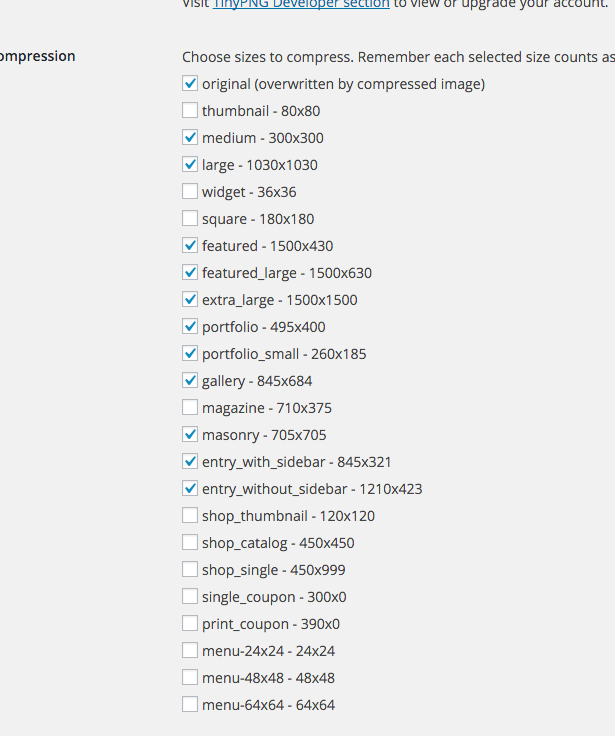
I mean to stop registering of a lot of the media sizes. We do not use most of them and I do not want to have to run optimization for so many..
Hi
I’ve got a Slider on the top of every page now. To simplify everything I’ve stripped out all CSS for the h2.avia-caption-title, except for this:
————————-
@media only screen and (max-width: 1024px) {
h2.avia-caption-title {
font-size: 40px!important;
}}
————————-
When reducing the browser width down from full screen, the Slider Caption scales fine at the first breakpoint (approx: 1000px), but on the second breakpoint (approx: 758px), the font size reduces too much.
This is where I need to add additional code to control this width and smaller to mobile.
Thanks
Hi,
Great, please let us know if you should need any more help on the topic.
Regards,
Rikard
Hi!
Try the following CSS:
.logo-text {
    font-size: 20px;
    font-weight: bold;
    top: -150px;
}
Adjust the font-size as you wish.
Cheers!
Jordan
Nice, i am following these steps. It is saying that i should Turn on Custom CSS Class field for all ALB Elements. I tryed to edit my Enfold Functions.php trying and put the following code add_theme_support(‘avia_template_builder_custom_css’);
Imediatly after I placed the code, the site stoped to work and to let me acess its administration painel.
I Was going to launch this site tomorrow. I need Help.
I was following this
Hi,
Great, glad you got it fixed. Please let us know if you should need any more help on the topic.
Regards,
Rikard
Hi – This is a follow up to the thread
https://kriesi.at/support/topic/any-way-for-site-visitors-to-download-audio-file/
I’d done this and it worked fine. But now on those old pages and any new attempts, the audio isn’t downloading anymore. Instead, it’s opening in a new tab (Chrome) with no download button. Before it used to automatically download onto my computer. Try this one as an example
[audio src="https://www.dominiquehurley.com/wp-content/uploads/2016/03/Spring-Equinox-Creative-Visualization.mp3" /]
Is there another easy way for a techy beginner to create a download link for visitor to download the audio I put on my site/
Thanks
Hi,
The full screen slider looks great on desktop but on mobile not so, can I:
1- Reduce the height?
2- Make the fonts larger?
Site
http://1c5.964.myftpupload.com
Hi,
I solved these problems by myself.
I tried the code again, it worked well. I used to add the new code to the end of line in Quick CSS area. I’ve put the code at the top in Quick CSS, and then the code worked perfectly.
.blog-author, .text-sep-cat, .blog-categories, .text-sep-comment {
display: none !important;
}
Hi I figured out that I can use plugins to display a new mobile menu so all I need to do is hide the block that normally would display. You can see the mobile menu here http://snag.gy/l4600.jpg along with the default menu section below. I want to hide that on mobile responsive only.
I tried using
.responsive #header_main .inner-container, .responsive .main_menu {display:none;}
But this hides it on desktop and mobile.
Hi Guys. My result message from my Mailchimp form is missing. Use to work perfect but stopped working today. I cant see the result message when the form submission is made. Please help!
-
This topic was modified 10 years ago by
 zedduo.
Merhabalar!
Please firstly go to Enfold theme options > Header > Mobile Menu and choose to display mobile menu on tablets – http://kriesi.at/documentation/enfold/wp-content/uploads/sites/2/2015/09/Screen-Shot-2015-09-28-at-16.00.59-997×1030.png
then please add following code to Quick CSS in Enfold theme options under General Styling tab
@media only screen and (max-width: 769px) {
.slideshow_caption {
    width: 70%;
}}
@media only screen and (max-width: 480px) {
.avia-caption-content p {
    margin: 0;
}
h2.avia-caption-title {
    margin-top: 0;
    margin: 0;
}
.avia-multi-slideshow-button.avia-slideshow-button {
display: none;
}}
This should fix the issue but buttons will be removed on mobile portrait mode, simply because there is not enough space :/
Best regards,
Yigit
Hi Pappasdg!
Please use the logo center menu below settings in Enfold options > Header > Header layout > Menu and Logo Position and the below css to achieve the look.
Adjust max width and margin right value to suit your needs.
NOTE: the below css works on default theme without any custom code please remove any styles applied earlier to see it in action. if you still have issue please create a temporary user with ‘administrator’ role and share in private content with permission to deactivate all plugins and add custom code if necessary to help you resolve this issue.
In the below code nth-child(X) should be half of the number of menus for example if you have 4 menus it should be 3 or if you have 6 menus it should be 3.
 /*centered menu*/
.av-main-nav li:nth-child(3) {
    margin-right:350px;
}

.av-logo-container {
 position:absolute;
}

#header_main_alternate {
    margin-top: -100px;
    z-index:9;
}
.logo {
z-index:9999!important;
max-width:200px;
}
Cheers!
Vinay Kashyap
no thats not what i need… my logo is on the left side and my menu on the right side. But i want to align my logo in the middle (vertical). At the moment the logo is to close at the end of the sreen. So in css i need a margin top:
`.logo { margin-top:20px;}’
This works… but not for the shrinked header. For the shrinked header the ‘margin-top’ is to much. Thats why i look for a solution to align the logo in the middle (vertical) of the skrinked and none skrinked header… Do you understand?
best
Chris