Hello I have found this post:
https://kriesi.at/support/topic/megamenu-submenu-just-as-titles-not-pages/
And I think this is that what I need. Can you please send me the solution?
Thanks
Wolfgang
Hi Vinay,
thank you for this tip, but it doesn´t solve the responsive problem. Font and line height are reduced now, but on my IPad, the text isn´t centered yet, there is still too much padding on the left
For the desktop version now the the font size is too small.
And there ist still the question, if it´s possible to fade out the text on hover (mouse rollover).
Any ideas?
kind regards
Ricarda
Hi,
Please try adding this code to the Quick CSS section under Enfold > General Styling or to your child themes style.css file:
#top #sub_menu1 {
	z-index:1!important
}
Best regards,
Vinay
Hello,
My website is having some trouble after the recent upgrade to WP4.5 I read the post here and followed all directions listed. Some of the issues I was experiencing were resolved, but I still have the following problems:
1. No images are visible in the Portfolio grids on my website (links below)
2. In Safari, the full-width easy sliders are not showing up other than on the homepage (these are placed at the top of each page, below the logo & menu. They display correctly in Chrome & Firefox).
Thanks in advance for your help!
Hello!
Any Idea? What can I do to fix only the logo and the menu button on top?
Please, I need the specific line of code, I couldn’t positioning this with previuos code.
Thanks Very much!
Hi,
Perhaps I should have mentioned I am using a child theme, so I have inserted the code in functions.php and style.css of the child theme. Is that ok too?
Yes, you can do that. Set the Menu and Logo Position to Logo center, menu below then add this in the Quick CSS field to align the logo to the left:
.html_header_top.html_logo_center .logo {
    left: 0;
    transform: none;
}
You have to remove the following code afterwards:
.html_header_top #top .av_menu_left .main_menu {
left: 20%;
}
Best regards,
Ismael
Hi,
Please copy the code directly from this forum, not from your email. If it’s still not working, remove the navigation with the following code in the QuicK CSS field:
#top .avia-post-nav {
    display: none;
}
Best regards,
Ismael
I tried placing a fullwidth submenu below the color section with the title “Our Services”. If I place it directly below the color section it appears at the top of the page underneath the fullscreen slider. However, if I add a whitespace element directly below the color section and then add the menu it appears kind of in the right place – but it overlaps the grid row element directly below it.
I just want to add a submenu below the Our Services color section that then scrolls to the grid elements below…
This seems to be a bug.
See login details in the private section below.
Thanks
That worked!
One more thing. On my old theme I was able to see the full height of the image that is featured for a product but the new enfold theme crops the photo into a square which cuts the products image. I have attached an image to describe what the problem is. The top section is the old website which shows the full length of the image and the bottom section is the new one which shows that it is cropped. I would like to have it show like the top section if possible.
View post on imgur.com
Hi I have several Masonry Galleries created that show fine on a desktop, laptop and tablet but they don’t show up on smart phones. Not sure why.
Any help would be appreciated.
Dear Support-Team,
first I want to thank you for this awesome theme. I love it.
With one of my projects I have some problems with the caption on images, it seems that this feature isn´t really responsive. On tablets and smaller screens, the text is cut off on the right side, it isn`t centered anymore and the font size is still the same as on the desktop version.
Can you help me and fix this problem?
Is it even possible to hide the text on hover and decrease the line space for the caption?
Kind regards
Ricarda
Hi,
I found a huge layout bug.
Please do the following:
1. Set main navigation layout to sidebar left as http://kriesi.at/themes/enfold-photography/
2. set blog layout to multi author.
3. set sidebars to off for all pages/archives/…
4. check the blog pages.
The multi-author layout is completely messed up in all possible widths, desktop and responsive modes. It has to do with the sidebar setting. When I choose to have a sidebar on the right it displays ok, but turning them off scrambles the layout. I also have this on a blank install.
It is easily fixed with keeping the sidebar right, setting the sidebar to display:none and adjust the width of the content to 100%, but it ain’t the right way of course.
Please provide an update or decent fix for this.
Thank you.
S
Hi there,
Following this fantastic solution you gave in to this request https://kriesi.at/support/topic/bug-elegant-blog-layout-category-pages-show-no-featured-image/ i am wondering how can i apply the same layout for the posts that get populated in the search results loop.
I have tried this https://kriesi.at/support/topic/adding-images-to-the-search-result/ but the outcome is much poorer than in your solution in the above request for the populated posts in categories and tags. The preferable blog layout is single-big.
Any suggestions?
thnx
Hey diantoine,
Please edit your page and check if you have an empty element on top of your content. If you do not. Please place 1/1 column element, update your page, then remove that 1/1 element and update once again.
Best regards,
Yigit
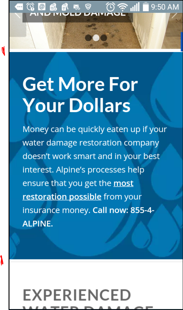
A white space displays above and below a color section on my phone. See Screenshot: https://snag.gy/7FGM1L.jpg
I marked the white spaces I am referencing with red lines on the screenshot.
I tried the following css, but it didn’t work:
div#water_getmore {
border-top: none!important;
border-bottom: none!important;
padding-top:0!important;
padding-bottom:0!important;}
The page with the problem is listed in private content
Hi,
Please try adding this code to the Quick CSS section under Enfold > General Styling or to your child themes style.css file:
#top .avia-font-entypo-fontello, body .avia-font-entypo-fontello, html body [data-av_iconfont='entypo-fontello']:before {
    font-family: 'entypo-fontello'!important;
}
Best regards,
Yigit
Hey afiqsyahmi69!
Vinnie replied you here – https://kriesi.at/support/topic/download-update-version-for-wordpress-4-5-2/#post-635886
Please do not create duplicated topics.
Regards,
Yigit
Hi,
Left a ticket a few days ago about making a widget area invisible on mobile.
I put the code below in quick css and now all widgetareas are invisible on mobile.
Is there a way to make only one particular widget area invisible?
I thougt I could work around this, but I really need to use other widgetareas.
Thanks!
Angela
@media only screen
and (min-device-width : 320px)
and (max-device-width : 767px)
{
.flex_column .widget:first-child, .content .widget:first-child {
padding-top: 0;
border-top: none;
display: none;
}
}
As an update to my previous post, previously the loading graphic would keep loading, but with the newer versions of Enfold when going back the loading icon now stops moving and the page stops doing anything, like this:
http://waltoncreative.com
I wonder if the problem might be something to do with the pre-loader graphic? I have another site using the same theme but not using the pre-loader and this site DOES go back perfectly well:
http://www.abbeyroadframing.co.uk
I am tempted to ditch the pre-loader perhaps?
Thanks for taking a look, my client is anal about the indicators, I know they will not like that solution. They have been looking at the site in other browsers and they like it that the first link has the indicator when you land on the page programs or about page. Is there somewhere in the js or css that the sub-menu is triggered on a scroll event?
I have taken the #target out of the main menu link for now (the links in the private section still work) but it would be great to have the sub-menu activate on page load instead of when you begin to scroll in firefox.
I tried a position fixed on the submenu container with css and that made the menu appear right away but the anchor position was off and the green header text is cut off for the content block. It looks like the anchor position is at the very top of the browser window frame not allowing/accounting the fixed header height till onscroll. Maybe I need a change in the fixed header css or js to look for it’s height on load? I’m guessing here :)
I’d like to find a solution because I think it looks better with the indicator, and it seems a shame to take it out for all the browsers just because firefox won’t load it correctly until you scroll.
Sorry to be a pain but I want to use this type of menu scenario again on other sites.
Hi. I want to have a header image (in logo area) but my image is not responsive anymore,
What i did.
1. website styling – logo area – bg image (image size: 1612×250) – top middle – fixed
2. header-layout = logo middle, menu beneath
3. css code for no logo (.logo {display: none};)
4. Website layout -measurements : 100%
It looks good on a 24″ screen but not on a small 13″ screen.
The header image is not responsive.
What did i do wrong?
THX Freek
Hi Rikard,
Thanks– that did the trick!
One other issue– at the top of the same page, there is a 4/5 section with 2 lines of text and big button that is not centered on tablets. The 1/5 section that appears above it is centered (it has the logo and social sharing element), and I aligned center the text and big button code, but they are a little to the left.
How can I fix that?
Screenshot is linked below.
Thank you so much for your help!
Hi,
Please change the code to following one
add_action('ava_after_main_container', function() {
if(is_search() || is_singular('product')) {
	?>
<div id="sub_menu1" class="av-submenu-container alternate_color  avia-builder-el-0  el_before_av_slideshow_full  avia-builder-el-first  container_wrap fullsize" style="z-index: 301; width: 1100px;">
<div class="container av-menu-mobile-disabled ">
<ul id="menu-2nd-menu" class="av-subnav-menu av-submenu-pos-center">
 	<li id="menu-item-1078" class="menu-item menu-item-type-post_type menu-item-object-page menu-item-top-level menu-item-top-level-1"><a href="http://harmony.naomialdort.com/guidance/events/"><span class="avia-bullet"></span><span class="avia-menu-text">Events</span><span class="avia-menu-fx"><span class="avia-arrow-wrap"><span class="avia-arrow"></span></span></span></a></li>
 	<li id="menu-item-43" class="menu-item menu-item-type-post_type menu-item-object-page menu-item-top-level menu-item-top-level-2"><a href="http://harmony.naomialdort.com/articles/"><span class="avia-bullet"></span><span class="avia-menu-text">Articles</span><span class="avia-menu-fx"><span class="avia-arrow-wrap"><span class="avia-arrow"></span></span></span></a></li>
 	<li id="menu-item-41" class="menu-item menu-item-type-post_type menu-item-object-page menu-item-top-level menu-item-top-level-3"><a href="http://harmony.naomialdort.com/videos/"><span class="avia-bullet"></span><span class="avia-menu-text">Videos</span><span class="avia-menu-fx"><span class="avia-arrow-wrap"><span class="avia-arrow"></span></span></span></a></li>
 	<li id="menu-item-39" class="menu-item menu-item-type-post_type menu-item-object-page menu-item-top-level menu-item-top-level-4"><a href="http://harmony.naomialdort.com/book/"><span class="avia-bullet"></span><span class="avia-menu-text">Book</span><span class="avia-menu-fx"><span class="avia-arrow-wrap"><span class="avia-arrow"></span></span></span></a></li>
 	<li id="menu-item-38" class="menu-item menu-item-type-post_type menu-item-object-page menu-item-top-level menu-item-top-level-5"><a href="http://harmony.naomialdort.com/biography/"><span class="avia-bullet"></span><span class="avia-menu-text">Biography</span><span class="avia-menu-fx"><span class="avia-arrow-wrap"><span class="avia-arrow"></span></span></span></a></li>
 	<li id="menu-item-944" class="menu-item menu-item-type-post_type menu-item-object-page menu-item-top-level menu-item-top-level-6"><a href="http://harmony.naomialdort.com/listen-now-mp3s/"><span class="avia-bullet"></span><span class="avia-menu-text">Listen Now MP3s</span><span class="avia-menu-fx"><span class="avia-arrow-wrap"><span class="avia-arrow"></span></span></span></a></li>
 	<li id="menu-item-943" class="menu-item menu-item-type-post_type menu-item-object-page menu-item-top-level menu-item-top-level-7"><a href="http://harmony.naomialdort.com/cdsdvds/"><span class="avia-bullet"></span><span class="avia-menu-text">CDs/DVDs</span><span class="avia-menu-fx"><span class="avia-arrow-wrap"><span class="avia-arrow"></span></span></span></a></li>
 	<li id="menu-item-36" class="menu-item menu-item-type-post_type menu-item-object-page menu-item-top-level menu-item-top-level-8"><a href="http://harmony.naomialdort.com/testimonials/"><span class="avia-bullet"></span><span class="avia-menu-text">Testimonials</span><span class="avia-menu-fx"><span class="avia-arrow-wrap"><span class="avia-arrow"></span></span></span></a></li>
 	<li id="menu-item-46" class="menu-item menu-item-type-custom menu-item-object-custom menu-item-top-level menu-item-top-level-9"><a href="http://naomialdort.com/discussion.html"><span class="avia-bullet"></span><span class="avia-menu-text">Forum</span><span class="avia-menu-fx"><span class="avia-arrow-wrap"><span class="avia-arrow"></span></span></span></a></li>
 	<li id="menu-item-792" class="menu-item menu-item-type-post_type menu-item-object-page menu-item-top-level menu-item-top-level-10"><a href="http://harmony.naomialdort.com/contact/"><span class="avia-bullet"></span><span class="avia-menu-text">Contact</span><span class="avia-menu-fx"><span class="avia-arrow-wrap"><span class="avia-arrow"></span></span></span></a></li>
</ul>
</div>
</div>
<?php
}
});
Best regards,
Yigit
Hey!
I could only reproduce the issue on your second link. However, since your content is on the top of your page and your visitors would go to that page firstly and would not use anchor link directly, i do not think that would be an issue.
Best regards,
Yigit
Hi Vinay,
I basically created all the other pages with a manual header using the builder and placed that on every page which worked fine until you look at it on a mobile and then the menu overlapped and wasn’t readable.
Does this make sense?
Ideally, I would like the header to look like this but have the theme menu function and mobile options:
is this possible?
if not then I just need the top bar with the google translate, phone number and email address followed by the menu bar an I would put the images below using the builder and then the page content.
Thanks
Dom
I was hoping that this would be a solution of something I am trying to accomplish.
Creating a row of 20 icons next to one another that would be able to resize with different screen sizes but still stay in one row, however it appears you cannot ‘click’ them / or make them clickable to go to a URL instead of popping up a lightbox. Can this be done?
I’m trying to rebuild my icon set (20 icons) below the header – I’m having a hard time as the framework is limited to 12 columns, and cannot figure out a good way to get this done so it says on desktop / ipad in one row / hide on mobile device
Hi, Josue,
don’t know what i do wrong, but after i added the snippet to the functions.php (at the top, middle, botom, whatever) – the browser shows internal 500 error.
Hi,
Issue was you added custom CSS class into the field as “.only-desktop” while it should be “only-desktop”. I fixed it. Please review your website now.
Best regards,
Yigit
Oh, I got it
#top #header.header_color.av_header_transparency .av-main-nav > li {
background-color: red;
}
it’s work for me