two pages in a portfolio website I’m currently building work just fine in desktop view
but all their page content completely disappear on mobile view
(links to those pages is in the Private Content)
I’m pretty sure I didn’t define any CSS (such as “@media only screen and (max-width…”) to cause this thing to happen and yet it happens
how come only those two have this issue?
most important – is there a way to find out whats causing this and fix it?
-
This topic was modified 9 years, 9 months ago by
 Doron.
Hi,
first of all I love Enfold and Thank you very much for all those great Updates!
I want to use a shortcode to add a product-slider into my 404 Page
I added this code into error404.php but it’s not working.
do_shortcode(“[av_productslider categories='142,85,158,173' columns='3' items='9' offset='0' sort='0' autoplay='yes' interval='5' custom_class='']“);
Can you help?
Thanks a lot
lilo
Hi Andy,
sry, but that’s not correct! It DOES work before with Shortcodes in Codeblocks, but no matter -> realcode also does not seem to work after the upgrade…
I did try the following code (very easy one):
(see private)
it just places two pictures of a Webcam into the Website, but it does not work. I used “body” as code wrapper element. And it just works fine previous versions…
Another point, seems to be the same story:
on the same page I use Icon Box and place a ShortCode into the TextBox of it:
[metar loc="EDDK"]
(hier klicken für Details)
It also stopped working after upgrade…
Thanks for a small thought on this.
No worries. thanks
any update on this ticket?
Hi,
Sorry for the delay. It is possible to force the mobile menu in tablet or other custom screen size. Please try adding this code to the Quick CSS section under Enfold > General Styling or to your child themes style.css file:
@media only screen and (max-width: 1024px) {
nav.main_menu {display:none !important;}
#advanced_menu_toggle, #advanced_menu_hide {
	display:block !important;
	top:20px;
	}
}
We would be glad to help you move the cart item to the end of the list, but at the moment there is no easy way to do this by using a small custom code snippet, instead try to move it to the bottom of the header. Please use the below css.
.html_header_sidebar #menu-item-shop.cart_dropdown {
    width: 225px!important;
    right: auto!important;
    left: 0!important;
    position: fixed!important;
}

#menu-item-shop.cart_dropdown {
    right: 0!important;
    top: auto!important;
    bottom: 0!important;
}
Best regards,
Vinay
I add this code to the css and it fixed the header issue but now the header is covering the top of each page
@media only screen and (max-width: 767px) {
.responsive #top #wrap_all #header {
position: fixed!important;
}}
Dear Support:
I’ve got the same problem outlined here: https://kriesi.at/support/topic/enfold-update-not-updating/
I would have continued the thread, but it has been closed to further replies; no solution was given.
When I go to the Enfold Child theme and look at “Theme Update” it says:
No Updates available. You are running the latest version! (3.5.3)
And when I click on check manually, it takes me to the multisite dashboard and tells me all themes are up to date.
What should I do to fix this? Please advise.
Thank you.
Tim
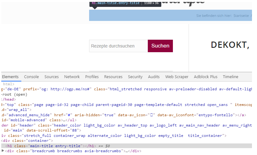
Hi, i have the same problem as described in this thread:
Link
when I check the option “Display only breadcrumbs”, the title is gone but it leaves an empty h1 behind.
Ismael stated:
Should be added on the next update.

Best regards,
Ismael
So when will this be fixed? As far as i kn ow it influences SEO
-
This topic was modified 9 years, 9 months ago by
 j0schi.
Hmmm.. no, still not working. The header widget is not showing at all now.
I have this code in my Quick CSS field. Would that have something to say? The clock/widget is located to the right side, just below the logo/menu section/border.
/* Header clock CSS */
#header .widget {
left: 91%;
padding-top: 0px;
position: absolute;
top: 80%;
padding-bottom: 0px;
z-index: 1;
}
-
This reply was modified 9 years, 9 months ago by
 Dbertelsen.
Hi, I’m using the post-slider at the foot of my blogs. I only have three blogs published at the moment (brand new site) and so I’ve set the columns/blogs to display to two so that it’ll show the other two blogs at the foot of the post, but it’s re-showing the icon of the blog that’s just been read. How do I set it so the blog they’ve just read doesn’t show up in the post slider? Thanks.
Hello, it looks like you gave this other poster on this thread plenty of assistance. Again, I was initially asking how to begin the full-width instagram section.
Here is the post which received tons of support before: https://kriesi.at/support/topic/instagram-widget-no-space-on-sides/
First off, I want to do as many have done and thank you for a beautiful product! I’ve used it many many times.
Even though it looks great on my desktop, on all browsers, I’m having some issues with the site on my iPad.
1. The full width easy slider images (I have only one image per slider) are not showing up at all on my iPad.
2. The gallery images are also not showing up properly, though they are ghosted out and smaller than they should be.
3. I have a PNG logo in a sign-up box at the top of the page, that is also not showing up at all on the iPad.
I’ve been searching through the threads and can’t find anyone who’s having the same problem as I am. Can you help? Is there some quick CSS I can add? Thanks so much!
Sarah
For some reason all of my interior pages are displaying a large white space right below the header on mobile. I have tried using .responsive #top #main .container_wrap:first-child {display:none} which works but since it is a global change it also hides the advanced layer slider on my home page which I need to be visible on the mobile. Any help is greatly appreciated.
Hi :)
This is what the new author page should look like. This one is just a handmade Enfold-page. Via htaccess I redirect visitors to this author pages.

This is the author.php I am coding. I would like the glassy header on top it.

-
This reply was modified 9 years, 9 months ago by
 aadwagner.
Hi Andy,
Thanks for your reply, unfortunately I haven’t come across a site with this ‘look’.
Hmm, it appears that a colleague was able to help the person with a very similar query (the one I linked to), however because I have 2 sliders (one for mobiles devices and one for desktops) I was confused as to where to put the custom CSS class. Perhaps if you can tell me where to put that, I might be able to figure the rest out. Even though I’m not ‘au fait’ with CSS, I have managed to muddle through with searching for snippets through the forum.
To clarify what I’d like the accordion slider to do:-
– instead of the black/grey overlay being the full height of the slider, but only part of the width, I’d like it to be around 30% of the height but full width
– instead of the caption showing all the time, I’d like it to appear on mouse hover, to the right of the title (this part is exactly the same as the post I linked to initially).
Can you assist me?
Hi,
thanks for the links.
Try this code inside of Quick CSS field:
.grid-sort-container.isotope.no_margin-container.with-title-container.grid-total-odd.grid-col-4.grid-links-.isotope_activated {
left: 15%;
}
and for second page:
.grid-sort-container.isotope.no_margin-container.with-title-container.grid-total-even.grid-col-4.grid-links-.isotope_activated {
left: 25%;
}
adjust as needed.
Best regards,
Andy
/Users/Kevin/Desktop/Bildschirmfoto 2016-06-27 um 15.07.29.png
Hi,
use this code:
#top #wrap_all .av_header_transparency .main_menu ul:first-child > li > a:hover {
color: red;
}
Best regards,
Andy
Hello,
I have two very similar WP-sites with Enfold.
After one of the recent Enfold updates the 1st site has HTML
<div id="main" class="all_colors" data-scroll-offset="116">
and the 2nd site has only
<div id="main" data-scroll-offset="116">
The class=”all_colors” is missing on the 2nd site!
Because of this missing class the CSS-Settings from Enfold Child Theme Options->Advanced Styling are not working anymore on the 2nd site. All that H1-H5 stuff is now wrong on the 2nd site.
How can the class=”all_colors” be added to div id=”main” of the 2nd site ?
Both sites use WP 4.5.3 and Enfold 3.6.1.
I saw your colleague Vinay added this class on the June 10, 2016 at 4:32 pm: https://kriesi.at/support/topic/enfold-whats-changed/ to an Enfold-Update. So the question goes presumably to Vinay.
Regards
Adele
Hi,
Firstly, Enfold is quite the most remarkable, adaptable and elegant theme I’ve come across – I’m blown away by how wonderful it is and the support given; so thank you!
Anyway, I’ve been trawling the forum to see if I can find a solution to my requirement but I need to get you guys involved now! I am using an accordion slider (well actually 2 as I wanted to format the accordion differently for mobiles) on a front page and would like the desktop version to have the title at the bottom of the screen with the overlay background of around 30% height but the full width of the slider. I’d also like the caption to appear like this post https://kriesi.at/support/topic/accordion-slider-responsive-excerpt-position/, ie. the caption to appear to the right of the title but only on mouse hover.
For the mobile slider, I’d like the title to be vertical but the caption to appear to the right on mouse hover.
Crikey, does this make sense??
Hello there,
I’m referring to https://kriesi.at/support/topic/fixed-menu-on-mobile/ (closed)
.responsive #top #header {
position: fixed !important;
}
After choosing an #anchor link for a position on the same page,
the mobile-toggle menu vanishes BUT keeps staying on the page,
so that the page itself becomes wider (scrollbars appear)
and you can scroll sidewards where you can see the expanded mobile-menu in the upper right corner.
Do you have an idea how to toggle the menu completely after choosing an #anchor link ?
Kind regards
Hi,
Thank you, I will create different tickets from now on.
However you don’t seem to be reading my posts carefully enough as I have mentioned 2 times already this is not what I need. So please read my post carefully enough to provide an answer to the question I asked.
I DO NOT want the header to be invisible until the user scrolls down. I think I have mentioned this clearly enough on two occasions already and you keep pointing me in this direction.
I want to remove the sticky footer functionality and and have a static header on that specific page. What you are providing as a solution is a whole different thing.
So please read my original post carefully, and my previous post as well if you find it necessary and give the answer to the question I asked.
Many of your colleagues are providing answers to questions much more complex than what I am asking with repeated replies and adjustments to make sure the topic is resolved.
I had 3 questions in relation to the same item. You provided an answer to one (which I should add did not work).
Again could you please read my posts carefully enough to provide answers at least to the first 2 questions if you consider the 3rd one so complex to require a freelance developer.
Many thanks,
Flavius
Hi,
Please try adding this code to the Quick CSS section under Enfold > General Styling or to your child themes style.css file:
@media only screen and (max-width: 480px) {
#top .avia-slideshow-button { display: none !important;
}}
Best regards,
Yigit
Hello,
I’m using Enfold and I’m very happy with it, but:
1) I want that the sale badge is in the top right of the product image. Maybe a little overlaying the border of the image.
In the default setting, it is next to the price (grid view). How can I move it (best with CSS)?
2) In the single product view it should be the same….. now it is at the top right of the single product page.
3) Further it should be forced to be a circle.
Thanks in advance.
Jan
Hi Andy,
I’ve used the same ticket since all questions are related and concern the same page item, the header. Thought it would be better for you guys as well instead of 3 tickets to have just 1 :) But sure, I’ll use different ones from now on.
In relation to your reply, unfortunately the solution you proposed to the question “Is it possible to deactivate the sticky header on this page alone?” is not available in the Header visibility and transparency drop down of the page.
My question is if it’s possible to deactivate the sticky header and keep the header as it appears until you start scrolling so having a fixed header with no change when scrolling. Is there a way to do this for a single page and not for the whole site?
In relation to the second question “is it possible to deactivate the top bar containing the secondary menu on this page alone?” I was hoping you would provide the code to do that as well…? I’m not a developer, I’m sure it’s possible and it would be much appreciated if you could provide a solution to this issue as well.
Many thanks,
Flavius
Hi Andreas,
Please try the following in Quick CSS under Enfold–>General Styling:
#menu-item-3051 span.avia-menu-text:after {
    content: "4";
    font-size: 9px;
    color: #FFF;
    background: #42A0BD;
    line-height: 17px;
    width: 17px;
    display: inline-block;
    text-align: center;
    border-radius: 100px;
    position: relative;
    top: -9px;
    left: 2px;
}
Regards,
Rikard
Hi,
I put that in custom.css
That doesn’t fix the problem though. social icons or phone info still does not show up in top bar on home page (iPhone +Chrome)
(iPhone + Safari) social icons also do not show up BUT very strangely I can see phone# “010 2797 800” even though full text from the field is supposed to be “Tilaa työvuoroja Puh: 010 2797 800 (joka päivä klo 6-24)”.
BR,
Teemu
Hi,
Displaying background images the same on all types of screens is more or less impossible unfortunately due to the different dimensions of screens, one option you could try would be to create a second section which will only show for mobile devices, and use an image better adapted to small screens. You can then use CSS like this to hide/show the correct section, remember to give you sections unique ID’s in the element option and replace the names after the hash sign in the code:
@media only screen and (max-width: 767px) {
#desktop-section {
display:none !important;
}
}

@media only screen and (min-width: 768px) {
#mobile-section {
display:none !important;
}
}
Best regards,
Rikard