Hi Jiri,
Great, glad you found the problem. Please let us know if you should need any further help on the topic.
Thanks,
Rikard
Hi, sorry, you are right. I had changed the 2nd link to Scroll in my testing and forgot to change it back. It is now set to Parallax so you can see the differences.
The link you provided looks great on laptop and on iPad Air, but not on iPhone 6 portrait — the image is not responsive and her head gest cut off. But is that a color section or a layer slider?
At this point, I would ask that you test this on your own in order to fix your bug. I am going to sacrifice the Parallax effect on my pages for now so I can get back to work.
Thank you Ismael, unfortunately that code I have for the second slider (labeled below ‘Cohort I….’) is overriding the landing home page’s CSS (labeled ‘Home…’)
/******************
Home page-title, caption, and slider size when minimized
****************/
@media only screen and (max-width: 425px) {
.avia-slideshow-inner, .avia-slideshow-inner img {
height: 200px !important;
}
}
@media only screen and (max-width: 886px) {
.avia-caption-content {
font-size: 11px !important;
}
.responsive #top .slideshow_caption h2 {
font-size: 17px !important;
}
}
/******************
Cohort I page-title, caption, and slider size when minimized
****************/
@media only screen and (max-width: 886px) {
.page-id-861 .avia-caption-content {
font-size: 11px !important;
}
.page-id-861 .responsive #top .slideshow_caption h2 {
font-size: 17px !important;
}
}
@media only screen and (max-width: 425px) {
.page-id-861 .avia-slideshow-inner, .avia-slideshow-inner img {
height: 100px !important;
}
}e is overriding the Landing home page’s css for the slider. This is what I have however the second code for
When I add new pages they are automatically added to the top menu (which is ok). How do I order the menu items the way that I want to?
I have purchased a game that I would like to integrate into my website. The game launches from a static html page which calls lots of separate javascripts and css. A click on that page calls a php page which handles a bunch of session variables. It would be awesome to integrate both of these into my enfold theme, especially so that I don’t lose the top header/menu.
I have seen this post on options on how to do this, not specific to Enfold:
http://stackoverflow.com/questions/2810124/how-to-add-a-php-page-to-wordpress
Considering I want to include the top header/menu – I suppose I need to create a new template and go from there. What documentation and best-practices should I follow with enfold?
Thanks,
Edward
Ditto! From top to bottom, I’m having the same problem. DiscoverLink you are officially not going crazy. : )
My parallax color section backgrounds are responsive on some pages, not on others.
Site is sandboxed and secret, but I’ll provide admin access in private content so you can take a look.
http://solace2.wpengine.com/industries/energy (hosted on WPengine) — backgrounds not responsive
http://solace2.wpengine.com/industries/gaming — backgrounds, with same settings, are not responsive
Hi Yigit,
Neither of the links you include address the second problem that foggygolf was having, and that I am trying to address too. Specifically: “Also when you drag the screen smaller this same block / nav text slides on top of the logo, how do i make this so the page switches to “mobile view” just before the text overlaps (if that makes sense).”
In my own words, on my Macbook Pro desktop, when I drag the screen smaller and smaller, the menu items begin to overlap with my transparent logo, and the mobile menu doesn’t appear until the menu items run out of space on the entire screen…not when it begins to overlap with my logo.
Can you please provide a solution…much thanks!
Hi,
I have 3 videos in the same page, want they autoplay at the same time. Looks like one of them stops as soon as the page load and one of the videos begins to play.
The video that stops is on the middle of the page (close to light generation).
Any way to allow it playing?
Thanks
Hi Yigit,
I have had some progress between your css and adjusting the background image position to Top Left instead of Center.
Your css works for the images being cut in half vertically on a tablet. At 100% though, they were just left with heads and no torso, so I changed it to 80% and it looks better.
I know ENFOLD has been around for awhile, but shouldn’t this all be done with media queries?
The picture size is dictated by how much text and how big the screen size is. It would be great if everything could adapt as a whole and be truly responsive.
Thanks for your help.
Kind regards,
Tamara
Hey Yigit,
yes, this was awesome form Guenni! I’m fine here, thanks :)
Could you please take a final look at my other problem in the other thread, please? I would very much appreciate it!!
Thank you,
Jan
Hi,
i found a solution for this problem.
$('.main_menu ul li ul li a').on('touchend', function() {
  $(this).parents('ul.sub-menu').delay(1000).animate({opacity: 0,},300,function() {$(this).css('visibility', 'hidden');})
});
The submenu is closing properly on touch devices like iPad (window width > 767) on my page:
https://www.secure-data-space.com/en/product/features/
The problem is, that the highlighted menu item is not right, it shows always the previous menue item.
On desktop computers everything is fine.
Can anyone help me?
Thanks, TJ
Hi,
I was wondering if anyone can help. I have been doing some updates to my site however if I clear the browsing history, a different version of the site is loaded where everything is a bit squashed up until I hit refresh and then the up to date page is shown.
This is what you see when you first load the site
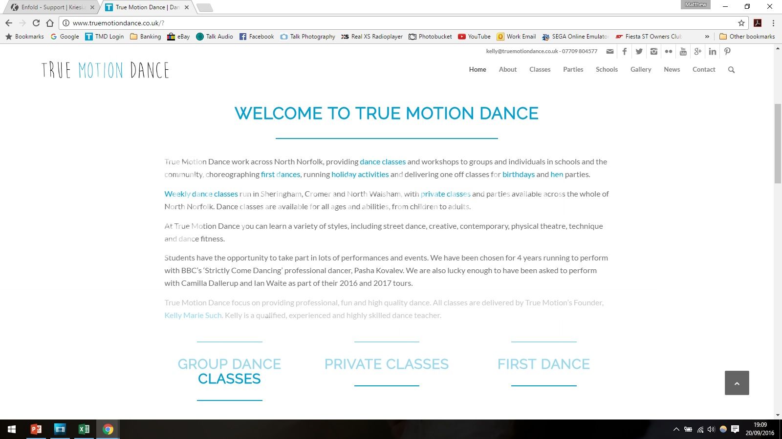
And this is what it is supposed to be like after I have refreshed
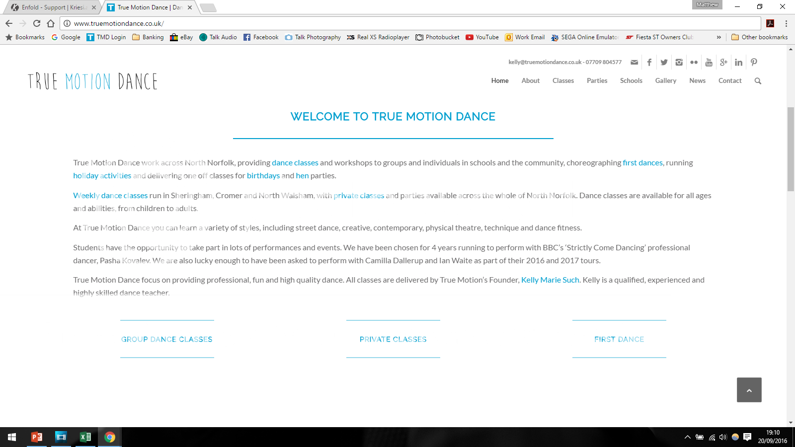
My concern is that any new visitors would see this older version and not the new one.
Is there anything I can do to stop this happening?
Thanks
Matt
Hi, I updated the theme to 3.8 and the google map widget stopped working on my Contact Us page.
It initially loads for a second but then is replaced with this error message.
Oops! Something went wrong.
This page didn’t load Google Maps correctly. See the JavaScript console for technical details.
Hi!
Please add following code to Quick CSS as well
#mobile-advanced span.menu-break,#mobile-advanced span.menu-top-adjust {
    bottom: 0;
}
Cheers!
Yigit
#top .av-magazine-top-bar {
    border-bottom: medium none;
    float: left;
    width: 30%;
}

.av-magazine-sort {
    float: left;
}

#top .av-sort-by-term a {
    display: block;
    float: none;
}

#top .av-magazine-group {
    clear: none;
    display: block;
    float: left;
    width: 70%;
}

#top .all_sort_button.active_sort {
    display: block;
    float: none;
}

.text-sep {
    display: none;
}

.av-magazine-group.av-hidden-mag {
    clear: none;
    float: left !important;
}
and looks this way:

-
This reply was modified 9 years, 7 months ago by
 Guenni007.
You are the best. Thank you so much. Is there any way to display the menu probably on mobile/in the Hamburger menu?
The two lines are superimposed on each other. Is there a way to have the links in two lines like on laptop version?
Hey!
Based on the topics and the suggestions shared, that is how it can be done.
https://kriesi.at/support/topic/open-form-in-a-lightbox-popup/#post-378103
Josue is explaining exactly what you need to do.
Yes it is not a big deal that is why he took the time to create the guide.
I am sorry but we do not login to make customizations. I udnerstand your client might need it, we offer the support
as per our guidelines and if you need any further assistance or does not manage to do it, you need to hire a freelancer who will be able to help you further.
Thanks a lot for your understanding
Regards,
Basilis
Hi,
Have you considered using Toggles and Tabs at the same time? you could hide them respectively with CSS:
@media only screen and (min-width: 767px) {
	.only-mobile{
		display: none
	}
	.only-desktop{
		display: block;
	}
}
.only-mobile{
	display: block;
}
.only-desktop{
	display: none;
}
Best regards,
Josue
Hey pinkabbestia,
Please try adding this code to the Quick CSS section under Enfold > General Styling or to your child themes style.css file:
#top #wrap_all .av_header_transparency .main_menu ul:first-child > li.current-menu-item > a > .avia-menu-text {
    color: green;
}
Please make sure that > sign is not converted to – http://i.imgur.com/IDXRZQ3.png in Quick CSS field.
Best regards,
Yigit
Hi cpdcngo!
Please add following code to Quick CSS in Enfold theme options under General Styling tab
.title_container .breadcrumb {
    right: auto;
    top: 80%;
}
Best regards,
Yigit
I made a test page: http://elmoallen.name/test/sample-page/
The problem actually occurs only if I use the Short Separator style. That style removes the float: left from the Separator, after which it stops using the top margin. I don’t think that’s the intended behaviour, as if it were, the coder would have removed the top margin instead, I think.
Ok, thanks a lot, we are almost there. It looks perfect on mobile, but still in desktop mode I have centered copyright but I still have footer menu on the right…as you can see in http://www.simonasantaera.it
This is the whole code I used till now
@media only screen and (max-width: 767px){
.responsive #socket .sub_menu_socket {
display: block !important;
}}
#socket .copyright {
width: 100%;
text-align: center;
}
Any other suggestions to stick the footer menu at the center also in desktop mode?
this is follow up to – https://kriesi.at/support/topic/display-footer-on-one-screen-with-full-height-background-section/
I only today noticed, that applied fixes doesnt fix the issue in Firefox. in firefox it still stays the same.
Hi!
Please add following code to Quick CSS in Enfold theme options under General Styling tab
#top .av-logo-container .social_bookmarks li {
    margin-right: 5px;
}

#top .av-logo-container .social_bookmarks li a {
    font-size: 20px;
}
If you have any other questions or issues, please start a new thread.
Cheers!
Yigit
I have never started a topic before, how do I go about this?
Hi!
@Basilis said issue is related to iOS 10 and not the theme itself. Still waiting to hear from rest of the team.
No actually, that is not the case. We have the manpower to handle the requests but WordPress update, changes on Google maps and Enfold update had us this busy. Unfortunately there are many different topics about the same questions :) We are working on that though. We should get back to our usual pace very soon :)
Best regards,
Yigit
Hey Andy,
yes its working as I’ve set it to the numeric option on the permalinks settings page. but if you just change the settings to post name it stops working. also i realised if you set it to the plain option the whole arabic site disappears for some reason, i click on arabic and i get a 404 error.
Hi!
Please add following code to Quick CSS in Enfold theme options under General Styling tab
.logo img {
    max-width: 70%;
}
Then increase the value in the code i posted for you here – https://kriesi.at/support/topic/logo-centered-in-the-header/#post-688676
Best regards,
Yigit