-
AuthorSearch Results
-
September 29, 2025 at 1:40 pm #1489644
In reply to: .scroll-down-link
ok then i misunderstood your aim.
you like to change these icons here:
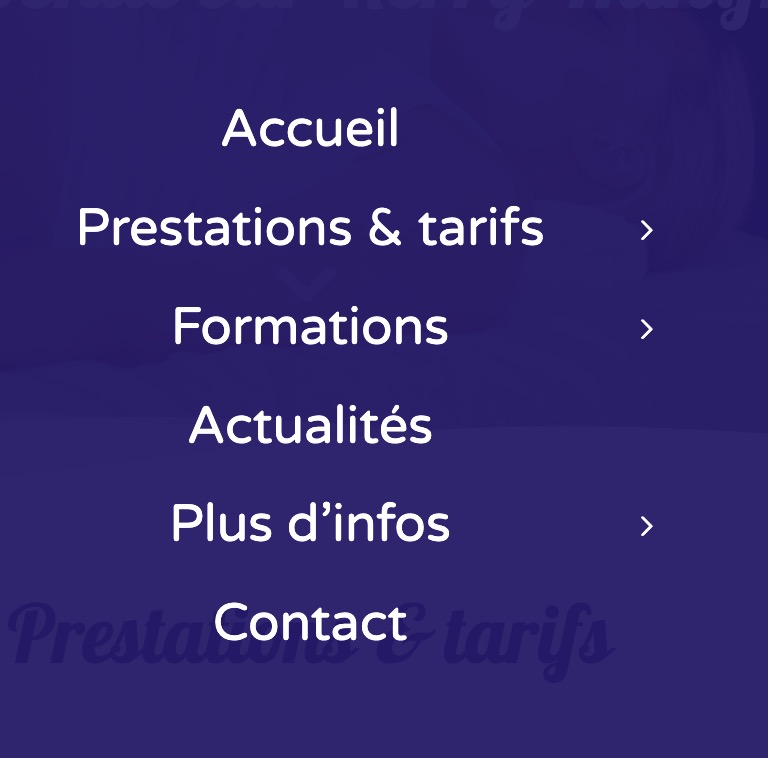
these are font-icons and could be replaced by css
(inside your quick css):.html_av-submenu-hidden #top .av-submenu-indicator::before { content: "\E875"; font-family: 'entypo-fontello'; font-size: 24px; }September 29, 2025 at 1:08 pm #1489643In reply to: .scroll-down-link
Hello dear support,
I would like to contact you today because I need your help to change certain icons on my site that do not have a menu allowing me to do so to try to homogenize them to make everything cleaner.
I previously asked Guenni007 for help changing my scroll icon to the next section on sliders by the icon on the scroll button at the top of the site and I would need you to do the same manipulation on the main menu icons in the burger menu to replace them with this same icon that I told you about.
Please contact me if you have a solution.
September 29, 2025 at 6:56 am #1489637In reply to: anchor links and section animation
Hey Diana,
Thank you for the inquiry.
We tried logging in, but the credentials above are incorrect. Please try adding this script to the functions.php file to adjust the scroll position on hash change.
add_action('wp_footer', function () {
    ?>
    <script>
      window.addEventListener('hashchange', function () {
        setTimeout(function () {
          const hash = window.location.hash;
          if (!hash) return;

          const target = document.querySelector(hash);
          if (!target) return;

          const elementPosition = target.getBoundingClientRect().top + window.pageYOffset;
          const offset = 100;

          window.scrollTo({
            top: elementPosition - offset,
            behavior: 'smooth'
          });
        }, 300);
      });
    </script>
    <?php
, 9999);
Best regards,
IsmaelSeptember 29, 2025 at 6:15 am #1489633In reply to: Multiple shop pages
Hi,
Thank you for the update.
Looks like you have successfully removed the category from the sidebar filter. For the banner, you can duplicate the ava_custom_add_shipping_text_script function in your functions.php file and customize it for each category as needed.
function ava_custom_add_shipping_text_script_category() {
    if ( is_product_category( array( 'apparel', 'bong' ) ) ) {
        ?>
        <script>
            (function ($) {
                $(document).ready(function () {
                    var newContainer = $('<div class="av-custom-shipping-container"><p>Free Shipping (USA) - Orders $35+<br><p><font size="6px">International Shipping Available - All Pieces Dab Compatible</font></p></div>');
                    $('#av_product_description .container').after(newContainer);
                });
            }(jQuery));
        </script>
        <?php
    }
}
add_action('wp_footer', 'ava_custom_add_shipping_text_script_category', 99);
If you have any additional questions at this time we kindly ask that you open them up in a separate thread. The longer threads get in the forum, they become more difficult to support as they tend to drift off topic and they also make it troublesome for users trying to search for solutions. Keeping threads relevant to their original inquiry ensures that we can keep better track of what has been resolved and that users can more effectively find answers to similar issues they might be experiencing.
Thanks!
Best regards,
IsmaelSeptember 29, 2025 at 6:04 am #1489632In reply to: To purchase support
Hey Gregory Beylerian,
Please continue here: https://kriesi.at/support/topic/to-purchase-support/
Best regards,
IsmaelSeptember 28, 2025 at 5:32 pm #1489623In reply to: Blog showing a category that it shouldn’t be
Hi,
The Read More tag will only work in the WP editor, not in the ALB, the ALB was intended for pages.
To add a slider to the top of a WP editor post, in the Block Editor, click on the “Classic” block above your post:

then click on the Shortcode Wand Tool to show the elements and choose the slider:

you will be prompted with the element builder, when you save you will see the shortcode:

Then save the post, on the frontend the slider will show below the featured image:

and on the blog page with the Blog Posts element:

Best regards,
MikeSeptember 28, 2025 at 4:43 pm #1489622In reply to: License Key
Hi Rikard,
Which link do you mean?
OR
I’ve read them.
Can you please give me advise with regard to changing texts on the buttons?
See: September 27, 2025 at 2:37 pm
Thanks in advance.Regards,
EricSeptember 28, 2025 at 8:50 am #1489617In reply to: Table Font in lower case
Hi Rikard,
thank you, it works fine, we can close the topicBest regards
ManfredSeptember 27, 2025 at 10:58 am #1489612In reply to: Table Font in lower case
Hi,
Thanks for the update. Please let us know if you should need any further help on the topic, or if we can close it.
Best regards,
RikardSeptember 27, 2025 at 3:38 am #1489608In reply to: Multiple shop pages
This removes the products from the shop list… but not from the categories:
I would want to remove the category from just the main shop page. I can use a page number identifier and remove it with CSS right?
It also makes the SHOP page… 2 pages… instead of just one. Which isn’t ideal, I would prefer that people keep scrolling, rather than have to press next page
-Also, what about my other question from above? Regarding a different banner for each shop page?
-Also, another question, is there a way to control which categories Start out Open… vs Closed on the Shop pages?
Like on the Main Shop Page… I want to Give people the option to search by Liquor Type. I don’t want the subcategories below it (like tequila, vodka, etc) to show up automatically, I’d like it to remain closed until a visitor clicks it?Another weird thing, when I add in the Spirits Category, the system for whatever reason pushes it to the top:
Even though alphabetically it should be below. I have no idea why thats happening
September 27, 2025 at 2:23 am #1489607In reply to: Blog showing a category that it shouldn’t be
Ok that worked for that site wherein the blog posts are in the default not advanced building mode. My question however is how do Iget this to work and have the posts show everything till a read more link when the posts are in the advanced editor.
On this page:
I have the same post twice, the one made with the default editor does what I need but the advanced one shows an excerpt and ignores the read more link I need the image to appear on the blog page as well as the individual post page. While I could just use the default editor in many cases I need to put a slider or other element on the post page showing several images but when I do that it ignores the layout and just goes a text excerpt whether that slider would be at the top or not.
Can the blog page display the posts to a read more break when using the advanced editor?
September 26, 2025 at 10:56 am #1489594In reply to: Layerslider text box right margin
Thanks Ismael that’s great. There are a couple of places next to where there are submenu items that show the page through the menu in mobile mode. Any idea how to stop this?
ThanksSeptember 26, 2025 at 10:01 am #1489593Hi Rikard,
Sorry for my late reply. I found this article in the knowledgebase from Plesk: https://www.plesk.com/kb/support/paid-theme-plugin-can-not-be-updated-in-wp-toolkit-in-plesk-error-no-themes-updated/.
Currently, WP Toolkit can update only non-paid plugins and themes. Paid themes and plugins should be updated manually directly in the WordPress Admin dashboard.
So the problem is related to WordPress Toolkit. You can close this topic.
Regards,
BerndSeptember 26, 2025 at 6:07 am #1489584In reply to: Google maps height
Hey Antonio,
Thank you for the inquiry.
You can try setting the map’s height for different screen sizes using css media queries.
Example:
@media only screen and (max-width: 1366px) {

  /* Add your Mobile Styles here */
  #top .av-2x5yv-2e4c878dbdd4546c1985e0573793e047 .av_gmaps_sc_main_wrap .avia-google-map-container {
    height: 700px !important;
  }
}

@media only screen and (max-width: 989px) {

  /* Add your Mobile Styles here */
  #top .av-2x5yv-2e4c878dbdd4546c1985e0573793e047 .av_gmaps_sc_main_wrap .avia-google-map-container {
    height: 655px !important;
  }
}

@media only screen and (max-width: 480px) {

  /* Add your Mobile Styles here */
  #top .av-2x5yv-2e4c878dbdd4546c1985e0573793e047 .av_gmaps_sc_main_wrap .avia-google-map-container {
    height: 455px !important;
  }
}
Best regards,
IsmaelSeptember 26, 2025 at 5:55 am #1489583In reply to: Staging Site Not Responsive on Child Theme
Hi,
We are only able to reproduce this issue when the screen width is around 782px, which is not a standard resolution for mobile devices, so it’s not something to be overly concerned about. If you’d still like to address it, consider reducing the font size of the button, then set the max-width to 100%.
@media only screen and (max-width: 989px) {
  .responsive #top #custom_html-2 button {
    font-size: 13px;
    word-break: keep-all;
    max-width: 100%;
    text-align: center;
  }
}
Best regards,
IsmaelSeptember 25, 2025 at 12:22 pm #1489568In reply to: Staging Site Not Responsive on Child Theme
Please see this screenshot showing the issues.
https://postimg.cc/8sbtZx7HIf you are testing on a desktop, please slowly shrink the column size. You will see the issue revealed as you approach mobile view (where the sidebar is no longer displayed). Also, please test on a tablet.
Can you please check all screen sizes and please help me fix this?
Thank you.-
This reply was modified 6 months, 4 weeks ago by
classywebsites.
-
This reply was modified 6 months, 4 weeks ago by
-
This reply was modified 6 months, 4 weeks ago by
September 25, 2025 at 9:37 am #1489559In reply to: .scroll-down-link
or the arrow thought even more demanding ;)
:root {
  --burger-main-icon-width: 40px; /* === adjust to your needs === */
}

@media only screen and (max-width:1150px) {
  .av-hamburger {display: none}

  #header #avia-menu li.av-burger-menu-main.menu-item-avia-special,
  #top #wrap_all #header .av-small-burger-icon a:before{
    width: var(--burger-main-icon-width);
  }

  #top #wrap_all #header .av-small-burger-icon a {
    display: flex;
    justify-content: center;
    align-content: center;
    align-items: center;
  }

  #top #wrap_all #header .av-small-burger-icon a:before {
    content: "\e873";
    font-family: "entypo-fontello";
    font-size: var(--burger-main-icon-width);
    color: var(--enfold-main-color-primary);
    text-align: center;
  }

  .av-burger-overlay-active #top #wrap_all #header .av-small-burger-icon a:before{
    font-size: calc(1.5 * var(--burger-main-icon-width));  /* === only if you like it === */
    color: #FFF;
    content: "\e877 \A \e873";
    line-height: 0.35em;
    animation: avia_fade_move_down 2s ease-in-out infinite;
  }
}
September 25, 2025 at 6:33 am #1489553In reply to: Mega menu sub menu column width (solved)
Hey koomo,
Thank you for the inquiry.
Try to add this css code to adjust the width of the mega menu container under the Destinations menu item:
@media only screen and (min-width: 768px) {
  /* Add your Desktop Styles here */
  #top #wrap_all #menu-item-35451 .avia_mega_div > .sub-menu {
      width: 750px !important;
  }

  #top #wrap_all #menu-item-35451 .avia_mega_div {
      width: 750px !important;
      overflow: visible;
      max-width: 750px !important;
  }

  #top #wrap_all #menu-item-35451 .avia_mega_div > .sub-menu > li {
      width: 250px;
  }
}
Best regards,
IsmaelSeptember 25, 2025 at 6:17 am #1489551In reply to: Layerslider text box right margin
Hi,
Add this css code to adjust the background color on smaller screens:
@media only screen and (max-width: 989px) {

  /* Add your Mobile Styles here */
  .responsive #top .av-submenu-container {
    position: absolute !important;
    background-color: #4f5b33a3;
  }

  .responsive #top .socket_color .mobile_menu_toggle {
    color: #ffffff;
    background: transparent;
    border: 0;
  }

  .responsive #top .socket_color .mobile_menu_toggle:hover {
    color: #f3ab29;
  }
}
Best regards,
IsmaelSeptember 25, 2025 at 6:02 am #1489548In reply to: color section arrow not working
Hi,
Thank you for the update.
You can try setting the png image as the background of the scroll-down link:
#top .scroll-down-link.avia-svg-icon {
    background-image: url('image.png');
}

#top .scroll-down-link.avia-svg-icon svg {
    display: none;
}
Let us know if you need more info.
Best regards,
IsmaelSeptember 24, 2025 at 3:12 pm #1489528In reply to: .scroll-down-link
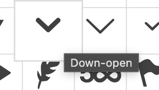
this burger menu is not a font icon or a svg icon. These are simple containers with a given width and height.
The top and the bottom lines are pseudo-containers (before and after).try in quick css: see next post for better solution ;)
September 24, 2025 at 11:45 am #1489523Topic: Portfolio Grid Pagination goes to top of page
in forum Enfolddondela
ParticipantDear support,
i tried this solution to avoid the scroll to top, when clicking the next page button. But it does not work. Is there any other solution which works?
Thanks and Regards//avoid scroll to top when clickin next page function add_custom_script(){ ?> <script type="text/javascript"> (function($){ function b(id) { $('.pagination .inactive').click(function(e) { e.preventDefault(); var section = $(id), link = $(this).attr('href'), anchor = $(section ).attr('id'); if(!section.length) return; var link = link + '#' + anchor; window.location.href = link; }); } $(document).ready( function() { b('#referenzen'); }); })(jQuery); </script> <?php } add_action('wp_footer', 'add_custom_script');September 24, 2025 at 10:26 am #1489520In reply to: webp images not opening in lightbox
on my installation it works without any problem – if you use the webp images from media-library!
https://webers-testseite.de/webp-lightbox/or: next suggestion – you are using a plugin that replaces jpgs by webp images ( f.e. from shortpixel – automatic calculation of jpgs to webp- and replacement in DOM )
As mentioned above
var defaults = { groups : ['.avia-slideshow', '.avia-gallery', '.av-horizontal-gallery', '.av-instagram-pics', '.portfolio-preview-image', '.portfolio-preview-content', '.isotope', '.post-entry', '.sidebar', '#main', '.main_menu', '.woocommerce-product-gallery'], autolinkElements : 'a.lightbox, a[rel^="prettyPhoto"], a[rel^="lightbox"], a[href$=jpg], a[href$=webp], a[href$=png], a[href$=gif], a[href$=jpeg], a[href*=".jpg?"], a[href*=".png?"], a[href*=".gif?"], a[href*=".jpeg?"], a[href$=".mov"] , a[href$=".swf"] , a:regex(href, .vimeo\.com/[0-9]) , a[href*="youtube.com/watch"] , a[href*="youtube.com/shorts"] , a[href*="screenr.com"], a[href*="iframe=true"]', videoElements : 'a[href$=".mov"] , a[href$=".swf"] , a:regex(href, .vimeo\.com/[0-9]) , a[href*="youtube.com/watch"] , a[href*="youtube.com/shorts"] , a[href*="screenr.com"], a[href*="iframe=true"]', exclude : '.noLightbox, .noLightbox a, .fakeLightbox, .lightbox-added, a[href*="dropbox.com"], .pagination a' },a[href$=webp]is an autolinkElement – so there must be something that hampers this on your installation.September 24, 2025 at 6:15 am #1489517Hi!
Thanks for following up.
We have moved the screenshot to the private field. To adjust the display of the navigation arrows and move them to the top of the testimonials, try to include this css code:
#top .avia-slider-testimonials.avia-testimonial-wrapper {
    overflow: visible;
}

#top .avia-slider-testimonials.av-slideshow-ui.av-nav-arrows-visible .avia-slideshow-arrows a {
    margin: -64px 15px 0;
}
Please make sure to clear the browser cache or history on your phone, or switch to incognito mode temporarily to see the latest changes.
Regards,
IsmaelSeptember 24, 2025 at 5:48 am #1489512In reply to: Layerslider text box right margin
Hi,
Are you trying to change the color of the menu items on hover? Try to add this css code:
#top .av-submenu-container.av-mfuwd2dc-fbfd62110b190173ec9e1a9c9af59e82 .av-subnav-menu li:hover a {
    color: #f3ab29;
}
Best regards,
IsmaelSeptember 24, 2025 at 5:28 am #1489509In reply to: Staging Site Not Responsive on Child Theme
Hi,
Thank you for the update.
It seems to be working correctly on our end. Please try purging the cache or temporarily disable the Autoptimize plugin before checking the page again.

Best regards,
IsmaelSeptember 23, 2025 at 12:03 pm #1489493In reply to: Layerslider text box right margin
That’s great thanks Ismael. I tried adding css under /* Add your Desktop Styles here */ but I cant get it to work. Please can you give me a quick example changing the hover colour and I can work it out from there.
Thanks againSeptember 23, 2025 at 10:41 am #1489483In reply to: Conflict with WP Carrousel (solved)
Hi Ismael,
The Dev is not really responding.I found this https://kriesi.at/support/topic/nextgen-wordpress-issue/ and did
add_filter( ‘body_class’, function( $classes ) {
if(is_page(26302, 24957)) {
$classes = array_merge( $classes, array( ‘noLightbox’ ) );
}
return $classes;
});It works on 26302 page, but I can’t find how to make it work on 24957 or multiple pages.
Thank you for your support.
regards,
Xavier
September 23, 2025 at 7:24 am #1489479In reply to: .scroll-down-link
Would you like to have an upward arrow to indicate a downward movement? … ( on top you are talking about scroll-top-link )
Does that really make sense?if you only want to turn arround :
#top .scroll-down-link.avia-svg-icon svg:first-child {
  transform: scaleY(-1)
}
but now you are talking about down-open arrow – but isnt it the down-open arrow on default?
 September 23, 2025 at 5:17 am #1489475
In reply to: Layerslider text box right margin
Hi,
You can add this css code to make the background transparent and have the menu float above the slider.
@media only screen and (min-width: 768px) {
  /* Add your Desktop Styles here */

  #top .av-submenu-container.av-mfuwd2dc-fbfd62110b190173ec9e1a9c9af59e82 {
    position: absolute;
    background-color: #4f5b33a3;
  }

  #top .av-submenu-container.av-mfuwd2dc-fbfd62110b190173ec9e1a9c9af59e82 .av-subnav-menu li a {
    background-color: transparent;
  }
}
Best regards,
Ismael -
This reply was modified 6 months, 4 weeks ago by
-
AuthorSearch Results
-
Search Results
-
Dear support,
i tried this solution to avoid the scroll to top, when clicking the next page button. But it does not work. Is there any other solution which works?
Thanks and Regards//avoid scroll to top when clickin next page function add_custom_script(){ ?> <script type="text/javascript"> (function($){ function b(id) { $('.pagination .inactive').click(function(e) { e.preventDefault(); var section = $(id), link = $(this).attr('href'), anchor = $(section ).attr('id'); if(!section.length) return; var link = link + '#' + anchor; window.location.href = link; }); } $(document).ready( function() { b('#referenzen'); }); })(jQuery); </script> <?php } add_action('wp_footer', 'add_custom_script');


