Hello Yigit,
Thanks for your awesomely fast reply.
However i’m still not fully able to accomplish what i want to accomplish, it might be something i’m doing wrong.
https://i.gyazo.com/c20fa28afa988a158ec0f7219b686103.jpg)
I want a top menu (Intranet, voorzwemscholen, Nederland)
A main menu (Ons verhaal, zwembad in de buurt, Webshop, contact)
And a submenu (Overtuiging, Pijlers & methodiek….)
However i’m only able to accomplish two out of three. It’s making me choose between the Top menu and the Sub-menu.
Also i cannot seem to decide that the sub-menu should be below the header.
Sorry if it’s me being a noob!
Hi,
Please try adding this code to the Quick CSS section under Enfold > General Styling or to your child themes style.css file:
a#advanced_menu_toggle:before {
    content: 'Menu';
    font-size: 14px;
    top: -7px;
    position: relative;
}
Best regards,
Yigit
Hi Rikard,
I’ve tried to use id of Color Section element in Sticky Elements plugin but it doesn’t work unfortunately… It works actually but in wrong way – it allows to stick only one element on the page, it doesn’t suit for me.
Well, I’ve created special test page http://mktnapirogovke.ru/testpageforstickyelements/ with 3 parts of text separated by headings “Sticky header 1”, “Sticky header 2” and “Sticky header 3”. So, the idea is to keep header 1 in the top while header 2 not push it up. Then keep header 2 while header 3 not push it up and so on…
Thank you so much in advance.
-
This reply was modified 9 years, 5 months ago by
 Alex.
Alex.
Hi,
Please try adding this code to the Quick CSS section under Enfold > General Styling or to your child themes style.css file:
@media only screen and (max-width: 480px) {
#header_meta {
    margin-top: 100px;
}
#header .widget {
    margin-top: -160px;
}}
Best regards,
Yigit
if you are familiar with html tables you can make it by yourself and insert that code to a text-block element.
This seems to be the best method for now – because i’m missing the colspan possibility in enfold tables element
you can find here a nice online generator for tables : https://tabletag.net/
if you activat on the preview on top two (or more) cells you can merge them – for your table it looks like this:

you see 2 lines as header lines
-
This reply was modified 9 years, 5 months ago by
 Guenni007.
So I got this site where the out of stock items show up in both the live search results as on the search page..
I kinda worked around it with CSS, the enclosing article element has an outofstock class
#top .outofstock {display:none;}
For instance..
http://www.elektrowitgoedoutlet.nl/?s=wasmachine
But this is a sloppy solution at best.. and the’re still visible in the live search..
Hi!
Please add following code to Quick CSS as well
@media only screen and (max-width: 767px) {
.rtl #header_main {
    margin-top: 40px;
}}
Code i posted fixes a similar issue that happens on your homepage :)
Regards,
Yigit
Hi!
Not at all! Always happy to help :)
Can you please change “1024px” in this code – https://kriesi.at/support/topic/reduce-widget-spaces-align-in-center/#post-699965 to “1140px”?
Issue is caused by custom widths you added to footer widget areas :)
Cheers!
Yigit
Hi,
I edited your page and added a color section element with “fwcs” for ID and added custom CSS code into the top of Quick CSS field. Please flush browser cache and review your page.
Best regards,
Yigit
how did you create your html ?
did you realy use the advanced layout builder from enfold ?
i see very unusual constructions
the grid layout f.e. you use it with one “column”
you construct the distance left and right by adding than a 1/5 empty flex-column –
and use for the content the 3/5th column.
Why don’t you use instead color section
And in it a 1/1 container for the content. The 1/1 container uses the enfold option max-width and the margin: 0 auto to center the content.
etc.
the code you are belonging to your question looks like this :
<div class="flex_column av_one_fourth flex_column_div avia-builder-el-45 el_after_av_one_fourth el_before_av_one_fourth column-top-margin">
% of variable fee
<p></p>
<p>–</p>
<p>0.5%</p>
<p>0.75%</p>
<p>1%</p></div>
the % of variable fee is not in the p tag and thats causing the niveau difference (p tag has margin: 0.85em 0;) etc.
PS for tables there is a advanced layout builder element. ( it opens an opition dialog first with price table but you can choose a normal table too)
Look to the image – i would have constructed the table:

and see result here: http://webers-testseite.de/ikom/neue-seite/
Hi,
I wanted the top header with the text in wihite for transparency menu option, the same than menu, but in that case you can choose the transparency menu color ,but not for the top header. Thanks
Hey Sadegh,
Please try adding this code to the Quick CSS section under Enfold > General Styling or to your child themes style.css file:
@media only screen and (max-width: 990px) {
.rtl img.ls-yourlogo {
    top: 45px!important;
}}
Best regards,
Yigit
Hi!,
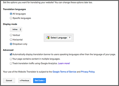
Where is the file where I Can put the google translator code? (near search or similar), in menu top.
Hi,
then use my code and add some media queries into, so it will work on mobile only:
@media only screen and (max-width: 767px) {
#top .av_header_transparency #header_meta li {
left: 27%;
}}
Adjust as needed.
Best regards,
Andy
Hi everybody,
I found this topic https://kriesi.at/support/topic/2-logo-on-the-header/ and it was what i was looking for, but what i tried doesn’t work for me, because i need that the second logo shrinks when the header shrinks instead it doesn’t. I notice that when i insert this CSS : #header .widget {
left: 80%;
padding-top: 0;
position: absolute;
top: 0;
transform: translate(-0%);
}
second logo shrinks but it’s too much on the left, as soon as i try to change position and i change value from left: 80% to 50%, logo hasn’t shrinked anymore and it doesn’t follow header behavior.
so i’m here:
1) I have create a widget area in header
2) I have create a widget called “header”
3) I insert in the widget what i needed
Now what do i need?
1) let logo shrink when the page scrolls and the header shrinks as well
2) Have one logo on the right and one on the left and main_menu in the middle between 2 logos ( if this thing is possible without too much work for)
if you any other way to let me get my target i’ll be happy to wait fot suggestions
could you help me please?
thanks so much
P.S.: this is the code of logo i would like to insert:
![]()
Hey Andy,
Uh, if you remember, the problem was with the mobile mode in Farsi pages. As I have already illustrated it in an image:

=
P.S> The last code you were kindly wrote for me (below code) didn’t work and caused a problem (I showed that in the image).
#top .av_header_transparency #header_meta li {
left: 27%;
}

=
Regards,
Sadegh
Hi, im not looking to hide menus. I want to have a promo box or notification that is visible on mobile but not on desktop.
Thanks Carl.
HI, I have a quick question im hoping you can help me on.
I want to create a section/colour section that i can display on mobiles but hide from desktops, but i can only see the option to hide from mobile. How can i achieve this?
Many thanks
Hey there, I hav the same question like in this post:
https://kriesi.at/support/topic/options-for-mobile-menu-display/
… the wonderful Kriesi wrote a code snippet. But this will not work. The mobile menu disapear completely! Even if I give the z-index a higher number.
Can you please help?
Topic can be closed. Added it to another Thread with similar topic.
Thank you.
Couldnt erase it myself. Sorry.
-
This topic was modified 9 years, 5 months ago by
 foxforce1.
Hi,
wenn du hier im Forum die Suchfunktion verwendest, wirst du einiges darüber finden, zu Beispiel hier: https://kriesi.at/support/topic/sticky-header-for-smartphones-and-tablets/#post-620974
Ich denke Enfold ist eins komplexesten (und daher auch flexibelsten Themes) auf dem Markt. Wenn du dir noch mehr Flexibilität wünscht, dann kannst du hier gerne ein Feature Request machen für Kriesi: kriesi.at/support/enfold-feature-requests/
Gruß,
Andy
The socket is now fixed, which is nice, but that didn’t solved my black space area problem. On pages with little content the black area will extend all the way to the top. Instead I want to use my original background. Can you help me here?
Hey lyudmylaz,
Autoplay videos are disabled on mobile devices due to manufacturer limitations unfortunately.
Regards,
Rikard
Hi Rikard
I tried the CSS, but there is no result, but the grid row content are still displaying like the desktop version and not below each other like on smartphones.
Hi,
Great, glad we could help :-)
Please let us know if you should need any further help on the topic.
Best regards,
Rikard
Hi Wanted2b,
If you want greater control over the background in mobile devices I suggest you create another section to show only on mobile and use an image better adapted to that screen size. You can assign unique IDs to your sections and then hide/show them using CSS like this:
@media only screen and (min-width: 768px) {
 #section-desktop {
display:block !important;
}
 #section-phone {
display:none !important;
}
}

@media only screen and (max-width: 767px) {
 #section-desktop {
display:none !important;
}
 #section-phone {
display:block !important;
}
}
Regards,
Rikard
Hi smoothbob!
Thank you for using Enfold.
1.) The selector is invalid. Please try this one.
.js_active .page-id-453 .tab { font-size: 22px; padding: 16px; background: #dfd80b ; color: #ffffff !important }
2.) Adjust the column width and margin.
div .av_two_fifth {
    margin-left: 3%;
    width: 37.4%;
}
This will affect every 1/5 columns in the site so you need to turn on the custom css class field if you want to apply it on a specific column.
3.) Do you want the checkbox to go on top of each other? Please set the Form Element Width to Fullwidth.
Regards,
Ismael
Hi,
Great, glad we could help :-)
Please let us know if you should need any further help on the topic.
Thanks,
Rikard
Hey Webtext-Autor,
Please try the following in Quick CSS under Enfold–>General Styling:
.html_elegant-blog .avia-content-slider .read-more-link {
    top: 0 !important;
}
Regards,
Rikard
Hey roger439,
I’m not sure I understand your question, could you try to explain a bit further please?
Edit: I guess you mean the description under the menu items? If you can’t see that option under Appearance->Menus then please click Screen Option in the top right hand corner of the screen and select to show it there.
Thanks,
Rikard
-
This reply was modified 9 years, 5 months ago by
 Rikard.