Hi!
I don’t think css we add on Quick CSS will actually make the site slowdown since it’s just a few several bytes. Try to replace this code above:
#menu-sidebar-underholdning li a {
    border: 1px solid #e1e1e1;
    border-right: 0;
    border-left: 0;
    margin: 0 0 -1px;
    padding: 12px 16px !important;
    text-align: left;
}

#menu-sidebar-underholdning li:first-child a {
    border-top: 0;
}
To this one (this should work on other left sidebars):
.sidebar_left .menu li a {
    border: 1px solid #e1e1e1;
    border-right: 0;
    border-left: 0;
    margin: 0 0 -1px;
    padding: 12px 16px !important;
    text-align: left;
}

.sidebar_left .menu li:first-child a {
    border-top: 0;
}
Hope this helps :)
Regards,
Nikko
-
This reply was modified 9 years, 4 months ago by
 Nikko.
Hey Connecttomoon!
I can see the logo on the top of your site, if I’m not mistaken you want the header to remain on top when you scroll and just reduce the size of the logo when scrolled? if this is right, you need to go to Enfold > Header > Behaviour Header (tab), check Sticky Header and Shrinking Header. Hope this helps :)
Cheers!
Nikko
Hi
On a single post the next and previous post are not accurate because they are displaying post coming from all categories.
I looked a your function: function avia_post_nav() in functions-enfold.php and see that $same_category is set to false, but why?
If i turn it to on, it works.
So as I do not want to modfiy Enfold core files, I just wonder if there is a hook to set it to on?
I also notice that the order is wrong, or reverse or not natural (I read that https://kriesi.at/support/topic/prevnext-portfolio-goes-in-reverse/) and I have the same question : how to hook that without modify any Enfold core files?
> I do not want to modify functions-enfold.php at eceh Enfold updates… :-(
Thanks
Hey Michael,
You can check on this thread: https://kriesi.at/support/topic/change-preload-image-animation/
Best regards,
Nikko
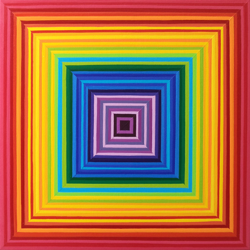
Hi Andy, I have now used a test image that has concentric squares of different colours to see what part of the image is being utilised by the different media. The image can be seen at http://www.shauno.ca/gallery/contemporary/concentric-multi-color-01.jpg
On the laptop version the border showing equals the outside border of this image – orange to crimson – the outside 6 stripes. That is what I want to have happen.
However, on both the iphone and the ipad, the center of this image is being used as the border – that is the colours showing in the side theme border on both sides are clearly from the middle strip of the image!
How this can be, I dont know. But that is what is happening. Take a look – you can see it clearly
Can you assist with getting the outside edge of the image as the one being displayed on all devices?
Thanks
Hey amatton,
You can use this code snippets and add it to Quick CSS (located in Enfold > General Styling):
Facebook Icon (2nd block of code is for hover):
.responsive #top #header_meta .social_bookmarks li.av-social-link-facebook a {
    background: #000;
    color: #fff;
}

.responsive #top #header_meta .social_bookmarks li.av-social-link-facebook a:hover {
    background: #fff;
    color: #000;
}
Twitter Icon (2nd block of code is for hover):
.responsive #top #header_meta .social_bookmarks li.av-social-link-twitter a {
    background: #000;
    color: #fff;
}

.responsive #top #header_meta .social_bookmarks li.av-social-link-twitter a:hover {
    background: #fff;
    color: #000;
}
Linkedin Icon (2nd block of code is for hover):
.responsive #top #header_meta .social_bookmarks li.av-social-link-linkedin a {
    background: #000;
    color: #fff;
}

.responsive #top #header_meta .social_bookmarks li.av-social-link-linkedin a:hover {
    background: #fff;
    color: #000;
}
Google Plus Icon (2nd block of code is for hover):
.responsive #top #header_meta .social_bookmarks li.av-social-link-gplus a {
    background: #000;
    color: #fff;
}

.responsive #top #header_meta .social_bookmarks li.av-social-link-gplus a:hover {
    background: #fff;
    color: #000;
}
Just adjust the colors as you see fit. Hope this helps :)
Best regards,
Nikko
Hi,
You can check here on how to create a new ticket: https://kriesi.at/support/topic/how-to-create-a-ticket-in-the-support-section/
Please open a new ticket since your question is unrelated to the topic.
Best regards,
Nikko
Hey troupdim,
Try to add this code in Quick CSS (located in Enfold > General Styling):
#top #wrap_all .social_bookmarks a {
    background: #000;
    color: #fff;
}
You can also change the hover using this code:
#top #wrap_all .social_bookmarks a:hover {
    background: #fff;
    color: #000;
}
Just adjust the colors as you see fit. Hope this helps :)
Best regards,
Nikko
Hi Andy, Thanks for your reply. I have adjusted the size of the image so that it now displays correctly on a laptop. Or at least on my macbook – I have not checked it on a windows device as yet. But that now means there was zero image showing in the margins for either an iphone or iPad (I dont have an android phone but assume its not working there either).
I tried various versions of the code from the page you provided the link for. Eventually, it occurred to me to try an all over pattern as that would HAVE to show (the image I was using had side borders). So, yeah, now images are showing. But again they are TOO huge and also blurry. If you check you will see how crummy it looks on mobiles (check on a laptop for how its supposed to look, please)
Like I say most people will be accessing the site using mobiles. This is basically the only thing holding up letting people know the site is ready and its fairly frustrating. We have admitted defeat on the parallax as it clearly is not going to work on ANY mobile. Very disappointing!!!
I don’t know why because I have seen other themes that have parallax components that work fine on mobiles. :( :(
Can we at least get this much to work?
So far it does not look like the theme works very well on mobiles at all :(
Hey pimroll,
Enfold doesn’t have a social share counter feature, so the easiest way is to use plugins, try using one of the plugins recommended here: http://www.bloggingwizard.com/top-wordpress-social-sharing-plugins-2014/
Best regards,
Nikko
Hey GraphicEyeDK,
1. How can I change the following:
– font color for p
– Text Transform and Font Weight for main menu
– letter spacing
– footer height
You can change it in Enfold > General Styling > Main Content tab and find Primary then change the color however, it would also affect not only p tag, so what you can do to change it specifically, at the bottom (still in General Styling) you should see Quick CSS, just add this code:
p {
  color: #000;
  font-weight: bold;
  letter-spacing: 2px;
  text-transform: uppercase;
}
This should answer the 3, except for the footer. The footer you are referring is the one with copyright? or the 4 columns on top of it?
2. How do I remove the text “Enfold WordPress Theme by Kriesi”?
Go to Enfold > Footer > Copyright, just add [nolink] after for example
© My Company [nolink]
3. Is it possible to download new fonts or do I need a plugin?
I would encourage you to use a child theme for Enfold, kindly check this thread: http://kriesi.at/documentation/enfold/using-a-child-theme/ then check the solution on this thread: https://kriesi.at/support/topic/new-custom-font/
4. I have installed WooCommerce. Is it possible to remove the box with Description, Additional Information and Reviews?
Hope you are using child theme by now, kindly add this at the bottom of functions.php
add_filter( 'woocommerce_product_tabs', 'woo_remove_product_tabs', 98 );

function woo_remove_product_tabs( $tabs ) {

    unset( $tabs['description'] );      	// Remove the description tab
    unset( $tabs['reviews'] ); 			// Remove the reviews tab
    unset( $tabs['additional_information'] );  	// Remove the additional information tab

    return $tabs;

}
Hope this helps :)
Best regards,
Nikko
Hey!
You can add the following codes to Quick CSS, just replace the IMAGE_URL with the image you have, I will be suggesting image widths on each.
This is for desktops and all screens that uses more than 1024px screen width. Suggested image width is 1600px.
#header {
  background: url('IMAGE_URL') no-repeat center center fixed;
  -webkit-background-size: cover;
  -moz-background-size: cover;
  -o-background-size: cover;
  background-size: cover;
}
This is for ipad or tablets in landscape orientation. Suggested image width is 1024px.
@media only screen and (max-width:1024px) {
  #header {
    background-image: url('IMAGE_URL');
  }
}
This is for ipad or tablets in portrait orientation and mobile in landscape orientation. Suggested image width is 768px.
@media only screen and (max-width:768px) {
  #header {
    background-image: url('IMAGE_URL');
  }
}
This is for iphone or mobile devices in portrait orientation. Suggested image width is 480px.
@media only screen and (max-width:480px) {
  #header {
    background-image: url('IMAGE_URL');
  }
}
You have 4 image with different sizes you need to use, kindly use the suggested image size. Hope this helps.
Best regards,
Nikko
-
This reply was modified 9 years, 3 months ago by Nikko.
There seems to be a thin border seen above the fullscreen sliders when the parallax option is turned on. How do I remove this?
hi, running 4.6.1. I use Enfold and tried to insert some coding in functions.php advised by your Ismail in another topic dated January 12, 2015 to obtain a language switcher but sadly it didn’t work and after having removed it again I get the following error message: Parse error: syntax error, unexpected end of file in /var/www/ferieboligsydfrankrig.dk/public_html/cannesholidayapartment/wp-content/themes/enfold/functions.php on line 575
I’m now unable to even reach the functions page as my page is completely blocked. Could you kindly reset the functions page?
I cannot understand why the slider cuts off the bottom when resizing to smaller screens. It looks great on the desktop. I’ve added quick CSS to media queries to render it well on mobile. The area in between is getting cut off.
I am using Enfold. Avia Layout Builder has stopped working. I have all the updated theme and WP. Please fix this issue.
Thanks, dbmcom
Hello I am having the same issue with my contact form as this individual on this thread ( https://kriesi.at/support/topic/contact-formular-email-adress-error/ ) I tried to input the same code but it doesn’t seem to work, do I just paste it and the end of the function.php and save it and that’s it or are there some changes that I need to make on the Contact Form itself to reflect the changes? I have tried to start a thread but last time someone told me to contact my hosting service I have they have done absolutely everything they can and told me that it would be on your side to fix the remaining.
Hi,
Ok thank you, but you do not answer my questions.
I do not like portfollio ajax.
If we are at the bottom of page it goes back to the top of the page at the opening
This is not ergonomic at all.
Is it possible to do what I ask?
Otherwise do you know an extension that would do it?
I need a size that will work well on desktop and mobiles, or all the sizes that i have to place and where to place them. I am sure it is not new to you, putting an image on the header.
Hello. Here you go. And I need the white space gone and my logo in the top left corners of the pages. Thank you. Also, If i need to provide access also so you can do it let me know. Thanks.
View post on imgur.com
Hey Poirot,
Please try adding this code to the Quick CSS section under Enfold > General Styling or to your child themes style.css file:
.av-magazine-top-bar > a {
    font-size: 22px;
}
Please make sure that > sign is not converted to – http://i.imgur.com/IDXRZQ3.png in Quick CSS field.
Best regards,
Yigit
Hi Andy
Thank you for your help & support, this help solve the issue but it now causes tablet & mobile issues.
Screenshot below in private.
Can we make the below 2 codes only to be used on laptop/pc viewing please?
#header_meta {
height: 25px;
}
#layer_slider_1 {
top: 26px;
}
Please advise?
Hi,
Great! Glad you figured it out!
We will keep the thread open and wait to hear from you. However, due to selector you used, it will be only applied on desktop :)
Best regards,
Yigit
Hey Eleina_Shinn,
Please try adding this code to the Quick CSS section under Enfold > General Styling or to your child themes style.css file:
.header-scrolled .av-main-nav ul {
    margin-top: -30px;
}
Best regards,
Yigit
Is there a guide how to spot specific pages on enfold theme to apply css?
For example main home page is #top.home. Is this correct? If i wanted to apply the same lets say in ”contact” what would be?
This way i could find myself solutions like the padding i was asking above, since i know that #top.home is the section now i know how to apply padding or margin better in this case :
#top.home .av-subheading.av-subheading_below {
padding-top: 20px;
}
or
#top.home .av-subheading.av-subheading_below {
margin-top: 20px;
}
Anyway i will be back next days as the website moves on…….. Would be nice on next version these simple but important things to able to make them without custom css but through the menu like other themes have……..
Since i see that quite some css will be need it for the website is it a good practice to make it by using a child theme for enfold?
-
This reply was modified 9 years, 4 months ago by
 naxiand.
Hi,
Please try adding this code to the Quick CSS section under Enfold > General Styling or to your child themes style.css file:
#header .widget {
  left: 50%;
  padding-top: 0;
  position: absolute;
  top: 0;
  transform: translate(-50%);
  z-index: 999;
}
Best regards,
Yigit
I’m sorry about the credentials, it’s ok now.
I have not installed any cache or minify plugin, the site stop working from one day to another.
Can you login and check from the inside please?
Hi,
I apologize for my mistake, try to use this code instead, this is for letter spacing on h1 Special Heading:
#top.home h1.av-special-heading-tag {
  letter-spacing: 10px;
}
This code is for subheadings either above or below the h1 Special Heading:
#top.home h1.av-special-heading-tag + .av-subheading {
  letter-spacing: 10px;
}
Just adjust the letter-spacing as you see fit. Thanks for your patience.
Cheers!
Nikko
-
This reply was modified 9 years, 4 months ago by Nikko.
Hey eKMUch!
1) Main color of ALL input fields. Referring to the forum, I tried it with these two, but as you can see it didn’t really work.
Textarea seems to be working just fine but input fields doesn’t because of the single quotes ‘, I have replaced the single quotes in Quick CSS it should look like this:
#top .main_color input[type='text'] { background-color: #f0eadd; border: solid 1px #ccc; }
2) Change the submit button background color on hover and non-hover
3) change the submit button to full-widht
Add this code to Quick CSS:
.avia_ajax_form input[type='submit'].button {
    background-color: #00bdbd;
    width: 100%;
}

.avia_ajax_form input[type='submit'].button:hover {
    background: #009a9a;
}
1st code block is for 2.) non-hover background color and 3.) fullwidth. 2nd block of code is for the button hover, just adjust the color as you see fit. Hope this helps :)
Best regards,
Nikko