Hi!
Change the top: 100px value and play around with it, until it is on the size you want.
Thanks a lot
Regards,
Basilis
and i thought that an image like this is your problem:

and look what my solution did with it in mobile (not simulated mobile) does with it!
http://webers-testseite.de/kaetz/leistungen/#av_section_6

Thank yuo all.
Every solutions you proposed to me didn’t work. I’m using google Chrome, I tried Firefox, Even safari. I still have same problem. If I clean all my browser cache, for the first time everything works like a charm, after page re-loading the problem show up again.
If you scroll the page from the top to the bottom, at the “Galleria Fotografica” you’ll see a little jump of the page and the last icon doesn’t appear.
This problem started before I installed WP Super Cache, I thought there was something with caching, then I installed this plugin.
I cannot every time clean my cache or make a hard referesh as Andy suggest. I can’t say to my clients “Just clean your browser cache everytime”. Nope, everything MUST work like a charm from first time, I paid 60$ for this theme.
Guys if you don’t have any better solutions, for now I just disable all animations and further I’ll reset all my WordPress.
Thanks to everybody
Hey R,
I don’t have any solutions that I can provide right now (since there are lots of ways to do it in css), moderators here are good with css so you can be assured if that happens in the future. I’ll leave this thread open, so you can post here if you experience any issue related to this topic :)
Regards,
Nikko
Hi Greg,
Thanks for the screenshot, please try adding this CSS as well:
#top .avia_ajax_form .text_area, form h3 {
    color: #fff2d6 !important;
    border-color: #fff2d6 !important;
}
Best regards,
Rikard
Hey!
I can’t find any special-heading in the homepage that’s using h1, I found 4 but using h2 tags. You can use this code:
.av-special-heading {
    position: realtive;
    top: -50px;
}
Just adjust the values however this is a global class which would affect all special headings in all pages, I suggest using Custom Css Classes: http://kriesi.at/documentation/enfold/turn-on-custom-css-field-for-all-alb-elements/ just add for example this class custom-special-heading then use this css code in Quick CSS
.custom-special-heading {
    position: realtive;
    top: -50px;
}
This way you can select which special headings this will take effect. Hope this helps :)
Best regards,
Nikko
Hey!
If you check on what the latest change, only the background color was changed, the logo wasn’t shrinking on scroll before. Anyway, I added this code:
#header.header-scrolled .logo img {
    max-height: 28px !important;
}
and removed this code:
@media only screen and (min-width:768px) {
  .html_header_top.html_header_sticky #top #wrap_all #main {
    padding-top: 50px !important;
  }
}
Best regards,
Nikko
Hi Phil,
Do you mean that you want the mobile menu to be more or less like the desktop version once the icon has been clicked?
Best regards,
Rikard
Hey!
Yes, the code in Quick CSS overwrites some css code and that’s what you are seeing, if you want the white background to show on scroll, please remove this code that I gave:
#top .header_bg {
    background: transparent !important;
}
If there’s any changes you need after doing this please let us know.
Best regards,
Nikko
Hi!
Yes, you can change the font size of caption. The code I gave and also Andy’s code shouldn’t have any effect on desktop version since our code only works on mobile devices, you will notice our codes are wrapped in:
@media only screen and (max-width:767px) {

}
Can you post screenshots on what issues you find in our codes?
Cheers!
Nikko
Hello!
I am using the Google Map Media Element on my contact page and it has seem to stop working. It would load for a split second and then I would get an error message stating:
” Oops! Something went wrong.
This page didn’t load Google Maps correctly. See the JavaScript console for technical details. ”
Not sure if it’s my computer or my website. Also, I tried to re-add the Google Map Media Element and it did mention something about Google’s API key not working? Hopefully that helps, thank you!
Hi,
This is the default CSS applied, please add it to Quick CSS and adjust to your liking. 9 is top/bottom and 12 is right/left:
td {
    padding: 9px 12px;
}
Best regards,
Rikard
Hi,
We are very sorry for the delay. Please refer to this thread for a possible fix.
// https://kriesi.at/support/topic/the-property-blogpost-is-not-recognised-by-google-for-an-object-of-type-blogpost/#post-679795
And please refrain from bumping or replying to your own thread because it gets pushed back to the end of the queue and moderators won’t be able to provide a response immediately. Please be patient while we go through the rest of the queue. Thank you for your understanding.
Best regards,
Ismael
Hi,
Try this instead:
@media only screen and (min-width: 768px) and (max-width: 990px) {
  #top .avia-slider-testimonials.avia-testimonial-wrapper {
    min-height: 350px;
    max-height: 350px;
  }
}
Clear your browser cache and reload a few times.
Best regards,
Rikard
Hi,
Thank you for the info. Please add this css code in the Quick CSS field.
.html_header_top.html_header_sticky.html_large.html_main_nav_header .main_menu ul:not(.sub-menu) > li > a {
    height: 30px !important;
    line-height: 30px !important;
}

#avia-menu {
    top: 20px;
    position: relative;
}
Best regards,
Ismael
Hi Sander,
Great, glad we could help :-)
Please let us know if you should need any further help on the topic.
Best regards,
Rikard
Hi,
It usually is, glad we could help though :-)
Please let us know if you should need any further help on the topic.
Best regards,
Rikard
I recently posted about having a lot of structured data errors and couldn’t really get a solid answer. So, I took the initiative to try to figure out what was happening.
Original Post here: https://kriesi.at/support/topic/error-in-structured-data-insane-amounts-of-errors/
This led me to find a post about something that was very similar that has since been closed.
Find the post here: https://kriesi.at/support/topic/structured-data-testing-datepublised-missing/
I think my issue is that I used the Avia layout builder for all of my content, even my blog posts which is the reason I have so many errors. I know that the thread above is a few months old, but I am guessing I’d need to hire someone to fix these issues?
Also, would like to know how expensive this would be to fix. My post’s aren’t indexing right in Google because of this.
Hi Hans,
Great, glad we could help :-)
Please let us know if you should need any further help on the topic.
Best regards,
Rikard
Hi!
I think that’s possible please refer to Ismael’s solution on this thread: https://kriesi.at/support/topic/events-countdown-widget-bug/page/2/#post-701707
Regards,
Nikko
Hi,
The element that you’re looking for is the Portfolio Grid element (http://kriesi.at/themes/enfold/portfolio/portfolio-3-column/). Unfortunately, you cannot apply the same hover effect for the masonry element without modifying one of the parent theme files.
// https://kriesi.at/support/topic/add-hover-effect-to-masonry-gallery/#post-685471
Best regards,
Ismael
Hey DaraEmerson,
If you place it over a Blog Post element and if you have selected to show a sidebar then it should be possible yes, I might have misunderstood your request so please post a link to the site/page in question if you should need any further help on the topic.
Best regards,
Rikard
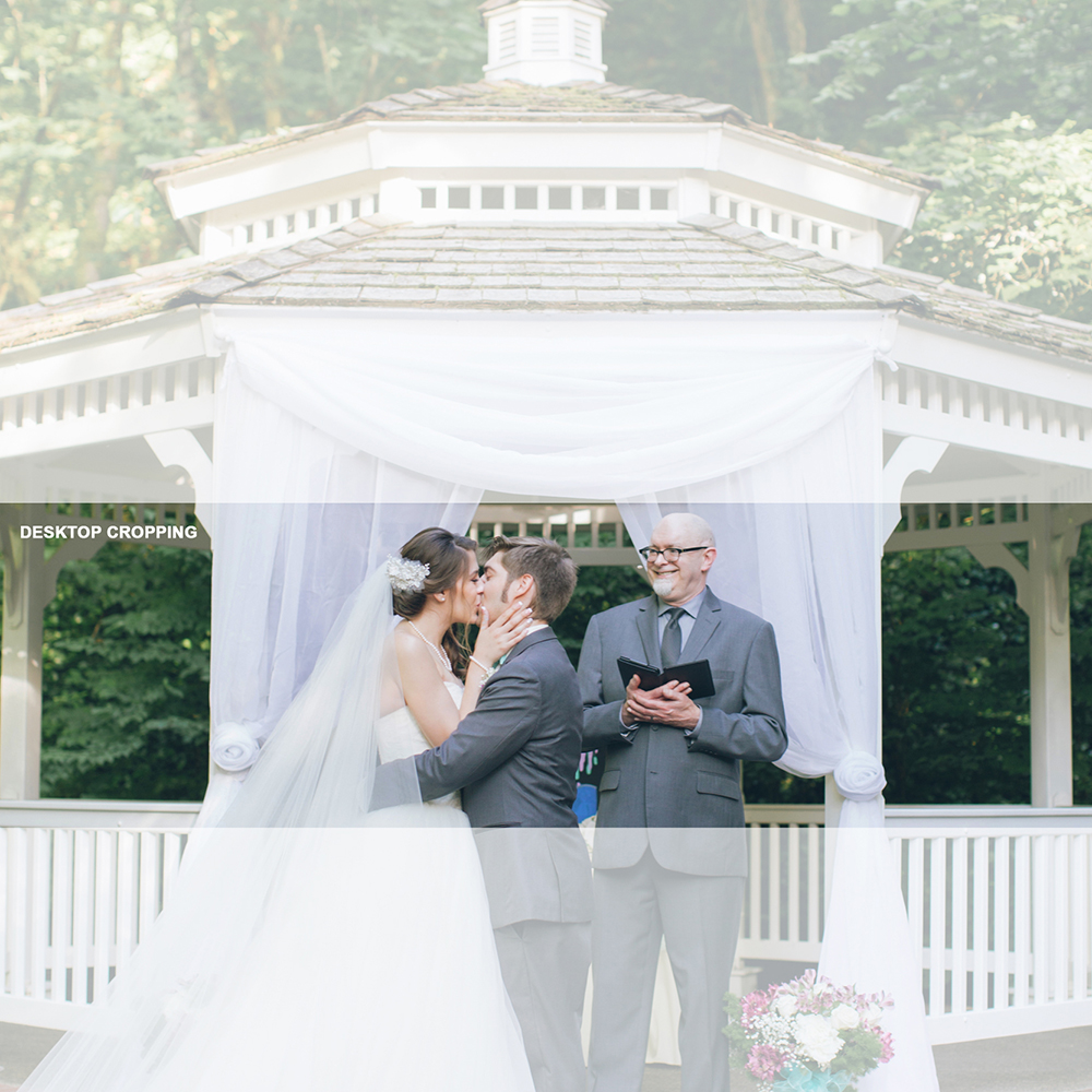
OK, I figured out a workaround for anyone having the same problem. It uses the image only, no coding needed.
Use a square image. I used about 1700px X 1700px. Keep the subject matter in the bottom half of the frame.
Upload it as the section background. Set to “Fixed,” set the image position to “Bottom Center,” and the Background Repeat to “Stretch to Fit.”
This gives you the following croppings on desktop and mobile:
Desktop:
Mobile:
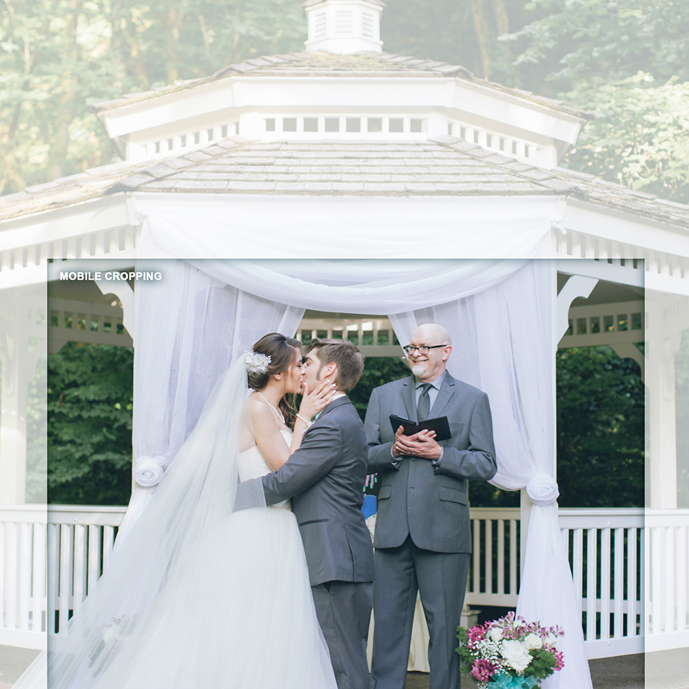
Hope this helps. Doesn’t matter what’s in the top part of the image – it isn’t seen.
Hey guys!
Here’s an interesting issue: I used your code snippet for a mobile-only logo which I now use and it’s great (see here: http://kriesi.at/documentation/enfold/change-logo-on-mobile/)
Mobile shows the smaller logo – great; desktop and iPad show normal logo – great!
However, when I go to my Shop page on iPad I get the small (mobile) logo instead of the normal one. This should not be happening.
The shop page is here: https://www.swarez.co.uk/shop/ and also a category page: https://www.swarez.co.uk/product-category/metal-sculpture/
For any other (non-Woo based page) go here: https://www.swarez.co.uk/
But it’s the iPad that has the issue; maybe a media screen width problem?
Any ideas?
I accidentally closed my previous thread because I thought it was foxed but I’m afraid it inst! Sorry!
Thanks
Ed
-
This topic was modified 9 years, 4 months ago by
 Swarez.
Can you give me some custom css to shift this image down on my iPhone in portrait mode so the top of the image shows. Thanks!
I originally looked up how to make desktop background images more mobile friendly and one of the moderators shared a code to add to the “Quick CSS in Enfold theme options under General Styling tab.”
I am not sure why I am having so much trouble finding where the Quick CSS but please help me get there – thank you!
Ok, I have found it. this works:
#top .footer_color .input-text, #top .footer_color input[type=”text”], #top .footer_color input[type=”input”], #top .footer_color input[type=”password”], #top .footer_color input[type=”email”], #top .footer_color input[type=”number”], #top .footer_color input[type=”url”], #top .footer_color input[type=”tel”], #top .footer_color input[type=”search”], #top .footer_color textarea, #top .footer_color select {
border-color: #dedede;
padding: 5px;
margin-top: -10px;}
.avia_ajax_form .button {
margin: 0;
padding: 5px;
margin-top: 5px;
border-radius: 0px;
border-bottom-width: 0px;
border-bottom-style: solid;
font-weight: normal;
font-size: 0.92em;
min-width: 60px;
outline: none;
}
Just the little question of not showing the form on one particular page, any ideas?
Hi Niko,
Thank you for your reply. I created a new thread as you suggested but didn’t know how to tag you. Here is the link.
I appreciate your time and help in advance.
Hi
I have created a little contact form in the footer of my site https://hi-flyfoto.de
using shortcode. How can I format background clour, padding etc of the form? I tried the CSS of my main contact form,
just with #footer, like this
#footer .main_color input[type=”text”],#footer .main_color input[type=”password”],#footer .main_color textarea {
padding:5px;
background-color:#F1F1F1;
color:#000
}
#footer .main_color input[type=”submit”] {
padding:10px;
margin-top: 5px;
background-color:#c00000;
color:#fff;
font-weight: bold;
border-radius: 0;
border-bottom-width: 0;
min-width: 100px;
}
It does not work.
Would be grateful for some help
Michael