Like this answer…
Sorry, but why to copy the complete function and kill the future of updates when an applay_filters() is there?
add_filter( 'avf_default_icons', function ($icons) {
	$icons['twitter'] = array( 'font' => 'entypo-fontello', 'icon' => 'ue8f1');
	return $icons;
});
this would be the correct answer.
But the thread is closed and I cant provide the correct answer.
I can understand, that the mods dont have the time to answer and code for everyone, but please let the community help themself.
Hi,
I see that your sample ‘Coming Soon’ page does not include the top Header and Nav as shown in your Enfold Modern Demo > Blank Pages > Coming Soon
Is this done by setting the Hide Header Visibility in the page settings?
Thanks
Hi,
Sorry for the confusion. I thought that you wanted the button element to look the same as the slider button, but it’s the other way around. Please use this css code to adjust the style of the slider button.
#top .avia-slideshow-button {
    text-transform: none;
    background: #FAC710 !important;
    padding: 12px 16px 10px;
    font-size: 16px;
    min-width: 90px;
    border-radius: 3px;
    text-decoration: none;
    display: inline-block;
    border-bottom-style: solid;
    border-bottom-width: 1px;
    margin: 3px 0;
    line-height: 1.2em;
    position: relative;
    font-weight: normal;
    text-align: center;
    max-width: 100%;
    color: #000;
    margin-top: 20px;
}

#top .avia-slideshow-button:hover {
    border-color: #CA9336;
    color: #fff;
    background: #D28C17 !important;
}
Best regards,
Ismael
Hi Rikard, there are two the same topics opened. We will go on here. Ok? You can close the other.
So please check this example: I like so much this!
Look also the social icons below, etc…
I like it at all!
(In private content you can find also my website and my credentials)
Thanks
Hello Ismael,
I have, of course, taken a look at it. Before I wrote to Mike.
a) I can define a button directly on the page via the “Button” element. I can’t use all the possibilities here (for example, a colour hover) as when I add CSS.
b) I can further adjust the styling of the button in the theme options. Okay. Here, too, I cannot create the desired colour hover.
Anyway …
The most important question is: How can I ultimately apply the same button settings I made for the bottom button to the top button (in the slider)?
All possibilities there …
– Theme colour
– Theme colour highlight
– Theme Subtle Colour
are not helpful here. (These settings also apply to other elements that are already used on the website and should not change.)
Sorry, but I’m not getting anywhere here?
It would be ideal if the CSS settings I made also referred to the button in the slider.
KR – Marc
Hey gatehealing,
Thank you for the inquiry.
1) Summary: Legible Font Sizes (THREE issues)
1) Font Size 11px – It seems to be referring to the base or default font size for all text elements. This css rule is overridden by the custom font sizes that can be set in the Enfold > General Styling > Typography panel.
2-3) Font Size 11px .pagination span, .pagination a – You can adjust the size of the pagination with this css code.
#top .pagination .current, #top .pagination a, #top .fullsize .template-blog .pagination a {
    height: 50px;
    width: 50px;
    line-height: 50px;
    border-radius: 100px;
    margin-right: 5px;
    font-size: 1em;
}

#top .pagination .pagination-meta {
    float: right;
    line-height: 35px;
    font-size: 1em;
}
2) Summary: Tap Target Sizing (FIVE issues)
1) Element Label Search – Looks like you’ve disabled the search bar in the header but if you want to adjust the size of the label, try to use this css code.
#top .av_minimal_header #s {
    font-size: 1.2em;
}
———————————————–
2-5) Element Label span.blog-categories > a – The other 4 refers to the post categories, which can be adjusted using this css code.
.html_elegant-blog #top .post-entry .minor-meta {
    font-size: 1em;
}
Best regards,
Ismael
Hi,
Try this css instead:
#top .mfp-content .avia-builder-el-69 .avia-button:first-child,
#top .mfp-content .avia-builder-el-80 .avia-button:first-child {
    background-color: #0e76a8;
    border-color: #0e76a8;
    color: #ffffff;
}
Best regards,
Mike
Awesome thank you! Is there also a way to make the area where the extra elements are transparent on both mobile and desktop?
Hi,
I created the lower button at the green arrow with the button element and some CSS.
Now I want the button at the top of the red arrow to look the same.
Have you tried editing the button styles within the element’s Styling panel? You’ll find options there to customize attributes like color, font size, borders, and more.
Best regards,
Ismael
Hi Nikko – I’m confused because the content elements can only be placed in the page. I want to display the widget in the sidebar, to the left of the page.
If you scroll to the bottom of the page I provided, you’ll see the widget in the left sidebar. It should be positioned at the top of the sidebar instead of the bottom. it seems that the Tab Section is causing the widget to move to the bottom of the sidebar.
Hi Nathan,
Thanks for contacting us!
Please try to add this CSS code in Enfold > General Styling > Quick CSS:
@media only screen and (max-width:767px) {
  .html_mobile_menu_tablet #top #wrap_all .av_header_transparency {
    background-color: transparent !important;
  }
}
Hope it helps.
Best regards,
Nikko
Hi octopussolutions,
Please try to add this CSS code in Enfold > General Styling > Quick CSS:
@media only screen and (min-width:1080px) {
  .html_header_top.html_header_transparency #header {
    background-color: white;
    margin-top: 30px;
    max-width: 1080px;
    left: 50%;
    transform: translateX(-50%);
    border-radius: 8px;
    box-shadow: 0 0 20px rgba(0,0,0,0.05);
    overflow: hidden;
  }
}
This code only takes effect on desktops and laptops but not on tablets and mobile phones.
Hope this helps.
Best regards,
Nikko
Hi Sascha,
Please try to add this CSS code in Enfold > General Styling > Quick CSS:
@media only screen and (max-width:767px) {
  #top .av-siteloader-inner {
    table-layout: fixed;
  }

  #top .av-siteloader-inner .av-preloading-logo {
    max-width: 100%;
  }
}
Hope it helps.
Best regards,
Nikko
Hi pampself,
For the background color of the canvas, please try to add this CSS code in Enfold > General Styling > Quick CSS: (just change the color value as you see fit)
#top.home .container_wrap_first {
    background-color: white;
}
To reduce the height, please add this CSS code (and adjust the padding values)
#top.home .container_wrap_first main.content {
    padding-top: 50px;
    padding-bottom: 20px;
}
Best regards,
Nikko
Hi Munford,
Can you try to use this CSS code instead (so it targets links inside headings):
#top h2 a:hover {
    color: #ff6a00 !important;
}
Best regards,
Nikko
hi
I don’t know if I’m missing something, but the color settings for links and hover etc in the general settings – are those only for the <paragraph> body links and not for the headings? How do I get the hover/active settings for links in the heading sizes?
I tried with
#top h2:hover {
color: #ff6a00 !important;
}
but that makes all the h2 hovers orange and not just links.
I would like the links to be #ff6a00 with the rollover/click #f59917 in all the text (headings and body).
can you help me understand this?
thanks
Nancy
-
This topic was modified 2 years, 7 months ago by
 Munford.
Hi, I followed the post below to make the & symbol non fancy. How do I make the & symbol normal and non italic?
Hi,
Try adding this CSS in your Enfold Theme Options ▸ General Styling ▸ Quick CSS field:
@media only screen and (max-width: 767px) {
#top .mfp-content .av-9g7ebi-f2e12a2e9a0504676810d016a51cefd3,
#top .mfp-content .av-4xc9se-e01829d9bd552af3332b6fd9af5b84e8 {
    background-color: #0e76a8;
    border-color: #0e76a8;
    color: #ffffff;
}
}
Thanks for pointing out the filter Guenni007
Best regards,
Mike
Hello – I have a page with a left sidebar and I want to use a tabbed section within the main page content (right side of sidebar). I can’t get this working. The widget in the sidebar gets pushed to the bottom left of the page (the widget contains the heading “Topics”). My goal is for the widget to serve as the navigation menu in the left sidebar, appearing in the top left.
Hi,
Great, I’m glad that Mike could help you out. Please let us know if you should need any further help on the topic, or if we can close it.
Best regards,
Rikard
Hi,
Great, I’m glad that Ismael could help you out. Please let us know if you should need any further help on the topic, or if we can close it.
Best regards,
Rikard
Hi there,
We’ve been using tab sections, which work wonderfully on desktop. But if you have multiple tabs, it gets really confusing on mobile devices, since the headlines and the corresponding content are separated by all the headlines.
In situations where there are e.g. 7 tabs, and the first tab is active, users have to scroll past 6 headlines before reaching the content. Also, it’s not really UX/UI-friendly.
Is there a way to reorganize the display on mobile so that the headlines and the toggle functionality appear directly above the corresponding content? This would greatly improve the usability of the mobile view, and it would also be more logical for the user.
Thanks in advance!
Hi Enfold support
Please could you help out. The logo in the header isn’t linking to the homepage.
I can´t see where to problem is.
It is currently on a staging server, however the logo is working fine when mobile and tablet, but not on desktop…
Please help out.
Best regards
Lene
or use the grid-row :
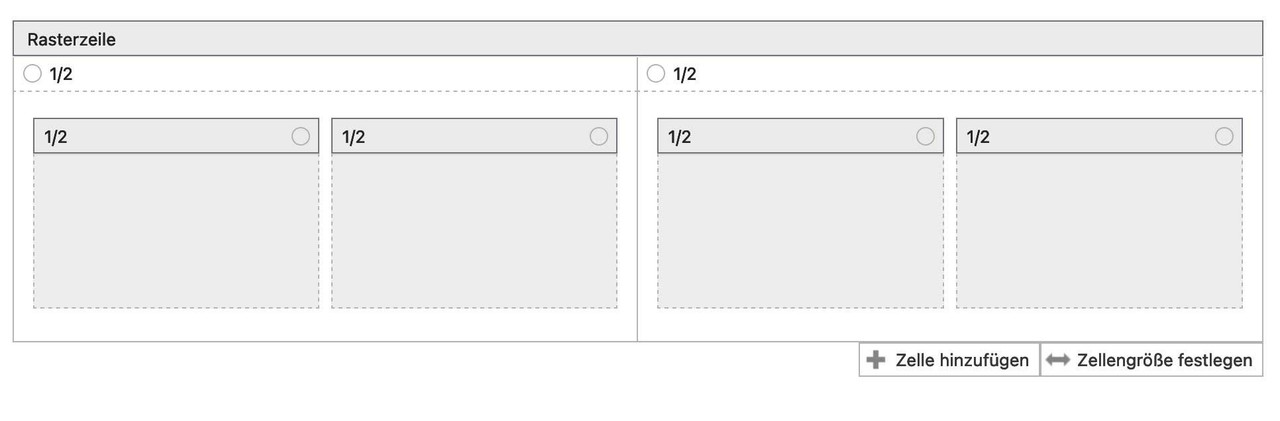
very comfortable even in responsive case – you can decide to have the text for the left cell on top and for the right cell vice versa etc. pp.
To create a non-fullwidth element for the grid-row could be reached easy.
…. Thank you very much, Mike.
I should have thought of that myself. :-(
Now I have another question on the same subject:
Please, look at the screenshot:
https://www.dropbox.com/scl/fi/b4ot02j2g5f9l8z543loe/2023-09-12_12-49-57.jpg?rlkey=9l4sikoc6ijjp6jbaj75jny7a&dl=0
I created the lower button at the green arrow with the button element and some CSS.
Now I want the button at the top of the red arrow to look the same.
How do I get that to work?
I appreciate your support, Mike.
KR – Marc
Hi,
For future readers please see the final solution at this thread
With the hotspot tooltips set to always show add this code to the end of your child theme functions.php file in Appearance ▸ Editor:
function one_hotspot_only_script() { ?>
  <script>
(function($) {
 $(window).ready(function() {
           $('.avia-tooltip').hide();
       $('.av-image-hotspot_inner').on( "click", function(e) {
       	var $this = $(this).parent().find('.avia-tooltip');
       	$(this).parent().css({'z-index':'9'});
	      $(this).siblings('.avia-tooltip').toggle('show');
	      $('.avia-tooltip').not($this).hide();
	      $('.avia-tooltip').not($this).parent().css({'z-index':'1'});
        });
     });
})(jQuery);
</script>
  <?php
}
add_action('wp_footer', 'one_hotspot_only_script', 99);
and on tooltips should show on page load and clicking a hotspot will show a tooltip then clicking any other hotspot will close any other open tooltip and open the one clicked.
Best regards,
Mike
Hi,
We adjusted the height of the images as follows, so they retain the aspect ratio of 16:9.
Desktop: 200px
Tablet: 147px
Mobile: 120px
Please make sure to remove the cache before checking the page.
Best regards,
Ismael
Ah, heard from a friend that the image is seen on her tablet, so maybe the problem is om my side.
But could you please make the proportions on my desktop and tablet on the same aspect ratio? The original image was: 960 by 540 px
I am not a professional webdeveloper, just a enterpreneur trying to make a living. Things that look simple to you are a huge challenge for me.
So I really would be so pleased if you could do this for me…
Hi,
Thank you for following up.
Also still sqeezed on the desktop. It would be great if it would be the same everywhere…
You can adjust the “height” property value as needed in the css rules that we provided above.
On my tablet there is still no image on Privé-(Foto)bespreking (4th item
The image of the Privé-(Foto)bespreking is visible on our end. Would you mind providing a screenshot of the issue? You can use platforms like Savvyify, Imgur or Dropbox to upload and share the screenshot. Here are the steps to follow:
1.) Visit the website of your chosen platform, such as Savvyify, Imgur or Dropbox.
2.) Locate the option to upload a file or an image.
3.) Select the screenshot file from your computer or device and upload it to the platform.
4.) After the upload is complete, you will be provided with a shareable link or an embed code.
5.) Copy the link or code and include it in your message or response to provide us with the screenshot.
Thank you for taking the time to share the screenshot. It will help us better understand the issue you’re facing and provide appropriate assistance.
Best regards,
Ismael
Hi,
Thank you for the screenshot.
You may have to adjust the height of the header on smaller screens. Please add this css code.
@media only screen and (max-width: 767px) {

  /* Add your Mobile Styles here */
  .responsive #top #wrap_all #header {
    height: 200px;
  }
}
Best regards,
Ismael