Hey James,
Thank you for the inquiry.
Ideally, I would only show two logos at a time on mobile (five on desktop), but they should scroll through the 12
At the moment, this is not possible because the partner/logo element script doesn’t have the capability to regroup the items on smaller screens once they are set. However, you can achieve the desired effect by cloning the current element, adjusting the settings accordingly, then use the Advanced > Responsive > Element Visibility settings to toggle the elements’ display on different screen sizes. Basically, you’ll have one element for desktop view and another specifically designed or configured for smaller screens.
Best regards,
Ismael
Hey Lene,
Thank you for the inquiry.
You can add this CSS code to push the logo downward and align it with the widget titles.
#footer .flex_column.av_one_fourth:nth-child(4) #media_image-4 a img {
    margin-top: 10px;
}
Best regards,
Ismael
Hello Enfold Team,
I am using the Partner/Logo Element and would like to maintain the scrolling effect I have on desktop on mobile. Ideally, I would only show two logos at a time on mobile (five on desktop), but they should scroll through the 12 or so that I am going to load. I have searched through previous threads but couldn’t find anything on this.
Can you please point me in the right direction?
Thank you
-James
Hi,
I am using accordian slider element on homepage – it looks great on desktop, but on mobile the 3 x images over 1 column crash the text and it doesn’t work well. Is there any CSS/settings to stack the 3 x images under each other on mobile?
Thanks
Hi,
For border color, radius, and icon size try this css:
#top #header.header_color .widget input[type=text] {
	border-color: red;
	border-radius: 10px;
}
#top #header.header_color .widget #searchsubmit {
    border-radius: 0 10px 10px 0;
}

#top #header.header_color .widget #searchform #searchsubmit {
 	font-size: 30px;
}
This should also work on your live site.
Best regards,
Mike
Hi,
Great, I’m glad that Mike could help you out. Please let us know if you should need any further help on the topic, or if we can close it.
Best regards,
Rikard
Hi,
I need to push 2 x telephone numbers above my header.
Is this best done as extra elements in the header
I also need to add coding so the phone numbers link
Where do I colour style the background and number colour? White copy #ffffff on Grey #969696
Thanks
Hi,
To show the header inage as a background image for the header after scroll, I added this CSS in your Enfold Theme Options ▸ General Styling ▸ Quick CSS field:
#top #header.av_header_sticky:not(.av_header_transparency) #header_main {
  background-image: url(https://wp-experten.com/wp-planer-consulting/wp-content/uploads/2023/09/planer-consulting-photovoltaik-anlagen-header-2.jpg);
  background-size: cover;
  background-repeat: no-repeat;
  background-position: top center;
  height: 100%;
  width: 100%;
}
please clear your browser cache and check.
Best regards,
Mike
Hi,
When testing for different devices on your desktop browser you will need to reload the page when you chage the screen width, this will not be an issue for real devices because their screen sizes don’t change in the same way after page load.
Adding a listener to the page only for testing is not a good idea.
Best regards,
Mike
funziona,
però se provo a restringere la finestra del browser al minimo, le due icone si alzano sopra il logo bftop e devo aggiornare la pagina perchè tornino nella loro posizione giusta
c’è un modo per rimediare?
Hi,
To add a screenshot please try using an Screenshot service and pasting the image URL in your post.
To center Olha Karpi on small screens

Try this CSS in your Enfold Theme Options ▸ General Styling ▸ Quick CSS field:
@media only screen and (max-width: 425px) {
	#top #main .av-large-testimonial-slider .avia-testimonial-meta {
	display: flex;
    flex-direction: column;
    align-items: center;
}
}
After applying the css, please clear your browser cache and check.

Best regards,
Mike
Hi, when I see my website in the mobile format, on the home page some titles do not fit and there are photos that are not centered as in the desktop version. The Theme in the desktop version looks better than in the mobile. How can I fix that?
I would like to see the mobile version when I am editing my website, but the preview on mobile doesn’t work.
Thanks in advance
Hi,
Try this CSS in your Enfold Theme Options ▸ General Styling ▸ Quick CSS field:
@media only screen and (max-width: 1366px) {
	#top.page-id-3627 .av-masonry-entry.type-product .av-masonry-image-container {
		transform: scale(.5);
	}
}
adjust the “.5” to suit, “.5” is 50% smaller and 1 would be the original size.
I added the page ID page-id-3627 in the code so it will only work on the one page, you can remove it if you want it to work on all pages.
Best regards,
Mike
Hey Stilecatalini,
I carefully examined your site and came up with a way to center your logo for all device sizes and for it to show in the same place when the menu is open.
This is the logo before the menu is open:

and this is with the menu open the logo shows in the same place:

Add this code to the end of your child theme functions.php file in Appearance ▸ Editor:
function show_logo_in_burger_menu() { ?>
  <script>
(function($){
$('#avia-menu').one('click', function(){
jQuery('.logo.avia-standard-logo').clone().wrapInner('<div class="burger-logo"/>').children(0).unwrap().prependTo('#av-burger-menu-ul');
});
})(jQuery);
</script>
  <?php
}
add_action('wp_footer', 'show_logo_in_burger_menu', 99);
and this CSS in your Enfold Theme Options ▸ General Styling ▸ Quick CSS field:
@media only screen and (min-width: 990px) {
	.logo.avia-standard-logo,
	.logo.avia-standard-logo a {
		display: flex;
	    justify-content: center;
	    width: 100%;
	    align-items: center;
	}
	.av-burger-overlay-active .burger-logo {
		top: 30px;
	    position: absolute;
	    justify-content: center;
	    display: flex;
	    width: 100%;
	}
}
@media only screen and (max-width: 989px) {
	.responsive #top .logo {
		width: 100%;
		display: flex;
		justify-content: center;
        align-items: center;
	}
	.responsive #top #wrap_all .main_menu,
	.responsive #top #wrap_all .av_mobile_menu_tablet .main_menu {
    	top: 11px;
    	height: 55px;
	}
	.av-burger-overlay-active .burger-logo img {
		height: 30px;
    	max-height: 30px;
    	width: 155.17px;
	}
	.av-burger-overlay-active .burger-logo {
		top: 25px;
	    position: absolute;
	    justify-content: center;
	    display: flex;
	    width: 100%;
	}
}
@media only screen and (min-width: 768px) and (max-width: 989px) {
	.responsive.html_header_transparency.html_header_top #top #main {
    	margin-top: -70px;
	}
	.responsive #top .logo {
    	height: 80px !important;
	}
}
Best regards,
Mike
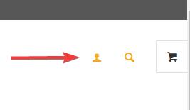
Hi,
To move your account & search menu items next to the cart icon:
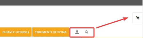
this is only needed for screens larger than 990px, because on mobile it’s already next to the burger menu:

Add this CSS in your Enfold Theme Options ▸ General Styling ▸ Quick CSS field:
@media only screen and (min-width: 990px) {
.account-menu {
    position: absolute;
    z-index: 3;
    height: 46px;
    right: 0;
    width: 150px;
    line-height: 46px;
    text-decoration: none;
    text-align: center;
    top: 38%;
    margin: -23px 0 0 0;
}
.account-menu .cart_dropdown {
	top: 85%;
}
.account-menu #menu-item-wc-account-icon {
	display: inline-block;
    height: 46px;
    width: 46px;
    float: left;
}
.account-menu #menu-item-search {
	display: inline-block;
    height: 46px;
    width: 46px;
    float: left;
}
.account-menu .menu-item-account-icon a {
	line-height: 46px !important;
	width: 46px;
    height: 46px !important;
    display: inline-block;
}
.account-menu #menu-item-search a {
	line-height: 46px !important;
	width: 46px;
    height: 46px !important;
    display: inline-block;
}
}
Then add this code to the end of your child theme functions.php file in Appearance ▸ Editor:
function move_account_search_nexto_cart() { ?>
  <script>
window.addEventListener('DOMContentLoaded', function() {
(function($){
	var width = $(window).width();
	if ((width >= 990)) {
 $(".menu-item.cart_dropdown ").wrapAll("<span class=account-menu></span>");
 $('#avia-menu #menu-item-wc-account-icon').detach().insertBefore('.account-menu .cart_dropdown');
 $('#avia-menu #menu-item-search').detach().insertBefore('.account-menu .cart_dropdown');
	} else {}
})(jQuery);
});
</script>
  <?php
}
add_action('wp_footer', 'move_account_search_nexto_cart', 99);
this is the expected results:
Best regards,
Mike
Hey bassato,
It looks like there is enough room in your menu for more items, Please see the screenshot in the Private Content area.
Or do you mean at smaller screen sizes, if so you should make the mobile menu show until the desktop menu will fit on the screen, such as 1215px with this css:
Try this CSS in your Enfold Theme Options ▸ General Styling ▸ Quick CSS field:
@media only screen and (max-width: 1215px) {
  #top #header .av-main-nav > li.menu-item  {
      display: none!important;
  }
  #top #header .av-burger-menu-main {
      cursor: pointer;
      display: block!important;
  }
}
Please ensure to copy the code from the forum and not an email notification so the symbols are not converted.
After applying the css, please clear your browser cache and check.
Best regards,
Mike
Yes I will look at SearchWP functionality next. For now, ideally, I would want the desktop/tablet users to see the open/static search bar where I specified, responsive for different screen sizes in that range, and not shown at all for mobile users since, as you mentioned, there is no room. I do not want it below the menu bar really.
I have tried the Header Widget Area code, it does not seem to function as intended, at least not on our site. Please advise how I can achieve what I am after within Enfold theme. I’d prefer to stick with you all vs using some other them. Thanks again.
Hi,
Right now your image looks like this:

if you try this CSS in your Enfold Theme Options ▸ General Styling ▸ Quick CSS field:
#top .av-masonry-image-container {
	background-position: unset;
    background-size: contain;
    background-repeat: no-repeat;
}
it should look like this:

but you will need to make sure all of your images are square, unlike this one:

Best regards,
Mike
Hi,
Have you tried adding phone number link in the topbar at Enfold Theme Options ▸ Header ▸ Extra Elements ▸ Phone Number or small info text
Best regards,
Mike
Hi,
Thank you for your patience and the password to your site but I don’t see a user name, please include.
I see the [avia_search] shortcode in your topbar, it looks like you have not added the code to the end of your child theme functions.php file in Appearance ▸ Editor: add_shortcode('avia_search', 'get_search_form'); or if you did the symbols may be converted, please ensure to copy the code from the forum and not an email notification so the symbols are not converted. You said that you are using SearchWP, did you add the code for it to be the search for your site? And doesn’t it have it’s own shortcode, this page explains how to adjust the SearchWP shortcode for the options you want, you should end up with something like this: [searchwp_search_form engine="default" var="searchvar" button_text="Find Results"] (this code may not work on your site, follow the instructions)
Your asking for a Amazon search bar, have you thought about adding a larger one like in our Knowledge Base Demo below your menu? We have a search bar element:
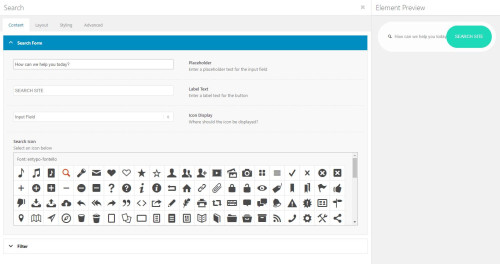
that will allow you to adjust the style better it you want a big search bar like on Amazon.
Best regards,
Mike
Hi,
Thank you for your patience, I checked your site for mobile and found that your Time-To-First-Byte is almost 3s:

this is not good, everything after that loods well, for desktop the TTFB is under a second so your whole site loads in about 2 seconds.
I found in your WP-Optimize cache settings a setting for mobile was Generate separate files for mobile devices, but this didn’t help, so I don’t see any other difference in your site between mobile and desktop, typically the TTFB is based on your server response to the page request and often that will be fast and the bottle neck is after that, for example my demo site has a TTFB .991

and there is no difference between the desktop & mobile.
I recommend checking your Cloudflare CDN if you are still using it and see if there is some mobile setting, and also check your server for any settings, it seems that somewhere a mobile request is treated differently but I’m not sure where.
Best regards,
Mike
Hi,
Great, I’m glad that Ismael could help you out. Please let us know if you should need any further help on the topic, or if we can close it.
Best regards,
Rikard
Hi,
Great, I’m glad that @guenni007 could help you out :-)
Please let us know if you should need any further help on the topic, or if we can close it.
Best regards,
Rikard
Hi,
I have an issue where my desktop version and mobile versions are different in one section. As you will see by the screenshots attached, what shows up on the mobile is different than on the desktop. I have also attached backend images so you can see how it is setup. It should be showing the same on all devices as there is only one instance of the section and its contents and it is set to show on all devices in the “Responsive” section. I have included below a link to some screenshots of the section in question. The issue is there are two arrows on the mobile screenshot and one arrow on the desktop screenshot. It should only have one arrow.
Thank You
~ JP
-
This topic was modified 2 years, 7 months ago by
 IDS.
IDS.
Thank you, Ismael. That does the trick for desktop and tablet. On mobile phones the images are suddenly panoramic now.
I would be so happy if you are able to fix that!
Have a nice weekend.
Hi,
Great, I’m glad that Ismael could help you out. Please let us know if you should need any further help on the topic, or if we can close it.
Best regards,
Rikard
Hey dithinks,
Thank you for the inquiry.
Looks like you have enabled the language switcher of the plugin. Please note that the theme automatically displays language flags next to the main menu when WPML is enabled. If you wish to disable the language flags, please add this CSS code.
#header_main #avia-menu .av-language-switch-item { display: none; }
Related thread: https://kriesi.at/support/topic/remove-wpm-flags-in-menu/#post-1312211
Best regards,
Ismael
Hi,
Sorry we missed the video. Looks like you have created a copy of the same section for smaller device. Does it work when you temporarily disable or remove the section? If the issue persists, please try to add this css code.
@media only screen and (min-width: 480px) and (max-width: 767px) {
  .responsive.av-no-preview #top #wrap_all .av-small-hide,
  .responsive.av-no-preview #top #wrap_all .av-small-font-size-hidden,
  .responsive.av-no-preview #top #wrap_all .av-small-font-size-title-hidden {
    display: none;
    height: 0;
  }
}
Best regards,
Ismael
I use Cloudflare CDN and it is integrated to WP fastest cache successfully. I just purchased unlimited credits for Short Pixel and re-processed everything. Oddly, I had one page speed insights result where performance was a 97. Then it went back to the 50’s and 60’s.
My host is Dreamhost, but I’m not sure where the server is located. Though I’d think if it was that it would also impact my desktop site, but that is straight A’s. 97 and above consistently.
Login info is in the private box.
Hey bbertuzzi7,
Thank you for the inquiry.
As you click through the other tags across the top, none of the others load there respective first six, and the last tag across the top doesn’t show up until you use the LOAD MORE button on any of them.
This is the default behavior of the category or tag sorting option. Only items that are present on the page are sortable, and empty tags or categories will not be visible. To work around this limitation, you can disable pagination and increase the number of items displayed on a single page.
Best regards,
Ismael