Hi,
Great, I’m glad that you found the problem. Please let us know if you should need any further help on the topic, or if we can close it.
Best regards,
Rikard
Hey profumopuntoit,
This is pretty tricky to get it exactly as your screenshot, but try this CSS in your Enfold Theme Options ▸ General Styling ▸ Quick CSS field:
@media only screen and (max-width: 767px) {
.responsive table.shop_table td {
    display: table-cell;
}
.responsive .shop_table .product-quantity {
	display: inline !important;
}
#top .order_details .product-name li {
	 margin: auto;
	 padding: 0;
	 border-right: none;
}
#top .order_details li {
	 border-right: none;
}
#top table.shop_table td {
    padding: 5px;
}
}
this is the expected results:
Best regards,
Mike
Hi, i’m in this situation: check.
The sapce between the logo and the flag is too much little. How to set instead of (vertical-align: top), a value in pixels?
So, this is works only on mobile.
Mike close every thread as soon as possible but we need time and tests to fix.
I will open a lot of identical thread beacuse that……………..
Hi,
To have very large menu items and align them at the top try this CSS in your Enfold Theme Options ▸ General Styling ▸ Quick CSS field:
#top #av-burger-menu-ul {
	vertical-align: top;
}
@media only screen and (max-width: 767px) {
#av-burger-menu-ul .avia-menu-text {
	font-size: 60px;
}
}
@media only screen and (min-width: 767px) {
	#av-burger-menu-ul .avia-menu-text {
	font-size: 80px;
}
}
feel free to adjust to suit, this is the expected results:

Since the original question has been answered we will close this thread as it has now covered multiple topics, please note that we ask each thread to limit to one topic.
If you have any further questions please create a new thread and we will gladly try to help you. Thank you for using Enfold.
Best regards,
Mike
Hi,
Thank you for your patience and the link to your site, I cloned your last slider item and saw the font size error on the frontend, it looks like the css for the slide was not added to the style for some reason, if you add this css to your Enfold Theme Options ▸ General Styling ▸ Quick CSS field it will correct this if you want to add more slides:
#top #wrap_all .avia-slideshow .av-slideshow-caption .avia-caption-title {
    font-size: 36px;
}
#top .avia-slideshow .avia-caption-content p {
    font-size: 20px;
}
I didn’t add this and I removed the cloned slide I created.
I don’t know why this has occurred, I tried looking at your Enfold Theme Options ▸ Performance settings and your plugins, etc but didn’t find a cause.
I created a test page on my site with 10 slides and your layout and font sizes and they all worked correctly. So you could try using this css for now and if you find any other issues in the future perhaps they will also point to a cause for this.
Or you could try disabling all of your plugins. If that resolves the issue, reactivate each one individually until you find the cause.
Perhaps your server is also caching, so try clearing your server cache and if it is using object-oriented cache such as Memcached, Redis, Varnish, Litespeed, etc try disabling it to see if this helps. Otherwise if you don’t have any other issues I would try using the css for now.
Best regards,
Mike
Hi,
Thank you for your patience, to add the descriptions below the mega menu items and show a icon next to the menu items:

Try adding this code to the end of your child theme functions.php file in Appearance ▸ Editor:
function enfold_menu_description($item_output, $item, $depth, $args) {
    if (!empty($item->description)) {
        $item_output .= '<span class="menu-description">' . esc_html($item->description) . '</span>';
    }
    return $item_output;
}
add_filter('walker_nav_menu_start_el', 'enfold_menu_description', 10, 4);
function enqueue_font_awesome() {
    wp_enqueue_style('font-awesome', 'https://cdnjs.cloudflare.com/ajax/libs/font-awesome/5.15.3/css/all.min.css');
}
add_action('wp_enqueue_scripts', 'enqueue_font_awesome');
function add_icon_to_menu_item($item_output, $item, $depth, $args) {
    // Get the custom icon class from the menu item's CSS Classes
    $custom_classes = implode(' ', $item->classes);
    preg_match('/menu-item-icon-([^ ]+)/', $custom_classes, $matches);

    if (!empty($matches[1])) {
        // Use the custom icon class specified in the menu item
        $icon_class = esc_attr($matches[1]);
        $icon = '<i class="fa ' . $icon_class . '"></i>';
        $item_output = $icon . $item_output;
    }
    return $item_output;
}
add_filter('walker_nav_menu_start_el', 'add_icon_to_menu_item', 10, 4);
The first one adds the description below the menu item, the second one adds the Font Awesome icons because it is easier to use a class name to determine the icon used, entypo-fontello icons don’t use class names the same way, and the third function adds the icon next to the menu item based on the class used in the menu item.
So to show the menu item description and custom classes please enable it in the menu page screen options at the top of the page:

then add your description and the icon you want to use in this format menu-item-icon-fa-users
the first part menu-item-icon- tells the function that a icon will be used, and then the Font Awesome Icon code is appened to the class fa-users

these are the classes I used in this example:
menu-item-icon-fa-users
menu-item-icon-fa-phone
menu-item-icon-fa-question
menu-item-icon-fa-life-ring
then add this CSS in your Enfold Theme Options ▸ General Styling ▸ Quick CSS field:
#top #header .avia_mega_div > .sub-menu > li > ul > li.menu-item > i ~ a {
	display: inline-block;
}
#top #header .avia_mega_div > .sub-menu > li > ul > li.menu-item .menu-description {
	display: block;
    padding: 0 25px;
}
Please give this a try.
Please ensure to copy the code from the forum and not an email notification so the symbols are not converted.
Best regards,
Mike
Hi Munford,
Sure, please replace the code I previously gave with this one:
@media only screen and (max-width:767px) {
    .responsive #top .logo {
        width: 100%;
    }

    .responsive #top .logo img {
        margin-left: auto;
        margin-right: auto;
    }

    #top #av-burger-menu-ul {
        vertical-align: top;
    }

    .responsive #top #wrap_all #header {
        position: fixed;
    }

    .responsive #top #wrap_all #main {
        padding-top: 80px !important;
    }
}
Best regards,
Nikko
Hi woogie07,
Please try to add this CSS code:
@media only screen and (max-width: 767px) {
  .responsive #top #wrap_all #header {
    position: fixed;
  }

  .responsive #top #wrap_all #main {
    padding-top: 113px !important;
  }
}
Best regards,
Nikko
Hi
I have an issue on the https://silviafindings.com/product/https-silviafindings-com-product-round-wire-sterling-silver-925 where the quantify field no longer displays. This is happening to all variable products. Simple products, the quantity field displays correctly.
Any idea why this is happening or why it stopped working? It also happens on the cart page, where customers have reported the issue.
I have created a staging site and deactivated all plugins except WooCommerce and still this happens – https://silviafindsstg.wpenginepowered.com/product/https-silviafindings-com-product-round-wire-sterling-silver-925
Thanks
Lyse
Hi woogie07,
How would you style the button?
You can add this CSS code:
#top .av-section-tab-title {
    padding: 10px 10px 0;
}

#top .av-section-tab-title .av-outer-tab-title {
    background-color: #FFFFFF;
    border: 1px solid rgb(209,213,219);
    border-radius: 0.5rem;
    box-sizing: border-box;
    color: #111827;
    line-height: 1.25rem;
    padding: 0.75rem 1rem;
    text-align: center;
    text-decoration: none #D1D5DB solid;
    text-decoration-thickness: auto;
    box-shadow: 0 1px 2px 0 rgba(0, 0, 0, 0.05);
    cursor: pointer;
}


#top .av-section-tab-title .av-outer-tab-title .av-inner-tab-title {
    margin: 0;
}

#top .av-inner-tab-title,
#top .av-tab-section-icon,
#top .av-tab-arrow-container,
#top .av-tab-section-image {
    width: 100%;
}
Maybe add an arrow icon above each tab header?
It’s possible, you can use this CSS code:
#top .av-outer-tab-title:before {
    content: '\e88b';
    display: block;
    font-family: 'entypo-fontello';
    font-size: 18px;
}
Best regards,
Nikko
Hi,
Yes, it’s possible, hex values are valid value, I just used color names for simplicity.
You can use this CSS code instead:
#top .team-member-name a:hover,
#top .team-member-job-title a:hover {
    color: #c01401;
}
Best regards,
Nikko
Hi,
I found that this is due to the title length of some of your elements, earlier it looks like we offered a customization to move the portfolio title, but now for smaller screens some of the titles are three lines and others are one line, so when the grid is created they will all have the height of the larest item giving the smaller items some white space. I have adjusted the css a little but it you could change the length of the items to similar it would be better.

Best regards,
Mike
On mobile the email logo is centered but on desktop is like in the picture.
Again, why the two logos (burger and email) are not at 100% width?
In this previous tickets ( Change Shop #3, Change Shop #2, Change Shop), we saw how to display the “Author” attribute (and others) under the woocommerce-product-details__short-description of single product page.
Now I would like, if possible, that the “Autore” attribute (Author) also appear in the Shop Page and in the products listed in the avia-product-slider-container, under the title.
As in this image
Could you please help me?
Best regards
Oriano
Hi,
Great, I’m glad that Mike could help you out. Please let us know if you should need any further help on the topic, or if we can close it.
Best regards,
Rikard
Hi,
Great, I’m glad that Ismael could help you out. Please let us know if you should need any further help on the topic, or if we can close it.
Best regards,
Rikard
Hey Lene,
1. Please try this in Quick CSS:
#footer .flex_column.av_one_fourth:nth-child(2), #footer .flex_column.av_one_fourth:nth-child(3) {
    margin-left: 22px;
}
2. I’m not sure I understand your second request, do you mean the scroll to top button? If so then that will be difficult, since it’s positioned outside the container.
Best regards,
Rikard
I would love to see this addressed so that the generated HTML doesn’t need JS hacks like this.
Thanks that solution got me pretty close. It needed a document ready to work.
function av_custom_inline_script()
{
// apply role menu to subnav
wp_add_inline_script( ‘jquery’,
”
(function($) {
$( document ).ready( function() {
$(‘.av-subnav-menu’).attr(‘role’, ‘menu’);
$(‘#scroll-top-link’).attr(‘tabindex’, ‘-1’);
})
})(jQuery);
”
);
}
add_action( ‘wp_enqueue_scripts’, ‘av_custom_inline_script’ );
Hello,
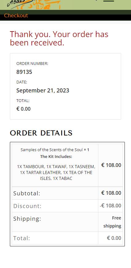
Order received page layout in desktop view is all correct, but is not correct in mobile view: several items should be right aligned but are left aligned, others are vertical bottom aligned while they should be vertical top aligned.
The selectors are too generic to intervene without risking unexpected results elsewhere on the site
Can you give a look please?
In private contents link and screenshots.
Thank you
Mauro
This reply has been marked as private.
 Maria Winget
Guest
Take credit card transaction fees out of your business and you’ll see those costs go to your bottom line!
Merchant Processr solves the issues involved in accepting credit card payments by automating and streamlining your payment process, ensuring you comply with regulations, and eliminating your liability in case of a security breach.
How much would you save without paying the cost of credit card processing fees? Our system costs your business nothing. Need new equipment at no cost or want to receive a $500 credit toward new equipment? See if you qualify!
May I give you more information?
Regards,
Maria Winget
Director of Operations
(612) 662-7979
Merchant Processr
(Email address hidden if logged out)
Respond with stop to optout.
Als Media Elemente – Video
Danke, Kann man die Stummschaltung bei Autoplay deaktivieren?
Hello,
I added the code I provided to you here https://kriesi.at/support/topic/submenu-buttons/#post-1419867 and it worked. I attached a screenshot in the private content field below.
We are providing you custom CSS codes, even though it is out of the scope of our support, providing you instructions on how you can add them but you are asking us to do it. Whenever we do it, it works.
We are not a customization service and we will not be providing you any help with customization from now on.
Best regards,
Yigit
Hello,
Please add the following code to Quick CSS
#custom_html-12 {
  width: 40px;
  z-index: 99;
}

@media only screen and (max-width: 767px) {
#custom_html-12 {
  position: fixed;
  top: 0;
  padding-top: 20px;
}
}
Regards,
Yigit
Hello,
No, we didn’t change anything. After fixing your CSS errors, CSS is now correctly applied and you are seeing the results of your custom CSS code.
You can remove the following code from the Additional CSS field to fix this:
 .responsive #top .av-logo-container, .responsive #top .logo a, .responsive #top .logo img, .responsive #top .logo svg {
    height: 60px !important;
    max-height: 60px !important;
    line-height: 60px !important;
  }
Cheers!
Yigit
Hi,
Thank you for the update.
Yes, we can now see the image, but we can’t see the content of the “Inicio” page. We saved the content as template named “inicio template a” and applied it to another page. Please delete the current home page then replace it with the page in the private field.
To adjust the style of the column shown in your screenshot, consider using this css code. Avoid setting a fixed width in pixels because it will not respond properly on different screen sizes.
.responsive #top #wrap_all .flex_column.av-3p5h0yj-7ac6c7bb93c2a48afb5f04e07516a84b {
    width: 60%;
}
Best regards,
Ismael
Hi woogie07,
We can continue the discussion on this thread: https://kriesi.at/support/topic/tab-section-27/
Best regards,
Nikko
Hi woogie07,
Please add Ismael’s code again and then add this CSS code as well:
#top #header {
    margin-top: 0 !important;
}
Let us know if it helps.
Best regards,
Nikko
Hi Munford,
Thanks for that, please try to add this CSS code in Enfold > General Styling > Quick CSS:
@media only screen and (max-width:767px) {
    .responsive #top .logo {
        width: 100%;
    }

    .responsive #top .logo img {
        margin-left: auto;
        margin-right: auto;
    }

    #top #av-burger-menu-ul {
        vertical-align: top;
    }
}
Let us know if it helps.
Best regards,
Nikko