-
Search Results
-
Topic: Theme overriding custom css
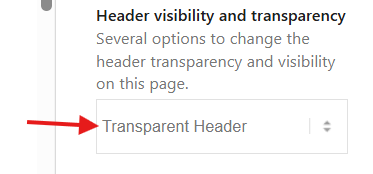
Topic: Transparacy header
How to remove that thin line that is between the top menu and the menu?
Topic: header logo not centered
Hi,
Thank you for the inquiry.
Dear TEam,
you helped my just a minute ago to increase the header logo sizeTry to add this css code to increase the size of the logo image – see below. – thats fine
But how to force the logo to be centered? I’ve chosen this option, but it keeps left-aligned
Best regards
Tilman
________________________________
.html_header_top.html_logo_center .logo {
    left: 0;
    transform: none;
}
Result:Screenshot-2025-10-17-at-12-33-48-PM
Best regards,
IsmaelI am using the knowledge base plugin from Echo plugins with my Enfold theme. On my article pages I have the issue that the Table of Contents in the right sidebar is not sticky, although it’s supposed to be.
In the knowledge base documentation the following is mentioned about this: “This issue is caused by your active WordPress theme. The theme has applied an overflow property somewhere on the page, which stops the TOC from scrolling.”
According to the same documentation the solution is to add the following css:
/*
The .container class needs to be change to the container class of your active themes classes. It could be even the HTML Tag or BODY Tag.
*/
.container {
overflow: initial !important;
}Can someone tell me if this will work and if it does where to paste this code?


