The issue is only visible on ipads. Android, OSX and Windows is working fine.
The Issue is mentioned above in the first post. If you use a anchor link or the “scroll-down” of the sliders the page will match the given anchor link the the top of the page and ignore the sticky header. The result is that the first headline or content will be hidden behind the sticky header. But again, only on the ipad. This was not a issue with older versions of enfold.
Thanks for your help.
So i may have found a to achieve this, just incase someone stumbles across this
Make sure you have the custom CSS field enabled in ALB and add a class name to the element.
Then in the quick css add the following: (change the url to where ever your img is hosted at)
.your-custom-class .image-overlay.overlay-type-extern .image-overlay-inside:before {
    content: '';
    background-image: url(https://kriesi.at/wp-content/themes/kriesi/images/logo.png);
    background-repeat: no-repeat;
    background-size: contain;
    background-position: 50% 50%;
}
https://kriesi.at/support/topic/custom-image-overlay-on-images/
Unless there is a better or more efficient way to do this, you can close this ticket. :)
-
This reply was modified 8 years, 10 months ago by
 Drebosio.
Two notes from me to this mobile topic:
1. I think it would be great, if the mobile menu would totally change to the new style.
2. I would really appreciate it, if there would be an option in every element like ‘hide on mobile / hide on desktop’
Nevertheless you’re doing a really great job on this. It’s really a pleasure to work with this template!
Best regards
HR
-
This reply was modified 8 years, 10 months ago by
 hr-scr-net.
Hi again Victoria
Wow you are fast -thanks again :-)
I WILL look into your suggestions ;-)
You may close the topic.
Very best regards
I would like to present a series of images (logos in this case) and none of the elements in enfold seem to work.
For example, if I use the logos element, it looks like this on desktop:
https://www.dropbox.com/s/uorcu4zdrbcwz68/Screenshot%202017-06-23%2010.52.51.png?dl=0
On mobile however, it looks like this:
https://www.dropbox.com/s/w3p1btx5uxvfis8/Screenshot%202017-06-23%2010.53.45.png?dl=0
in other words, it does not scale properly…
Hey Victoria,
thank you.
First: The mega menu option is now available. The problem was my ultimate member plugin.
About the post formats:
I´ve tried it with the standard Editor, but there are also no options.
About the google map:
On different zoom levels the white lines are visible and they don´t disappear. When you click through the levels, than you know what I mean.
On the demo enfold 2017 the map works absolutely fine without these lines.
Can you please take a look one more time for these both points.
Victoria, thank you so much.
It´s embrassing for me, but can you tell me for the future how I can add in threads images or screenshots. I can´t find any options to load it from my desktop.
Best regards
Klaus
Hi,
Please do create a new topic, so we can have a full control of the things please.
Thank you for your understanding
Best regards,
Basilis
Hi Sergio,
This is not Enfold related, you could find your answers here:
https://wordpress.org/support/topic/on-woocommerce-3-0-getting-fatal-error-uncaught-exception-invalid-order/
https://wordpress.org/support/topic/editing-pages-and-posts-broken-after-update-to-3-0/
If you need further assistance please let us know.
Best regards,
Victoria
Hi,
Here is the code you can put in Enfold > General Styling > Quick Css, if it does not work, put into themes/enfold/css/custom.css
.content {
    padding-top: 0;
    padding-bottom: 0;
}
If you need further assistance please let us know.
Best regards,
Victoria
Hi CY,
Here is the code you can put in Enfold > General Styling > Quick Css, if it does not work, put into themes/enfold/css/custom.css
#top .main_menu .menu li {
    float: right;
    height: 80px;
    line-height: 80px;
    clear: right;
}
Where do you want the search to be? I see two of them, which one should stay?
If you need further assistance please let us know.
Best regards,
Victoria
Hi,
All right. :) Do let us know if you need further help with this topic, or if we can close this thread.
Thank you!
Best regards,
Sarah
Hi Nikko,
That works. Thank you.
Can you tell me how I can move my logo to the left. Please provide code that will allow me to adjust the logo position up/down left/right?
Also, how can I increase the size of just the “Have questions? (562) 528-5194” at the top of my page?
I’ve tried to create a small separator bar like the example site has just below the large background picture. I can’t seem to set the height to match theirs. It’s the grey bar.
Lastly, I want to create a “search” field on top of our background image where visitors can search the site. It’s just like Google has their search bar. Any advice would be appreciated.
Hi Yigit,
Thanks for your quick response. The CSS you suggested removes all the portfolio item page preview images except the first one. I want to remove the thumbnails that display at the bottom of each portfolio item page.
The following class I believe controls the thumbnail container, and when I add display: none; it does disable the thumbnails but it also disables the thumbnails on the main portfolio page, and I need those to stay as is.
.grid-sort-container isotope no_margin-container with-title-container grid-total-odd grid-col-4 grid-links-ajax isotope_activated {
display: none;
}
Hi Yigit,
Thanks for your input. I’ve tried this code on our staging site, with no other quick CSS. It helps. The single event listing is better, except the venue information is not there, nor the << All Events link at the top.
Single event on staging site with your suggested CSS only
https://i2.wp.com/centerforworldmusic.org/wp-content/uploads/2017/06/CWM-Event-Enfold-w-New-CSS-Added.jpg
However, the event list (all upcoming events) was actually made worse, with the venue info squeezed on the left.
Event list on staging site with your suggested CSS only:
https://i2.wp.com/centerforworldmusic.org/wp-content/uploads/2017/06/CWM-Event-List-Enfold-w-New-CSS-Added.jpg
I tried adding your suggested code to simple CSS in the live site, with a good deal of other Quick CSS entries, and it seems to make no difference:
https://centerforworldmusic.org/event/north-india-classical-sitar-tabla/
As you can see, the venue info is still hoisted up in what is seemingly its own column on the left.
I’m including our entire Quick CSS file in the Private Content area, in case perhaps you can spy something. Note that it contains a number of suggested tweaks derived from earlier interactions with the Tribe team on this forum.
Any further suggestions you might have would be much appreciated. Thanks! Lance
Hi,
We’re glad you were able to sort this out. Do you need further help about this topic?
Best regards,
Sarah
So, we have migrated over to the new host. The good news is that the spinning wheel has stopped and I can now access the page to edit. The bad news is that I cannot see the text and all of the editor buttons are missing. Not sure if I need to open a new thread for this.
-
This reply was modified 8 years, 10 months ago by
 DWMLawFirm.
Hi,
Unfortunately there is not enough room on mobile devices to make that work seamlessly. The below css is likely as good as you can make it with some additional line breaks if you don’t like my first solution. There is the option to make a second table that would perhaps be more mobile friendly and only show that on mobile while hiding it on the desktop.
.postid-2499 table td:nth-child(2){
width:160px!important;
}
Best regards,
Jordan Shannon
Hi Ahmad,
It’s very unusual that you’d like to hide the main and top menus… But if you’re absolutely sure that you’d like to do that, you can use this in Quick CSS:
@media only screen
  and (max-width: 1024px) {
	.advanced_menu_toggle {display:none}
	.sub_menu {display:none}
}
You may adjust the maximum width to fit your preference.
Best regards,
Sarah
Great!
Do you need more help with this topic or can we close this thread?
For your information, you can take a look at Enfold documentation here – http://kriesi.at/documentation/enfold/
For any other questions or issues, feel free to post them here on the forum and we will gladly try to help you.
Cheers!
Sarah
Hey Ric,
Here is the code you can put in Enfold > General Styling > Quick Css, if it does not work, put into themes/enfold/css/custom.css
.av-main-nav-wrap ul * {
    color: #fff;
}
#header_main_alternate {
      background-color: #2f3393;
}
#top #wrap_all .header_color .av-menu-button-colored > a .avia-menu-text {
  background-color: #00aeed;
}
.header_color .avia-menu-fx {
    border-bottom-color:  #00aeed;
    background-color:  #00aeed;
}

.av-main-nav-wrap ul.sub-menu * {
    color: #2f3393;
}
If you need further assistance please let us know.
Best regards,
Victoria
Hi,
Thank you Jordan for your support.
Unfortunately, Zen menu is not compliant with the WPML plugin so it will not work in my case.
is there any other plugin that can help with my purpose?
in the other hand, please how I can hide the main and top menus in the responsive view??
Regards,
Ahmad
Hey th-photography,
Please refer to this thread for a possible solution.
If you need further assistance please let us know.
Best regards,
Victoria
Hey FlatText,
I don’t see any breadcrumbs, could you give us a page with breadcrumbs and the tables?
Here is a thread on breadcrumbs.
Best regards,
Victoria
aha – on your portfolio item itself – open one please.
down under the editior of the content! there is a field (normaly it is there – if not look to window top right corner “screen options” mark the field “Additonal Portfolio Settings”) In this field under the content field – that is the content shown on Ajax Preview ! And not the content of the item itself.
Hi there support guys!
I have discussed this issue over on this thread:
I believe there is an issue with the tabbed page sections height not working when there are other layout elements inside the tabs. So on my page here: http://alert-it.co.uk/sense-it-new/
On some tabs there is a big white space after where the tab section has not re-sized to fit the content.
Nikko: You mentioned you had been able to replicate the issue and when I chased it up you said about it still being a bug to be fixed. Is there any progress with this?
I was actually just looking on Query Monitor at some script errors and I noticed the following not working:
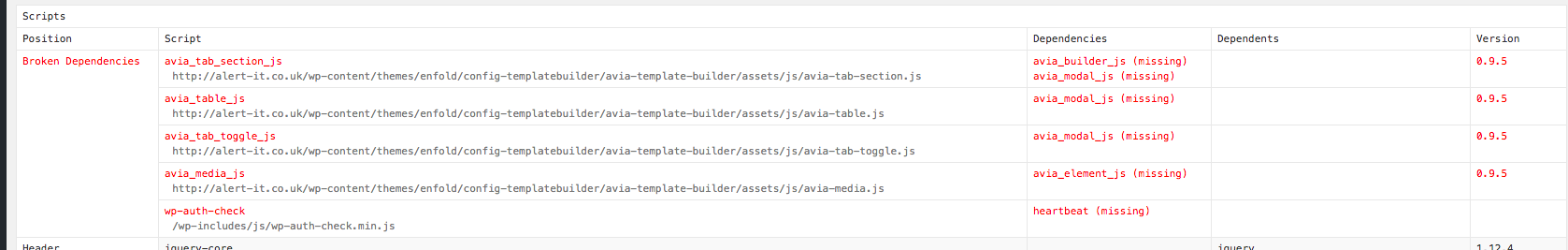
Is there anything that I can do in the meantime to get this working or are you able to apply a fix for this at the moment?
Many thanks in advance for your support.
Ben
Hi,
Attached login info.
Also, see the search widget that i added on top of slider. It doesn’t seem to align horizontally. For some reason it’s vertical. please help.
I’ve tried fixing it for hours.
Waiting for all your answers.
Hey.
Excuse me. I have normal signs without special characters. It’s not working in Moz (all plugins are of in Moz and WP)
And also the colour definition is not working for first tab. Only if the switch to another tab in chrome, the tab font color has change the design. is an !Important Missing? I don’t know.
I wait for the moment, when the finally tab section is working with an update ASAP.
It’s so buggy and so many workarounds. I have the feeling i should to ask a full time dev to set all manual workarounds on my and my 13 clients enfold pages. Inside the tab content, it seems a table show also not special signs like a mathematic sign “<” or “>”
PS: it’s not possible to send credentials for my clients page.
Best
S.
please delete your code and try this one:
.av-hotspot-container .av-image-hotspot_inner {
    border-radius: 0 !important;
}

.av-hotspot-container .av-image-hotspot-pulse {
    border-radius: 0 !important;
}

.responsive .av-image-hotspot {
    font-size: 14px;
    height: 30px;
    line-height: 29px;
    width: 30px;
}

.responsive .av-image-hotspot-pulse {
    height: 60px;
    left: -15px;
    top: -15px;
    width: 60px;
}
i increased the size of the font a bit – if you don’t like it try with your font-size.
vertical-centering you can achieve via line-height parameter.
Hi there,
For color sections, I use the layout option “Display a small arrow that points down to the next section”, as it looks really nice.
I’d also like to use a section overlay image, but that seems to conflict with the arrow option.
When I activate both the arrow and the overlay image, the area with the arrow looks a bit weird and you can see the overlay image in the whitespace around the arrow. You can have a look at it here, right below the green section at the top: https://www.mondiale.de/web/en/jobs/
Any idea how to fix that?
Thanks in advance!