-
AuthorSearch Results
-
October 19, 2025 at 4:02 pm #1490373
In reply to: header logo not centered
Hi,
Try adding this css:.html_header_top.html_logo_center .logo img { left: 50%; transform: translate(-50%, 0); }After applying it, clear your browser cache & check.
Best regards,
MikeOctober 19, 2025 at 1:08 am #1490366In reply to: Sorting Posts Differently on Different Pages
HI Ismael, thank you for your response. I inserted the code into the functions, but it doesn’t seem to work.
I updated a post and classified it for the blog page, but it is still showing up in chronological order. I updated it today, so it should be at the top if that page is sorting by modified date. When you have a chance, could you look and let me know if I did something wrong? Thank you!
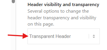
October 17, 2025 at 10:32 pm #1490359In reply to: Logo header transparent but not sticky Desktop
Hey gquezada1,
To make the header transparent, choose the Transparent Header option for your page:
Then to make the header not sticky, go to Theme options > Header > Header Behavior > Sticky Header and unchoose:
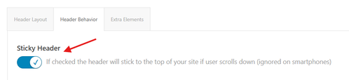
This is the solution for desktop, transparent headers are not supported for mobile by default, for mobile you will need to follow this thread:Best regards,
MikeOctober 17, 2025 at 8:50 pm #1490356Topic: Logo header transparent but not sticky Desktop
in forum Enfoldgquezada1
ParticipantHi, Is there a way to make the logo transparent and not sticky on the desktop and mobile?
-
This topic was modified 5 months ago by
gquezada1.
October 17, 2025 at 4:50 pm #1490353I believe I understand those instructions. However, I still have questions on how to edit the template in question.
I believe the correct template is taxonomy-portfolio_entries.php. I made a few adjustments to it…but I’d like to further customize the template.
1. I would like to remove “Archive: ” from the title (It’s NOT an “archive”. It’s a category. If I could append it somehow…like with a data attribute?
2. I would like to have some control over the layout, can this template use a page with a custom layout (like the way the Blog page can be set to a custom page)?
3. When this grid first loads, on hover, the image-overlay appears as a thin strip at the top. I could not determine how to eliminate this with css.With regard to the Sidebar, thank you for providing more clarity there!
I went to Enfold > Sidebar Settings > Sidebar On Archive Pages and chose Right Sidebar. That works.I also set Separate Sidebars For Blog And Archive Pages to Show separate Archive Sidebar on Archive Pages. That works. It exposes the Sidebar Archives widget area.
Then, I added the navigation menu widget to the Sidebar Archives widget area, but it does not display (that’s how I realized that this has to be a totally different template file: taxonomy-portfolio_entries.php). Rather, a default: Pages, Categories, Archive widget set is shown.
I don’t think its the right solution to set that navigation menu widget to Display Everywhere because that would affect other pages where I may want to have a sidebar with different widgets in the sidebar…is that the ONLY way?
Thank you for any advice (and for your patience), I really appreciate it.
October 17, 2025 at 1:47 pm #1490349In reply to: Margins for masonry grid loading delay on mobile
Yes, you solved the problem!
Thank you so much for all your time and effort!This topic can be marked as resolved.
October 17, 2025 at 12:33 pm #1490343In reply to: Transparacy header
Hey limedrop,
Please try the following in Quick CSS under Enfold->General Styling:
#top .av_header_transparency #header_meta {
  border-bottom: none;
}
Best regards,
RikardOctober 17, 2025 at 10:50 am #1490338In reply to: .scroll-down-link
hm – didn’t i mention a solution before ? …
but take this instead from https://kriesi.at/support/topic/scroll-down-link/#post-1489662 – because we have choosen before this slightly rounded version :
function avia_replace_default_icons($icons){
 $icons['svg__scrolldown'] =  array( 'font' =>'svg_entypo-fontello', 'icon' => 'down-open');
 $icons['svg__prev'] =  array( 'font' =>'svg_entypo-fontello', 'icon' => 'left-open');
 $icons['svg__next'] =  array( 'font' =>'svg_entypo-fontello', 'icon' => 'right-open');
 return $icons;
}
add_filter('avf_default_icons','avia_replace_default_icons', 10, 1);
and try :
#top .avia-post-nav {
  padding: 20px;
}

#top .avia-post-nav .label {
  position:absolute;
  top:50% !important;
  transform: translateY(-50%);
  height:48px;
  margin-top:0;
}

.avia-post-nav .label.avia-svg-icon svg:first-child {
  fill: #FFF;
  height:48px;
  width: auto;
}
btw: you can have on opend slide-out a different fill color:
#top .avia-post-nav:hover .label.avia-svg-icon svg:first-child {
  fill: #eee
}
October 17, 2025 at 10:04 am #1490331In reply to: Padding on search results page
I want to have same rules but for different devices (mobile, tablet and desktop) to get different custom margins on this elements of search results page. It’s more precise like that ?
October 17, 2025 at 9:58 am #1490330Topic: Transparacy header
in forum EnfoldOctober 17, 2025 at 6:54 am #1490324In reply to: header logo not centered
Hey!
Thank you for the update.
Try to remove the previous css code, then replace it with this css rule.
.html_header_top.html_logo_center .logo {
    left: 50%;
    transform: translate(-50%, 0);
    width: 100%;
}

html_header_top.html_logo_center .logo img, html_header_top.html_logo_center .logo svg {
    margin: 0 auto;
}
Let us know the result.
Regards,
IsmaelOctober 17, 2025 at 6:49 am #1490323Topic: header logo not centered
in forum Enfoldoestersund
ParticipantHi,
Thank you for the inquiry.
Dear TEam,
you helped my just a minute ago to increase the header logo sizeTry to add this css code to increase the size of the logo image – see below. – thats fine
But how to force the logo to be centered? I’ve chosen this option, but it keeps left-aligned
Best regards
Tilman
________________________________
.html_header_top.html_logo_center .logo {
left: 0;
transform: none;
}
Result:Screenshot-2025-10-17-at-12-33-48-PM
Best regards,
IsmaelOctober 17, 2025 at 6:48 am #1490322In reply to: Can’t Upload SVG Icon Set
Hi,
Thank you for the inquiry.
Are you trying to upload this in Enfold > Import/Export? The name of the top folder in the zip file should be “SVG”. Currently, it’s named “Medical_Icons_SVG”, so the theme can’t recognize it. Please rename the top folder, then archive or zip it again before uploading it to the icon manager.
Please check this documentation for more info: https://kriesi.at/documentation/enfold/svg-icon-sets/
Best regards,
IsmaelOctober 17, 2025 at 6:41 am #1490319In reply to: Edit sub-sub menu
Hi,
Thank you for the update.
Adjusting the line spacing of the text doesn’t seem to make a difference on our end, but we’re using a relatively small screen, which might be the reason. If you want to adjust the font size and also limit the height of the mega menu images, try this css code:
#top #header .avia_mega_div > .sub-menu > li > ul > li a .avia-menu-text {
    line-height: 10px;
    font-size: 10px;
}

#top #wrap_all .avia_mega_div img {
    height: 64px;
    object-fit: cover;
    width: 100%;
}
Result:

Best regards,
IsmaelOctober 17, 2025 at 6:34 am #1490317In reply to: header logo size – not big enough
Hi,
Thank you for the inquiry.
Try to add this css code to increase the size of the logo image.
.html_header_top.html_logo_center .logo {
    left: 0;
    transform: none;
}
Result:

Best regards,
IsmaelOctober 17, 2025 at 6:30 am #1490316Hi,
Thank you for the update.
Did you add this css code?
.avia-menu.av-main-nav-wrap, .main_menu {
    width: 100%;
    display: flex;
    justify-content: flex-end;
}
This causes the main menu to cover the top half of the sidebar and everything below it. You need to remove this code or override it with this css rule.
#top .avia-menu, #top .main_menu {
    display: block;
}

#top .avia-menu #avia-menu {
    float: right;
}
Screenshot showing the menu overlap issue:

If you have any additional questions at this time we kindly ask that you open them up in a separate thread. The longer threads get in the forum, they become more difficult to support as they tend to drift off topic and they also make it troublesome for users trying to search for solutions. Keeping threads relevant to their original inquiry ensures that we can keep better track of what has been resolved and that users can more effectively find answers to similar issues they might be experiencing.
Thanks!
Best regards,
IsmaelOctober 16, 2025 at 3:37 pm #1490296The password protection shouldn’t matter, you can still see the links aren’t working. But I removed the password.
I did some tinkering, and I have discovered something.
Compare one portfolio item vs. another. They have the same template but their Title Bar settings are different.
The Title Bar is set to “hide both” and the links don’t work here:The Title Bar is set to “default”, and the links do work here:
So there is something that is causing the links to stop working if “hiding both” is selected. I think it is the existence of drop-down menu items in the header where those regions overlap the sidebar. See this screenshot:
https://drive.google.com/file/d/1gac80t1KhrN_RVFbez1uoBZXRLn9RSR_/view?usp=sharing
You can see that the region for the drop-down menus overlaps the sidebar menu items at the top. I added two additional categories in the menu, and those work because they fall below the drop-down menu region.
As a work around, I can show the title bar (though, for various reasons particular to this site’s content, I wanted to hide the title and use an h1 in the custom layout), but I think this should be addressed so that one can have a drop-down menu, and sidebar navigation that do not conflict (out-of-the-box). I could also add padding to the menu…but I shouldn’t have to force the sidebar menu down on the page to avoid overlap with the drop-down menu region–if the region were larger, it would still conflict with moderate padding.
Can you fix this?
Just in case there was an issue between the Boxed vs Stretched layout, I switched to the stretched layout (but it turns out the same issues existed in Boxed and Stretched).
Also: Before I found this through inspecting the menu, I’d considered these options below. I’m including them in case it’s helpful:
I also tried setting the page’s sidebar settings to use “Sidebar Pages” and moved the navigation widget to the default Sidebar Pages widget area. Same result, so it doesn’t appear to be an issue with the custom widget area.
I added Enfold Child Latest Portfolio links to the Sidebar Pages widget area and those links work (even when “hide both” is selected). ((But this is because they appear lower on the page and don’t conflict with the Z-index of the drop-down menus, even when those drop-down menus aren’t active.))
I have since removed these test options and put the navigation menu widget back in the custom widget area and changed the settings back to display these in my custom posts.
October 16, 2025 at 1:44 pm #1490291In reply to: header logo size – not big enough
do you have set your header to logo top menu below?
October 15, 2025 at 9:47 pm #1490260Topic: Sticky TOC in Echo Knowledge base plugin not working
in forum Enfoldpfk-kbh
ParticipantI am using the knowledge base plugin from Echo plugins with my Enfold theme. On my article pages I have the issue that the Table of Contents in the right sidebar is not sticky, although it’s supposed to be.
In the knowledge base documentation the following is mentioned about this: “This issue is caused by your active WordPress theme. The theme has applied an overflow property somewhere on the page, which stops the TOC from scrolling.”
According to the same documentation the solution is to add the following css:
/*
The .container class needs to be change to the container class of your active themes classes. It could be even the HTML Tag or BODY Tag.
*/
.container {
overflow: initial !important;
}Can someone tell me if this will work and if it does where to paste this code?
October 15, 2025 at 12:12 pm #1490251In reply to: Padding on search results page
What do you mean by ‘devices’ – there are no restrictions regarding different devices in the CSS rules above?
By the way, you should not set this for mobile devices, as it looks terrible (it is not easy to read with these settings).
f.e.:/*Ajout de marges personnalisées dans les sections spécifiques de la page de résultats de recherche*/ @media only screen and (min-width: 768px) { .responsive #top.search #main .container { max-width: 100%; } .responsive #top.search #main .page-heading-container { max-width: 1310px !important; padding-right: 100px !important; padding-left: 100px !important; } .responsive #top.search #main .post-entry { margin-left: 100px !important; margin-right: 100px !important; } }October 15, 2025 at 10:30 am #1490249In reply to: Padding on search results page
Thanks @guenni007 for the code, that’s what i wanted to get for my website but can you tell me how i can do to put different spaces on all devices ?
The code modified with my values is :
/*Ajout de marges personnalisées dans les sections spécifiques de la page de résultats de recherche*/
.responsive #top.search #main .container {
  max-width: 100%;
}

.responsive #top.search #main .page-heading-container {
  max-width: 1310px !important;
  padding-right: 100px !important;
	padding-left: 100px !important;
}

.responsive #top.search #main .post-entry {
  margin-left: 100px !important;
  margin-right: 100px !important;
}
October 15, 2025 at 9:37 am #1490241In reply to: Padding on search results page
something like this:
.responsive #top.search #main .container {
  max-width: 100%;
}

.responsive #top.search #main .page-heading-container {
  max-width: 1310px !important;
  margin: 0 auto 50px;
  padding: 0 50px 50px;
}

.responsive #top.search #main .post-entry {
  margin-left: 50px;
  margin-right: 150px;
}
October 14, 2025 at 11:42 pm #1490226You can close this. This actually worked;
.container_wrap { border-top: none !important; }
.container_wrap { border-bottom: none !important; }
October 14, 2025 at 5:51 pm #1490213Topic: Two-tier (or two-row) navigation bar
in forum Enfoldvantagepointmg
ParticipantHello
Is there a way to create a two-tier (or two-row) navigation bar with simple CSS?
For example:
Top row: Home | About | Contact
Second row: Services | Products | Suppliers
Thank youOctober 14, 2025 at 12:02 pm #1490194In reply to: Submit button on contact form
you should shift not the button but the p-tag that has that button.
because pseudo class :has is already for most browsers usable we can do:.page-id-15 p.form_element:has(.av-recaptcha-submit) { margin-top: -20px; }or if you are able to give a custom-class to that p-tag use that instead for better browser support.
October 14, 2025 at 9:26 am #1490182In reply to: Slider is not showing on ipad
i can see both images on mobile ( dev tools setting ). So autoplay works on my end here
i did not check if real mobile device shows it.October 14, 2025 at 8:52 am #1490179In reply to: Looking for Menu Support
Hi,
I can see this text in a Color Section with a green background both on the front- and backend: Best of Cleveland Award winner 17 years in a row!
Did you manage to get it working? If you have questions which is not on the original topic, then please open new threads for each of them.
Best regards,
RikardOctober 14, 2025 at 6:37 am #1490165In reply to: Slider is not showing on ipad
This reply has been marked as private.October 14, 2025 at 6:22 am #1490162In reply to: Slider is not showing on ipad
Hi,
We can now see the fading slider. If you need this to be visible on tablet view, please add this css code:
@media screen and (max-width: 1024px) {
    .responsive.av-no-preview #top #wrap_all #slider-gebaede-frueher-heute {
        display: block !important;
    }
}
Let us know the result.
Best regards,
IsmaelOctober 14, 2025 at 6:10 am #1490160In reply to: Margins for masonry grid loading delay on mobile
Hi,
This only seems to hide the empy item om the “News” page (https://regenboogalliantie.nl/nieuws/)
The same issue is visible in the masonry element on the page https://regenboogalliantie.nl/nieuws/The links above look the same. Can you provide the correct link to the other page? For the home page, you can add this css code:
#top .av-mfb8b6h9-903a18144fa2874ec5abc87835770ec5 .av-masonry-container .av-masonry-entry:first-child,
#top .av-mfgqr9vd-8ed003c43d554c716ccad992e0119c66 .av-masonry-container .av-masonry-entry:first-child {
    display: none !important;
}
If you’re planning to add more Masonry elements in the future, go to Advanced > Developer Settings, add a Custom CSS Class name “av-masonry-no-empty-items”, then add this css code:
#top .av-masonry-no-empty-items .av-masonry-container .av-masonry-entry:first-child {
    display: none !important;
}
For the read more link, try to replace the previous script with this:
(function($){
    $(document).ready(function() {
        $('.av-masonry:not([class*="-gallery"]) .av-masonry-entry').each(function() {
            var more = $(this).find('.av-masonry-read-more');
            var cont = $(this).find('.av-masonry-entry-content');

            if (more.length == 1) return;
            cont.append('<div class="av-masonry-read-more">Lees meer ></div>');
        });

        $(window).trigger('resize av-height-change');
    });
})(jQuery);
Best regards,
Ismael -
This topic was modified 5 months ago by
-
AuthorSearch Results
-
Search Results
-
Topic: Transparacy header
How to remove that thin line that is between the top menu and the menu?
Topic: header logo not centered
Hi,
Thank you for the inquiry.
Dear TEam,
you helped my just a minute ago to increase the header logo sizeTry to add this css code to increase the size of the logo image – see below. – thats fine
But how to force the logo to be centered? I’ve chosen this option, but it keeps left-aligned
Best regards
Tilman
________________________________
.html_header_top.html_logo_center .logo {
left: 0;
transform: none;
}
Result:Screenshot-2025-10-17-at-12-33-48-PM
Best regards,
IsmaelI am using the knowledge base plugin from Echo plugins with my Enfold theme. On my article pages I have the issue that the Table of Contents in the right sidebar is not sticky, although it’s supposed to be.
In the knowledge base documentation the following is mentioned about this: “This issue is caused by your active WordPress theme. The theme has applied an overflow property somewhere on the page, which stops the TOC from scrolling.”
According to the same documentation the solution is to add the following css:
/*
The .container class needs to be change to the container class of your active themes classes. It could be even the HTML Tag or BODY Tag.
*/
.container {
overflow: initial !important;
}Can someone tell me if this will work and if it does where to paste this code?