-
AuthorSearch Results
-
February 12, 2024 at 6:23 am #1434050
In reply to: Cart text overlaps entry in change address form
It was on desktop too. The code below did the trick.
If the issue is also happening on desktop view, remove the css media query.
.wc-block-components-form .wc-block-components-text-input.is-active label,
.wc-block-components-text-input.is-active label {
opacity: 0;
}Thanks!
February 12, 2024 at 4:41 am #1434047In reply to: Advanced Custom Fields broken since update
Hey Blaise,
Thank you for the inquiry.
There have been a few changes in the post meta info and the blog post elements, which might have caused the layout to change. To fix this, you can add the following css code to adjust the layout of the post meta info.
#top .av-blog-meta-category-disabled .minor-meta.blog-categories, #top .av-blog-meta-category-disabled .text-sep-cat, #top .av-blog-meta-category-disabled .minor-meta.blog-categories, #top .av-blog-meta-category-disabled .text-sep-source {
  display: none;
}

#top .fullsize .template-blog .post-meta-infos .author {
  display: block;
  font-weight: 600;
}
Best regards,
IsmaelFebruary 12, 2024 at 4:34 am #1434046In reply to: buttons don`t work on the cell phone
Hey Diana,
Thank you for the inquiry.
Please add this css code to decrease the padding of the slider caption container to create more space and adjust the style of the slider buttons on mobile view.
@media only screen and (max-width: 767px) {

  /* Add your Mobile Styles here */

  #top #wrap_all .av-kvs50u-67fae942c84a74078cfcead2fbe75fa9 .avia-slideshow-button {
    width: 100%;
    margin-top: 10px;
  }

  #top #wrap_all .av-kvs50u-67fae942c84a74078cfcead2fbe75fa9__0 .container.caption_container .slideshow_align_caption {
    padding-top: 50px !important;
    vertical-align: top;
  }
}
Best regards,
IsmaelFebruary 12, 2024 at 3:38 am #1434044In reply to: Cart text overlaps entry in change address form
Hi,
Thank you for the screenshot.
Is the issue only visible on mobile view? If so, then you can try this css code to hide the label when the input field is active.
@media only screen and (max-width: 767px) {

  /* Add your Mobile Styles here */
  .wc-block-components-form .wc-block-components-text-input.is-active label,
  .wc-block-components-text-input.is-active label {
    opacity: 0;
  }
}
If the issue is also happening on desktop view, remove the css media query.
  .wc-block-components-form .wc-block-components-text-input.is-active label,
  .wc-block-components-text-input.is-active label {
    opacity: 0;
  }
Best regards,
IsmaelFebruary 12, 2024 at 3:21 am #1434042In reply to: Header Transparency
Hey dreamreader,
Thank you for the inquiry.
Did you set the Header visibility and transparency settings to Transparent & Glassy Header? If you did, then you can use this css code to adjust the transparency of the header background.
#top .av_header_glassy.av_header_transparency .header_bg {
    opacity: 0.5;
}
Default opacity value is 0.1.
Best regards,
IsmaelFebruary 12, 2024 at 2:44 am #1434038In reply to: Blocks are cut at 50% in mobile screen
Hey bcndisseny,
Thank you for the inquiry.
You can add this css code to adjust the default padding of the cell or column and create more space for the contact form on mobile view.
@media only screen and (max-width: 767px) {

  /* Add your Mobile Styles here */
  .responsive #top #wrap_all .flex_cell.av-c9mynt-bafa8a24bf3e6e0c489a0aa61dc412d0 {
    padding: 20px !important;
  }
}
Best regards,
IsmaelFebruary 12, 2024 at 12:05 am #1434035In reply to: Link with lightbox only content option
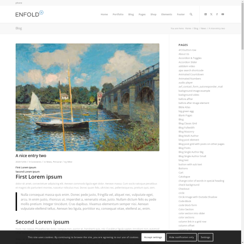
Hi,
I tried to recreate the post that you linked to, so I created a test page with two links:

the first link opens a Classic Editor post in a new tab, the second opens the same post in a lightbox, in order for the link to work this must be added to the end of the post url:
?iframe=true&modal
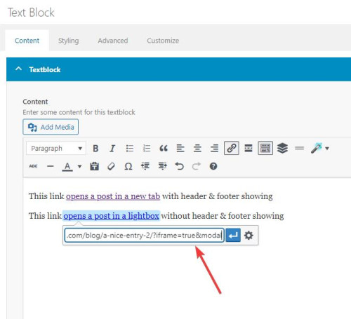
Then I added two snippets in my WP Code plugin, the first is a PHP snippetfunction add_modal_qs(){ if(isset($_GET['modal'])) { global $avia_config; if(isset($avia_config)) { $avia_config['template'] = 'blank'; } } } add_action('init', 'add_modal_qs');the second is a CSS snippet
#top.blank .title_container,#top.blank #main .sidebar{display:none;}
#top.blank .container .av-content-small.units {width: 100%;}
#top.blank .container .content {border: none;}
#top.blank #main .sidebar {border: none;}
The PHP snippet opens the post in a lightbox with no header or footer, the CSS snippet hides the titlebar and the sidebar and makes the post content full width.
So the first link, with the normal url, opens the post in a new tab with everything showing:
the second link with ?iframe=true&modal added to the url open a lightbox with only the content showing:

Best regards,
MikeFebruary 11, 2024 at 10:00 pm #1434029In reply to: Breakpoint for Flipbox Grid to be set to lower.
Hey ausgesonnen,
This seems to ba a duplicate thread, I offered a solution in your other thread, please review.Best regards,
MikeFebruary 11, 2024 at 8:47 pm #1434025In reply to: Full transperent Cookie-Banner
Hey northorie,
Try starting with the theme options to have the cookie bar at the bottom of the page, and then add this CSS in your Enfold Theme Options ▸ General Styling ▸ Quick CSS field:#top .avia-cookie-consent.avia-cookiemessage-bottom { bottom: unset; left: unset; margin: 0; position: absolute; top: 50%; left: 50%; transform: translate(-50%, -50%); background-color: rgba(0,0,0,0.3); } #top .avia-cookie-consent .avia-cookie-consent-button { display: block; width: 60%; margin: 10px auto; } #top .avia-cookie-consent p { display: block; padding-bottom: 20px; } #top .avia-cookie-consent-button { border-radius: 50px; } @media only screen and (max-width: 767px) { #top .avia-cookie-consent.avia-cookiemessage-bottom { width: 80%; } } @media only screen and (min-width: 768px) { #top .avia-cookie-consent.avia-cookiemessage-bottom { width: 25%; } }the desktop results:

tablet:

mobile:

Please ensure to copy the code from the forum and not an email notification so the symbols are not converted.
After applying the css, please clear your browser cache and check.Best regards,
MikeFebruary 11, 2024 at 7:33 pm #1434018In reply to: Table Header Loses Stying on Mobile
Almost! I’ve lost the green header with the addition of the new CSS. Also, in order to make this work, too, I had to stick it in the middle of my old CSS.
/*Avia Table*/
#top .avia-table td, #top .avia-table tr, #top .avia-table th, #top .avia-table tr th:first-child, #top .avia-table tr td:first-child {border-color: #000;}#top .main_color .avia-data-table.avia_pricing_minimal td {color: #000; font-size: 15px;}
#top .main_color .avia-data-table.avia_pricing_minimal. th {
background-color: #70bf4f; color: white; text-align: left;
}/*Avia Table Not Accepted Custom CSS for Red Header*/
#top .main_color .avia-data-table.avia_pricing_minimal.not-accepted th {
background-color: #FF0000; color: white; text-align: left;
}table.avia_pricing_minimal td {
text-align: left !important;
}#top .fullsize .template-blog .post .entry-content-wrapper {
text-align: left;
}February 11, 2024 at 6:45 pm #1434012In reply to: Overlapping Header and Shortened Menus
Hi Rikard,
It is now worse on my 13″ Apple laptop, as you can see here: https://snipboard.io/0HYMQf.jpg
So, I had to delete the CSS you provided, but the same issues are still there:
1. overextended header menu, and,
2. menu items not fully listed.
Is it possible for you to go into my backend and try to fix the two issues and then tell me exactly what you did?
Regards,
Ramon
February 11, 2024 at 6:40 pm #1434010In reply to: PHP Fatal error: Uncaught TypeError
Hi,
Great, I’m glad to hear that you found a solution, and thanks for sharing. Please let us know if you should need any further help on the topic, or if we can close it.
Best regards,
RikardFebruary 11, 2024 at 5:21 pm #1434000In reply to: blog page customize
Hey rqn,
If you want to hide the prev / next post navigation and add a new blog post navigation to the bottom of the posts, above the share buttons, try adding this code to the end of your child theme functions.php file in Appearance ▸ Editor:add_filter( 'the_content', 'prev_next_post_nav' ); function prev_next_post_nav( $content ) { if ( is_singular('post') ) { $content .= '<div style="clear:both;"></div>'; $content .= '<div class="prev-next-nav-container">'; $content .= '<div class="prev-nav">'; $content .= get_previous_post_link(); $content .= '</div>'; $content .= '<div class="next-nav">'; $content .= get_next_post_link(); $content .= '</div>'; $content .= '</div>'; return $content; } else { return $content; } }Then add this CSS in your Enfold Theme Options ▸ General Styling ▸ Quick CSS field:
.prev-next-nav-container {
	width: 100%;
	height: 70px;
    padding-top: 20px;
    padding-bottom: 10px;
}
.prev-next-nav-container .prev-nav {
	display: inline-block;
	float: left;
    border-style: solid;
    border-width: 2px;
    border-radius: 0px;
    text-align: center;
    padding: 5px;
    text-decoration: none;
}
.prev-next-nav-container .next-nav {
	display: inline-block;
	float: right;
    border-style: solid;
    border-width: 2px;
    border-radius: 0px;
    text-align: center;
    padding: 5px;
    text-decoration: none;
}
.prev-next-nav-container .prev-nav:hover,
.prev-next-nav-container .next-nav:hover {
	background-color: rgba(0,0,0,.2);
	color: #fff;
}
.prev-next-nav-container .prev-nav:hover a,
.prev-next-nav-container .next-nav:hover a {
	color: #fff;
}
.prev-next-nav-container .prev-nav a,
.prev-next-nav-container .next-nav a {
	display: inline-block;
}
.prev-next-nav-container .prev-nav:empty,
.prev-next-nav-container .next-nav:empty,
.single-post .avia-post-nav.avia-post-prev,
.single-post .avia-post-nav.avia-post-next {
  display: none;
}
This will make post navigation buttons like this:

The buttons only have a light styling, you can adjust to suit.
On Advanced Layout Builder posts they will show at the bottom of the post page:

Please ensure to copy the code from the forum and not an email notification so the symbols are not converted.Best regards,
MikeFebruary 11, 2024 at 2:14 pm #1433994Topic: Link with lightbox only content option
in forum Enfoldwelswebmaster
ParticipantHi Enfold team,
Thanks always for your support and theme.I’m using posts in two ways. 1) Display full post when accessing via post URL. 2) Displaying a lightbox of a post when adding the iframe=true to the end of the URL.
When doing #2, I’d like to only display the body of the post. When doing #1 I would like to display all (header, footer, sidebar and socket as it normally does.
I saw https://kriesi.at/support/topic/open-page-in-modal-lightbox-without-sidebars-header-and-footer/ but that addresses only one situation. How might I accomplish both?Thanks for your help.
February 11, 2024 at 2:06 pm #1433993In reply to: Table Header Loses Stying on Mobile
Hi,
Try this CSS in your Enfold Theme Options ▸ General Styling ▸ Quick CSS field:#top .main_color .avia-data-table.avia_pricing_minimal.not-accepted th { background-color: red; color: white; text-align: left; }Please ensure to copy the code from the forum and not an email notification so the symbols are not converted.
After applying the css, please clear your browser cache and check.Best regards,
MikeFebruary 11, 2024 at 12:22 pm #1433984Topic: Change layout of category archive to masonry style
in forum EnfoldVera
ParticipantHi,
referring to your reply #1433752 my question as a new thread:
How to change the layout of category archives to masonry style?
Your latest suggestions in the thread didn’t work on my side. Login below.Best regards,
VeraFebruary 11, 2024 at 11:52 am #1433981In reply to: Change 1 font color on Mobile Menu
Hi,
Great, I’m glad to hear that you found a solution :-)
Please let us know if you should need any further help on the topic, or if we can close it.
Best regards,
RikardFebruary 11, 2024 at 11:51 am #1433980Hi,
Great, I’m glad that we could help you out. Please let us know if you should need any further help on the topic, or if we can close it.
Best regards,
RikardFebruary 11, 2024 at 11:40 am #1433976In reply to: Cart text overlaps entry in change address form
Hey designmek,
Please try the following in Quick CSS under Enfold->General Styling:
.wc-block-components-combobox .wc-block-components-combobox-control label.components-base-control__label {
  top: -27px;
}
Best regards,
RikardFebruary 11, 2024 at 11:04 am #1433970In reply to: You are running the latest version! (4.4)
Hi,
Great, I’m glad to hear that you solved your problem. Please let us know if you should need any further help on the topic, or if we can close it.
Best regards,
RikardFebruary 11, 2024 at 12:05 am #1433960In reply to: Table Header Loses Stying on Mobile
Am I allowed a second and related question?
If I want to make the header (th) of the second table a different color like red, how would I modify the CSS? I currently have the CSS below to color the headers the same green #70bf4f.
I added a custom class: not-accepted to the second table. Where do I add the custom class “.not-accepted” to the CSS below?
The reason for this is because the tables work best in mobile if they are separate. Otherwise both headers stack first and then the data so it’s confusing for the user.
/*Avia Table*/
#top .avia-table td, #top .avia-table tr, #top .avia-table th, #top .avia-table tr th:first-child, #top .avia-table tr td:first-child {border-color: #000;}#top .main_color .avia-data-table.avia_pricing_minimal td {color: #000; font-size: 15px;}
#top .main_color .avia-data-table.avia_pricing_minimal th {
background-color: #70bf4f; color: white; text-align: left;
}table.avia_pricing_minimal td {
text-align: left !important;
}#top .fullsize .template-blog .post .entry-content-wrapper {
text-align: left;
}-
This reply was modified 2 years, 1 month ago by
beverlystone. Reason: Additional details
February 10, 2024 at 11:36 pm #1433959In reply to: Breakpoint for Flipbox Grid to be set to lower.
Hey ausgesonnen,
Try this CSS in your Enfold Theme Options ▸ General Styling ▸ Quick CSS field:@media only screen and (max-width: 1190px) { #top .avia-icongrid.av-flex-cells.av-break-989 .av-icon-cell-item { flex: 1 1 100%; } }Please ensure to copy the code from the forum and not an email notification so the symbols are not converted.
After applying the css, please clear your browser cache and check.Best regards,
MikeFebruary 10, 2024 at 8:39 pm #1433944Hi,
Try also adding this CSS in your Enfold Theme Options ▸ General Styling ▸ Quick CSS field:@media only screen and (max-width: 767px) { .responsive #top.page-id-472 .avia-data-table.avia_pricing_minimal tr { padding-bottom: 20px; } }Please ensure to copy the code from the forum and not an email notification so the symbols are not converted.
After applying the css, please clear your browser cache and check.Best regards,
MikeFebruary 10, 2024 at 7:21 pm #1433938In reply to: Change 1 font color on Mobile Menu
YES! I figured something out on my own! All your skills are rubbing off on my. Ha. This is the code I used to change 1 font color on desktop and mobile. thanks
#menu-item-4776 > a > .avia-menu-text {
color: #3eec0e!important;
}#av-burger-menu-ul .menu-item-4776 > a > .avia-menu-text {
color:#3eec0e!important;
}February 10, 2024 at 7:08 pm #1433935Topic: Change 1 font color on Mobile Menu
in forum Pre Sale Questionsbemodesign
ParticipantI added this code below and it properly changed the color on desktop, but not on Mobile view. Can you get me code to change 1 mobile menu item to a different color?
#menu-item-4776 > a > .avia-menu-text {
color: #3eec0e!important;
}-
This topic was modified 2 years, 1 month ago by
bemodesign.
February 10, 2024 at 6:55 pm #1433933Understood, thanks for the explanation. I’m getting an “Incompatible Archive” error when I upload the Enfold child theme zip file using WordPress theme installer.
From research (see below links) it seems this is a common issue for mac users. I am using a windows machine and did not modify the zip file – I do not want to do custom code just to get this install to work. Please suggest a workaround.
https://wordpress.org/support/topic/zip-files-created-in-macos-stopped-working-in-wordpress-6-4-3/
February 10, 2024 at 6:08 pm #1433925Topic: Breakpoint for Flipbox Grid to be set to lower.
in forum Enfoldausgesonnen
ParticipantHi,
please send css for following problem: There are 3 cells in the flip box grid. When the window is wide it is ok. But when it is smaller then the cells overlap. This is because before it reaches breaking point and the images are aligned vertically, they briefly move on top of eachother. See here: https://ibb.co/7t748SZThis looks particularly bad in the mobile version on some mobile phones with larger screens.
Please send CSS so I can adjust breaking point.
February 10, 2024 at 5:08 pm #1433922Hi,
Ok, please remove the last snippet and try this CSS in your Enfold Theme Options ▸ General Styling ▸ Quick CSS field instead:@media only screen and (max-width: 767px) { .responsive #top.page-id-472 .avia_responsive_table .avia-data-table tr:first-child th { display: block; } .responsive #top.page-id-472 div .avia_responsive_table .avia-data-table td, .responsive #top.page-id-472 div .avia_responsive_table .avia-data-table th { padding: 0; } }This is the expected results:

Best regards,
MikeFebruary 10, 2024 at 3:40 pm #1433914In reply to: One page not resolving correctly
Hi,
Try this CSS in your Enfold Theme Options ▸ General Styling ▸ Quick CSS field for this one page:.page-id-214219 #header_main .container, .page-id-214219 .main_menu ul:first-child>li a, .page-id-214219 .main_menu ul:first-child>li { height: 40px; line-height: 40px; } .page-id-214219 li.dropdown_ul_available:not(#menu-item-5472)::after { content: "▼"; color: #210e23; position: absolute; top: -4px; left: -3px; font-weight: bold; }Please ensure to copy the code from the forum and not an email notification so the symbols are not converted.
After applying the css, please clear your browser cache and check.Best regards,
MikeFebruary 10, 2024 at 2:13 pm #1433910In reply to: Sticky Menu on mobile
Hey northorie,
This seems to be a duplicate thread, I answered your other thread, please review.Best regards,
Mike -
This reply was modified 2 years, 1 month ago by
-
AuthorSearch Results
-
Search Results
-
Hi Enfold team,
Thanks always for your support and theme.I’m using posts in two ways. 1) Display full post when accessing via post URL. 2) Displaying a lightbox of a post when adding the iframe=true to the end of the URL.
When doing #2, I’d like to only display the body of the post. When doing #1 I would like to display all (header, footer, sidebar and socket as it normally does.
I saw https://kriesi.at/support/topic/open-page-in-modal-lightbox-without-sidebars-header-and-footer/ but that addresses only one situation. How might I accomplish both?Thanks for your help.
Hi,
referring to your reply #1433752 my question as a new thread:
How to change the layout of category archives to masonry style?
Your latest suggestions in the thread didn’t work on my side. Login below.Best regards,
VeraHi,
please send css for following problem: There are 3 cells in the flip box grid. When the window is wide it is ok. But when it is smaller then the cells overlap. This is because before it reaches breaking point and the images are aligned vertically, they briefly move on top of eachother. See here: https://ibb.co/7t748SZThis looks particularly bad in the mobile version on some mobile phones with larger screens.
Please send CSS so I can adjust breaking point.