You can close the topic, thank you!
Hi,
Thanks for the update. Please let us know if you should need any further help on the topic, or if we can close it.
Best regards,
Rikard
It is showing ok for me on desktop, but when I am viewing on mobile devices, as i’m scrolling down the page keeps reloading and not allowing for the page to completely load. Everything else is looking good!
Hi there,
these days I repeatedly had some weird experience with the editor.
For demonstration purpose I am sharing two pics with you on Imgur. (See below in private section)
My issue is the editor and the view in the dashboard.
On picture No. 1 you can see the correct view; At the top you see “Edit page”, “Create new page” as well as the permalink and the possibility to change the editor to “Standard Editor”. Furthermore the options on the right hand side are completely different than on pic No. 2.
There. the the options Edit page & Create new page are missing and there is no permalink! The view on the right hand side is completely different as well.
How can I get back to the regular options like on pic No. 1. To my opinion this must be a change of the editor but I didn’t get what to do.
Can you advise pls?
Thanks a lot.
Kind regards
Anne
I don’t mean to take over someone’s thread, but I don’t see how to start a new topic.
I am trying to enlarge the font in the footer using the theme settings and it doesn’t respond. I’ve deactivated all my plugins and nothing seems to help. Any ideas?
Or can you direct me on to how to start my own topic?
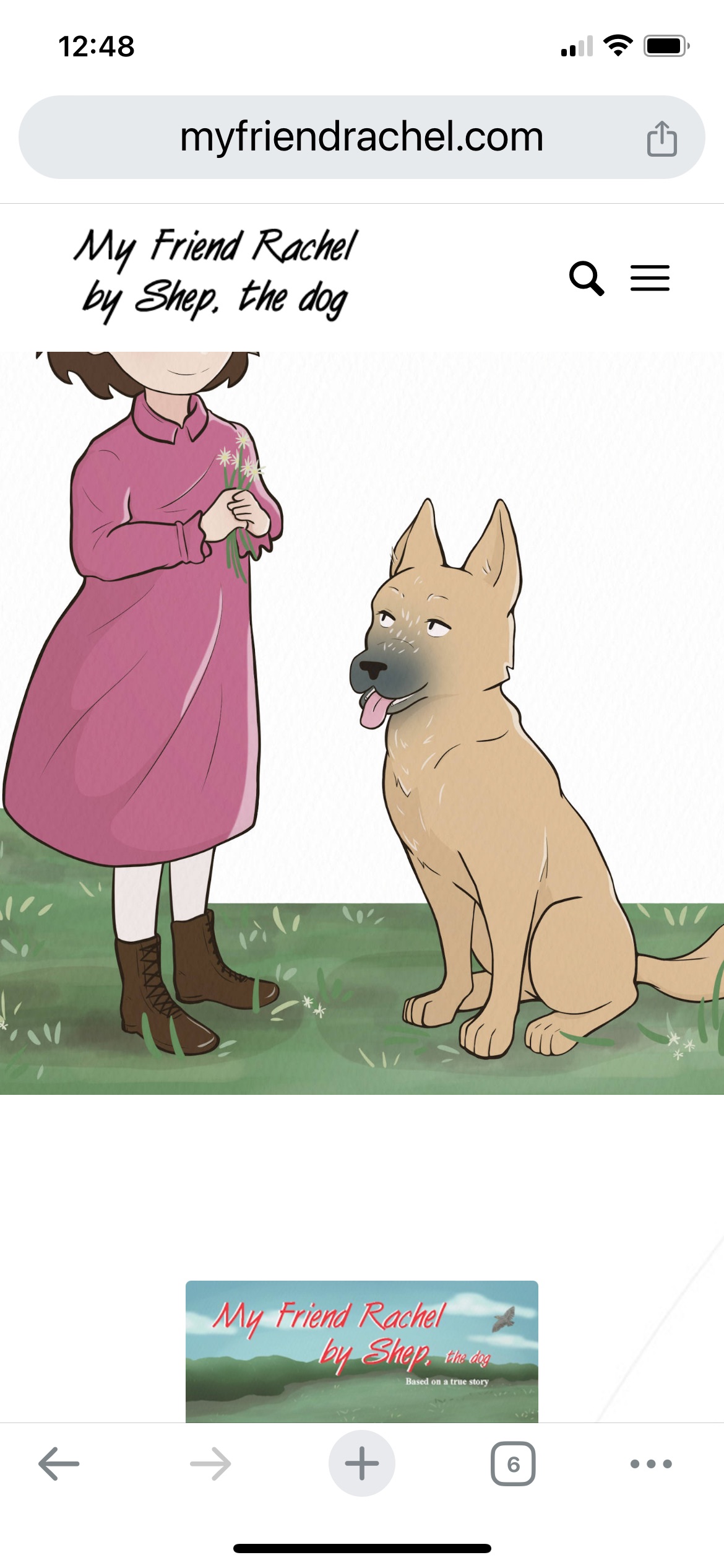
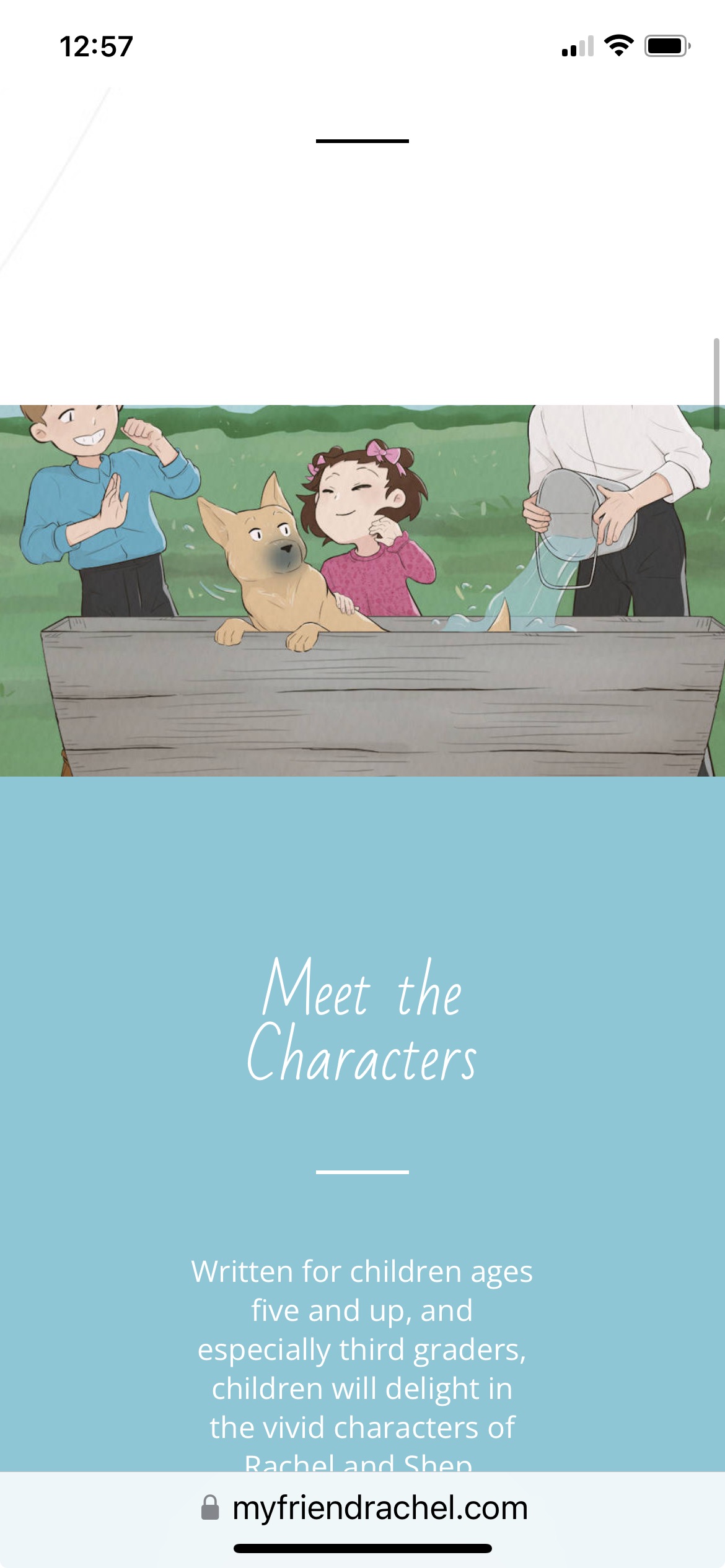
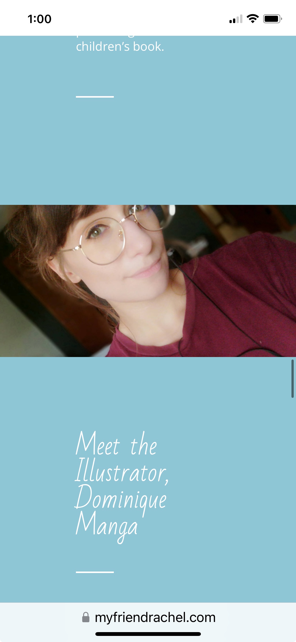
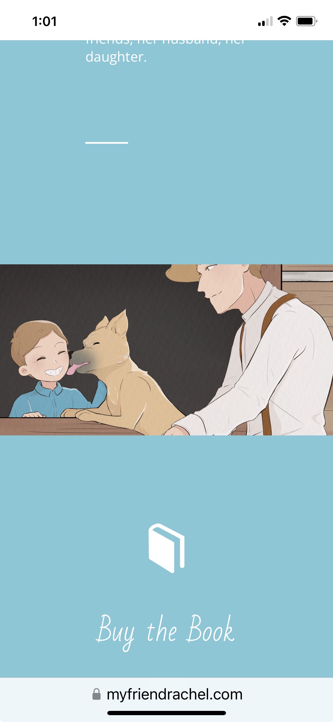
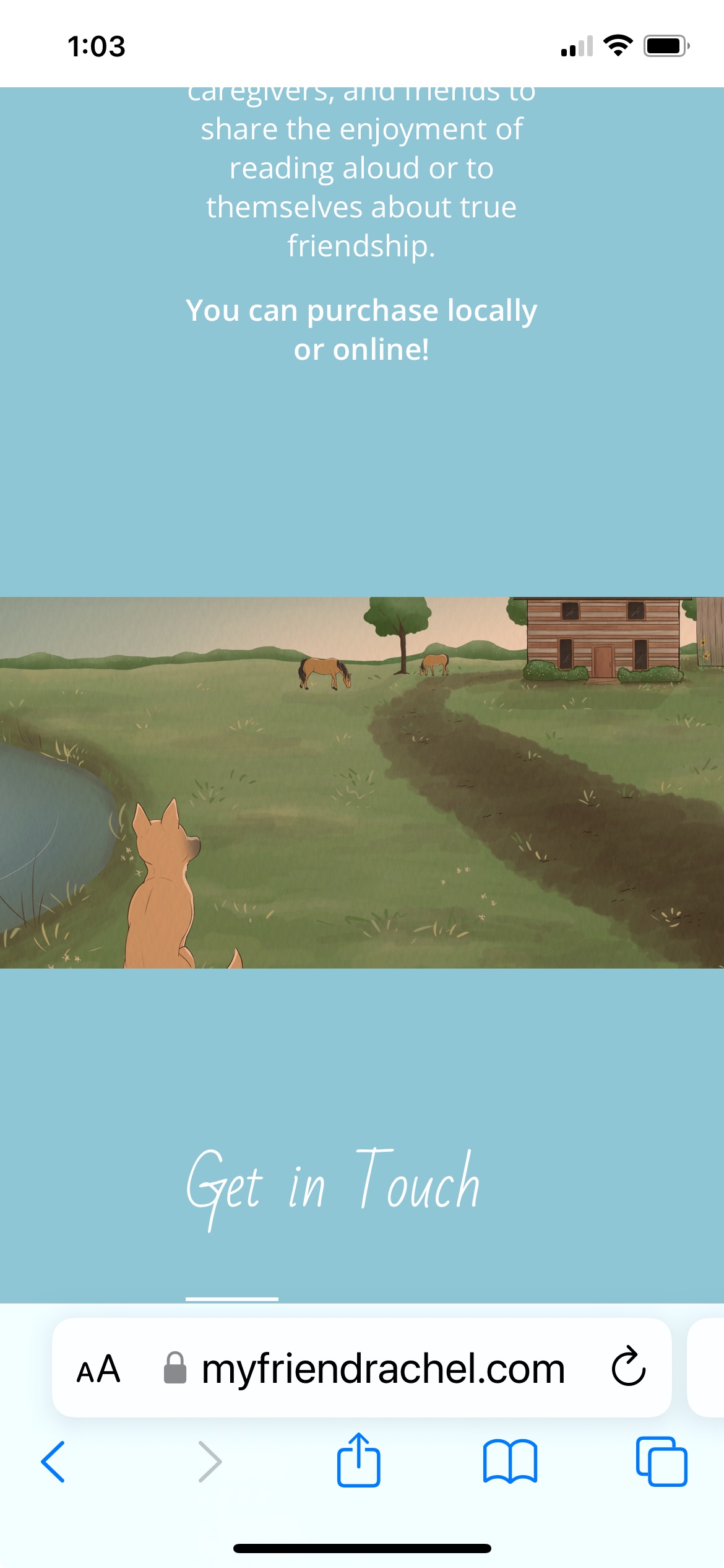
Hi, I am having issues with other images being cut off on phones and tablets. They are fine on a computer! Can you please advise as how to fix on phone or tablet? The site is myfriendrachel.com.
1. on the image at the top of the page on the left – on an iphone and ipad, the girl’s head is cut off (screenshot: https://myfriendrachel.com/wp-content/uploads/2024/03/My-Friend-Rachel-by-Shep-the-dog-Cathy-Feemster.jpeg)
2. on this image, on a phone or tablet, the boy on the left and man on the right’s heads are cut off (screenshot:https://myfriendrachel.com/wp-content/uploads/2024/03/My-Friend-Rachel-by-Shep-the-dog-Cathy-Feemster2.jpeg)
3. the top of the illustrator’s head is cut off on phone and tablet (screenshot:https://myfriendrachel.com/wp-content/uploads/2024/03/illustrator.jpeg)
4. on the image of boy, dog, and man, the man’s head is cut off on phone or tablet (screenshot: https://myfriendrachel.com/wp-content/uploads/2024/03/boy-dog-and-man.jpeg)
5. on the image of the dog, the bottom of the dog is cut off on phone or tablet (screenshot: https://myfriendrachel.com/wp-content/uploads/2024/03/dog.jpeg)
Any help you could give would be much appreciated. Thank you!
Hi,
You could add a custom class to the column that you want it to would on and then add the custom class to the css, like this:
#top .customClass.flex_column:hover {
	animation: grow 2s;
	animation-fill-mode: forwards;
}
@keyframes grow {
  to {
      transform: scale(1.2);
      border: 1px solid yellow;
  }
}
Just change customClass to what you choose to use.
Best regards,
Mike
Hi,
There is no padding involved, it makes the elements equal height. You might see an overlay if you are emulating a mobile device on the desktop my resizing the window, the script should re-calculate in 300ms if you are doing this but it won’t be an issue for real devices because they don’t change like this, if the auto re-calculate doesn’t work for you as you change the window size then reload the page.
This is what I see on my Android device:


Best regards,
Mike
You can close the topic ;)
Hi,
Thanks for the update. Please let us know if you should need any further help on the topic, or if we can close it.
Best regards,
Rikard
Hi,
Great, I’m glad that you found a solution. Please let us know if you should need any further help on the topic, or if we can close it.
Best regards,
Rikard
Hi,
Great, I’m glad that the plugin developers could help you out. Please let us know if you should need any further help on the topic, or if we can close it.
Best regards,
Rikard
 Andrea
Guest
Good morning,
I’m building the site https://www.romacittaperta.com/ with enfold and the desktop result seems excellent, apart from some small malfunctions on the last row of the tables. The problem is that mobile responsive viewing has a terrible user experience, you can do everything, but using the site is terrible. Frankly speaking, I’d rather get a similar result to checking the desktop website on chrome! It wouldn’t be much smartphone style, but at least the usability would return to decent levels.
Do I need to ask you for specific assistance on the project for this or is the classic forum support enough that I have to renew?
Thanks for the attention
Andrea
Hi,
No problem – it will also take me some time to investigate.
I’m tagged to this topic.
Best regards,
Günter
Sorry. I was not clear. Is there any other way to speed up the pages Is what I meant Besides reducing thousands of images? In your response of March 5th, you asked if I did any of those things on the page speed test suggestions And I explained that I didn’t understand them. Can you please Help me with some of them or anything at all that is simple? I have reduced A few hundred images, which took me several days. This slowdown only happened recently, even with the full-size images.
What about the settings and Enfold theme? Just anything to help me, please, if you can. Maybe I have them set wrong?
Thank you..
ON TOP OF THAT…
I can’t figure out these broken links for the life of me. Could this be related to the slow speed?
404 Not Found
https://photomagx.com/wp-content/uploads/avia_fonts/fontello/fontello.woff2
403 Forbidden
https://photomagx.com/xmlrpc.php?rsd
403 Forbidden
https://photomagx.com/xmlrpc.php
THANK YOU IN ADVANCE FOR YOUR HELP!!!
-
This reply was modified 2 years ago by
 extraeyes.
Hi Mike
Thanks! You can close this topic.
Regards,
Bernd
Hey Monika,
Thank you for the inquiry.
You can create a custom shortcode for the social icons and then place this shortcode in a text widget. Please refer to this thread for more info.: https://kriesi.at/support/topic/social-media-icons-in-footer-8/#post-1397164
Best regards,
Ismael
Hi,
We replied to this issue in the other thread. Please continue the discussion here. https://kriesi.at/support/topic/custom-shop-page-sort-by/#post-1437448
Best regards,
Ismael
Hello to the team,
I use Enfold Theme 5.6.12. and have problems with the display of the accordeon-slider.
Please have a look at the website https://thesanctuary.me/ausbildungen/ and
An image in the slider is displayed large and distorted. The problem occurs in various browsers, but only on the desktop. Even deleting and re-creating it multiple times doesn’t help, to solve the problem. It is really a severe problem, which should be solved urgently.
I am looking forward to your help.
Thanks a lot
Jutta
so here is my version of your logo:
https://webers-testseite.de/motive-agency.svg
on looking to the svg with dev tools ( or download it and see in a good text editor) you see that i renamed the standard classes st to ma – and even the gradient is build via class – so changing it from outwards css (quick css) is easy even for the gradient stop-colors.
Hello everyone
I have created a new page. link below
centered on this page is a logo (hexagonal) from the demo data
can be seen.
how can i replace this with my own?
is it also possible to place a hamburger menu centered at the top of this page?
thanks
kind regards
Franz
Hi,
Is it possible to apply a 1px yellow border to the hover effect?
Yes, that should be possible. Please replace the modification with the following code:
#top .flex_column:hover {
	animation: grow 2s;
	animation-fill-mode: forwards;
}
@keyframes grow {
  to {
      transform: scale(1.2);
      border: 1px solid yellow;
  }
}
Best regards,
Ismael
Thanks Rikard, however that did not work. It did lead me to another search through your support forum and I found the solution.
For anyone else with this issue I found it here: https://kriesi.at/support/topic/how-to-insert-slide-show-with-layerslider/#post-123960
Basically, to insert a LayerSlider using php requires the plugin to be copied from the Enfold Parent theme into the WordPress Plugins folder, once activated the php methods below work:
- layerslider(1);
- echo do_shortcode(‘[layerslider id =”1″]’);
Thank you
Hi! Did it. So it worked well for the number, it is now set to 50, so showing all we have for now. But isn’t showing alphabetically?
I see there is (and was already I think) a snippet inn the quick CSS that seems to affect the same side bar. If I remove that code the side bar shows what it does now, plus time, date, who posted it and category too. It is back in place now. Let me know if it should go if it interferes with your coding.
Kind regards, Hanne
/*.single-portfolio aside.sidebar.sidebar_right {
display: none !important;
}
.single-portfolio .container .av-content-small.units {
width: 100% !important;
}*/
.image_size_widget span.news-time {
display: none;
}
.image_size_widget strong.news-headline {
padding-top: 10px;
}
#top .avia-post-nav { display: none !important; }
This reply has been marked as private.
Hi,
Thank you for your patience, in your video it looks like the special heading text is bold, so I believe that you have used “strong” tags in the special heading and perhaps didn’t close it correctly, so when you save the page all of the elements after it are lost, this is a common error, but I can’t check because we don’t have a login to your site. Please include an admin login in the Private Content area so we can be of more assistance.
As for your burger menu it looks like you have added 4 phone links to your header somehow, none show on the frontend, the one that does show in the top bar is a fifth, so these seem to be causing the issue, try removing these:

If this doesn’t help we can take a look to see what else could be the issue.
Best regards,
Mike
Thank you very much Mike
almost perfect
you could still set that both are left-aligned
the distance between the top and bottom is smaller
thanks
kind regards
Franz
Hi,
Thank you for your patience, I checked again in Windows in Chrome, Firefox, & Edge and in Mac in Safari, Chrome, Firefox and in all cases all of your images show:
Safari on Mac

Chrome on Mac

Firefox on Mac

Firefox on Windows

I didn’t feel a need to post more images. This is very strange that you can’t see these, your images are still coming from https://i0.wp.com I believe this is the JetPack image server, and you still have a CDN “onesingnal”, did you try disabling all of your plugins to get your images to be served from your domain and wordpress install?
Are you using a mobile connection or a limited wifi? Often “data saver” will not show huge images. Have you updated your Mac, old Safari versions had problems with parallax and I have been told that some iPads have their Safari version locked and can’t update.
Have you tried a Windows desktop or a different Mac, try going to your public library or try a VPN and use a IP address from another country.
Best regards,
Mike
Hey leilitacc,
Typically something like this would work:
#top .flex_column:hover {
	animation: grow 2s;
	animation-fill-mode: forwards;
}
@keyframes grow {
  to {
      transform: scale(1.2)
  }
}
but you probably will need to adjust the class for your column, if you need help please link to your page so we can examine.
Best regards,
Mike
Hi,
When you add a media query you will also want to wrap the above rule, so for example for desktop & mobile try this:
@media only screen and (min-width: 768px) {
.main_color .pricing-table li.avia-heading-row {
    height: 290px;
    min-height: 290px;
}
}
@media only screen and (max-width: 767px) {
.main_color .pricing-table li.avia-heading-row {
    height: 150px;
    min-height: 150px;
}
}
After applying the css, please clear your browser cache and check.
Best regards,
Mike