-
AuthorSearch Results
-
October 9, 2024 at 5:58 am #1468688
In reply to: Background image vertical alignment mobile
Hi,
Thank you for the update.
The screenshot was taken using an iPhone SE emulation. What is the actual model of your iPhone device? Please try adding this css code to adjust the parallax background position:
@media only screen and (max-width: 390px) and (max-height: 844px) {
    .avia-section.av-4yjl9v-7b320115415e977d04047ac1e3f3980a .av-parallax .av-parallax-inner {
        top: 150px;
    }
}
Best regards,
IsmaelOctober 9, 2024 at 12:38 am #1468679In reply to: Use of, AVIA editor in popup maker plugin
Ok,
you can close the ticket. Please let meknow it there are some news about this topic.
I would like to use the Advanced Layout Builder is not rendering in the popup maker if possible.Thanks and best ergards
AndreaOctober 8, 2024 at 6:19 pm #1468666In reply to: term-description below the products
Hi again,
I have found this
I have add the ccs and the order is correct, the issue is the sidebar match in two parts on the sidebar and in the bottom.
Could you help me?
Thanks,
BR
Antonio
October 8, 2024 at 5:42 pm #1468659In reply to: Contact Form was not working – are emails archived?
No luck there. Do you have any other thoughts on any possible way to retrieve them?
And do you have any idea why the form would have stopped working? It worked before but then stopped. And then the only way I’ve been able to get it to work again is by using the WP SMPT Mail plugin. It won’t work at all natively anymore. I have tried updating PHP on the server end, updating WP theme to latest version. Any other ideas on what might have stopped it from working?October 8, 2024 at 3:35 pm #1468657In reply to: Googlemap does not load
Hi Ismael,
Sorry for my late reply. I tried activating delayed JS execution in WP-Rocket while disabling the Enfold > Performance > File Compression settings. But whitout success. It only works, if the delayed JS execution in WP-Rocket is disabled. But that’s ok for me.
You can close this topic.
Regards,
BerndOctober 8, 2024 at 2:27 pm #1468652In reply to: term-description below the products
Hi Ismael,
I add this and add the text below
add_action( ‘woocommerce_after_main_content’, ‘woocommerce_taxonomy_archive_description’, 5 );
But I don’t know how remuve the text on the top.
Could you help me?
Thank advance!
BR,
Antonio.
October 8, 2024 at 2:20 pm #1468648Topic: Website accessibility
in forum EnfoldMeetx
ParticipantHi
I have a couple of questions regarding accessibility.
1. Assistive tools navigating landmarks – Is it correct to add the text “content” to the Aria Label Text field in the Advanced section of a Color Section & if you have more than one color section should you add this for each?
(I have the footer on a page in a color section with the Aria Label Text: footer)
i.e. for meeting accessibility standards for assistive tool navigation should each color section explain what it is in the Aria Label Text – content or footer
2. The website has been evaluated by an independent assessor who has come back with a number of accessibility points I am working through.
Could you please advise on this point that has been raised?
The scroll to top button does not provide a link purpose.
Aria is set to aria-hidden=true so this is not an definitive fail. But the user can still
navigate to the button with the tab keys.
Recommend solution
Provide label.
How would I provide a label?I will be grateful for your advice with these questions.
Thanks Nick
October 8, 2024 at 11:47 am #1468641In reply to: Background image vertical alignment mobile
Hi Ismael,
Thank you for your message.
I checked the page right away by using my phone. Unfortunately the image still does not get alligned how the settings are set. Still I only see the shoulder of the woman instead of the face (located top center).
Kind Regards,
LisaOctober 8, 2024 at 10:20 am #1468637In reply to: Make menu span the menu area
Hi,
The issue with the mobile menu occurs because of this css code:
#top #header_main > .container, #top #header_main > .container .main_menu .av-main-nav > li > a, #top #header_main #menu-item-shop .cart_dropdown_link {
    line-height: 244px !important;
}
Please try wrapping the rule in a css media query so that it only affects the desktop view:
@media only screen and (min-width: 989px) {

  /* Add your Desktop Styles here */
  #top #header_main>.container,
  #top #header_main>.container .main_menu .av-main-nav>li>a,
  #top #header_main #menu-item-shop .cart_dropdown_link {
    line-height: 244px !important;
  }
}
Best regards,
IsmaelOctober 8, 2024 at 9:30 am #1468629In reply to: Enfold tab has issue on mobile
Hi Ismael I sent to you a very clear link. You must look in mobile version. In desktop all is ok. The issue is on mobile.
Tabs are all the same. For example the fist tab is exactly as like the second one. Both tabs hace titles but In the first I can see titles correctly. In the second title has problems. If I invert the tabs, first become correct, second one become with issue.
In all pages I have the same problem. The first tab is ok. Second, third… title disappears.It’s clear that there is some bug in Enfold tabs.
Waitng for your answear please.October 8, 2024 at 4:49 am #1468623In reply to: full width slider caption doesn’t fit on mobile
Hi,
Thank you for the update.
Please include this css rule inside the css media query (max-width: 767px) to adjust the font size of the caption content:
#top .avia-slideshow .av-slideshow-caption.av-m1g8o6g7-f7efce2774fcf0ca4bccdacd45c3be64__0 .avia-caption-content p {
    font-size: 18px;
}
Best regards,
IsmaelOctober 7, 2024 at 7:23 pm #1468598In reply to: 4 Spalten nebeneinander in mobiler Ansicht
Hi,
Thanks for the update. Please let us know if you should need any further help on the topic, or if we can close it.
Best regards,
RikardOctober 7, 2024 at 7:22 pm #1468597In reply to: responsive column
Hi,
Thanks for that. So you want the CSS that you posted above to only apply on desktop?
Best regards,
RikardOctober 7, 2024 at 6:56 pm #1468595In reply to: term-description below the products
I find this code that remove the side bar
But it remove the search field side bar of the shop too.
https://relojesexclusivos.com/tienda/Many thanks!
October 7, 2024 at 6:26 pm #1468594In reply to: full width slider caption doesn’t fit on mobile
Now I also see it on the small screen, much better thank you. However, when I turn the small screen into landscape mode the font of the top part of the caption (pink) becomes much smaller than the bottom part (white), which looks very strange. Can you see that? Thanks for your time
October 7, 2024 at 3:56 pm #1468580In reply to: Boxes around Images
Hi,
Try this instead:
#top .avia-gallery-thumb img {
  border-style: none;
}

#top .avia-gallery img {
  padding: 5px;
}
Best regards,
RikardOctober 7, 2024 at 1:42 pm #1468573In reply to: responsive column
I upload the screenshot of what happens to the non-responsive column I’m talking about… on the page I indicated services and I put the credentials in a field (I think private) so you can access the backend to check the settings of the element that doesn’t respect the responsiveness rules.
we would like the columns to be stacked one under the other when movinghttps://ibb.co/7JzBgLM Screen how it looks on desktop and how it looks on mobile
Thanks
October 7, 2024 at 1:12 pm #1468569In reply to: Boxes around Images
Hey ausgesonnen,
Please try the following in Quick CSS under Enfold->General Styling:
#top .avia-gallery-thumb a {
  border-color: transparent;
}

#top .avia-gallery img {
  padding: 5px;
}
Best regards,
RikardOctober 7, 2024 at 12:46 pm #1468565In reply to: Strange menu activity on scroll
in other words – shrink only the logo the rest stays on position – white line erased.
#top #header_main > .container,
#top #header_main > .container .main_menu .av-main-nav > li > a,
#top #header_main #menu-item-shop .cart_dropdown_link {
  line-height: 244px !important;
}

#top #avia-menu::after {
  transition: opacity 1s ease;
}

#top #header.header-scrolled #avia-menu::after {
  opacity: 0;
}
October 7, 2024 at 12:43 pm #1468564In reply to: Whole block clickable – Portfolio Grid
ok – nice to have the page link (on your other topic it is shown):
there are links on the images too – but they could not be clicked because there is a full overlay of the grid-content
so no need for a script here#top .grid-content { pointer-events: none; } /*** if you do not like to have that image white overlay:*****/ #top .grid-entry .image-overlay { display: none !important; }__________________________
this will work too – but it is not needed herefunction transfer_first_link_as_link_to_article(){ ?> <script type="text/javascript"> window.addEventListener("DOMContentLoaded", function () { (function($) { $('.grid-content').each( function() { var LinkSection = $(this).find('.grid-entry-title a').attr('href'); var LinkTarget = $(this).find('.grid-entry-title a').attr('target'); if (typeof LinkSection !== "undefined"){ $(this).on("click", function(){ if (LinkTarget === "_blank"){ window.open(LinkSection, '_blank'); } else { window.location.href = LinkSection; }; }); $(this).css('cursor','pointer'); $(this).find('.image-overlay').css('display','none'); }; }); })(jQuery); }); </script> <?php } add_action('wp_footer', 'transfer_first_link_as_link_to_article');October 7, 2024 at 10:41 am #1468550In reply to: Strange menu activity on scroll
We want to keep the shrinking header, but:
1. Stop the menu links from raising up on scroll.
2. Make the white line underneath disapear on scroll.Hope that is more understandable.
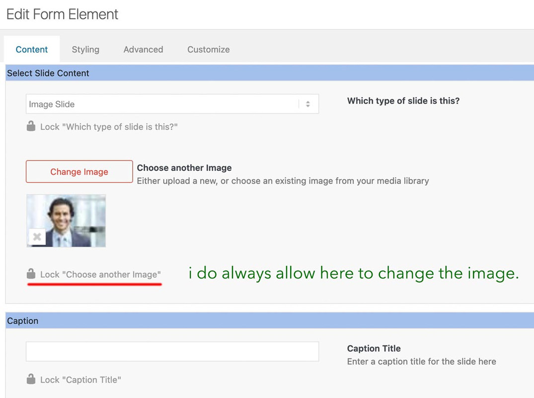
October 7, 2024 at 8:04 am #1468541When creating a custom element, the aim is to make settings for this element in advance and, if necessary, to block them directly for non-admins (possibly) editors (depending on your pre-selection see screenshot).
Ultimately, the aim is to define as many settings as possible in advance so that an author no longer has access to many of these settings (headings tag, position of the heading, captions etc., background-colors etc. . The image that you enter on creation of the custom slider is only used to set default settings for this slider. You can here hamper for example that the author got the possibility to insert videos to the slide.
Once your custom element has been created and is ready to be inserted into the layout, authors can insert as many images as they like using the predefined default settings.
And only the nonblocked Settings are editable.October 7, 2024 at 5:34 am #1468537In reply to: Icon-Elements in one Row on Mobile
Hi,
Thank you for the update.
Please add this css code inside the css media query..
.responsive #top #wrap_all .flex_column.av-2o2o-d04f592131d4626bc887b0d7857940a1 {
    width: 60%;
    margin: 0 auto;
    float: none;
}
.. right after this css rule:
.flex_column.avia-builder-el-19 .hr.hr-invisible {
    display: none;
}
Best regards,
IsmaelOctober 6, 2024 at 6:03 pm #1468524In reply to: Googlemap does not load
Hi Rikard,
It works if you’re logged in under Firefox or Chrome. But today I experimented with the delayed JS execution. The Googlemap now works :-) Also if you’re logged out. But only because I disabled delayed JS execution. With enabled delayed JS execution and many JS exceptions it won’t work.
Perhabs you know the required JS exceptions for the enabled delayed JS execution?
Otherwise you can close this topic :-)Regards,
BerndOctober 6, 2024 at 12:10 pm #1468514Topic: Icon-Elements in one Row on Mobile
in forum Enfoldmirotck
ParticipantDear Enfold Team
I would love to have 3 icon elements in one row on mobile, instead of having them aligned vertically i would love to have them horizontally basically.
Also, i would love to have the width of that row to be the same more or less as the buttons on top. I will attach a screenshot of how it should look.
It’s the first element on mobile layout (home).Thank you so much for providing me any sort of help. I just renewed my support licence, thanks!
Cheers from Switzerland
Miro
October 6, 2024 at 10:00 am #1468510In reply to: 2 or more columns on a row
Hi,
Thanks for the update. Please let us know if you should need any further help on the topic, or if we can close it.
Best regards,
RikardOctober 5, 2024 at 10:27 pm #1468489In reply to: 2 or more columns on a row
if you want it 5 columns on desktop and on mobile always 2 column:
#top .settore-attivita .entry-content-wrapper {
  display: flex;
  flex-flow: row wrap;
  justify-content: space-between;
}

#top .settore-attivita .entry-content-wrapper:before,
#top .settore-attivita .entry-content-wrapper:after {
  display: none !important;
}

#top .settore-attivita .entry-content-wrapper .flex_column {
  flex: 0 1 19%;
  width: unset !important;
  margin: 0px;
}

@media only screen and (max-width: 767px) {
  #top .settore-attivita .entry-content-wrapper .flex_column {
    flex: 0 1 48%;
  }
}
}
you see how it works ?
October 5, 2024 at 9:49 pm #1468486In reply to: 2 or more columns on a row
Thanks but I did exactly as you told me:
#top .settore-attivita .entry-content-wrapper {
display: flex;
flex-flow: row wrap;
justify-content: space-between;
}#top .settore-attivita .entry-content-wrapper:before,
#top .settore-attivita .entry-content-wrapper:after {
display: none !important;
}#top .settore-attivita .entry-content-wrapper .flex_column {
flex: 0 1 19%;
width: unset !important;
margin: 0px;
}@media only screen and (max-width: 989px) {
#top .settore-attivita .entry-content-wrapper .flex_column {
flex: 0 1 30%;
}
}@media only screen and (max-width: 767px) {
#top .settore-attivita .entry-content-wrapper .flex_column {
flex: 0 1 48%;
}
}@media only screen and (max-width: 549px) {
#top .settore-attivita .entry-content-wrapper .flex_column {
flex: 1 1 100%;
}
}But on mobile phone I still see one column for each row
October 5, 2024 at 8:13 pm #1468484In reply to: 2 or more columns on a row
look to the layout image again – the color-section with your columns should have the custom-class : settore-attivita
you gave to it an ID : settore-attivitaIf you like to have only 2 columns beside – even on mobile phone just get rid of last media query rules:
@media only screen and (max-width: 549px) {
  #top .settore-attivita .entry-content-wrapper .flex_column {
    flex: 1 1 100%;
  }
}
October 5, 2024 at 11:04 am #1468466In reply to: Global Widgets
-
AuthorSearch Results
-
Search Results
-
Topic: Website accessibility
Hi
I have a couple of questions regarding accessibility.
1. Assistive tools navigating landmarks – Is it correct to add the text “content” to the Aria Label Text field in the Advanced section of a Color Section & if you have more than one color section should you add this for each?
(I have the footer on a page in a color section with the Aria Label Text: footer)
i.e. for meeting accessibility standards for assistive tool navigation should each color section explain what it is in the Aria Label Text – content or footer
2. The website has been evaluated by an independent assessor who has come back with a number of accessibility points I am working through.
Could you please advise on this point that has been raised?
The scroll to top button does not provide a link purpose.
Aria is set to aria-hidden=true so this is not an definitive fail. But the user can still
navigate to the button with the tab keys.
Recommend solution
Provide label.
How would I provide a label?I will be grateful for your advice with these questions.
Thanks Nick
Dear Enfold Team
I would love to have 3 icon elements in one row on mobile, instead of having them aligned vertically i would love to have them horizontally basically.
Also, i would love to have the width of that row to be the same more or less as the buttons on top. I will attach a screenshot of how it should look.
It’s the first element on mobile layout (home).Thank you so much for providing me any sort of help. I just renewed my support licence, thanks!
Cheers from Switzerland
Miro