Dear Enfold Support Team,
We are currently using the Enfold theme along with the “The Events Calendar” plugin on our website, https://greifbar-bouldern.de. Unfortunately, events scheduled for the current day are not displayed on the site. (https://greifbar-bouldern.de/startseite/eventsuebersicht/)
We have already tested for potential conflicts by deactivating all plugins and the Enfold Child theme. However, even with all plugins and the child theme disabled, events for the same day do not appear unless we activate a default theme. This suggests that Enfold may be overriding some of the plugin’s settings.
In various support threads, we found code snippets intended to prevent such conflicts by stopping Enfold from overriding plugin settings, but these solutions have not worked in our case.
Could you please assist us with a solution compatible with our child theme, as we rely on regular updates and would like a solution that is sustainable over time?
Thank you very much in advance for your help!
Best regards,
Alisa
Dear Support Team
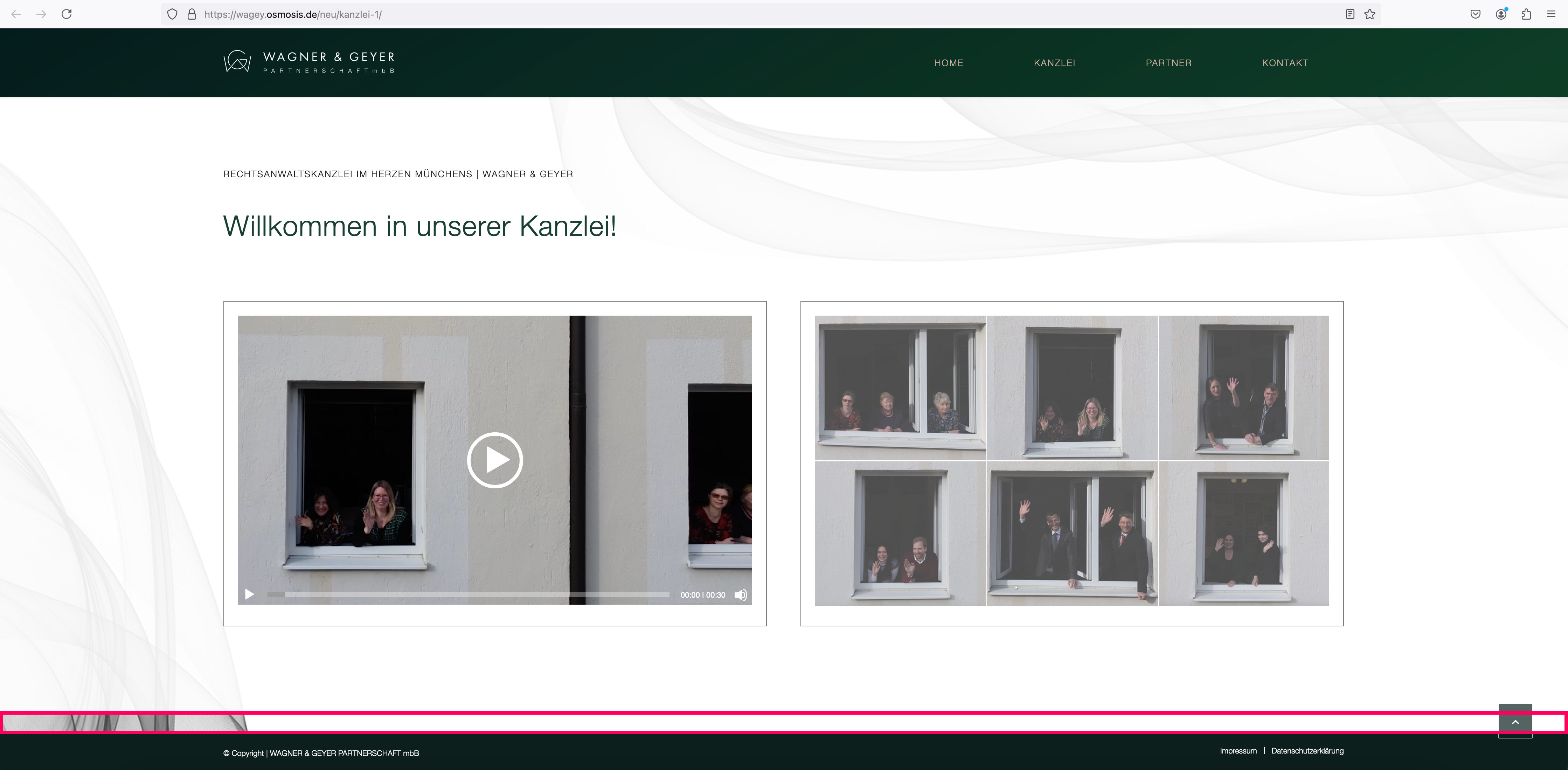
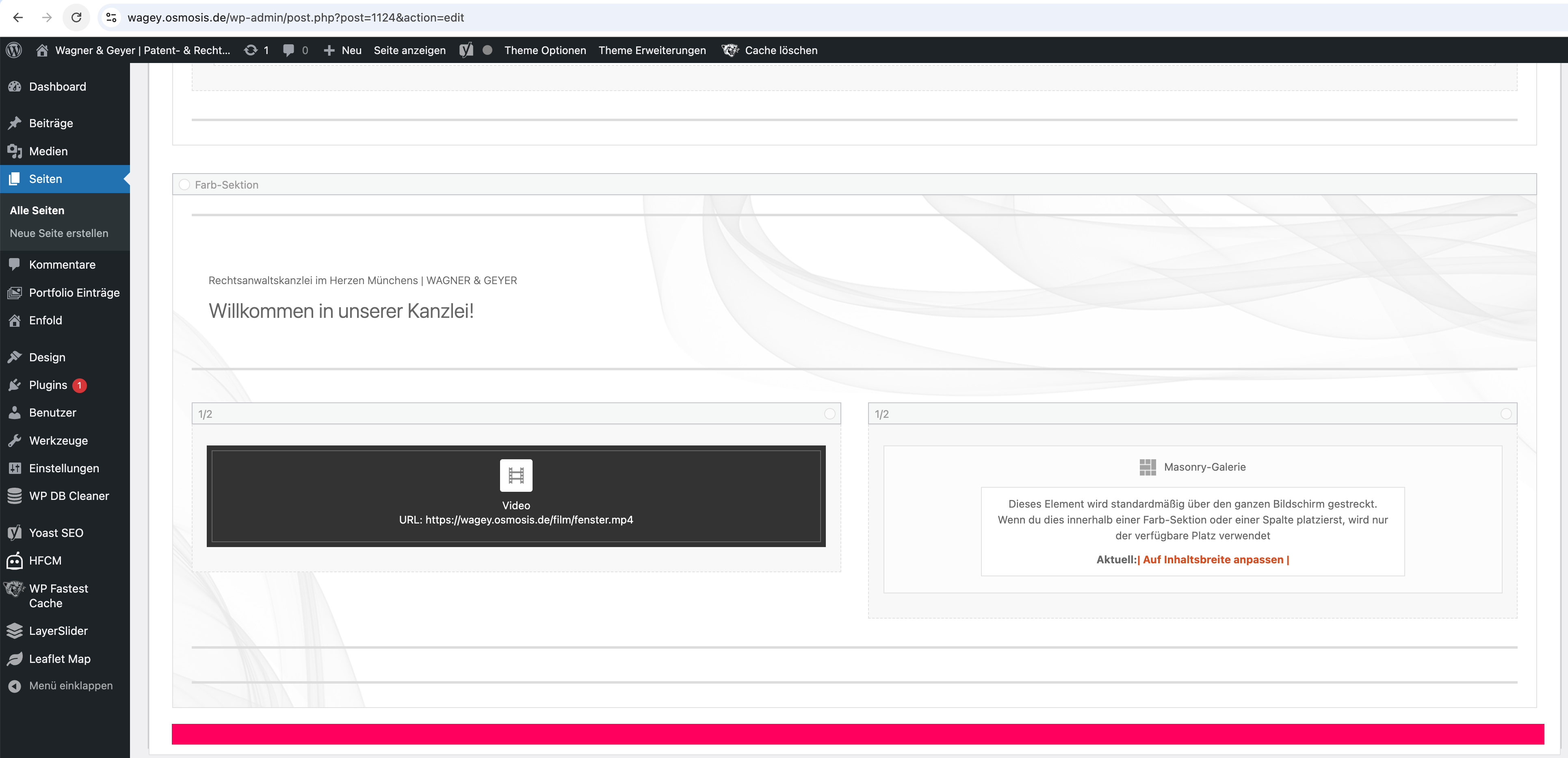
In a new editing version of the website https://wagey.osmosis.de/neu/kanzlei-1/ there is a question at the very bottom – in the last colour section:
The section has a background image with an overlay, which is also displayed correctly: only at the very bottom before the socket area this overlay suddenly disappears: see screenshot: https://wagey.osmosis.de/support/overlay.jpg
But there is no other element placed in the backend (see screenshot: https://wagey.osmosis.de/support/overlay-backend.jpg) and I wonder why the overlay stops here and what I can do to make it appear at the end?
Do you have any ideas?
Many thanks and best regards, Diana
Hello Guenni
thank you very much for the tips – I have done everything according to your instructions and also removed the min-height from the color section directly.
I have integrated the following in the CSS: https://mp-audioproductions.de/home-v1/#overview
@media only screen and (min-width: 990px) {
#overview { min-height: 280px !important; }
}
Is this correct?
—-
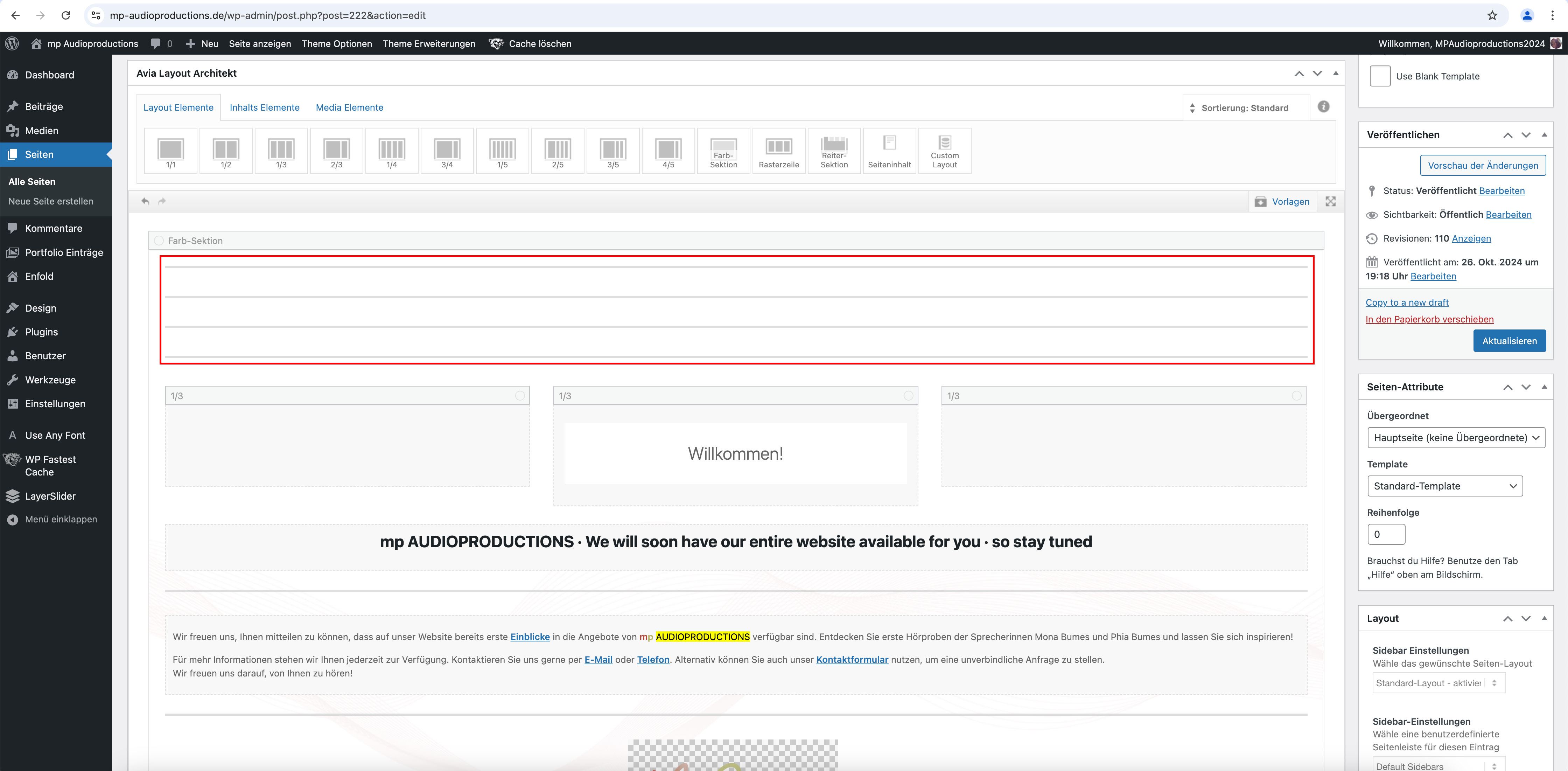
Regarding your question to #1470225, I wanted to show you the following screenshot of the backend:
Somehow everything always disappears behind the header, even though it is shown as non-transparent.
I also had to add several “free space” elements (each 50px > 200px in total) to the Enter section at the top (where it says “Welcome”) so that the heading doesn’t disappear behind the header: see screenshot: https://mp-audioproductions.de/support/leerraum.jpg
Is there perhaps a better solution for this?
Best regards, Diana
Hi,
Thanks for the update. Please let us know if you should need any further help on the topic, or if we can close it.
Best regards,
Rikard
Hi,
Thanks for the update. Please let us know if you should need any further help on the topic, or if we can close it.
Best regards,
Rikard
because: there is no hover style on mobile devices!
what did you expect to see? What is what you like to see?
f.e.:
.responsive.avia_mobile #top .av-masonry-entry .av-inner-masonry-content {
  padding: 10px;
}

.responsive.avia_mobile #top .av-caption-style-overlay .av-masonry-item-with-image .av-inner-masonry-content {
  background: rgba(0,0,0,.01);
}

.responsive.avia_mobile #top .av-caption-style-overlay .av-masonry-item-with-image .av-inner-masonry-content-pos,
.responsive.avia_mobile #top .av-fixed-size .av-masonry-entry.av-masonry-item-no-image .av-inner-masonry-content-pos {
  text-align: left;
}

.responsive.avia_mobile #top #wrap_all .all_colors h3 {
  font-size: 18px;
  text-align: left;
}

.responsive.avia_mobile #top #wrap_all .all_colors .av-masonry-entry h3 {
  padding: 5px;
  font-size: 18px;
  background: rgba(0,0,0,0.3);
  -webkit-backdrop-filter: blur(3px);
  backdrop-filter: blur(3px);
  position: relative;
  width: auto !important;
  text-transform: none;
}

.responsive.avia_mobile #top .av-inner-masonry-content-pos-content {
  display: inline-block !important;
  position: absolute;
  top: auto;
  bottom: 10px;
}
it is for mobile devices only:
remove that div with the ID overview – it creates an ugly break in your background-image (by adding a after_section_1 container)
Give the second color-section the ID : overview. Set the min-height to 280px.
On activating that section in the dom to be seen in its dimension- you can see that 280px will touch the top- and the next grid-row will be visible beneath the header:
(click to enlarge that image:)
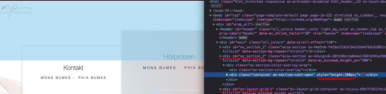
the grid-row shown now under the second color-section because parallax shift have moved it to that place – but you see that is not under the header!
PS: i would determine the min-height of that second color-section not via the Color-Section Options! but via quick css – because on mobile you have different circumstances and have to set media-queries on this to have no min-height and no background-image – and a very small height.
Hi Ismael
That worked! Adding white to the background color of the fields made it clear where to click to enter information.
I reactivated Autoptimize again and it is working nicely.
It is not exactly the same as on the other page.
You shift those columns with a transform rule with parallax effect to the top. ;)
But overall I still have the question why everything is shown behind the header, although it is not transparent ? See previous question (2 section, beginning with “Somehow everything always disappears ….”)
can you make a screenshot – i do not see what you are describing.
width and height are set in the iframe – the only thing to change is the positioning as Ismael mentioned above.
I would change the width to 100%
<iframe style="position: relative; left: 0; right: 0; top: 0; border-radius: 15px; border: 0; margin: 0 auto;"
    src="https://3d-configurator.arimars.com/arimars/AutumnSeasonTshirt"
    width="100%"
    height="500">
</iframe>
Hey yoncay,
Thank you for the inquiry.
You may need to wrap the iframe in a container and then apply a minimum height to that container.
Example:
<div style="min-height: 500px; position: relative;">
    <iframe
        style="position: absolute; left: 0; right: 0; top: 0; border-radius: 15px; border: 0; margin: 0 auto;"
        src="https://3d-configurator.arimars.com/arimars/AutumnSeasonTshirt"
        width="560"
        height="500">
    </iframe></div>
Best regards,
Ismael
Hi,
Thank you for the update.
You may need to manually create the html and css for this layout. You can add this html in a Code Block element for example:
<div class="av-bento-container">
<div class="av-bento-box av-bento-left-box">Left Box (100%)</div>
<div class="av-bento-right-container">
<div class="av-bento-box av-bento-top-box">Top Box</div>
<div class="av-bento-box av-bento-bottom-box">Bottom Box</div>
</div>
</div>
Then insert this css code:
.av-bento-container {
    display: flex;
    height: 100vh;
}

.av-bento-container .av-bento-left-box {
    flex: 1;
    background-color: #4CAF50;
    color: white;
    padding: 20px;
    text-align: center;
}

.av-bento-container .av-bento-right-container {
    display: flex;
    flex-direction: column;
    width: 300px;
}

.av-bento-container .av-bento-top-box {
    flex: 1;
    background-color: #2196F3;
    color: white;
    padding: 20px;
    text-align: center;
}

av-bento-container .av-bento-bottom-box {
    flex: 1;
    background-color: #f44336;
    color: white;
    padding: 20px;
    text-align: center;
}
Best regards,
Ismael
Hello no I am not using any as far as I know….i don’t even know what they are?
How can we fix it?
And what about the WhatsApp button? in desktop is green but in mobile is light grey….the same one
Thank you
Hey leloux,
Thank you for the inquiry.
You can use the ava_main_header_sidebar hook in the functions.php file to insert additional content to the left sidebar menu or header:
Example:
The following will add a paragraph element:
add_action( 'ava_main_header', 'ava_header_sidebar_custom_text' );
function ava_header_sidebar_custom_text() {
  echo "<p class='av-sidebar-header-text'>Additional text</p>";
}
This one will insert a widget area called “header-top”:
add_action( 'ava_main_header', 'ava_header_sidebar_widget_area' );
function ava_header_sidebar_widget_area() {
  dynamic_sidebar( 'header-top' );
}
Best regards,
Ismael
Hey Silje,
Thank you for the inquiry.
Have you tried adjusting the color values in the Enfold > General Styling > Main Content tab? To fix the issue temporarily, please disable the Autoptimize and cache plugin, then add this css code:
#top .main_color .input-text, #top .main_color input[type=text], #top .main_color input[type=input], #top .main_color input[type=password], #top .main_color input[type=email], #top .main_color input[type=number], #top .main_color input[type=url], #top .main_color input[type=tel], #top .main_color input[type=search], #top
 .main_color textarea, #top .main_color select {
   border-color: black;
   background-color: white;
   color: gray;
   font-family: inherit;
}
Best regards,
Ismael
Hey carmen,
Thank you for the inquiry.
The background is not visible when we check the site in desktop view. We also encountered this error:
Uncaught ReferenceError: jQuery is not defined
    at landing-bruxismo/:1533:6
Did you add any custom scripts to the site?
Best regards,
Ismael
Hi,
Thank you for the update.
If I can’t make it stay within its own Category, how do I remove it?
You can disable the product navigation by adjusting the Single Post Navigation settings in the Enfold > Blog Layout panel. You can also use this css code:
#top .avia-post-nav {
    display: none;
}
Best regards,
Ismael
Hey schweg33,
Thank you for the inquiry.
Try to add this css code:
#top .av_header_glassy.av_header_transparency #header_main .container.av-logo-container {
    display: none;
}
You may need to adjust the top margin in the previous modification.
Best regards,
Ismael
where did you get your font from? Is it a download from Google? Offers Google a variable font on that download?
The macosx comes from those invisible files OSX is generating for a lot of files ( some are icons etc. and meta infos ). Packing these folders by OSX internal zip – these files are inside that zip too.
BetterZip for example can zip folders without those meta info files ( it is called: pack for PC ).
After your Answers – i will try to give a good explanation on how you do it.
If you downloaded an otf or ttf file – try: https://kriesi.at/support/topic/eigene-schrift-einbetten/#post-1401545
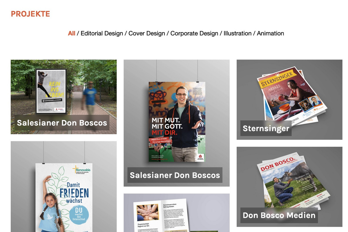
The Grid layout doesn’t work bc I want the image on the left to be 100% height and then the two image on the right to be on top of each other.
Hi,
Thanks for the update. Please let us know if you should need any further help on the topic, or if we can close it.
Best regards,
Rikard
I am a website admin.
I have now granted a person Author privileges to contribute to content on the website. They will be able to create content in new Posts and Pages under their name. As the admin, I will have edit access to what they create.
We have a number of Pages already on the site and I would prefer that they didn’t have edit access to those existing Pages however they will be able to create and edit new Pages and Posts.
Is there a way to stop them being able to edit Pages and Posts that I have already created and will continue to create?
Hi,
Thanks for the update. Please let us know if you should need any further help on the topic, or if we can close it.
Best regards,
Rikard
Hi Rikard,
Feel free to close the topic.
Regards,
Sheldon
Hi,
Thanks for the update. Please let us know if you should need any further help on the topic, or if we can close it.
Best regards,
Rikard
Hi,
Thanks for the update. Please let us know if you should need any further help on the topic, or if we can close it.
Thanks @guenni007 for helping out :-)
Best regards,
Rikard
Regarding the title, everything is clear! You can close the topic
THANK YOU again! :)
Hi, I’m building a page, and when I’m on the desktop version, the background image displays well, and the green WhatsApp buttons also appear correctly. However, when I switch to the mobile version, the background image doesn’t show up (it appears white), and the green WhatsApp buttons turn white as well. Could you help me figure out what’s going on? Thank you! If you need images or screenshots, I can provide them. This issue happens, for example, on this page: https://faceclinic.es/landing-bruxismo/
set up for mobile devices :
.responsive.avia_mobile #top .av-large-gap.av-fixed-size .av-masonry-entry .av-inner-masonry {
    right: 20px;
    bottom: 20px;
}
or if you mean for small screens – then a media-query is the means of choice instead:
f.e.:
@media screen and (max-width: 767px) {
  #top .av-large-gap.av-fixed-size .av-masonry-entry .av-inner-masonry {
      right: 20px;
      bottom: 20px;
  }
}
#top .av-large-gap.av-flex-size .av-masonry-entry .av-inner-masonry {
  position: relative;
  margin-right: 20px !important;
  margin-bottom: 20px !important;
}