Hey Nancy,
Thank you for the inquiry.
You may need to upload images with the same size and aspect ratio to make sure that all slides have the same height. Alternatively, you can try this css code, but it may slightly adjust the width of smaller images.
.avia-content-slider .slide-image, .avia-content-slider .slide-image img {
    max-height: 258px;
    width: auto;
}
Best regards,
Ismael
Hi,
for example horizontal photos are visible in their entirety because they are automatically adapted to the screen,
Some images appear fully visible on mobile because their aspect ratio differs from the phone browser’s viewport. In portrait mode, the viewport is taller than most images with a landscape proportion, making them fully visible. Please note that images automatically adjust to occupy the space of their parent container. If you want to control how the images are resized and make them fully visible on certain screens with different aspect ratio, you need to apply a custom css class name to them and adjust their width or height manually. For example, you can set the image width to 50%, and the image will resize proportionally to its height.
@media only screen and (max-width: 1366px) {
     /* Add your Mobile Styles here */
     .av-limit-image-height img.avia_image {
        width: 50%;
        margin: 0 auto;
    }
}
Again, you need to apply the class name “av-limit-image-height” to the Image element. However, focusing on whether the images are fully visible on load may not be necessary, as users can still scroll to view the content.
Best regards,
Ismael
Hey fanlokbun,
Thank you for the inquiry.
Which browser are you using? Would you mind providing a screenshot of the issue? You can use platforms like Savvyify, Imgur or Dropbox to upload and share the screenshot. Here are the steps to follow:
1.) Visit the website of your chosen platform, such as Savvyify, Imgur or Dropbox.
2.) Locate the option to upload a file or an image.
3.) Select the screenshot file from your computer or device and upload it to the platform.
4.) After the upload is complete, you will be provided with a shareable link or an embed code.
5.) Copy the link or code and include it in your message or response to provide us with the screenshot.
Thank you for taking the time to share the screenshot. It will help us better understand the issue you’re facing and provide appropriate assistance.
Best regards,
Ismael
I’m still new to WordPress/Enfold and I’m trying to set the thumbnail for a post slider to the same height.
In the link of the test page, the post slider after the first image has one thumbnail that is at 1210 x 420, and the others 1080 x 420.
I want them all to appear at a certain height, preferably the same height as the one with the 1210 x 420 dimension.
The slider’s image size is set to “Entry without sidebar (1210×423)”.
Below is the custom css I added over the course of solving multiple issues, so some of them may be working against each other. I would appreciate any advice about the custom css below or any additional one(s) that could achieve the look I want.
#top .avia-content-slider .slide-entry-title { font-size: 1em; }

#top .post-entry .blog-categories {
  	font-size: 0.9em;
    font-weight: normal; }

#top .content .entry-content-wrapper {
	padding-right: 0px;
}

#top .avia-slideshow-inner {
	float: center;
}

#top .avia-content-slider .slide-entry-wrap {
	float: center;
}

#top .avia-content-slider-inner {
	margin: 0px;
	overflow: hidden !important;
}

#top .avia-content-slider {
	display: flex;
}

#top .avia-content-slider .slide-image img{
	height: auto !important;
}

.avia_desktop .avia-content-slider .avia-slideshow-arrows a{ opacity: 1; }

@media only screen and (max-width: 479px)
{
	.responsive #top #wrap_all .slide-entry{width:48%; margin-left:4%}
	.responsive #top #wrap_all .avia-content-slider-even .slide-entry.slide-parity-odd,
	.responsive #top #wrap_all .avia-content-slider-odd .slide-entry.slide-parity-even{margin:0; clear:both;}
	.responsive #top #wrap_all .avia-content-slider-odd  .slide-entry.first{margin-left:0; width:100%;}
	.responsive .avia-content-slider .slide-image img { width: 100%; }
	.responsive #top .avia-slideshow-arrows a{
		display:block !important;
		opacity: 1;
		font-size: 20px;
		width: 60px;
		height: 60px;
		top: 30%;
    margin: -30px 0 0;
		text-align: center;
	}
}

#top .scroll-down-link {
    height: 60px;
    width: 80px;
    margin: 0px 0 0 -40px;
    line-height: 60px;
    position: absolute;
    left: 50%;
    bottom: 25px;
    color: #263238;
    text-align: center;
    font-size: 70px;
    z-index: 100;
    text-decoration: none;
	  text-shadow: 0px 0px 5px rgba(0, 0, 0, 0);
}
Hello! I have made changes in the theme options (logo, favicon, header area image), saved the changes, but the demo won’t update to them. I have cleared the cache, still doesn’t update. I also tried to add css from a previous version of Enfold to a new upload of Enfold without demo and that didn’t update either. Any suggestions? Thanks!
Hi,
In Brave please ensure to disable the “Brave Shield” in the address bar.
I added the word “test” to your message bar:


Best regards,
Mike
Hi Ismael.
Thanks for your suggestions and your time.
Obviously the first proposed code distorts the image and is not what I would like.
Maybe it’s my fault, maybe I explained myself badly.
I would like the images to resize while maintaining the proportions, as happens for example when looking at them on a smartphone: for example horizontal photos are visible in their entirety because they are automatically adapted to the screen, while maintaining the ratio between dimensions (e.g. 4:3 – 16:9).
Furthermore, you advise me to set the Custom CSS Class name in Advanced > Developer Settings for each individual image, while I would like to force the automatic resizing system (especially for vertical images) which already works correctly in other situations.
Also, how can I activate the Editor in Appearance? In my installation it is not visible
This reply has been marked as private.
ok – if i place those images with different links inside a text-block – i can force that behaviour by adding the link class: mfp-iframe and as rel: lightbox.
see the script – avia-snippet-lightbox.js – a[rel^="lightbox"] – is an autolink element (autolinkElements)
Edit: a solution for masonry is shown on that test-page : https://webers-testseite.de/mixed-lightbox-content/
Hi,
Thank you for the clarification.
Try to add this css code to adjust the text color of the title:
#top #wrap_all .all_colors .av-image-caption-overlay-center h3 {
    color: #ffffff;
}
And to apply the overlay on mobile view, try this css code:
@media only screen and (max-width: 767px) {

  /* Add your Mobile Styles here */
  #top .avia-slideshow.av-m3vkqh71-4e1d1fba30600cffcf1218dbcfe528bd .avia-slide-wrap:before {
    content: '';
    background: rgba(0,0,0,0.5);
    width: 100%;
    height: 100%;
    display: block;
    position: absolute;
    top: 0;
    left: 0;
    z-index: 10;
  }
}
Best regards,
Ismael
Hey tixxpff,
Thank you for the inquiry.
You can add this filter in the functions.php file to change the lightbox thumbnail size of the horizontal gallery:
function avf_alb_lightbox_image_size_mod($size) {
  return "full";
}
add_filter('avf_alb_lightbox_image_size', 'avf_alb_lightbox_image_size_mod', 10, 1);
Best regards,
Ismael
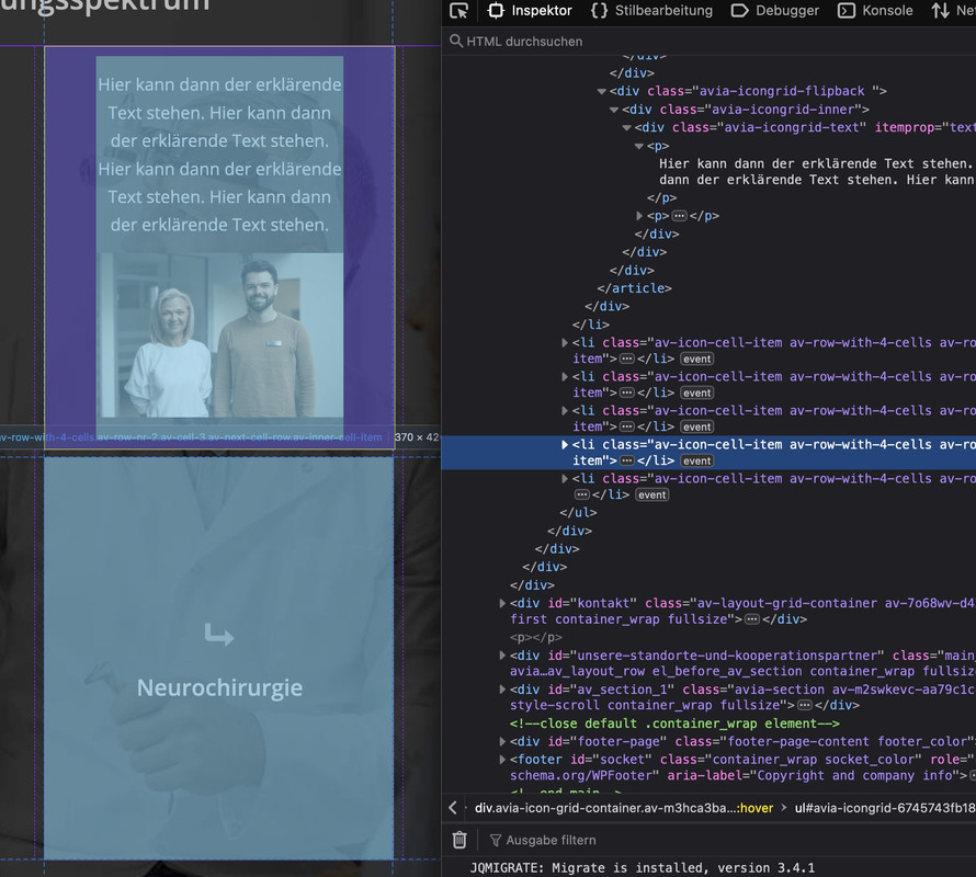
However, the real reason for the appearance is that all boxes have the same height. This height is then determined by the one box with the image with the corresponding padding. We then have the same height for all the others. This makes it look like a large distance. If you create the seventh box with the same content as above, you will see that the distance is not that big.
With that setting from Ismael you can see :
Hey!
Thank you for the inquiry.
We were not able to edit the settings because the account above is not an admin. This should work for the first image in the portfolio, but it might slightly distort the image:
.avia-image-container.av-m3m81k8l-37e2592474b1f3aa9f01e6b56eac1db5 img.avia_image {
    max-height: 600px;
}
If you want to apply this to specific images, try adding a Custom CSS Class name (e.g., av-limit-image-height) in Advanced > Developer Settings, then replace the css code with this:
.av-limit-image-height img.avia_image {
    max-height: 600px;
}
For more info about css class names, please check this link: https://kriesi.at/documentation/enfold/add-custom-css/#enable-custom-css-class-name-support
Regards,
Ismael
Hello
Love the theme first and foremost. Usuing it on a few sites that I run. On one of them, the Lightbox Modal is not working. The URL is in private content to view.
All images open the image URL/source in a new window, be it the Masonry Galleryon the hompeage or Woocommerce Singe Product photos. I have looked at all settings that I could think of and cannot figure out the issue.
Shop Options > Product Gallery is set to Default Enfold. Lightbox Modal is activate. Load Jquery in Footer is not active.
Please help.
Hey there,
the title says it all. When I click on the images in my horizontal gallery and they open in a lightbox, I would like these images to appear in full-size, not a cropped version (I believe it’s “large”).
There’s an older thread with a post and solution for exactly this problem, only for a different gallery type and I don’t know how to make this code work for the horizontal gallery.
Thank you!
Hey Tanja,
Please try the following in Quick CSS under Enfold->General Styling:
.av-image-caption-overlay-center {
  vertical-align: bottom;
  padding: 10px 1.5em;
}
Best regards,
Rikard
hm – seems to be hard to mix images with website in iframes in one gallery.
images and videos work from the scratch – if you choose “use custom link and fallback is image”.
 Tanja van der Harst
Guest
Theme Enfold:
By default, there is a piece of text in the middle of the image. I want to move it to the bottom. Is that possible? And how can I do that?
Hi,
Please try the following in Quick CSS under Enfold->General Styling:
.av-masonry-image-container {
  transition: none !important;
}
Best regards,
Rikard
the easiest way would be: if devs could create a conditional input field as soon as you have selected lightbox as the destination, in which you can enter the mfp type as a link class – because:
By default, Magnific Popup has four types of content: image, iframe, inline, and ajax ( classes: mfp-image, mfp-iframe, mfp-inline, mfp-ajas) . There is no any “auto-detection” of type based on URL, so you should define it manually.
But that had to be tested if that will be enough to rule the grouping between mixed content.
First: i think you have an additional lightbox plugin working on that page. Nivo ?
Next: you can declare for an image a custom-link – on lightbox setting there is the option “custom-link fallback is image”
(The disadvantage is that this link is saved globally for the image, i.e. not exclusively for this element.)
on magnific popup there seems to be possibilities to mix content types in one gallery ( e.g. images and video in iframes ) – but i guess you had to decide what lightbox plugin you like to use. the embedded magnificPopup script can do that. ( i hope ;) )
i will test it now on my test page …
@ismael, i dont think we are looking at the same thing. did you check it on desktop view? the captions in the easy slider are white (mobile) indeed. but on desktop (images with titles) they are grey.
so the first question is about the images with titles (desktop)
the 2nd about easy slider (mobile) .how do i add the same overlay ?
Hey luleloki,
Thank you for the inquiry.
What do you mean by “iFrame and Lightbox for different views”? If you simply need to display an image inside a lightbox, you can link the image, and the theme will automatically configure it to open within a lightbox container.
Best regards,
Ismael
Hi,
Thank you for the inquiry.
Where can we check these images? Please provide the link to the page in question so that we can inspect the images. Have you tried applying a maximum height to the image?
@media only screen and (max-width: 1366px) {
	/* Add your Mobile Styles here */
	.image {
		max-height: 700px;
	}
}
Adjust the “.image” selector accordingly.
// https://kriesi.at/documentation/enfold/add-custom-css/#enable-custom-css-class-name-support
Best regards,
Ismael
Hi Mike.
I’ll try to explain using images.
The first two show how the inserted images can be seen entirely on large screens (in this case 1680×1050).
https://img.savvyify.com/image/1065×800-image-1680×1050-screen.9G3xM
https://img.savvyify.com/image/600×800-image-1680×1050-screens.9GOfA
The second two instead demonstrate how the images behave on smaller screens (in this case 1360×768).
They are not visible in their entirety because the automatic scaling is probably calculated on the horizontal dimension and not on the vertical one.
https://img.savvyify.com/image/1065×800-image-1360×768-screen.9GSb3
https://img.savvyify.com/image/600×800-image-1360×768-screen.9GXUL
I would like the 800 number to be read correctly in both cases, but especially for the vertical image.
2nd question:
for the the easy slider see below
https://img.savvyify.com/images/2024/11/24/Schermafbeelding-2024-11-24-172825.png
i’d like to get the same result as
https://img.savvyify.com/images/2024/11/24/Schermafbeelding-2024-11-24-172857.png
(same overlay, title nicely in centre, and then naturally with the nav. arrows on the side as is)
I added the CSS you proposed, but it’s not in the centre yet and I tried several CSS options for the overlay, but no luck insofar. do you know?
Hi,
I assume that here it is correct:

here there is a “em” tag

but on your other page there is not

Please check your page the “em” tag
Best regards,
Mike
Hi @mike.
I’ll break the questions down:
so, look at :
https://img.savvyify.com/images/2024/11/24/Schermafbeelding-2024-11-24-171312.png
‘rug’, ‘schouders’, ‘elleboog’ are now H3 (due to some code you gave, which is what I wanted)
Under the advanced settings in the child time I’ve set all H3 to be grey.
but in this case I want to make an exception.
If you check the settings I have set the text on white, in the preview it shows white. I even added CSS to make it white. (image-caption-weight)
https://img.savvyify.com/images/2024/11/24/Schermafbeelding-2024-11-24-171456.png
Yet, it remains grey. how can I still make it white? (I want to keep the other h3’s, except for the ones over images, grey). Also, the line height should be 30px and the font size 23. basically i want to achieve the same as
https://img.savvyify.com/images/2024/11/24/Schermafbeelding-2024-11-24-172057.png
Hi Mike,
your image shows the two different fonts in a correct way. But this is how it looks on iOS 18.0.1
font chambersitalic is not shown
An em Tag is used on this page and here it shows correctly also with iOS.
Best regards,
Vera
-
This reply was modified 1 year, 5 months ago by
 Vera.
Vera.
-
This reply was modified 1 year, 5 months ago by Vera.
Hey icarogioiosi,
Typically, forcing a 600*800 image to 1360*768 will stretch the image, is this what you want?
Best regards,
Mike