Viewing 30 results - 2,101 through 2,130 (of 106,490 total)
  • Author
    Search Results
  • #1477544

    In reply to: Video in Color Section

    Hi Ismael,

    thanks, I’ve tried that on a separate test page [private content] using the settings you’ve mentioned. The source video isn’t 16:9 though but I’ve selected stretch regardless which only results in the fall back image being stretched. Isn’t there a way to define the height of the slider? – can’t find that. On top of that I’ll need to place the text plus box on top of the slider as in shown my color section.

    Kind regards.

    #1477533

    In reply to: Mobile screen result

    Hi,

    Would you mind opening another thread and providing a screenshot of the issue? You can use platforms like Savvyify, Imgur or Dropbox to upload and share the screenshot. Here are the steps to follow:

    1.) Visit the website of your chosen platform, such as Savvyify, Imgur or Dropbox.
    2.) Locate the option to upload a file or an image.
    3.) Select the screenshot file from your computer or device and upload it to the platform.
    4.) After the upload is complete, you will be provided with a shareable link or an embed code.
    5.) Copy the link or code and include it in your message or response to provide us with the screenshot.

    Thank you for taking the time to share the screenshot. It will help us better understand the issue you’re facing and provide appropriate assistance.

    Best regards,
    Ismael

    #1477529

    In reply to: Video in Color Section

    Hi,

    Have you tried using the Fullscreen Slider? Add a Video Slide, define the video URL, then go to the Styling > Video Settings panel and set the Video Display to the second option (Stretch the video…). This should remove the black bars around the video. You will still need to define a preview image in the Content > Fallback Image panel.

    Best regards,
    Ismael

    #1477526

    Hi,

    We applied a unique class name (av-black-vertical-line) to the first column with the feather image, then added this css code to create the black line.

    .av-black-vertical-line:before {
        content: '';
        width: 1px;
        height: 200px;
        position: absolute;
        background: #000000;
        top: -100px;
        left: 100px;
        display: block;
        z-index: 1000;
        visibility: visible;
    }
    

    We also added a separator/whitespace element to the first section to create a huge space at the bottom, then added this css to pull the columns upward.

    .av-grid-with-black-border {
        position: relative;
        z-index: 100;
    }
    
    .av-grid-pull-black-border {
       margin-bottom: -324px;
    }

    Best regards,
    Ismael

    #1477521

    Hey Yigit.

    Thanks for the feedback.

    I understand what you’re saying about some other plugin or something, but the entire code section goes missing, not just the URL for the image, which makes me think this is less likely.

    And yep, plenty of server space reported.

    Thanks for making a test at your end, I have added one on my end, as well with your suggestion of trying it through Gutenberg – two pages made within minutes of each other, one with ALB and one with Gutenberg. Will report back in a week or two.

    Thanks

    Tim

    #1477513

    Hi Ismael,

    I don’t have a specific code for it. I simply added the contact form element inside the content slider. You can check the image in the private content.

    For customisation, I got some assistance from your team.

    #1477509

    Dear Ishmael

    First of all, thank you again for your help.

    The solution you tell me about is the one where there is a warning that ‘fixed’ may not work. I attach an image.
    (Unfortunately it is in Italian, but you should understand it all the same).

    https://www.legvideo.cloud/s/47y886RN5rkqRMx

    I was asking: since you know it might not work, is there no other way than to buy a plugin to overcome the limitation?

    #1477508

    Hi,

    The correct image is shown if logged in, which means that the results you are getting are likely cache related. Try clearing all caches or disable the plugin temporarily.

    Best regards,
    Rikard

    #1477507

    Hey spitsdesign,

    You have added that ID to more than one element, the image has that ID as well.

    Best regards,
    Rikard

    #1477502

    In reply to: Button Place

    426 / 5.000
    Hello Rikard,

    sorry, a bit late – thanks for your answer.

    I had already tried your suggestion. It looks very good on iPhones; but unfortunately on Android phones I saw this distorted image.

    Everything is great on the desktop and on the iPad; I also adjusted the tab for the different devices.

    Do you perhaps have another idea for me??

    Thanks for your effort and kind regards

    Andrea

    #1477498

    Nothing is helping the photo image go all the way to the top of mobile device. It used to be able to.

    #1477497

    Hi Mike,
    Thanks for the quick reply. I deleted all html and characters and it didn’t seem to help. Still no images showing.
    Greg

    #1477477
    spitsdesign
    Participant

    I’m using a lot of anchors. They are all working fine except one. The links are added to images.
    One image link is not working.

    #1477473
    DianaLoola73
    Participant

    Dear Support Team,

    on the following page I have a problem with a few sections in the display on the tablet landscape format – all other devices are displayed correctly with a few settings, but for the ipad landscape, I just can’t get it to work:

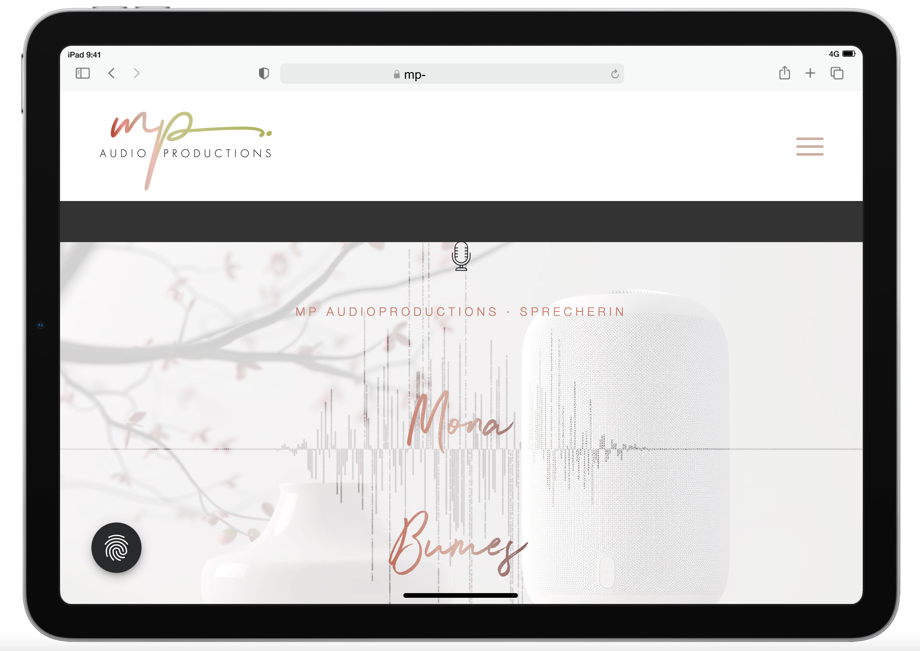
    1. start section: Enter – movie in the background of the section
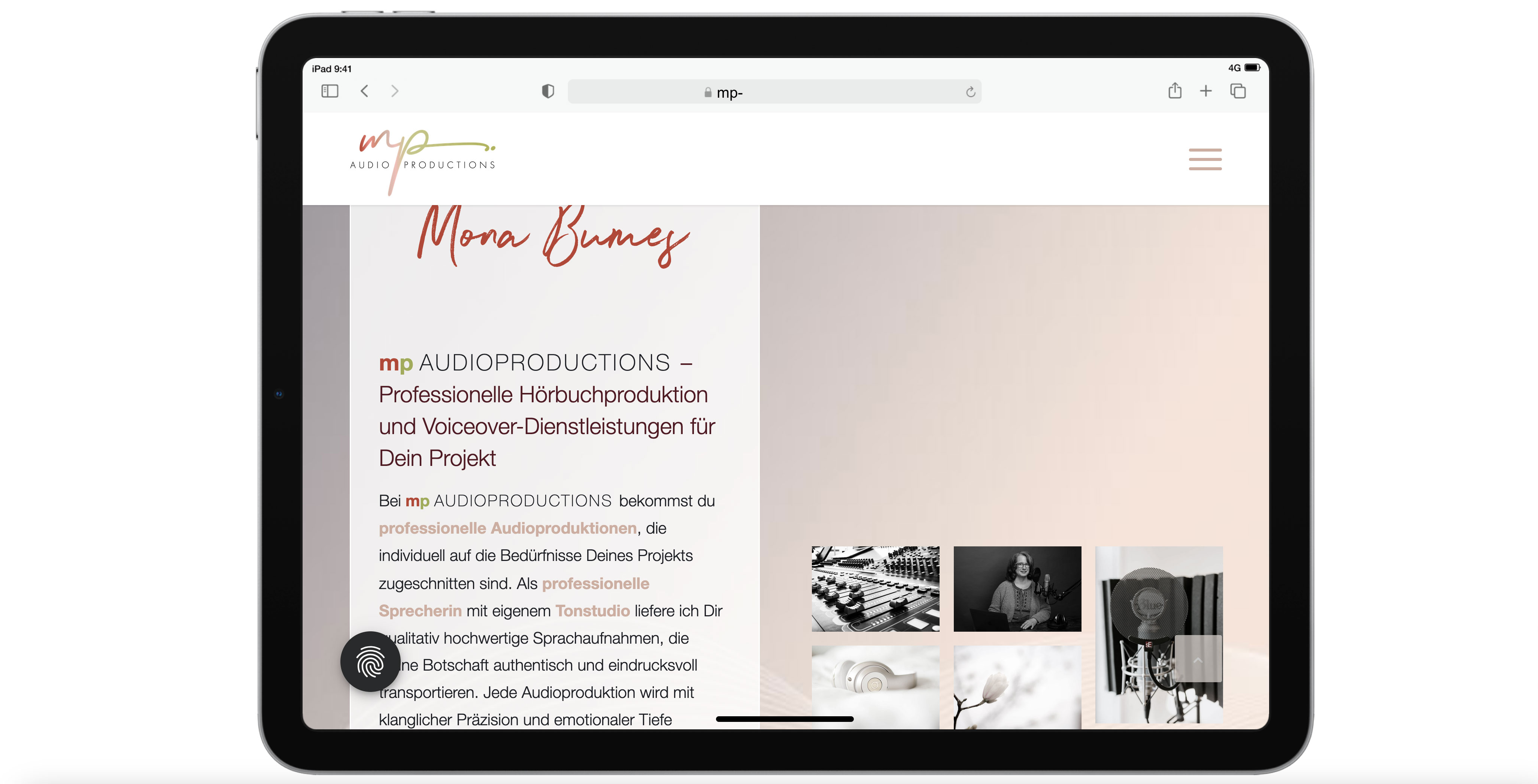
    The Enter section exists twice: once only for the desktop version with the movie, and once with a still image in the background for the mobile devices. However, the desktop version is still displayed on the i-pad even though I have also hidden tablets in the settings. Here is a screenshot of the display on the tablet: https://mp-audioproductions.de/support/3.jpg > the movie doesn’t work, it looks messy with the black bars – or is there a way to scale the movie across the entire screen width? If not, then it would be good to switch to the section with the still image: Is that possible?

    2nd section Offers: https://mp-audioproductions.de/mona-bumes/#angebote
    This also does not work correctly on the tablet: The cells are displayed next to each other (instead of below each other, as in other mobile versions): see screenshot: https://mp-audioproductions.de/support/1.jpg
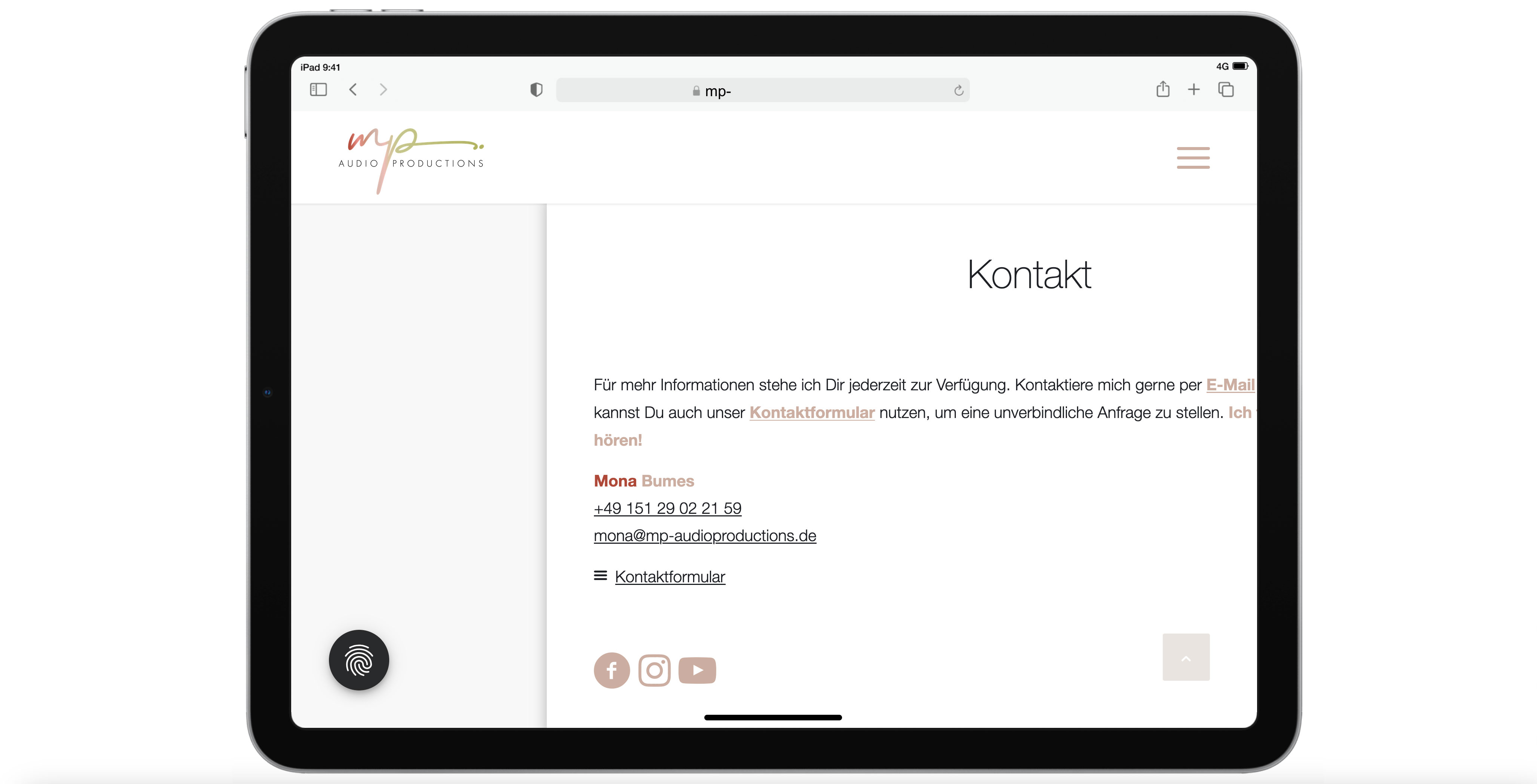
    > What setting do I need so that the cells are also displayed one below the other on the tablet landscape?

    3. contact section (last section): https://mp-audioproductions.de/mona-bumes/#kontakt
    Display tablet landscape: truncated text on the right: https://mp-audioproductions.de/support/2.jpg
    > In all other mobile versions, the cell with the contact details is displayed correctly centered, but not on the tablet landscape. What setting do I need here?

    With a request for support, best regards, Diana

    Stegemueller
    Participant

    Hi support

    I have two questions:

    1) Is it true that you have to buy a new license for Enfold when the old one runs out? Can’t you just extend the old one? Right now it looks like I have three licenses for Enfold.

    Am I doing something wrong? Can you help me?

    2) On my site, I have activated something that causes, for example, ‘featured image’ and other images that are links to appear with a round arrow in a small circle above. I have been through all the menu items, but can’t figure out how to disable this functionality.

    Can you help me?

    Kind regards
    Hanne B. Stegemüller,
    Denmark

    #1477437

    Hi,

    The only way to make the slide image or video scroll with the content is to set Advanced > Slider Animation > Slideshow Image Scrolling to Parallax or Fixed.

    You can try this plugin, but it only works with the Block Editor: https://wordpress.org/plugins/advanced-backgrounds/

    Best regards,
    Ismael

    #1477424

    Hi,
    Please see the “Warning: Characters <,>,[,] might break ALB backend or frontend.”
    Screen Shot 2025 02 19 at 5.24.45 PM
    this HTML in your titles and caption could be braking your slider, try removing and check again.

    Best regards,
    Mike

    #1477419

    I”m having the same issue (full width slider images not showing up I can see the navigation buttons but no images). Tried the above and my defaults are already disabled. Yes, I tried disabling all plugins.
    Enfold is up to date, WordPress is up to date.

    #1477384
    northorie
    Participant

    Hi,
    would you kindly check my page in progress on mobile: https://projekt2.mindful-designs.de
    Below the orange button is a strange huge space.

    For the image inside the header on desktop you gave me this code:
    @media only screen and (min-width: 1024px) {
    .responsive .home #av_section_1 .container {
    max-width: 100%;
    }
    }

    Maybe that’s the reason?

    Best regards

    #1477369

    Great, that worked for this icons. Now can the image photo go all the way to top of the phone, with no black area where the time and battery are. I know you can change this color but youve’ also given me code to ahve photo run all the way up.

    #1477364

    Hi,

    Thank you for the info.

    The blog entry picture was added through the settings sidebar on the right side.

    If you’re using the Classic/Block Editor, you don’t need to add the image again in the editor or builder if you’ve already set it as the featured image — it will automatically display in the post. However, if you’re using the Advanced Layout Builder, you must add the image manually in the builder.

    For some reason, the editor has switched to the default editor even though the content was added using the builder. Please refrain from switching between editors.

    Best regards,
    Ismael

    Hey there

    Sorry I thought they were all footer related so thats why I did them all – but note taken for future :-)

    Also dont worry about the “How can I reduce the Gap top and bottom of entire footer section inner padding?” I have found some code to fix that myself now. Which also seems to have helped with this questio “How can I reduce the gap between columns when they are stacked on mobile?” too.

    I cant see any issues – here is the quick css:
    /* remove the meta container from blog page*/
    .html_elegant-blog #top .post-entry .post-meta-infos {
    display: none;
    }
    /* remove the category displaying on blog page*/
    .html_elegant-blog #top .avia-content-slider .blog-categories {
    display: none;
    }

    /* Remove Product sorting from Product pages*/
    .product-sorting { display: none !important;
    }

    /* Product price*/
    #top .price, #top .price span, #top del, #top ins{
    display: inline;
    text-decoration: none;
    font-size: 17px;
    line-height: 45px;
    font-weight: 600;
    letter-spacing: 0.5px;
    }

    .image-overlay {background: none;
    }
    .av_font_icon.av-icon-style-border .av-icon-char {
    -moz-box-sizing: content-box;
    -webkit-box-sizing: content-box;
    box-sizing: content-box;
    border-radius: 1000px;
    border-width: 2px;
    border-style: solid;
    display: block;
    margin: 0 auto;
    padding: 25px;
    color: inherit;
    border-color: inherit;
    position: relative;
    }

    /* Centre 5 stars in testimonials*/
    .avia-testimonial p[style*=”center”] {
    margin-top: 0;
    display: inline-block;
    }

    .avia-testimonial-meta-mini {
    text-align: center !important;
    }

    /* Reduce gap above header on events calendar – what’s on page*/
    .tribe-common–breakpoint-medium.tribe-events .tribe-events-l-container {
    padding-top: 0;
    }
    .tribe-events .tribe-events-l-container {
    padding-top: 0;
    }

    #top #reviews h2{
    font:”HelveticaNeue”, “Helvetica Neue”, Helvetica, Arial, sans-serif;
    line-height: 25px;
    font-weight: normal;
    text-transform: none;
    letter-spacing: 1px;
    }

    .big-preview.single-big {
    text-align: center; }

    .big-preview.single-big a {
    display: inline-block; }

    .woocommerce-review__published-date {
    display: none !important;
    }

    .html_elegant-blog .avia-content-slider .slide-meta {
    display: none !important;
    }

    /* IconList space-*/
    #top .av-iconlist-small li {
    margin: 10px 0;
    }

    /*reduce the gap between Icon list and the text block above it*/
    .avia-icon-list-container {
    margin: 10px 0 30px 0;
    }

    /*reduce the gap between text box and colour section*/
    .content {
    padding-top: 22px;
    padding-bottom: 20px;
    }

    @media only screen and (max-width: 767px) {

    /* Add your Mobile Styles here */
    /* Social icons 5 column display on mobile to stop overlaping */
    @media only screen and (max-width: 767px) {
    .flex_column.av-1wutg6-75a2def9a5e4dfdd6a7dc4b173f7d740 {
    display: none;
    }
    .responsive #top.page-id-734 #wrap_all .content .entry-content-wrapper .flex_column.av_one_fifth {
    width: 33%;
    }

    /* increase width of testimonial slider on mobile */
    .responsive #top .av-large-testimonial-slider.avia-testimonial-wrapper .avia-testimonial {
    padding: 0;
    }
    #top .av-large-testimonial-slider .avia-testimonial-meta .avia-testimonial-image {
    width: 100%;
    }
    #top .av-large-testimonial-slider .avia-testimonial-meta-mini {
    text-align: center;
    }

    /* Scroll to top button on mobile */
    .responsive #scroll-top-link {
    display: block !important;
    }

    And there is also the Advanced styling for the Widgets titles.

    • This reply was modified 1 year, 2 months ago by xfacta.
    #1477314

    So this is the link
    https://saffronwalden.gov.uk/category/news/
    As mentioned it’s fine for everybody who’s not logged in and also admin users who are logged in

    But anyone logged in with less than an admin account sees this
    https://img.savvyify.com/images/2025/02/18/Screenshot-2025-02-18-at-09.19.54.png

    Thanks

    #1477309

    Hey itsjona,

    Thank you for the inquiry.

    Did you insert the image in the text editor? Please provide the login details in the private field so we can check the post further.

    Best regards,
    Ismael

    #1477308
    itsjona
    Participant

    Hello Kriesi team,
    in one of my blog posts, the blog picture is displayed twice, along with a different title. Both appeared after I picked a blog image in the sidebar menu. I tried to remove it from the code, but it seems to be not there, I guess it’s some kind of preview gone wrong. At the same time, the font size and the padding to the left and right are both bigger now than before and in my other blog entries.
    Thanks for your help!

    #1477284
    Munford
    Participant

    I found a solution by selecting “title and exerpt” and leaving the exerpt blank.
    hi
    I would like to use the portfolio grid with captions that are placed under the image instead of on top of them at the bottom so that the whole image is visible.
    Is this possible?
    thanks
    Nancy

    • This topic was modified 1 year, 2 months ago by Munford.
    • This topic was modified 1 year, 2 months ago by Munford.
    #1477281

    In reply to: Icon Grid Flipbox

    Hey Ad-Min747,
    Sorry, I don’t understand your question, please explain further, and include screenshots to demonstrate.
    To add a screenshot please try using an Screenshot service and pasting the image URL in your post.
    An admin login may also help.

    Best regards,
    Mike

    #1477279

    In reply to: Logo is not showing

    Well now the homepage hero image shows, but not logo is not set up in the same way on all pages. On the homepage when I scroll down, it switches to the original Enfold on mobile. On some pages it just doesn’t change from transparent to coloured. I tried in multiple ways, incognito and different browsers. The issue persists. Is this a caching issue again? Not sure what’s happening really.

    Thank you,

    Lilija

    #1477277

    In reply to: Logo is not showing

    Thanks so much! I updated all logos and added a transparent one. And now the whole homepage just got messed up. The background image in the header is not showing. Not sure what happened since I just added logos to the site without doing anything else. I also tried to add a favicon and the issue occurred right after that. Is this something you could help me with?

    #1477266

    Hey Köln,
    I don’t believe that you will have any trouble, but I do recommend first creating a full backup of the site and database, just in case.
    To update your version of Enfold you will need to download the latest installable WP version from your Theme Forest account and upload it to your WordPress ▸ Appearance ▸ Themes ▸ Add Themes ▸ Add New
    WordPress_Appearance_Themes_Add-Themes_Add-New.jpg
    after you choose the zip file and click install, you will see a This theme is already installed message because you are updating, you can continue
    Installing_theme_from_uploaded_file_This_theme_is_already_installed.jpg
    then you will see the Theme updated successfully message.
    Theme_updated_successfully.jpg

    Best regards,
    Mike

Viewing 30 results - 2,101 through 2,130 (of 106,490 total)