Hi,
We set the image as the background in the Enfold > General Styling > Logo Area panel and adjusted the header height in Header > Header Layout > Header Size to a custom pixel value. We then added this css code to adjust the background image height and hide the default logo.
.header_color .header_bg {
    background: var(--enfold-header-color-background-image);
    background-size: auto 240px;
}

.logo img, .logo svg {
    display: none !important;
}
Screenshot:
View post on imgur.com
Best regards,
Ismael
I’m sure it’s in this forum somewhere, but I can’t find it.
I want to change the highlighted icon on my archive pages that’s to the upper-left of every post.
How do I do it?
And, can I change it to an actual image?
Thanks ahead of time.
Hi,
your nav bar is white due to this setting in Enfold Theme Options ▸ General Styling ▸ Logo Area Background Color I do this for you:

Best regards,
Mike
Hi Rikard.
The idea is to put this image https://artelt.inburlozuhause.de/wp-content/uploads/2025/02/Header_Logo_1.png as a background or Logo like on this Web page https://artelt-beratung.de. you can see it there fullresponsive it scales with the browser size.
If i put it as a background image, it will be cut because it is to wide,
I use the image as a logo it is to small.
cu
Rainer
Hi,
Thanks for that. I’m still not sure that I fully understand your intentions though, since the site you linked to has a background image on desktop resolutions, and only a text link on lower resolutions. Are you looking to set a background image to the header? If so, then that can be set under Enfold->General Styling->Logo Area.
Best regards,
Rikard
In the Masonry gallery with the setting Flexible Masonry and, for example, No Scaling, only the first two rows of images (4 columns) are displayed correctly when the page is loaded. The lower images are displayed with no white border or a much too large white border above and below them. The width of the white border is correct for all images. Only after scrolling up and down or by changing the browser window size are the images rearranged and then the white border above and below in the visible area is also correct. If you scroll further down, the images are displayed again with no or far too large a white border above and below them
Many thanks for your help!
-
This topic was modified 1 year, 1 month ago by
 Herb.
Herb.
Hi,
these images are from desktop:


What browser, OS are you using?
please include a admin login in the Private Content area so we can examine further.
Best regards,
Mike
Hi,
I checked with an incognito window and it looks like it is working:
Try disabling your wp-rocket plugin and clearing your cache
Best regards,
Mike
Hi,
Check that your Menu Screen elements ▸ CSS classs is checked, then add the custom class “nolinkstyle”, the manually add the link:

then add this css to your Quick CSS:
#top #header .avia_mega_div .sub-menu .avia_mega_text_block.nolinkstyle a {
    text-decoration: none;
    color: #000;
}
.header_color .main_menu .menu ul li.nolinkstyle a:hover {
	background-color: unset;
}
Best regards,
Mike
Hi,
This is in the Enfold Theme Options ▸ General Styling

this is in the Enfold Theme Options ▸ Advanced Styling

Best regards,
Mike
This reply has been marked as private.
you can find all demos on GitHub Library: Link
download the zip file you need. Extract the xml file of it and look for the needed enfold shortcode of the wanted page — easiest way: search for the page ID as: post_id>206 or finding the home page on that demo search for: CDATA[home]
copy the needed enfold shortcodes from :
<content:encoded><![CDATA[
… here is the avia shortcode inside
]]></content:encoded>
this copied shortcodes you can enter on a new page inserting it to the debug mode input field (activate the debug mode on : Layout Builder – Debug Mode (Backend Only))
save that new page – now you have copied all the layout of the wanted page.
You had to edit now that page elements to enter your image/media links inside that code.
Unfortunately, I can’t find out on my own.
I want to move an existing website to enfold theme. In the old theme, the header logo
is adapted to the browser window and is fully responsive. I can’t do that with enfold. Does anyone have a suggestion?
Thanks in advance
Rainer
Hey FDovalA,
The page that you linked to is using a plugin in a widget, yith_wc_category_accordion-2
You can add a widget in your sidebar


and use the Widget Options plugin if you o only what it to show in some places.
Best regards,
Mike
Hi,
The strong tags get the color for here:
your H2 & H3 get color from here:
Best regards,
Mike
Hey slikslok,
You can change the Enfold Theme Options ▸ Cookie Consent ▸ Cookie Handling ▸ Default Cookie Behaviour


Try each setting to find the result you want.
Best regards,
Mike
Hey Christian,
Check that your Menu Screen elements ▸ Description is checked:


Best regards,
Mike
Hi,
Your “PHP max input variables” & “PHP memory limit” have not changed:

this is my site:

I also note that your PHP time limit is only 30 and mine is 300
Best regards,
Mike
Hi,
@Guenni007, in this case it seems to work:


he has a strange ratio 2.35:1, but as I recall you have another solution that I couldn’t find, if you want to post it.
Best regards,
Mike
Hi,
It looks like you have this css: line-height: 1px !important;

add by a plugin or custom css, it is not from the theme.
If you can not find it, try this css:
.av-toggle-switch label {
	line-height: 23px !important;
}

Best regards,
Mike
Hey manurimini,
It seems to work for me:


Try using the login you posted above for us.
Best regards,
Mike
Hi,
I also don’t see double arrows

Please note that testing with Safari can be hard to clear the cache, often you need to also clear the history to fully purge the cache, following these steps for Safari and note Step 4 where you will Clear the History.
Best regards,
Mike
Hi,
In your screenshot:

the image is not all the way to the top, the top bar background color is white because of the Safari Website Tinting option:

from the site background color.
This color is not customizable beyond setting a solid color that matches the theme color of your website
and you cannot overlay an image or extend the background of your website into the status bar area

Best regards,
Mike
on https://kriesi.at/themes/enfold-2017/elements/magazine/ you want to preserve the bigger image post and have on the smaller images a two column view?
to have:
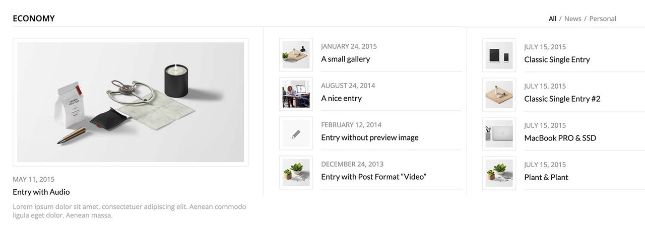
you can have this by css only – but you had to break earlier to responsive case to have enough space for showing the articles with smaller images:
#top .av-magazine-sideshow:before,
#top .av-magazine-sideshow:after {
  display: none;
}

#top .av-magazine-sideshow {
  display: flex;
  flex-flow: row wrap;
  justify-content: space-between;
}

#top .av-magazine-sideshow .av-magazine-entry {
  flex: 0 1 48%;
  width: unset;
}
Hi,
Try this CSS in your Enfold Theme Options ▸ General Styling ▸ Quick CSS field:
@media only screen and (max-width: 479px) {
#top.home .slideshow_inner_caption {
    width: 50%;
}
    #top.home .avia-slideshow .av-slideshow-caption .avia-caption-content p {
        font-size: 9px;
        line-height: 9px;
        margin-bottom: 0;
    }
   #top.home .avia-slideshow .avia-slideshow-button {
   	margin-top: 10px;
   	font-size: 9px;
   }
}

Best regards,
Mike
The following text: Cisco Meraki vous propose should be in the left position where there is the while color in my the image.
Hi Ismael,
This is my screen on my mobile phone.
I do not see the button (blue) and the text is on the image. I need to have the text in the left position.
HI
A couple of questions
I would like to show the excerpt in the magazine element.
I found the code here: https://kriesi.at/support/topic/magazine-excerpt-2/ but it’s not working for me.
I have the magazine.php in a child theme. Can you take a look at my code?
I would also like to be able to have it display in 2 columns? is that possible?
I know I can use the portfolio grid, but that puts the image at the top instead of on the side.
Is it possible to modify that? On the page below I have 2 magazine elements shown by date, but maybe there is a better way to do it?
Thanks
Hi Ismael,
thanks, I’ve tried that on a separate test page [private content] using the settings you’ve mentioned. The source video isn’t 16:9 though but I’ve selected stretch regardless which only results in the fall back image being stretched. Isn’t there a way to define the height of the slider? – can’t find that. On top of that I’ll need to place the text plus box on top of the slider as in shown my color section.
Kind regards.

