-
Search Results
-
I have encountering an issue with Enfold 7.1.3 in various websites. The debug_log has the following errors, exactly as reported by another user here https://kriesi.at/support/topic/multiple-errors-on-pages-and-posts-analysis-included/
[20-Feb-2026 10:37:32 UTC] PHP Notice:  Function WP_Styles::add was called <strong>incorrectly</strong>. The style with the handle "avia-module-audioplayer" was enqueued with dependencies that are not registered: avia-layout. Please see <a href="https://developer.wordpress.org/advanced-administration/debug/debug-wordpress/">Debugging in WordPress</a> for more information. (This message was added in version 6.9.1.) in /home/www/public/isea-development/wp-includes/functions.php on line 6131
[20-Feb-2026 10:37:32 UTC] PHP Notice:  Function WP_Styles::add was called <strong>incorrectly</strong>. The style with the handle "avia-module-blog" was enqueued with dependencies that are not registered: avia-layout. Please see <a href="https://developer.wordpress.org/advanced-administration/debug/debug-wordpress/">Debugging in WordPress</a> for more information. (This message was added in version 6.9.1.) in /home/www/public/isea-development/wp-includes/functions.php on line 6131
[20-Feb-2026 10:37:32 UTC] PHP Notice:  Function WP_Styles::add was called <strong>incorrectly</strong>. The style with the handle "avia-module-postslider" was enqueued with dependencies that are not registered: avia-layout. Please see <a href="https://developer.wordpress.org/advanced-administration/debug/debug-wordpress/">Debugging in WordPress</a> for more information. (This message was added in version 6.9.1.) in /home/www/public/isea-development/wp-includes/functions.php on line 6131
[20-Feb-2026 10:37:32 UTC] PHP Notice:  Function WP_Styles::add was called <strong>incorrectly</strong>. The style with the handle "avia-module-button" was enqueued with dependencies that are not registered: avia-layout. Please see <a href="https://developer.wordpress.org/advanced-administration/debug/debug-wordpress/">Debugging in WordPress</a> for more information. (This message was added in version 6.9.1.) in /home/www/public/isea-development/wp-includes/functions.php on line 6131
[20-Feb-2026 10:37:32 UTC] PHP Notice:  Function WP_Styles::add was called <strong>incorrectly</strong>. The style with the handle "avia-module-buttonrow" was enqueued with dependencies that are not registered: avia-layout. Please see <a href="https://developer.wordpress.org/advanced-administration/debug/debug-wordpress/">Debugging in WordPress</a> for more information. (This message was added in version 6.9.1.) in /home/www/public/isea-development/wp-includes/functions.php on line 6131
[20-Feb-2026 10:37:32 UTC] PHP Notice:  Function WP_Styles::add was called <strong>incorrectly</strong>. The style with the handle "avia-module-button-fullwidth" was enqueued with dependencies that are not registered: avia-layout. Please see <a href="https://developer.wordpress.org/advanced-administration/debug/debug-wordpress/">Debugging in WordPress</a> for more information. (This message was added in version 6.9.1.) in /home/www/public/isea-development/wp-includes/functions.php on line 6131
[20-Feb-2026 10:37:32 UTC] PHP Notice:  Function WP_Styles::add was called <strong>incorrectly</strong>. The style with the handle "avia-module-catalogue" was enqueued with dependencies that are not registered: avia-layout. Please see <a href="https://developer.wordpress.org/advanced-administration/debug/debug-wordpress/">Debugging in WordPress</a> for more information. (This message was added in version 6.9.1.) in /home/www/public/isea-development/wp-includes/functions.php on line 6131
[20-Feb-2026 10:37:32 UTC] PHP Notice:  Function WP_Styles::add was called <strong>incorrectly</strong>. The style with the handle "avia-module-comments" was enqueued with dependencies that are not registered: avia-layout. Please see <a href="https://developer.wordpress.org/advanced-administration/debug/debug-wordpress/">Debugging in WordPress</a> for more information. (This message was added in version 6.9.1.) in /home/www/public/isea-development/wp-includes/functions.php on line 6131
[20-Feb-2026 10:37:32 UTC] PHP Notice:  Function WP_Styles::add was called <strong>incorrectly</strong>. The style with the handle "avia-module-contact" was enqueued with dependencies that are not registered: avia-layout. Please see <a href="https://developer.wordpress.org/advanced-administration/debug/debug-wordpress/">Debugging in WordPress</a> for more information. (This message was added in version 6.9.1.) in /home/www/public/isea-development/wp-includes/functions.php on line 6131
[20-Feb-2026 10:37:32 UTC] PHP Notice:  Function WP_Styles::add was called <strong>incorrectly</strong>. The style with the handle "avia-module-slideshow" was enqueued with dependencies that are not registered: avia-layout. Please see <a href="https://developer.wordpress.org/advanced-administration/debug/debug-wordpress/">Debugging in WordPress</a> for more information. (This message was added in version 6.9.1.) in /home/www/public/isea-development/wp-includes/functions.php on line 6131
[20-Feb-2026 10:37:32 UTC] PHP Notice:  Function WP_Styles::add was called <strong>incorrectly</strong>. The style with the handle "avia-module-countdown" was enqueued with dependencies that are not registered: avia-layout. Please see <a href="https://developer.wordpress.org/advanced-administration/debug/debug-wordpress/">Debugging in WordPress</a> for more information. (This message was added in version 6.9.1.) in /home/www/public/isea-development/wp-includes/functions.php on line 6131
[20-Feb-2026 10:37:32 UTC] PHP Notice:  Function WP_Styles::add was called <strong>incorrectly</strong>. The style with the handle "avia-module-dynamic-field" was enqueued with dependencies that are not registered: avia-layout. Please see <a href="https://developer.wordpress.org/advanced-administration/debug/debug-wordpress/">Debugging in WordPress</a> for more information. (This message was added in version 6.9.1.) in /home/www/public/isea-development/wp-includes/functions.php on line 6131
[20-Feb-2026 10:37:32 UTC] PHP Notice:  Function WP_Styles::add was called <strong>incorrectly</strong>. The style with the handle "avia-module-gallery" was enqueued with dependencies that are not registered: avia-layout. Please see <a href="https://developer.wordpress.org/advanced-administration/debug/debug-wordpress/">Debugging in WordPress</a> for more information. (This message was added in version 6.9.1.) in /home/www/public/isea-development/wp-includes/functions.php on line 6131
[20-Feb-2026 10:37:32 UTC] PHP Notice:  Function WP_Styles::add was called <strong>incorrectly</strong>. The style with the handle "avia-module-maps" was enqueued with dependencies that are not registered: avia-layout. Please see <a href="https://developer.wordpress.org/advanced-administration/debug/debug-wordpress/">Debugging in WordPress</a> for more information. (This message was added in version 6.9.1.) in /home/www/public/isea-development/wp-includes/functions.php on line 6131
[20-Feb-2026 10:37:32 UTC] PHP Notice:  Function WP_Styles::add was called <strong>incorrectly</strong>. The style with the handle "avia-module-gridrow" was enqueued with dependencies that are not registered: avia-layout. Please see <a href="https://developer.wordpress.org/advanced-administration/debug/debug-wordpress/">Debugging in WordPress</a> for more information. (This message was added in version 6.9.1.) in /home/www/public/isea-development/wp-includes/functions.php on line 6131
[20-Feb-2026 10:37:32 UTC] PHP Notice:  Function WP_Styles::add was called <strong>incorrectly</strong>. The style with the handle "avia-module-heading" was enqueued with dependencies that are not registered: avia-layout. Please see <a href="https://developer.wordpress.org/advanced-administration/debug/debug-wordpress/">Debugging in WordPress</a> for more information. (This message was added in version 6.9.1.) in /home/www/public/isea-development/wp-includes/functions.php on line 6131
[20-Feb-2026 10:37:32 UTC] PHP Notice:  Function WP_Styles::add was called <strong>incorrectly</strong>. The style with the handle "avia-module-rotator" was enqueued with dependencies that are not registered: avia-layout. Please see <a href="https://developer.wordpress.org/advanced-administration/debug/debug-wordpress/">Debugging in WordPress</a> for more information. (This message was added in version 6.9.1.) in /home/www/public/isea-development/wp-includes/functions.php on line 6131
[20-Feb-2026 10:37:32 UTC] PHP Notice:  Function WP_Styles::add was called <strong>incorrectly</strong>. The style with the handle "avia-module-hr" was enqueued with dependencies that are not registered: avia-layout. Please see <a href="https://developer.wordpress.org/advanced-administration/debug/debug-wordpress/">Debugging in WordPress</a> for more information. (This message was added in version 6.9.1.) in /home/www/public/isea-development/wp-includes/functions.php on line 6131
[20-Feb-2026 10:37:32 UTC] PHP Notice:  Function WP_Styles::add was called <strong>incorrectly</strong>. The style with the handle "avia-module-icon" was enqueued with dependencies that are not registered: avia-layout. Please see <a href="https://developer.wordpress.org/advanced-administration/debug/debug-wordpress/">Debugging in WordPress</a> for more information. (This message was added in version 6.9.1.) in /home/www/public/isea-development/wp-includes/functions.php on line 6131
[20-Feb-2026 10:37:32 UTC] PHP Notice:  Function WP_Styles::add was called <strong>incorrectly</strong>. The style with the handle "avia-module-icon-circles" was enqueued with dependencies that are not registered: avia-layout. Please see <a href="https://developer.wordpress.org/advanced-administration/debug/debug-wordpress/">Debugging in WordPress</a> for more information. (This message was added in version 6.9.1.) in /home/www/public/isea-development/wp-includes/functions.php on line 6131
[20-Feb-2026 10:37:32 UTC] PHP Notice:  Function WP_Styles::add was called <strong>incorrectly</strong>. The style with the handle "avia-module-iconbox" was enqueued with dependencies that are not registered: avia-layout. Please see <a href="https://developer.wordpress.org/advanced-administration/debug/debug-wordpress/">Debugging in WordPress</a> for more information. (This message was added in version 6.9.1.) in /home/www/public/isea-development/wp-includes/functions.php on line 6131
[20-Feb-2026 10:37:32 UTC] PHP Notice:  Function WP_Styles::add was called <strong>incorrectly</strong>. The style with the handle "avia-module-icongrid" was enqueued with dependencies that are not registered: avia-layout. Please see <a href="https://developer.wordpress.org/advanced-administration/debug/debug-wordpress/">Debugging in WordPress</a> for more information. (This message was added in version 6.9.1.) in /home/www/public/isea-development/wp-includes/functions.php on line 6131
[20-Feb-2026 10:37:32 UTC] PHP Notice:  Function WP_Styles::add was called <strong>incorrectly</strong>. The style with the handle "avia-module-iconlist" was enqueued with dependencies that are not registered: avia-layout. Please see <a href="https://developer.wordpress.org/advanced-administration/debug/debug-wordpress/">Debugging in WordPress</a> for more information. (This message was added in version 6.9.1.) in /home/www/public/isea-development/wp-includes/functions.php on line 6131
[20-Feb-2026 10:37:32 UTC] PHP Notice:  Function WP_Styles::add was called <strong>incorrectly</strong>. The style with the handle "avia-module-image" was enqueued with dependencies that are not registered: avia-layout. Please see <a href="https://developer.wordpress.org/advanced-administration/debug/debug-wordpress/">Debugging in WordPress</a> for more information. (This message was added in version 6.9.1.) in /home/www/public/isea-development/wp-includes/functions.php on line 6131
[20-Feb-2026 10:37:32 UTC] PHP Notice:  Function WP_Styles::add was called <strong>incorrectly</strong>. The style with the handle "avia-module-image-diff" was enqueued with dependencies that are not registered: avia-layout. Please see <a href="https://developer.wordpress.org/advanced-administration/debug/debug-wordpress/">Debugging in WordPress</a> for more information. (This message was added in version 6.9.1.) in /home/www/public/isea-development/wp-includes/functions.php on line 6131
[20-Feb-2026 10:37:32 UTC] PHP Notice:  Function WP_Styles::add was called <strong>incorrectly</strong>. The style with the handle "avia-module-hotspot" was enqueued with dependencies that are not registered: avia-layout. Please see <a href="https://developer.wordpress.org/advanced-administration/debug/debug-wordpress/">Debugging in WordPress</a> for more information. (This message was added in version 6.9.1.) in /home/www/public/isea-development/wp-includes/functions.php on line 6131
[20-Feb-2026 10:37:32 UTC] PHP Notice:  Function WP_Styles::add was called <strong>incorrectly</strong>. The style with the handle "avia-module-sc-lottie-animation" was enqueued with dependencies that are not registered: avia-layout. Please see <a href="https://developer.wordpress.org/advanced-administration/debug/debug-wordpress/">Debugging in WordPress</a> for more information. (This message was added in version 6.9.1.) in /home/www/public/isea-development/wp-includes/functions.php on line 6131
[20-Feb-2026 10:37:32 UTC] PHP Notice:  Function WP_Styles::add was called <strong>incorrectly</strong>. The style with the handle "avia-module-magazine" was enqueued with dependencies that are not registered: avia-layout. Please see <a href="https://developer.wordpress.org/advanced-administration/debug/debug-wordpress/">Debugging in WordPress</a> for more information. (This message was added in version 6.9.1.) in /home/www/public/isea-development/wp-includes/functions.php on line 6131
[20-Feb-2026 10:37:32 UTC] PHP Notice:  Function WP_Styles::add was called <strong>incorrectly</strong>. The style with the handle "avia-module-masonry" was enqueued with dependencies that are not registered: avia-layout. Please see <a href="https://developer.wordpress.org/advanced-administration/debug/debug-wordpress/">Debugging in WordPress</a> for more information. (This message was added in version 6.9.1.) in /home/www/public/isea-development/wp-includes/functions.php on line 6131
[20-Feb-2026 10:37:32 UTC] PHP Notice:  Function WP_Styles::add was called <strong>incorrectly</strong>. The style with the handle "avia-siteloader" was enqueued with dependencies that are not registered: avia-layout. Please see <a href="https://developer.wordpress.org/advanced-administration/debug/debug-wordpress/">Debugging in WordPress</a> for more information. (This message was added in version 6.9.1.) in /home/www/public/isea-development/wp-includes/functions.php on line 6131
[20-Feb-2026 10:37:32 UTC] PHP Notice:  Function WP_Styles::add was called <strong>incorrectly</strong>. The style with the handle "avia-module-menu" was enqueued with dependencies that are not registered: avia-layout. Please see <a href="https://developer.wordpress.org/advanced-administration/debug/debug-wordpress/">Debugging in WordPress</a> for more information. (This message was added in version 6.9.1.) in /home/www/public/isea-development/wp-includes/functions.php on line 6131
[20-Feb-2026 10:37:32 UTC] PHP Notice:  Function WP_Styles::add was called <strong>incorrectly</strong>. The style with the handle "avia-module-notification" was enqueued with dependencies that are not registered: avia-layout. Please see <a href="https://developer.wordpress.org/advanced-administration/debug/debug-wordpress/">Debugging in WordPress</a> for more information. (This message was added in version 6.9.1.) in /home/www/public/isea-development/wp-includes/functions.php on line 6131
[20-Feb-2026 10:37:32 UTC] PHP Notice:  Function WP_Styles::add was called <strong>incorrectly</strong>. The style with the handle "avia-module-numbers" was enqueued with dependencies that are not registered: avia-layout. Please see <a href="https://developer.wordpress.org/advanced-administration/debug/debug-wordpress/">Debugging in WordPress</a> for more information. (This message was added in version 6.9.1.) in /home/www/public/isea-development/wp-includes/functions.php on line 6131
[20-Feb-2026 10:37:32 UTC] PHP Notice:  Function WP_Styles::add was called <strong>incorrectly</strong>. The style with the handle "avia-module-portfolio" was enqueued with dependencies that are not registered: avia-layout. Please see <a href="https://developer.wordpress.org/advanced-administration/debug/debug-wordpress/">Debugging in WordPress</a> for more information. (This message was added in version 6.9.1.) in /home/www/public/isea-development/wp-includes/functions.php on line 6131
[20-Feb-2026 10:37:32 UTC] PHP Notice:  Function WP_Styles::add was called <strong>incorrectly</strong>. The style with the handle "avia-module-post-metadata" was enqueued with dependencies that are not registered: avia-layout. Please see <a href="https://developer.wordpress.org/advanced-administration/debug/debug-wordpress/">Debugging in WordPress</a> for more information. (This message was added in version 6.9.1.) in /home/www/public/isea-development/wp-includes/functions.php on line 6131
[20-Feb-2026 10:37:32 UTC] PHP Notice:  Function WP_Styles::add was called <strong>incorrectly</strong>. The style with the handle "avia-module-progress-bar" was enqueued with dependencies that are not registered: avia-layout. Please see <a href="https://developer.wordpress.org/advanced-administration/debug/debug-wordpress/">Debugging in WordPress</a> for more information. (This message was added in version 6.9.1.) in /home/www/public/isea-development/wp-includes/functions.php on line 6131
[20-Feb-2026 10:37:32 UTC] PHP Notice:  Function WP_Styles::add was called <strong>incorrectly</strong>. The style with the handle "avia-module-promobox" was enqueued with dependencies that are not registered: avia-layout. Please see <a href="https://developer.wordpress.org/advanced-administration/debug/debug-wordpress/">Debugging in WordPress</a> for more information. (This message was added in version 6.9.1.) in /home/www/public/isea-development/wp-includes/functions.php on line 6131
[20-Feb-2026 10:37:32 UTC] PHP Notice:  Function WP_Styles::add was called <strong>incorrectly</strong>. The style with the handle "avia-sc-search" was enqueued with dependencies that are not registered: avia-layout. Please see <a href="https://developer.wordpress.org/advanced-administration/debug/debug-wordpress/">Debugging in WordPress</a> for more information. (This message was added in version 6.9.1.) in /home/www/public/isea-development/wp-includes/functions.php on line 6131
[20-Feb-2026 10:37:32 UTC] PHP Notice:  Function WP_Styles::add was called <strong>incorrectly</strong>. The style with the handle "avia-module-slideshow-accordion" was enqueued with dependencies that are not registered: avia-layout. Please see <a href="https://developer.wordpress.org/advanced-administration/debug/debug-wordpress/">Debugging in WordPress</a> for more information. (This message was added in version 6.9.1.) in /home/www/public/isea-development/wp-includes/functions.php on line 6131
[20-Feb-2026 10:37:32 UTC] PHP Notice:  Function WP_Styles::add was called <strong>incorrectly</strong>. The style with the handle "avia-module-slideshow-ls" was enqueued with dependencies that are not registered: avia-layout. Please see <a href="https://developer.wordpress.org/advanced-administration/debug/debug-wordpress/">Debugging in WordPress</a> for more information. (This message was added in version 6.9.1.) in /home/www/public/isea-development/wp-includes/functions.php on line 6131
[20-Feb-2026 10:37:32 UTC] PHP Notice:  Function WP_Styles::add was called <strong>incorrectly</strong>. The style with the handle "avia-module-social" was enqueued with dependencies that are not registered: avia-layout. Please see <a href="https://developer.wordpress.org/advanced-administration/debug/debug-wordpress/">Debugging in WordPress</a> for more information. (This message was added in version 6.9.1.) in /home/www/public/isea-development/wp-includes/functions.php on line 6131
[20-Feb-2026 10:37:32 UTC] PHP Notice:  Function WP_Styles::add was called <strong>incorrectly</strong>. The style with the handle "avia-module-tabsection" was enqueued with dependencies that are not registered: avia-layout. Please see <a href="https://developer.wordpress.org/advanced-administration/debug/debug-wordpress/">Debugging in WordPress</a> for more information. (This message was added in version 6.9.1.) in /home/www/public/isea-development/wp-includes/functions.php on line 6131
[20-Feb-2026 10:37:32 UTC] PHP Notice:  Function WP_Styles::add was called <strong>incorrectly</strong>. The style with the handle "avia-module-table" was enqueued with dependencies that are not registered: avia-layout. Please see <a href="https://developer.wordpress.org/advanced-administration/debug/debug-wordpress/">Debugging in WordPress</a> for more information. (This message was added in version 6.9.1.) in /home/www/public/isea-development/wp-includes/functions.php on line 6131
[20-Feb-2026 10:37:32 UTC] PHP Notice:  Function WP_Styles::add was called <strong>incorrectly</strong>. The style with the handle "avia-module-tabs" was enqueued with dependencies that are not registered: avia-layout. Please see <a href="https://developer.wordpress.org/advanced-administration/debug/debug-wordpress/">Debugging in WordPress</a> for more information. (This message was added in version 6.9.1.) in /home/www/public/isea-development/wp-includes/functions.php on line 6131
[20-Feb-2026 10:37:32 UTC] PHP Notice:  Function WP_Styles::add was called <strong>incorrectly</strong>. The style with the handle "avia-module-team" was enqueued with dependencies that are not registered: avia-layout. Please see <a href="https://developer.wordpress.org/advanced-administration/debug/debug-wordpress/">Debugging in WordPress</a> for more information. (This message was added in version 6.9.1.) in /home/www/public/isea-development/wp-includes/functions.php on line 6131
[20-Feb-2026 10:37:32 UTC] PHP Notice:  Function WP_Styles::add was called <strong>incorrectly</strong>. The style with the handle "avia-module-testimonials" was enqueued with dependencies that are not registered: avia-layout. Please see <a href="https://developer.wordpress.org/advanced-administration/debug/debug-wordpress/">Debugging in WordPress</a> for more information. (This message was added in version 6.9.1.) in /home/www/public/isea-development/wp-includes/functions.php on line 6131
[20-Feb-2026 10:37:32 UTC] PHP Notice:  Function WP_Styles::add was called <strong>incorrectly</strong>. The style with the handle "avia-module-timeline" was enqueued with dependencies that are not registered: avia-layout. Please see <a href="https://developer.wordpress.org/advanced-administration/debug/debug-wordpress/">Debugging in WordPress</a> for more information. (This message was added in version 6.9.1.) in /home/www/public/isea-development/wp-includes/functions.php on line 6131
[20-Feb-2026 10:37:32 UTC] PHP Notice:  Function WP_Styles::add was called <strong>incorrectly</strong>. The style with the handle "avia-module-toggles" was enqueued with dependencies that are not registered: avia-layout. Please see <a href="https://developer.wordpress.org/advanced-administration/debug/debug-wordpress/">Debugging in WordPress</a> for more information. (This message was added in version 6.9.1.) in /home/www/public/isea-development/wp-includes/functions.php on line 6131
[20-Feb-2026 10:37:32 UTC] PHP Notice:  Function WP_Styles::add was called <strong>incorrectly</strong>. The style with the handle "avia-module-video" was enqueued with dependencies that are not registered: avia-layout. Please see <a href="https://developer.wordpress.org/advanced-administration/debug/debug-wordpress/">Debugging in WordPress</a> for more information. (This message was added in version 6.9.1.) in /home/www/public/isea-development/wp-includes/functions.php on line 6131
[20-Feb-2026 10:37:32 UTC] PHP Notice:  Function WP_Scripts::add was called <strong>incorrectly</strong>. The script with the handle "avia-module-audioplayer" was enqueued with dependencies that are not registered: avia-shortcodes. Please see <a href="https://developer.wordpress.org/advanced-administration/debug/debug-wordpress/">Debugging in WordPress</a> for more information. (This message was added in version 6.9.1.) in /home/www/public/isea-development/wp-includes/functions.php on line 6131
[20-Feb-2026 10:37:32 UTC] PHP Notice:  Function WP_Scripts::add was called <strong>incorrectly</strong>. The script with the handle "avia-module-chart-js" was enqueued with dependencies that are not registered: avia-shortcodes. Please see <a href="https://developer.wordpress.org/advanced-administration/debug/debug-wordpress/">Debugging in WordPress</a> for more information. (This message was added in version 6.9.1.) in /home/www/public/isea-development/wp-includes/functions.php on line 6131
[20-Feb-2026 10:37:32 UTC] PHP Notice:  Function WP_Scripts::add was called <strong>incorrectly</strong>. The script with the handle "avia-module-chart" was enqueued with dependencies that are not registered: avia-shortcodes. Please see <a href="https://developer.wordpress.org/advanced-administration/debug/debug-wordpress/">Debugging in WordPress</a> for more information. (This message was added in version 6.9.1.) in /home/www/public/isea-development/wp-includes/functions.php on line 6131
[20-Feb-2026 10:37:32 UTC] PHP Notice:  Function WP_Scripts::add was called <strong>incorrectly</strong>. The script with the handle "avia-module-contact" was enqueued with dependencies that are not registered: avia-shortcodes. Please see <a href="https://developer.wordpress.org/advanced-administration/debug/debug-wordpress/">Debugging in WordPress</a> for more information. (This message was added in version 6.9.1.) in /home/www/public/isea-development/wp-includes/functions.php on line 6131
[20-Feb-2026 10:37:32 UTC] PHP Notice:  Function WP_Scripts::add was called <strong>incorrectly</strong>. The script with the handle "avia-module-slideshow" was enqueued with dependencies that are not registered: avia-shortcodes. Please see <a href="https://developer.wordpress.org/advanced-administration/debug/debug-wordpress/">Debugging in WordPress</a> for more information. (This message was added in version 6.9.1.) in /home/www/public/isea-development/wp-includes/functions.php on line 6131
[20-Feb-2026 10:37:32 UTC] PHP Notice:  Function WP_Scripts::add was called <strong>incorrectly</strong>. The script with the handle "avia-module-countdown" was enqueued with dependencies that are not registered: avia-shortcodes. Please see <a href="https://developer.wordpress.org/advanced-administration/debug/debug-wordpress/">Debugging in WordPress</a> for more information. (This message was added in version 6.9.1.) in /home/www/public/isea-development/wp-includes/functions.php on line 6131
[20-Feb-2026 10:37:32 UTC] PHP Notice:  Function WP_Scripts::add was called <strong>incorrectly</strong>. The script with the handle "avia-module-gallery" was enqueued with dependencies that are not registered: avia-shortcodes. Please see <a href="https://developer.wordpress.org/advanced-administration/debug/debug-wordpress/">Debugging in WordPress</a> for more information. (This message was added in version 6.9.1.) in /home/www/public/isea-development/wp-includes/functions.php on line 6131
[20-Feb-2026 10:37:32 UTC] PHP Notice:  Function WP_Scripts::add was called <strong>incorrectly</strong>. The script with the handle "avia-module-gallery-hor" was enqueued with dependencies that are not registered: avia-shortcodes. Please see <a href="https://developer.wordpress.org/advanced-administration/debug/debug-wordpress/">Debugging in WordPress</a> for more information. (This message was added in version 6.9.1.) in /home/www/public/isea-development/wp-includes/functions.php on line 6131
[20-Feb-2026 10:37:32 UTC] PHP Notice:  Function WP_Scripts::add was called <strong>incorrectly</strong>. The script with the handle "avia-module-rotator" was enqueued with dependencies that are not registered: avia-shortcodes. Please see <a href="https://developer.wordpress.org/advanced-administration/debug/debug-wordpress/">Debugging in WordPress</a> for more information. (This message was added in version 6.9.1.) in /home/www/public/isea-development/wp-includes/functions.php on line 6131
[20-Feb-2026 10:37:32 UTC] PHP Notice:  Function WP_Scripts::add was called <strong>incorrectly</strong>. The script with the handle "avia-module-icon-circles" was enqueued with dependencies that are not registered: avia-shortcodes. Please see <a href="https://developer.wordpress.org/advanced-administration/debug/debug-wordpress/">Debugging in WordPress</a> for more information. (This message was added in version 6.9.1.) in /home/www/public/isea-development/wp-includes/functions.php on line 6131
[20-Feb-2026 10:37:32 UTC] PHP Notice:  Function WP_Scripts::add was called <strong>incorrectly</strong>. The script with the handle "avia-module-icongrid" was enqueued with dependencies that are not registered: avia-shortcodes. Please see <a href="https://developer.wordpress.org/advanced-administration/debug/debug-wordpress/">Debugging in WordPress</a> for more information. (This message was added in version 6.9.1.) in /home/www/public/isea-development/wp-includes/functions.php on line 6131
[20-Feb-2026 10:37:32 UTC] PHP Notice:  Function WP_Scripts::add was called <strong>incorrectly</strong>. The script with the handle "avia-module-iconlist" was enqueued with dependencies that are not registered: avia-shortcodes. Please see <a href="https://developer.wordpress.org/advanced-administration/debug/debug-wordpress/">Debugging in WordPress</a> for more information. (This message was added in version 6.9.1.) in /home/www/public/isea-development/wp-includes/functions.php on line 6131
[20-Feb-2026 10:37:32 UTC] PHP Notice:  Function WP_Scripts::add was called <strong>incorrectly</strong>. The script with the handle "avia-module-image-diff" was enqueued with dependencies that are not registered: avia-shortcodes. Please see <a href="https://developer.wordpress.org/advanced-administration/debug/debug-wordpress/">Debugging in WordPress</a> for more information. (This message was added in version 6.9.1.) in /home/www/public/isea-development/wp-includes/functions.php on line 6131
[20-Feb-2026 10:37:32 UTC] PHP Notice:  Function WP_Scripts::add was called <strong>incorrectly</strong>. The script with the handle "avia-module-hotspot" was enqueued with dependencies that are not registered: avia-shortcodes. Please see <a href="https://developer.wordpress.org/advanced-administration/debug/debug-wordpress/">Debugging in WordPress</a> for more information. (This message was added in version 6.9.1.) in /home/www/public/isea-development/wp-includes/functions.php on line 6131
[20-Feb-2026 10:37:32 UTC] PHP Notice:  Function WP_Scripts::add was called <strong>incorrectly</strong>. The script with the handle "avia-module-magazine" was enqueued with dependencies that are not registered: avia-shortcodes. Please see <a href="https://developer.wordpress.org/advanced-administration/debug/debug-wordpress/">Debugging in WordPress</a> for more information. (This message was added in version 6.9.1.) in /home/www/public/isea-development/wp-includes/functions.php on line 6131
[20-Feb-2026 10:37:32 UTC] PHP Notice:  Function WP_Scripts::add was called <strong>incorrectly</strong>. The script with the handle "avia-module-isotope" was enqueued with dependencies that are not registered: avia-shortcodes. Please see <a href="https://developer.wordpress.org/advanced-administration/debug/debug-wordpress/">Debugging in WordPress</a> for more information. (This message was added in version 6.9.1.) in /home/www/public/isea-development/wp-includes/functions.php on line 6131
[20-Feb-2026 10:37:32 UTC] PHP Notice:  Function WP_Scripts::add was called <strong>incorrectly</strong>. The script with the handle "avia-module-menu" was enqueued with dependencies that are not registered: avia-shortcodes. Please see <a href="https://developer.wordpress.org/advanced-administration/debug/debug-wordpress/">Debugging in WordPress</a> for more information. (This message was added in version 6.9.1.) in /home/www/public/isea-development/wp-includes/functions.php on line 6131
[20-Feb-2026 10:37:32 UTC] PHP Notice:  Function WP_Scripts::add was called <strong>incorrectly</strong>. The script with the handle "avia-module-notification" was enqueued with dependencies that are not registered: avia-shortcodes. Please see <a href="https://developer.wordpress.org/advanced-administration/debug/debug-wordpress/">Debugging in WordPress</a> for more information. (This message was added in version 6.9.1.) in /home/www/public/isea-development/wp-includes/functions.php on line 6131
[20-Feb-2026 10:37:32 UTC] PHP Notice:  Function WP_Scripts::add was called <strong>incorrectly</strong>. The script with the handle "avia-module-numbers" was enqueued with dependencies that are not registered: avia-shortcodes. Please see <a href="https://developer.wordpress.org/advanced-administration/debug/debug-wordpress/">Debugging in WordPress</a> for more information. (This message was added in version 6.9.1.) in /home/www/public/isea-development/wp-includes/functions.php on line 6131
[20-Feb-2026 10:37:32 UTC] PHP Notice:  Function WP_Scripts::add was called <strong>incorrectly</strong>. The script with the handle "avia-module-portfolio" was enqueued with dependencies that are not registered: avia-shortcodes. Please see <a href="https://developer.wordpress.org/advanced-administration/debug/debug-wordpress/">Debugging in WordPress</a> for more information. (This message was added in version 6.9.1.) in /home/www/public/isea-development/wp-includes/functions.php on line 6131
[20-Feb-2026 10:37:32 UTC] PHP Notice:  Function WP_Scripts::add was called <strong>incorrectly</strong>. The script with the handle "avia-module-progress-bar" was enqueued with dependencies that are not registered: avia-shortcodes. Please see <a href="https://developer.wordpress.org/advanced-administration/debug/debug-wordpress/">Debugging in WordPress</a> for more information. (This message was added in version 6.9.1.) in /home/www/public/isea-development/wp-includes/functions.php on line 6131
[20-Feb-2026 10:37:32 UTC] PHP Notice:  Function WP_Scripts::add was called <strong>incorrectly</strong>. The script with the handle "avia-module-slideshow-video" was enqueued with dependencies that are not registered: avia-shortcodes. Please see <a href="https://developer.wordpress.org/advanced-administration/debug/debug-wordpress/">Debugging in WordPress</a> for more information. (This message was added in version 6.9.1.) in /home/www/public/isea-development/wp-includes/functions.php on line 6131
[20-Feb-2026 10:37:32 UTC] PHP Notice:  Function WP_Scripts::add was called <strong>incorrectly</strong>. The script with the handle "avia-module-slideshow-accordion" was enqueued with dependencies that are not registered: avia-shortcodes. Please see <a href="https://developer.wordpress.org/advanced-administration/debug/debug-wordpress/">Debugging in WordPress</a> for more information. (This message was added in version 6.9.1.) in /home/www/public/isea-development/wp-includes/functions.php on line 6131
[20-Feb-2026 10:37:32 UTC] PHP Notice:  Function WP_Scripts::add was called <strong>incorrectly</strong>. The script with the handle "avia-module-slideshow-ls" was enqueued with dependencies that are not registered: avia-shortcodes. Please see <a href="https://developer.wordpress.org/advanced-administration/debug/debug-wordpress/">Debugging in WordPress</a> for more information. (This message was added in version 6.9.1.) in /home/www/public/isea-development/wp-includes/functions.php on line 6131
[20-Feb-2026 10:37:32 UTC] PHP Notice:  Function WP_Scripts::add was called <strong>incorrectly</strong>. The script with the handle "avia-module-tabsection" was enqueued with dependencies that are not registered: avia-shortcodes. Please see <a href="https://developer.wordpress.org/advanced-administration/debug/debug-wordpress/">Debugging in WordPress</a> for more information. (This message was added in version 6.9.1.) in /home/www/public/isea-development/wp-includes/functions.php on line 6131
[20-Feb-2026 10:37:32 UTC] PHP Notice:  Function WP_Scripts::add was called <strong>incorrectly</strong>. The script with the handle "avia-module-tabs" was enqueued with dependencies that are not registered: avia-shortcodes. Please see <a href="https://developer.wordpress.org/advanced-administration/debug/debug-wordpress/">Debugging in WordPress</a> for more information. (This message was added in version 6.9.1.) in /home/www/public/isea-development/wp-includes/functions.php on line 6131
[20-Feb-2026 10:37:32 UTC] PHP Notice:  Function WP_Scripts::add was called <strong>incorrectly</strong>. The script with the handle "avia-module-testimonials" was enqueued with dependencies that are not registered: avia-shortcodes. Please see <a href="https://developer.wordpress.org/advanced-administration/debug/debug-wordpress/">Debugging in WordPress</a> for more information. (This message was added in version 6.9.1.) in /home/www/public/isea-development/wp-includes/functions.php on line 6131
[20-Feb-2026 10:37:32 UTC] PHP Notice:  Function WP_Scripts::add was called <strong>incorrectly</strong>. The script with the handle "avia-module-timeline" was enqueued with dependencies that are not registered: avia-shortcodes. Please see <a href="https://developer.wordpress.org/advanced-administration/debug/debug-wordpress/">Debugging in WordPress</a> for more information. (This message was added in version 6.9.1.) in /home/www/public/isea-development/wp-includes/functions.php on line 6131
[20-Feb-2026 10:37:32 UTC] PHP Notice:  Function WP_Scripts::add was called <strong>incorrectly</strong>. The script with the handle "avia-module-toggles" was enqueued with dependencies that are not registered: avia-shortcodes. Please see <a href="https://developer.wordpress.org/advanced-administration/debug/debug-wordpress/">Debugging in WordPress</a> for more information. (This message was added in version 6.9.1.) in /home/www/public/isea-development/wp-includes/functions.php on line 6131
[20-Feb-2026 10:37:32 UTC] PHP Notice:  Function WP_Scripts::add was called <strong>incorrectly</strong>. The script with the handle "avia-module-video" was enqueued with dependencies that are not registered: avia-shortcodes. Please see <a href="https://developer.wordpress.org/advanced-administration/debug/debug-wordpress/">Debugging in WordPress</a> for more information. (This message was added in version 6.9.1.) in /home/www/public/isea-development/wp-includes/functions.php on line 6131
I tried the function suggested in the above mentioned post, but it messed up the custom css I created in my child theme.
In private content details
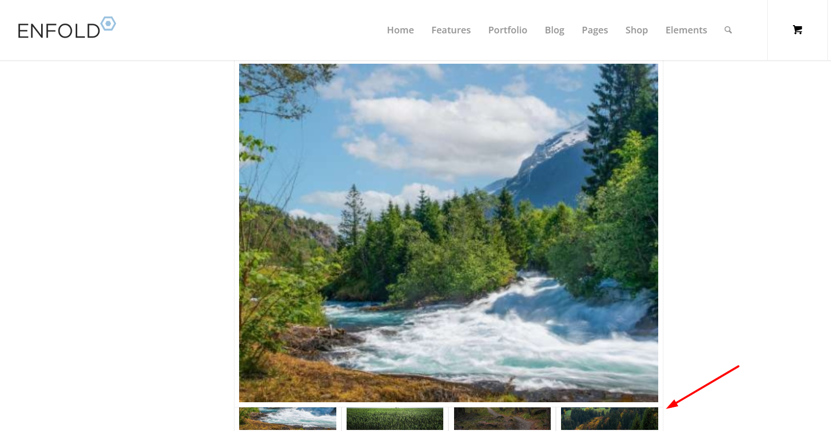
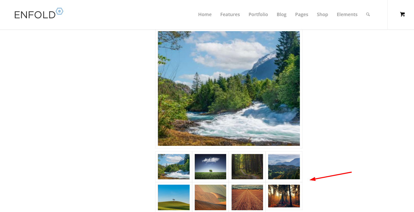
Topic: Images not responsive
Hi,
I’m experiencing an issue where some images on my client’s website are not being replaced with their optimized versions generated by the Smush Pro plugin. Other images appear to be optimizing correctly, but a subset of them continue to serve the original, unoptimized files.
I believe this may be related to how Enfold handles images. I tried to deactivate all plugins except Woocommerce and Smush Pro to see if any other plugins might be the cause of this issue, but it doesn’t seem like it. There are missing srcsets as well, which leads me to believe the theme isn’t using the regular wp_get_attachment_image() function (loading images the WordPress way), which then doesn’t let WordPress apply image optimizations and other hooks that come from that function.
Could you advise on whether Enfold has any known conflicts with Smush Pro, or if there’s a recommended way to ensure all theme-rendered images are picked up by the plugin?
In the example link, you can look at image HTML. The first section’s image has been manually replaced with AVIF while the second and third section’s image still load PNGs. None of the images have responsive srcsets.
We look forward to your response,
NevenHi,
next mission:
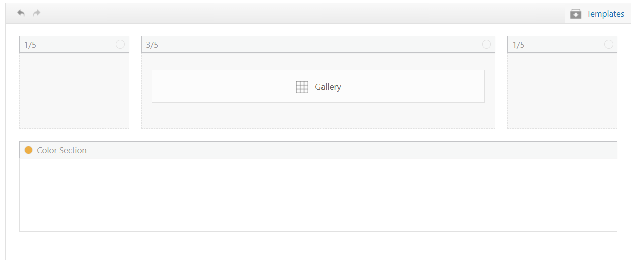
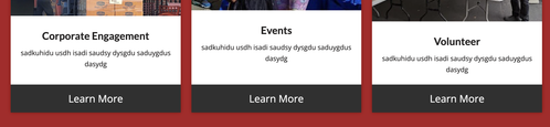
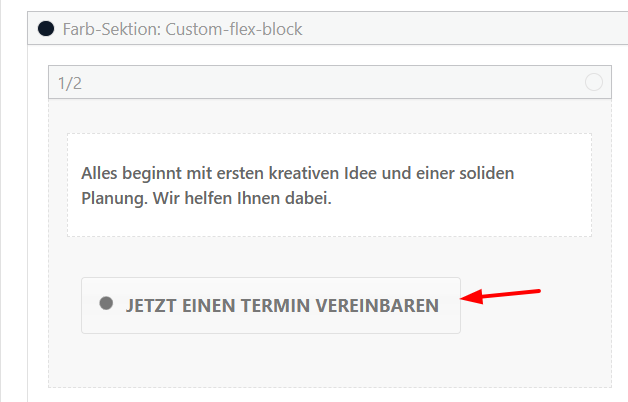
I have build a portfolio including images. But i would like to add inside/inbetween the images 2 colored blocks with a text / link.
When i add a new block and insert a colored image as background – i cannot place text on it …any idea?that should looks like here:

With caption text block it might work but i do not get it in this design


