-
AuthorSearch Results
-
February 26, 2026 at 7:10 am #1495519
In reply to: Cropped images in Lightbox
Your description of the whole thing is quite unclear.
Which Enfold element did you use? Portfolio Grid? ( When I searched for avia_post_grid in the Enfold folder, I only found portfolio.php as an element with such an entry. )Then you selected “Open in Lightbox” for link handling.
You can set the preview image size in the “Styling” tab – Grid settings:
To do this, you must first select “Select the grid image size manually” under “Portfolio Grid Image Size”—a second drop-down menu will then open where you can specify the grid image size.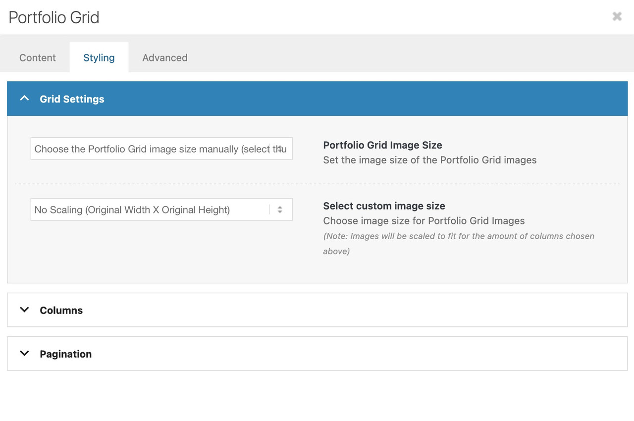
Do you like to change something on the lightbox images – or the bottom-bar text?
February 26, 2026 at 6:45 am #1495517In reply to: Mobile view – Hero text position
Also, how can I get the rounded button corners, and possible images to have rounded corners?
February 26, 2026 at 6:14 am #1495511In reply to: horizontal gallery crop on mobile
Hey Tilman,
Thank you for the inquiry.
You can add this css code to apply a minimum height to the horizontal gallery container on smaller screens.
@media only screen and (max-width: 767px) {
    .responsive .av-horizontal-gallery-inner {
        position: static;
        min-height: 400px;
    }
}
Result:
Best regards,
IsmaelFebruary 26, 2026 at 5:52 am #1495509In reply to: Cropped images in Lightbox
Hi,
Thank you for the clarification.
How did you add the Portfolio Grid? Did you create a custom element? Try setting the preview_mode to custom to ensure that the image_size does not revert to the default.
Best regards,
IsmaelFebruary 25, 2026 at 10:30 pm #1495503Hey theamplifiedagent,
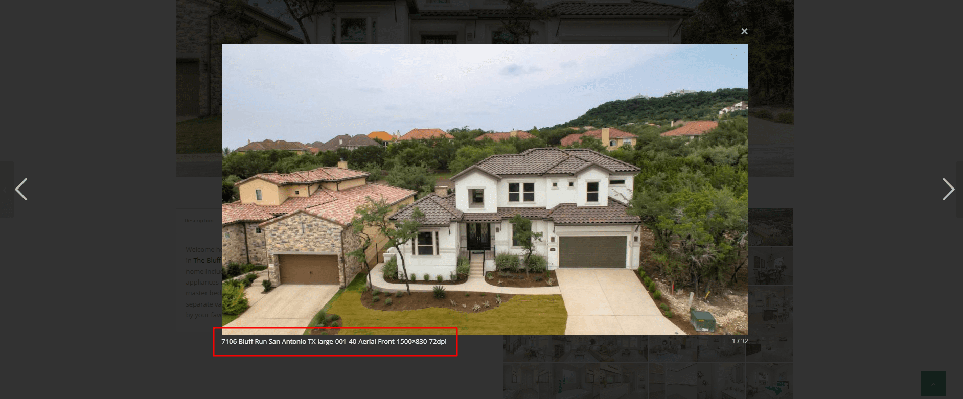
Typically it is the title of the image that is shown, check your image in the media library and check the title field, it is possible that if you didn’t add a title it will fallback to the file name.
If you find that there is no title and you don’t want to edit dozens of images adding titles, you can hide this field with this css:.mfp-content .mfp-title { display: none; }Best regards,
MikeFebruary 25, 2026 at 9:46 pm #1495501In reply to: Columns elements not lining up
Hi,
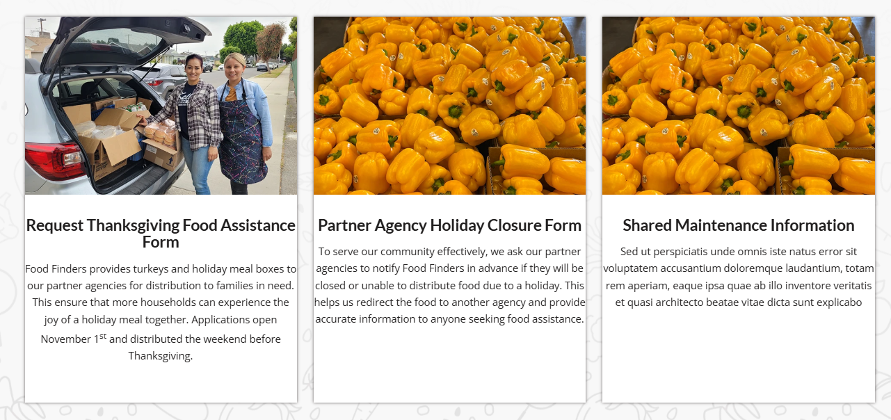
On your /find-food/ page your column Vertical Alignment was set to middle, I changed it to top
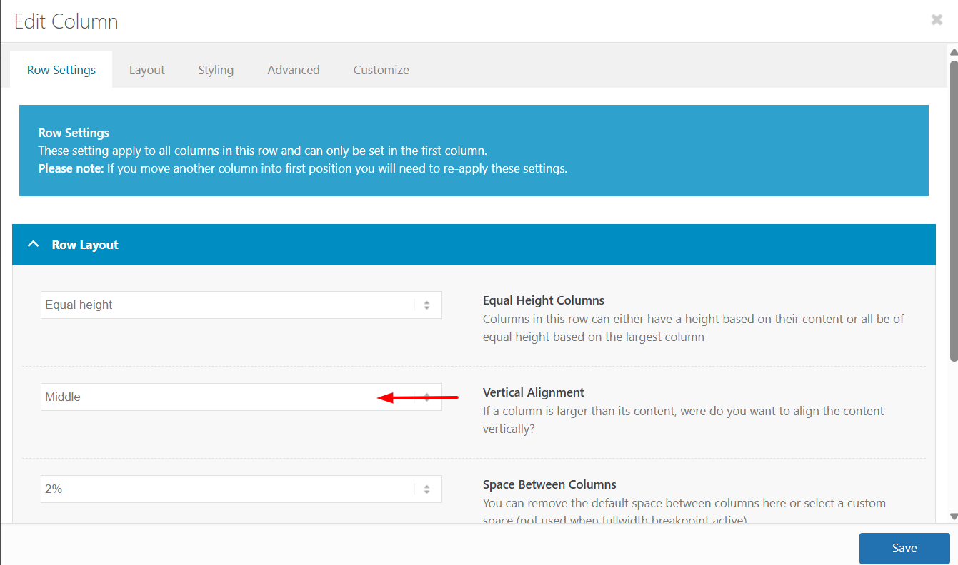
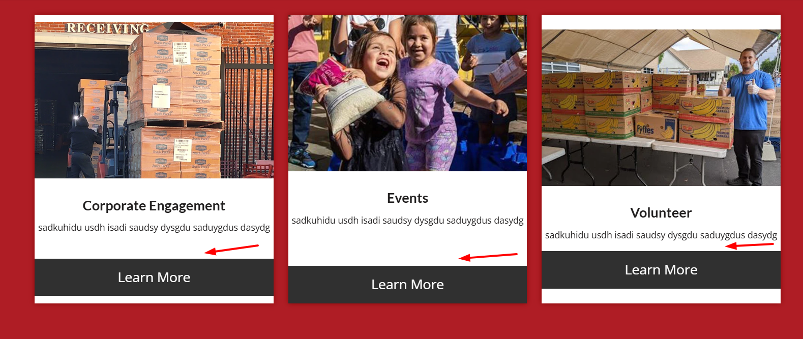
The reason is that the first column has more text which sets the height for the other two columns, but with the Vertical Alignment set to middle the other two columns center the content. In the screenshot notice how the special heading titles and images do not line up:
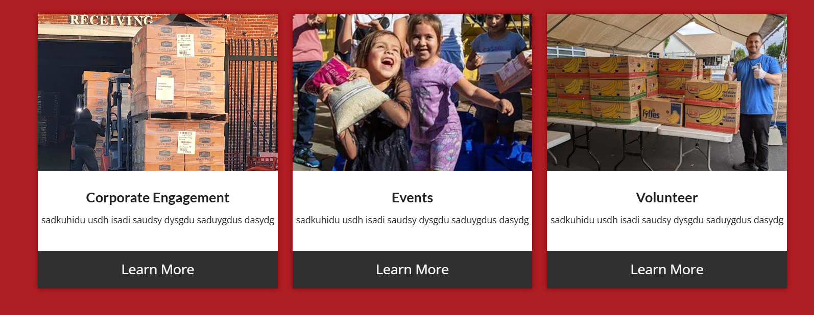
After making the change everything lines up:
I made this change to the other pages that you listed above and the all work now.
Keep Ismael’s CSS above as it forces the buttons to the bottom of the columns without using extra HR elements.Best regards,
MikeFebruary 25, 2026 at 5:36 pm #1495495Topic: Lightbox Caption Showing Filename – How do I change that?
in forum Enfoldtheamplifiedagent
ParticipantWhen i open a gallery image, the lightbox shows the image and below it displays the filename of the image as a caption. I’ve searched but can’t seem to find anywhere to turn this off. I’d even be ok if it showed the images ALT or Title, but the file name is ugly.
You can see what I mean here:
http://themcnairexperience.com/wp-content/uploads/2026/02/Screenshot-2.pngAny help would be appreciated. Thanks!
February 25, 2026 at 1:50 pm #1495489In reply to: Cropped images in Lightbox
Thank you for the quick answers and the provided code examples.
Sorry for the misunderstanding. My intention was to show a full size image In the post grid, not in the lightbox itself. Is there any chance I can achieve that with the avia_post_grid object?February 25, 2026 at 12:23 pm #1495487Topic: horizontal gallery crop on mobile
in forum Enfoldoestersund
ParticipantDear team, On my draft page below, I use in the middle section a horizontal gallery. Below: “Ein paar Dinge, die hier einfach normal sind”:
it looks fine on laptop, but on mobile the pics are cutted top and bottom. on mobile It does not make a difference to set the gallery with a different percentage of height. the image setting is and shall be: no scaling
How can I ensure that the pictures are not cropped on mobile?
Thanks and best regards,
Tilman!February 25, 2026 at 9:33 am #1495477Hey Ismael
I found the solution. An error occurred when loading the images, but I was able to fix it by making adjustments to the CSS. Thank you.
BRFebruary 24, 2026 at 11:01 pm #1495455In reply to: Image does not open video in Lightbox
but btw. why don’t you use the video element and set your image as preview /fallback image on that element?
On advanced privacy settings (on the video element itsself) you can choose to show the video in the lightbox.February 24, 2026 at 10:53 pm #1495454In reply to: Image does not open video in Lightbox
maybe this helps you on that:
only to show that you can have video, websites or images in one lightbox group.
INFO: due to GDPR ( DSGVO in Germany ) i can not show the working script for video content – it is hard to block this – playing videos from a masonry or from an image linked to a video.
or not only for masonries:
https://kriesi.at/support/topic/lightbox-pdf-not-working-shows-up-black-multiple-solutios/#post-1495451February 24, 2026 at 10:43 pm #1495452Topic: Image does not open video in Lightbox
in forum EnfoldEleina_Shinn
ParticipantHi, I have an image that links to a Vimeo Video and, although I’ve set the URL manually to the Vimeo URL, and then set the image to open in “same window”, it does not open in a lightbox, which is typical; can’t seem to figure out why it’s not working. I did make sure that the Lightbox Modal Window is turned on in Theme Options.
Help?
Thank you!February 24, 2026 at 10:07 pm #1495451can you try this:
place that snippet inside your child-theme functions.php:function lightbox_with_mixed_content_type() { ?> <script type="text/javascript"> window.addEventListener("DOMContentLoaded", function () { (function($){ $('.mixed-contenttype a').each(function(){ var anchorLink = $(this).attr('href'); if (/\.(jpg|png|gif|webp|jpeg)$/.test(anchorLink)) { //console.log(anchorLink + " is an image link"); } else { $(this).attr('rel', 'lightbox').addClass('mfp-iframe'); } }); })(jQuery); }); </script> <?php } add_action('wp_footer', 'lightbox_with_mixed_content_type', 999);on your page place a button and give that custom class to the elment (or to one parent element) : mixed-contenttype
now link to your pdf.
See: https://webers-testseite.de/pdf-in-lightbox/
But: Not all browsers will display this, especially mobile browser variants.INFO: due to GDPR ( DSGVO in Germany ) i can not show the working script for video content – it is hard to block this – playing videos from a masonry or from an image linked to a video.
February 24, 2026 at 5:15 pm #1495441In reply to: Cropped images in Lightbox
i guess you only want to influence the lightbox images source. And because Enfold uses on default the large image. This does not always uses the original aspect ratio.
I would not influence the thumbnail sizes of the gallery. Only the lightbox source image.
If you are usiing the gallery element try:function custom_alb_lightbox_image_size( $size, $context ){ if( $context == ('av_gallery' || 'avia_masonry') ){ return 'original'; } return $size; } add_filter( 'avf_alb_lightbox_image_size', 'custom_alb_lightbox_image_size', 10, 2 );February 24, 2026 at 3:18 pm #1495429Topic: Cropped images in Lightbox
in forum EnfoldRENZCOM
ParticipantDear Enfold Theme,
We are currently implementing a gallery page where a lightbox opens in a gallery with additional data and the image. Unfortunately, the image is only displayed partially. We are using the following function for this:$grid = new avia_post_grid( array( 'linking' => ‘’, ‘columns’ => ‘3’, ‘contents’ => ‘title’, ‘sort’ => ‘no’, 'paginate' => ‘yes’, ‘set_breadcrumb’ => false, ‘preview_mode’ => ‘auto’, ‘image_size’ => ‘full’ )); $grid->use_global_query(); echo $grid->html( ‘’ );Highlighted in bold that the full images should actually be used. However, this does not seem to work.
February 24, 2026 at 1:38 pm #1495422Topic: Portfolio filter causes loading errors in testimonials
in forum Enfolddominictschupp
ParticipantHello
When I insert the code to display a specific category in the portfolio element, or even when I select one of the categories in the portfolio element, the images in the testimonial do not load correctly.
I enter the following code in my funticons.php. This is in accordance with the instructions on the themes website.//——————————
// php – Open portfolio category
//——————————function select_portfolio_filter(){
?>
<script>
jQuery( window ).load(function() {
jQuery(‘.inner_sort_button:eq(2)’).click();
});
</script>
<?php
}
add_action(‘wp_head’, ‘select_portfolio_filter’);Do you have a solution for this problem?
February 24, 2026 at 10:15 am #1495416In reply to: Not registered dependencies for Enfold css and js
I did it. Actually I tried the same thing in other websites. At a moment I thought that the problem was caused by some plugin, but I deactivated or checked in other websites I have the same thing. Also I thought it could be Enfold 7.1.3 the problem, but I found it also with Enfold 6.0.8 (on a website where I didn’t update the theme).
I am not sure what you say about shortcodes. Here is the debug log form another website all updated[24-Feb-2026 09:11:10 UTC] PHP Notice: Function WP_Styles::add was called <strong>incorrectly</strong>. The style with the handle "avia-module-audioplayer" was enqueued with dependencies that are not registered: avia-layout. Please see <a href="https://developer.wordpress.org/advanced-administration/debug/debug-wordpress/">Debugging in WordPress</a> for more information. (This message was added in version 6.9.1.) in /home/hidgvei/marinemammalhabitat/wp-includes/functions.php on line 6131 [24-Feb-2026 09:11:10 UTC] PHP Notice: Function WP_Styles::add was called <strong>incorrectly</strong>. The style with the handle "avia-module-blog" was enqueued with dependencies that are not registered: avia-layout. Please see <a href="https://developer.wordpress.org/advanced-administration/debug/debug-wordpress/">Debugging in WordPress</a> for more information. (This message was added in version 6.9.1.) in /home/hidgvei/marinemammalhabitat/wp-includes/functions.php on line 6131 [24-Feb-2026 09:11:10 UTC] PHP Notice: Function WP_Styles::add was called <strong>incorrectly</strong>. The style with the handle "avia-module-postslider" was enqueued with dependencies that are not registered: avia-layout. Please see <a href="https://developer.wordpress.org/advanced-administration/debug/debug-wordpress/">Debugging in WordPress</a> for more information. (This message was added in version 6.9.1.) in /home/hidgvei/marinemammalhabitat/wp-includes/functions.php on line 6131 [24-Feb-2026 09:11:10 UTC] PHP Notice: Function WP_Styles::add was called <strong>incorrectly</strong>. The style with the handle "avia-module-button" was enqueued with dependencies that are not registered: avia-layout. Please see <a href="https://developer.wordpress.org/advanced-administration/debug/debug-wordpress/">Debugging in WordPress</a> for more information. (This message was added in version 6.9.1.) in /home/hidgvei/marinemammalhabitat/wp-includes/functions.php on line 6131 [24-Feb-2026 09:11:10 UTC] PHP Notice: Function WP_Styles::add was called <strong>incorrectly</strong>. The style with the handle "avia-module-buttonrow" was enqueued with dependencies that are not registered: avia-layout. Please see <a href="https://developer.wordpress.org/advanced-administration/debug/debug-wordpress/">Debugging in WordPress</a> for more information. (This message was added in version 6.9.1.) in /home/hidgvei/marinemammalhabitat/wp-includes/functions.php on line 6131 [24-Feb-2026 09:11:10 UTC] PHP Notice: Function WP_Styles::add was called <strong>incorrectly</strong>. The style with the handle "avia-module-button-fullwidth" was enqueued with dependencies that are not registered: avia-layout. Please see <a href="https://developer.wordpress.org/advanced-administration/debug/debug-wordpress/">Debugging in WordPress</a> for more information. (This message was added in version 6.9.1.) in /home/hidgvei/marinemammalhabitat/wp-includes/functions.php on line 6131 [24-Feb-2026 09:11:10 UTC] PHP Notice: Function WP_Styles::add was called <strong>incorrectly</strong>. The style with the handle "avia-module-catalogue" was enqueued with dependencies that are not registered: avia-layout. Please see <a href="https://developer.wordpress.org/advanced-administration/debug/debug-wordpress/">Debugging in WordPress</a> for more information. (This message was added in version 6.9.1.) in /home/hidgvei/marinemammalhabitat/wp-includes/functions.php on line 6131 [24-Feb-2026 09:11:10 UTC] PHP Notice: Function WP_Styles::add was called <strong>incorrectly</strong>. The style with the handle "avia-module-comments" was enqueued with dependencies that are not registered: avia-layout. Please see <a href="https://developer.wordpress.org/advanced-administration/debug/debug-wordpress/">Debugging in WordPress</a> for more information. (This message was added in version 6.9.1.) in /home/hidgvei/marinemammalhabitat/wp-includes/functions.php on line 6131 [24-Feb-2026 09:11:10 UTC] PHP Notice: Function WP_Styles::add was called <strong>incorrectly</strong>. The style with the handle "avia-module-contact" was enqueued with dependencies that are not registered: avia-layout. Please see <a href="https://developer.wordpress.org/advanced-administration/debug/debug-wordpress/">Debugging in WordPress</a> for more information. (This message was added in version 6.9.1.) in /home/hidgvei/marinemammalhabitat/wp-includes/functions.php on line 6131 [24-Feb-2026 09:11:10 UTC] PHP Notice: Function WP_Styles::add was called <strong>incorrectly</strong>. The style with the handle "avia-module-slideshow" was enqueued with dependencies that are not registered: avia-layout. Please see <a href="https://developer.wordpress.org/advanced-administration/debug/debug-wordpress/">Debugging in WordPress</a> for more information. (This message was added in version 6.9.1.) in /home/hidgvei/marinemammalhabitat/wp-includes/functions.php on line 6131 [24-Feb-2026 09:11:10 UTC] PHP Notice: Function WP_Styles::add was called <strong>incorrectly</strong>. The style with the handle "avia-module-countdown" was enqueued with dependencies that are not registered: avia-layout. Please see <a href="https://developer.wordpress.org/advanced-administration/debug/debug-wordpress/">Debugging in WordPress</a> for more information. (This message was added in version 6.9.1.) in /home/hidgvei/marinemammalhabitat/wp-includes/functions.php on line 6131 [24-Feb-2026 09:11:10 UTC] PHP Notice: Function WP_Styles::add was called <strong>incorrectly</strong>. The style with the handle "avia-module-dynamic-field" was enqueued with dependencies that are not registered: avia-layout. Please see <a href="https://developer.wordpress.org/advanced-administration/debug/debug-wordpress/">Debugging in WordPress</a> for more information. (This message was added in version 6.9.1.) in /home/hidgvei/marinemammalhabitat/wp-includes/functions.php on line 6131 [24-Feb-2026 09:11:10 UTC] PHP Notice: Function WP_Styles::add was called <strong>incorrectly</strong>. The style with the handle "avia-module-gallery" was enqueued with dependencies that are not registered: avia-layout. Please see <a href="https://developer.wordpress.org/advanced-administration/debug/debug-wordpress/">Debugging in WordPress</a> for more information. (This message was added in version 6.9.1.) in /home/hidgvei/marinemammalhabitat/wp-includes/functions.php on line 6131 [24-Feb-2026 09:11:10 UTC] PHP Notice: Function WP_Styles::add was called <strong>incorrectly</strong>. The style with the handle "avia-module-maps" was enqueued with dependencies that are not registered: avia-layout. Please see <a href="https://developer.wordpress.org/advanced-administration/debug/debug-wordpress/">Debugging in WordPress</a> for more information. (This message was added in version 6.9.1.) in /home/hidgvei/marinemammalhabitat/wp-includes/functions.php on line 6131 [24-Feb-2026 09:11:10 UTC] PHP Notice: Function WP_Styles::add was called <strong>incorrectly</strong>. The style with the handle "avia-module-gridrow" was enqueued with dependencies that are not registered: avia-layout. Please see <a href="https://developer.wordpress.org/advanced-administration/debug/debug-wordpress/">Debugging in WordPress</a> for more information. (This message was added in version 6.9.1.) in /home/hidgvei/marinemammalhabitat/wp-includes/functions.php on line 6131 [24-Feb-2026 09:11:10 UTC] PHP Notice: Function WP_Styles::add was called <strong>incorrectly</strong>. The style with the handle "avia-module-heading" was enqueued with dependencies that are not registered: avia-layout. Please see <a href="https://developer.wordpress.org/advanced-administration/debug/debug-wordpress/">Debugging in WordPress</a> for more information. (This message was added in version 6.9.1.) in /home/hidgvei/marinemammalhabitat/wp-includes/functions.php on line 6131 [24-Feb-2026 09:11:10 UTC] PHP Notice: Function WP_Styles::add was called <strong>incorrectly</strong>. The style with the handle "avia-module-rotator" was enqueued with dependencies that are not registered: avia-layout. Please see <a href="https://developer.wordpress.org/advanced-administration/debug/debug-wordpress/">Debugging in WordPress</a> for more information. (This message was added in version 6.9.1.) in /home/hidgvei/marinemammalhabitat/wp-includes/functions.php on line 6131 [24-Feb-2026 09:11:10 UTC] PHP Notice: Function WP_Styles::add was called <strong>incorrectly</strong>. The style with the handle "avia-module-hr" was enqueued with dependencies that are not registered: avia-layout. Please see <a href="https://developer.wordpress.org/advanced-administration/debug/debug-wordpress/">Debugging in WordPress</a> for more information. (This message was added in version 6.9.1.) in /home/hidgvei/marinemammalhabitat/wp-includes/functions.php on line 6131 [24-Feb-2026 09:11:10 UTC] PHP Notice: Function WP_Styles::add was called <strong>incorrectly</strong>. The style with the handle "avia-module-icon" was enqueued with dependencies that are not registered: avia-layout. Please see <a href="https://developer.wordpress.org/advanced-administration/debug/debug-wordpress/">Debugging in WordPress</a> for more information. (This message was added in version 6.9.1.) in /home/hidgvei/marinemammalhabitat/wp-includes/functions.php on line 6131 [24-Feb-2026 09:11:10 UTC] PHP Notice: Function WP_Styles::add was called <strong>incorrectly</strong>. The style with the handle "avia-module-icon-circles" was enqueued with dependencies that are not registered: avia-layout. Please see <a href="https://developer.wordpress.org/advanced-administration/debug/debug-wordpress/">Debugging in WordPress</a> for more information. (This message was added in version 6.9.1.) in /home/hidgvei/marinemammalhabitat/wp-includes/functions.php on line 6131 [24-Feb-2026 09:11:10 UTC] PHP Notice: Function WP_Styles::add was called <strong>incorrectly</strong>. The style with the handle "avia-module-iconbox" was enqueued with dependencies that are not registered: avia-layout. Please see <a href="https://developer.wordpress.org/advanced-administration/debug/debug-wordpress/">Debugging in WordPress</a> for more information. (This message was added in version 6.9.1.) in /home/hidgvei/marinemammalhabitat/wp-includes/functions.php on line 6131 [24-Feb-2026 09:11:10 UTC] PHP Notice: Function WP_Styles::add was called <strong>incorrectly</strong>. The style with the handle "avia-module-icongrid" was enqueued with dependencies that are not registered: avia-layout. Please see <a href="https://developer.wordpress.org/advanced-administration/debug/debug-wordpress/">Debugging in WordPress</a> for more information. (This message was added in version 6.9.1.) in /home/hidgvei/marinemammalhabitat/wp-includes/functions.php on line 6131 [24-Feb-2026 09:11:10 UTC] PHP Notice: Function WP_Styles::add was called <strong>incorrectly</strong>. The style with the handle "avia-module-iconlist" was enqueued with dependencies that are not registered: avia-layout. Please see <a href="https://developer.wordpress.org/advanced-administration/debug/debug-wordpress/">Debugging in WordPress</a> for more information. (This message was added in version 6.9.1.) in /home/hidgvei/marinemammalhabitat/wp-includes/functions.php on line 6131 [24-Feb-2026 09:11:10 UTC] PHP Notice: Function WP_Styles::add was called <strong>incorrectly</strong>. The style with the handle "avia-module-image" was enqueued with dependencies that are not registered: avia-layout. Please see <a href="https://developer.wordpress.org/advanced-administration/debug/debug-wordpress/">Debugging in WordPress</a> for more information. (This message was added in version 6.9.1.) in /home/hidgvei/marinemammalhabitat/wp-includes/functions.php on line 6131 [24-Feb-2026 09:11:10 UTC] PHP Notice: Function WP_Styles::add was called <strong>incorrectly</strong>. The style with the handle "avia-module-image-diff" was enqueued with dependencies that are not registered: avia-layout. Please see <a href="https://developer.wordpress.org/advanced-administration/debug/debug-wordpress/">Debugging in WordPress</a> for more information. (This message was added in version 6.9.1.) in /home/hidgvei/marinemammalhabitat/wp-includes/functions.php on line 6131 [24-Feb-2026 09:11:10 UTC] PHP Notice: Function WP_Styles::add was called <strong>incorrectly</strong>. The style with the handle "avia-module-hotspot" was enqueued with dependencies that are not registered: avia-layout. Please see <a href="https://developer.wordpress.org/advanced-administration/debug/debug-wordpress/">Debugging in WordPress</a> for more information. (This message was added in version 6.9.1.) in /home/hidgvei/marinemammalhabitat/wp-includes/functions.php on line 6131 [24-Feb-2026 09:11:10 UTC] PHP Notice: Function WP_Styles::add was called <strong>incorrectly</strong>. The style with the handle "avia-module-sc-lottie-animation" was enqueued with dependencies that are not registered: avia-layout. Please see <a href="https://developer.wordpress.org/advanced-administration/debug/debug-wordpress/">Debugging in WordPress</a> for more information. (This message was added in version 6.9.1.) in /home/hidgvei/marinemammalhabitat/wp-includes/functions.php on line 6131 [24-Feb-2026 09:11:10 UTC] PHP Notice: Function WP_Styles::add was called <strong>incorrectly</strong>. The style with the handle "avia-module-magazine" was enqueued with dependencies that are not registered: avia-layout. Please see <a href="https://developer.wordpress.org/advanced-administration/debug/debug-wordpress/">Debugging in WordPress</a> for more information. (This message was added in version 6.9.1.) in /home/hidgvei/marinemammalhabitat/wp-includes/functions.php on line 6131 [24-Feb-2026 09:11:10 UTC] PHP Notice: Function WP_Styles::add was called <strong>incorrectly</strong>. The style with the handle "avia-module-masonry" was enqueued with dependencies that are not registered: avia-layout. Please see <a href="https://developer.wordpress.org/advanced-administration/debug/debug-wordpress/">Debugging in WordPress</a> for more information. (This message was added in version 6.9.1.) in /home/hidgvei/marinemammalhabitat/wp-includes/functions.php on line 6131 [24-Feb-2026 09:11:10 UTC] PHP Notice: Function WP_Styles::add was called <strong>incorrectly</strong>. The style with the handle "avia-siteloader" was enqueued with dependencies that are not registered: avia-layout. Please see <a href="https://developer.wordpress.org/advanced-administration/debug/debug-wordpress/">Debugging in WordPress</a> for more information. (This message was added in version 6.9.1.) in /home/hidgvei/marinemammalhabitat/wp-includes/functions.php on line 6131 [24-Feb-2026 09:11:10 UTC] PHP Notice: Function WP_Styles::add was called <strong>incorrectly</strong>. The style with the handle "avia-module-menu" was enqueued with dependencies that are not registered: avia-layout. Please see <a href="https://developer.wordpress.org/advanced-administration/debug/debug-wordpress/">Debugging in WordPress</a> for more information. (This message was added in version 6.9.1.) in /home/hidgvei/marinemammalhabitat/wp-includes/functions.php on line 6131 [24-Feb-2026 09:11:10 UTC] PHP Notice: Function WP_Styles::add was called <strong>incorrectly</strong>. The style with the handle "avia-module-notification" was enqueued with dependencies that are not registered: avia-layout. Please see <a href="https://developer.wordpress.org/advanced-administration/debug/debug-wordpress/">Debugging in WordPress</a> for more information. (This message was added in version 6.9.1.) in /home/hidgvei/marinemammalhabitat/wp-includes/functions.php on line 6131 [24-Feb-2026 09:11:10 UTC] PHP Notice: Function WP_Styles::add was called <strong>incorrectly</strong>. The style with the handle "avia-module-numbers" was enqueued with dependencies that are not registered: avia-layout. Please see <a href="https://developer.wordpress.org/advanced-administration/debug/debug-wordpress/">Debugging in WordPress</a> for more information. (This message was added in version 6.9.1.) in /home/hidgvei/marinemammalhabitat/wp-includes/functions.php on line 6131 [24-Feb-2026 09:11:10 UTC] PHP Notice: Function WP_Styles::add was called <strong>incorrectly</strong>. The style with the handle "avia-module-portfolio" was enqueued with dependencies that are not registered: avia-layout. Please see <a href="https://developer.wordpress.org/advanced-administration/debug/debug-wordpress/">Debugging in WordPress</a> for more information. (This message was added in version 6.9.1.) in /home/hidgvei/marinemammalhabitat/wp-includes/functions.php on line 6131 [24-Feb-2026 09:11:10 UTC] PHP Notice: Function WP_Styles::add was called <strong>incorrectly</strong>. The style with the handle "avia-module-post-metadata" was enqueued with dependencies that are not registered: avia-layout. Please see <a href="https://developer.wordpress.org/advanced-administration/debug/debug-wordpress/">Debugging in WordPress</a> for more information. (This message was added in version 6.9.1.) in /home/hidgvei/marinemammalhabitat/wp-includes/functions.php on line 6131 [24-Feb-2026 09:11:10 UTC] PHP Notice: Function WP_Styles::add was called <strong>incorrectly</strong>. The style with the handle "avia-module-progress-bar" was enqueued with dependencies that are not registered: avia-layout. Please see <a href="https://developer.wordpress.org/advanced-administration/debug/debug-wordpress/">Debugging in WordPress</a> for more information. (This message was added in version 6.9.1.) in /home/hidgvei/marinemammalhabitat/wp-includes/functions.php on line 6131 [24-Feb-2026 09:11:10 UTC] PHP Notice: Function WP_Styles::add was called <strong>incorrectly</strong>. The style with the handle "avia-module-promobox" was enqueued with dependencies that are not registered: avia-layout. Please see <a href="https://developer.wordpress.org/advanced-administration/debug/debug-wordpress/">Debugging in WordPress</a> for more information. (This message was added in version 6.9.1.) in /home/hidgvei/marinemammalhabitat/wp-includes/functions.php on line 6131 [24-Feb-2026 09:11:10 UTC] PHP Notice: Function WP_Styles::add was called <strong>incorrectly</strong>. The style with the handle "avia-sc-search" was enqueued with dependencies that are not registered: avia-layout. Please see <a href="https://developer.wordpress.org/advanced-administration/debug/debug-wordpress/">Debugging in WordPress</a> for more information. (This message was added in version 6.9.1.) in /home/hidgvei/marinemammalhabitat/wp-includes/functions.php on line 6131 [24-Feb-2026 09:11:10 UTC] PHP Notice: Function WP_Styles::add was called <strong>incorrectly</strong>. The style with the handle "avia-module-slideshow-accordion" was enqueued with dependencies that are not registered: avia-layout. Please see <a href="https://developer.wordpress.org/advanced-administration/debug/debug-wordpress/">Debugging in WordPress</a> for more information. (This message was added in version 6.9.1.) in /home/hidgvei/marinemammalhabitat/wp-includes/functions.php on line 6131 [24-Feb-2026 09:11:10 UTC] PHP Notice: Function WP_Styles::add was called <strong>incorrectly</strong>. The style with the handle "avia-module-social" was enqueued with dependencies that are not registered: avia-layout. Please see <a href="https://developer.wordpress.org/advanced-administration/debug/debug-wordpress/">Debugging in WordPress</a> for more information. (This message was added in version 6.9.1.) in /home/hidgvei/marinemammalhabitat/wp-includes/functions.php on line 6131 [24-Feb-2026 09:11:10 UTC] PHP Notice: Function WP_Styles::add was called <strong>incorrectly</strong>. The style with the handle "avia-module-tabsection" was enqueued with dependencies that are not registered: avia-layout. Please see <a href="https://developer.wordpress.org/advanced-administration/debug/debug-wordpress/">Debugging in WordPress</a> for more information. (This message was added in version 6.9.1.) in /home/hidgvei/marinemammalhabitat/wp-includes/functions.php on line 6131 [24-Feb-2026 09:11:10 UTC] PHP Notice: Function WP_Styles::add was called <strong>incorrectly</strong>. The style with the handle "avia-module-table" was enqueued with dependencies that are not registered: avia-layout. Please see <a href="https://developer.wordpress.org/advanced-administration/debug/debug-wordpress/">Debugging in WordPress</a> for more information. (This message was added in version 6.9.1.) in /home/hidgvei/marinemammalhabitat/wp-includes/functions.php on line 6131 [24-Feb-2026 09:11:10 UTC] PHP Notice: Function WP_Styles::add was called <strong>incorrectly</strong>. The style with the handle "avia-module-tabs" was enqueued with dependencies that are not registered: avia-layout. Please see <a href="https://developer.wordpress.org/advanced-administration/debug/debug-wordpress/">Debugging in WordPress</a> for more information. (This message was added in version 6.9.1.) in /home/hidgvei/marinemammalhabitat/wp-includes/functions.php on line 6131 [24-Feb-2026 09:11:10 UTC] PHP Notice: Function WP_Styles::add was called <strong>incorrectly</strong>. The style with the handle "avia-module-team" was enqueued with dependencies that are not registered: avia-layout. Please see <a href="https://developer.wordpress.org/advanced-administration/debug/debug-wordpress/">Debugging in WordPress</a> for more information. (This message was added in version 6.9.1.) in /home/hidgvei/marinemammalhabitat/wp-includes/functions.php on line 6131 [24-Feb-2026 09:11:10 UTC] PHP Notice: Function WP_Styles::add was called <strong>incorrectly</strong>. The style with the handle "avia-module-testimonials" was enqueued with dependencies that are not registered: avia-layout. Please see <a href="https://developer.wordpress.org/advanced-administration/debug/debug-wordpress/">Debugging in WordPress</a> for more information. (This message was added in version 6.9.1.) in /home/hidgvei/marinemammalhabitat/wp-includes/functions.php on line 6131 [24-Feb-2026 09:11:10 UTC] PHP Notice: Function WP_Styles::add was called <strong>incorrectly</strong>. The style with the handle "avia-module-timeline" was enqueued with dependencies that are not registered: avia-layout. Please see <a href="https://developer.wordpress.org/advanced-administration/debug/debug-wordpress/">Debugging in WordPress</a> for more information. (This message was added in version 6.9.1.) in /home/hidgvei/marinemammalhabitat/wp-includes/functions.php on line 6131 [24-Feb-2026 09:11:10 UTC] PHP Notice: Function WP_Styles::add was called <strong>incorrectly</strong>. The style with the handle "avia-module-toggles" was enqueued with dependencies that are not registered: avia-layout. Please see <a href="https://developer.wordpress.org/advanced-administration/debug/debug-wordpress/">Debugging in WordPress</a> for more information. (This message was added in version 6.9.1.) in /home/hidgvei/marinemammalhabitat/wp-includes/functions.php on line 6131 [24-Feb-2026 09:11:10 UTC] PHP Notice: Function WP_Styles::add was called <strong>incorrectly</strong>. The style with the handle "avia-module-video" was enqueued with dependencies that are not registered: avia-layout. Please see <a href="https://developer.wordpress.org/advanced-administration/debug/debug-wordpress/">Debugging in WordPress</a> for more information. (This message was added in version 6.9.1.) in /home/hidgvei/marinemammalhabitat/wp-includes/functions.php on line 6131 [24-Feb-2026 09:11:10 UTC] PHP Notice: Function WP_Scripts::add was called <strong>incorrectly</strong>. The script with the handle "avia-module-audioplayer" was enqueued with dependencies that are not registered: avia-shortcodes. Please see <a href="https://developer.wordpress.org/advanced-administration/debug/debug-wordpress/">Debugging in WordPress</a> for more information. (This message was added in version 6.9.1.) in /home/hidgvei/marinemammalhabitat/wp-includes/functions.php on line 6131 [24-Feb-2026 09:11:10 UTC] PHP Notice: Function WP_Scripts::add was called <strong>incorrectly</strong>. The script with the handle "avia-module-chart-js" was enqueued with dependencies that are not registered: avia-shortcodes. Please see <a href="https://developer.wordpress.org/advanced-administration/debug/debug-wordpress/">Debugging in WordPress</a> for more information. (This message was added in version 6.9.1.) in /home/hidgvei/marinemammalhabitat/wp-includes/functions.php on line 6131 [24-Feb-2026 09:11:10 UTC] PHP Notice: Function WP_Scripts::add was called <strong>incorrectly</strong>. The script with the handle "avia-module-chart" was enqueued with dependencies that are not registered: avia-shortcodes. Please see <a href="https://developer.wordpress.org/advanced-administration/debug/debug-wordpress/">Debugging in WordPress</a> for more information. (This message was added in version 6.9.1.) in /home/hidgvei/marinemammalhabitat/wp-includes/functions.php on line 6131 [24-Feb-2026 09:11:10 UTC] PHP Notice: Function WP_Scripts::add was called <strong>incorrectly</strong>. The script with the handle "avia-module-contact" was enqueued with dependencies that are not registered: avia-shortcodes. Please see <a href="https://developer.wordpress.org/advanced-administration/debug/debug-wordpress/">Debugging in WordPress</a> for more information. (This message was added in version 6.9.1.) in /home/hidgvei/marinemammalhabitat/wp-includes/functions.php on line 6131 [24-Feb-2026 09:11:10 UTC] PHP Notice: Function WP_Scripts::add was called <strong>incorrectly</strong>. The script with the handle "avia-module-slideshow" was enqueued with dependencies that are not registered: avia-shortcodes. Please see <a href="https://developer.wordpress.org/advanced-administration/debug/debug-wordpress/">Debugging in WordPress</a> for more information. (This message was added in version 6.9.1.) in /home/hidgvei/marinemammalhabitat/wp-includes/functions.php on line 6131 [24-Feb-2026 09:11:10 UTC] PHP Notice: Function WP_Scripts::add was called <strong>incorrectly</strong>. The script with the handle "avia-module-countdown" was enqueued with dependencies that are not registered: avia-shortcodes. Please see <a href="https://developer.wordpress.org/advanced-administration/debug/debug-wordpress/">Debugging in WordPress</a> for more information. (This message was added in version 6.9.1.) in /home/hidgvei/marinemammalhabitat/wp-includes/functions.php on line 6131 [24-Feb-2026 09:11:10 UTC] PHP Notice: Function WP_Scripts::add was called <strong>incorrectly</strong>. The script with the handle "avia-module-gallery" was enqueued with dependencies that are not registered: avia-shortcodes. Please see <a href="https://developer.wordpress.org/advanced-administration/debug/debug-wordpress/">Debugging in WordPress</a> for more information. (This message was added in version 6.9.1.) in /home/hidgvei/marinemammalhabitat/wp-includes/functions.php on line 6131 [24-Feb-2026 09:11:10 UTC] PHP Notice: Function WP_Scripts::add was called <strong>incorrectly</strong>. The script with the handle "avia-module-gallery-hor" was enqueued with dependencies that are not registered: avia-shortcodes. Please see <a href="https://developer.wordpress.org/advanced-administration/debug/debug-wordpress/">Debugging in WordPress</a> for more information. (This message was added in version 6.9.1.) in /home/hidgvei/marinemammalhabitat/wp-includes/functions.php on line 6131 [24-Feb-2026 09:11:10 UTC] PHP Notice: Function WP_Scripts::add was called <strong>incorrectly</strong>. The script with the handle "avia-module-rotator" was enqueued with dependencies that are not registered: avia-shortcodes. Please see <a href="https://developer.wordpress.org/advanced-administration/debug/debug-wordpress/">Debugging in WordPress</a> for more information. (This message was added in version 6.9.1.) in /home/hidgvei/marinemammalhabitat/wp-includes/functions.php on line 6131 [24-Feb-2026 09:11:10 UTC] PHP Notice: Function WP_Scripts::add was called <strong>incorrectly</strong>. The script with the handle "avia-module-icon-circles" was enqueued with dependencies that are not registered: avia-shortcodes. Please see <a href="https://developer.wordpress.org/advanced-administration/debug/debug-wordpress/">Debugging in WordPress</a> for more information. (This message was added in version 6.9.1.) in /home/hidgvei/marinemammalhabitat/wp-includes/functions.php on line 6131 [24-Feb-2026 09:11:10 UTC] PHP Notice: Function WP_Scripts::add was called <strong>incorrectly</strong>. The script with the handle "avia-module-icongrid" was enqueued with dependencies that are not registered: avia-shortcodes. Please see <a href="https://developer.wordpress.org/advanced-administration/debug/debug-wordpress/">Debugging in WordPress</a> for more information. (This message was added in version 6.9.1.) in /home/hidgvei/marinemammalhabitat/wp-includes/functions.php on line 6131 [24-Feb-2026 09:11:10 UTC] PHP Notice: Function WP_Scripts::add was called <strong>incorrectly</strong>. The script with the handle "avia-module-iconlist" was enqueued with dependencies that are not registered: avia-shortcodes. Please see <a href="https://developer.wordpress.org/advanced-administration/debug/debug-wordpress/">Debugging in WordPress</a> for more information. (This message was added in version 6.9.1.) in /home/hidgvei/marinemammalhabitat/wp-includes/functions.php on line 6131 [24-Feb-2026 09:11:10 UTC] PHP Notice: Function WP_Scripts::add was called <strong>incorrectly</strong>. The script with the handle "avia-module-image-diff" was enqueued with dependencies that are not registered: avia-shortcodes. Please see <a href="https://developer.wordpress.org/advanced-administration/debug/debug-wordpress/">Debugging in WordPress</a> for more information. (This message was added in version 6.9.1.) in /home/hidgvei/marinemammalhabitat/wp-includes/functions.php on line 6131 [24-Feb-2026 09:11:10 UTC] PHP Notice: Function WP_Scripts::add was called <strong>incorrectly</strong>. The script with the handle "avia-module-hotspot" was enqueued with dependencies that are not registered: avia-shortcodes. Please see <a href="https://developer.wordpress.org/advanced-administration/debug/debug-wordpress/">Debugging in WordPress</a> for more information. (This message was added in version 6.9.1.) in /home/hidgvei/marinemammalhabitat/wp-includes/functions.php on line 6131 [24-Feb-2026 09:11:10 UTC] PHP Notice: Function WP_Scripts::add was called <strong>incorrectly</strong>. The script with the handle "avia-module-magazine" was enqueued with dependencies that are not registered: avia-shortcodes. Please see <a href="https://developer.wordpress.org/advanced-administration/debug/debug-wordpress/">Debugging in WordPress</a> for more information. (This message was added in version 6.9.1.) in /home/hidgvei/marinemammalhabitat/wp-includes/functions.php on line 6131 [24-Feb-2026 09:11:10 UTC] PHP Notice: Function WP_Scripts::add was called <strong>incorrectly</strong>. The script with the handle "avia-module-isotope" was enqueued with dependencies that are not registered: avia-shortcodes. Please see <a href="https://developer.wordpress.org/advanced-administration/debug/debug-wordpress/">Debugging in WordPress</a> for more information. (This message was added in version 6.9.1.) in /home/hidgvei/marinemammalhabitat/wp-includes/functions.php on line 6131 [24-Feb-2026 09:11:10 UTC] PHP Notice: Function WP_Scripts::add was called <strong>incorrectly</strong>. The script with the handle "avia-module-menu" was enqueued with dependencies that are not registered: avia-shortcodes. Please see <a href="https://developer.wordpress.org/advanced-administration/debug/debug-wordpress/">Debugging in WordPress</a> for more information. (This message was added in version 6.9.1.) in /home/hidgvei/marinemammalhabitat/wp-includes/functions.php on line 6131 [24-Feb-2026 09:11:10 UTC] PHP Notice: Function WP_Scripts::add was called <strong>incorrectly</strong>. The script with the handle "avia-module-notification" was enqueued with dependencies that are not registered: avia-shortcodes. Please see <a href="https://developer.wordpress.org/advanced-administration/debug/debug-wordpress/">Debugging in WordPress</a> for more information. (This message was added in version 6.9.1.) in /home/hidgvei/marinemammalhabitat/wp-includes/functions.php on line 6131 [24-Feb-2026 09:11:10 UTC] PHP Notice: Function WP_Scripts::add was called <strong>incorrectly</strong>. The script with the handle "avia-module-numbers" was enqueued with dependencies that are not registered: avia-shortcodes. Please see <a href="https://developer.wordpress.org/advanced-administration/debug/debug-wordpress/">Debugging in WordPress</a> for more information. (This message was added in version 6.9.1.) in /home/hidgvei/marinemammalhabitat/wp-includes/functions.php on line 6131 [24-Feb-2026 09:11:10 UTC] PHP Notice: Function WP_Scripts::add was called <strong>incorrectly</strong>. The script with the handle "avia-module-portfolio" was enqueued with dependencies that are not registered: avia-shortcodes. Please see <a href="https://developer.wordpress.org/advanced-administration/debug/debug-wordpress/">Debugging in WordPress</a> for more information. (This message was added in version 6.9.1.) in /home/hidgvei/marinemammalhabitat/wp-includes/functions.php on line 6131 [24-Feb-2026 09:11:10 UTC] PHP Notice: Function WP_Scripts::add was called <strong>incorrectly</strong>. The script with the handle "avia-module-progress-bar" was enqueued with dependencies that are not registered: avia-shortcodes. Please see <a href="https://developer.wordpress.org/advanced-administration/debug/debug-wordpress/">Debugging in WordPress</a> for more information. (This message was added in version 6.9.1.) in /home/hidgvei/marinemammalhabitat/wp-includes/functions.php on line 6131 [24-Feb-2026 09:11:10 UTC] PHP Notice: Function WP_Scripts::add was called <strong>incorrectly</strong>. The script with the handle "avia-module-slideshow-video" was enqueued with dependencies that are not registered: avia-shortcodes. Please see <a href="https://developer.wordpress.org/advanced-administration/debug/debug-wordpress/">Debugging in WordPress</a> for more information. (This message was added in version 6.9.1.) in /home/hidgvei/marinemammalhabitat/wp-includes/functions.php on line 6131 [24-Feb-2026 09:11:10 UTC] PHP Notice: Function WP_Scripts::add was called <strong>incorrectly</strong>. The script with the handle "avia-module-slideshow-accordion" was enqueued with dependencies that are not registered: avia-shortcodes. Please see <a href="https://developer.wordpress.org/advanced-administration/debug/debug-wordpress/">Debugging in WordPress</a> for more information. (This message was added in version 6.9.1.) in /home/hidgvei/marinemammalhabitat/wp-includes/functions.php on line 6131 [24-Feb-2026 09:11:10 UTC] PHP Notice: Function WP_Scripts::add was called <strong>incorrectly</strong>. The script with the handle "avia-module-tabsection" was enqueued with dependencies that are not registered: avia-shortcodes. Please see <a href="https://developer.wordpress.org/advanced-administration/debug/debug-wordpress/">Debugging in WordPress</a> for more information. (This message was added in version 6.9.1.) in /home/hidgvei/marinemammalhabitat/wp-includes/functions.php on line 6131 [24-Feb-2026 09:11:10 UTC] PHP Notice: Function WP_Scripts::add was called <strong>incorrectly</strong>. The script with the handle "avia-module-tabs" was enqueued with dependencies that are not registered: avia-shortcodes. Please see <a href="https://developer.wordpress.org/advanced-administration/debug/debug-wordpress/">Debugging in WordPress</a> for more information. (This message was added in version 6.9.1.) in /home/hidgvei/marinemammalhabitat/wp-includes/functions.php on line 6131 [24-Feb-2026 09:11:10 UTC] PHP Notice: Function WP_Scripts::add was called <strong>incorrectly</strong>. The script with the handle "avia-module-testimonials" was enqueued with dependencies that are not registered: avia-shortcodes. Please see <a href="https://developer.wordpress.org/advanced-administration/debug/debug-wordpress/">Debugging in WordPress</a> for more information. (This message was added in version 6.9.1.) in /home/hidgvei/marinemammalhabitat/wp-includes/functions.php on line 6131 [24-Feb-2026 09:11:10 UTC] PHP Notice: Function WP_Scripts::add was called <strong>incorrectly</strong>. The script with the handle "avia-module-timeline" was enqueued with dependencies that are not registered: avia-shortcodes. Please see <a href="https://developer.wordpress.org/advanced-administration/debug/debug-wordpress/">Debugging in WordPress</a> for more information. (This message was added in version 6.9.1.) in /home/hidgvei/marinemammalhabitat/wp-includes/functions.php on line 6131 [24-Feb-2026 09:11:10 UTC] PHP Notice: Function WP_Scripts::add was called <strong>incorrectly</strong>. The script with the handle "avia-module-toggles" was enqueued with dependencies that are not registered: avia-shortcodes. Please see <a href="https://developer.wordpress.org/advanced-administration/debug/debug-wordpress/">Debugging in WordPress</a> for more information. (This message was added in version 6.9.1.) in /home/hidgvei/marinemammalhabitat/wp-includes/functions.php on line 6131 [24-Feb-2026 09:11:10 UTC] PHP Notice: Function WP_Scripts::add was called <strong>incorrectly</strong>. The script with the handle "avia-module-video" was enqueued with dependencies that are not registered: avia-shortcodes. Please see <a href="https://developer.wordpress.org/advanced-administration/debug/debug-wordpress/">Debugging in WordPress</a> for more information. (This message was added in version 6.9.1.) in /home/hidgvei/marinemammalhabitat/wp-includes/functions.php on line 6131 [24-Feb-2026 09:11:10 UTC] PHP Notice: Function WP_Scripts::add was called <strong>incorrectly</strong>. The script with the handle "avia_analytics_js" was enqueued with dependencies that are not registered: avia_builder_js. Please see <a href="https://developer.wordpress.org/advanced-administration/debug/debug-wordpress/">Debugging in WordPress</a> for more information. (This message was added in version 6.9.1.) in /home/hidgvei/marinemammalhabitat/wp-includes/functions.php on line 6131It seems that it detects all avia modules are enqueued with dependencies that are not registered
February 24, 2026 at 6:03 am #1495407In reply to: Images not responsive
Hi,
Thank you for the update.
This specific condition is for images that are retrieved only using their ID but still use wp_get_attachment_image() for retrieval — such as element shortcodes. We recommend reaching out to the plugin developers regarding this issue, as we cannot reproduce it on our end. Image elements contain srcset attributes when we tested them in our installation.
Best regards,
IsmaelFebruary 24, 2026 at 5:48 am #1495404In reply to: Fullscreen Homepage Teaser Implementation
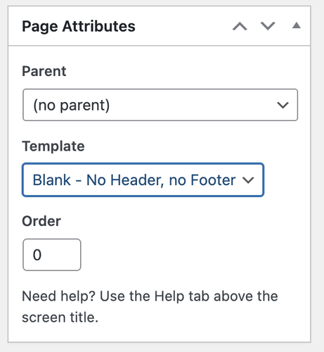
Hey cktanju,
Thank you for the inquiry.
Have you tried setting the page’s Page Attributes > Template to Blank – no header, no footer? This should remove everything from the page, including the header and footer.
Best regards,
IsmaelFebruary 24, 2026 at 5:19 am #1495397Hey dreyerjm,
Thank you for the inquiry.
You can add this css code to apply a background, border and padding to the icon box. Simply replace the selector “iconbox” with your own custom css class name.
#top .iconbox {
    background: white;
    padding: 20px;
    border: 1px solid gray;
}
Best regards,
IsmaelFebruary 23, 2026 at 9:50 pm #1495386Hey Tilman,
If you want a different logo on some pages, try this function in your child theme functions.php and change the logo url to yours and change the page IDs to yours and add as many as you like with a comma between each:add_filter('avf_logo','av_change_logo'); function av_change_logo($logo) { if(is_page( array(626, 632) ) ) { $logo = "http://kriesi.at/wp-content/themes/kriesi/images/logo.png"; } return $logo; }If you want all pages except your home page to be different, then I would recommend changing your logo in the theme settings to your other logo and use this function to only change the home page to the red one:
add_filter('avf_logo','av_change_logo');
function av_change_logo($logo)
{
    if(is_page(2) )
    {
    $logo = "http://kriesi.at/wp-content/themes/kriesi/images/logo.png";
    }
    return $logo;
}
Best regards,
MikeFebruary 23, 2026 at 9:33 pm #1495385In reply to: H tag all stands in capital letters
Hey Alan,
When I check your site the only H tags that are capitalized are in the three boxes:

but these are as they are written
all others are first letter capitalized and the rest in lowercase

Best regards,
MikeFebruary 23, 2026 at 9:14 pm #1495384Hi,
@goldengate415 glad it is working for you, they are white because of the lazy loading and change on scroll. Right now the page with them in the view point so lazy load doesn’t recognize any user action. If they were below some othe content like on your live page scrolling down would trigger them.
@Guenni007 a smaller image is used and padding is added to the column that the gallery is in to reduce the images more. See the screenshot in the post earlier.Best regards,
MikeFebruary 23, 2026 at 6:17 am #1495356In reply to: Vulnerability Alert
Hi,
Thank you for the update.
Would you mind providing a screenshot of the report, or provide the login details so we can check? You can use platforms like FreeImage, ImgBB, PostImages or Dropbox to upload and share the screenshot. Here are the steps to follow:
1.) Visit the website of your chosen platform, such as Savvyify, ImgBB, PostImages or Dropbox.
2.) Locate the option to upload a file or an image.
3.) Select the screenshot file from your computer or device and upload it to the platform.
4.) After the upload is complete, you will be provided with a shareable link or an embed code.
5.) Copy the link or code and include it in your message or response to provide us with the screenshot.Thank you for taking the time to share the screenshot. It will help us better understand the issue you’re facing and provide appropriate assistance.
Best regards,
IsmaelFebruary 23, 2026 at 6:05 am #1495354In reply to: 2 buttons styles on site
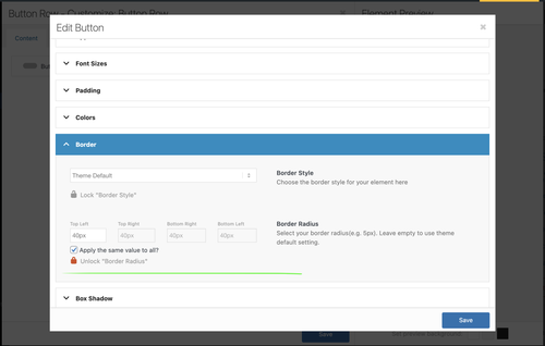
Hi,
Thank you for the login info.
We edited your custom Button Row element, locked the Styling > Border > Border Radius setting, and set it to 40px. All instances of this Button Row should now have the same border radius.
Best regards,
IsmaelFebruary 22, 2026 at 10:03 pm #1495348Hi,
You are correct, I wanted to test the login before I headed out for an appointment. I created the test page today for you, linked below, as I had described above.
It seems to work better on your site because you have limited image sizes, most of yours seem to bet set to 0x0.
Nonetheless you can try adjusting the column padding and image sizes to make the large image the size you like.
The css for the page is in a code block element on the page, you could move it to your Quick CSS if you decide to apply this to other pages.
Also note that the page is saved as a draft right now, but you will need to publish it for the css in the code block to work, WordPress doesn’t load everything in preview mode, it’s a known issue that we don’t have control over.Best regards,
MikeFebruary 22, 2026 at 7:29 pm #1495346In reply to: Columns elements not lining up
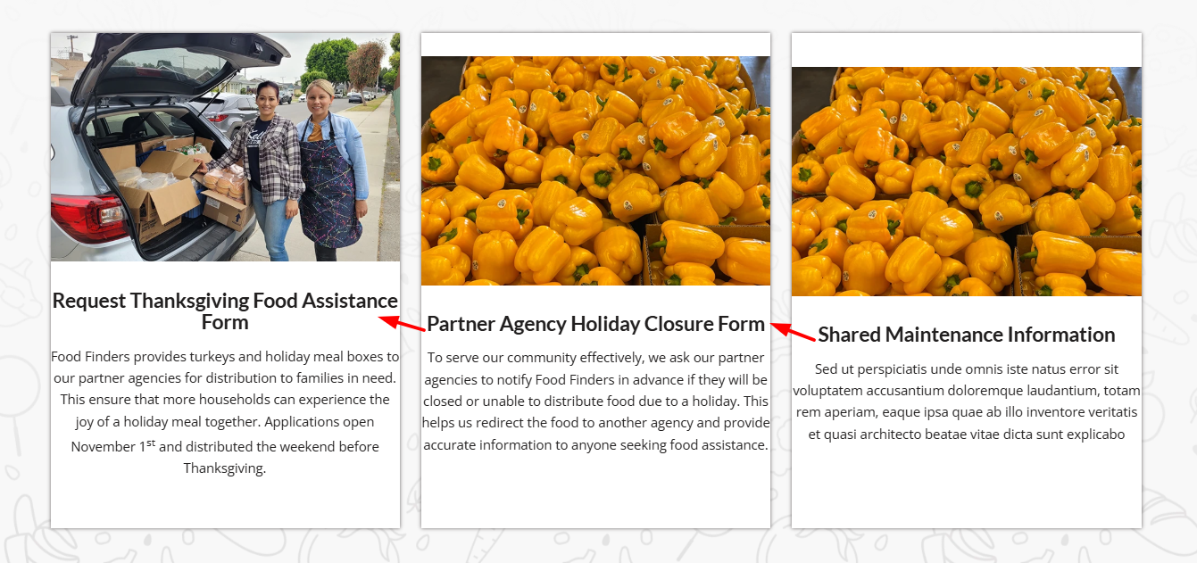
Hi,
When I check your page I see that your are using equal height columns, so all three columns will adjust to be the same height.
The problem is that in each of the three columns you have an HR element between the text element and the button, and all three are set to different heights.
30px 58px 2px
Please check an adjust so all are the same height, then the buttons and images will be correct.
Best regards,
MikeFebruary 22, 2026 at 7:04 pm #1495345In reply to: Padding column
Hi,
Try this css in your Quick CSS field:.slide-entry-excerpt.entry-content { top: -20px; position: relative; }
Best regards,
MikeFebruary 22, 2026 at 5:56 pm #1495337In reply to: Enfold Video Widgets Not Giving Black Box
Hey amanda-mdllc,
Thank you for your patience, I found that your plugin ClickRank – Ai SEO automation is causing a conflict with the videos causing them to not load. I further found that it is the setting: Image Alt Text Generation causing this conflict, I disabled this one setting and now the videos work.
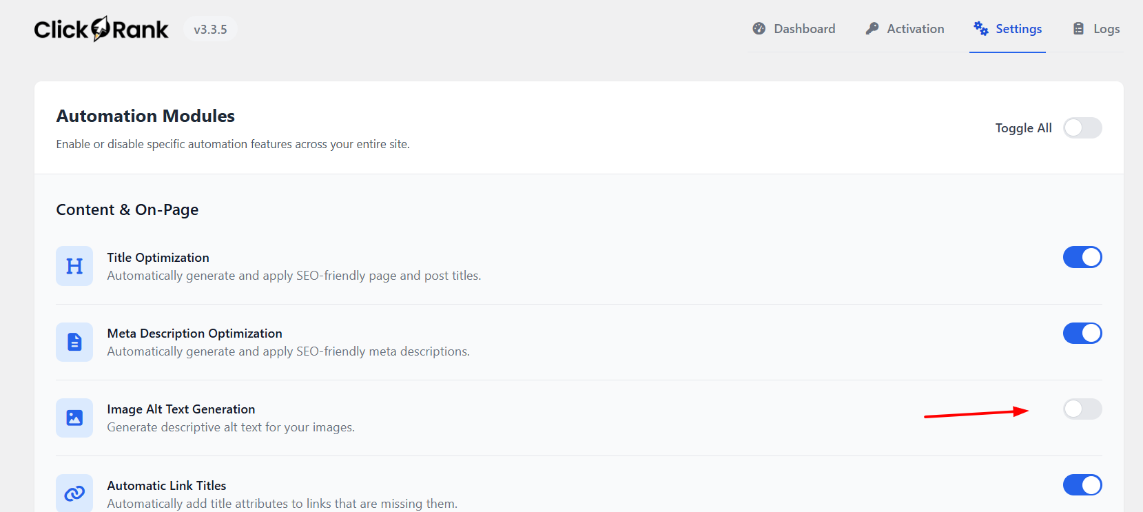
Best regards,
Mike -
AuthorSearch Results
-
Search Results
-
When i open a gallery image, the lightbox shows the image and below it displays the filename of the image as a caption. I’ve searched but can’t seem to find anywhere to turn this off. I’d even be ok if it showed the images ALT or Title, but the file name is ugly.
You can see what I mean here:
http://themcnairexperience.com/wp-content/uploads/2026/02/Screenshot-2.pngAny help would be appreciated. Thanks!
Dear team, On my draft page below, I use in the middle section a horizontal gallery. Below: “Ein paar Dinge, die hier einfach normal sind”:
it looks fine on laptop, but on mobile the pics are cutted top and bottom. on mobile It does not make a difference to set the gallery with a different percentage of height. the image setting is and shall be: no scaling
How can I ensure that the pictures are not cropped on mobile?
Thanks and best regards,
Tilman!Hi, I have an image that links to a Vimeo Video and, although I’ve set the URL manually to the Vimeo URL, and then set the image to open in “same window”, it does not open in a lightbox, which is typical; can’t seem to figure out why it’s not working. I did make sure that the Lightbox Modal Window is turned on in Theme Options.
Help?
Thank you!Topic: Cropped images in Lightbox
Dear Enfold Theme,
We are currently implementing a gallery page where a lightbox opens in a gallery with additional data and the image. Unfortunately, the image is only displayed partially. We are using the following function for this:$grid = new avia_post_grid( array( 'linking' => ‘’, ‘columns’ => ‘3’, ‘contents’ => ‘title’, ‘sort’ => ‘no’, 'paginate' => ‘yes’, ‘set_breadcrumb’ => false, ‘preview_mode’ => ‘auto’, ‘image_size’ => ‘full’ )); $grid->use_global_query(); echo $grid->html( ‘’ );Highlighted in bold that the full images should actually be used. However, this does not seem to work.
Hello
When I insert the code to display a specific category in the portfolio element, or even when I select one of the categories in the portfolio element, the images in the testimonial do not load correctly.
I enter the following code in my funticons.php. This is in accordance with the instructions on the themes website.//——————————
// php – Open portfolio category
//——————————function select_portfolio_filter(){
?>
<script>
jQuery( window ).load(function() {
jQuery(‘.inner_sort_button:eq(2)’).click();
});
</script>
<?php
}
add_action(‘wp_head’, ‘select_portfolio_filter’);Do you have a solution for this problem?