-
AuthorSearch Results
-
March 3, 2026 at 9:40 am #1495685
Hi,
Please see the private content field below.
It looks like the author has removed their image from https://photodune.net/, but it is available on other stock image sites. You can find it by searching the Licensor’s Author Username and Item Title.
I hope this helps!
Regards,
YigitMarch 3, 2026 at 5:29 am #1495678Hey zimbo,
Thank you for the inquiry.
What happens when you add the following css code?
#top #header .av-main-nav>li>a>svg:first-child, #top #wrap_all .header_color .cart_dropdown_first .cart_dropdown_link.avia-svg-icon svg:first-child {
    fill: #000;
    stroke: #000;
}
Best regards,
IsmaelMarch 3, 2026 at 5:26 am #1495677In reply to: How to ReOrder Page Sidebar menu Items
Hey JennyGr,
Thank you for the inquiry.
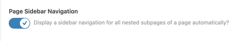
You might be referring to the Enfold > Sidebar Settings > Page Sidebar Navigation option. When enabled, this option displays sidebar navigation containing the nested subpages of the active page. Let us know the result.
Best regards,
IsmaelMarch 2, 2026 at 9:33 pm #1495672In reply to: Icon box columns same height
Hi,
With the custom class that you added: av-icon-box-same-height it will only work on those icon boxes, not over your whole site. I didn’t see the function added to your functions.php so I added it for you and it is working:

Please check.Best regards,
MikeMarch 1, 2026 at 8:20 pm #1495645In reply to: woo commerce breadcrumbs
Hi,
I can not view your page as it is maintenance mode. You can not use the advanced layer builder on category pages.
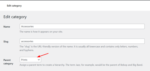
But we can change the Prints link in the breadcrumb to your prints page instead of the new prints page that you want to use as a custom category page.
So the first step is to add a new product category “Prints” and make it the parent of any other category that you wish for it to show in the breadcrumb trail.
Then add this code to your child theme functions.php if you are not using a child theme you could use the WP Code plugin then add a new snippet, in the top right corner use the PHP snippet as the code type: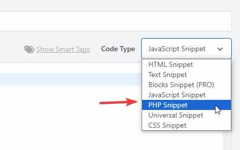 then add the code below and save.
function change_breadcrumb_trail() { ?>
  <script>
document.addEventListener('DOMContentLoaded', function() {
const printsLink = document.querySelector('.breadcrumb-trail a[href="http://enfold.test/product-category/prints/"]');

if (printsLink) {
  printsLink.href = 'http://enfold.test/prints/';
}
});
</script>
  <?php
}
add_action( 'wp_footer', 'change_breadcrumb_trail', 99 );
Ensure that you change the URLs in the code above to your site, and make sure to use the full URL.
Best regards,
MikeMarch 1, 2026 at 6:04 pm #1495642btw: , under German law, copyright is a highly personal asset. You cannot simply issue a warning to someone just because you see them stealing a third party’s image – even if you are a direct competitor.
Here is a breakdown of who is allowed to do what:
1. “Active legal standing” (who is allowed to sue?)
Only those whose own rights have been infringed may demand cessation. In copyright law, these are:- The author themselves: The creator of the work.
- The exclusive rights holder: For example, a publisher or agency to whom the sole rights have been transferred. (Shutterstock, iStock etc.)
- Authorized representatives: A lawyer or an association (e.g., GEMA), but these act on behalf of and with the authority of the author.
Therefore, ask whether COPYTRACK (and the internet is full of complaints about them) has the right to issue warnings on behalf of the author.
March 1, 2026 at 5:45 pm #1495640In reply to: woo commerce breadcrumbs
Hey Munford,
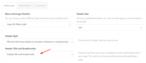
To add breadcrumbs to the category pages go to Theme Options > Header > Header Layout > Header Title and Breadcrumbs
It shows on my site:
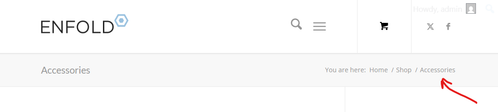
Since you are not using the Shop page, try creating a blank “Prints” page and then go to WooCommerce > Settings > Products > General > Shop page and choose it. Then “Prints” will show in the breadcrumbs on the category pages:

and on the product pages:

Or you could add a new product category “Prints” and make it the parent of any other category that you wish:
and will also show in the breadcrumbs:

Best regards,
MikeMarch 1, 2026 at 5:27 pm #1495639That would be too risky for me—in this case, just get the license for €9 and you’re done. Link iStock
or shutterstock LinkOtherwise, take a look at free image providers (pixabay, pexels, or Unsplash).
or you can use AI to create images:
 March 1, 2026 at 4:08 pm #1495638
Hey A1city,
The demo images were purchased with an extended license from Photodune.net (the Envato Stock website) with some images from peopleimages.com that are Royalty Free Images. I’m not sure exactly which site that image is from, but I think it’s from Photodune.net due to it’s age.
See this thread: https://kriesi.at/support/topic/abmahnung-wegen-bildrechtverstos/
Kriesi states that his extended license allows end users to use the images in the theme, but not outside the theme.
If you want to have your own license to images on your site for future reference, there are many Royalty Free Images sites, this would also ensure that you site doesn’t look exactly like the demo and other sites that use the same demo. Just a thought.Best regards,
MikeMarch 1, 2026 at 3:12 pm #1495637In reply to: Mobile view – Hero text position
Hi,
To shrink the header and logo on mobile scroll I added this css to the end of your Quick CSS field:/* mobile shrinking header */ @media only screen and (max-width: 767px) { #top #header:not(.av_header_transparency) #header_main > .container { height: 70px !important; line-height: 70px !important; } .responsive #top #header:not(.av_header_transparency) .logo img { height: 60px !important; } .responsive #top #wrap_all #header:not(.av_header_transparency) .main_menu { top: -12px; } }adjust to suit.
As for moving the logo up away from the text try this css and adjust to suit:.responsive #top #header .logo img { top: -10px; }but you don’t have much room in the header, so you may need to adjust the previous css that changed the size of the logo to suit, I can not because I don’t see the same as you do, to me it looks like plenty of room:

Best regards,
MikeMarch 1, 2026 at 2:33 pm #1495635A1city
ParticipantHi, I bought the theme and installed the restaurant demo data, ie.: https://kriesi.at/themes/enfold-restaurant-one-page/ Does buying the theme with the regular license give me the right to use the demo content? Since I got an email from a german Copyrights agency, COPYTRACK that wants me to show the license to them for a particular image from the demo data, or otherwise risk a fine 350 euro? But it sounds a bit skechy…
The image in question is this one: https://kriesi.at/themes/enfold-restaurant-one-page/wp-content/uploads/sites/42/2014/07/cheese-1030×686.jpg
Just to be safe I removed the image from my wordpress image library already.
March 1, 2026 at 1:49 pm #1495634Hi,
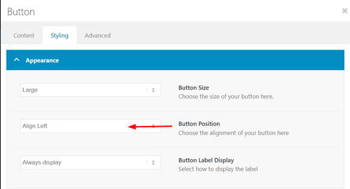
I added the class avia-button-center to it to center it:
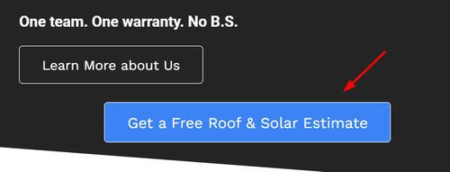
note that it is centered within the column, if you want it centered on the page, you will need to remove it from the column:
If you want the button above it, Learn More about Us, centered use the option in the element:
Best regards,
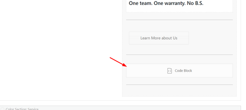
MikeFebruary 28, 2026 at 9:48 pm #1495626Hi,
I do not have experience with elfsight, but from examining your button I can tell that there is no direct link to your side form popout, it works via the data-elfsight-show-form attribute:
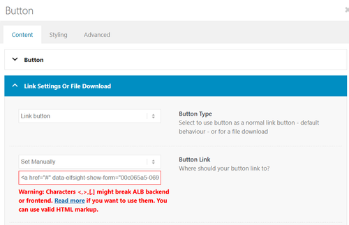
There is not a built-in way to add a data attribute to a button.
So I created a second button for you with your link snippet and the Enfold classes so the style is the same. Please check.Best regards,
MikeFebruary 28, 2026 at 7:07 pm #1495615Topic: disable lightbox transitions
in forum EnfoldMunford
Participanthi
my client wants to disable the change of size transition in the lightbox slideshow.
I tried a few things but nothing worked. Can it be that the images just fade into each other without moving in and out when you click on them?
thanks
Nancytried this:
/* Disable Enfold Lightbox Animation/Transition */ .mfp-zoom-in.mfp-ready.mfp-bg.mfp-zoom-in.mfp-ready .mfp-preloader { opacity: 0.8; } .mfp-zoom-in.mfp-ready .mfp-content.mfp-zoom-in.mfp-removing .mfp-content { transform: scale(1); opacity: 1; } .mfp-zoom-in.mfp-removing.mfp-bg { opacity: 0; } /* Force instant transition */ .mfp-zoom-in .mfp-content { transition: none !important; }-
This topic was modified 1 month ago by
Munford.
February 28, 2026 at 5:35 pm #1495609In reply to: horizontal gallery pic enlarge
Hey Tilman,
When I check your page the horizontal galleries behave as intended, clicking a image enlarges it until the next one is clicked. It’s true that they stay enlarged. If you want the image size to be restored after 5 seconds, try this function in your child theme function.php file. If you are not using a child theme you could use the WP Code plugin then add a new snippet, in the top right corner use the PHP snippet as the code type:
then add the code below and save.function restore_horizontal_gallery_size() { ?> <script> document.querySelectorAll('.av-horizontal-gallery-wrap').forEach(item => { item.addEventListener('click', function () { clearTimeout(this._galTimer); this._galTimer = setTimeout(() => { this.classList.remove('av-active-gal-item'); }, 5000); }); }); </script> <?php } add_action( 'wp_footer', 'restore_horizontal_gallery_size', 99 );Best regards,
MikeFebruary 28, 2026 at 5:02 pm #1495608In reply to: Can’t select category in portfolio
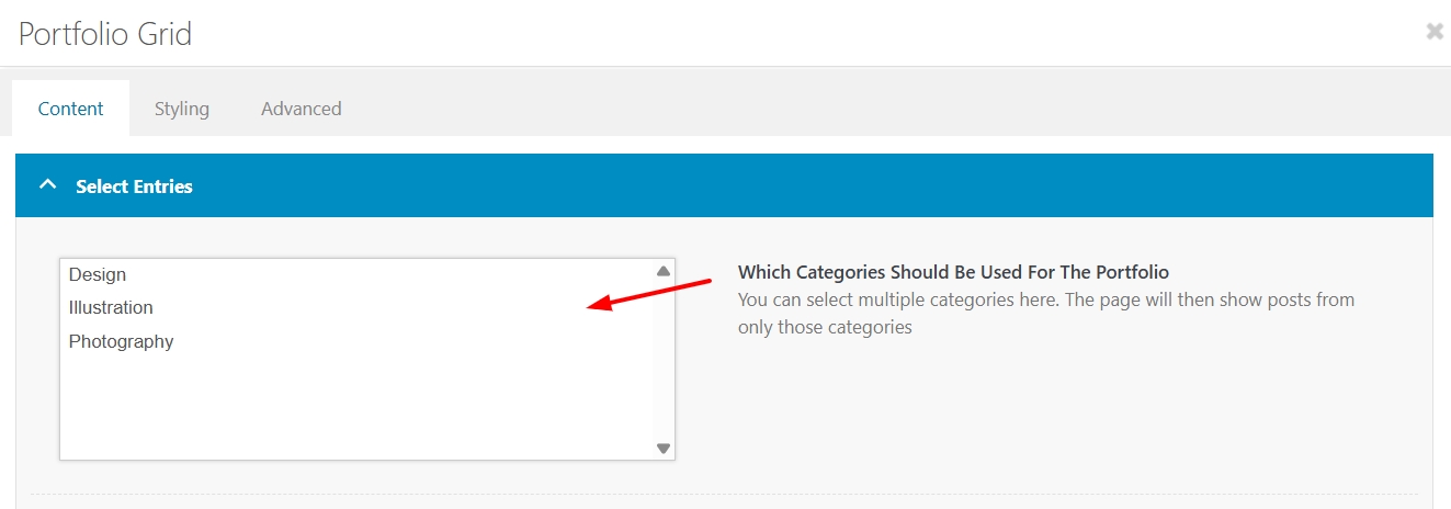
Hey Erwin,
I do not see a portfolio grid on either page that you linked to, only a special heading & text element.
When I check on my install it works.
Best regards,
MikeFebruary 28, 2026 at 4:38 pm #1495606Hi,
Try this css and adjust to suit:.html_av-overlay-full #top #wrap_all #av-burger-menu-ul li li { line-height: 0.4em; }
Best regards,
MikeFebruary 28, 2026 at 4:33 pm #1495605In reply to: Add a picturer to a mega menu column
Hey dreyerjm,
Please see our documentation: Add Images to mega menu you may need to scroll to the section, or use the link in the sidebar.Best regards,
MikeFebruary 28, 2026 at 3:47 pm #1495602Hi,
I see that your button is in a text block, the reason that the text is not centered is because it has a
BR before the text, try viewing in the plain text tab of the element and remove the BR
If you can’t find it try this css:.avia_textblock .avia-slideshow-button br { display: none; }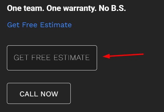
Best regards,
MikeFebruary 28, 2026 at 3:27 pm #1495601In reply to: Mobile view – Hero text position
Hi,
There is not a setting, you will need to use css. Since I’m not seeing the same as you I had to guess a little, try the following css and adjust to suit:@media only screen and (max-width: 767px) { #top .logo img { max-height: 140px; } #top .logo img { left: 55%; transform: translateX(-50%); } #top .av-burger-menu-main { transform: translateY(-38%) !important; } .av-hamburger-box { width: 50px!important; } .av-hamburger-inner::before{ top: -15px; } .av-hamburger-inner::after { bottom: -15px; } .av-hamburger-inner, .av-hamburger-inner::before, .av-hamburger-inner::after { height: 6px; } }This is how it looks for me with this css:

Best regards,
MikeFebruary 28, 2026 at 11:40 am #1495599where do you want to use it? as standalone text. or inside a text-block?
you can style a button this way (i used x-large button for that) – and even the padding you can have on button element itself – including border-width and border-radius.
Only css is needed if you like to have a min-width for that button.https://webers-testseite.de/bemo-button/
on the right – that is your screenshot image.
February 28, 2026 at 1:21 am #1495593In reply to: adding aria-labels to lightbox arrows/controls
Sorry for the lag replying, @Guenni007 — I always appreciate your time and effort! Frankly, I didn’t really dig into your replies too much — I just scanned them and couldn’t quickly find a reason to not use the Claude code that was already working for me, so I just stuck with that. Here’s a leaner version of that code — again, this is adding aria labels to prev/next arrows for enfolds lightbox galleries and the custom popups @Guenni007 provided me previously, which both use the Magnific Popup code. So this is just fyi, unless anyone sees any serious issue with it:
/* ==========================================================================
   MAGNIFIC POPUP ARIA LABELS
   ========================================================================== */
add_action('wp_footer', 'abode_magnificpopup_aria_labels', 999);
function abode_magnificpopup_aria_labels() { ?>
<script>
jQuery(document).ready(function($) {
  $.extend(true, $.magnificPopup.defaults, {
    closeMarkup: '<button title="Close (Esc)" type="button" class="mfp-close" aria-label="Close popup">×</button>',
    gallery: {
      arrowMarkup: '<button title="%title%" type="button" class="mfp-arrow mfp-arrow-%dir%" aria-label="%title%"></button>',
      tPrev: 'Previous bio',
      tNext: 'Next bio'
    }
  });

  var observer = new MutationObserver(function(mutations) {
    mutations.forEach(function(mutation) {
      mutation.addedNodes.forEach(function(node) {
        if (node.nodeType === 1) {
          var $node = $(node);
          if ($node.hasClass('mfp-arrow') || $node.find('.mfp-arrow').length) {
            var isImage = $('.mfp-figure').length > 0;
            var prevLabel = isImage ? 'Previous image' : 'Previous bio';
            var nextLabel = isImage ? 'Next image' : 'Next bio';
            $('.mfp-arrow-left').attr('aria-label', prevLabel);
            $('.mfp-arrow-right').attr('aria-label', nextLabel);
          }
        }
      });
    });
  });

  observer.observe(document.body, {childList: true, subtree: true});
});
</script>
<?php }
February 28, 2026 at 12:12 am #1495585In reply to: Mobile view – Hero text position
mine shows different and off center. How do I adjust sizes and position?
https://drive.google.com/file/d/18drlqw6M6q3U4a34w5TRLTLjYtNkA81P/view?usp=sharing
Also, how can I get the rounded button corners, and possible images to have rounded corners?
February 27, 2026 at 10:16 pm #1495582In reply to: Mobile view – Hero text position
Hi,
This is how it looks on my mobile:

The logo & burger menu both look large to me, do you still want them larger?
If you want to show the social icons on mobile, I recommend showing them in the top bar, but this will also show on desktop, probably not what you want.
How about adding the social icons to mobile menu?Best regards,
MikeFebruary 27, 2026 at 9:21 pm #1495578In reply to: Image does not open video in Lightbox
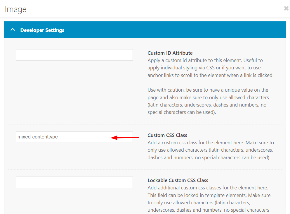
Hi,
I tested Guenni007’s solution and it is working for me. It looks like you forgot to add the custom class mixed-contenttype to the image element.
Best regards,
MikeFebruary 27, 2026 at 3:44 pm #1495574In reply to: Image does not open video in Lightbox
Hi Guenni007, Thank you so much, as always for assisting me! I have added the code you provided in the link, your first response. It’s there now and I am still using an image with the video link, attempting to have it open in a lightbox. Unfortunately, it did not work. Might you have any suggestions ?
My reason for not using the Video element is that the Preview/Fallback image gets cut off – it makes it horizontal, when the image is actually vertical.
So my Child Theme functions.php file now looks like this, but the video still won’t open in a lightbox…. Might you have any additional suggestions?
<?php
function lightbox_with_mixed_content_type() {
?>
<script type=”text/javascript”>
window.addEventListener(“DOMContentLoaded”, function () {
(function($){
$(‘.mixed-contenttype a’).each(function(){
var anchorLink = $(this).attr(‘href’);
if (/\.(jpg|png|gif|webp|jpeg)$/.test(anchorLink)) {
//console.log(anchorLink + ” is an image link”);
} else {
$(this).attr(‘rel’, ‘lightbox’).addClass(‘mfp-iframe’);
}
});
})(jQuery);
});
</script>
<?php
}
add_action(‘wp_footer’, ‘lightbox_with_mixed_content_type’, 999);
/*
* Add your own functions here. You can also copy some of the theme functions into this file.
* WordPress will use those functions instead of the original functions then.
*/If you don’t think it’s possible to do this, I will make a horizontal image for the preview/fallback (doesn’t look quite as nice in terms of filling up the space), just thought I’d give it one more try.
-
This reply was modified 1 month ago by
Eleina_Shinn.
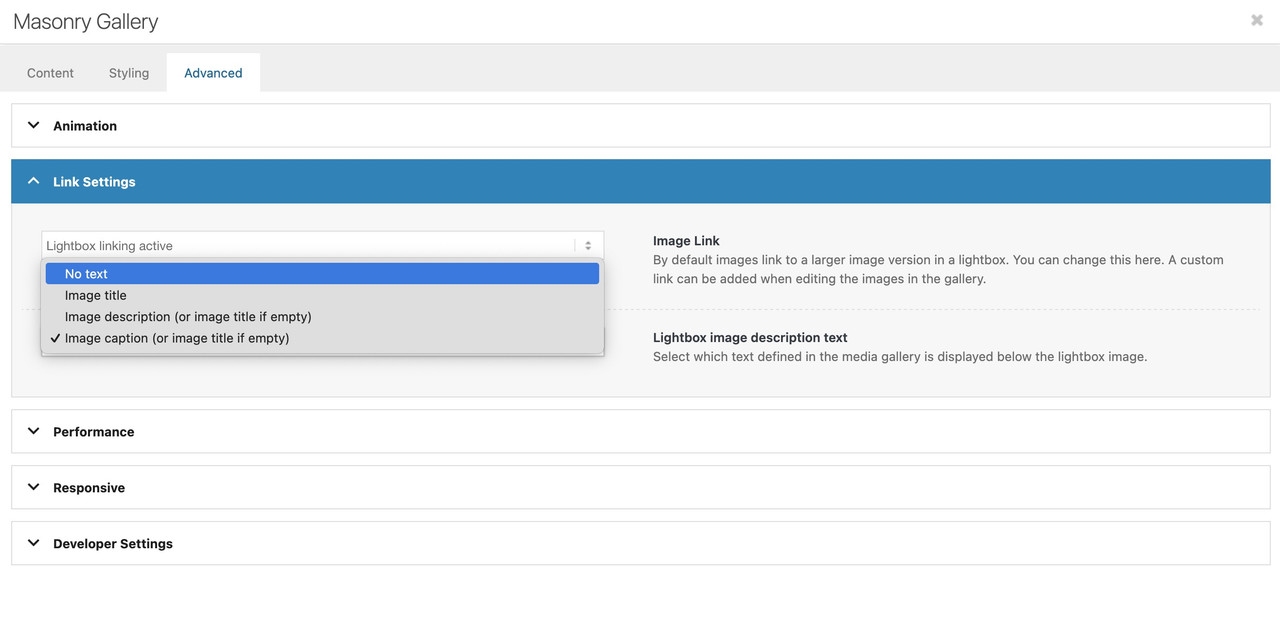
February 27, 2026 at 12:21 pm #1495566there is one problem with your links on that masonry – the titles are often the same as the file-names
your alt attribute is always the same for that gallery: 7106 Bluff RunNext : on the element itself – where you set the option to show lightbox images. – there is underneath a dropdown with an option what to show as bottom-bar text:
But if you have forgotton to show this on multiple masonry galleries – then you can place a little snippet instead in your child-theme functions.php:
function masonry_title_fix(){
?>
<script>
(function($){
    $(window).load(function() {
        $('.av-masonry .lightbox-added').each(function(){
            var lin = $(this).attr('alt');  /* === or choose title here === */
            $(this).attr('title',lin);
        });
    });
})(jQuery);
</script>
<?php
}
add_action('wp_footer', 'masonry_title_fix');
because you have the masonry perfect grid – you have no imgs inside but you can change it for the anchor tag.
February 27, 2026 at 11:27 am #1495565Topic: horizontal gallery pic enlarge
in forum Enfoldoestersund
ParticipantDear team,
On my page below I use 3horizontal galleries (middle of page)
I use the option “The chosen image gets enlarged on click”, but it stays enlarged. Only browser refresh resizes it.
Is there an option to keep the enlargement function, but each pic will automatically resize without browsing refresh?
Thanks and best regards . Tilman
February 27, 2026 at 6:25 am #1495555Hey volpagirl,
Thank you for the inquiry.
Would you mind providing a screenshot of the issue or posting the login details in the private field? You can use platforms like FreeImage, ImgBB, PostImages or Dropbox to upload and share the screenshot. Here are the steps to follow:
1.) Visit the website of your chosen platform, such as Savvyify, ImgBB, PostImages or Dropbox.
2.) Locate the option to upload a file or an image.
3.) Select the screenshot file from your computer or device and upload it to the platform.
4.) After the upload is complete, you will be provided with a shareable link or an embed code.
5.) Copy the link or code and include it in your message or response to provide us with the screenshot.Thank you for taking the time to share the screenshot. It will help us better understand the issue you’re facing and provide appropriate assistance.
Best regards,
IsmaelFebruary 26, 2026 at 11:58 am #1495536volpagirl
ParticipantWhen trying to update images within post and portfolio entries they do not appear when opening the edit box. Therefore images cannot be changed. The sites on previous theme version do not seem to have this issue.
-
AuthorSearch Results
-
Search Results
-
Hi, I bought the theme and installed the restaurant demo data, ie.: https://kriesi.at/themes/enfold-restaurant-one-page/ Does buying the theme with the regular license give me the right to use the demo content? Since I got an email from a german Copyrights agency, COPYTRACK that wants me to show the license to them for a particular image from the demo data, or otherwise risk a fine 350 euro? But it sounds a bit skechy…
The image in question is this one: https://kriesi.at/themes/enfold-restaurant-one-page/wp-content/uploads/sites/42/2014/07/cheese-1030×686.jpg
Just to be safe I removed the image from my wordpress image library already.
Topic: disable lightbox transitions
hi
my client wants to disable the change of size transition in the lightbox slideshow.
I tried a few things but nothing worked. Can it be that the images just fade into each other without moving in and out when you click on them?
thanks
Nancytried this:
/* Disable Enfold Lightbox Animation/Transition */ .mfp-zoom-in.mfp-ready.mfp-bg.mfp-zoom-in.mfp-ready .mfp-preloader { opacity: 0.8; } .mfp-zoom-in.mfp-ready .mfp-content.mfp-zoom-in.mfp-removing .mfp-content { transform: scale(1); opacity: 1; } .mfp-zoom-in.mfp-removing.mfp-bg { opacity: 0; } /* Force instant transition */ .mfp-zoom-in .mfp-content { transition: none !important; }Dear team,
On my page below I use 3horizontal galleries (middle of page)
I use the option “The chosen image gets enlarged on click”, but it stays enlarged. Only browser refresh resizes it.
Is there an option to keep the enlargement function, but each pic will automatically resize without browsing refresh?
Thanks and best regards . Tilman