Hello, thanks for your help ! All work normally now with this code :
#av-cookie-consent-badge:before {
  display: block;
  position: relative;
  content: "";
  width: 25px;
  height: 25px;
  align-items: center;
  top: 12px;
  left: 12px;
  background-image: url("https://kerry-han.fr/wp-content/uploads/2025/08/Cookie.svg");
  background-size: contain;
  background-repeat: no-repeat;
}
And i just wanted to know if you can help me to change the color of that icon and the icon of scroll up please.
Hi Guenni,
Here I send you the image with the space between table lines on mobile now and the space I would like.
I don´t know why in the mobile version the space is bigger.


Many Thanks,
BR,
Antonio
Hi everyone.
The social media icons in the header are definitely too small by default.

On your support pages (e.g., https://kriesi.at/support/), they’re already an acceptable size.

How can I make them larger?
And how can I also include them in pages?
The Social Buttons tool in the Advanced Layout Editor seems to only work for articles.
or without uploading – just with base 64 data uri:
#av-cookie-consent-badge:before {
  display: block;
  position: relative;
  content: "";
  width: 100%;
  height: 100%;
  top: 10px;
  left: 10px;
  background-image: url(data:image/svg+xml;base64,PHN2ZyBpZD0iQ29va2llcyIgeG1sbnM9Imh0dHA6Ly93d3cudzMub3JnLzIwMDAvc3ZnIiB4bWw6c3BhY2U9InByZXNlcnZlIiBwcmVzZXJ2ZUFzcGVjdFJhdGlvPSJ4TWlkWU1pZCBtZWV0IiB2aWV3Qm94PSIwIDAgMzAwIDMwMCI+CiAgPGNpcmNsZSBjeD0iMTgzLjMiIGN5PSIyNC45IiByPSIxNy41Ii8+CiAgPGNpcmNsZSBjeD0iMjIzLjIiIGN5PSI3My41IiByPSIxMi4yIi8+CiAgPGNpcmNsZSBjeD0iMjU2LjUiIGN5PSIxMjUuMyIgcj0iMTAuNyIvPgogIDxjaXJjbGUgY3g9IjI2My44IiBjeT0iNTkuMyIgcj0iOC43Ii8+CiAgPHBhdGggZD0iTTI3OS4xIDE1Mi45Yy02LjcgNi4zLTE1LjcgMTAuMS0yNS42IDEwLjEtMjAuNyAwLTM3LjUtMTYuOC0zNy41LTM3LjUgMC02LjcgMS43LTEyLjkgNC44LTE4LjMtMTcuMy0yLjMtMzEuMi0xNS0zNS4zLTMxLjctMS4yLjEtMi40LjItMy43LjItMjMuMiAwLTQyLTE4LjctNDIuMi00MS44QzcyLjkgMzkuMyAyMC41IDk1IDIwLjUgMTYzLjFjMCA3MS41IDU4IDEyOS41IDEyOS41IDEyOS41czEyOS41LTU4IDEyOS41LTEyOS41YzAtMy41LS4xLTYuOC0uNC0xMC4yek02OS4yIDE3OS41Yy05LjcgMC0xNy41LTcuOC0xNy41LTE3LjVzNy44LTE3LjUgMTcuNS0xNy41IDE3LjUgNy44IDE3LjUgMTcuNS03LjkgMTcuNS0xNy41IDE3LjV6bTQ1LTk4LjhjOS43IDAgMTcuNSA3LjggMTcuNSAxNy41cy03LjggMTcuNS0xNy41IDE3LjUtMTcuNS03LjgtMTcuNS0xNy41IDcuOS0xNy41IDE3LjUtMTcuNXptMy4xIDE2OS4xYy05LjcgMC0xNy41LTcuOC0xNy41LTE3LjVzNy44LTE3LjUgMTcuNS0xNy41IDE3LjUgNy44IDE3LjUgMTcuNS03LjkgMTcuNS0xNy41IDE3LjV6bTU3LjktNzAuM2MtOS43IDAtMTcuNS03LjgtMTcuNS0xNy41czcuOC0xNy41IDE3LjUtMTcuNSAxNy41IDcuOCAxNy41IDE3LjUtNy44IDE3LjUtMTcuNSAxNy41em0zMy45IDcyLjNjLTkuNyAwLTE3LjUtNy44LTE3LjUtMTcuNXM3LjgtMTcuNSAxNy41LTE3LjUgMTcuNSA3LjggMTcuNSAxNy41LTcuOCAxNy41LTE3LjUgMTcuNXoiLz4KPC9zdmc+);
  background-size: 30px;
  background-repeat: no-repeat;
}
by the way – here is a huge amount of usefull path – with the option to get the base 64 data uri:
https://www.svgviewer.dev/svg-to-data-uri
Enter f.e. cookie on search input field.
upload that svg to your media library: Cookie SVG
and put this to your quick css:
#av-cookie-consent-badge:before {
  display: block;
  position: relative;
  content: "";
  width: 100%;
  height: 100%;
  top: 0;
  left:0;
  background-image: url("/wp-content/uploads/cookie.svg");
  background-size: contain;
  background-repeat: no-repeat;
}
adjust the url with your path
Hello,
I create a page where I would like to add some entry blog post with large images (for portraits of people) displayed like in this example : https://refugee-food.org/parcours/
I tried several options, but it’s not what I want. The only “big image” option is too little to have a good result.
Can you help me ?
Thank you very much
Hi,
Perhaps you have found the error, when I check in Chrome, Firefox, Safari and Brave, it looks like this:

Best regards,
Mike
Hi,
To update try to download the latest installable WP version from your Theme Forest account and upload it to your WordPress ▸ Appearance ▸ Themes ▸ Add Themes ▸ Add New

after you choose the zip file and click install, you will see a This theme is already installed message because you are updating, you can continue

then you will see the Theme updated successfully message.

Best regards,
Mike
Hey jarodebnar,
Please see the theme setting Enfold Theme Options ▸ Header ▸ Header behavior ▸ Sticky Header

Best regards,
Mike
Hey Pam Haskell,
I would not expect issues with updating, but you will need to do it manually and then update your PHP to v8
I recommend creating a full backup of your site including the database with your webhost tool, and not a plugin.
To update your version of Enfold you will need to download the latest installable WP version from your Theme Forest account and upload it to your WordPress ▸ Appearance ▸ Themes ▸ Add Themes ▸ Add New
after you choose the zip file and click install, you will see a This theme is already installed message because you are updating, you can continue
then you will see the Theme updated successfully message.
Best regards,
Mike
Can you get me CSS code for Sub, Sub Menu color option?
I really like the flyout menu but don’t want it to be confusing for viewers. And Ideas on this?
screenshots:
https://img.savvyify.com/image/menu%2C-sub%2C-and-sub-menu-colors.yTbEN
https://img.savvyify.com/image/menu%2C-sub%2C-and-sub-menu.yTKX1
Hi,
Thank you for the confirmation.
install a fallback-picture.
Yes, the video will not display on mobile or smaller screens by default, which is why a fallback image is provided. Please refer to the screenshot below. If you need the video to display on mobile, try using the Layer Slider element.

Best regards,
Ismael
Hi,
Thank you for the info.
We couldn’t find the same image on the page. Please create a test page with the image so we can inspect it.

Best regards,
Ismael
Hi,
Thank you for the update.
To increase the size of the thumbnail, please add this filter in the functions.php file:
function avf_post_featured_image_link_mod( $image_link, array $current_post, $size ){
  $image_link = get_the_post_thumbnail( $current_post['the_id'], 'full' );
  return $image_link;
}
add_filter( 'avf_post_featured_image_link', 'avf_post_featured_image_link_mod', 10, 3 );
Then, include this css code inside the css media query to remove the dotted line:
.responsive #top #main .sidebar, .responsive .post_author_timeline, .responsive .template-blog .blog-meta {
    display: none;
}
Best regards,
Ismael
I want to add new image dimention i.e tab_thumb thats width is 260px and height is 80px. How can i add.
Hi Ismael.
Thanks for your reply.
The images are indeed moved above the title, but they are blurry.
The theme is probably using a small image, which is enlarged to full screen with the code provided, thus degrading the quality of the photos.
Furthermore, in landscape view on a smartphone, the image origin is not the center but the top margin.
And the CSS code provided does not resolve the dotted line issue.

This reply has been marked as private.
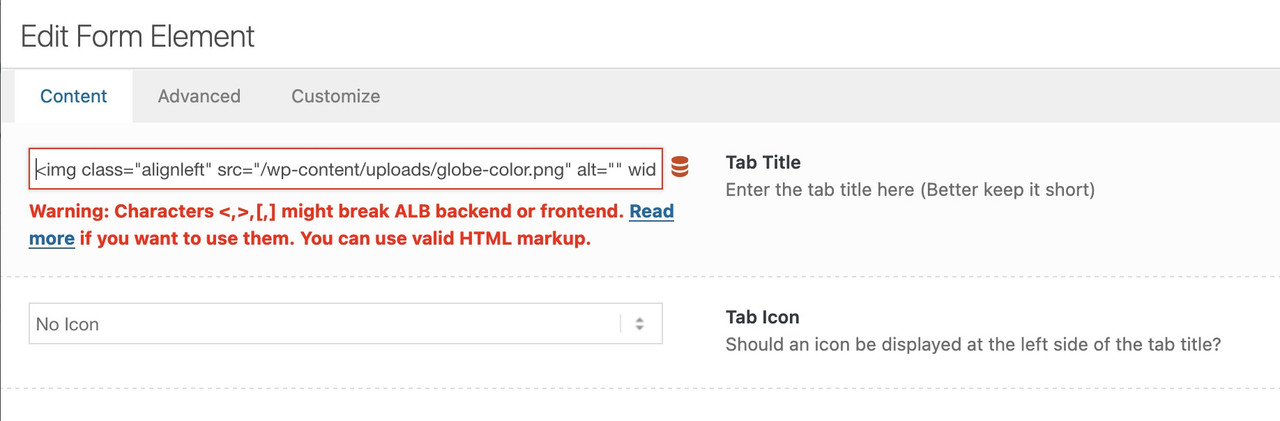
you have mixed two elements here on your page – the one is the tab-section
and the images belong to these av-section-tab-title
the other element is inside your content of the tab-section element. (Tabs) – and indeed they only have the option to show icons!
but – if you got svg images – you could place these files by choosing wordpress media library as source for your icons.
next hint: no one hampers you to insert left to the tab title :
<img class="alignleft" src="/wp-content/uploads/globe-color.png" alt="" width="40" height="40" />
you can horizontally center these images with the tab-titles by:
.tabcontainer .tab_titles .tab {
  display: flex;
  align-items: center;
}
there will be warnings – but you can ignore them – it works!
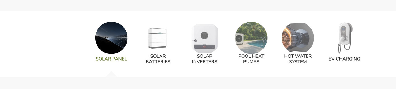
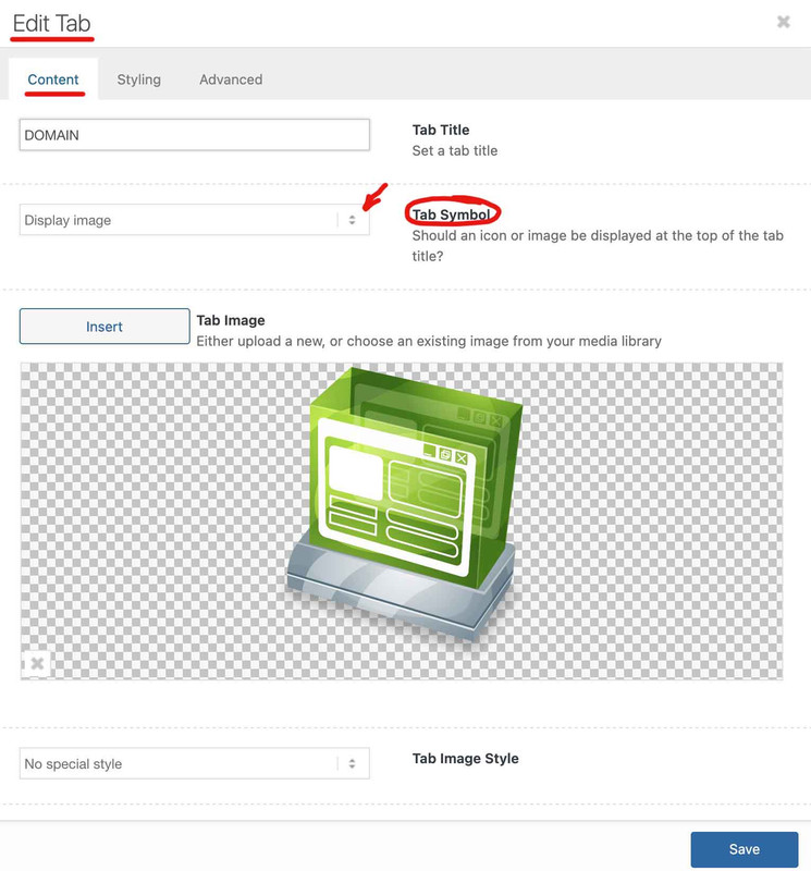
In ‘Tab Section’ I can see ‘display image’ option. With in Tab Section, I have add other ‘Tab’ Element that is not showing ‘display image’ option.
you have found the solution on the element itself? – because i see images on your tabs.
Hi Rikard,
Sorry it is about the space between lines in the tablet in mobile. See the attach the images; one is the line space now in mobile and the other the line space I would like.
I try this:
@media only screen and (max-width: 767px) {
.avia-data-table.avia_pricing_minimal td, .avia-data-table.avia_pricing_minimal th {
padding: 0px;
}
But the line space keep be big.
Thanks advance,
BR,
Antonio.
This reply has been marked as private.
1. I have created a ‘Tab Section’ element from Layout Elements.
2. In ‘Tab Section’, I have dragged/added a ‘Tabs’ element.
I see that ‘Tabs’ element only allows option ‘Yes Display Icon’. I want to display Image, not the icon, How to enable to upload image instead of displaying icon.
website page: All Products
Hi,
Thank you for the inquiry.
You can add this css code to move the featured image above the post content and adjust its width:
@media only screen and (max-width: 768px) {

  /* Add your Mobile Styles here */
  .responsive .template-blog .blog-meta {
    display: block;
    float: none;
  }

  .responsive .template-blog .post .entry-content-wrapper {
    overflow: hidden;
    float: none;
    width: 100%;
  }

  .responsive .template-blog .blog-meta,
  .responsive .template-blog .blog-meta a {
    width: 100%;
    min-height: 200px;
    margin-bottom: 20px;
  }

  .responsive .big-preview img,
  .responsive .small-preview img {
    object-fit: cover;
  }
}
Best regards,
Ismael
Hey Alexandre,
Thank you for the inquiry.
Would you mind providing a screenshot of the issue and a link to the page containing the Calendly widget? You can use platforms like Savvyify, Imgur, or Dropbox to upload and share the screenshot. Here are the steps to follow:
1.) Visit the website of your chosen platform, such as Savvyify, Imgur or Dropbox.
2.) Locate the option to upload a file or an image.
3.) Select the screenshot file from your computer or device and upload it to the platform.
4.) After the upload is complete, you will be provided with a shareable link or an embed code.
5.) Copy the link or code and include it in your message or response to provide us with the screenshot.
Thank you for taking the time to share the screenshot. It will help us better understand the issue you’re facing and provide appropriate assistance.
Best regards,
Ismael
Hi,
Thank you for the update.
To apply the same modification on mobile and tablet view, you can remove the css media query or replace the previous css rule with the following code:
.av-inner-tab-title, .av-tab-arrow-container, .av-tab-section-icon, .av-tab-section-image {
      width: 200px;
}
Let us know the result.
Best regards,
Ismael
Hey envisageiam,
Thank you for the inquiry.
You can add another menu item in the Appearance > Menus panel and in the Navigation Label field of the menu item, insert an <img> tag containing the logo image. Then, add the class name “only_mobile” to display the logo only on mobile view.
View post on imgur.com
Add this code in the Quick CSS field:
.only_mobile { display: none; }

@media only screen and (max-width: 989px) {

  /* Add your Mobile Styles here */
  .only_mobile { display: block; }
}
Best regards,
Ismael
Hi Rikard,
Works perfect, many thanks.
Could you help me with the space between table lines on mobile? I achtatted images in the first post.
Thanks,
BR,
Antonio.
