Hi,
When I check it looks like you removed the background image from the socket.
Best regards,
Mike
Hey Antonio,
Use the Use first slides caption as permanent caption option.
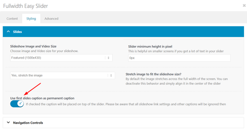
Best regards,
Mike
Hey mjrielly,
Typically the solution is to apply css height so all of the testimony slides will have the same height, and also calculate the needed height for each screen size. The following javascript will do this automatically for you. Add the following code to your child theme functions.php file. If you are not using a child theme you could use the WP Code plugin then add a new snippet, in the top right corner use the PHP snippet as the code type:
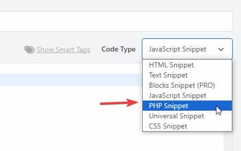
then add the following code and save.
function equalise_testimonial_heights() { ?>
  <script>
(function () {

  function equaliseTestimonialHeights() {

    const row = document.querySelector('.avia-testimonial-row');
    if (!row) return;

    const slides = row.querySelectorAll('.avia-testimonial');
    if (!slides.length) return;

    slides.forEach(function (slide) {
      slide.style.height = '';
    });

    let maxHeight = 0;
    slides.forEach(function (slide) {
      const h = slide.offsetHeight;
      if (h > maxHeight) maxHeight = h;
    });

    slides.forEach(function (slide) {
      slide.style.height = maxHeight + 'px';
    });
  }

  function debounce(fn, delay) {
    let timer;
    return function () {
      clearTimeout(timer);
      timer = setTimeout(fn, delay);
    };
  }

  if (document.readyState === 'loading') {
    document.addEventListener('DOMContentLoaded', equaliseTestimonialHeights);
  } else {
    equaliseTestimonialHeights();
  }

  window.addEventListener('resize', debounce(equaliseTestimonialHeights, 150));

})();
</script>
  <?php
}
add_action( 'wp_footer', 'equalise_testimonial_heights', 99 );
Best regards,
Mike
Not sure how to describe this, but here goes. :)
I have a testimonial inside a Testimonial Element inside a Color Section. I am using a background image in the Color Section. Some testimonials contain multiple lines of text. This causes the Color Section to expand and contract (height) every time a new testimonial appears.
Is there a way to keep this from moving? I’ve messed around with every combination of settings, but I can’t figure it out.
Thanks for any help!
 Adam Golden
Guest
Bug Report, I don’t need support or help.
Description:
The filesize column added by avia_media_gallery in class-media.php displays a stale file size when an attachment’s underlying file has been replaced or converted after upload.
Steps to reproduce:
1. Upload a JPEG or PNG image
2. Programmatically convert it to WEBP or AVIF — update _wp_attached_file postmeta to point to the new file, update _wp_attachment_metadata[‘file’] and _wp_attachment_metadata[‘filesize’], update post_mime_type, and delete the original file
3. Visit wp-admin/upload.php in list view
4. The filesize column shows the original file’s size, not the converted file’s size
Expected: The column shows the size of the current file on disk, as returned by filesize( get_attached_file( $post_id ) )
Actual: The column shows a stale size — the original file no longer exists on disk, yet the old size is displayed
Cause: avia_media_gallery appears to cache or calculate the file size at upload time rather than reading it fresh at render time, or reads from a stale source that isn’t updated when the attachment file is replaced.
Verified: get_attached_file( $post_id ) returns the correct new file path, the file exists on disk, and filesize() on that path returns the correct size. WordPress core’s _wp_attachment_metadata[‘filesize’] is also correct. The issue is specific to Enfold’s column rendering.
Workaround: Hooking manage_media_custom_column at priority 20 and replacing the output with a direct filesize( get_attached_file() ) call produces the correct value.
Hey rixi,
Try going to WordPress Dashboard > Settings > General > Site Icon and add your icon:
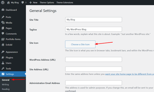
Best regards,
Mike
Hey Madison,
Your Milestone Content has a lot of strange classes, css styles, spans, & divs
Please view the Milestone Content using the Code tab
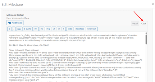
This looks excessive for the simple text in the field, I assume that you copied the text from somewhere and the page code was added when you pasted. You may have unclosed tags breaking the milestone layout.
Try building again with only plain text, if you want to copy the text from the frontend of your page, first paste into a plain text editor like notepad, notepad++, or vscode then copy the plain text again and paste into the milestone content field.
Best regards,
Mike
Hey tchamp77,
Your product grid Pagination is set to 20 items
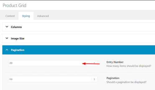
Try choosing a different number or All
Best regards,
Mike
you see that image here:
https://kriesi.at/support/topic/making-the-logo-bigger-2/#post-1496150
do not make it by mikes css – just use these settings on Enfold Header Options. Choose on the right custom pixel value – then the hidden input field will show – and enter 200px there – thats all.
put this to your quick css:
( or @media only screen and (min-width: 768px) {
@media only screen and (min-width: 990px) {
  #top #menu-item-logo a {
    display: inline-block;
    transform-origin: center top;
  }

  #top #menu-item-logo img {
    max-height: 200px;
    height: 100%;
    position: relative;
    top: 50%;
    transform: translateY(-50%);
  }
}
after that you can decide to have more or less shrink-faktor on:
 Silvia Socinovi
Guest
Hi, I’m using Enfold on my website and now I need to customize the layout of WooCommerce product page. My license is now expired, but before purchasing a new one, I’d like to know if this would allow me to receive support to do one of the following actions:
1. have full-width tabs section below product form
2. include info for customers (how it works, payment methods, etc.) below product image
If you can confirm you can actually help me out, I’ll buy a new license right away.
Thank you
Silvia
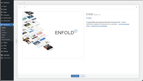
Hi,
Thank you for the update.
To check your theme version, go to Appearance > Themes and click the Enfold theme thumbnail. The version number should appear there. Please make sure you are on the latest version (7.1.4).
Looks like your site has two-factor authentication enabled — asking for a 9-digit code. Could you temporarily disable that so we can log in, or alternatively clone the site to a staging environment and share the staging URL and credentials instead?
Let us know once that’s done and we’ll investigate further.
Best regards,
Ismael
you see on the first two images the position where you can enter a custom value:
https://kriesi.at/support/topic/making-the-logo-bigger-2/#post-1496110
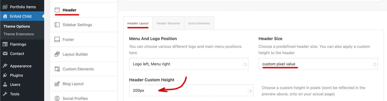
if you enter 200px there on “header custom height” ( i guess you are now back to “large” ) you had to synchronise that max-height value on #top #menu-item-logo img rule to 200px too.
Hi,
This is a sidebar widget:
You can remove the widget shortcode or use this css to hide it:
.single-product .sidebar #block-7 {
	display: none;
}
Let us know if this helps, if you have any further questions please open a new thread and we will try to help, we ask that each thread stays on one topic to be easier for everyone.
Best regards,
Mike
Hi,
Thank you for the update.
When you insert an image from the Media Library as background for a Color Section, make sure you select “Full Size” from the size dropdown before inserting it. The default selection is often a smaller cropped or resized version, which will appear soft or blurry when stretched to fill a full-width section.
Please give that a try and let us know if the image looks sharper after switching to full size.
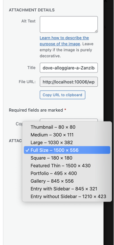
Best regards,
Ismael
Hi,
We have seen a couple of claims from COPYTRACK on behalf of genious2000de, the author of the image that you linked to. Who is claiming the same images that we own extended licenses for, by the user francesco83 from 2014
Perhaps these are the same person, we are not sure. Kriesi states that his extended license allows end users to use the images in the theme, but not outside the theme. Please see these threads.
This seems shady, perhaps your best course of action would be to follow Ismael’s advice and use a royalty-free image or create one with AI which can not have a claim against them. Double check your local laws though, we can not offer legal advice.
https://www.reuters.com/world/us/us-appeals-court-rejects-copyrights-ai-generated-art-lacking-human-creator-2025-03-18/
Hope that this helps.
Best regards,
Mike
This reply has been marked as private.
Hi,
Thank you for the inquiry.
Regarding the logo shrinking on smaller screens and the burger menu/search icon overlapping, you can add the following css to Enfold > General Styling > Quick CSS field:
@media only screen and (max-width: 1290px) {
  .responsive #top .logo img {
    max-width: 62%;
  }

  #avia-menu {
    margin-right: 0;
    padding-right: 0;
  }
}

@media only screen and (max-width: 767px) {
  .responsive #top .logo img {
    max-width: 35%;
  }
}
Adjust the max-width value as needed to fit your logo within the header. Please make sure to purge the cache before testing.

Let us know if the issue persists.
Best regards,
Ismael
Hey jpassmann,
Thank you for the inquiry.
The demo images bundled with Enfold may or may not include a license for use on live websites — it varies by image. We cannot guarantee that any of them are safe to use publicly.
The safest course of action is to replace all demo images with your own. There are several royalty-free sources you can use:
— https://unsplash.com
— https://www.pexels.com
— https://pixabay.com
If you still want to check the origin of a specific image first, you can do a reverse image search to find the source and confirm its license terms:
— https://images.google.com
— https://tineye.com
We tried checking your site but it redirects to a 404, so we were unable to verify which image you are referring to.
Let us know if you have more questions.
Best regards,
Ismael
Hey Sabina,
Thank you for the inquiry.
Regarding the registration issue, you will need your Themeforest purchase code to register on our support forum. You can find this in your Themeforest account under your downloads. Once you have it, please use it to register here:
— https://kriesi.at/support/register/
For the image quality issue, we would need to take a closer look at your site to diagnose what’s happening. The blurriness could be caused by a few things, such as the image being scaled up beyond its original dimensions, css filters applied to the section, or the image compression settings in WordPress.
Could you share a link to your site or a screenshot so we can check it out? Please post the link or screenshot in the private field below.
Let us know if you have more questions.
Best regards,
Ismael
Hi
With the transparent header selected for a page with image behind it, is it possible to also have the submenu background also transparent until the user scrolls. When they user then scrolls, the header background changes to the Logo Area Background Color default. and also the submenu background changes to the same color.
Many Thanks
Regards
Colin
Hey bemodesign,
Thank you for the inquiry.
You can disable the breadcrumb from the Enfold > Header > Header Layout > Header Title and Breadcrumbs — set it to “Hide Both”.
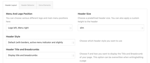
Let us know if you have more questions.
Best regards,
Ismael
Hey cherrmann,
Thank you for the update.
The negative margin-top values in your custom css are pulling the footer upward and overlapping the content above it, which is why the submit button and other elements near the footer get cut off.
You have these rules defined in two places:
#footer {
    padding: 0 0 190px 0;
    margin-top: -190px;
    background-image: url(//janisch-schulz.com/wp-content/uploads/2022/05/090-footer-wasser.jpg);
    background-size: cover;
}

@media only screen and (max-width: 768px) {
    #footer {
        background: url(//janisch-schulz.com/wp-content/uploads/2022/05/090-footer-wasser-mobil.jpg);
        background-size: cover !important;
        margin-top: -360px;
    }
}
The negative margin-top on both rules is what pulls the footer up over your content. Remove both margin-top values and your submit button should become visible again. The padding-bottom on the desktop rule was likely added to compensate for the overlap, so you may want to revisit that value as well once the margin is removed.
Let us know if the issue persists.
Best regards,
Ismael
Hi,
I changed the script to this:
function disable_horizontal_gallery_image_nav() { ?>
  <script>
document.addEventListener('DOMContentLoaded', function() {
  document.querySelectorAll('.av-horizontal-gallery-wrap').forEach(function(wrap) {
    const link = wrap.querySelector('a[href^="#toggle-id-"]');
    if (!link) return;

    const href = link.getAttribute('href');

    wrap.style.cursor = 'pointer';
    wrap.addEventListener('click', function(e) {
      e.stopPropagation();

      const toggleId = href.replace('#', '');
      const toggleTrigger = document.querySelector('[data-fake-id="' + href + '"], [href="' + href + '"], #' + toggleId + ' .toggler, .toggle-title[href="' + href + '"]');

      if (toggleTrigger) {
        toggleTrigger.click();

        let scrollTimer = null;
        window.addEventListener('scroll', function onScroll() {
          clearTimeout(scrollTimer);
          scrollTimer = setTimeout(function() {
            window.removeEventListener('scroll', onScroll);
            window.scrollBy({ top: -250, behavior: 'smooth' });
          }, 300);
        });

      } else {
        window.location.hash = href;
      }
    });

    link.addEventListener('click', function(e) {
      e.preventDefault();
      e.stopPropagation();
    });
  });
});
  </script>
  <?php
}
add_action( 'wp_footer', 'disable_horizontal_gallery_image_nav', 99 );
Give it a try.
Best regards,
Mike
warum hast du für #footer ein negatives margin-top definiert?
Du hast es an zwei Stellen so gesetzt:
#footer {
    padding: 0 0 190px 0;
    margin-top: -190px;
    background-image: url(//janisch-schulz.com/wp-content/uploads/2022/05/090-footer-wasser.jpg);
    background-size:cover
}

@media only screen and (max-width: 768px) {
    #footer {
        background: url(//janisch-schulz.com/wp-content/uploads/2022/05/090-footer-wasser-mobil.jpg);
        background-size: cover !important;
        margin-top:-360px
    }
}
lösche mal beide margin-top Werte – dann siehst du auch wieder deinen Submit Button.
Hi,
I don’t understand how your custom search field is applied to your page, but I see that it is not the same on mobile. On desktop, when opened it has the classes: SumoSelect sumo_gallery_ids open and has a div with the classes: optWrapper okCancelInMulti multiple that creates the drop down.
On mobile it only has the class: SumoSelect and doesn’t have the div.
I see no errors that might point to this, but I believe that this is an error with your script and not with the theme. Try asking wherever you got the script from for further advice.
Yes img.savvyify.com is no longer working, try freeimage.host instead.
Best regards,
Mike
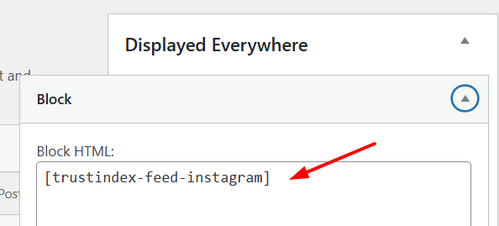
Hey Erwin,
The footer & socket are inside the main container, so you will need this JavaScript to move them after it:
Add to your child theme functions.php file
function move_footer_scoket_after_main() { ?>
  <script>
document.addEventListener('DOMContentLoaded', function () {
  const main   = document.getElementById('main');
  const footer = document.getElementById('footer');
  const socket = document.getElementById('socket');

  if (!main || !footer || !socket) return;

  const parent = main.parentNode;
  parent.insertBefore(footer, main.nextSibling);
  parent.insertBefore(socket, footer.nextSibling);
});
</script>
  <?php
}
add_action( 'wp_footer', 'move_footer_scoket_after_main', 99 );
Then add the css for the header, footer, & socket:
.responsive.html_boxed.html_header_sticky #header,
#footer, #footer .container,
#socket, #socket .container {
    width: 100vw;
    max-width: 100vw;
		left: calc(-50vw + 50%);
}
Best regards,
Mike
on tab sections we are able to insert on tab title section icons – or images. On tabs not – there is only the option to insert icons.
Wouldn’t it be nice if there was also the option to choose there?
Until now, to place a png there, you always had to go through the tedious process of using before container and background image via quick css rules.
[EDIT: I’m sorry I messed up, because I set the header image on button to not show on small devices, but still the following is valid:]
Applying https://kriesi.at/support/topic/display-issues-on-iphone-13/#post-1495940 this Is what I got (section above footer not fully visible):

The issue is only to see on a real iPhone unfortunately.
@Guenni007 – die svg-Trenner werde ich ausprobieren, danke für den Hinweis.
Hi Janny,
Thank you for the inquiry.
Since this widget is loaded from an external script (https://public.tommbookingsupport.nl/reservation-inline.js), we recommend reaching out to the booking software support team to confirm whether they have any css customization guidelines or if there’s a native setting within their platform to control the styling.
We may also need screenshots to better understand the issue. You can use platforms like FreeImage, ImgBB, PostImages or Dropbox to upload and share the screenshot. Here are the steps to follow:
1.) Visit the website of your chosen platform, such as Savvyify, ImgBB, PostImages or Dropbox.
2.) Locate the option to upload a file or an image.
3.) Select the screenshot file from your computer or device and upload it to the platform.
4.) After the upload is complete, you will be provided with a shareable link or an embed code.
5.) Copy the link or code and include it in your message or response to provide us with the screenshot.
Thank you for taking the time to share the screenshot. It will help us better understand the issue you’re facing and provide appropriate assistance.
Best regards,
Ismael