-
AuthorSearch Results
-
January 8, 2026 at 3:39 pm #1493719
Topic: How to add button or call to action in the header
in forum Enfoldfiorettipau
ParticipantHello,
I would like to add to my header two buttons “faire un don” et “newsletter” on the right side of it (exactly like in the example of the image in the attached file).
Is an easy way to do that ?
Thank you !
January 8, 2026 at 10:25 am #1493705In reply to: problem with lightbox images
yes, that’s how I set the visibility, in the image element.
I can try with duplicating the section, thanks.January 8, 2026 at 10:16 am #1493703In reply to: Main Content
Hi,
You could try something like this in Quick CSS:
.avia-accordion {
  max-height: 1200px;
  height: 1200px;
}
Note that it might stretch the images.
Best regards,
RikardJanuary 8, 2026 at 10:16 am #1493702In reply to: problem with lightbox images
Hi,
Thank you for the inquiry.
Did you toggle the visibility of the image elements using Advanced > Responsive > Element Visibility settings? If you need to exclude the image from the lightbox, you may need to create a duplicate of the entire section — one for desktop and another for smaller screens.
Best regards,
IsmaelJanuary 7, 2026 at 11:30 pm #1493698In reply to: problem with lightbox images
how did you insert that image to your page? as image element – or inside a text-block element or via masonry gallery etc. pp.
why do i ask this : if you can separate these images to different sections – then they will not group together. And you can set the responsive visibility on the section.but if you have the images inside a common section then –
see: https://webers-testseite.de/munford-lightbox/sadly for that setting of some images are grouped – some are not ( the layout image is a lightbox image too) the solution of Mike does not work here
Don’t worry, the script only runs if groups are actually set on the page, otherwise the script will abort.
January 7, 2026 at 6:36 pm #1493695Topic: problem with lightbox images
in forum EnfoldMunford
Participanthi
I have images on my site that open in a lightbox in some color sections.
I have a problem that an image that is set to show only on mobile is showing in the lightbox still on the PC when I scroll through the images.
You can see it on the page below in the section called Vårgæslingeblomsten – the botanical drawing opens twice – the second one is just for mobile.
Can you help me with this?
thanks
Nancy-
This topic was modified 2 months, 3 weeks ago by
Munford.
January 7, 2026 at 3:18 pm #1493692In reply to: Masonry falls apart
Thank you – but I recommend using the unscaled images
f.e.:
http://www.interior-collection.de/wp-content/uploads/2025/12/IMG_7870-1.jpg : 135kb
http://www.interior-collection.de/wp-content/uploads/2025/12/IMG_7870-1-529×705.jpg : 285kb (imgSize: masonry – 705×705)so better resolution but less file size.
background on that : search for : avf_jpeg_quality
e.g: https://kriesi.at/support/topic/enfold-creating-images-larger-than-the-orginal/#post-1488786January 7, 2026 at 12:45 pm #1493687In reply to: Masonry falls apart
One thing is that your images you use are not wide enogh to fill the column width.
you can test my suggestion on placing this to your quick css for that section on that page:
#top.postid-3536 #av_section_3 .av-masonry-image-container img {
  width: 100%;
}
or use the non scaled images ( original sizes ) : No Scaling (Original Width X Original Height)
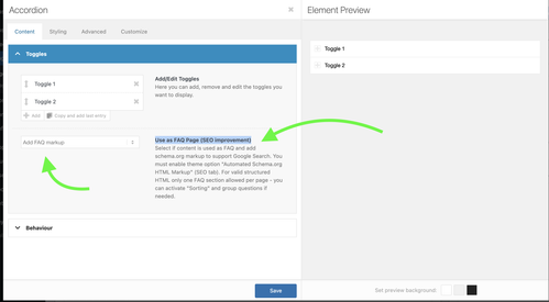
January 7, 2026 at 4:44 am #1493679In reply to: Yoast SEO FAQ block
Hi,
Thank you for the update.
Yes, you can enable the Content > Toggles > Use as FAQ Page (SEO improvement) option for the Accordion element to automatically add the FAQ Page schema. Please check this screenshot for reference.
Let us know if you need more info.
Best regards,
IsmaelJanuary 7, 2026 at 4:39 am #1493678Hey Johannes,
Thank you for the inquiry.
You have to edit the cells with the background image, go to Advanced > Developer Settings, and apply the Custom CSS Class name “av-cell-with-image”. After that, add the following css in the Enfold > General Styling > Quick CSS field code to set a minimum height for the cell, which will also enlarge the image.
@media only screen and (max-width: 767px) {

  /* Add your Mobile Styles here */
  .responsive #top #wrap_all .av-flex-cells .av-cell-with-image {
    min-height: 300px;
  }
}
Please check this link for more info on adding custom css class names to builder elements.
— https://kriesi.at/documentation/enfold/add-custom-css/#enable-custom-css-class-name-support
Best regards,
IsmaelJanuary 5, 2026 at 1:36 pm #1493655In reply to: Color section not showing color or image background.
Hi,
I’m facing an issue with Enfold / Avia Layout Builder where a section background image is set in the editor, but no
background-image: url(...)is generated on the frontend.What I see
- In the Avia editor, the section clearly has a background image selected
- The image attachment exists, has metadata, and
wp_get_attachment_url()returns a valid URL _aviaLayoutBuilderCleanDatacontains the image data, e.g.:
src='https://example.com/wp-content/uploads/2022/02/example.jpg'
attachment='3172'
attach='parallax'
What is generated
In both per-page CSS (
dynamic_avia/avia_posts_css/post-XXXX.css) and merged CSS,
Enfold outputs:.avia-section.av-XXXX { background-image: unset; }The image URL does not appear anywhere in CSS or HTML.
Important detail
In the same builder data block, the section has:
background='bg_color'
even thoughsrc/attachmentare set.Question
Isbackground-image: unsetexpected behavior whenbackground='bg_color'is set, even if an image is assigned?If yes:
- what is the correct way to switch a section from
bg_colortoimagemode programmatically? - is there a supported way to make Enfold re-evaluate the background type based on existing
src/attachment, without manually re-editing each section?
Thanks for any clarification.
Vaclav
January 5, 2026 at 2:14 am #1493652In reply to: portfolio grid styling
Hi,
Thank you for the inquiry.
The white background is from the image overlay — adding this css code should remove it.
.avia_transform a .image-overlay {
    background-color: transparent;
}
Best regards,
IsmaelJanuary 4, 2026 at 10:47 am #1493644In reply to: portfolio grid styling
for the bar under the images try:
.avia_transform #top .avia-fullwidth-portfolio .grid-content,
.avia_transform #top .avia-fullwidth-portfolio .grid-entry-title,
.avia_transform #top .avia-fullwidth-portfolio .avia-arrow {
  background-color:  var(--enfold-main-color-primary) !important;   /* ==== or any color you like === */
}

.avia_transform #top .avia-fullwidth-portfolio .grid-entry-title{
  color: #FFF
}
January 4, 2026 at 10:36 am #1493642In reply to: portfolio grid styling
if you only want to get rid of that white overlay – but show on hover the little round icon – try:
.avia_transform .avia-fullwidth-portfolio a .image-overlay {
  background-color: transparent !important;
  opacity: 1 !important;
}
.avia_transform .avia-fullwidth-portfolio a .image-overlay-inside {
  opacity: 0 !important;
}
.avia_transform .avia-fullwidth-portfolio a:hover .image-overlay-inside {
  opacity: 0.8 !important;
}
January 3, 2026 at 10:49 am #1493639Topic: portfolio grid styling
in forum Enfoldspitsdesign
ParticipantI’m using the portfolio grid in a content section with dark background color. How do I remove the white squares behind the images and div grid content? I would like it to be transparent. Also when hovering the image a white square appears behind the rounded image. How do I remove this? The text in div grid content should be white. Also I would like tho add more spacing between the images.
Thank you!January 3, 2026 at 10:26 am #1493638Thanks for your feedback.
Just to clarify — are you saying that if each product has one dropdown, and the images match the choices in that dropdown, then this will work (even if the number of images differs per variation)? But having two dropdowns (e.g., colour + size) won’t work with the current setup?
I agree that WooCommerce’s native variation handling is the better choice for image switching, but I’m concerned about losing the other layout elements we’ve built with Enfold’s Advanced Layout Builder. It feels like a real negative that Enfold doesn’t support WooCommerce variation images out of the box.
Do you know of any plugin or solution that would let me keep using Enfold’s builder and have a variation image gallery that works properly with WooCommerce variations? Something that bridges the gap between Enfold and variation images?
Thanks,
January 2, 2026 at 9:49 pm #1493633Hi,
Thank you for your patience, unfortunately you would not be able to have a hybrid approach. If you check the test page in the thread that you linked to, the images to not change when an option is selected. If you use the built-in native WooCommerce variation images instead, this should work, but you could not customize the rest of the product page.
If you only have one dropdown option, with the same number of images, like your “Column Radiators Raw Steel III Horizontal” then I have a working script, but it sounds like this won’t help you with all products, so you should try using the default native WooCommerce variation images instead.Best regards,
MikeJanuary 2, 2026 at 4:40 am #1493625In reply to: No responsive gallery view
Hey ThorstenFB,
Thank you for the inquiry.
The gallery seems to be responsive when we checked it on smaller screens (see private field).
Would you mind providing a screenshot of the issue? You can use platforms like FreeImage, ImgBB, PostImages or Dropbox to upload and share the screenshot. Here are the steps to follow:
1.) Visit the website of your chosen platform, such as Savvyify, ImgBB, PostImages or Dropbox.
2.) Locate the option to upload a file or an image.
3.) Select the screenshot file from your computer or device and upload it to the platform.
4.) After the upload is complete, you will be provided with a shareable link or an embed code.
5.) Copy the link or code and include it in your message or response to provide us with the screenshot.Thank you for taking the time to share the screenshot. It will help us better understand the issue you’re facing and provide appropriate assistance.
Best regards,
IsmaelJanuary 2, 2026 at 4:32 am #1493623In reply to: WooCommerce Features not working
Hi,
Thank you for the update.
For the product page, try to add the solution provided in this thread: https://kriesi.at/support/topic/enfold-sidebar-on-single-product-pages/#post-1162484
And for the home page, make sure to adjust Layout > Sidebar Settings.
Let us know the result.
Best regards,
IsmaelJanuary 2, 2026 at 4:22 am #1493621Hey blaircomm1,
Thank you for the inquiry.
Try adding this css code to move the social icons to the very bottom of the left sidebar/header.
.html_header_sidebar #header .container .inner-container {
    height: 100vh;
}

.html_header_sidebar #header .av-sidebar-social-container {
    position: absolute;
    clear: both;
    overflow: hidden;
    bottom: 34px;
}
Best regards,
IsmaelDecember 31, 2025 at 10:39 am #1493611Hi,
I’ve revised the test page for the Liberty radiator — the dropdowns now correctly match the finish and the corresponding image in the slider.
Some product pages will include both colour and size variants and will therefore require three dropdowns. Other pages will only have a size variant and will just need a single dropdown.
If this setup isn’t possible, is there a way to use the native WooCommerce variation images instead of the Enfold slider, while still keeping the other content elements on the page — effectively a hybrid approach?
I came across this support topic, which suggests it may be possible:
I can provide guest login access to the dev site if required.
Please advise.
Thanks
December 31, 2025 at 10:06 am #1493609Hi,
Thanks for the update. I’ve imported the content for the top level pages for you, please review your site. Please note that the theme settings and images are not included. Let us know if you should need anything more from the demo.
Best regards,
RikardDecember 30, 2025 at 9:53 pm #1493599Hi,
Thanks for the demos, I have a working script for the first product “Column Radiators Raw Steel III Horizontal” that contains only one dropdown options box. But your second page that has two dropdowns for color & size is not working because you don’t have enough images for each possibility, your only image are for “Brushed Bronze” and none for “Polished Stainless Steel”.
I’m not sure if this will work as the script may work better with one dropdown option per page. Can you have a different page for each? The slides only have the classes “slide-3”, etc not the variation that you may achive using the WooCommerce variation images built into WooCommerce instead of using the Enfold slider that is not built for this.Best regards,
MikeDecember 29, 2025 at 8:36 pm #1493571Hi,
I have set up 2 x test pages in Private.
Can you set the test?
Extra images for gallery that are not sizes or colours eg. lifestyle images – if I wanted extra images in the gallery would this be possible, or would these need to be added as a separate gallery? If so, where would you suggest for best USX?
Thanks
December 29, 2025 at 12:28 pm #1493562In reply to: Main Content
Hi,
You can upload images to a service like Dropbox, Google Drive, Imgur or Snipboard to name a few. You can then link to the image in your reply.
Best regards,
RikardDecember 29, 2025 at 10:46 am #1493558Topic: Blurry image when embedded
in forum Enfoldthomasb328
ParticipantHi, Enfold theme, GYM demo, about page, our team, Sandra… When I replace the image with my own, it always appears blurry in stretch-to-fit and scale-to-fit modes, even though the resolution is very good. If I insert the image without stretching and scaling, it appears much too small. What can I do? Best regards, Thomas
December 27, 2025 at 6:47 pm #1493530In reply to: Masonry Gallery Image Order not saving
may i ask you what is behind your “avia_gallery_image_order” – because this seems to be your custom function name – and not the filter that is used by enfold. So could you give more info about that function?
December 24, 2025 at 1:29 pm #1493490In reply to: Slides won’t open in LayerSlider since the update
Sorry but that isn’t the issue. I can’t edit any slides. The slide editor won’t open. Also, I would prefer that image not be public.
-
This reply was modified 3 months, 1 week ago by
beverlystone.
December 24, 2025 at 12:11 pm #1493488In reply to: Slides won’t open in LayerSlider since the update
Hey beverlystone,
Thanks for your patience, when I check your English site the LayerSlider links seem to for for me:

Best regards,
MikeDecember 24, 2025 at 10:26 am #1493483although you have the grid the different “images” are placed in a slide-loop and the slides are numbered – starting at number 1 from left to right – to to bottom : slide-loop-1, slide-loop-2, slide-loop-3 etc.
so you can address the “image” via that class – why i do note it as “image” these are background-images – no img tag here !
So a padding will not bring you to your wanted result.but try f.e.:
#top .avia-logo-grid .slide-entry-wrap .slide-loop-6 .av-partner-fake-img {
  background-size: 80% !important;
  background-position: center;
  background-color: inherit;
}
if you want it for only that element – give a custom ID or class to the partner-logo element.
e.g. with my-custom-class#top .avia-logo-grid.my-custom-class .slide-entry-wrap .slide-loop-6 .av-partner-fake-img { background-size: 50% !important; background-position: center; background-color: inherit; }if you use a jpg for that slide – change the background-color to the background of that jpg.
-
This topic was modified 2 months, 3 weeks ago by
-
AuthorSearch Results
-
Search Results
-
Hello,
I would like to add to my header two buttons “faire un don” et “newsletter” on the right side of it (exactly like in the example of the image in the attached file).
Is an easy way to do that ?
Thank you !
Topic: problem with lightbox images
hi
I have images on my site that open in a lightbox in some color sections.
I have a problem that an image that is set to show only on mobile is showing in the lightbox still on the PC when I scroll through the images.
You can see it on the page below in the section called Vårgæslingeblomsten – the botanical drawing opens twice – the second one is just for mobile.
Can you help me with this?
thanks
NancyTopic: portfolio grid styling
I’m using the portfolio grid in a content section with dark background color. How do I remove the white squares behind the images and div grid content? I would like it to be transparent. Also when hovering the image a white square appears behind the rounded image. How do I remove this? The text in div grid content should be white. Also I would like tho add more spacing between the images.
Thank you!Topic: Blurry image when embedded
Hi, Enfold theme, GYM demo, about page, our team, Sandra… When I replace the image with my own, it always appears blurry in stretch-to-fit and scale-to-fit modes, even though the resolution is very good. If I insert the image without stretching and scaling, it appears much too small. What can I do? Best regards, Thomas