Hi,
This information is not correct, there is a lot more to it. But the contact form is not appropriate for support questions.
Please login to the support forum and open a new thread.
If you are unable to login to the support forum because you don’t have a activate support contract, please try going to your Theme Forest account and renew your support.
Best regards,
Mike
Hi,
I’m experiencing an issue where some images on my client’s website are not being replaced with their optimized versions generated by the Smush Pro plugin. Other images appear to be optimizing correctly, but a subset of them continue to serve the original, unoptimized files.
I believe this may be related to how Enfold handles images. I tried to deactivate all plugins except Woocommerce and Smush Pro to see if any other plugins might be the cause of this issue, but it doesn’t seem like it. There are missing srcsets as well, which leads me to believe the theme isn’t using the regular wp_get_attachment_image() function (loading images the WordPress way), which then doesn’t let WordPress apply image optimizations and other hooks that come from that function.
Could you advise on whether Enfold has any known conflicts with Smush Pro, or if there’s a recommended way to ensure all theme-rendered images are picked up by the plugin?
In the example link, you can look at image HTML. The first section’s image has been manually replaced with AVIF while the second and third section’s image still load PNGs. None of the images have responsive srcsets.
We look forward to your response,
Neven
Hi,
Thank you for the update.
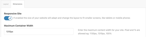
Looks like you didn’t use a Color Section element on the page, which allowed the theme to automatically create one without container constraints. Make sure to move the columns or content inside a Color Section container so they don’t go full width. You can then set the Maximum Container Width value in Enfold > General Layout > Dimensions as shown in the screenshot below.
Best regards,
Ismael
Hey Dave Chapple,
Since upwork is not available at fontello, you will need to convert your upwork image into a iconfont and add the correct code to your functions file:
function avia_add_custom_icon($icons) {
  $icons['tiktok'] = array( 'font' =>'fontello', 'icon' => 'ue800');
  return $icons;
  }
  add_filter('avf_default_icons','avia_add_custom_icon', 10, 1);

  function avia_add_custom_social_icon($icons) {
  $icons['TikTok'] = 'tiktok';
  return $icons;
  }
  add_filter('avf_social_icons_options','avia_add_custom_social_icon', 10, 1);
  add_filter('avia_social_share_link_arguments', 'avia_add_social_share_link_arguments', 10, 1);
  function avia_add_social_share_link_arguments($args){
      $tiktok = array('tiktok' => array("encode"=>true, "encode_urls"=>false, "pattern" => "https://www.tiktok.com/", 'label' => __("Share on TikTok",'avia_framework')));
      $args = array_merge($tiktok, $args);
      return $args;
  }
You will need to adjust the code to suit your icon which has a custom code from fontello.
Please also note that you need to login to support and not use the contact form, it is not appropriate for support questions. Your support license expired a year ago, so please renew. (Supported until: 2025-02-19)
If you are unable to login to the support forum because you don’t have a activate support contract, please try going to your Theme Forest account and renew your support and then log in to the support forum and open a new thread.
Best regards,
Mike
Hi,
Glad that Ismael could help, if you have further questions please open a new thread and we will try to help. Thanks for using Enfold.
Best regards,
Mike
Hi,
Thanks for the update. The coming soon page on your site is not generated by Enfold, it looks like it might be coming from the Under Construction plugin.
Best regards,
Rikard
This reply has been marked as private.
I’m unable to disable the maintenance page. I’ve gone through the forum but couldn’t find a solution. Could you please help me with this?
I usually rely on a plugin, but after trying Enfold’s built-in maintenance mode, I ran into issues. Thanks for your assistance!
Hey ist_int,
Thanks for using Enfold. We can give the shortcodes for them instead. Which demo pages are you interested in?
Best regards,
Rikard
 Dave Chapple
Guest
I have found an SVG file for the Upwork icon. I have uploaded it to the media library. I have also followed the directions to upload through the “import/export” Enfold theme UI. When I upload as a straight SVG, it tells me it needs to be a ZIP file. So when I compress and make it a ZIP file, it is represented in (i think) the media browser) but it does not show up as a selection in the icons list under social profiles. This is very confusing. Where does the SVG end up so it can be selected within the social profile icons? Seems like a link to the media library would make sense.
Understanding where the sag icon is stored and how it is called into action would help.
I studied the code and I dont see how the new icon is being referenced and from where.
Here is the link to the icon below in “private Content”
 Leo
LeoGuest
Dear,
I have purchased the enfold wordpress site over 10 years ago. i have a problem with my child theme when i update the PHP to 8.3, i will get a critical error which i can’t resolve and manually im forced to switch it back to 7.4.
I can’t find my license code anywhere so i’m trying this way how i can get support on this issue to solve it.
Sincerely regards,
Leo
Hi,
Can’t find a way to use Cloudflare Turnstile into Enfold forms (instead of Google reCAPTCHA).
I see people asking for it for quite some times now but no updates in the feature request threads.
Is there any chance to get it in short times? :)
Thanks!
Hi guys,
I’ve just purchased another Enfold license and really enjoy working with the theme. To speed up the development process, I’d like to request the Layout Builder template files so I can import them into a new page. Is there a link where I can download the templates for all demos?
Looking forward to your reply.
Thank you!
Enfold + Mailter + WPML produces this problem. Currently the only working fix I’ve implemented is:
/**
* ========================================
* FIX Enfold Grid Layout Blog – Mailster – WPML
* ========================================
*/
/**
* 1. Exclude Mailster newsletters from the Enfold blog Grid Layout
*
* Issue: WPML adds SQL conditions that include non-translatable post types
* through an OR clause, causing newsletters to appear in the Grid Layout.
*
* Solution: Modify the final SQL query to explicitly exclude ‘newsletter’
*/
add_filter(‘posts_request’, ‘aiteb_exclude_newsletter_from_blog’, 999, 2);
function aiteb_exclude_newsletter_from_blog($sql, $query) {
// Only frontend
if (!is_admin() && !empty($sql)) {
// Exclude newsletter adding AND condition
if (strpos($sql, “wp_posts.post_type”) !== false) {
$sql = str_replace(
“WHERE 1=1”,
“WHERE 1=1 AND wp_posts.post_type != ‘newsletter'”,
$sql
);
}
}
return $sql;
}
Hi,
There is no icon specific to Upwork, but you can add one using the Iconfont Manager. Please check this documentation.
— https://kriesi.at/documentation/enfold/social-share-buttons/#how-to-add-custom-social-icons-to-enfold-options
— https://kriesi.at/documentation/enfold/icon/
If you have any additional questions at this time we kindly ask that you open them up in a separate thread. The longer threads get in the forum, they become more difficult to support as they tend to drift off topic and they also make it troublesome for users trying to search for solutions. Keeping threads relevant to their original inquiry ensures that we can keep better track of what has been resolved and that users can more effectively find answers to similar issues they might be experiencing.
Thanks!
Best regards,
Ismael
thx Mike,
this works, but only if I host the video directly on the webspace – see right column on the page mentioned
If I host the video on AWS (left column) nothing happens.
the direct AWS url in browser starts the video: https://2026-02-eins.s3.eu-north-1.amazonaws.com/Ronald-Video.MP4
As mentioned, we want to host the video son AWS, so the questions remains: How to configure it in Enfold, that the AWS hosted video plays, too ?
thx again & best regards Tilman
Hey grimkraneveld,
We could take a look and your page if you post a link to it with a admin login. There could be the possibility that the popup script is conflicting with the built-in popup script, which you can disable in the theme sttings and check again. Or some layerslider premium addon require the full paid version of the layerslider and not the free version that comes with the Enfold theme.
Best regards,
Mike
Hey Sebastian,
It looks like the Tab Section element: https://kriesi.at/themes/enfold-2017/elements/tab-section/#layer-slider-plugin
Jive it a try.
Best regards,
Mike
 Claudia Aschauer
Guest
Dear Kriesi Team,
I hope you are doing well.
In 2020, I purchased the Enfold Theme and installed it on our website. I recently tried to update the theme, but unfortunately I was unable to do so. I checked my Envato/Themeforest account, but I cannot find the purchase there. I also searched through all my emails and documents but could not locate the purchase code.
Could you please check your database and help me recover the purchase information?
My Envato account has been active since September 2020, so the purchase should have been made around that time.
Thank you very much in advance for your support. I appreciate your help.
Kind regards,
Claudia Aschauer
Hi amanda-mdllc,
Please open a new thread.
Best regards,
Rikard
Hi Ismael,
thanks – I have added different version s of this coulmn using different settings. It all does not lead to the result I would like to have.
Like here: the video plays, and the rest of the site is still visible:
On this page the video is hosted @youtube and linked with the enfold video element.
Also loading the video directly on the web space did not lead to the way I would like to show it, or I still have the wrong settings. But I think I do not know where to change the settings. Cookie settings I had changed it is correct.
Shall I use better the image element with link to the video Or the video element ? on the dev site mentioned I´v tried both
would be great to know how to fis this.
thx a lot & best regards
Tilman
-
This reply was modified 1 month, 2 weeks ago by
 oestersund.
Hi,
Thank you for the update.
We temporarily disabled the Enfold > Performance > File Compression settings, and this seems to have fixed the issue with the toggles. Please make sure to purge the cache before testing.
Best regards,
Ismael
Hey frankb54,
Thank you for the inquiry.
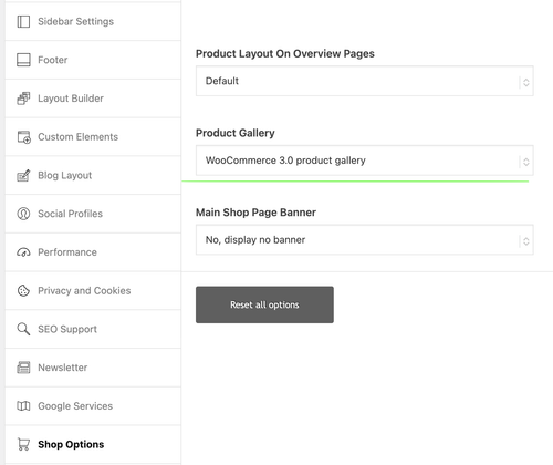
That is the default behavior when using the theme’s product gallery. To change this, you need to set Enfold > Shop Options > Product Gallery to WooCommerce 3.0 product gallery. Please check the screenshot below.
Best regards,
Ismael
Hey Tilman,
Thank you for the inquiry.
Please try to edit the Video element and set the Advanced > Privacy Settings > Lazy Load Videos option to Always load videos.
You may also need to go to Enfold > Privacy & Cookies > Cookie Handling > Default Cookie Behaviour and set it to the first or second option to allow videos to play or load automatically.
Let us know the result.
Best regards,
Ismael
Hello,
I have just purchased and installed a new ENFOLD theme and I have received a message from my host indicating a vulnerability alert.
I have also received the same feedback on other sites created with ENFOLD.
——-
Vulnerability analysis
1Alert detected
We automatically perform daily scans and scans whenever a new extension or theme is installed, using the WPScan vulnerability database. Learn more
Vulnerability alert
Detected vulnerabilities are sent by email to
1 warning
Enfold
This theme is active. Please activate another theme.
——-
Thank you for your help.
Kind regards,
Christophe
Hi Rikard
I deactivated all plugins and deleted the CSS, no change.
Please note, this issues checked with ChatGPT:
Here’s a clear English version of your text:
> Why does the page “jump up and down”?
> The cause isn’t the button itself, but the combination of:
> – multiple anchor links using #kontaktformular
> – Enfold’s **sticky header + scroll offset**
> – possibly **animation or lazy loading**
>
> 👉 Result:
> On the first click → works correctly
> On subsequent clicks → the browser thinks:
> “I’m already at the anchor,”
> → so it briefly jumps up and down without actually scrolling.
>
> This is standard HTML behavior, amplified by Enfold.
Any thoughts how I can resolve this issue?
Thank yous so much!
Best,
Philipp
Hi there,
how can I delete that passage in the copyright line at the bottom?
Hi,
I’m not sure what you mean by pulling it from Enfold. The image in question is not a theme resource.
Best regards,
Rikard
Hey bjacomet,
Thank you for the inquiry.
Where is the site hosted? Some hosting platforms blacklist or block the source of the demo files, so the demo import will not work on those servers. You may need to manually import the demo using the XML files.
Please check this documentation for more info: https://kriesi.at/documentation/enfold/import-demos/#how-to-manually-import-a-theme-demo
Best regards,
Ismael
Hi,
If you need to display the custom field for each article, you will need to modify either enfold/includes/loop-index.php or enfold/config-templatebuilder/avia-shortcodes/postslider/postslider.php.
You can use the get_field() function to retrieve the custom field and render it within the template.
— https://www.advancedcustomfields.com/resources/get_field/
Unfortunately, this is beyond the scope of our support and is not something we can provide. We recommend hiring a freelance developer or contact Codeable for additional assistance.
— https://kriesi.at/contact/customization
Thank you for your understanding.
Best regards,
Ismael