-
Search Results
-
Hi,
I’m using an masonry gallery to show posts with images. Because I would like the images to shot at the original ratio, I’ve set it to set your own format and use no-scaling. But, the no-scaling causes large thumbnails as 800kb. With 100 posts to show, this is becoming a big page to load. See the private content field for a link to this page.
Can you recomment me another way to achieve this layout? Or another setting for the post-images?Regards,
ErwinHello,
I am using the feeds plugin to pull in posts from Substack. I have modified the feed with this css. The first two increments format the text as you can see. By default the theme seems to make the thumbnails square so I added the third increment in the css to preserve the original aspect ratio of each of the thumbnails. You can see the result here: https://sethledermanmd.com/opinion-pieces/But…I need the spacing above and below the individual poqststo be consistent, you can see that the sauce below the thumbnails is larger on the ones which have thumbnails which are horizontal because the grid seems to have the same overall depth for each post. Is there a way to have them pull in with a consistent amount of space below the thumbnails and also make he spacing above a little less in height?
Thanks so much.
/* Feedzy RSS post titles */
.feedzy-rss .rss_item .title a {
font-size: 20px !important; /* Adjust the size */
color: #3b68bb !important; /* Optional: title color */}
/* Hover effect for titles */
.feedzy-rss .rss_item .title a:hover {
color: #0073aa !important; /* Optional hover color */
text-decoration: underline !important;
}.post-entry img {
width: 100%;
height: auto !important;
display: block;
}Enfold 7.1.4
Wordpress 6.9.4
Block EditorHi team, I think I found an uncaught issue created by wrong user input. If I insert a youtube block at a page and type in this wrong URL https://www.youtube.com/embed/u0ynt7CK2og , then wordpress converts the block to an usual embed block, but without enfold there are no display issues. With Enfold active, the video thumbnail looks only half-height, and a space to the bottom end of the block. At the rendered page, there is a huge space at the bottom of the video.
The solution is to use the correct link https://www.youtube.com/watch?v=u0ynt7CK2og
I don’t need support here, only FYI.
best regardsHi Enfold team,
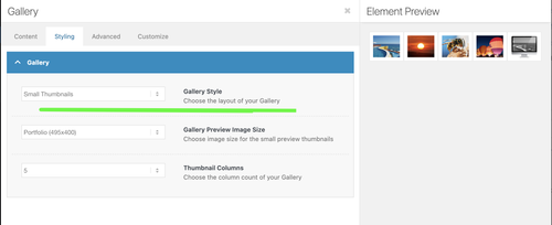
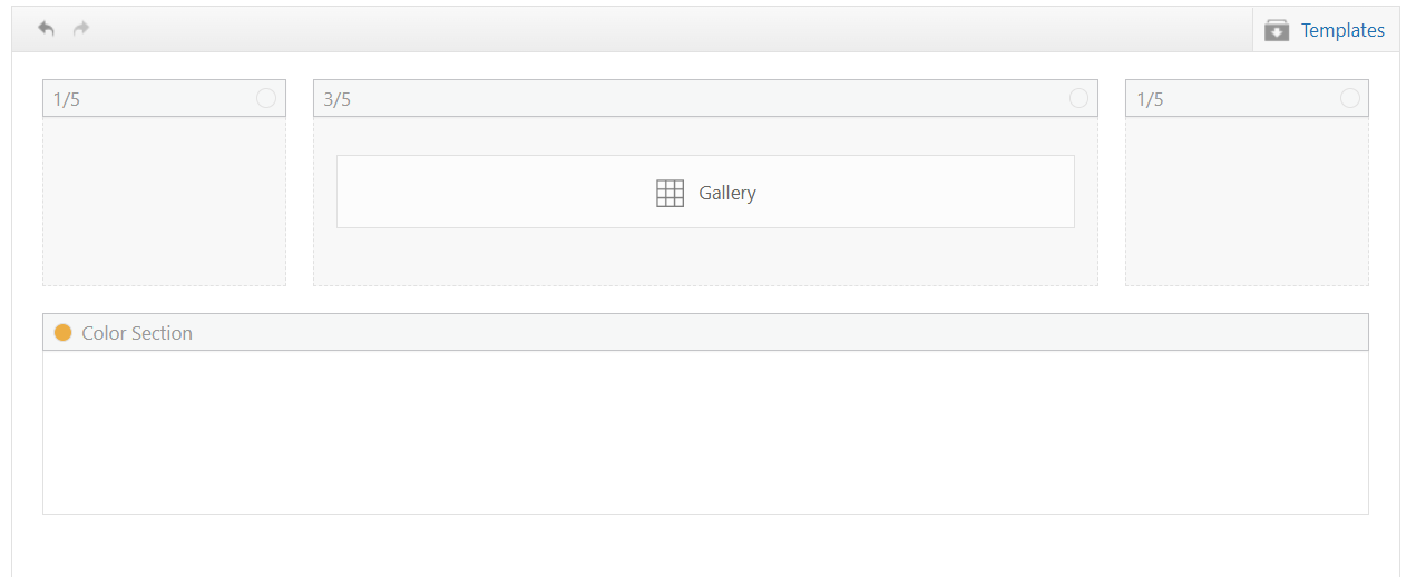
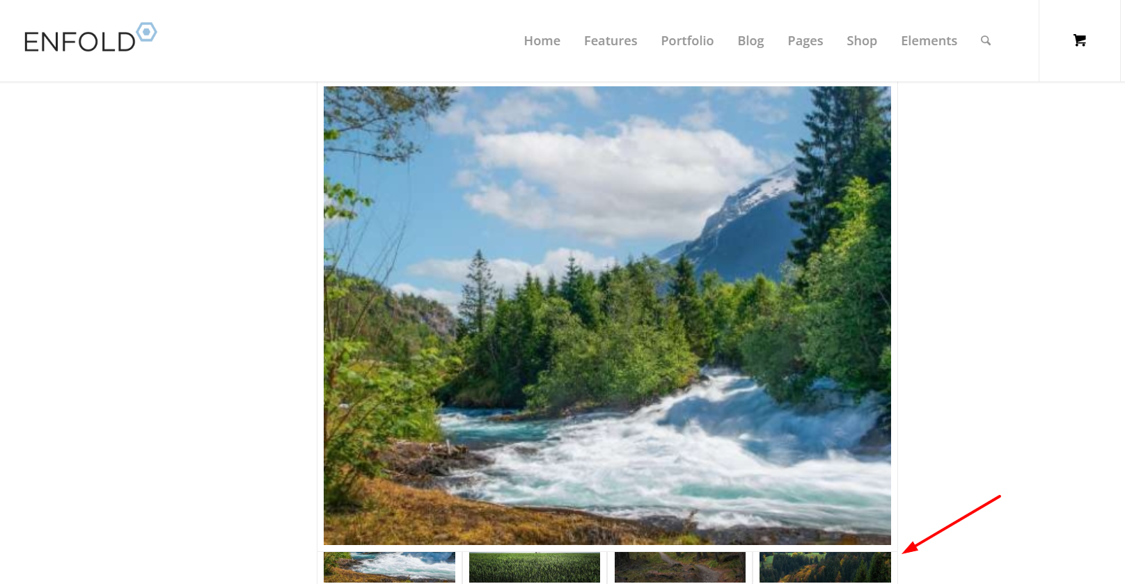
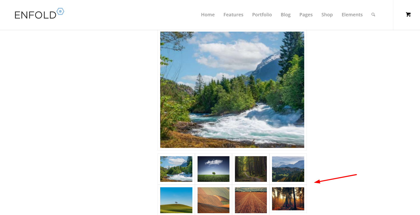
I’m using the Enfold Gallery element in WordPress (Avia Layout Builder). I’m trying to achieve a CSS-only UX like this:
The large preview image stays at the top and is sticky while the user scrolls down through the thumbnails below it.
Once the thumbnails end, the page continues scrolling normally to the next section.
I’m not using any JS. I added a custom class to the Gallery element and tried multiple CSS approaches. I can sometimes get sticky to work, but then the layout breaks (preview shifts left / preview becomes tiny / thumbnails become huge or microscopic / only a few thumbs show per row). When I fix thumbnail sizing, the sticky behavior stops working.
What I’m using
Enfold theme (latest) + WordPress
Gallery element style: big preview + thumbnails (the normal preview-on-top layout)
I added a custom class on the Gallery element: av-gallery-sticky-scroll
What I want (exact behavior)
Keep Enfold’s default layout: big image on top, thumbnails below
Make only the big preview sticky (position: sticky; top: …)
Thumbnails should remain a normal-sized grid below
No inner scrolling container — I want normal page scroll, with preview sticking until the thumbnail list ends
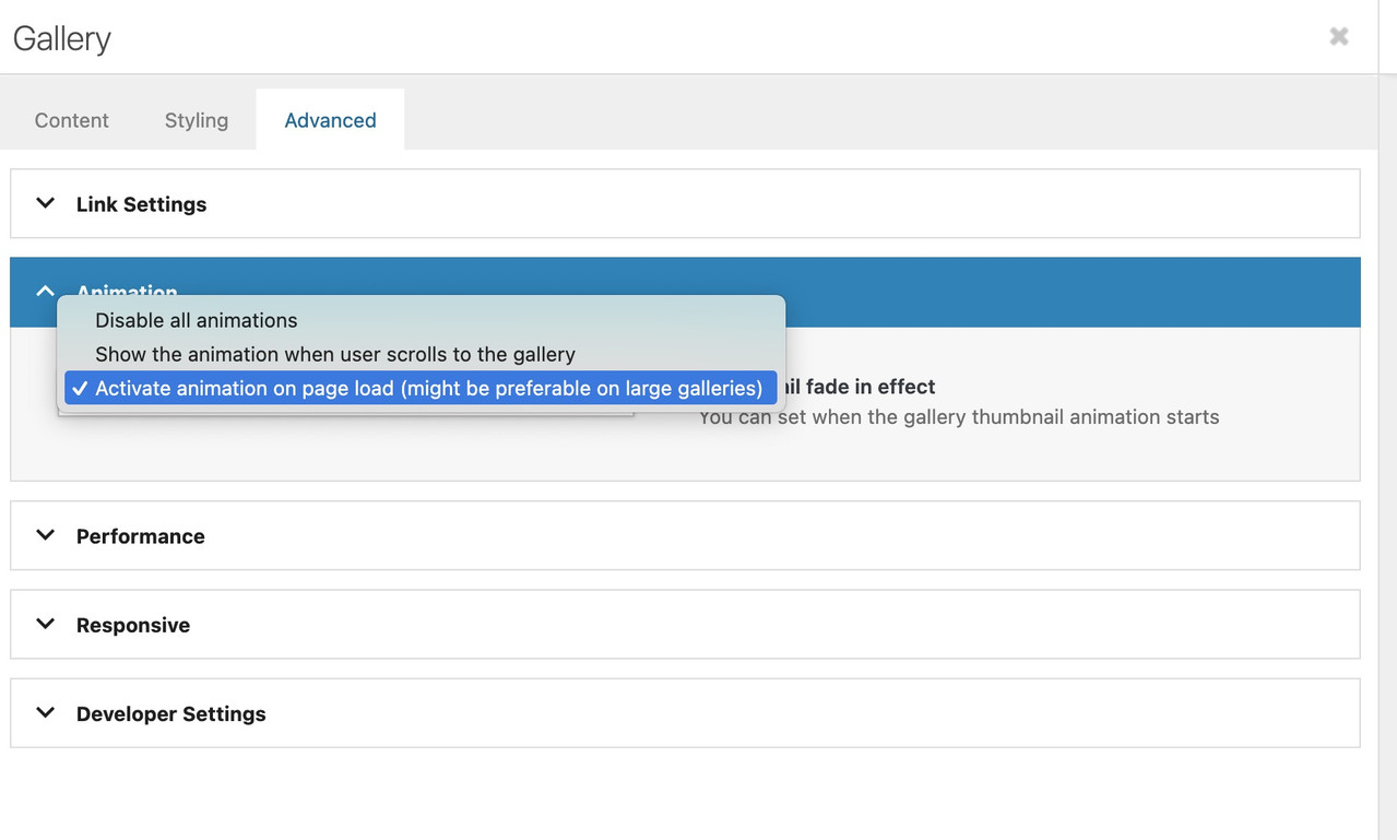
CSS attempts (examples)
I tried sticky on .avia-gallery-big and also .avia-gallery-big-inner (in case the inner wrapper is needed), plus forcing overflow: visible on likely parents. I also tried overriding thumbnail widths using flex/grid.
Example of my latest attempt:
@media (min-width: 990px){
.av-gallery-sticky-scroll{
–stickyTop: 120px;
–thumbSize: 140px;
}.av-gallery-sticky-scroll .avia-gallery-big,
.av-gallery-sticky-scroll .avia-gallery-big .avia-gallery-big-inner{
position: sticky;
top: var(–stickyTop);
z-index: 50;
}.av-gallery-sticky-scroll,
.av-gallery-sticky-scroll .avia-gallery,
.av-gallery-sticky-scroll .avia-gallery-big{
overflow: visible !important;
}.av-gallery-sticky-scroll .avia-gallery-thumb{
display: grid !important;
grid-template-columns: repeat(auto-fill, var(–thumbSize));
gap: 12px;
margin-top: 14px;
justify-content: start;
}.av-gallery-sticky-scroll .avia-gallery-thumb li{
float: none !important;
width: auto !important;
margin: 0 !important;
padding: 0 !important;
}.av-gallery-sticky-scroll .avia-gallery-thumb img{
width: 100% !important;
height: auto !important;
display: block;
}
}Result: thumbnail sizing becomes unpredictable (either microscopic or huge), and sticky often stops working.
My questions
Is it possible CSS-only to make the Gallery element’s big preview sticky (preview on top, thumbs below) without breaking Enfold’s internal thumb sizing/layout rules?
Is there a recommended selector/wrapper inside the Gallery element that is safe to apply position: sticky to?
If sticky fails because of an Enfold container overflow rule, which wrapper should I override (and is there an Enfold setting that influences this)?
If this isn’t feasible with the Gallery element, is there a recommended Enfold-native alternative (e.g., specific element/layout pattern) that support suggests?
Thanks,
Rob