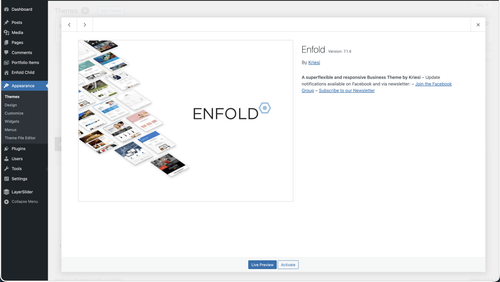
Viewing 30 results - 1 through 30 (of 10,094 total)
  • Author
    Search Results
  • #1495441

    i guess you only want to influence the lightbox images source. And because Enfold uses on default the large image. This does not always uses the original aspect ratio.

    I would not influence the thumbnail sizes of the gallery. Only the lightbox source image.
    If you are usiing the gallery element try:

    function custom_alb_lightbox_image_size( $size, $context ){
      if( $context == ('av_gallery' || 'avia_masonry') ){
        return 'original';
      }
      return $size;
    }
    add_filter( 'avf_alb_lightbox_image_size', 'custom_alb_lightbox_image_size', 10, 2 );

    Thanks mike, that looks great… any idea why the thumbnails are initially “whited out”? page is published so you can see it now. Thank you!

    There is no way around side positioning. The large image will always take up so much space that you will always find scenarios where you can only see very little of the thumbnails scrolling underneath.
    iPad landscape etc.

    Hi Mike, actually I dont want to large image to be as large as possible, just larger than the thumbnails, in a 3/5 layout. Your solution looks great. Thanks! See private details in case you want to try on test page on my site.

    Best,
    Rob

    Hi,
    Thanks for your patience, I only asked for access to your test page so we would be looking at the same thing and so I would  not need to recreate your layout on my site, nonetheless I created 1/5 + 3/5 + 1/5 columns with a gallery with large image on top and thumbnails below, and a color section with 100% min-height below that to simulate the rest of the page.
    qFouAOl.png
    My sticky header is 90px, although I see yours is 157px.
    My first impression of the layout is that the large gallery image on top is almost the full height of the screen, so the thumbnails are not really seen, I added 50px right & left padding to the 3/5 column and that helped a little
    qFoE6fR.png
    Adding 150px right & left padding to the 3/5 column was better
    qFoWUkN.png
    but I get the feeling that you want the large image to be as large as possible, and not so much empty space on the sides, so having it sticky would make the thumbnails hard to see. I tested Guenni007’s solution at: https://webers-testseite.de/ajax-gallery/#av_section_2 and other than adjusting the top: 70px to match my header it seems to work well.
    But ypur current masonry layout https://www.thomashenthorne.com/26-mooring-road-san-rafael-ca/#av_section_42
    seems much better because the user can see the thumbnails, it fills the page and the user can easily navigate the lightbox images (slideshow).

    Best regards,
    Mike

    #1495152

    Hi,

    Thank you for the inquiry.

    We replaced the iframe with the video tag, which should display a thumbnail or video cover by default using the poster attribute and have the video controls enabled automatically.

    <video width="100%" height="1000" controls poster="https://www.timm-tiegelkamp.de/wp-content/uploads/2026/02/Danny-Videocover-Foto_Web.jpg">
        <source src="https://2026-02-eins.s3.eu-north-1.amazonaws.com/Ronald-Video.MP4" type="video/mp4">
        Your browser does not support the video tag.
    </video>
    

    Best regards,
    Ismael

    #1495120

    Thanks a lot, Ismael. How can we change the code so that the column height is only the same as the video size? At my end, you see black bars above and below the video.

    e.g. like 100% instead of 1500px did not work,

    Now `ve added a second column with 1000 px height:

    <iframe src=”https://2026-02-eins.s3.eu-north-1.amazonaws.com/Ronald-Video.MP4&#8243; width=”100%” height=”1000px” scrolling=”no” allowfullscreen=”allowfullscreen”></iframe&gt

    -> but maybe there is a code to have dynamicly a correct height?

    And 2 reamining questions if we do it via a.m. code and not video element:
    a) is it possible to add a play button above the video?
    b) and how to implement/show a start pic / thumbnail?

    Thanks again for your continuous support, and best regards, Tilman.

    • This reply was modified 3 weeks, 4 days ago by oestersund.
    • This reply was modified 3 weeks, 4 days ago by oestersund.

    Hi Mike! Yes, that is the layout I was going for, but as you saw we ran into some problems, and then also I found out that lazy load has not yet been added to the performance settings of gallery element, and since we are having some bandwidth issues, I returned to Masonry block. I actually would prefer the “hero” photo of Gallery on top with thumbnails below, and the hero to be sticky as user scrolls through thumbnails because sometimes there can be 60-90 photos in one gallery. I would also need to figure out how to lazy load it…

    Thanks!
    Rob

    Hi,

    Did you add the intermediate_image_sizes_advanced filter? All we added to the functions.php file is the avf_alb_lightbox_image_size filter, which replaces the thumbnail with the full or original image.

    If you add the intermediate_image_sizes_advanced filter, no thumbnails will be generated for uploaded images and all elements will use the full size regardless of the viewport size or device.

    Installing an image compression plugin, such as WP Smush, should help optimize file generation.

    Best regards,
    Ismael

    #1495046

    Hey es.design.ma,

    Thank you for the inquiry.

    The first post is currently showing a thumbnail instead of the original image. Did you install any image or media library plugins? Please provide the login details in the private field so we can check further.

    Best regards,
    Ismael

    Hi,

    Thank you for the information.

    On the “logos-3-2” page, the images seem to be displaying at their original size. If you’re referring to the images inside the lightbox or image modal, you can add the following code to the functions.php file to display the original image instead of the default “large” thumbnail.

    function avf_alb_lightbox_image_size_mod( $size, $context ){
      if( $context == ('av_gallery' || 'avia_masonry') ){
        return 'full';
      }
      return $size;
    }
    add_filter( 'avf_alb_lightbox_image_size', 'avf_alb_lightbox_image_size_mod', 10, 2 );
    

    If the issue persists, please provide a screenshot of the issue using platforms like FreeImage, ImgBB, PostImages or Dropbox to upload and share the screenshot. Here are the steps to follow:

    1.) Visit the website of your chosen platform, such as Savvyify, ImgBB, PostImages or Dropbox.
    2.) Locate the option to upload a file or an image.
    3.) Select the screenshot file from your computer or device and upload it to the platform.
    4.) After the upload is complete, you will be provided with a shareable link or an embed code.
    5.) Copy the link or code and include it in your message or response to provide us with the screenshot.

    Thank you for taking the time to share the screenshot. It will help us better understand the issue you’re facing and provide appropriate assistance.

    Best regards,
    Ismael

    Hi,

    Thank you for the update.

    Please note that thumbnail generation is primarily handled by WordPress core, not the theme itself. WordPress automatically creates multiple intermediate image sizes upon upload. While themes (including Enfold) can register additional image sizes or adjust quality settings, the actual generation process is managed by WordPress.

    If you would like to disable the creation of thumbnails or other image sizes, you can add the following filter to the child theme’s functions.php file. Please make sure to create a full site backup before proceeding:

    add_filter('intermediate_image_sizes_advanced', '__return_empty_array');
    

    Best regards,
    Ismael

    Hey Dave Chapple,

    Thank you for the inquiry.

    The theme actually increases the compression quality compared to the default, which can sometimes result in heavier thumbnails or thumbnails with a larger file size than the original images. This is not intentional, but it can happen from time to time.

    Please create a test page and provide the URL in the private field so we can check the issue — screenshots would also be helpful.

    To adjust the default quality, try to add this filter in the functions.php file, then regenerate the thumbnails.

    add_filter("avf_jpeg_quality", "avf_set_quality_mod", 9999, 1); 
    add_filter("avf_wp_editor_set_quality", "avf_set_quality_mod", 9999, 1); 
    function avf_set_quality_mod($quality) { $quality = 60; return $quality;}
    

    Use this plugin to regenerate the thumbnails, but make sure to create a site backup first.

    https://wordpress.org/plugins/regenerate-thumbnails/

    Best regards,
    Ismael

    test :

    /* 1. GLOBAL STICKY PERMISSION */
    html.html_stretched, 
    html.html_stretched body#top,
    #top #wrap_all, 
    #top #main {
        overflow: visible !important;
    }
    
    @media only screen and (min-width: 768px) {
    
        /* 2. MAIN CONTAINER 
           We use CSS Grid for the 65% / 1fr split */
        #top .avia-gallery.av-gallery-sticky-scroll {
            display: grid !important;
            grid-template-columns: 65% 1fr !important;
            gap: 30px !important;
            align-items: start !important; /* Crucial: prevents big-wrapper from stretching to full height */
            overflow: visible !important;
            position: relative !important;
            width: 100% !important;
        }
    
        /* 3. STICKY WRAPPER (Left Column) */
        #top .avia-gallery.av-gallery-sticky-scroll .avia-gallery-big-wrapper {
            grid-column: 1 !important;
            position: -webkit-sticky !important;
            position: sticky !important;
            top: 100px !important; /* Adjust based on your header height */
            z-index: 100 !important;
            height: auto !important;
            margin: 0 !important;
            background: #ffffff !important;
        }
    
        /* 4. IMAGE ELEMENT */
        #top .avia-gallery.av-gallery-sticky-scroll .avia-gallery-big {
            position: relative !important;
            display: block !important;
            height: auto !important;
        }
    
        #top .avia-gallery.av-gallery-sticky-scroll .avia-gallery-big img {
            display: block !important;
            width: 100% !important;
            height: auto !important;
            max-height: 80vh;
            object-fit: contain;
        }
    
        /* 5. THUMBNAILS (Right Column) */
        #top .avia-gallery.av-gallery-sticky-scroll .avia-gallery-thumb {
            position: relative !important;
            z-index: 10 !important;
            padding: 0 !important;
            width: 100% !important;
          min-height: 100vh;  /*** we need the gallery thumbs container bigger than the big image *** /
        }
    }

    the min-height option is necessary only because my thumbs container is less high than the big image – guess your

    And change the 65% to your needs in : grid-template-columns: 65% 1fr !important;

    Yes—now your page is opening. Now please explain to me how this is supposed to work with such large images above the thumbnails—it’s obvious that these images will cover the thumbnails below.
    How about if the thumbnails scroll up to the side of the large sticky image?

    Cloudflare Ray ID: 9cac7fcdcced65d6
    change the animation at advanced tab:

    It’s exactly the problem you can see on my page now, where I’ve widened the gallery. At some point, the sticky large image is so big that you can’t see much of the thumbnails scrolling underneath it.
    Therefore, it’s really only suitable if the column with the gallery is narrower.

    If yo ucan give the ray ID from the cloudflare error (at bottom) we can fix.

    Re the image, here you go… basically the thumbnails are against the bottom of the screen and dont start to display nicely until user hovers. We are 99% there, just need some padding between bottom of thumbnails and bottom of page.

    thumbnails

    Sorry Guenni, WP Engine seems to insist on geoblocking my website even though i have told them to disable it. Can you try again? You can also see the behavior on your preview page. The thumbnails are right against the bottom of the container / page. it would be great if the container had some padding around it just under the thumbnails.

    Thank you!
    Rob

    Wow Guenni, that is a lovely piece of code!! Thank you!! Enfold should consider adding this to core functionality as it is a huge upgrade to the Gallery element.

    One question – how do I adjust the preview photo size and/or how much room the thumbnails have at the bottom of the sticky container?

    Gallery with your css is now live on this page, towards the bottom:

    https://www.thomashenthorne.com/26-mooring-road-san-rafael-ca/

    Thank you!
    Rob

    goldengate415
    Participant

    Hi Enfold team,

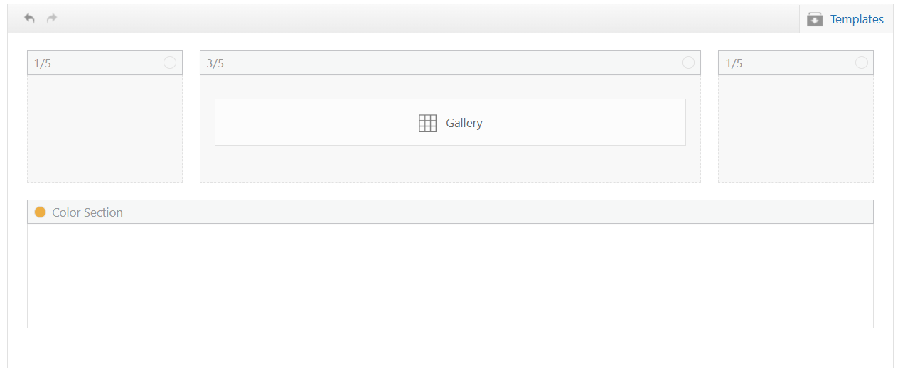
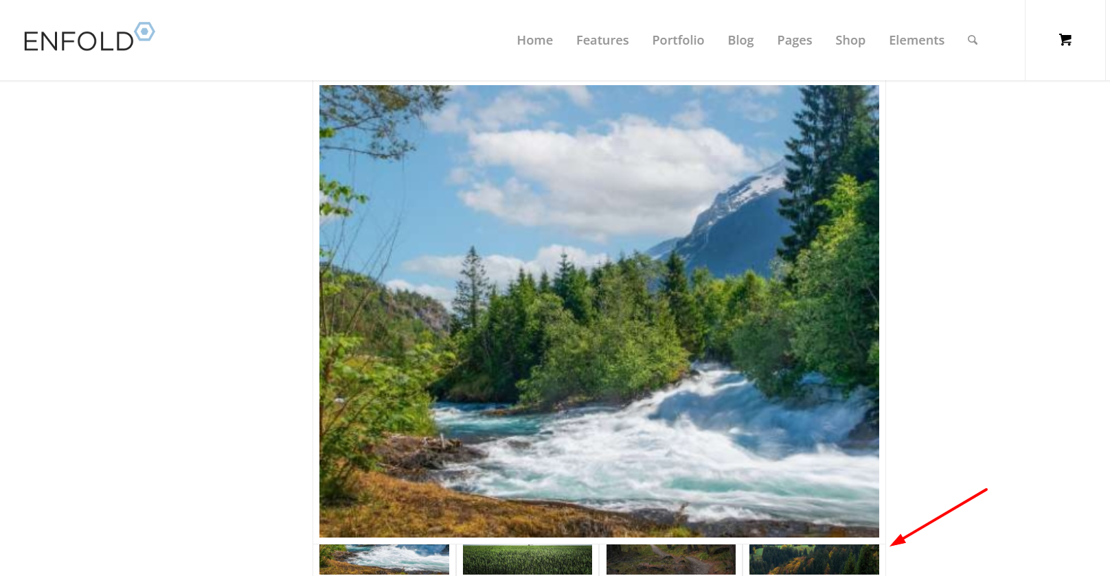
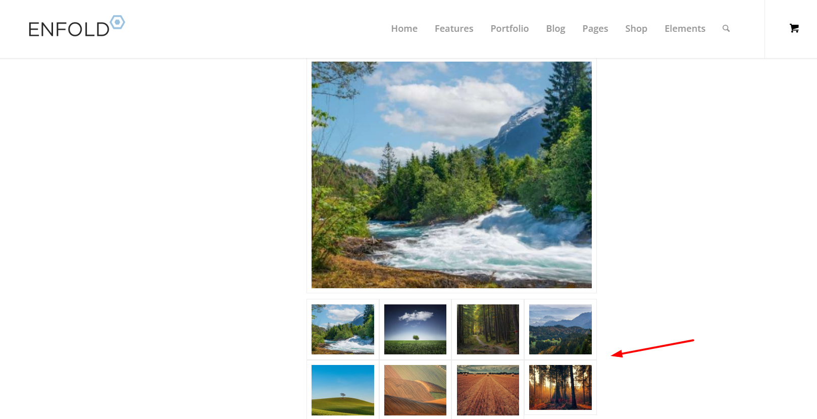
    I’m using the Enfold Gallery element in WordPress (Avia Layout Builder). I’m trying to achieve a CSS-only UX like this:

    The large preview image stays at the top and is sticky while the user scrolls down through the thumbnails below it.

    Once the thumbnails end, the page continues scrolling normally to the next section.

    I’m not using any JS. I added a custom class to the Gallery element and tried multiple CSS approaches. I can sometimes get sticky to work, but then the layout breaks (preview shifts left / preview becomes tiny / thumbnails become huge or microscopic / only a few thumbs show per row). When I fix thumbnail sizing, the sticky behavior stops working.

    What I’m using

    Enfold theme (latest) + WordPress

    Gallery element style: big preview + thumbnails (the normal preview-on-top layout)

    I added a custom class on the Gallery element: av-gallery-sticky-scroll

    What I want (exact behavior)

    Keep Enfold’s default layout: big image on top, thumbnails below

    Make only the big preview sticky (position: sticky; top: …)

    Thumbnails should remain a normal-sized grid below

    No inner scrolling container — I want normal page scroll, with preview sticking until the thumbnail list ends

    CSS attempts (examples)

    I tried sticky on .avia-gallery-big and also .avia-gallery-big-inner (in case the inner wrapper is needed), plus forcing overflow: visible on likely parents. I also tried overriding thumbnail widths using flex/grid.

    Example of my latest attempt:

    @media (min-width: 990px){
    .av-gallery-sticky-scroll{
    –stickyTop: 120px;
    –thumbSize: 140px;
    }

    .av-gallery-sticky-scroll .avia-gallery-big,
    .av-gallery-sticky-scroll .avia-gallery-big .avia-gallery-big-inner{
    position: sticky;
    top: var(–stickyTop);
    z-index: 50;
    }

    .av-gallery-sticky-scroll,
    .av-gallery-sticky-scroll .avia-gallery,
    .av-gallery-sticky-scroll .avia-gallery-big{
    overflow: visible !important;
    }

    .av-gallery-sticky-scroll .avia-gallery-thumb{
    display: grid !important;
    grid-template-columns: repeat(auto-fill, var(–thumbSize));
    gap: 12px;
    margin-top: 14px;
    justify-content: start;
    }

    .av-gallery-sticky-scroll .avia-gallery-thumb li{
    float: none !important;
    width: auto !important;
    margin: 0 !important;
    padding: 0 !important;
    }

    .av-gallery-sticky-scroll .avia-gallery-thumb img{
    width: 100% !important;
    height: auto !important;
    display: block;
    }
    }

    Result: thumbnail sizing becomes unpredictable (either microscopic or huge), and sticky often stops working.

    My questions

    Is it possible CSS-only to make the Gallery element’s big preview sticky (preview on top, thumbs below) without breaking Enfold’s internal thumb sizing/layout rules?

    Is there a recommended selector/wrapper inside the Gallery element that is safe to apply position: sticky to?

    If sticky fails because of an Enfold container overflow rule, which wrapper should I override (and is there an Enfold setting that influences this)?

    If this isn’t feasible with the Gallery element, is there a recommended Enfold-native alternative (e.g., specific element/layout pattern) that support suggests?

    Thanks,
    Rob

    Still not working as It did before before upgrade

    POSTS USED TO WORK HERE — this earlier Enfold install

    Nicer small preview image to left of Blog Excerpt

    and no featured image

    Now Grey Box shows without pencil icon…would rather see pencil or no grey box at all

    Preview images are smaller than 180 x 180 selected thumbnail — not the size selected in Post Element

    Preview images on blog listing Do not show up at all in Safari

    #1494755

    Hi,

    Thank you for the update.

    Please note that 300x300px will not be the exact size at which the thumbnails are generated. The resizing process also takes the image’s aspect ratio into account, so if the image is not perfectly square or has a different aspect ratio, it will not be resized to exactly 300x300px. This is why you’re seeing images with different dimensions.

    If you want to display a grid with uniform image sizes, you will need to upload images with the same dimensions and aspect ratio. Hope this clear things up a bit.

    Best regards,
    Ismael

    #1494642

    Hey daninap,

    Thank you for the inquiry.

    You can change the size of the thumbnails used in the gallery by adjusting the Styling > Gallery > Gallery Preview Image Size setting. Please refer to the screenshot below.

    ftVtpMQ.md.png

    Best regards,
    Ismael

    #1494533
    slikslok
    Participant

    Looking for a snippet to show a deafult image in blog views – but NOT Single view (there only images should be shwon, which are uplaoded with the post).
    I tried it like this:

    function enfold_fallback_thumb_url( $size = ‘enfold-blog-thumb’ ) {
    // Deine Fallback-ID (anpassen!)
    $fallback_id = 4283;
    return wp_get_attachment_image_url( $fallback_id, $size );
    }

    // Enfold-kompatibler Filter: Nur Übersicht, kein Single
    function enfold_fallback_thumbnail_html( $html, $post_id, $post_thumbnail_id ) {
    global $post;

    // Admin/Single/hat Bild: überspringen
    if ( is_admin() || is_singular() || $post_thumbnail_id ) {
    return $html;
    }

    // Nur Posts in Übersichten
    if ( ! is_home() && ! is_archive() || $post->post_type !== ‘post’ ) {
    return $html;
    }

    // Fallback-Bild rendern (Enfold-Size)
    $fallback_html = ‘<img src=”‘ . enfold_fallback_thumb_url( ‘enfold-blog-thumb’ ) . ‘”
    alt=”‘ . esc_attr( get_the_title( $post_id ) ) . ‘”
    class=”attachment-enfold-blog-thumb wp-post-image fallback-thumb” />’;

    return $fallback_html;
    }
    // Filter aktivieren
    add_filter( ‘post_thumbnail_html’, ‘enfold_fallback_thumbnail_html’, 10, 3 );

    But it doesn’t work. Any advices? Thakns
    Tim

    Hi Ismael

    Many thanks for your response. Unfortunately this doesn’t seem to work. Unless I’m doing something daft!

    I’ve tried adding the filter you suggested to the functions.php file in the child theme. That didn’t work. Although the previous filter for gallery images I used seems to be fine.

    I also changed the size of Large images in Settings>Media as suggested and regenerated thumbnails.

    No luck.

    Any other ideas? I’m really stuck.

    If it’s of help, I’ve attached FTP info in Private Content.

    Thanks

    Steve

    Hey steve159159,

    Thank you for the inquiry.

    You can use this filter in the functions.php file to adjust the default size of the lightbox image.

    function avf_alb_lightbox_image_size_mod($size) {
      return "full";
    }
    add_filter('avf_alb_lightbox_image_size', 'avf_alb_lightbox_image_size_mod', 10, 1);

    This defaults to large and we set it to full (the original size of the image). You can also remove this filter and adjust the size of the Large thumbnail in Settings > Media panel. You’ll need to regenerate the thumbnails afterward.

    https://wordpress.org/plugins/regenerate-thumbnails/

    Best regards,
    Ismael

    steve159159
    Participant

    Hi

    We are updating a site for our client and he wants enlarged images to display at full size (1500px) wide in lightbox when a smaller image element is clicked upon.

    We were advised to add the following into the functions.php file. However, I think this only works in an image gallery?

    function avia_change_gallery_thumbnail_link($link, $attachment, $atts, $meta){
    $link = wp_get_attachment_image_src($attachment->ID, “full”);
    return $link;
    }
    add_filter(‘avf_avia_builder_gallery_image_link’, ‘avia_change_gallery_thumbnail_link’, 10, 4);

    Is there a way of forcing enlarged images to display full size when clicking smaller or thumbnail elements?

    Thanks in advance

    Steve

    #1494153

    In reply to: Fullwidt Slider height

    Hey Sonno,

    Thank you for the inquiry.

    You can use this css code to control the height of the slider.

    #top .avia-fullwidth-slider, #top .avia-fullwidth-slider ul li {
        height: 50vh;
    }

    We recommend adding a Custom CSS Class name to the slider element and adjust the css rule accordingly so it applies only to this specific slider.

    https://kriesi.at/documentation/enfold/add-custom-css/

    Make sure the size of the selected thumbnail is appropriate to the size and aspect ratio of the modified slider.

    Best regards,
    Ismael

    #1493863

    Hey Antonio,

    Thank you for the inquiry.

    You can use the Masonry element with the Styling > Masonry Settings > Size Settings set to Flexible Masonry. Another option is to use the Column elements to create rows of Image elements, allowing you to control which image size or thumbnail is used. Let us know if you need more info.

    Best regards,
    Ismael

    #1492102

    Thanks for your response Ismail,

    How do I alter the sizes and dimension on of the thumbnails in the gallery to be the same as at https://wayneandersonart.com/gallery/nggallery/advertising-design/advertising-design.

Viewing 30 results - 1 through 30 (of 10,094 total)