-
AuthorSearch Results
-
June 15, 2022 at 2:42 pm #1355347
Murmeltier
ParticipantI have several problems that I can’t solve with my rudimentary knowledge and I hope for your help.
1. in the search result list page the text is so small that you can not read it. I would like to have there the text size 14 open sans, both in the title and in the meta data as well as in the text excerpt.
see https: https://parkinson-journal.de/?s=Ern%C3%A4hrung&id=48699
Furthermore, I fail to design the search result page, especially with a sidebar on the right and a graphic in the header.
2. the same problem “font size” exists with the ajax search result list pages,
3. i have imported about 300 pages from another blog and would now have to match them in design to my self created posts. Basically it is the graphic in the header and the font size. Do I have to rework each page manually or is there a way to do the design adjustment once for all imported posts.
June 12, 2022 at 9:27 pm #1354989Hey Eleina,
Thanks for your question, for this example I created long team member descriptions and used css to make them hidden (the borders are only for reference):

this is the css for the lightbox popup and to hide the team member descriptions:.white-popup { position: relative; background: #FFF; padding: 20px; width: auto; max-width: 500px; margin: 20px auto; } .white-popup .team-social { border: 7px solid rgba(0, 0, 0, 0.1); position: absolute; font-size: 19px; background: #fff; background: rgba(255, 255, 255, 0.7); opacity: 0; visibility: hidden; top: 0; left: 0; right: 0; bottom: 0; text-align: center; border-radius: 3px; } .avia-team-member .team-member-description { visibility:hidden; }Then I added this code to the end of my child theme functions.php file in Appearance ▸ Editor:
function clone_team_member_to_lightbox_popup() { ?>
  <script>
window.addEventListener('DOMContentLoaded', function() {
(function($){
   $('.avia-team-member').each(function () {
        var copyTeam = $(this).clone().html();
$(this).magnificPopup({
    items: {
        src: $('<div class="white-popup">'+copyTeam+'</div>'),
    },
    type: 'inline'
});
});
})(jQuery);
});
  </script>
  <?php
}
add_action('wp_footer', 'clone_team_member_to_lightbox_popup');
Then on click the team member element opens in a lightbox with the team member description showing.

*recommended css thanks to Guenni007 to have the team member image to the left and content to the right instead of below.mfp-content { display: inline-flex !important; } .white-popup { position: relative; background: #FFF; padding: 20px; width: auto; max-width: 800px; margin: 20px auto; } .white-popup .team-img-container { max-width: 300px; float: left; margin: 0 20px 10px 0 } .white-popup .team-member-name, .white-popup .team-member-job-title, .white-popup .team-member-description { width: 100%; }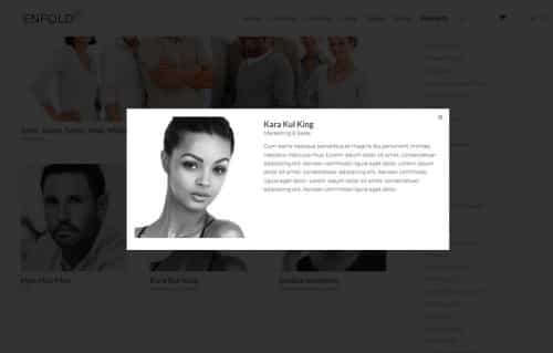
Best regards,
Mike-
This reply was modified 3 years, 7 months ago by
Mike.
June 11, 2022 at 4:40 pm #1354918In reply to: blog page not working regularly
Hi,
I changed the css to this:.custom-masonry-cat, .av-post-metadata-category-link a { color: #719430; font-family: 'caveat'; font-size: 16px; text-align: center; display: block; font-weight: 700; text-transform: uppercase; }please clear your browser cache and check.
Best regards,
MikeJune 11, 2022 at 12:39 pm #1354903In reply to: blog page not working regularly
Hi,
Thank you for your patience I changed the function to this so the categories would be over the title like on your article slider in the homepage:add_filter( 'avf_masonry_loop_prepare', 'avf_masonry_loop_prepare_mod_cat', 10, 2 ); function avf_masonry_loop_prepare_mod_cat( $key, $entries ) { $categories = get_the_category($key['ID']); $separator = ' '; $output = ' <div class="custom-masonry-cat">'; if ( ! empty( $categories ) ) { foreach( $categories as $category ) { $output .= '<span alt="' . esc_attr( sprintf( __( 'View all posts in %s', 'textdomain' ), $category->name ) ) . '">' . esc_html( $category->name ) . '</span>' . $separator; } } $output .= '</div>'; $key['text_before'] .= trim( $output, $separator ); return $key; }and added this css to match your article slider in the homepage:
.custom-masonry-cat {
	 color: #719430;
	 font-family: 'caveat';
	 font-size: 16px;
	 text-align: center;
     display: block;
     font-weight: 700;
     text-transform: uppercase;
}
please clear your browser cache and check.
Best regards,
MikeJune 10, 2022 at 7:47 pm #1354866In reply to: Enfold CSS overriding Block Editor's CSS
Hi,
If you check the block editor CSS specificity here: https://polypane.app/css-specificity-calculator/, then you will see that is has a specificity of 0,0,0, which is the lowest possible. The theme CSS which is applying it has a specificity of 0,0,1, just slightly higher. The CSS on your live site:
.wp-block-columns:where(.has-background)Has a specificity score of 0,1,0, which would explain why it is trumping the theme styling. It seems to me that this is intentional, maybe because theme styling should apply, if any is available. I would advice that you try to post this question on a general WordPress help forum and ask why the specificity of the CSS in question is so low.
If you want to change this yourself, then you would have to remove the padding argument from base.css in the theme:
html, body, div, span, applet, object, iframe, h1, h2, h3, h4, h5, h6, p, blockquote, pre, a, abbr, acronym, address, big, cite, code, del, dfn, em, img, ins, kbd, q, s, samp, small, strike, strong, sub, sup, tt, var, b, u, i, center, dl, dt, dd, ol, ul, li, fieldset, form, label, legend, table, caption, tbody, tfoot, thead, tr, th, td, article, aside, canvas, details, embed, figure, figcaption, footer, header, hgroup, menu, nav, output, ruby, section, summary, time, mark, audio, video {
    margin: 0;
    padding: 0;
    border: 0;
    font-size: 100%;
    font: inherit;
    vertical-align: baseline;
}
Best regards,
Rikard-
This reply was modified 3 years, 9 months ago by
Rikard.
June 10, 2022 at 6:04 pm #1354854In reply to: blog page not working regularly
Hi Nikko,
that makes it turn green and a smaller font size, though not the same font type as is the article slider in the homepage. I’m not sure what the font name is or why the category name link looks different in different places. It would be nice to have it look the same everywhere, for instance in each individual article page too. Is that possibile?Best regards,
ElenaJune 10, 2022 at 12:08 pm #1354797In reply to: subtitle to the right of the logo
if you look on top of this page here ( our forum ) you see kriesi logo with additional Text.
if you look to the DOM :
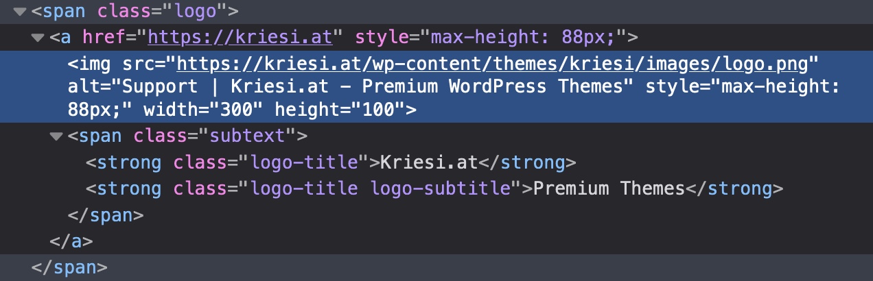
this might be done in a similar way – and because i do take the same classes – you can see how the board has set its css for itadd_filter('avf_logo_subtext', 'kriesi_logo_addition'); function kriesi_logo_addition($sub){ $sub .= "<span class='logo-title'>"; $sub .= get_bloginfo( 'name', 'display' ); $sub .= "</span>"; $sub .= "<span class='logo-title logo-subtitle'>"; $sub .= get_bloginfo( 'description', 'display' ); $sub .= "</span>"; return $sub; }/*position logo text*/ #top .subtext{float:left; position: relative;} #top .logo img{float:left;} #top .logo, #top .logo a{overflow: visible;} #top .logo-title{ transition: opacity 0.4s ease-out; -moz-transition: opacity 0.4s ease-out; -webkit-transition: opacity 0.4s ease-out; -o-transition: opacity 0.4s ease-out; font-size: 12px; color: #000; position: absolute; left:7px; top:-7px; opacity: 1; white-space: nowrap; } #top .logo-subtitle{ color: #aaa; top:7px; } #top .header-scrolled .logo-title{ opacity: 0; filter: alpha(opacity=0); } @media only screen and (max-width: 989px) { .responsive #top .logo-title{ opacity: 0; filter: alpha(opacity=0); } }June 10, 2022 at 6:21 am #1354750In reply to: White Space/Gap Below Slider
Hi 1stamerican,
I think the issue might be due to caching (older js and CSS files are fetched)
As for the mobile slider font issue, edit the Fullwidth Easy Slider, edit the slide item, and go to Styling > Font Sizes > Caption Title Font Size then click the mobile icon and set it’s font to another size. (screenshot in private content)
Hope it helps.Best regards,
Nikko-
This reply was modified 3 years, 9 months ago by
Nikko.
June 10, 2022 at 1:51 am #1354736Hi,
I mean that for mobile screens to have the footer text in a single line the text will be very small, you can see what I mean by trying this code in the General Styling ▸ Quick CSS field or in the WordPress ▸ Customize ▸ Additional CSS field:@media only screen and (max-width: 620px) { .avia-buttonrow-wrap.footer-buttonrow .avia-button { font-size: 8px; padding: 9px 2px 7px; } }if your button text was less characters it would be better perhaps like: Conditions | légales | Confidentialité
To remove the border from the buttons try this code in the General Styling ▸ Quick CSS field or in the WordPress ▸ Customize ▸ Additional CSS field:
#top .avia-buttonrow-wrap.footer-buttonrow .avia-button.avia-color-light {
    border: none;
}
After applying the css, please clear your browser cache and check.
Best regards,
MikeJune 9, 2022 at 11:52 pm #1354729Topic: Menue Font Size
in forum Enfoldmwinter
ParticipantHello, we want to change the font size in the menu. Unfortunately it does not work under advanced settings. Here in the screenshot we have set the size 25, but it is not changed.
Here the Screen:
 (Full Size: https://ibb.co/FBq4yh7)
 -
This topic was modified 3 years, 9 months ago by
mwinter.
June 9, 2022 at 7:14 pm #1354703In reply to: Mobile VIew
Hi,
Please try this CSS instead:
@media only screen and (max-width: 767px) {
.home .slideshow_align_caption h2.avia-caption-title {
  font-size: 28px !important;
}

.home .avia-caption-content p {
  font-size: 14px !important;
}
}
Best regards,
RikardJune 9, 2022 at 6:17 pm #1354698This reply has been marked as private.June 9, 2022 at 1:54 pm #1354653In reply to: Color Section background image not clearing
Hi,
Thanks for the feedback, I was looking for a phone number, but now I see it’s the text in the Enfold Theme Options ▸ Header ▸ Extra Elements ▸ Phone Number or small info text
Please try this code in the General Styling ▸ Quick CSS field or in the WordPress ▸ Customize ▸ Additional CSS field:@media only screen and (max-width: 424px) { #header_meta .phone-info { font-size:16px; } } @media only screen and (max-width: 767px) { #header_meta .phone-info { top: 64px; position: relative; width: 80%; } }After applying the css, please clear your browser cache and check.
Best regards,
MikeJune 9, 2022 at 12:00 pm #1354629In reply to: Mobile VIew
Hey tsvweinsberg,
Please try the following in Quick CSS under Enfold->General Styling:
@media only screen and (max-width: 767px) {
.home .slideshow_align_caption h2.avia-caption-title {
  font-size: 28px;
}

.home .avia-caption-content p {
  font-size: 14px;
}
}
Best regards,
RikardJune 9, 2022 at 3:33 am #1354576Hi,
Thanks for the feedback, at the smallest mobile screen size, 375px, your link text is about half of the screen width with your current font size 13px:

in order to have these in one line at this screen width you will need to back the font size 8px which would probably be hard to read, you can try with this css:@media only screen and (max-width: 620px) { .avia-buttonrow-wrap.footer-buttonrow .avia-button { font-size: 8px; padding: 9px 2px 7px; } }To remove the border from the buttons try this css:
#top .avia-buttonrow-wrap.footer-buttonrow .avia-button.avia-color-light {
    border: none;
}
After applying the css, please clear your browser cache and check.
Best regards,
MikeJune 8, 2022 at 5:53 pm #1354551In reply to: Post Slider not loading correctly
Hi,
It seems like you used to display FontAwesome icons there. You can remove following codes from custom.css file to remove those
#recent-post .slide-meta-comments a::before {
  font-family: "FontAwesome";
  content: "\f086";
  font-size: 22px;
  margin-right: 10px;
  color: #239dd8;
}

#recent-post .slide-meta-time::before {
  font-family: "FontAwesome";
  content: "\f017";
  font-size: 22px;
  margin-right: 10px;
  color: #239dd8;
}
Regards,
YigitJune 8, 2022 at 5:17 pm #1354545In reply to: Blog Post Excerpt Font size
Hi,
Thanks for that. Please try this CSS instead:
.template-blog .entry-content-wrapper p {
  font-size: 12px;
}
Best regards,
RikardJune 8, 2022 at 2:46 pm #1354530In reply to: White Space/Gap Below Slider
Hi,
Thanks for the update. Please try the following CSS as well:
@media only screen and (max-width: 767px) {
.slideshow_align_caption h2.avia-caption-title {
    font-size: 30px;
}

.slideshow_align_caption a.avia-slideshow-button {
    margin-top: 5px;
    font-size: 16px !important;
}
}
Best regards,
RikardJune 8, 2022 at 1:53 pm #1354521Hi,
As a temporary fix you can put the following in theme options -> General Styling -> Quick CSS:
@media only screen and (max-width: 767px) {
#top #wrap_all .av-inherit-size .av-special-heading-tag{ font-size: 0.8em !important; }
}
This reverts back to 4.8.3 behaviour.
But it will override custom settings for mobile < 767px (or you can wait for the next release where I will add some logic to prevent this)
New Size options
Is added to our dev repo.Best regards,
GünterJune 8, 2022 at 12:11 pm #1354514Hi Gunter,
I think what you are suggesting should solve the problem
As per guenni’s screen shot above.
Making it so the font size specified in the special heading (and all headings) only apply to the screen size specified would make sense – instead of becoming the new default size.
Then all other screen sizes are the default size as set by the theme OR as set in the new typography settings.New Size options
As a pro feature I would probably use extra percentage based sizes however scale from desktop to mobiles is not uniform so percentages never seem to work too well vs px sizes. The percentages are based on screen width desktop is 16:9 and mobiles are 9:16. So percentage driven often means the fonts are too small on mobiles when they scale down. I normally use px values for each screen size because of this.I wouldnt complain if there were more options. A Pro users being able to type in a figure and unit would be preferred as an extension to the existing options – better for developers than more dropdown options.
June 8, 2022 at 11:51 am #1354508Hi,
@thinkjarvis
Thank you for bringing this up.
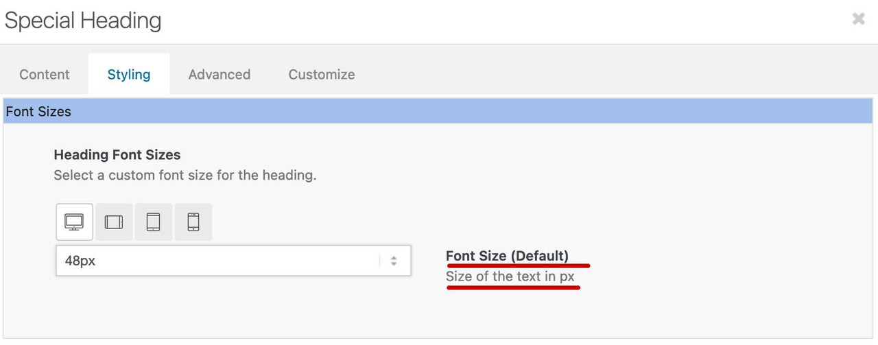
I checked the font behaviour of the “Special Heading” element with 4.8.3 (a version prior the post css file changes).
Setting Heading Font Sizes – Font Size (Default) to e.g. 50px, responsive Font sizes to “Use default”.
The 50px are used for all devices (because added inline in a style tag).
There is a media query in heading.css:@media only screen and (max-width: 767px) { #top #wrap_all .av-inherit-size .av-special-heading-tag{ font-size: 0.8em; } }And this is what I missed to implement when switching to post css file implementation.
And the only difference I can see.
Would adding this help you ?
And I’m also thinking about extending the selectable font sizes with flexible units also for responsive:
vw
em
remMaybe an option for pro users to replace the dropdown with input boxes ?
Best regards,
GünterJune 8, 2022 at 9:47 am #1354494Thanks @Guenni007
The issue is simple when you set the sizes you expect it to only affect those screen sizes and the “Default” for all other screen sizes should be the theme default OR the styles specified in the new Enfold > General Styling > Typography tab. The logic isn’t right at the moment.
This is a new change in the most recent versions of Enfold. The problem only started to occur when I moved to the latest version.
It used to work as expected but now as Guenni007 has pointed out the Default size is now the desktop size which is really silly.
@Rikard
Do you have enough to understand the issue here?I just want to add – I have over 50 Enfold licenses / sites with another 15 in progress and in about half of the cases I did not specify font sizes for the smaller screens. This means I will have to go through every heading on every page and explicitly state font sizes – Its going to take an extremely long time and is caused by a recent change in the logic.
-
This reply was modified 3 years, 9 months ago by
thinkjarvis.
-
This reply was modified 3 years, 9 months ago by
June 8, 2022 at 8:47 am #1354485if this is important for me to have a more responsive design on font-sizes – i use often the clamp method
see the heading on page: https://webers-testseite.de/heading-with-fluid-font-size/one big disadvantage on that – you had to think of column-width – because the middle font-size definition is related to screen-width.
but a 1/2 column only got 50vw of total place … and after colaps it has that 100vw again.So a perfect simple solution is not in sight. Customized solutions are then sought after. For headings that are positioned within a full-width container, one can take the min – max solution.
You can see here a nice font-size calculator to get this css definition:
https://websemantics.uk/tools/responsive-font-calculator/June 8, 2022 at 8:29 am #1354482Yes – i can confirm this for headings
on that test page i choose under styling tab : 48px and for the next ( 768-989) 40px and let the rest to default.So – I can confirm that. Strangely enough, it is also there as it is.
The first setting defines the “Default Size”. I think this is not how it should be interpreted. The format should be set there for large screens.
Or one takes it in fact here around the default to specify, it can be overwritten then in the following with another setting and if one leaves it on “default” with the smaller screen widths it is defined there relative (thus 480px to 767px) on 50% then the smaller screens accordingly smaller.June 8, 2022 at 5:04 am #1354471In reply to: Column widths of table
Hi whdsolutions,
Is this already fixed? I have checked the link and it seems to be working properly with this code:
tr th:first-child, tr td:nth-child(1) {
  width: 20%;
  vertical-align: middle;
  font-size: 15px;
  color: #2d4f76;
}

tr th:first-child, tr td:nth-child(2) {
  width: 58%;
  vertical-align: middle;
  font-size: 15px;
  color: #2d4f76;
}

tr th:first-child, tr td:nth-child(3) {
  width: 22%;
  text-align: center;
  vertical-align: middle;
  font-size: 17px;
  font-weight: bold;
  color: #2d4f76;
}
The code however is global and could affect tables on other pages, I would suggest you target the specific table using ID (#av-tm6a-293684b59095412a37110c873b903ed6).
Best regards,
NikkoJune 8, 2022 at 4:54 am #1354470In reply to: blog page not working regularly
Hi Elena,
Please try adding this CSS code as well:
.ww-masonry-cat span {
    color: #719430;
    font-size: 12px;
}
Best regards,
NikkoJune 7, 2022 at 3:39 pm #1354412In reply to: blog page not working regularly
Hi Mike,
thank you for your help.
It does show the category name, but I don’t like how it looks that much, as it is in the same font, size and color as the summary and one can hardly understand it is a category name.
Any chance it can appear in the same font and color as it appears in the article slider? (there is one at the bottom of the homepage).Best regards,
ElenaJune 7, 2022 at 2:40 pm #1354391Topic: Bug: New Typography tools clash with settings on the page
in forum Enfoldthinkjarvis
ParticipantHi team,
In the latest update of Enfold – When you specify font sizes for ALB Special Headings or Slider Headings the default sizes are not applied correctly.
If you overide the settings locally for Desktops and leave the others as default – The system seems to apply the last specified size to smaller screen sizes.
So if I create an ALB Special Heading and set the Desktop font size to 48px and the tablet size to 40px – Leaving the two smallest size as default – It automatically applies the larger size to the mobile sizes.
Essentially – Giant fonts on mobile phones causing overflow issues for sliders and headings where the container has a fixed height.Really hard to explain but this has affected every site on my server where I had left some of the font settings for smaller screen sizes as default size.
I had to go in to every header element (h1 – h6) on every page and change the mobile size defaults to specific pixel sizes to resolve the issue.
Is it possible for you to investigate? I’ll see if I can re-create the issues for you on my test server when I am next in there.
Can you try creating a special heading in a clean Enfold install and within the element change the desktop and tablet sizes to 48px leaving the smallest two sizes as default. This should cause the fonts to become massive on mobile devices instead of using the defaults.
-
This topic was modified 3 years, 9 months ago by
June 7, 2022 at 9:10 am #1354357In reply to: Move menu to center
Hi,
Thanks for the update. You can change the default body font size under Enfold->General Styling->Typography.
Facebook; did you try to activate social icons under Enfold->Header->Extra Elements?
Best regards,
RikardJune 6, 2022 at 6:56 pm #1354320In reply to: Move menu to center
This reply has been marked as private. -
This reply was modified 3 years, 7 months ago by
-
AuthorSearch Results
-
Search Results
-
I have several problems that I can’t solve with my rudimentary knowledge and I hope for your help.
1. in the search result list page the text is so small that you can not read it. I would like to have there the text size 14 open sans, both in the title and in the meta data as well as in the text excerpt.
see https: https://parkinson-journal.de/?s=Ern%C3%A4hrung&id=48699
Furthermore, I fail to design the search result page, especially with a sidebar on the right and a graphic in the header.
2. the same problem “font size” exists with the ajax search result list pages,
3. i have imported about 300 pages from another blog and would now have to match them in design to my self created posts. Basically it is the graphic in the header and the font size. Do I have to rework each page manually or is there a way to do the design adjustment once for all imported posts.
Topic: Menue Font Size
Hello, we want to change the font size in the menu. Unfortunately it does not work under advanced settings. Here in the screenshot we have set the size 25, but it is not changed.
Here the Screen:
(Full Size: https://ibb.co/FBq4yh7) Hi team,
In the latest update of Enfold – When you specify font sizes for ALB Special Headings or Slider Headings the default sizes are not applied correctly.
If you overide the settings locally for Desktops and leave the others as default – The system seems to apply the last specified size to smaller screen sizes.
So if I create an ALB Special Heading and set the Desktop font size to 48px and the tablet size to 40px – Leaving the two smallest size as default – It automatically applies the larger size to the mobile sizes.
Essentially – Giant fonts on mobile phones causing overflow issues for sliders and headings where the container has a fixed height.Really hard to explain but this has affected every site on my server where I had left some of the font settings for smaller screen sizes as default size.
I had to go in to every header element (h1 – h6) on every page and change the mobile size defaults to specific pixel sizes to resolve the issue.
Is it possible for you to investigate? I’ll see if I can re-create the issues for you on my test server when I am next in there.
Can you try creating a special heading in a clean Enfold install and within the element change the desktop and tablet sizes to 48px leaving the smallest two sizes as default. This should cause the fonts to become massive on mobile devices instead of using the defaults.