Hey shoo!
The width in my earlier css was an example. It needs to be adjusted to encapsulate the text like it’s shown in the below screenshot
http://www.awesomescreenshot.com/image/409089/535d8c0282a72e0160fd841cba49049f
Here is the css I used for this example:
.avia-caption-title {
  font-size: 22px;
  background-color: #000000;
  width: 730px;
}

.avia-caption-content {
  font-size: 18px;
  background-color: rgba(0, 0, 0, 0.7);
  width: 440px;
}
Best regards,
Dake
Hi!
Please change your code to following one
add_filter('avf_logo_subtext', 'kriesi_logo_addition');
function kriesi_logo_addition($sub) {
$sub .= "<span class='logo-title'><span class='headline'>Judith Poulteney</span><br />UCAS statements – job applications<br /> interview practice</span>";
return $sub;
}
and then add following code to Quick CSS
.headline { font-size: 40px; }
Regards,
Yigit
Hey jmorillo!
1.) I can see the issue with menu overlapping menu on tablet landscape mode. Use this code to enable mobile menu instead:
@media only screen and (min-device-width: 768px) and (max-device-width: 1024px) and (orientation: landscape) {
nav.main_menu {
display: none;
}
a#advanced_menu_toggle {
display: block;
}}
2.) Text is cut: I suggest to make font size a little bit smaller:
@media only screen and (min-device-width: 768px) and (max-device-width: 1024px) and (orientation: landscape) {
.av-special-heading.av-special-heading-h1.blockquote.modern-quote.modern-centered.avia-builder-el-2.el_before_av_button.avia-builder-el-first.av-thin-font.av-inherit-size {
font-size: 49px !important;
}}
3.) Add background-color to the code from 2.):
@media only screen and (min-device-width: 768px) and (max-device-width: 1024px) and (orientation: landscape) {
.av-special-heading.av-special-heading-h1.blockquote.modern-quote.modern-centered.avia-builder-el-2.el_before_av_button.avia-builder-el-first.av-thin-font.av-inherit-size {
background-color: red;
}}
Adjust as needed.
4.) Rebajado button:
@media only screen and (min-device-width: 768px) and (max-device-width: 1024px) and (orientation: landscape) {
span.onsale {
position: relative;
}}
5.) Price is cut:
@media only screen and (min-device-width: 768px) and (max-device-width: 1024px) and (orientation: landscape) {
#top .price, #top .price span, #top del, #top ins {
font-size: 9px;
}}
That is already quite a lot of customization, which needed a lot of time. Normally we would ask you to open separate ticket for each task/code/issue, so others from our team can answer simultaneously and you would get a faster reply.
Best regards,
Andy
Thank you so much Yigit, the problem is solved for desktop but the submit button on the mobile version isn’t aligned even though padding/font sizes are the same. You can see it here.
Any chance we can fix this? Thanks!
Any idea why I can’t change main menu font color using Advanced Styling? I can change size and font family, but the font color stays stubbornly white.
I have also tried this css with the same sad results: .main_menu ul:first-child > li > a { color: #2d5c88 !important; }
I have turned off all plugins and removed all my quick css. I do have a few lines in functions.php to add placeholders to contact form. The theme and wp are latest versions.
http://www.edswaterproofing.com/eds_wp_new_site_here/
Thanks
URL: http://www.judithpoulteney.co.uk
Hi there,
Is there any chance you can give me a code to make the first tagline in the header under the logo. The text to be enlarged is “Judith Poulteney” and should be a larger font size (40px) than the 2 lines below (they are font size 22px): see http://imgur.com/VJNZpww
Do I need to create another class in functions.php to do this?
This is what I added for all subtext on functions.php:
add_filter(‘avf_logo_subtext’, ‘kriesi_logo_addition’);
function kriesi_logo_addition($sub) {
$sub .= “<span class=’logo-title’>Judith Poulteney<br />UCAS statements – job applications<br /> interview practice</span>”;
return $sub;
}
Thanks a lot,
Susanne
-
This topic was modified 10 years, 8 months ago by
 Susanne.
Hi Mkieling!
Try Dashboard > Enfold > General Styling > Fonts. There is an option for setting the theme default font size there.
Cheers!
Elliott
I’ve looked over the forum but I can’t seem to find a fix for my issue.
I want to add a button to the right of “Header Phone Number/Extra Info” area. I currently have “Call Today: 800.608.3645” and I would like for the button to be on the right side of this text. I added the code to my functions.php file for a Header widget. I then added a widget titled Header and added Text Area to this with button code I pasted from a page ([av_button label='Client Login' link='manually,http://' link_target='' size='small' position='center' icon_select='no' icon='ue800' font='entypo-fontello' color='theme-color' custom_bg='#444444' custom_font='#ffffff']). In previous support tickets, you provided custom css to put in the custom css box. But I can’t seem to find the correct custom css for my needs. It puts the button below or above this area. I want it to be “Call Today: 800.608.3645 [Button]”- all on the same line.
http://4e5.745.myftpupload.com/
Hey shoo!
In order to add a highlight to the text, you can try using the below css, but it would affect each slide:
.avia-caption-title {
  font-size: 22px;
  background-color: #00ff00;
  width: 200px;
}
.avia-caption-content {
  font-size: 12px;
  background-color: #00ff00;
  width: 500px;
}
Alternatively, you could enlist the help of a freelancer to add this feature to the first slide only.
Regards,
Dake
Hello guys,
I am trying to change the main content font size and color, but I can’t manage to accomplish it.
I’m doing it at the right place, I think.
I’m in Enfold Theme Optoins > General Styling > Main Content.
Somehow, it’s not working.
Could you please help?
Thanks,
Miguel
Hey!
Please add following code to Quick CSS
@media only screen and (max-width: 990px) {
#top .av_seperator_big_border#header .av-main-nav > li > a {
  padding: 0 3px;
  font-size: 12px;
}
li#menu-item-search {
  display: none;
}}
Please make sure that > sign is not converted to – http://i.imgur.com/IDXRZQ3.png in Quick CSS field
Cheers!
Yigit
Hi Yigit,
thanks, but that is not what I asked for.
I think that in case of a vertical iPad view it is better not to have the mobile menu already.
So what about disable the Search icon and make the Menu fontsize and/or padding a little bit smaller?
Thank you for Help
Bernd
Hi,
The problem that I had with Full Screen Slider is that the positioning of the captions was not flexible enough and I could not get the font size or style how I wanted. The other issue is that the full screen slider is showing as more than 100% of the browser screen, i.e. the picture is too tall for the screen and doesn’t adjust.
How do I configure the Full Screen Slider to show as I need?
Kind regards
Tommy
Hi!
Please try the following in Quick CSS, it’s what you didn’t want to do (make the text smaller), but I think it works:
@media only screen and (min-width: 768px) and (max-width: 990px) {
span.avia-menu-text{
  font-size: 97% !important;
}
}
Please let us know if you’d want another solution.
Best regards,
Rikard
Hello
I’ve tried the aforementioned fixes…and my blog font is still 12px (shooting for 16px)
.blog .entry-content p {
font-size: 16px !important;
}
Any ideas?
Hello Elliot!
Due to the size and location of my logo, I don’t believe that reduction in the size of the logo will work, and I don’t want to reduce the font size on the menu. In the vertical view there is already little padding between elements as well.
So, after reviewing my menu and secondary pages, I have would like to request another solution.
Is there a quick css that will enable the mobile view of the site for vertical tablet view? This would include the menu and all page content (trying to keep things uniform).
Essentially, if the menu changes to mobile, is there a quick css that will change all the content to mobile view (menu and all)? Only in vertical tablet though… not tablet horizontal.
Thanks for that. I elaborated slightly. With font size set to 32px in the element and the code below font size and centering will be good on every size device I can think of.
@media only screen and (max-width: 420px) {
.av-image-caption-overlay-center{
padding: 0px 0.5em !important;
font-size: 24px!important;}
}
@media only screen and (min-width: 768px) and (max-width: 800px) {
.av-image-caption-overlay-center{
padding: 0px 0.5em !important;
font-size: 18px!important;}
}
@media only screen and (min-width: 801px)
{
.av-image-caption-overlay-center{
padding: 0px 0.5em !important;
font-size: 24px!important;}
}
-
This reply was modified 10 years, 8 months ago by
 rdswestnet.
Hey Aleigh!
How are you trying to change it? Reduce the font size? Reduce padding between elements?
Regards,
Elliott
Hey mawebdesign!
Add this to your custom CSS.
#header_meta .sub_menu a {
  font-size: 16px;
}
Best regards,
Elliott
Hi Mborie!
You could give the elements a font size using vw units which scale depending on the screen width.
font-size: 50vw;
Or you could use some media queries to change the size on different screen sizes.
@media screen and (max-width: 767px) and (min-width: 900px) { /* set it to 50px */ }
@media screen and (max-width: 400px) and (min-width: 767px) { /* set it to 25px */ }
@media screen and (max-width: 400px) { /* set it to 12px */ }
Or you could add the text inside the image itself.
Cheers!
Elliott
-
This reply was modified 10 years, 8 months ago by
 Elliott.
Hello,
this is the Main Menu on a desktop:
On an iPad it looks like that:
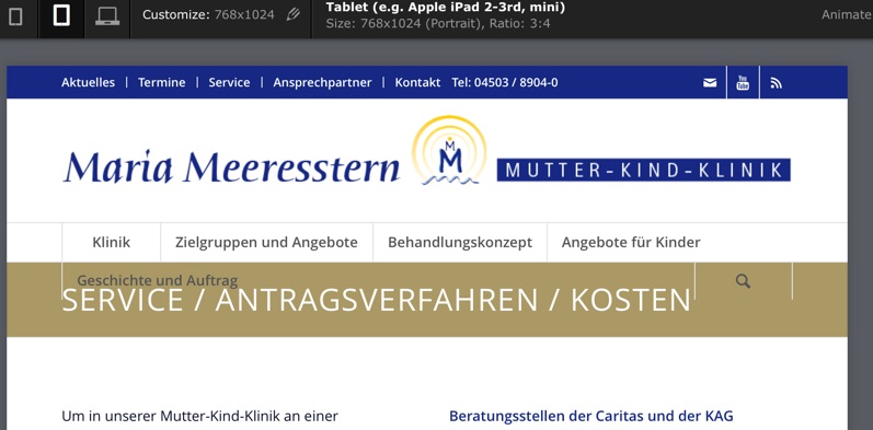
Is it possible to disable the search icon here and minimize the Menu fontsize, so that it fits again?
Glad about Help!
Bernd
Hi PRuuPH!
In order to affect a single page or post you can use a page-id to apply the changes to that page/post only:
.page-id-37 .main_color .av-inner-masonry-content, .main_color .avia-arrow {
  background-color: red;
}
Font Color:
.av-masonry-entry .av-masonry-entry-title {
line-height: 1.3em;
margin: 0;
font-size: 15px;
}
Overlay opacity:
.avia_desktop .av-hover-overlay-active .av-masonry-image-container {
opacity: 0.5;
}
Cheers!
Dake
Hi,
I’m building a slider on Enfold with the layerSlider plugin, but i can’t find any options or referenced good settings to make text blocks font-size as <p> or <h2> rescaling as the window resizes down (or on smaller devices). I’ve even noticed the same problem when i use the Enfold Demo slider on my front page.
Can you tell me what the good procces is, to make this work and where to set theeses options ?
Following are my actual layout options:
Slider width: 100%
Slider heigh :474
Responsive: On
max-width: none
Full-width: On
Responsive under: 2500
Layers container: 2500
As the site is still on a localhost, i actually can’t give any acces to it.
Best Regards
Hey!
Please add following code to Quick CSS
.avia-testimonial-content {
  font-family: Open Sans;
  font-size: 16px;
  font-weight: 600;
  color: black;
}
.avia-slider-testimonials .avia-slideshow-arrows {
  display: none;
}
Cheers!
Yigit
Hi wiwaldi79!
Please add following code to Style.css file of your child theme
.home #av_section_6 a {
  font-size: 60px;
  text-decoration: none!important;
}
Regards,
Yigit
Hi!
would be better for us if you separate each question/issue into different tickets, because then we can answer simultaneously and you would get a faster reply.
2.) I can’t see any captions for mobile devices. Did you remove them? Could you please provide us admin access so we can take a deeper look? post login details here as private reply.
However, try this code to control font-size of captions:
.av-inner-masonry-content-pos {
font-size: 6px;
}
and this to control height of captions:
figcaption.av-inner-masonry-content.site-background {
height: 35px;
}
Hope this helps.
Regards,
Andy
Hi rdswestnet;
I think it happens because of “padding” and “font size”.
try to add theses lines into your custom css file or the quick CSS area :
/* Mobile Styles ================================================== */

@media only screen and (max-width: 990px) {
.av-image-caption-overlay-center{
padding: 0px 0.5em;
font-size: 24px; }
}
I reduced the font size of the headline and caption, unfortunately it still does not fix the problem on the mobile layout. I’ve tried adding different sizes of slider image but there’s still not enough space to accommodate the CTA button on mobile layout. I think the problem here is the way the theme resizes the slider image on a mobile layout. Is there any way we can use CSS so that when it resizes the slider image on mobile it will use a resolution large enough to accommodate all elements within the slider?
No. I need the style I first posted for desktop display. As I mentioned, I tried all different variations of styles and media assignments (including the above style set only to desktop and specific media styles for every screen size between phone and desktop). Nothing is changing anything on the table, no matter what I do. Even font size. I’m attaching two screenshots showing the displays (both horizontal and vertical). Sending admin access just in case as well.
(Also finding it odd that if I take all of my styles out of quick css and put them in the custom file, those styles will no longer work).
http://janeyj.com/graphics/iPadVert.png
http://janeyj.com/graphics/iPadHor.png
Hey
Heute im Angebot; ein kleines Problem mit Hang zur Kuriosität.
Ich würde gern die Schriftfarbe eines einzelnen Eintrag im mobile-menu ändern.
Dazu habe ich diesem eine eigene CSS-Klasse und diverse Stil-Attribute zugewiesen (In meinem Fall “font-style”, “font-size” und “text-align”).
Das funktioniert, nur die Schriftfarbe will sich partout nicht ändern.
Das Kuriose ist, im Browster “kleines Fenster” geht es, aber nicht auf smartphones.
Was funktioniert ist “#mobile-advanced a”, für [u]alle[/u] Einträge, ich bräuchte allerdings nur einen bestimmten, wie hat die genaue CSS-Anweisung auszusehen!?
Schönen Restsonntag und vielen Dank