The following message came from Google about the Enfold theme, please advise on how to fix this?
Usability error Pages with errors
1 Viewport not configured 16
2 Small font size 16
3 Touch elements too close 16
4 Content not sized to viewport 8
-
This topic was modified 10 years, 8 months ago by
 ejo14.
Hi videogame!
Add this to your custom CSS.
.product_meta span {
  font-size: 15px;
}
.product_meta { padding: 10px; }
Cheers!
Elliott
Hi Team,
I can’t get the wanted font size on smartphones for my Fullscreen Slideshow on http://www.webigami.de
On iPad landscape and portrait I could manipulate the font size of caption and content. But it just doesn’t work with this code on my iPhone:
/** Fullscreen Slideshow Heading anpassen Smartphone */

@media only screen and (max-width: 467px) {
div .slideshow_caption h2 { font-size: 60px !important; }
div.avia-caption-content { font-size: 25px!important; }
#top .avia-slideshow-button { font-size: 18px; }
}
I’m using these codes for the iPad views:
/** Fullscreen Slideshow Heading anpassen Tablet Hochformat*/

@media only screen and (max-width: 768px) and (min-width: 481px){
div .slideshow_caption h2 { font-size: 80px !important; }
div.avia-caption-content { font-size: 28px!important; }
#top .avia-slideshow-button { font-size: 20px; }
}

/** Fullscreen Slideshow Heading anpassen Tablet Querformat*/

@media only screen and (max-width: 1024px) and (min-width: 769px){
div .slideshow_caption h2 { font-size: 100px !important; }
div.avia-caption-content { font-size: 32px!important; }
#top .avia-slideshow-button { font-size: 22px; }
}
Please advise!!!
Thanks,
Jan :)
-
This topic was modified 10 years, 8 months ago by
 WEBIGAMI.
Hi guys,
Hope this is not beyond your scope of support. Please let me know to which css element should I apply rule to control padding (and font size) of the line showing SKU number and tags on Woocommerce Single product page.
Many thanks in advance, regards,
Ivan
Hello Ismael,
I understand the issue. Thanks for trying to help me.
I looked again and tried what you said. The pages loads fine and sometimes I get the text,
but sometimes it still now showing.
Please look at this:
On the moment I can’t see the text I opened the browser and saw this code:
<p class=”ls-l” style=”top: 220.034375px; left: 243.821875px; white-space: nowrap; width: auto; height: auto; font-size: 11.89375px; line-height: 12.637109375px; padding: 0px; border-width: 0px; visibility: hidden;” data-ls=”offsetxin:0;durationin:0;fadein:false;offsetxout:0;durationout:0;fadeout:false;”><span style=”color:#ffffff; line-height:1.6em; text-transform: uppercase; font-size:2.5em; font-family: Adobe Garamond Pro;”>The most finest wines, from a host <br> of destinations, supplied by the experts <br> since 1965. Celebrate success <br> with Klerks Fine Wines </span></p>
This is the code that supose to show the text. You can see the inline CSS is standing on visibility hidden.
When I change this to block; the text shows up just nice… so it hangs on that part of code.
I’m curtain that the page was fully loaded… maybe this will help you to understand what happens?
Greets Jeen
Hi!
You can add following code to Quick CSS and adjust as needed
.widget .social_bookmarks li a { font-size: 20px !important; }
Regards,
Yigit
Hi, I am trying to add the social icons to the header area for mobile, since we don’t need to use the menu. I have followed the instructions from this post: https://kriesi.at/support/topic/how-do-i-part-2/#post-452123 and it works except for iPad in vertical position. Maybe I need more coffee, but I’m not seeing why it doesn’t work for that browser size?
This was the instructions from that post…
In functions.php for the child theme:
function attach_social_icons_to_mobile_menu(){
?>
<script>
(function($){
    $(window).load(function() {
    		var social_buttons 		= $("#header").find('ul.social_bookmarks').clone(),
    			mobile_advanced 	= $("#mobile-advanced");

			mobile_advanced.prepend(social_buttons);
    });
})(jQuery);
</script>
<?php
}
add_action('wp_footer', 'attach_social_icons_to_mobile_menu');
And in the style:
#mobile-advanced ul.social_bookmarks {
    display: block !important;
    position: absolute;
    top: 0;
    left: 25px;
    top: 25px;
}

#mobile-advanced ul.social_bookmarks li, #mobile-advanced ul.social_bookmarks li a {
    clear: none;
    width: 40px;
    min-height: 40px;
    line-height: 40px;
}

#mobile-advanced ul.social_bookmarks li, #mobile-advanced ul.social_bookmarks li a{
    border: 0 !important;
}

#mobile-advanced ul.social_bookmarks li > a:before{
    content: attr(data-av_icon);
    position: relative;
    top: auto;
    font-size: 22px;
    margin-left: 0;
}
Thanks for any thoughts!
Hi there,
Building a new site and trying to adapt the submenu style via your interface but keep failing.
The submenu is inside “Top 100 destinations”
Any quick css to
. Amend the font size (have it smaller)
. Amend the font style (no bold)
. Align perfectly each column (dubai day trips and marseille day trips are not aligned) ?
Thanks
Hey Tokyo!
Add this to your custom CSS.
.recentcomments a, .widget_recent_entries li a {
  font-family: "Open sans" !important;
  font-size: 13px !important;
  font-style: normal !important;
}
Regards,
Elliott
Thanks Yigit. Sorry I’m still being a bit dim. I added the above to my custom css but it didn’t do anything.
http://www.edendesignandinteriors.co.uk/design-portfolio/
You can see the labels on large screens but I have hidden them again on mobiles. I have both queries in my custom css at the moment:
/* hide masonry labels */
@media only screen and (max-device-width: 1024px) {
figcaption.av-inner-masonry-content.site-background {
display: none;
}}

/* masonry smaller labels */
@media only screen and (max-device-width: 1024px) {
.av-masonry-entry .av-masonry-entry-title + .av-masonry-entry-content {
  padding: 1px;
  font-size: 12px;
}}
Hi Andy,
Thanks for your reply.
The font size is not really the issue…
I think we can solve the problem when the content will be displayed under the image (like on smaller devices).
How can I do that?
Thanks & regards,
Monique
Hi!
It seems like that font only comes in 300 and 400, I’m guessing the one you are using is the 400 so you would have to important the 300 as well to be able to use it. https://www.google.com/fonts#UsePlace:use/Collection:Muli
@import url(https://fonts.googleapis.com/css?family=Muli:300);

#top #header .av-main-nav > li > a {
  color: #ffffff;
  font-size: 14px;
  font-family: 'Muli', 'Helvetica Neue', Helvetica, Arial, sans-serif;
  font-weight: 300 !important;
}
Best regards,
Rikard
Arrh the code:
[av_one_full first][av_image src='[352 show=id]’ attachment='[352 show=id]’ attachment_size=’full’ align=’center’ animation=’pop-up’ styling=” hover=” link=” target=” caption=” font_size=” appearance=” overlay_opacity=’0.4′ overlay_color=’#000000′ overlay_text_color=’#ffffff’][/av_image][/av_one_full]
Hey!
That’s ok, I went ahead and added the media queries again:
@media only screen and (max-width: 1085px) {
#top #wrap_all .alternate_color h1 {
  line-height: 1.2em !important;
}
}

@media only screen and (max-width: 1110px) {
#top #header .av-main-nav > li > a {
  font-size: 9.5px !important;
}
}
Cheers!
Dake
Hey!
You should use the code as following
@media only screen and (max-device-width: 1024px) {
.av-masonry-entry .av-masonry-entry-title + .av-masonry-entry-content {
  padding: 1px;
  font-size: 12px;
}}
Best regards,
Yigit
Hi!
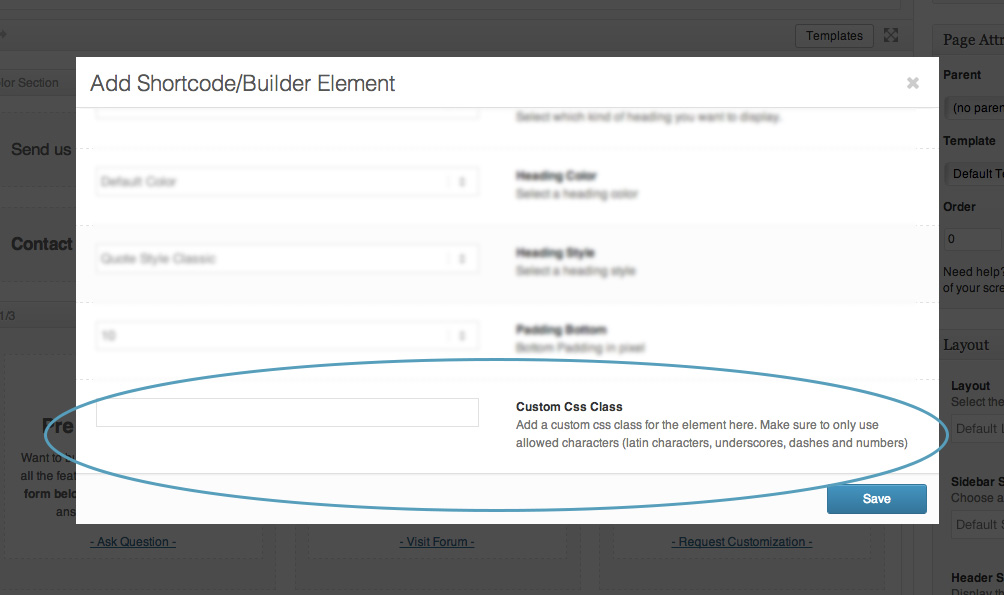
Please edit your icon box and find custom CSS field – http://kriesi.at/documentation/enfold/wp-content/uploads/sites/2/2013/12/blur.jpg and give your element a custom class (i.e.: my-custom-class ) and then add following code to Quick CSS in Enfold theme options under General Styling tab
.my-custom-class h3.iconbox_content_title {
    font-weight: normal;
    font-size: 15px!important;
}
Regards,
Yigit
Hi!
The line height and font size are now controlled by more accurate media queries.
Best regards,
Dake
Hi Dake, Thanks for the reply. Is it possible to use CSS that will only reduce the font size of the main menu to 12px when the website is being viewed at a smaller width, but still keep it at 15px when it is viewed at a larger width? If so, please advise on what would need to be added to the Quick CSS.
Also, in regards to the line height of the title, it looks great in mobile view, but it is still spaced out when viewed at a size that is in between mobile width and desktop width (please try resizing the browser window and you will see what I mean). Is there something else that needs to be altered to ensure the line height is consistent regardless of the particular width of the page being viewed?
Hey!
When you edit each slide of the accordion slider there is an option for a caption. You can add our button shortcode in there and set it’s link to an image. It should open up in a lightbox automatically.
[av_button label='Click me' link='manually,http://yoursite.com/image.jpg' link_target='' size='small' position='center' icon_select='yes' icon='ue800' font='entypo-fontello' color='theme-color' custom_bg='#444444' custom_font='#ffffff']
Regards,
Elliott
-
This reply was modified 10 years, 8 months ago by
 Elliott.
Hey!
Please change the code to following one
.sort_by_cat span.text-sep:before {
    content: "\e8c0";
    font-family: entypo-fontello;
    color: black !important;
    font-size: 24px;
    top: 3px;
    position: relative;
    left: 5px;
}
.sort_by_cat span.text-sep {
    color: transparent!important;
}
Cheers!
Yigit
Hi AdDesign!
It should be. Perhaps you have a very long word and a very large font size so it is running off the side of the screen? When you use long words the browser doesn’t know where to break them to a next line. Send us a link to your page and we’ll take a look.
Best regards,
Elliott
Hi Rikard,
I’m sorry, but I’m confused with your code suggestion. Here’s the CSS code I have in my stylesheet where I use the line-height element exactly with the same (and I see no change with to my issue):
#top #wrap_all .avia_mega_div, #top #wrap_all .avia_mega_div ul {
background-color: #f8f8f8;
border:hidden;
color: #cc6600;
font-size: 12px;
line-height: 1em;
}
#top #wrap_all .av-main-nav ul > li:hover > a {
line-height: 1em;
}
Thanks
Lyse
Hey Derrick!
Please add following code to Quick CSS in Enfold theme options under General Styling tab and adjust as needed
.phone-info { font-size: 18px; }
Regards,
Yigit
Hello,
For the countdown I reduced the size a bit a quit the seconds so is OK now.
For the tootips, its not working yet:
1.- This code works only in one box – please see pictures 10 in https://drive.google.com/open?id=0B1pkqICrGgvKflRwckk2ZnR1b29VNEVQbVYwNUlYTlRBUXg2ZlkyLUJqWGN6SmxJRlZXYTg
@media only screen and (min-device-width: 768px) and (max-device-width: 1386px) {
.avia-tooltip.avia-tt.av-tt-xlarge-width.av-tt-pos-right.av-tt-align-top.av-mobile-fallback-active.av-permanent-tooltip-single.transparent_dark.av-tt-hotspot {
padding: 3px !important;
font-size: 10px;
}}
2.- This code works great
.av-tt-xlarge-width {
width: 240px !important;
}
3.- There is a problem of overlapping between sections that I’ve resolved moving to different sections. Pictures 10 and 11.
Thanks
Jorge
Hi!
You can insert this inside the media query:
.av-masonry-entry .av-masonry-entry-title + .av-masonry-entry-content {
  padding: 1px;
  font-size: 12px;
}
Best regards,
Ismael
Hi!
Please try adding this as well:
.text-sep business_sort_sep {
  font-size: 15px !important;
}
Regards,
Rikard
Hey!
You can use the settings below to adjust the font:
http://i.imgur.com/wE6PWgA.png
I have reduced the font size to 12px (15px was your original font size).
Alternatively you can use this css to convert your menu to the mobile menu at a larger width:
@media only screen and (max-width: 1024px)
.container #advanced_menu_toggle, #advanced_menu_hide {
  display: block;
}
The line height css is working now as well.
Cheers!
Dake
Hi Yigit, thank you! So I used only this code:
#menu-item-5672:hover > a {background-image: url(https://aquaquestonline.com/wp-content/uploads/2015/07/bp.png); background-size: contain; background-repeat: no-repeat;background-position: 50% 50%; }
#menu-item-5672:hover > a >.avia-menu-text { opacity: 0; }
(without the upper part that went like this: #menu-item-3436 > a::before {
content: “\e824”;
font-family: entypo-fontello;
opacity: 0;
})
I got the menu word to disappear (see https://aquaquestonline.com/ -> “Backpacks” – this is the menu item I applied the code to). But the icon doesn’t appear for some reason. I think I might be missing some small step?
Thanks for your help!!
Hi Rikard,
I have the following CSS for my mega menu:
#top #wrap_all .avia_mega_div, #top #wrap_all .avia_mega_div ul {
background-color: #f8f8f8;
border:hidden;
color: #cc6600;
font-size: 12px;
line-height: 1em; (I removed the line-height element and nothing changed)
}
I tried adding your CSS code and nothing changed.
Thanks
Lyse