-
Search Results
-
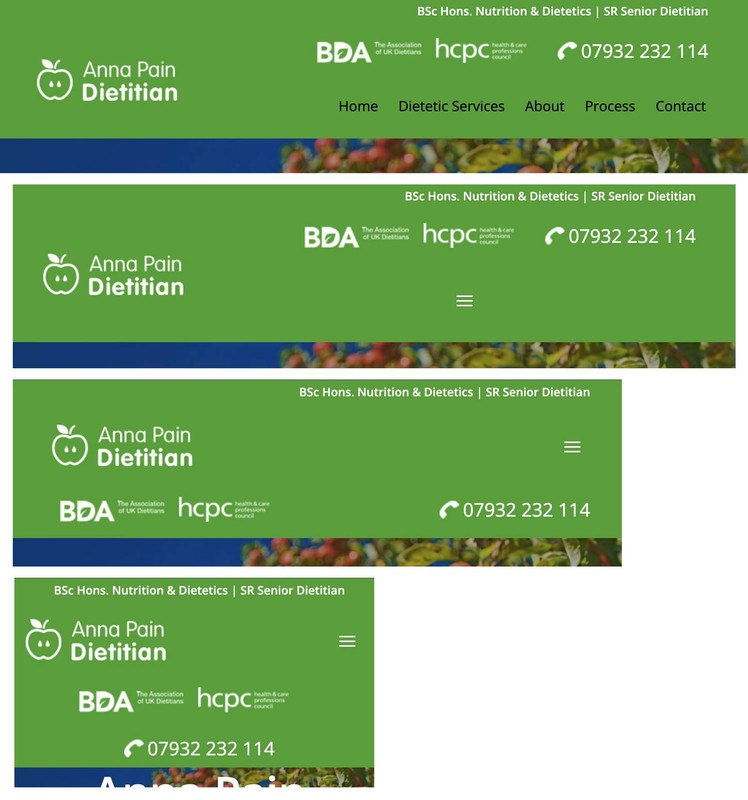
I’m trying to migrate to SVG social icons as per the recommendation in Theme Options. I have changed X and Instagram on the ‘dev’ test site (see below) and you can see the problem with SVG versions – too ‘low’ and wrong color.
The fix for the lowered icons is, I think:
#top .social_bookmarks li.avia-svg-icon svg:first-child {
    margin-top: 6px;}
from the default of 9px – please confirm this is the right CSS to target to get the SVG icons higher.
I cannot however find the code that is making the SVG icons display grey (#808080, the secondary font color) instead of blue.
I have this CSS in my child theme style.css to change the old/existing icons to the site’s main blue colour:
.header_color .social_bookmarks a {
	color: #2e3192 !important;}
This code is still being loaded but is being ignored by the SVG icons. How can I get the SVG icons displaying blue?
[There is additional CSS to format the social icons, as below, but I don’t think this is relevant, it’s just FYI:
.html_bottom_nav_header #top .av-logo-container .social_bookmarks {
right: 83px; margin-top: -30px;}#top .social_bookmarks li {
width: 36px;}#top .social_bookmarks li a {
font-size: 20px;}
]Hello,
Please let me know how can I match the font size of the captions on a masonry gallery to be exactly the same as the pages below.
This should be applied to all galleries across the whole website.The difference is that some pages are using a Flexible Masonry (this one is fine) while others use the Perfect Automatic Masonry (with the font too big). The idea is to match them like the flexible masonry is.
Pages in private for context.
Thank you
Topic: font size in header menu
Topic: content slider
How do I change the size of the content slider headline on mobile
I’m already using other css to control the font. Please see private comments.We are displaying weekly Youtube sermons in our website as videos.
We would like to also insert “cleaned up” transcripts, using the magic of ChatGPT.
We get a lovely html with print buttons, pdf buttons, style sheet — but cannot figure out how to insert this html document on our Enfold page.I have tried to use content in Accordion. Have learned that won’t work.
(Obviously, each week transcript will be different, so hoped I could use Advanced Custom Fields to store document info and then display via my custom post template.)
Right now, I am trying Textblock — in Code, not Visual.
I see the document nicely displayed on BACKEND, but on FRONTEND, I do NOT see the document displayed.
Since STYLE was included in the HTML — I moved style out to a Codeblock.
SCRIPT is also in there and I can move it out to another Codeblock.
What is your suggestion to “see” the document on the FRONTEND?
Thanks in Advance…
Below is the attempted code…
`[av_codeblock wrapper_element='' wrapper_element_attributes='' codeblock_type='' alb_description='' id='' custom_class='' template_class='' av_uid='av-mfpdws8b' sc_version='1.0']
<style>
/* ——– Base Styles ——– */<br />
:root {<br />
–bg: #0b0c0f;<br />
–card: #11131a;<br />
–ink: #e8ecf1;<br />
–muted: #aeb7c2;<br />
–accent: #6aa2ff;<br />
–accent-ink: #0b1b3a;<br />
–rule: #1e2330;<br />
}<br />
html, body { height: 100%; }<br />
body {<br />
margin: 0;<br />
background: radial-gradient(1200px 1200px at 10% -10%, #1b2030 0%, var(–bg) 60%);<br />
color: var(–ink);<br />
font: 16px/1.7 system-ui, -apple-system, Segoe UI, Roboto, Helvetica, Arial, “Apple Color Emoji”, “Segoe UI Emoji”;<br />
-webkit-font-smoothing: antialiased;<br />
-moz-osx-font-smoothing: grayscale;<br />
}</p>
<p> .wrapper {<br />
max-width: 860px;<br />
margin: 48px auto 96px;<br />
padding: 0 20px;<br />
}</p>
<p> .toolbar {<br />
position: sticky;<br />
top: 0;<br />
z-index: 10;<br />
backdrop-filter: blur(10px);<br />
-webkit-backdrop-filter: blur(10px);<br />
background: color-mix(in srgb, var(–bg) 80%, transparent);<br />
border-bottom: 1px solid var(–rule);<br />
}<br />
.toolbar-inner {<br />
max-width: 860px;<br />
margin: 0 auto;<br />
padding: 10px 20px;<br />
display: flex;<br />
gap: 10px;<br />
align-items: center;<br />
justify-content: flex-end;<br />
}<br />
.btn {<br />
appearance: none;<br />
border: 1px solid var(–rule);<br />
background: linear-gradient(180deg, #1a2233, var(–card));<br />
color: var(–ink);<br />
padding: 10px 14px;<br />
border-radius: 14px;<br />
cursor: pointer;<br />
font-weight: 600;<br />
transition: transform 0.05s ease, box-shadow 0.2s ease, background 0.2s ease;<br />
box-shadow: 0 6px 14px rgba(0,0,0,0.25);<br />
}<br />
.btn:hover { transform: translateY(-1px); }<br />
.btn:active { transform: translateY(0); }<br />
.btn.accent {<br />
border-color: color-mix(in srgb, var(–accent), #000 50%);<br />
background: linear-gradient(180deg, color-mix(in srgb, var(–accent) 50%, #fff 0%), var(–accent-ink));<br />
color: white;<br />
text-shadow: 0 1px 0 rgba(0,0,0,0.35);<br />
}</p>
<p> .card {<br />
background: linear-gradient(180deg, #131827, var(–card));<br />
border: 1px solid var(–rule);<br />
border-radius: 22px;<br />
padding: 28px 28px 36px;<br />
box-shadow: 0 20px 60px rgba(0,0,0,0.35);<br />
}</p>
<p> h1, h2, h3 { line-height: 1.2; margin: 0 0 8px; }<br />
h1 {<br />
font-size: clamp(28px, 4.2vw, 44px);<br />
letter-spacing: -0.02em;<br />
margin-bottom: 12px;<br />
}<br />
.meta { color: var(–muted); margin-bottom: 28px; }</p>
<p> h2 {<br />
font-size: clamp(20px, 2.5vw, 26px);<br />
margin-top: 34px;<br />
}</p>
<p> p { margin: 12px 0; }<br />
ul { margin: 8px 0 16px 24px; }<br />
li { margin: 6px 0; }</p>
<p> blockquote {<br />
margin: 18px 0;<br />
padding: 16px 18px;<br />
border-left: 4px solid var(–accent);<br />
background: color-mix(in srgb, var(–card), #000 8%);<br />
border-radius: 10px;<br />
}<br />
blockquote p { margin: 0; }</p>
<p> hr { border: none; border-top: 1px solid var(–rule); margin: 28px 0; }</p>
<p> .note { color: var(–muted); font-size: 14px; }</p>
<p> /* Drop cap for the opening paragraph */<br />
.lead:first-letter {<br />
float: left;<br />
font-size: 3.2em;<br />
line-height: 0.9;<br />
padding-right: 10px;<br />
margin-top: 6px;<br />
font-weight: 800;<br />
color: var(–accent);<br />
text-shadow: 0 6px 16px rgba(106,162,255,0.35);<br />
}</p>
<p> /* Print styles */<br />
@media print {<br />
body { background: white; color: #111; }<br />
.toolbar { display: none !important; }<br />
.wrapper { margin: 0; max-width: 100%; }<br />
.card { box-shadow: none; border: none; border-radius: 0; padding: 0; }<br />
a { color: black; text-decoration: none; }<br />
.note { color: #444; }<br />
@page { size: A4; margin: 20mm; }<br />
h1 { font-size: 28pt; }<br />
h2 { font-size: 16pt; margin-top: 18pt; }<br />
p, li, blockquote { font-size: 11.5pt; }<br />
blockquote { background: #f6f6f6; border-left-color: #888; }<br />
}<br />
</style>
[/av_codeblock][av_textblock fold_type='' fold_height='' fold_more='Read more' fold_less='Read less' fold_text_style='' fold_btn_align='' textblock_styling_align='' textblock_styling='' textblock_styling_gap='' textblock_styling_mobile='' size='' av-desktop-font-size='' av-medium-font-size='' av-small-font-size='' av-mini-font-size='' font_color='' color='' background='bg_color' background_color='' background_gradient_direction='vertical' background_gradient_color1='#000000' background_gradient_color2='#ffffff' background_gradient_color3='' padding='' padding_sync='true' av-desktop-padding='' av-desktop-padding_sync='true' av-medium-padding='' av-medium-padding_sync='true' av-small-padding='' av-small-padding_sync='true' av-mini-padding='' av-mini-padding_sync='true' fold_overlay_color='' fold_text_color='' fold_btn_color='theme-color' fold_btn_bg_color='' fold_btn_font_color='' size-btn-text='' av-desktop-font-size-btn-text='' av-medium-font-size-btn-text='' av-small-font-size-btn-text='' av-mini-font-size-btn-text='' fold_timer='' z_index_fold='' id='' custom_class='' template_class='' av_uid='av-mfpdtbrg' sc_version='1.0' admin_preview_bg='']
<div class=”toolbar” aria-label=”Document tools”>
<div class=”toolbar-inner”><button class=”btn” title=”Send to a printer”>
️ Print
</button>
<button class=”btn accent” title=”Use your browser’s Save as PDF option in the dialog”>
Download PDF
</button></div>
</div>
<div class=”wrapper”><article id=”content” class=”card”><header>
<h1>Sermon: “You Are the Light of the World”</h1>
<div class=”meta”>Text: Matthew 5:14–16</div>
</header>
<p class=”lead”>So, you might have noticed the theme. Send the Light. Thy Word is a lamp. There’s definitely a theme going here.</p>
We are continuing through the best sermon ever preached by the greatest preacher ever. We have seen Jesus giving assurances to His followers in the Beatitudes—letting them know that His followers are blessed.Last week, we began looking at the section where Jesus tells His followers that they are salt and light.
<h2>Salt</h2>
We learned a few things about salt in Jesus’ day. Salt was precious. When Jesus said, “Ye are the salt of the earth,” His disciples understood the value. Salt was so valuable it was sometimes used as payment for soldiers.Its value came from its purpose:
- Preservative – As salt, we preserve the holiness of God and His Word in the world.
- Purifier – Salt was used as a cleansing agent; so are we in the world.
- Penetrating – Salt works its way in. We are called to go into all the world with the gospel.
- Creates thirst – Salt makes people thirsty. Do we, by our lives, make people thirst for the living water that is Christ?
Jesus also warned of useless salt: “If the salt has lost its savour… it is good for nothing, but to be cast out and trodden under foot of men.” Notice, Jesus never challenged us to be salt or light. He simply said, you are.
<hr />
<h2>Light</h2>
Matthew 5:14–16 — “Ye are the light of the world. A city that is set on a hill cannot be hid. Neither do men light a candle and put it under a bushel, but on a candlestick, and it giveth light unto all that are in the house. Let your light so shine before men that they may see your good works and glorify your Father which is in heaven.”
What a title. What a privilege—that Jesus would say we are the light of the world. But what does He mean?
<h3>Jesus, the True Light</h3>
John wrote of the Light in John 1:4–9: “In Him was life, and the life was the light of men. And the light shineth in darkness, and the darkness comprehended it not… That was the true Light, which lighteth every man that cometh into the world.” Of course, John was speaking of Jesus.Jesus confirmed it Himself in John 8:12—“I am the light of the world.” Again, in John 9:5—“As long as I am in the world, I am the light of the world.” But then Jesus turned to His disciples and said, “Ye are the light of the world.”
<h3>The Nature of Our Light</h3>- It is personal – Jesus has given every believer this light. He didn’t say we might be light someday; He said we are light.
- It is His light in us – We are not the source. Jesus is. We are the lamp, the candle, the bulb through which His light shines.
- It is powerful – Even the smallest light conquers darkness. A single match in a dark cave changes everything.
Paul reminds us in 2 Corinthians 4:6 that God “commanded the light to shine out of darkness” into our hearts. Philippians 2:15 calls us to shine as lights “in the midst of a crooked and perverse nation.”
The tragedy is that much of the darkness in our world exists because Christians have hidden their light.
<h3>The Purpose of Our Light</h3>- To shine – Light is not made to be hidden under a bushel but set on a candlestick.
- To expose – Light reveals what is hidden in darkness, including sin.
- To reflect – Like the moon reflects the sun, we reflect the Son.
- To guide – Like runway lights, a lighthouse, or a warning sign, our light points others to safety and to the Father through Christ.
<h3>The Result of Our Light</h3>
Jesus says, “Let your light so shine before men that they may see your good works and glorify your Father which is in heaven.” Our light draws others to God. Our good works should point people to Him, not to ourselves. Salvation is mankind’s greatest need—and our shining light directs people to Christ.
<h2>Closing Challenge</h2>
Light always overcomes darkness, but it must shine to make a difference. Is your light shining for Jesus? Can you truly sing, “This little light of mine, I’m going to let it shine”? Or are you hiding your light under a bushel?If you are trusting in Christ, you have His light. Let it shine.
Prayer — “Lord, we thank You for Your Word this morning and the encouragement that we are the light of the world. Help us not to cover or hide the light, but to let it shine, that others may see our good works and glorify our Father in heaven. Amen.”
<p class=”note”>Tip: Use Print to send directly to a printer, or choose Save as PDF in the print dialog to download a PDF copy.</p>
</article></div>
<script>
// Optionally hide buttons when printing (extra safety for non-supporting browsers)
window.addEventListener(‘beforeprint’, () => {
document.querySelector(‘.toolbar’)?.setAttribute(‘data-hidden’, ‘true’);
});
window.addEventListener(‘afterprint’, () => {
document.querySelector(‘.toolbar’)?.removeAttribute(‘data-hidden’);
});
</script>
[/av_textblock]Hi Team Enfold, Kriesi,
I have been using Enfold for 10 years(?). I have no idea when it came out, but it feels like forever. Having used it on three websites, two of which are still online (links below). I wanted to give some serious user feedback to you and your team since I hope it will help you to make it even better! I totally understand if there is no room for such a thing in your team. So I’m simply sending it as a “here you go, some seriously golden nuggets, do with it what you want” type of email :)
Websites:
MeshMasters.com (up2date)
RobertBerrier.com (old, and needs an update)Before I slap all the feedback points. Know that I am a (3D) artist, with limited web coding knowledge. So I don’t know what is possible or not.
—
1) Often I want to have media like an image or video, but also text fields, to the left or right, or center of a section or part of the website, but in a smaller size than the container it’s in. For example, if I have a full width color section. Within that color section, I can use a 1/4 container with the media/text in it, another 3/4 container next to it to “force” it to be at a smaller size to the left or right of that color section. Or, I want to have a 1/3 sized media/text in the center of the website, so I put two 1/5 containers to the left and right. This “works”, but it’s finicky. I often rather want the media to be at a fixed (smaller) size, no matter what is next to it. Even better would be a percentage. Eg, this media should always be 20% size compared to the browser window, or 20% of the container it’s in. The container it is in would still be its max possible size. But it will try to get close to the smaller percentage or pixel size. This can somewhat be done with using a smaller resolution image. But this is also finicky because of all the different screen resolutions, especially in our age with HD vs 4k. So, a better way to “size” down images without having to container it. Perhaps a percentage setting in the media element itself.
—
2) The ability to have (all) elements be in the center of of the page. Eg, media, containers, buttons. If they are smaller than the color section or container they are in. I often want them in the center of that color section or container. No matter what responsive size we are in. Currently I need to do this with “buffer” containers to try and align it to the setting.
I have created some CSS code with a Class ID that I can add to a color section. Then everything in that color section will be centered. But I believe this should be a default setting within a color section and containers. Eg, “align all content within this container/color section to the Left/Center/Right.
—
3) I use CSS code to not have the header be transparent. I would say this should be an option in the Enfold settings. Rather than needing to code.
#header {
background-color: #1d1d40; /* This is needed for the opacity change */
opacity: 1 !important;
}4) When text is in BOLD or STRONG. It gets an assigned color from the theme options. Not a bad idea, but it is a shared color with I believe “Primary Color – Font color for links, dropcaps and other elements” This means we users have less control over how text and it’s colors looks like. I suggest that BOLD and STRONG has a separate color option within the Theme color settings. In my opinion, links and BOLD should be seen as two different things to customize. I currently use CSS code to adjust this.
—
5) For all my websites I have a max website width setting, as set in the Enfold settings. But sometimes, I want a color section to use its own unique size. For example, you will see on MeshMasters.com that the portfolio section is a full-width color section. While the contact section at the button is a bit smaller than the website’s width settings. Having this as a setting in color sections would give people more options to make cool layouts. Currently I have this CSS code for this:
/* ========================================== */
/* === Color sections width additions === */
/* ========================================== *//* === Full width, no padding === */
#fullwidth-container-nopadding .container {
width: 100% !important;
min-width: 100%;
padding: 0;
margin: 0;
}/* === Full width, small padding === */
#fullwidth-container-smallpadding .container {
width: 100% !important;
min-width: 100%;
padding: 10px;
margin: 10px;
}/* === Full width, default padding === */
#fullwidth-container .container {
width: 100% !important;
min-width: 100%;
}—
5) Similar to the point above. I want my blog posts to be a smaller width. Since it makes reading large pieces of text easier. So having a separate width setting for blog posts could be interesting to add. For example, the main website is at say 85% width. But perhaps all blog posts are at 70%.
—
6) Font sizes on the main page (or landing pages) are often large. To grab attention with cool copy writing that sells. These are often smaller pieces of text. But on blog posts you have large pieces of text. And so a smaller font size makes it more readable. Since there is only one BODY or P font size for the entire website. You are stuck in choosing one for all pages. I currently made CSS code so on blog posts all font sizes are 95% or 90% smaller than the rest of the website. Perhaps this could also be a setting in the Enfold theme settings. Eg “blog posts font sizes”.
—
7) There are currently three responsive break points in pixels. I believe it’s 990px and 768px and 480px. Perhaps this is the standard in web development. But the ability to change these website wide would be great. Eg, If I change the 990px to say 800px in the enfold settings. Then on all other instances where this is used, like in color sections, containers, etc. That value is also reflected there in the UI.
—
8) When columns break down for responsiveness. They break down into a single column. Eg, a column of 3 containers, becomes a column of 1 with 3 containers below each other. Having options to control to how many columns it breaks would be great. Eg, 4 columns of containers next to each other (4×1). Could be 2 columns of 2 containers next to each other. Eg, 2×2. Instead of 1×4. More controls options for this would be AMAZING!
—
9) fyi, I used CSS code to adjust the masonry gap size (to 4 px). It’s a small thing, but perhaps a quick win to add to the Masonry settings and so to make the theme better.
—
10) another small thing. I use CSS code to remove the Gallery border.
—
11) I use CSS code to remove the Blog button hover effect. Perhaps also a quick win to add to Enfold.
/* === Hover icon disable === */
.slide-entry-wrap .image-overlay-inside:before { display: none; }/* === Hover overlay color === */
.image-overlay { background: #0f0f26; }—
12) Very similar where I remove the Featured Image effect:
.big-preview.single-big a{
pointer-events:none!important;
}—
13) And also the blog page excerpts and dates:
/* === Remove blog page excerpts === */
.blog .slide-entry-excerpt { display: none; }/* === Remove blog page dates === */
.slide-meta { display: none !important; }—
14) Tables are very difficult to adjust. There is no control over it’s color and borders. I use quite a lot of CSS code to adjust them. Perhaps this should be an entire section in the Enfold themes to control them?
I currently use code to:
– Adjust colors for: General cells, uneven cells, even cells, header cells, the borders
– Thickness of borders and its colors
– Give transparency to cells.
– And then to apply these settings to each different theme area (Logo area, main area, alternative area, footer area, socket area)—
15) the button element is missing padding and margin settings (and maybe also alignment settings?)
—
16) There are default padding settings for Color Sections. 0%, 20%, Default(?), 70% and 130%. It would be great if we can adjust these globally in the Enfold Settings. And ofcourse these changes are reflected in the Color Section padding settings. For example, Perhaps I want the default to be 60%, the large 100% and the extra large 150%
Yes, I am aware you can put in custom values in the element itself. But it’s better to align values website wide.
—
That’s it. I hope it helps and you can improve Enfold to an even better edition!
Robert Berrier
