-
AuthorSearch Results
-
December 7, 2023 at 5:17 pm #1427476
In reply to: problems with Mobile Menu
Hey ausgesonnen,
1. Please check your settings under Enfold->Main Menu->Burger/Mobile Menu.
2. Please try this CSS:
.html_av-overlay-full #av-burger-menu-ul li {
    font-size: 20px;
}
Best regards,
RikardDecember 6, 2023 at 6:33 pm #1427374In reply to: Enfold Theme (custom CSS @media queries)
Hey Jonathon Parris,
Thanks for the css, the issue is that your css for the H2 & H3 tags are don’t have enough specificity, you need to add some IDs and classes to override the theme css, like this:@media only screen and (max-height: 767px) { #top .main_color h2 { font-size: 30px; line-height: 30px; font-family: "Bangers"; } #top .main_color h3 { font-size: 45px; line-height: 45px; font-family: "Bangers"; } }If this doesn’t help please log into the support forum and open a new thread with the url to the page in question so we can examine the specific element closer.
Please note that using the contact form is not appropriate for support question.
If you are unable to login to the support forum because you don’t have a activate support contract, please try going to your Theme Forest account and renew your support and then log in to the support forum and open a new thread.Best regards,
MikeDecember 5, 2023 at 6:35 am #1427188In reply to: Not able to see stock overlay badge in WooCommerce
Hey Silje,
Thank you for the inquiry.
The “soldout” container is being covered by the product image. You need to increase the z-index to adjust the stack order of the element.
.soldout {
    padding: 3px 8px;
    text-align: center;
    background: #222!important;
    color: #fff!important;
    font-weight: 700;
    position: absolute!important;
    top: 6px;
    right: 6px;
    font-size: 12px;
    opacity: 1!important;
    display: block!important;
    z-index: 100;
}
Best regards,
IsmaelDecember 4, 2023 at 11:07 pm #1427168Topic: Not able to see stock overlay badge in WooCommerce
in forum EnfoldSHR Design
ParticipantHi
I added this PHP and CSS code. PHP Snippet 1.
Then set a product to 0. Stock Management is tracked.
Under the category: TROMBOCYTTINKUBATORER – (KLIMASKAP)
Right clicked the product Climax 100. Noticed the codeHTML Class soldout has been added.
CSS has been added..soldout { padding: 3px 8px; text-align: center; background: #222!important; color: #000!important; font-weight: 700; position: absolute!important; top: 6px; right: 6px; font-size: 12px; opacity: 1!important; display: block!important; }Why is the black box sold out just seen for a moment before it goes away?
What is going on?I have been down this road before in an earlier support thread in regards to a search in WooCommerce.
December 4, 2023 at 6:12 pm #1427160In reply to: Masonry Gallery Caption
Hi Mike – I have inserted the code and cleared cache but did not get the desired result. Link below
All CSS I’m using
#footer .widget p {
font-size: 15px !important;
}#footer {
padding-top: 80px;
padding-bottom: 80px;
margin: 0px;
}@media only screen and (min-width: 990px) {
#header_main .main_menu {
position: relative;
right: unset;
display: flex;
justify-content: center;
}.av-masonry-entry-title {
font-size:28px!important;
}.av-masonry-entry-content.entry-content {
font-size:16px!important;
text-align: left;
}#top #wrap_all .av-flex-size .av-masonry-entry.av-masonry-item-with-image .av-inner-masonry-content .av-masonry-entry-title.entry-title {
position: absolute;
transform: translate(12vw,-28vh);
color: #fff;
}
#top #wrap_all .av-flex-size .av-masonry-entry.av-masonry-item-with-image .av-masonry-outerimage-container:before {
content:””;
display: block;
height: 100%;
position: absolute;
visibility: visible !important;
top: 0;
left: 0;
width: 100%;
background-color: rgba(0, 0, 0,.5)!important;
}December 4, 2023 at 10:23 am #1427115In reply to: slider above the password entry?
Thank you Guenni007
for your feedback
everything is working finewith the color i don’t mean the color in the slider
sondern die farbe in der meldung aus der function.php
<div class=”av-more-info”><span style=”font-size: 14pt; color: ##0097d2;”>Dorfgeschichte Eschnen Nendeln</span></div>
December 2, 2023 at 11:45 pm #1427015In reply to: Custom header font and size different H1 or H2
Hey sharynt3,
If you don’t want this everywhere you will need to add a custom class to the H5 tag like this: <h5 class=”huge”>…</h5>

Then add this CSS in your Enfold Theme Options ▸ General Styling ▸ Quick CSS field:#top #wrap_all #main.all_colors h5.huge { font-size: 48px; }
After applying the css, please clear your browser cache and check.Best regards,
MikeDecember 2, 2023 at 8:57 pm #1426992Topic: Custom header font and size different H1 or H2
in forum Enfoldsharynt3
ParticipantHi
I tried to customize one of the headings like H5 or H6 (to function as a main header size like H1 or H2) that I am not using to have just the Corinthia font and set the size but it is not taking it. Is there a way to modify so I can use it as a main header? I would need at least 48 px but not everywhere. Please let me know if this is possible. Thanks.December 1, 2023 at 9:24 pm #1426916In reply to: Google font not listed
Hey sharynt3,
Thanks for the link to your site, I see the font is added via a script & css plugin:<style type="text/css" id="cst_font_data"> @font-face { font-family: 'Corinthia'; font-weight: 400; src: url('/wp-content/uploads/2023/12/Corinthia.eot?#iefix') format('embedded-opentype'), url('/wp-content/uploads/2023/12/Corinthia.svg') format('svg'), url('/wp-content/uploads/2023/12/Corinthia.ttf') format('truetype'), url('/wp-content/uploads/2023/12/Corinthia.woff') format('woff'), url('/wp-content/uploads/2023/12/Corinthia.woff2') format('woff2'); } </style>to use it for your headings try this CSS in your Enfold Theme Options ▸ General Styling ▸ Quick CSS field:
#top #wrap_all .all_colors h1,
#top #wrap_all .all_colors h2,
#top #wrap_all .all_colors h3,
#top #wrap_all .all_colors h4 {
	font-family: Corinthia;
}
and note that this font has a smaller size than your current font, so you will need to adjust the font size in the elements, for example if your element is currently 34px, you should try setting it to 48px.
Best regards,
MikeDecember 1, 2023 at 4:12 pm #1426900In reply to: Demo Services Page – How to replicate?
Hey mehwishxperia,
Please enable debug mode under Enfold->Layout Builder->Show advanced options->Debug mode. Then you can paste this shortcode into the shortcode window in a new page:
[av_section min_height='' min_height_px='500px' padding='large' shadow='no-border-styling' bottom_border='no-border-styling' id='' color='main_color' custom_bg='' src='' attachment='' attachment_size='' attach='scroll' position='top left' repeat='no-repeat' video='' video_ratio='16:9' overlay_opacity='0.5' overlay_color='' overlay_pattern='' overlay_custom_pattern='' av_uid='av-flk2a2']
[av_heading tag='h1' padding='15' heading='Our Services' color='custom-color-heading' style='blockquote modern-quote' custom_font='#000000' size='40' subheading_active='' subheading_size='15' custom_class='' admin_preview_bg='' av_uid='av-fjbr2q'][/av_heading]

[av_hr class='custom' height='50' shadow='no-shadow' position='left' custom_border='av-border-fat' custom_width='50px' custom_border_color='#000000' custom_margin_top='10px' custom_margin_bottom='10px' icon_select='no' custom_icon_color='' icon='ue808' font='entypo-fontello' admin_preview_bg='rgb(255, 255, 255)' av_uid='av-fczdmi']

[av_one_half first min_height='' vertical_alignment='' space='' custom_margin='' margin='0px' padding='0px' border='' border_color='' radius='0px' background_color='' src='' background_position='top left' background_repeat='no-repeat' animation='' mobile_display='' av_uid='av-f6oc0i']

[av_textblock size='' font_color='' color='' av_uid='av-eykr3m']
Lorem ipsum dolor sit amet, consectetuer adipiscing elit. Aenean commodo ligula eget dolor. Aenean massa. Cum sociis natoque penatibus et magnis dis <a href="#">parturient montes</a>, nascetur ridiculus mus.

Donec quam felis, ultricies nec, pellentesque eu, pretium quis, sem. Nulla consequat massa quis enim.
[/av_textblock]

[/av_one_half][av_one_half min_height='' vertical_alignment='' space='' custom_margin='' margin='0px' padding='0px' border='' border_color='' radius='0px' background_color='' src='' background_position='top left' background_repeat='no-repeat' animation='' mobile_display='' av_uid='av-etbavu']

[av_textblock size='' font_color='' color='' av_uid='av-elfvya']
Donec pede justo, fringilla vel, aliquet nec, vulputate eget, arcu. In enim justo, rhoncus ut, imperdiet a, venenatis vitae, justo. Nullam dictum felis eu pede mollis pretium. Integer tincidunt.

Cras dapibus. <strong>Vivamus elementum</strong> semper nisi. Aenean vulputate eleifend tellus. Aenean leo ligula.
[/av_textblock]

[/av_one_half]
[/av_section]

[av_tab_section transition='av-tab-slide-transition' padding='large' tab_pos='av-tab-above-content' tab_padding='none' initial='5' id='Plugins' av_element_hidden_in_editor='0' av_admin_tab_active='6' bg_color='#ffffff' color='#919191' av_uid='av-eekvz6']

[av_tab_sub_section tab_title='Product Photography' vertical_align='middle' icon_select='icon_top' icon='ue80f' font='entypo-fontello' tab_image='' tab_image_style='' color='#35383c' background_color='#35383c' src='' attachment='' attachment_size='' background_attachment='scroll' background_position='top left' background_repeat='no-repeat' av_uid='av-e94tc2']

[av_three_fifth first min_height='av-equal-height-column' vertical_alignment='av-align-middle' space='' margin='0px' margin_sync='true' padding='0px' padding_sync='true' border='' border_color='' radius='0px' radius_sync='true' background_color='' src='' attachment='' attachment_size='' background_position='top left' background_repeat='no-repeat' animation='' mobile_display='' av_uid='av-e4rdwa']

[av_heading tag='h1' padding='0' heading='Photography' color='custom-color-heading' style='blockquote modern-quote' custom_font='#ffffff' size='30' subheading_active='' subheading_size='15' custom_class='' admin_preview_bg='rgb(34, 34, 34)' av_uid='av-dywjma'][/av_heading]

[av_hr class='custom' height='50' shadow='no-shadow' position='left' custom_border='av-border-fat' custom_width='50px' custom_border_color='#ffffff' custom_margin_top='30px' custom_margin_bottom='30px' icon_select='no' custom_icon_color='' icon='ue808' font='entypo-fontello' admin_preview_bg='' av_uid='av-drfolu']

[av_textblock size='' font_color='custom' color='#ffffff' admin_preview_bg='rgb(34, 34, 34)' av_uid='av-dmdbsi']
Lorem ipsum dolor sit amet, consectetuer adipiscing elit. Aenean commodo ligula eget dolor. Aenean massa. Cum sociis natoque penatibus et <strong>magnis</strong> dis parturient montes, nascetur ridiculus mus. Donec quam felis, ultricies nec, pellentesque eu, pretium quis, sem. Nulla <strong>consequat</strong> massa quis enim.

Donec pede justo, fringilla vel, aliquet nec, vulputate eget, arcu. In enim justo, rhoncus ut, imperdiet a, venenatis vitae, justo. <strong>Nullam</strong> dictum felis eu pede mollis pretium. Integer tincidunt. Cras dapibus. Vivamus elementum semper nisi. Aenean vulputate eleifend tellus. Aenean leo ligula, porttitor eu, consequat vitae, eleifend ac, enim. Aliquam lorem ante, dapibus in, viverra quis, feugiat a, tellus.
[/av_textblock]

[/av_three_fifth][av_two_fifth min_height='av-equal-height-column' vertical_alignment='av-align-middle' space='' margin='0px' margin_sync='true' padding='0px' padding_sync='true' border='' border_color='' radius='0px' radius_sync='true' background_color='' src='' attachment='' attachment_size='' background_position='top left' background_repeat='no-repeat' animation='' mobile_display='' av_uid='av-dfnwfm']

[av_image src='https://test.kriesi.at/enfold-2017/wp-content/uploads/sites/24/2015/07/features-5-845x684.jpg' attachment='354' attachment_size='gallery' align='center' styling='' hover='' link='' target='' caption='' font_size='' appearance='' overlay_opacity='0.4' overlay_color='#000000' overlay_text_color='#ffffff' animation='no-animation' admin_preview_bg='rgb(255, 255, 255)' av_uid='av-dd63eq'][/av_image]

[/av_two_fifth][/av_tab_sub_section][av_tab_sub_section tab_title='Amazing Support' vertical_align='middle' icon_select='icon_top' icon='ue8b9' font='entypo-fontello' tab_image='' tab_image_style='' color='#35383c' background_color='#35383c' src='' attachment='' attachment_size='' background_attachment='scroll' background_position='top left' background_repeat='no-repeat' av_uid='av-d3pdz6']

[av_two_fifth first min_height='av-equal-height-column' vertical_alignment='av-align-middle' space='' margin='0px' margin_sync='true' padding='0px' padding_sync='true' border='' border_color='' radius='0px' radius_sync='true' background_color='' src='' attachment='' attachment_size='' background_position='top left' background_repeat='no-repeat' animation='' mobile_display='' av_uid='av-cz9zju']

[av_image src='https://test.kriesi.at/enfold-2017/wp-content/uploads/sites/24/2015/07/features-1-845x684.jpg' attachment='350' attachment_size='gallery' align='center' styling='' hover='' link='' target='' caption='' font_size='' appearance='' overlay_opacity='0.4' overlay_color='#000000' overlay_text_color='#ffffff' animation='no-animation' admin_preview_bg='rgb(255, 255, 255)' av_uid='av-crt282'][/av_image]

[/av_two_fifth][av_three_fifth min_height='' vertical_alignment='' space='' custom_margin='' margin='0px' padding='0px' border='' border_color='' radius='0px' background_color='' src='' background_position='top left' background_repeat='no-repeat' animation='' mobile_display='' av_uid='av-cpgqqa']

[av_heading tag='h1' padding='0' heading='Amazing Support' color='custom-color-heading' style='blockquote modern-quote' custom_font='#ffffff' size='30' subheading_active='' subheading_size='15' custom_class='' admin_preview_bg='rgb(34, 34, 34)' av_uid='av-cih7y2'][/av_heading]

[av_hr class='custom' height='50' shadow='no-shadow' position='left' custom_border='av-border-fat' custom_width='50px' custom_border_color='#ffffff' custom_margin_top='30px' custom_margin_bottom='30px' icon_select='no' custom_icon_color='' icon='ue808' font='entypo-fontello' admin_preview_bg='' av_uid='av-cbkzzm']

[av_textblock size='' font_color='custom' color='#ffffff' admin_preview_bg='rgb(34, 34, 34)' av_uid='av-c7alci']
Donec pede justo, fringilla vel, aliquet nec, vulputate eget, arcu. In enim justo, rhoncus ut, imperdiet a, venenatis vitae, justo. <strong>Nullam</strong> dictum felis eu pede mollis pretium. Integer tincidunt. Cras dapibus.

Vivamus elementum semper nisi. Aenean vulputate eleifend tellus. Aenean leo ligula, porttitor eu, consequat vitae, eleifend ac, enim. Aliquam lorem ante, dapibus in, viverra quis, feugiat a, tellus.

Lorem ipsum dolor sit amet, consectetuer adipiscing elit. Aenean commodo ligula eget dolor. Aenean massa. Cum sociis natoque penatibus et <strong>magnis</strong> dis parturient montes, nascetur ridiculus mus. Donec quam felis, ultricies nec, pellentesque eu, pretium quis, sem. Nulla <strong>consequat</strong> massa quis enim.
[/av_textblock]

[/av_three_fifth][/av_tab_sub_section][av_tab_sub_section tab_title='Professional Web Design' vertical_align='middle' icon_select='icon_top' icon='ue8ab' font='entypo-fontello' tab_image='' tab_image_style='' color='#35383c' background_color='#35383c' src='' attachment='' attachment_size='' background_attachment='scroll' background_position='top left' background_repeat='no-repeat' av_uid='av-bxv0t6']

[av_three_fifth first min_height='av-equal-height-column' vertical_alignment='av-align-middle' space='' margin='0px' margin_sync='true' padding='0px' padding_sync='true' border='' border_color='' radius='0px' radius_sync='true' background_color='' src='' attachment='' attachment_size='' background_position='top left' background_repeat='no-repeat' animation='' mobile_display='' av_uid='av-bv5clu']

[av_heading tag='h1' padding='0' heading='Web Design' color='custom-color-heading' style='blockquote modern-quote' custom_font='#ffffff' size='30' subheading_active='' subheading_size='15' custom_class='' admin_preview_bg='rgb(34, 34, 34)' av_uid='av-bopqn6'][/av_heading]

[av_hr class='custom' height='50' shadow='no-shadow' position='left' custom_border='av-border-fat' custom_width='50px' custom_border_color='#ffffff' custom_margin_top='30px' custom_margin_bottom='30px' icon_select='no' custom_icon_color='' icon='ue808' font='entypo-fontello' admin_preview_bg='' av_uid='av-bfptdm']

[av_textblock size='' font_color='custom' color='#ffffff' admin_preview_bg='rgb(34, 34, 34)' av_uid='av-bcarle']
Lorem ipsum dolor sit amet, consectetuer adipiscing elit. Aenean commodo ligula eget dolor. Aenean massa. Cum sociis natoque penatibus et <strong>magnis</strong> dis parturient montes, nascetur ridiculus mus. Donec quam felis, ultricies nec, pellentesque eu, pretium quis, sem. Nulla <strong>consequat</strong> massa quis enim.

Donec pede justo, fringilla vel, aliquet nec, vulputate eget, arcu. In enim justo, rhoncus ut, imperdiet a, venenatis vitae, justo. <strong>Nullam</strong> dictum felis eu pede mollis pretium. Integer tincidunt. Cras dapibus.

Vivamus elementum semper nisi. Aenean vulputate eleifend tellus. Aenean leo ligula, porttitor eu, consequat vitae, eleifend ac, enim. Aliquam lorem ante, dapibus in, viverra quis, feugiat a, tellus.
[/av_textblock]

[/av_three_fifth][av_two_fifth min_height='av-equal-height-column' vertical_alignment='av-align-middle' space='' margin='0px' margin_sync='true' padding='0px' padding_sync='true' border='' border_color='' radius='0px' radius_sync='true' background_color='' src='' attachment='' attachment_size='' background_position='top left' background_repeat='no-repeat' animation='' mobile_display='' av_uid='av-b58fqa']

[av_image src='https://test.kriesi.at/enfold-2017/wp-content/uploads/sites/24/2015/07/features-3-845x684.jpg' attachment='352' attachment_size='gallery' align='center' styling='' hover='' link='' target='' caption='' font_size='' appearance='' overlay_opacity='0.4' overlay_color='#000000' overlay_text_color='#ffffff' animation='no-animation' admin_preview_bg='rgb(255, 255, 255)' av_uid='av-aye57u'][/av_image]

[/av_two_fifth][/av_tab_sub_section][av_tab_sub_section tab_title='Project Planing' vertical_align='middle' icon_select='icon_top' icon='ue84b' font='entypo-fontello' tab_image='' tab_image_style='' color='#35383c' background_color='#35383c' src='' attachment='' attachment_size='' background_attachment='scroll' background_position='top left' background_repeat='no-repeat' av_uid='av-audymq']

[av_two_fifth first min_height='av-equal-height-column' vertical_alignment='av-align-middle' space='' margin='0px' margin_sync='true' padding='0px' padding_sync='true' border='' border_color='' radius='0px' radius_sync='true' background_color='' src='' attachment='' attachment_size='' background_position='top left' background_repeat='no-repeat' animation='' mobile_display='' av_uid='av-aoipoy']

[av_image src='https://test.kriesi.at/enfold-2017/wp-content/uploads/sites/24/2015/07/features-4-845x684.jpg' attachment='353' attachment_size='gallery' align='center' styling='' hover='' link='' target='' caption='' font_size='' appearance='' overlay_opacity='0.4' overlay_color='#000000' overlay_text_color='#ffffff' animation='no-animation' admin_preview_bg='rgb(255, 255, 255)' av_uid='av-ajeasy'][/av_image]

[/av_two_fifth][av_three_fifth min_height='' vertical_alignment='' space='' custom_margin='' margin='0px' padding='0px' border='' border_color='' radius='0px' background_color='' src='' background_position='top left' background_repeat='no-repeat' animation='' mobile_display='' av_uid='av-aauvoa']

[av_heading tag='h1' padding='0' heading='Planing' color='custom-color-heading' style='blockquote modern-quote' custom_font='#ffffff' size='30' subheading_active='' subheading_size='15' custom_class='' admin_preview_bg='rgb(34, 34, 34)' av_uid='av-a4n7z6'][/av_heading]

[av_hr class='custom' height='50' shadow='no-shadow' position='left' custom_border='av-border-fat' custom_width='50px' custom_border_color='#ffffff' custom_margin_top='30px' custom_margin_bottom='30px' icon_select='no' custom_icon_color='' icon='ue808' font='entypo-fontello' admin_preview_bg='' av_uid='av-a0i8ju']

[av_textblock size='' font_color='custom' color='#ffffff' admin_preview_bg='rgb(34, 34, 34)' av_uid='av-9s8mte']
Lorem ipsum dolor sit amet, consectetuer adipiscing elit. Aenean commodo ligula eget dolor. Aenean massa. Cum sociis natoque penatibus et <strong>magnis</strong> dis parturient montes, nascetur ridiculus mus. Donec quam felis, ultricies nec, pellentesque eu, pretium quis, sem. Nulla <strong>consequat</strong> massa quis enim.

Donec pede justo, fringilla vel, aliquet nec, vulputate eget, arcu. In enim justo, rhoncus ut, imperdiet a, venenatis vitae, justo. <strong>Nullam</strong> dictum felis eu pede mollis pretium. Integer tincidunt. Cras dapibus.
[/av_textblock]

[/av_three_fifth][/av_tab_sub_section][av_tab_sub_section tab_title='SEO Basic Optimization' vertical_align='middle' icon_select='icon_top' icon='ue803' font='entypo-fontello' tab_image='' tab_image_style='' color='#35383c' background_color='#35383c' src='' attachment='' attachment_size='' background_attachment='scroll' background_position='top left' background_repeat='no-repeat' av_uid='av-9nmtoi']

[av_three_fifth first min_height='av-equal-height-column' vertical_alignment='av-align-middle' space='' margin='0px' margin_sync='true' padding='0px' padding_sync='true' border='' border_color='' radius='0px' radius_sync='true' background_color='' src='' attachment='' attachment_size='' background_position='top left' background_repeat='no-repeat' animation='' mobile_display='' av_uid='av-9krmei']

[av_heading tag='h1' padding='0' heading='Search Engine Optimization' color='custom-color-heading' style='blockquote modern-quote' custom_font='#ffffff' size='30' subheading_active='' subheading_size='15' custom_class='' admin_preview_bg='rgb(34, 34, 34)' av_uid='av-9bwzq2'][/av_heading]

[av_hr class='custom' height='50' shadow='no-shadow' position='left' custom_border='av-border-fat' custom_width='50px' custom_border_color='#ffffff' custom_margin_top='30px' custom_margin_bottom='30px' icon_select='no' custom_icon_color='' icon='ue808' font='entypo-fontello' admin_preview_bg='' av_uid='av-x7yii']

[av_textblock size='' font_color='custom' color='#ffffff' admin_preview_bg='rgb(34, 34, 34)' av_uid='av-8zg0wy']
Lorem ipsum dolor sit amet, consectetuer adipiscing elit. Aenean commodo ligula eget dolor. Aenean massa. Cum sociis natoque penatibus et <strong>magnis</strong> dis parturient montes, nascetur ridiculus mus. Donec quam felis, ultricies nec, pellentesque eu, pretium quis, sem. Nulla <strong>consequat</strong> massa quis enim.

Donec pede justo, fringilla vel, aliquet nec, vulputate eget, arcu. In enim justo, rhoncus ut, imperdiet a, venenatis vitae, justo. <strong>Nullam</strong> dictum felis eu pede mollis pretium. Integer tincidunt. Cras dapibus. Vivamus elementum semper nisi. Aenean vulputate eleifend tellus. Aenean leo ligula, porttitor eu, consequat vitae, eleifend ac, enim. Aliquam lorem ante, dapibus in, viverra quis, feugiat a, tellus.
[/av_textblock]

[/av_three_fifth][av_two_fifth min_height='av-equal-height-column' vertical_alignment='av-align-middle' space='' margin='0px' margin_sync='true' padding='0px' padding_sync='true' border='' border_color='' radius='0px' radius_sync='true' background_color='' src='' attachment='' attachment_size='' background_position='top left' background_repeat='no-repeat' animation='' mobile_display='' av_uid='av-8tpgyi']

[av_image src='https://test.kriesi.at/enfold-2017/wp-content/uploads/sites/24/2015/07/features-5-845x684.jpg' attachment='354' attachment_size='gallery' align='center' styling='' hover='' link='' target='' caption='' font_size='' appearance='' overlay_opacity='0.4' overlay_color='#000000' overlay_text_color='#ffffff' animation='no-animation' admin_preview_bg='rgb(255, 255, 255)' av_uid='av-8pml5e'][/av_image]

[/av_two_fifth][/av_tab_sub_section][av_tab_sub_section tab_title='Reliable Print Design' vertical_align='middle' icon_select='icon_top' icon='ue838' font='entypo-fontello' tab_image='' tab_image_style='' color='#35383c' background_color='#35383c' src='' attachment='' attachment_size='' background_attachment='scroll' background_position='top left' background_repeat='no-repeat' av_uid='av-8imp8y']

[av_two_fifth first min_height='av-equal-height-column' vertical_alignment='av-align-middle' space='' margin='0px' margin_sync='true' padding='0px' padding_sync='true' border='' border_color='' radius='0px' radius_sync='true' background_color='' src='' attachment='' attachment_size='' background_position='top left' background_repeat='no-repeat' animation='' mobile_display='' av_uid='av-8bl1ay']

[av_image src='https://test.kriesi.at/enfold-2017/wp-content/uploads/sites/24/2015/07/features-6-845x684.jpg' attachment='355' attachment_size='gallery' align='center' styling='' hover='' link='' target='' caption='' font_size='' appearance='' overlay_opacity='0.4' overlay_color='#000000' overlay_text_color='#ffffff' animation='no-animation' admin_preview_bg='rgb(34, 34, 34)' av_uid='av-86kya2'][/av_image]

[/av_two_fifth][av_three_fifth min_height='' vertical_alignment='' space='' custom_margin='' margin='0px' padding='0px' border='' border_color='' radius='0px' background_color='' src='' background_position='top left' background_repeat='no-repeat' animation='' mobile_display='' av_uid='av-82lvte']

[av_heading tag='h1' padding='0' heading='Print Design' color='custom-color-heading' style='blockquote modern-quote' custom_font='#ffffff' size='30' subheading_active='' subheading_size='15' custom_class='' admin_preview_bg='rgb(34, 34, 34)' av_uid='av-7wao16'][/av_heading]

[av_hr class='custom' height='50' shadow='no-shadow' position='left' custom_border='av-border-fat' custom_width='50px' custom_border_color='#ffffff' custom_margin_top='30px' custom_margin_bottom='30px' icon_select='no' custom_icon_color='' icon='ue808' font='entypo-fontello' admin_preview_bg='' av_uid='av-7mwtzu']

[av_textblock size='' font_color='custom' color='#ffffff' admin_preview_bg='rgb(34, 34, 34)' av_uid='av-7jowdu']
Donec pede justo, fringilla vel, aliquet nec, vulputate eget, arcu. In enim justo, rhoncus ut, imperdiet a, venenatis vitae, justo. <strong>Nullam</strong> dictum felis eu pede mollis pretium. Integer tincidunt. Cras dapibus.

Lorem ipsum dolor sit amet, consectetuer adipiscing elit. Aenean commodo ligula eget dolor. Aenean massa. Cum sociis natoque penatibus et <strong>magnis</strong> dis parturient montes, nascetur ridiculus mus. Donec quam felis, ultricies nec, pellentesque eu, pretium quis, sem. Nulla <strong>consequat</strong> massa quis enim.
[/av_textblock]

[/av_three_fifth][/av_tab_sub_section][av_tab_sub_section tab_title='Cloud Service' vertical_align='middle' icon_select='icon_top' icon='ue82f' font='entypo-fontello' tab_image='' tab_image_style='' color='#35383c' background_color='#35383c' src='' attachment='' attachment_size='' background_attachment='scroll' background_position='top left' background_repeat='no-repeat' av_uid='av-7es4yi']

[av_two_fifth first min_height='av-equal-height-column' vertical_alignment='av-align-middle' space='' margin='0px' margin_sync='true' padding='0px' padding_sync='true' border='' border_color='' radius='0px' radius_sync='true' background_color='' src='' attachment='' attachment_size='' background_position='top left' background_repeat='no-repeat' animation='' mobile_display='' av_uid='av-76e1yi']

[av_image src='https://test.kriesi.at/enfold-2017/wp-content/uploads/sites/24/2015/07/features-1-845x684.jpg' attachment='350' attachment_size='gallery' align='center' styling='' hover='' link='' target='' caption='' font_size='' appearance='' overlay_opacity='0.4' overlay_color='#000000' overlay_text_color='#ffffff' animation='no-animation' admin_preview_bg='rgb(255, 255, 255)' av_uid='av-72up2y'][/av_image]

[/av_two_fifth][av_three_fifth min_height='' vertical_alignment='' space='' custom_margin='' margin='0px' padding='0px' border='' border_color='' radius='0px' background_color='' src='' background_position='top left' background_repeat='no-repeat' animation='' mobile_display='' av_uid='av-6w94m2']

[av_heading tag='h1' padding='0' heading='Cloud Service Setup' color='custom-color-heading' style='blockquote modern-quote' custom_font='#ffffff' size='30' subheading_active='' subheading_size='15' custom_class='' admin_preview_bg='rgb(34, 34, 34)' av_uid='av-6oi5ei'][/av_heading]

[av_hr class='custom' height='50' shadow='no-shadow' position='left' custom_border='av-border-fat' custom_width='50px' custom_border_color='#ffffff' custom_margin_top='30px' custom_margin_bottom='30px' icon_select='no' custom_icon_color='' icon='ue808' font='entypo-fontello' admin_preview_bg='' av_uid='av-6km0ne']

[av_textblock size='' font_color='custom' color='#ffffff' admin_preview_bg='rgb(34, 34, 34)' av_uid='av-6bbct6']
Donec pede justo, fringilla vel, aliquet nec, vulputate eget, arcu. In enim justo, rhoncus ut, imperdiet a, venenatis vitae, justo. <strong>Nullam</strong> dictum felis eu pede mollis pretium. Integer tincidunt. Cras dapibus.

Vivamus elementum semper nisi. Aenean vulputate eleifend tellus. Aenean leo ligula, porttitor eu, consequat vitae, eleifend ac, enim. Aliquam lorem ante, dapibus in, viverra quis, feugiat a, tellus.

Lorem ipsum dolor sit amet, consectetuer adipiscing elit. Aenean commodo ligula eget dolor. Aenean massa. Cum sociis natoque penatibus et <strong>magnis</strong> dis parturient montes, nascetur ridiculus mus. Donec quam felis, ultricies nec, pellentesque eu, pretium quis, sem. Nulla <strong>consequat</strong> massa quis enim.
[/av_textblock]

[/av_three_fifth][/av_tab_sub_section][av_tab_sub_section tab_title='PHP Development' vertical_align='middle' icon_select='icon_top' icon='ue855' font='entypo-fontello' tab_image='' tab_image_style='' color='#35383c' background_color='#35383c' src='' attachment='' attachment_size='' background_attachment='scroll' background_position='top left' background_repeat='no-repeat' av_uid='av-68g1oa']

[av_three_fifth first min_height='av-equal-height-column' vertical_alignment='av-align-middle' space='' margin='0px' margin_sync='true' padding='0px' padding_sync='true' border='' border_color='' radius='0px' radius_sync='true' background_color='' src='' attachment='' attachment_size='' background_position='top left' background_repeat='no-repeat' animation='' mobile_display='' av_uid='av-lthia']

[av_heading tag='h1' padding='0' heading='PHP Development' color='custom-color-heading' style='blockquote modern-quote' custom_font='#ffffff' size='30' subheading_active='' subheading_size='15' custom_class='' admin_preview_bg='rgb(34, 34, 34)' av_uid='av-5ts3i2'][/av_heading]

[av_hr class='custom' height='50' shadow='no-shadow' position='left' custom_border='av-border-fat' custom_width='50px' custom_border_color='#ffffff' custom_margin_top='30px' custom_margin_bottom='30px' icon_select='no' custom_icon_color='' icon='ue808' font='entypo-fontello' admin_preview_bg='' av_uid='av-5ro80q']

[av_textblock size='' font_color='custom' color='#ffffff' admin_preview_bg='rgb(34, 34, 34)' av_uid='av-5kjlle']
Lorem ipsum dolor sit amet, consectetuer adipiscing elit. Aenean commodo ligula eget dolor. Aenean massa. Cum sociis natoque penatibus et <strong>magnis</strong> dis parturient montes, nascetur ridiculus mus. Donec quam felis, ultricies nec, pellentesque eu, pretium quis, sem. Nulla <strong>consequat</strong> massa quis enim.

Donec pede justo, fringilla vel, aliquet nec, vulputate eget, arcu. In enim justo, rhoncus ut, imperdiet a, venenatis vitae, justo. <strong>Nullam</strong> dictum felis eu pede mollis pretium. Integer tincidunt. Cras dapibus.

Vivamus elementum semper nisi. Aenean vulputate eleifend tellus. Aenean leo ligula, porttitor eu, consequat vitae, eleifend ac, enim. Aliquam lorem ante, dapibus in, viverra quis, feugiat a, tellus.
[/av_textblock]

[/av_three_fifth][av_two_fifth min_height='av-equal-height-column' vertical_alignment='av-align-middle' space='' margin='0px' margin_sync='true' padding='0px' padding_sync='true' border='' border_color='' radius='0px' radius_sync='true' background_color='' src='' attachment='' attachment_size='' background_position='top left' background_repeat='no-repeat' animation='' mobile_display='' av_uid='av-5gcyr6']

[av_image src='https://test.kriesi.at/enfold-2017/wp-content/uploads/sites/24/2015/07/features-3-845x684.jpg' attachment='352' attachment_size='gallery' align='center' styling='' hover='' link='' target='' caption='' font_size='' appearance='' overlay_opacity='0.4' overlay_color='#000000' overlay_text_color='#ffffff' animation='no-animation' admin_preview_bg='rgb(255, 255, 255)' av_uid='av-576glu'][/av_image]

[/av_two_fifth][/av_tab_sub_section][av_tab_sub_section tab_title='Social Media Setup' vertical_align='middle' icon_select='icon_top' icon='ue8f1' font='entypo-fontello' tab_image='' tab_image_style='' color='#35383c' background_color='#35383c' src='' attachment='' attachment_size='' background_attachment='scroll' background_position='top left' background_repeat='no-repeat' av_uid='av-50ivlu']

[av_two_fifth first min_height='av-equal-height-column' vertical_alignment='av-align-middle' space='' margin='0px' margin_sync='true' padding='0px' padding_sync='true' border='' border_color='' radius='0px' radius_sync='true' background_color='' src='' attachment='' attachment_size='' background_position='top left' background_repeat='no-repeat' animation='' mobile_display='' av_uid='av-4vesai']

[av_image src='https://test.kriesi.at/enfold-2017/wp-content/uploads/sites/24/2015/07/features-4-845x684.jpg' attachment='353' attachment_size='gallery' align='center' styling='' hover='' link='' target='' caption='' font_size='' appearance='' overlay_opacity='0.4' overlay_color='#000000' overlay_text_color='#ffffff' animation='no-animation' admin_preview_bg='rgb(255, 255, 255)' av_uid='av-4nsxhu'][/av_image]

[/av_two_fifth][av_three_fifth min_height='' vertical_alignment='' space='' custom_margin='' margin='0px' padding='0px' border='' border_color='' radius='0px' background_color='' src='' background_position='top left' background_repeat='no-repeat' animation='' mobile_display='' av_uid='av-g94jm']

[av_heading tag='h1' padding='0' heading='Social Media Managment' color='custom-color-heading' style='blockquote modern-quote' custom_font='#ffffff' size='30' subheading_active='' subheading_size='15' custom_class='' admin_preview_bg='rgb(34, 34, 34)' av_uid='av-4ci24a'][/av_heading]

[av_hr class='custom' height='50' shadow='no-shadow' position='left' custom_border='av-border-fat' custom_width='50px' custom_border_color='#ffffff' custom_margin_top='30px' custom_margin_bottom='30px' icon_select='no' custom_icon_color='' icon='ue808' font='entypo-fontello' admin_preview_bg='' av_uid='av-47moui']

[av_textblock size='' font_color='custom' color='#ffffff' admin_preview_bg='rgb(34, 34, 34)' av_uid='av-3zhtmy']
Lorem ipsum dolor sit amet, consectetuer adipiscing elit. Aenean commodo ligula eget dolor. Aenean massa. Cum sociis natoque penatibus et <strong>magnis</strong> dis parturient montes, nascetur ridiculus mus. Donec quam felis, ultricies nec, pellentesque eu, pretium quis, sem. Nulla <strong>consequat</strong> massa quis enim.

Donec pede justo, fringilla vel, aliquet nec, vulputate eget, arcu. In enim justo, rhoncus ut, imperdiet a, venenatis vitae, justo. <strong>Nullam</strong> dictum felis eu pede mollis pretium. Integer tincidunt. Cras dapibus.
[/av_textblock]

[/av_three_fifth][/av_tab_sub_section][/av_tab_section][av_section min_height='' min_height_px='500px' padding='large' shadow='no-border-styling' bottom_border='no-border-styling' id='' color='main_color' custom_bg='' src='' attachment='' attachment_size='' attach='scroll' position='top left' repeat='no-repeat' video='' video_ratio='16:9' overlay_opacity='0.5' overlay_color='' overlay_pattern='' overlay_custom_pattern='' av_uid='av-3vjl9m']
[av_one_half first min_height='' vertical_alignment='' space='' custom_margin='' margin='0px' padding='0px' border='' border_color='' radius='0px' background_color='' src='' background_position='top left' background_repeat='no-repeat' animation='' mobile_display='' av_uid='av-3pe0ey']

[av_heading heading='Our Workflow...' tag='h2' style='blockquote modern-quote' size='40' subheading_active='' subheading_size='15' padding='0' color='' custom_font='' admin_preview_bg='' av_uid='av-3mibe2'][/av_heading]

[av_hr class='custom' height='50' shadow='no-shadow' position='left' custom_border='av-border-fat' custom_width='50px' custom_border_color='#000000' custom_margin_top='10px' custom_margin_bottom='10px' icon_select='no' custom_icon_color='' icon='ue808' font='entypo-fontello' admin_preview_bg='rgb(255, 255, 255)' av_uid='av-3f04je']

[av_textblock size='' font_color='' color='' admin_preview_bg='' av_uid='av-39i6rm']
Lorem ipsum dolor sit amet, consectetuer adipiscing elit. Aenean commodo ligula eget dolor. Aenean massa. Cum sociis natoque penatibus et magnis dis parturient montes, nascetur ridiculus mus.

Donec quam felis, ultricies nec, pellentesque eu, pretium quis, sem. Nulla consequat massa quis enim.
[/av_textblock]

[/av_one_half][av_one_half min_height='' vertical_alignment='' space='' custom_margin='' margin='0px' padding='0px' border='' border_color='' radius='0px' background_color='' src='' background_position='top left' background_repeat='no-repeat' animation='' mobile_display='' av_uid='av-31o2wi']

[av_heading heading='What you need to provide...' tag='h2' style='blockquote modern-quote' size='40' subheading_active='' subheading_size='15' padding='0' color='' custom_font='' admin_preview_bg='' av_uid='av-2uusnm'][/av_heading]

[av_hr class='custom' height='50' shadow='no-shadow' position='left' custom_border='av-border-fat' custom_width='50px' custom_border_color='#000000' custom_margin_top='10px' custom_margin_bottom='10px' icon_select='no' custom_icon_color='' icon='ue808' font='entypo-fontello' admin_preview_bg='rgb(255, 255, 255)' av_uid='av-2szhte']

[av_textblock size='' font_color='' color='' admin_preview_bg='' av_uid='av-2jn5si']
Donec quam felis, ultricies nec, pellentesque eu, pretium quis, sem. Nulla consequat massa quis enim.

Lorem ipsum dolor sit amet, consectetuer adipiscing elit. Aenean commodo ligula eget dolor. Aenean massa. Cum sociis natoque penatibus et magnis dis parturient montes, nascetur ridiculus mus.
[/av_textblock]

[/av_one_half]
[/av_section]

[av_section min_height='' min_height_px='500px' padding='huge' shadow='no-border-styling' bottom_border='no-border-styling' bottom_border_diagonal_color='#333333' bottom_border_diagonal_direction='' bottom_border_style='' id='' color='main_color' custom_bg='' src='https://test.kriesi.at/enfold-2017/wp-content/uploads/sites/24/2017/02/banner-news-alt.jpg' attachment='1057' attachment_size='full' attach='fixed' position='center center' repeat='stretch' video='' video_ratio='16:9' overlay_enable='aviaTBoverlay_enable' overlay_opacity='0.7' overlay_color='#000000' overlay_pattern='' overlay_custom_pattern='' av_element_hidden_in_editor='0' av_uid='av-2gjbk2']
[av_one_fifth first min_height='' vertical_alignment='' space='' custom_margin='' margin='0px' padding='0px' border='' border_color='' radius='0px' background_color='' src='' background_position='top left' background_repeat='no-repeat' animation='' mobile_display='' av_uid='av-26ybsy']

[/av_one_fifth][av_three_fifth min_height='' vertical_alignment='' space='' custom_margin='' margin='0px' padding='0px' border='' border_color='' radius='0px' background_color='' src='' background_position='top left' background_repeat='no-repeat' animation='' mobile_display='' av_uid='av-238a6q']

[av_heading heading='Lorem ipsum dolor...' tag='h2' style='blockquote modern-quote modern-centered' size='40' subheading_active='' subheading_size='15' padding='20' color='custom-color-heading' custom_font='#ffffff' admin_preview_bg='rgb(34, 34, 34)' av_uid='av-1udvzu'][/av_heading]

[av_textblock size='' font_color='custom' color='#ffffff' admin_preview_bg='rgb(34, 34, 34)' av_uid='av-1t6no2']
<p style="text-align: center;">Lorem ipsum dolor sit amet, consectetuer adipiscing elit. Aenean commodo ligula eget dolor. Aenean massa. Cum sociis natoque penatibus et magnis disies nec, pellentesque eu, pretium quis, sem.</p>
[/av_textblock]

[/av_three_fifth][av_one_fifth min_height='' vertical_alignment='' space='' custom_margin='' margin='0px' padding='0px' border='' border_color='' radius='0px' background_color='' src='' background_position='top left' background_repeat='no-repeat' animation='' mobile_display='' av_uid='av-1lbuca']

[/av_one_fifth]
[/av_section]

[av_section min_height='' min_height_px='500px' padding='large' shadow='no-border-styling' bottom_border='no-border-styling' bottom_border_diagonal_color='#333333' bottom_border_diagonal_direction='' bottom_border_style='' id='' color='main_color' custom_bg='#f8f8f8' src='' attachment='' attachment_size='' attach='scroll' position='top left' repeat='no-repeat' video='' video_ratio='16:9' overlay_opacity='0.5' overlay_color='' overlay_pattern='' overlay_custom_pattern='' av_element_hidden_in_editor='0' av_uid='av-1eqt5u']
[av_heading tag='h2' padding='0' heading='What others say about us...' color='' style='blockquote modern-quote modern-centered' custom_font='' size='40' subheading_active='' subheading_size='15' custom_class='' admin_preview_bg='' av_uid='av-18etlm'][/av_heading]

[av_hr class='custom' height='50' shadow='no-shadow' position='center' custom_border='av-border-fat' custom_width='50px' custom_border_color='#000000' custom_margin_top='50px' custom_margin_bottom='50px' icon_select='no' custom_icon_color='' icon='ue808' font='entypo-fontello' admin_preview_bg='rgb(255, 255, 255)' av_uid='av-119rqq']

[av_testimonials style='grid' columns='2' interval='5' font_color='' admin_preview_bg='' av_uid='av-xd3p6']
[av_testimonial_single src='1961' name='Martha M. Masters' subtitle='Marketing' link='http://www.wikipedia.com' linktext='WikiTravel' av_uid='av-sj97m']
Nulla consequat massa quis enim. Donec pede justo, frinnec, vulputate eget, arcu. In enim juerdiet a, venenatis vitae, justo.
[/av_testimonial_single]
[av_testimonial_single src='1959' name='Anna Vandana' subtitle='CEO' link='http://www.wikipedia.com' linktext='Media Wiki' av_uid='av-k4q0a']
In enim justo, rhoncus ut, imperdiet a, venenatis vitae, justo. Nullam dictum felis eu pede mollis pretium. Integer tincidunt. Cras dapibus.
[/av_testimonial_single]
[av_testimonial_single src='1960' name='Maxi Milli' subtitle='Public Relations' link='http://www.wikipedia.com' linktext='Max Mobilcom' av_uid='av-gpbvm']
Nulla consequat massa quis enim. Donec pede justo, fringilla vel, aliquet nec, vulputate eget, arcu.
[/av_testimonial_single]
[av_testimonial_single src='1958' name='Dr. Dosist' subtitle='Dean of Medicine' link='http://www.wikipedia.com' linktext='Doom Inc' av_uid='av-864gq']
In enim justo, rhoncus ut, imperdiet a, venenatis vitae, justo. Nullam dictum felis eu pede mollis pretium. Integer tincidunt. Cras dapibus.
[/av_testimonial_single]
[/av_testimonials]
[/av_section]
Best regards,
RikardDecember 1, 2023 at 11:22 am #1426881In reply to: Breakpoint for iPad display
Hi,
Thank you for the clarification.
To adjust the breakpoint of the element visibility settings, please try to add this css code.
@media only screen and (min-width: 990px) {

    .responsive.av-no-preview #top #wrap_all .av-desktop-hide,
    .responsive.av-no-preview #top #wrap_all .av-desktop-font-size-hidden,
    .responsive.av-no-preview #top #wrap_all .av-desktop-font-size-title-hidden {
        display: block;
    }
}

@media only screen and (min-width: 768px) and (max-width: 989px) {

    .responsive.av-no-preview #top #wrap_all .av-medium-hide,
    .responsive.av-no-preview #top #wrap_all .av-medium-font-size-hidden,
    .responsive.av-no-preview #top #wrap_all .av-medium-font-size-title-hidden {
        display: block;
    }
}

@media only screen and (min-width: 1366px) {

    .responsive.av-no-preview #top #wrap_all .av-desktop-hide,
    .responsive.av-no-preview #top #wrap_all .av-desktop-font-size-hidden,
    .responsive.av-no-preview #top #wrap_all .av-desktop-font-size-title-hidden {
        display: none;
    }
}

@media only screen and (min-width: 768px) and (max-width: 1366px) {

    .responsive.av-no-preview #top #wrap_all .av-medium-hide,
    .responsive.av-no-preview #top #wrap_all .av-medium-font-size-hidden,
    .responsive.av-no-preview #top #wrap_all .av-medium-font-size-title-hidden {
        display: none;
    }
}
Best regards,
IsmaelNovember 30, 2023 at 9:48 pm #1426850In reply to: How to insert line with own icon
Or if it only affects a few icons and it is therefore not worth uploading your own font icon set, you can also swap the icon via a user class and using css.
The advantage could then also be that multi-colored icons are possible.First case: you see a different html-entity f.e. here: https://www.toptal.com/designers/htmlarrows/
then you can replace that content directly:
my custom class is in this case: my-separator-icon#top .my-separator-icon .av-seperator-icon:before { content: "\00A7"; font-size: 40px; }next colored icons:
my custom class is in this case: my-colored-separator-icon#top .my-colored-separator-icon .av-seperator-icon:before { content: ""; display: inline-block; position: relative; width: 40px; height: 40px; background: url(/wp-content/uploads/webers-globe1.svg); background-size: contain; background-repeat: no-repeat; }November 23, 2023 at 5:57 am #1426316In reply to: WooCommerce issues
Hi,
Thank you for the update.
To adjust the style of the elements in the cart dropdown widget, please add this css code.
#top div ul.product_list_widget li a {
    display: block;
    font-weight: bold;
    font-size: 1.5em;
    line-height: 1.6em !important;
}

#top .dropdown_widget ul.product_list_widget li .quantity {
    color: #ffffff;
    font-size: 1em;
}

#top .dropdown_widget .total span.woocommerce-Price-currencySymbol, #top .dropdown_widget .total {
    color: #ffffff;
    font-size: 1em;
}
Best regards,
IsmaelHi,
Thank you for the clarification.
Please use this css code to adjust the style of the H1 element in the product category page.
#top #wrap_all .term-description h1 {
    font-size: 2em;
    color: red;
}
Best regards,
IsmaelNovember 22, 2023 at 8:45 am #1426245In reply to: WooCommerce issues
Hey bemodesign,
Thank you for the inquiry.
1.) Please use add this code to adjust the size of the table and product title.
.is-large.wc-block-cart .wc-block-cart-items th span {
    font-size: 2em;
}

table.wc-block-cart-items .wc-block-cart-items__row .wc-block-components-product-name {
    font-size: 2em;
}
2.) And include this code to hide the label while typing on the fields.
.wc-block-components-form .wc-block-components-text-input.is-active label, .wc-block-components-text-input.is-active label {
    display: none;
}
3.) Add this code in the functions.php file to remove the additional informations tab.
/** Remove product data tabs */

add_filter( 'woocommerce_product_tabs', 'my_remove_product_tabs', 98 );

function my_remove_product_tabs( $tabs ) {
  unset( $tabs['additional_information'] ); // To remove the additional information tab
  return $tabs;
}
You may need to toggle or temporarily disable the Enfold > Performance > File Compression settings in order to ensure that the changes take effect. Once you have made the required modifications, you can re-enable the file compression settings to optimize the performance of your website.
Best regards,
IsmaelNovember 22, 2023 at 7:27 am #1426240Topic: WooCommerce issues
in forum Pre Sale Questionsbemodesign
Participant1. CART PAGE – The font size is tiny for the word “Product” and the “product name”. Any way to adjust text sizes and colors? (See private link)
2. CHECKOUT PAGE: when you type your info into the fields, the “info wording” still shows behind the text you type.
3. INDIVIDUAL PRODUCT PAGE: Do you know how to remove “Additional Information” tab?-
This topic was modified 2 years, 4 months ago by
bemodesign.
-
This topic was modified 2 years, 4 months ago by
November 20, 2023 at 1:22 am #1426017In reply to: Make blog header span full width
Hey navindesigns,
Thank you for the link to your site and your example, try adding this code to the end of your child theme functions.php file in Appearance ▸ Editor:function custom_single_post_banner() { ?> <script> (function($) { $(function() { var postTitle = $('.single-post h1.post-title').detach().text(); var postBanner = $('<div class="banner"><h1>'+ postTitle +'</h1></div>'); $('.single-post .big-preview.single-big').detach().insertBefore('.container_wrap_first'); $(postBanner).insertAfter('.single-post .big-preview.single-big img'); }); })(jQuery); </script> <?php } add_action('wp_footer', 'custom_single_post_banner', 99);and this CSS in your Enfold Theme Options ▸ General Styling ▸ Quick CSS field:
@media only screen and (max-width: 767px) {
#top.single-post #wrap_all .all_colors .big-preview.single-big .banner h1 {
	font-size: 18px;
}
.single-post .big-preview.single-big .banner {
	top:18%;
	padding:0 5%;
}
}

.single-post .big-preview.single-big {
    padding: 0;
	pointer-events:none;
}
.single-post .big-preview.single-big .banner {
	top:30%;
	position:absolute;
	z-index:4;
	padding:0 10%;
	color:#000;
}
.single-post .banner h1 {
	background-color: rgba(255,255,255,71%);
}

@media only screen and (min-width: 1440px) {
.single-post .big-preview.single-big {
	max-height: 450px;
}
.single-post .big-preview.single-big a img {
	transform: translateY(-20%);
}
.single-post .big-preview.single-big a {
	max-height: 450px;
}
.single-post .big-preview.single-big .banner {
	top:36%;
	padding:0 15%;
}
}
it will take the single post feature image and title from the default layout like this:

and create a full width banner with the title in it like this:

On mobile it should look like this:

Please ensure to copy the code from the forum and not an email notification so the symbols are not converted.Best regards,
MikeNovember 19, 2023 at 10:28 pm #1426007In reply to: Import font does not work on mobile
Hi,
The subline above is calling the font-family “calibriz” which is not correct, it should be font-family “calibri-cursiv-bold”
So please correct your css to this:#top .av-special-heading .av-subheading.av-subheading_above { font-size: 32px !important; font-family: 'calibri-cursiv-bold'!important; font-style: italic; bold !important; color: #ff0044 !important; }then clear your browser cache and check.

Best regards,
MikeNovember 19, 2023 at 9:37 pm #1426004In reply to: Import font does not work on mobile
Hey Mike,
many thanks for your response!
It’s not about the font in the headlines, but in the subline above, which I want to enforce with code:
#top .av-special-heading .av-subheading.av-subheading_above {
font-size: 32px !important;
    font-family: 'calibri'!important;
    font-style: italic; bold !important;
    color: #ff0044 !important;
}
Everything was displayed correctly on the desktop, but not on mobile. Safari displays a different font.
Since the font face rule, the correct font is no longer displayed on the desktop:
 November 16, 2023 at 11:15 pm #1425788
Topic: Import font does not work on mobile
in forum Enfoldlauragrashoff
ParticipantHey,
I’m having a problem with my font displaying on mobil.
I imported the font “calibri” into Theme Options and it works. It is also partially displayed correctly in the mobile view.
However, I use this code so that the Font is also displayed as subheading:
#top .av-special-heading .av-subheading.av-subheading_above {
font-size: 32px !important;
    font-family: 'calibri'!important;
    font-style: italic; bold !important;
    color: #ff0044 !important;
}
And no matter what I do, the exact subheading is not displayed in the correct font on mobil.
Do you have an idea how I can solve the problem? I really want to keep the font in the subheading.
Best regards!
November 16, 2023 at 7:10 am #1425733In reply to: adjust words font size & add post time
Hi Yaphoon,
I have added the following in Enfold > General Styling > Quick CSS:
To remove the words uncategorized#top #main .avia-content-slider .minor-meta { display: none; }To change the font size (Just change the value as you see fit)
#top #main .avia-content-slider .slide-entry-title {
    font-size: 16px;
}
As for the last one, since you are using the Advanced Layout Builder, you need to add it manually via Text Block, or you can add this in your child theme’s functions.php:
function post_published_date(){
    return get_the_date();
}

add_shortcode( 'post_published', 'post_published_date' );
Then add a Text Block and put this shortcode inside it:
[post_published]Then it should automatically post the published date of the current post.
Hope it helps.Best regards,
NikkoNovember 15, 2023 at 3:50 pm #1425691Hey JoStudioDeRijp,
Please try the following in Quick CSS under Enfold->General Styling:
#header_meta ul li a {
  font-size: 14px;
}
Best regards,
RikardNovember 15, 2023 at 11:53 am #1425671JoStudioDeRijp
ParticipantHi Kriesi,
I have a question: how can I change the font size of the information in the topbar above the main menu?
In the Advanced settings I can change the font colour, letter spacing, font weight, but NOT the size…
Hope you can help!
Kind regards, Jolanda Zijp, JoStudioNovember 15, 2023 at 11:18 am #1425665Topic: adjust words font size & add post time
in forum EnfoldYaphoon
ParticipantHi there
Could you pls help me make small change in the home page and post page.
Pls see

Thanks
Wang
November 15, 2023 at 4:50 am #1425638In reply to: Color Section – Images disappeared
Hi,
Thank you for the update.
The account above doesn’t have admin rights, so we were not able to adjust anything. To adjust the style of the post headings, go to the Enfold > Advanced Styling panel and configure the H3 heading element. You can also use this css code.
.html_elegant-blog #top #wrap_all .avia-content-slider .slide-entry-title {
    color: red;
    font-size: 20px;
    font-weight: normal;
}
Best regards,
IsmaelNovember 15, 2023 at 3:50 am #1425629In reply to: Social icon style and size in footer
Hi woogie07,
Please try to add this CSS code in Enfold > General Styling > Quick CSS:
#top #wrap_all #footer .social_bookmarks li a {
    color: white;
    font-size: 20px;
}
Hope it helps.
Best regards,
NikkoNovember 14, 2023 at 8:18 pm #1425594In reply to: Color Section – Images disappeared
Hi Rikard,
I apologize for the delay. I’m trying to decrease the font size for the header on Blog Posts Headings to 20pt. On mobile all of the letters run together. I have looked under Advance Styling and through the Support threads.
Thanks again. I’m leaving you with the credentials again.
Debra
November 14, 2023 at 4:11 pm #1425579In reply to: no fix for justified test
thanks for the link :
First: you had the wrong language defintiton on your page – for a good hyphenation you should have your lang set for the main language on your page.
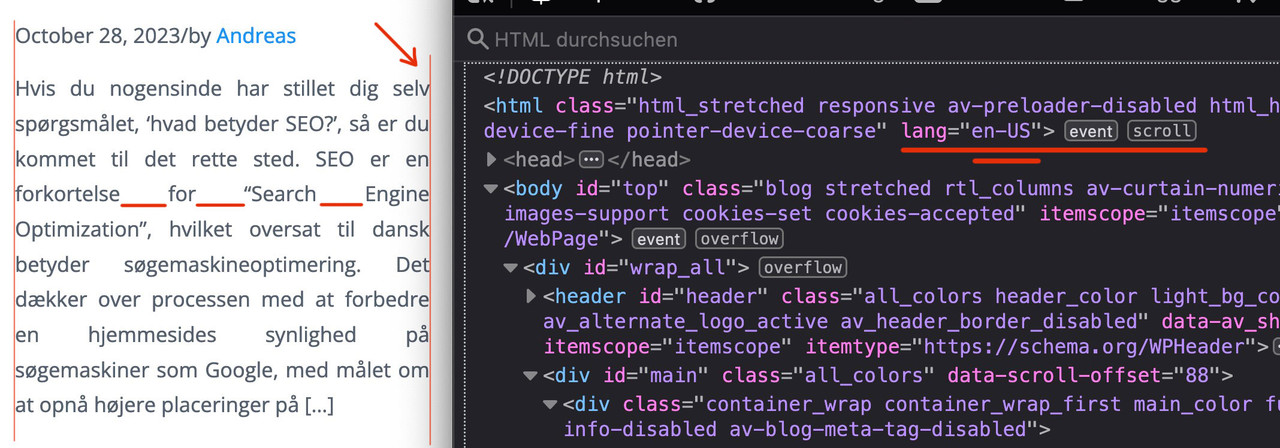
guess it is:lang="da-DK"
(alway click to enlarge the images)
Next: this is justified text layout ! – you can see the rule for it here:
i told you in the other topic that it is alway difficult to have a nice word distance without breaking the words on justified text.
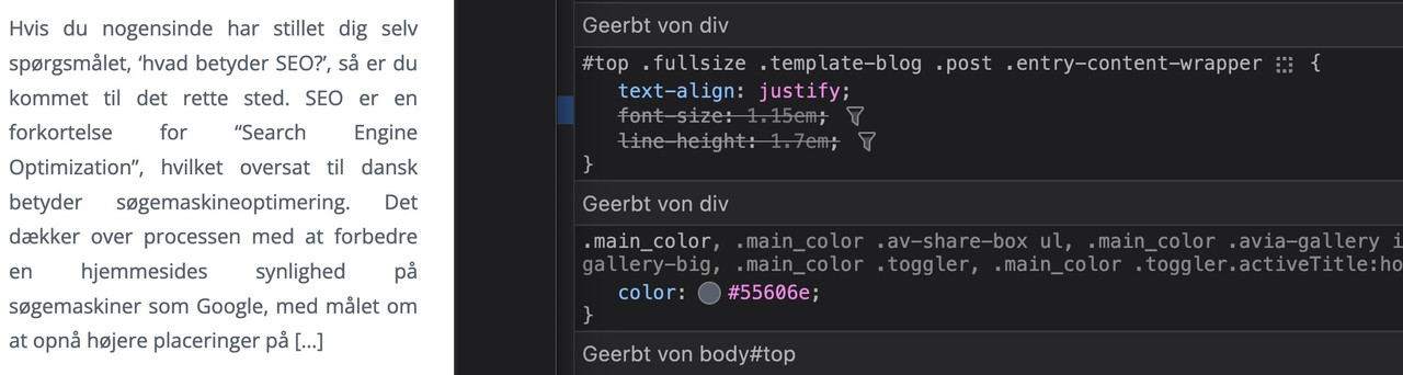
if you do not like to justify the text get rid of that part inside:#top .fullsize .template-blog .post .entry-content-wrapper { text-align: left; /****** this part is set to justify in your css *****/ font-size: 1.15em; line-height: 1.7em; max-width: 800px; /****** see comment under this codeblock *****/ margin: 0 auto; }the 800px ( or 40em ) max-width is a default setting from enfold – if this is what you mean in your e-mail talking about:
it’s stuck in the center regardless of the CSS I apply
then you can avoid that by:
#top #wrap_all .fullsize .template-blog .post .entry-content-wrapper,
#top #wrap_all .fullsize .template-blog .post .entry-content-wrapper > * ,
#top #wrap_all .fullsize .template-blog .post-title {
  max-width: unset !important;
  margin: 0;
}
if you like to preserve the justification of your paragraph texts – then a hyphens: auto will mainly solve that issue:
(those ugly underlined spaces inside block : “for______Search_____Engine”)#top #wrap_all .fullsize .template-blog .post .entry-content-wrapper p { text-align: justify; -webkit-hyphens: auto; hyphens: auto !important; text-justify: distribute; word-spacing: -0.05em !important; text-align-last: left; }but: as mentioned above the hyphenation only works well if the lang attribute on html is set to the language of your texts.
F.e. the word “Søgemaskineoptimering” does not hyphen on small screens.November 13, 2023 at 1:42 pm #1425440In reply to: Move down bullet points
Hi Ismael,
Thank you very much for your reply!
I have tried your code and this solved the problem, so thank you!After I added your code, the “default” bullet points were still there. To remove these, I made some changes in my code.
The code now looks like this:/* bullet points */ li::marker { color: transparent; font-size: 28px; } .entry-content-wrapper div li:before { content: ''; width: 9px; height: 9px; display: block; background: #ff9001; border-radius: 100%; float: left; top: 8px; position: relative; margin-right: 14px; margin-left: -24px; }November 13, 2023 at 12:49 pm #1425437In reply to: Blog post headline?
-
This topic was modified 2 years, 4 months ago by
-
AuthorSearch Results
-
Search Results
-
Hi
I added this PHP and CSS code. PHP Snippet 1.
Then set a product to 0. Stock Management is tracked.
Under the category: TROMBOCYTTINKUBATORER – (KLIMASKAP)
Right clicked the product Climax 100. Noticed the codeHTML Class soldout has been added.
CSS has been added..soldout { padding: 3px 8px; text-align: center; background: #222!important; color: #000!important; font-weight: 700; position: absolute!important; top: 6px; right: 6px; font-size: 12px; opacity: 1!important; display: block!important; }Why is the black box sold out just seen for a moment before it goes away?
What is going on?I have been down this road before in an earlier support thread in regards to a search in WooCommerce.
Hi
I tried to customize one of the headings like H5 or H6 (to function as a main header size like H1 or H2) that I am not using to have just the Corinthia font and set the size but it is not taking it. Is there a way to modify so I can use it as a main header? I would need at least 48 px but not everywhere. Please let me know if this is possible. Thanks.Topic: WooCommerce issues
1. CART PAGE – The font size is tiny for the word “Product” and the “product name”. Any way to adjust text sizes and colors? (See private link)
2. CHECKOUT PAGE: when you type your info into the fields, the “info wording” still shows behind the text you type.
3. INDIVIDUAL PRODUCT PAGE: Do you know how to remove “Additional Information” tab?Hey,
I’m having a problem with my font displaying on mobil.
I imported the font “calibri” into Theme Options and it works. It is also partially displayed correctly in the mobile view.
However, I use this code so that the Font is also displayed as subheading:
#top .av-special-heading .av-subheading.av-subheading_above { font-size: 32px !important; font-family: 'calibri'!important; font-style: italic; bold !important; color: #ff0044 !important; }And no matter what I do, the exact subheading is not displayed in the correct font on mobil.
Do you have an idea how I can solve the problem? I really want to keep the font in the subheading.
Best regards!
Hi Kriesi,
I have a question: how can I change the font size of the information in the topbar above the main menu?
In the Advanced settings I can change the font colour, letter spacing, font weight, but NOT the size…
Hope you can help!
Kind regards, Jolanda Zijp, JoStudioHi there
Could you pls help me make small change in the home page and post page.
Pls see
Thanks
Wang