Hi vantagepointmg,
Please try to replace the CSS code I gave with this one:
@media only screen and (max-width:767px) {
  #top #header_meta {
    padding-top: 10px;
  }

  #top #header_meta .sub_menu .menu-item {
    margin-bottom: 12px;
  }

  #top #header_meta .sub_menu * {
    font-size: 14px;
  }

  #top #header_meta #menu-item-130,
  #top #header_meta #menu-item-131 {
    text-indent: -999em;
  }

  #top #header_meta #menu-item-130 img,
  #top #header_meta #menu-item-131 img {
    position: absolute;
    top: 0;
    left: 0;
  }

  #top #header .av-burger-menu-main a {
    max-height: 80px;
    line-height: 80px !important;
  }

  .logo img,
  .logo svg {
    max-height: 80px !important;
  }

  #top #header_meta .sub_menu #avia2-menu {
    height: auto;
  }

  #header_main {
    padding-top: 8px;
  }
}
Best regards,
Nikko
Hi I added this code to my site to make the icon box icons larger when they are display icon on left side. It works but it also makes the icons in the social header and buttons larger. The section these are in are the blue one with the title COACHING ONLINEOR IN PERSON. I have some other code on my site for the top icons that it is also conflicint with. Please advise
Code for left icons
/* Icon Size */
[data-av_icon]:before {
    font-size: 50px!important;
}
.iconbox_icon {
    margin-right:20px!important;
}`
Code for top icons
.iconbox_top .iconbox_icon {
    font-size: 60px!important;
    text-align: center;
    height: 60px;
    width: 60px;
    line-height: 56px;
    top: -34px;
    margin-left: -45px;
}
I adjust the height and font size of the top bar in the header by using custom CSS.
/* Increase the height of the top bar */
.site-header .top-bar {
height: 60px; /* Adjust the height as needed */
}
/* Increase the font size of the top bar */
.site-header .top-bar a {
font-size: 16px; /* Adjust the font size as needed */
}
But it doesn’t work?
Hi,
I have questions on the freelancer-theme:
1. Where to change the bakcground color for the pricing table?
2. How and where to change the title font of the milestones on timelines. I tried H2, H3 and H4, but it didn’t work
3. I am not able to center he background pictues of each section. I treid different picturesizes already. Didn’t work. Whats the secret?
4. Where to change the hover color of the shrinked menu?
5. I need to change to color on one parting line. How to?
Best regards an thanks in advance for your help :)
Hey joandjaxx,
Thank you for the inquiry.
You can replace the modification with the following code.
/* Icon Size */
.iconbox [data-av_icon]:before {
    font-size: 50px!important;
}
.iconbox_icon {
    margin-right:20px!important;
}
Best regards,
Ismael
Hey biggsuccess,
Thank you for the inquiry.
We have found an extra curly brace in the css code above, which renders the css rules below it invalid. We also adjusted the position of the css media queries.
.main_menu {
  background: white;
}

#top #header_meta a,
#top #header_meta li,
#top #header_meta .phone-info {
  font-size: 14px;
}

.avia-layerslider {
  box-shadow: none !important;
  border-top-width: 0 !important;
}

div#after_layer_slider_1 {
  border-top: none !important;
}

.home #main>.container_wrap_first>.container>.content {
  padding-bottom: 0;
}

@media only screen and (max-width: 430px) {
  .html_header_top.html_header_sticky #top #wrap_all #main {
    padding-top: 182px !important;
  }
}

@media only screen and (max-width: 767px) and (orientation: landscape) {
  .responsive #top #wrap_all #main {
    padding-top: 119px !important;
  }
}

@media only screen and (max-width: 768px) {
  .responsive #top #header #header_main .inner-container .widget {
    order: 3;
    flex-basis: 100% !important;
  }

  .responsive #top #header #header_main .inner-container .widget .avia-button.avia-size-medium {
    padding: 12px 5px 10px;
    font-size: 12px;
    min-width: 60px;
  }

  .responsive #top #header #header_main .inner-container .widget>div {
    padding: 0;
  }

  .responsive #top #header #header_main .inner-container .widget>div>div {
    text-align: center;
  }
}
Best regards,
Ismael
HI,
I added some code to make the icon box icon larger. I t worked but I notcied it also changed the icon size of the social icons in my header.
This is the code I added
/* Icon Size */
[data-av_icon]:before {
    font-size: 50px!important;
}
.iconbox_icon {
    margin-right:20px!important;
}
Hey maryenvato,
Thank you for the inquiry.
We can add a few css modifications in the Enfold > General Styling > Quick CSS field to adjust the style of the first column on smaller screens. Please start with this css code.
@media only screen and (max-width: 768px) {
  /* Add your Mobile Styles here */
  .av_textblock_section.av-lr4yjeic-cd8285095e8d65e185685adbb051d6f7 table th.avia-desc-col {
    font-size: 0.9em;
    word-break: break-word;
    width: 130px;
  }
}
You may need to toggle or temporarily disable the Enfold > Performance > File Compression settings after applying the modification.
Best regards,
Ismael
Hi,
Thanks for that. Please try the following in Quick CSS under Enfold->General Styling:
@media only screen and (max-width: 990px) {
.page-id-8445 h2 {
  font-size: 18px;
}
}
Best regards,
Rikard
What is the CSS code to specify the font size for h2 on a specific page on mobile only?
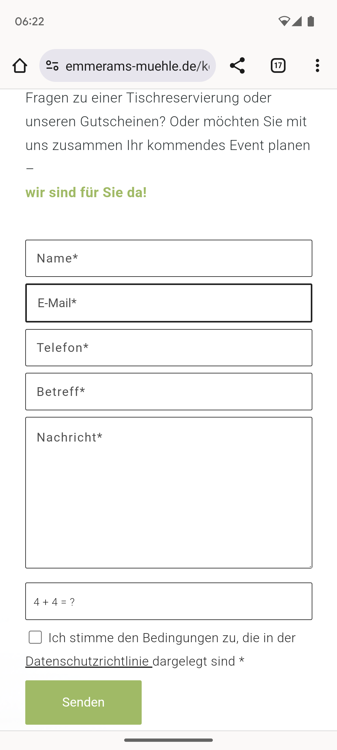
Dear support team
We have a contact form on the website https://emmerams-muehle.de/kontakt/#kontaktform. In the mobile view, the border of the email field is much thicker than in the other boxes: see screenshot: https://emmerams-muehle.de/support/email.png
I have already added the following script to the CSS:
@media only screen and (max-width: 767px) {
input#avia_2_1 {
border-width: 1px !important;
font-size: 15px !important;
}
}
What do I have to change so that the same thin border is displayed for the email field in the mobile view as for the other fields?
Best regards, Diana
Hi,
I added this css:
#top .all_colors h1 {
	font-size: 18px;
}
#top .all_colors h2 {
	font-size: 14px;
}
check now.
Best regards,
Mike
Hi,
Can you link to a page that it doesn’t work and explain if it is a header or the paragraph font-size that you wish to change and what size you want it to be.
Best regards,
Mike
Trying to save time as site was hacked
Hey fabienneRedUmb,
Thank you for the inquiry.
You can leave the Heading Font Sizes and Subheading Font Sizes of the Special Heading elements set to Default, and define the font size for headings (h1, h2, h3, etc.) in the Enfold > Advanced Styling panel. Afterward, you can add the following css code to adjust the default size of the subheading element relative to the configurations or style adjustments made in the Advanced Styling panel.
#top .av-subheading {
    font-size: 1.2em !important;
}
Best regards,
Ismael
Hey, how can I implement that the font size of the subheading always is 62% of the special heading it accompanies without doing each and every single special heading?
Thank you
Hi,
Thanks for that. Please try this in Quick CSS:
.learndash-wrapper * {
  font-family: verdana;
  font-size: 13px;
}
I couldn’t find a list in your content though? Please add one so that we can check that problem as well.
Best regards,
Rikard
Hi daves1997,
I apologize for the delayed response.
Adjusting the font size of the menu should help, otherwise, the number of menu items should be reduced by making it a submenu of other menu items.
Best regards,
Nikko
Hi vantagepointmg,
This was the code that was responsible for the size:
.logo img,
.logo svg {
height:160%;
max-height:240px !important
}
To fix it, please try adding this CSS code as well:
@media only screen and (max-width:767px) {
  #top #header_meta {
    padding-top: 10px;
  }

  #top #header_meta .sub_menu .menu-item {
    margin-bottom: 12px;
  }

  #top #header_meta .sub_menu * {
    font-size: 14px;
  }

  #top #header_meta #menu-item-130,
  #top #header_meta #menu-item-131 {
    text-indent: -999em;
  }

  #top #header_meta #menu-item-130 img,
  #top #header_meta #menu-item-131 img {
    position: absolute;
    top: 0;
    left: 0;
  }

  #top #header .av-burger-menu-main a {
    max-height: 80px;
    line-height: 80px !important;
  }

  .logo img,
  .logo svg {
    max-height: 80px !important;
  }
}
Best regards,
Nikko
Dear Rikard. Thank you. In private you can find what you asked. I need to fix the bulleted list bug and I need to have a bigger text size ora a different font.
Thank you.
Hi,
Thganks for the clarification. Please try this in Quick CSS:
.grid-sort-container .grid-entry-title a {
  font-size: 16px;
}

.grid-sort-container .grid-content {
  padding: 4px 20px 20px 20px;
}
Best regards,
Rikard
Hi,
When I try the the Enfold Theme Options ▸ Advanced Styling ▸ H3 option as Ismael suggested it works correctly:


But if you only want this font change on one page, try this CSS in your Enfold Theme Options ▸ General Styling ▸ Quick CSS field:
#top.page-id-30 .slide-entry-wrap h3.slide-entry-title {
	font-size: 18px;
}
Please ensure to copy the code from the forum and not an email notification so the symbols are not converted.
After applying the css, please clear your browser cache and check.
Best regards,
Mike
Hello Ismael,
I made the adjustments but nothing changed. I just want the names to be a Normal Font size 18 and not so large. I want the names on one line and because the names are so large they are showing up on 2 lines. Can you please help me with this.
Thank you
Maggie
Hey Maggie,
Thank you for the inquiry.
You should be able to adjust the font size in the Enfold > General Styling > Typography tab or in the Enfold > Advanced Styling panel. Edit the h3 element.
Best regards,
Ismael
Hello I can’t find where I can adjust the font size of my post’s titles. I created a team page using posts and the attached screenshot on this page url shows how large the names are.
Is ther a way you can reduce the font size so that the names are a font size 18 and bold? Here is the link to the site page
Please help
Hey DermaBBSaar,
Thanks for your question, but the site that you have linked to doesn’t seem to be built with Enfold and doesn’t use the LayerSlider.
For Enfold & the LayerSlider on mobile, typically Enfold doesn’t have a transparent header for mobile, so on mobile the LayerSlider will be below the header, while on desktop with a transparent header the LayerSlider shows to the top behind the header.
Also in the LayerSlider, typically the desktop slider is in a landscape format, but mobile devices use a portrait format, so a desktop slider will scale down to show the whole slider.
Typically people will create two sliders one of desktop and the other in a portrait layout to show on mobile, if they want more that a scaled down slider.
If you have some experience with the LayerSlider, it is possible to use one slider and have the desktop and mobile elements and layout set for all devices, but this can be tricky, here is a basic example of the LayerSlider device options used to show different elements and different sizes. You could also watch some YouTube tutorials. But it is a lot easier to use two sliders and display one or the other.
So if this describes your situation please give this a try.
Best regards,
Mike
Dear Team,
on my page below I us the tab section with 5 tabs. 2 questions:
How can I increase the tab / tab section title width, i.e. that all 5 tabs titles cover the whole section? Currently It is much narrower vs. the tab content width and the other sections above & below
How can I avoid capitals in the tab title font? I only did find a css code too increase the font size
thx a lot & best regards Tilman
Hi daves1997,
The sub menu arrows are caused by this code:
.menu li > a:after,
#top .av-subnav-menu .menu-item-has-children > a:after { content: ' ▾'; }
}
To fix it, I have removed that code from Appearance > Customize, and then replaced it from Quick CSS:
#top .main_menu .menu-item-has-children > a:after {
    content: ' ▾';
    font-size: 18px;
}
The code should work however caching seems to prevent it from working because the older code is being fetched.
Would it be okay to temporarily disable WP Rocket?
Best regards,
Nikko
Hey UPON,
Thank you for the link to your site, try this CSS in your Enfold Theme Options ▸ General Styling ▸ Quick CSS field:
#top .formcraft-datepicker .ui-datepicker-title select {
    color: inherit;
    -webkit-appearance: none;
    -moz-appearance: none;
    text-indent: 0.01px;
    text-overflow: '';
    box-shadow: none;
    padding: 0 0.5em!important;
    height: 2.9em;
    vertical-align: top;
    margin: 0;
    border: 0;
    background: 0 0;
    cursor: pointer;
    width: auto;
    display: inline-block;
    font-size: inherit;
    border-radius: 0;
}
Please ensure to copy the code from the forum and not an email notification so the symbols are not converted.
After applying the css, please clear your browser cache and check.
This in the expected results:

Best regards,
Mike
Hi,
When I checked your site the blue background color for the “COSMETIC, FAMILY & SPECIALTY DENTISTRY” section and the background image and font size for the “New Patient Offers” only show when I’m logged in. This is due to your caching plugin, WP Rocket, note that the cache settings shows the cache for mobile devices and logged out users:

So your WP Rocket cache needs to be cleared. I did this and checked your site again logged out and incognito and now your sections show correctly.
I checked with Windows in Chrome, Firefox, & Edge and it is showing correctly now, Please note that testing Safari can be hard to clear the cache, often you need to also clear the history to fully purge the cache, following these steps for Safari and note Step 4 where you will Clear the History.
If you find that after making edits to your site you see this issue a again, I recommend disabling your caching plugin until you are done creating your site, often caching causes issues while people are creating the sites, your caching should be activated only after your site is done so you don’t need to fight with it.
Best regards,
Mike