Good morning
I have just built a website for a client and whilst he is happy with the website, he doesn’t like the mobile responsiveness of the Testimonial Slider (large). On a desktop it looks great, but on the mobile, there is a large margin on either side and also the photo does not appear centred and the name is also off centre.
I tried changing the font size for a mobile device but that didn’t seem to work.
Is there a quick CSS code that I can add that would reduce the margin size on all the testimonials throughout the website and that would centre the image and the name.
See below for link to website and also screenshots of the testimonial element and how they appear on a mobile device.
Thank you very much
Ivana
Hey Aleksandra,
Thank you for the inquiry.
Have you tried selecting a different font? You can adjust this in the Enfold > General Styling > Fonts tab. You can also modify the default content font size for various screen sizes in the Typography tab.
Best regards,
Ismael
Hi,
This CSS is applying:
@media only screen and (min-width: 767px) {
  h1.av-special-heading-tag {
    font-size: 140px !important;
  }
}
Try removing the !important part, then use this CSS:
#boelge h1 a {
  font-size: 200px;
}
Best regards,
Rikard
Hi
I am trying to target the special heading element with css class “boelge” on my landing page to change the font size, but it’s not displaying correctly.
I’m using this code:
#top .boelge {
font-size: 200px !important;
}
Can you help me with this?
Thanks
Nancy
Hi,
Try this CSS in your Enfold Theme Options ▸ General Styling ▸ Quick CSS field:
#top #wrap_all .all_colors h3 .span-reading-time {
	font-size: 12px;
}
and adjust the font size to suit.
After applying the css, please clear your browser cache and check.
Best regards,
Mike
Hey dburton77,
Thank you for the link to your site, for the max-width 767px the heading row is hidden and the pseudo-element :before is used so the heading is stacked instead of being in a single row.
To style the pseudo-element try this css:
@media only screen and (max-width: 767px) {
    .responsive .avia_responsive_table .avia-data-table td:before {
        color: #0097ff;
        font-weight: 600;
        font-size: 17px;
        font-style: normal;
    }
}
Please ensure to copy the code from the forum and not an email notification so the symbols are not converted.
After applying the css, please clear your browser cache and check.
Best regards,
Mike
Hey tonyiatridis,
Try this CSS in your Enfold Theme Options ▸ General Styling ▸ Quick CSS field:
.html_header_sidebar #header .av-main-nav > li > a .avia-menu-subtext {
    font-size: 16px;
}
Please ensure to copy the code from the forum and not an email notification so the symbols are not converted.
adjust the font size to suit and clear your browser cache
Best regards,
Mike
Hi guys,
Quick question.
I am using a sidebar menu on this mockup for my client:
I adjusted the main menu links under advanced formatting, but I don’t see how to adjust the size of the description text for each. Is there a spot for that in the interface or would that be a CSS solution?
Thanks so much
Hi Rikard,
thank you for your reply. I tried this before and it did not work. Tried it a few minutes ago and now this part of my problem ist solved.
… but stillI am not able to change the size of the Menue-Font. I did this via „enhanced Styling“ –>> „Main-Menue-Links“ but there is no reaction.
best regards
Wolfram
Hey -wol-,
Thanks for the login details. 13px is the default theme setting, did you try to activate and change the Default Content Font Size option under Enfold->General Styling->Typography to see if that helps?
Best regards,
Rikard
Hey schweg33,
Thanks for the link to your page, in your css above you have the color: color: #ff0000; to have a white text please use: color: #fff; you also need to add .main_color a to override the theme color, so the solution is:
.main_color a.my-link-class {
background-color: #ff3a2d;
-webkit-border-radius: 33px;
-moz-border-radius: 3px;
color: #fff;
font-size: 16px;
padding: 7px 15px;
}
since this element only shows on mobile you can not have a mouse-over as touch devices don’t use a mouse-over.
Best regards,
Mike
Dear Kriesi-Team,
I have encountered a strange problem: A website, which worked perfectly fine changed her overall-Fontsize (or I did something stupid) and is now stuck with a fontsize of 13 pt on most of the parts – menue-entrys and Slidercaptions. This is somehow inheritet from the body-element but i didn‘t set it in your typographie-settings. Also (and I hope I don‘t have to open a new topic for this) the Fontsize of the Menue-Items ist stuck in the same size and I can‘t change it via your typography-options.
I hope sombody can take a look and give me a hint…
Best regards
Wolfram
Hi,
Try this CSS in your Enfold Theme Options ▸ General Styling ▸ Quick CSS field:
#av-burger-menu-ul ul.sub-menu ul.sub-menu .avia-menu-text {
  font-size: 20px;
}
After applying the css, please clear your browser cache and check.Feel free to adjust the size to suit.
Best regards,
Mike
this does not change the font size of the mobile link text under the mega menu
Hi,
Please try this CSS as well:
#av-burger-menu-ul ul.sub-menu ul.sub-menu a {
  font-size: 16px;
}
Best regards,
Rikard
Thanks, the distance improved!
Any idea also how to increase the font size for the sub– and the sub, sub links? in the mega menu?
Hey Meetx,
Thank you for the inquiry.
1-2) Please add this css code to adjust color of the icon on hover and make it bigger on mobile view.
.html_bottom_nav_header #top .av_seperator_big_border .av-main-nav>#menu-item-search:hover a {
    color: red;
}

@media only screen and (max-width: 767px) {

  /* Add your Mobile Styles here */
  .responsive #top #wrap_all .menu-item-search-dropdown>a {
    font-size: 32px;
    margin-right: 20px;
  }
}
Best regards,
Ismael
First: Do you really need all of them. Fontloading is something that could reduce performance of your website.
Next: My advice is not to use the variable Font that is inside the TypeType CommonsPro folder too – it has all the font-faces that are inside that folder and a file size of 1.8MB
if you can live with light, regualar and bold – i would only take the non italic fonts and upload them to transfonter
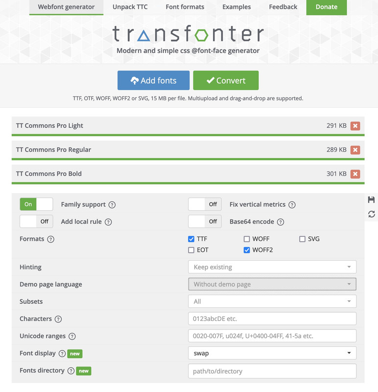
the convert as shown above and download it – rename the zip file to f.e.: Commons-Pro
Edit
This is a strange professional font. Normally it always works right away to generate the zip file as a font family. In this case – I first had to open the files in FontLab and have the names (postscript names) regenerated there by Build Names. I then saved these as otf families and uploaded them to Tranfonter.
Now you can see it is ok:
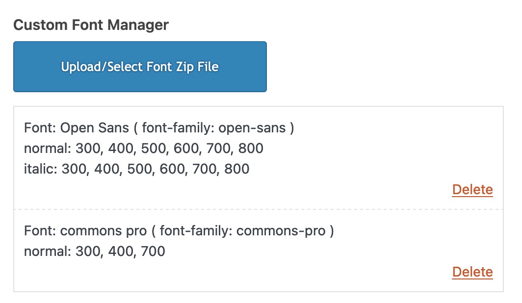
test yourself with: https://webers-testseite.de/commons-pro.zip
Please note, however, that your licensing model must include web font use.
Hey joshuati,
Thank you for the inquiry.
This is possible, but there won’t be enough space for the menu items. We may need to decrease the size of the logo or the font size of the menu items. If that is acceptable, you can start with this css code:
@media only screen and (max-width: 767px) {

  /* Add your Mobile Styles here */
  .responsive #top .av-main-nav .menu-item-avia-special {
    display: none;
  }

  .responsive #top .av-main-nav .menu-item {
    display: inline;
  }

  .responsive .logo img,
  .responsive .logo svg {
    margin: 0;
    max-height: 40px !important;
    margin-left: -20px;
  }
}
Best regards,
Ismael
Hi,
Thank you for the update.
1. The Cart and Search buttons a little larger
You can add this css code to make the cart and search icons larger:
@media only screen and (max-width: 767px) {

  /* Add your Mobile Styles here */
  #menu-item-shop .cart_dropdown_link {
    font-size: 24px;
  }

  #top #menu-item-search a:before {
    font-size: 30px !important;
  }
}
If you have any additional questions at this time we kindly ask that you open them up in a separate thread. The longer threads get in the forum, they become more difficult to support as they tend to drift off topic and they also make it troublesome for users trying to search for solutions. Keeping threads relevant to their original inquiry ensures that we can keep better track of what has been resolved and that users can more effectively find answers to similar issues they might be experiencing.
Thanks!
Best regards,
Ismael
Hi,
Thank you for the update.
Try to replace the selector “.home” with “.page-id-362”.
.page-id-362 .av-image-caption-overlay-center p {
    border-radius: 3px;
    padding: 10px;
    font-size: 12px;
    text-decoration: none;
    display: inline-block;
    border-bottom-style: solid;
    border-bottom-width: 1px;
    margin: 3px 0;
    line-height: 1.2em;
    position: relative;
    font-weight: normal;
    text-align: center;
    max-width: 100%;
    color: var(--enfold-main-color-button-font);
    background: var(--enfold-main-color-button-border);
    transition: all 0.4s ease-in-out;
    box-shadow: none;
    border: 0;
    padding: 25px 50px 23px;
    font-size: 28px;
    min-width: 200px;
}
Please make sure to purge the cache before checking the page.
Best regards,
Ismael
Hi,
Thanks for the update. If you only want the CSS to apply to the home page, then you can use this instead:
.home .av-image-caption-overlay-center p {
    border-radius: 3px;
    padding: 10px;
    font-size: 12px;
    text-decoration: none;
    display: inline-block;
    border-bottom-style: solid;
    border-bottom-width: 1px;
    margin: 3px 0;
    line-height: 1.2em;
    position: relative;
    font-weight: normal;
    text-align: center;
    max-width: 100%;
    color: var(--enfold-main-color-button-font);
    background: var(--enfold-main-color-button-border);
    transition: all 0.4s ease-in-out;
    box-shadow: none;
    border: 0;
    padding: 25px 50px 23px;
    font-size: 28px;
    min-width: 200px;
}
Best regards,
Rikard
Hey Monika,
Thank you for the inquiry.
You can use this css code to adjust the style of the caption overlay.
.av-image-caption-overlay-center p {
    border-radius: 3px;
    padding: 10px;
    font-size: 12px;
    text-decoration: none;
    display: inline-block;
    border-bottom-style: solid;
    border-bottom-width: 1px;
    margin: 3px 0;
    line-height: 1.2em;
    position: relative;
    font-weight: normal;
    text-align: center;
    max-width: 100%;
    color: var(--enfold-main-color-button-font);
    background: var(--enfold-main-color-button-border);
    transition: all 0.4s ease-in-out;
    box-shadow: none;
    border: 0;
    padding: 25px 50px 23px;
    font-size: 28px;
    min-width: 200px;
}
Best regards,
Ismael
Hey craig374,
Please try the following in Quick CSS under Enfold->General Styling:
#text-7 span strong {
  font-size: 14px;
  text-transform: uppercase;
}
Best regards,
Rikard
Hi – I was wondering if you could help me with CSS to change the text color in the search bar. It is currently white on a white background. Link below.
CSS being used in header area:
.header_color .header_bg, .header_color .main_menu ul ul, .header_color .main_menu .menu ul li a, .header_color .pointer_arrow_wrap .pointer_arrow, .header_color .avia_mega_div, .header_color .av-subnav-menu > li ul, .header_color .av-subnav-menu a {
background-color: transparent;
}
#top #header #header_main .mega_menu_title a {
color: #ffffff;
}
#top #header #header_main .mega_menu_title a:hover {
color: #d6001d;
}
.av-masonry-entry .av-masonry-entry-title {
font-size: 32px !important; text-transform: uppercase;
}
#top #header #header_main .mega_menu_title a:hover {
text-decoration: none;
}
@media only screen and (max-width: 1024px) {
nav.main_menu {
display: block !important;
}
#avia-menu .menu-item {
display: none;
}
.av-burger-menu-main.menu-item-avia-special {
display: block;
}
}
.footer_color { background-size: cover; }
.toggler.activeTitle {
border-bottom: 0;
}
.taglist a:hover, #top .taglist .activeFilter {
color: red;
}
.taglist a:hover, #top .taglist {
color: white;
}
.av-elegant-toggle .taglist a {
background: #fff;
border-radius: 4px;
padding: 5px 15px;
margin: 5px;
color: #333;
text-decoration: none;
}
.av-elegant-toggle .taglist { margin-bottom: 20px; }
.av-elegant-toggle .tag-seperator { display: none; }
@media only screen and (max-width: 767px) {
.av-elegant-toggle .taglist a {
line-height: 2.0em;
font-size: 0.9em;
padding: 3px 15px;
display: inline-block;
}
}
Hi,
Ok, as I examine your page I see that the wrap_all & main divs are closed and your injected color section is outsite the page:

Then I recalled that injecting any full width element, like color sections, causes the page to auto close like this, so the way around this is to inject the HTML instead, so I tested this on my site linked below as a proof of concept and this is the code that I used:
add_action('ava_after_main_title', 'ava_after_main_title_mod');
function ava_after_main_title_mod() {
	$post_id = get_the_ID();
    if(get_post_type( $post_id ) == "post" || is_archive() || is_category()) {
		echo '<div id="av_section_1" aria-label="header-blog" style="background-color:#e7e6e0;" class="avia-section av-gurxi-f7ad7ba9aa66e762665269785c869839 main_color avia-section-no-padding avia-no-border-styling  avia-builder-el-0  avia-builder-el-no-sibling  block-fit-size avia-bg-style-scroll container_wrap fullsize"><div class="container av-section-cont-open"><main role="main" itemprop="mainContentOfPage" class="template-page content  av-content-full alpha units"><div class="post-entry post-entry-type-page post-entry-3814"><div class="entry-content-wrapper clearfix"><div class="flex_column_table av-lwc8c3ub-7fae82ac0e7450fe73ac250f770e4e79 sc-av_one_half av-equal-height-column-flextable"><div style="padding: 20px 0 20px 0;" class="flex_column av-lwc8c3ub-7fae82ac0e7450fe73ac250f770e4e79 av_one_half  avia-builder-el-1  el_before_av_one_half  avia-builder-el-first  first no_margin flex_column_table_cell av-equal-height-column av-align-bottom  "><div class="av-special-heading av-tkaly-59af4c81dd5bd8035cb05863635061b6 av-special-heading-h1 custom-color-heading blockquote modern-quote  avia-builder-el-2  el_before_av_textblock  avia-builder-el-first "><div style="font-size: 18px;color: #a07860;" class="av_custom_color av-subheading av-subheading_above"><p>Veranstaltungen und Lesungen</p></div><h1 style="color:#1f4339;font-size:45px;font-family: "librebaskerville", Helvetica, Arial, sans-serif;text-transform: none;" class="av-special-heading-tag" itemprop="headline">Veranstaltungen</h1><div class="special-heading-border"><div class="special-heading-inner-border"></div></div></div><section class="av_textblock_section av-3a7ov5-3365d9d47359d52499c6170f6e5d6913 " itemscope="itemscope" ><div class="avia_textblock" itemprop="text"><p style="color: #666666;font-size: 17px;">Wir laden Sie ein, an unseren gemeinsamen Veranstaltungen, Reisen und Lesungen an besonderen Orten, teilzunehmen. Weiteres erfahren Sie in der jeweiligen Veranstaltungsbeschreibung.</p></div></section></div><div class="flex_column av-fy05a-677df80f19dcd41d19a6c602b9b923d5 av_one_half  avia-builder-el-4  el_after_av_one_half  avia-builder-el-last  buch-monat no_margin flex_column_table_cell av-equal-height-column av-align-bottom  "><div class="avia-image-container av-9gv81-4c6171ac5adc202d5cf1671f776d7959 av-styling- avia-align-right  avia-builder-el-5  avia-builder-el-no-sibling " itemprop="image" itemscope="itemscope" ><div class="avia-image-container-inner"><div class="avia-image-overlay-wrap"><img decoding="async" fetchpriority="high" class="wp-image- avia-img-lazy-loading-not- avia_image " src="/wp-content/uploads/2024/05/area-book-ueber-uns.png" alt="" title="" itemprop="thumbnailUrl"></div></div></div></div></div></div></div></main></div></div>';
	}
}
Note that I didn’t understand why you had $thumbnail = get_the_post_thumbnail_url ( $post_id ); since I saw no call for $thumbnail so it’s not in my code, feel free to adjust after to test my code. I also had to add so style inline so my test would look like your page, it should not cause a issue for you.
Please ensure to copy the code from the forum and not an email notification so the symbols are not converted.
Best regards,
Mike
Hi,
Enable the Avia Layout Builder Debugger and add the code to the debugger and save:
[av_section min_height='' min_height_px='500px' padding='huge' shadow='no-shadow' bottom_border='no-border-styling' bottom_border_diagonal_color='#333333' bottom_border_diagonal_direction='' bottom_border_style='' id='' color='main_color' custom_bg='' src='https://test.kriesi.at/enfold-2017/wp-content/uploads/sites/24/2017/02/business-office-work-blurred.jpg' attachment='885' attachment_size='full' attach='scroll' position='top center' repeat='stretch' video='' video_ratio='16:9' overlay_enable='aviaTBoverlay_enable' overlay_opacity='0.6' overlay_color='#000000' overlay_pattern='' overlay_custom_pattern='' av_element_hidden_in_editor='0' av_uid='av-35gtt']
[av_heading heading='Masonry Portfolio Example:<br/>4 Column Masonry Grid' tag='h1' style='blockquote modern-quote modern-centered' size='40' subheading_active='' subheading_size='15' padding='0' color='custom-color-heading' custom_font='#ffffff' admin_preview_bg='rgb(34, 34, 34)' av_uid='av-qj14h'][/av_heading]

[av_hr class='custom' height='50' shadow='no-shadow' position='center' custom_border='av-border-fat' custom_width='50px' custom_border_color='#ffffff' custom_margin_top='30px' custom_margin_bottom='30px' icon_select='no' custom_icon_color='' icon='ue808' font='entypo-fontello' admin_preview_bg='rgb(34, 34, 34)' av_uid='av-mx0kh']

[av_textblock size='' font_color='custom' color='#dddddd' admin_preview_bg='rgb(34, 34, 34)' av_uid='av-5ee9']
<p style="text-align: center;">Hey there! We are Enfold and we make really beautiful and amazing stuff.
This can be used to describe what you do, how you do it, & who you do it for.</p>
[/av_textblock]
[/av_section]

[av_masonry_entries link='portfolio_entries' term_rel='' wc_prod_visible='' wc_prod_hidden='hide' wc_prod_featured='' prod_order_by='' prod_order='' date_filter='' date_filter_start='' date_filter_end='' date_filter_format='yy/mm/dd' period_filter_unit_1='1' period_filter_unit_2='year' page_element_filter='' sort='yes-tax' query_orderby='date' query_order='DESC' caption_elements='title' caption_styling='overlay' caption_display='on-hover' img_copyright='' size='fixed manually' orientation='' image_size='masonry' gap='large' columns='4' av-desktop-columns='' av-medium-columns='' av-small-columns='' av-mini-columns='' items='9' paginate='load_more' color='' custom_bg='' img_copyright_font='' av-desktop-font-img_copyright_font='' av-medium-font-img_copyright_font='' av-small-font-img_copyright_font='' av-mini-font-img_copyright_font='' img_copyright_color='' img_copyright_bg='' animation='active' animation_duration='' animation_custom_bg_color='' animation_custom_bg_color_multi_list='' animation_z_index_curtain='100' overlay_fx='active' img_scrset='' lazy_loading='disabled' alb_description='' id='' custom_class='' template_class='' av_uid='av-83rt5' sc_version='1.0']
once the elements show after the page reloads open the masonry element and select the Portfolio Entries that you want to show.
Best regards,
Mike
Hi,
Thank you for your patience, in your shortcode it looks like you manually added class=’open-popup-link’, but the correct way to add a class in the shortcode is custom_class=’open-popup-link’ but this adds the class to the button and not the link in the button.
So we will follow these steps.
So this is what you add to your code block:
[av_button label='Jealousy-Letter abonnieren' icon_select='yes-right-icon' icon='ue875' font='entypo-fontello' icon_hover='aviaTBaviaTBicon_hover' link='manually,#test-popup' custom_class='pu-link' link_target='' size='x-large' position='center' label_display='' title_attr='' size-text='' av-desktop-font-size-text='' av-medium-font-size-text='' av-small-font-size-text='' av-mini-font-size-text='' margin='' margin_sync='true' padding='' padding_sync='true' av-desktop-margin='' av-desktop-margin_sync='true' av-desktop-padding='' av-desktop-padding_sync='true' av-medium-margin='' av-medium-margin_sync='true' av-medium-padding='' av-medium-padding_sync='true' av-small-margin='' av-small-margin_sync='true' av-small-padding='' av-small-padding_sync='true' av-mini-margin='' av-mini-margin_sync='true' av-mini-padding='' av-mini-padding_sync='true' color_options='' color='theme-color-highlight' custom_bg='#444444' custom_font='#ffffff' btn_color_bg='theme-color' btn_custom_grad_direction='vertical' btn_custom_grad_1='#000000' btn_custom_grad_2='#ffffff' btn_custom_grad_3='' btn_custom_grad_opacity='0.7' btn_custom_bg='#444444' btn_color_bg_hover='theme-color-highlight' btn_custom_bg_hover='#444444' btn_color_font='theme-color' btn_custom_font='#ffffff' btn_color_font_hover='white' btn_custom_font_hover='#ffffff' border='solid' border_width='2' border_width_sync='true' border_color='#000000' border_radius='10' border_radius_sync='true' box_shadow='' box_shadow_style='0px,0px,0px,0px' box_shadow_color='' animation='' animation_duration='' animation_custom_bg_color='' animation_z_index_curtain='100' hover_opacity='' sonar_effect_effect='' sonar_effect_color='' sonar_effect_duration='1' sonar_effect_scale='' sonar_effect_opac='0.5' css_position='' css_position_location=',,,' css_position_z_index='' av-desktop-css_position='' av-desktop-css_position_location=',,,' av-desktop-css_position_z_index='' av-medium-css_position='' av-medium-css_position_location=',,,' av-medium-css_position_z_index='' av-small-css_position='' av-small-css_position_location=',,,' av-small-css_position_z_index='' av-mini-css_position='' av-mini-css_position_location=',,,' av-mini-css_position_z_index='' id='' template_class='' element_template='' one_element_template='' av_uid='av-1x42t1' sc_version='1.0' admin_preview_bg='']
<div id="test-popup" class="white-popup mfp-hide">[av_mailchimp list='eifersuchtscoach' double_opt_in='true' on_send='' sent='Thank you for subscribing to our newsletter!' link='' color='' hide_labels='' av-desktop-hide='' av-medium-hide='' av-small-hide='' av-mini-hide='' alb_description='' id='' custom_class='' template_class='' av_uid='av-8l32o' sc_version='1.0'][/av_mailchimp]</div>
and this is your new popup code:
function popup_inline() { ?>
<script type="text/javascript">
jQuery(window).load(function(){
       jQuery('.pu-link a').addClass('open-popup-link');
	jQuery('.open-popup-link').magnificPopup({
	  type:'inline',
	  midClick: true // Allow opening popup on middle mouse click. Always set it to true if you don't provide alternative source in href.
	});
});
</script>
<?php }

add_action('wp_head', 'popup_inline');
Please ensure to copy the code from the forum and not an email notification so the symbols are not converted.
This should now work for you.
Best regards,
Mike
Hello all together,
I would like to know how to change the size of the title, subtile and button of a full with slider on start page for the mobile view.
On mobile view they are too large..
Access data you’ll find in private content.
thanks in advance
znello