Hi,
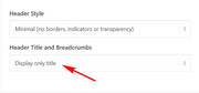
The theme will add the title automatically without the breadcrumbs in the title bar if you choose the setting “Display only title” in the Header Title and Breadcrumbs option.
It can also be styled with a larger font size and a different color, with css like this:
h1.entry-title a {
font-size: 30px !important;
color: #000 !important;
}
But I know it’s not quite what you are looking for, so I have another solution for you, first set the “Display only title” in the Header Title and Breadcrumbs option, then we will automatically move the title for you on each page and hide the empty title bar area with this code at the end of your functions.php file in Appearance > Editor:
function move_page_title(){
  ?>
  <script>
(function($){
  $(document).ready(function(){
    $( '#top.page h1.main-title.entry-title' ).insertBefore( '.post-entry-type-page' );
    });
})(jQuery);
</script>
<?php
}
add_action('wp_footer', 'move_page_title');
and add this code in the General Styling > Quick CSS field:
#top.page div.title_container {
display: none !important;
}
You only have to add this code once and it will work on each page automatically
Please let us know if you want further styling like the title center on the page.
Best regards,
Mike
Hi Ismael,
Thank you for looking into this. I don’t understand either why the button is not visible on mobile devices :(
Following are the codes I have so far added in Quick CSS. Can you please tell me if there is any that is conflicting? I have never touched anything in the theme files.
Thank you so much for your help!
Regards,
Xandria
#top .avia-button-fullwidth {
border-style: solid!important;
border-width: 1px!important;
border-color: #fff!important;
}
.avia-section.main_color.avia-section-default div.container {
max-width: 100%!important;
width: 100%!important;
padding-right: 0px !important;
padding-left: 0px !important;
}
span.copyright a.xandria { color: #6e6e6e;}
.logo, .responsive .logo {
display:none;
}
a.avia-button.avia-button-fullwidth .avia_iconbox_title {
font-size: 14px !important;
}
.logo img, .responsive .logo img {
display:none !important;
}
.grid-entry .inner-entry {
margin-right: 14px;
}
.mfp-zoom-in.mfp-ready.mfp-bg, .mfp-zoom-in.mfp-ready .mfp-preloader {
background-color: #e3e3e3;
}
.html_modern-blog .avia-content-slider .slide-entry-title {
font-size: 1.7em;
}
.ls-v6 .ls-circle-timer { display: none; }
.html_elegant-blog #top .post-entry .post-title, .html_elegant-blog .avia-content-slider .slide-entry-title {
text-transform: none;
}
Hi,
Sorry for the late reply, to change the font size of the labels, please use this css:
#top.page-id-45 label[for=avia_5_1], #top.page-id-45 label[for=avia_6_1] {
  font-size: 16px !important;
}
To change the border width of the submit button, and the font color, we will have to override a !important; that is in current use, but this should do it:
#top.page-id-45 #av_section_1 .av-dark-form .button {
    border-width: 3px !important;
    color: #cf3662 !important;
}
To change the background color of the submit button, and font, when hovering:
#top.page-id-45 #av_section_1 .av-dark-form .button:hover {
    background-color: #cf3662 !important;
    color: #ffffff !important;
}
Best regards,
Mike
Hi,
Please use the same CSS selector and add the font property :)
Your code should look like:
#top #header #avia-menu li .mega_menu_title {
   color: red;
   font-size: 14px;
   font-family: your-font-name-here;
}
Best regards,
Vinay
Hello,
I want to change the css of a button with custom css ID like “button_new” but it´s not working, even not with an !important.
Like that:
.button_new {
border-radius: 15px !important;
}
But If I change that quick css class below for that button, than it´s working.
My problem is, that I need different style for the buttons with “button_new” class.
What can I do?
Thanks for response.
#top .avia-button-fullwidth {
font-size: 1em!important;
border-radius: 0px 0px 10px 10px;
padding: 17px 33px 17px!important;
margin-bottom: 10px !important;
-webkit-transition: all 0.5s ease-in-out !important;
-moz-transition: all 0.5s ease-in-out !important;
-o-transition: all 0.5s ease-in-out !important;
transition: all 0.5s ease-in-out !important;
}
Thanks, that wil do the trick.
And what about the font and the font size ?
This reply has been marked as private.
Hey Simon,
Add this to quick css:
.grid-sort-container header h3{
font-size:18px!important;
}
Best regards,
Jordan Shannon
Dear all,
I want to change the font size of my portfolio grid on https://www.hkmedia.ch/projekte/ and tried several CSS snippets, but non of them worked. Can someone help me?
Thanks and best regards,
Simon
Hi,
I have an issue with the base css file overriding the css of the HappyForms (https://happyforms.me/) plugin I’ve installed. The form page is essentially separate from the main website and I would like style the text on the form independently from anything else that is going on elsewhere across the site. The form is created in the plugin and then added to a page using a shortcode. Inspecting one of the form input titles generated in Chrome shows the following:
#top label span,	base.css?ver=4.5.3:258
#top legend span {
font-weight: normal;
font-size: 13px;
color: #444;
}

.happyforms-	frontend.css?1.6.19:244
Part_label .label, .happyforms-
part_label .happyforms-optional {
padding: 0;
font-weight: normal; [crossed out]
font-style: normal;
font-size: 16px; [crossed out]
font-size: var(  happyforms-part-title-font-size); [crossed out]
color: #000;
color: var(  happyforms-color-part-title); [crossed out]
background-color: transparent;
}
The base.css file is therefore taking precedence. I’ve tried adding the #top label span, #top legend span rule to the Enfold Child css file and changed the font size but nothing seems to change. Is there a way to exclude the base css from applying to the form either through use of the Enfold Child (as thought would be the case) or otherwise?
Lastly, in order to understand it a bit better, why is this happening? Is it the rules of specificity?
Thanks in advance
Hey Andreas,
Thank you for using Enfold.
You can change the default font size in the Enfold > General Styling > Fonts panel. Just look for the “Default content font size” settings. If you want to change the style of a specific element such the strong or the paragraph tag, go to the Advanced Styling panel.
Best regards,
Ismael
Hey MarieAn,
you can use
body { font size: 16px; }
for example, but why not you use the Enfold Theme Options, to change the size of the page on where ever u need it?
Best regards,
Basilis
Hi Dave,
Try using this css code:
#footer,
#footer p,
#footer li {
    font-size: 16px !important;
}

#socket * {
    font-size: 14px;
}
Hope it helps.
Best regards,
Nikko
Hi,
how can I change the color of the active page in the menu (color:#F06F29) of this website
fta-test.de
With Quick CSS I could change the hovered menu like this which works perfect:
#top #header #avia-menu .menu-item > a:hover > .avia-menu-text {
color:#F06F29;
font-size:18px;
font-weight:700;
}
its okay I solved the font size with
#av-burger-menu-ul a{
font-size:18px!important;
}
As an FYI, here is everything I currently have in my Quick CSS the relates to the mobile header:
@media only screen and (max-width: 989px) {
.avia_transform .av_slideshow_full .avia-caption-title {
font-size: 1em;
}
.avia_transform .av_slideshow_full .active-slide .avia-caption-content {
font-size: 12px;
}
.av_slideshow_full li img {
min-width: 900px;
margin-left: 15px;
}
@media only screen and (max-width: 767px) {
#top #wrap_all .av_header_transparency {
background-color: transparent;
position: absolute!important;
}}
.slideshow_caption .slideshow_inner_caption {
top: -40px;
}
}
@media only screen and (max-width: 480px) {
.logo {
position: relative!important;
top: 13px!important;
}
#header_main .inner-container {
height: 120px;
}}
@media only screen and (max-width: 767px) {
.avia-caption-content {
display:none !important;
}
.responsive #top .slideshow_caption h2 {
font-size: 32px !important;
margin-left: -53px!important;
}
}
Thanks a lot.
I want to list “Ultrasonic Anemometer Home”. But Now list:
“Ultrasonic
Anemometer
Home”
/* CSS – Subtext on right */
#top .logo,
#top .logo a {
overflow: visible;
}
CSS below:
/* Subtext styling */
.logo .subtext h1 {
font-size: 25px;
color: #239ff7;
width: 120%;
top: 60%;
right: 20;
}
.logo .subtext {
position: absolute;
color: #239ff7;
top: 60%;
width: 120%;
right: 0;
transform: translate(120%, -50%);
z-index: 999;
}

you can use tags inside a input filed of that form alb:
(if you use span it will have a different font-size)
<i>First Line</i><i>Second Line</i>
#top label i {
    display: block;
}
so try the code in quick css and put in your field:
<i>Message (You can list the number of rooms / areas or rough sizes)</i><i>ex) 3 Bedrooms, 1 Living room(12‘x16’), 12 Stairs, 1 Hallway, 1 Rug</i>
This reply has been marked as private.
Hi, how can I increase the font size of a sub menu element, change the background color to green, the text to white and on hover, change the background to grey – http://prntscr.com/mdcw07
Thanks.
This reply has been marked as private.
Hi
I would like to increase the size of the font and make it bold on the burger menu I am using.
Thanks
Alex
Hi!
I would like to change the default font size to make it bigger. I would like this to happen everywhere, on both posts and pages.
I have no knowledge of code, so I hope to get a code snippet to insert in the quick css-field.
First you can decide to insert in the heading input field the word with a softhyphen !
<span style="color: #eaa11d;"><span style="color: #ffffff;">#FairShare­</span>Everywhere</span>
that ­ helps you to have a non visible breakpoint for your heading
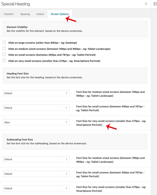
And then you got the opportunity to go to that tab “screen options” there are some options for screenwidth for both the heading and the subheadline font size.
Result is here: https://webers-testseite.de/accordion/
-
This reply was modified 7 years, 2 months ago by
 Guenni007.
Hi,
Please try this code in the General Styling > Quick CSS field or in the WordPress > Customize > Additional CSS field:
.avia-timeline .milestone_icon i {
font-size: 80px !important;
}
Best regards,
Mike
Hey suesee,
Thank you for contacting us.
To change the font size please refer to the docs
Best regards,
Vinay
hi there,
i read through the forum. I cannot find a solution how to enlarge my font size in the menu
Can you help me?
Hi Victoria,
Yes, thanks – login is in private content below.
I would like the Script font (pollistons) to have line height of 0.5em on mobile only.
I would also like the sizes of the buttons to be reduced on mobile.
Thanks!
I have the same issue. I’ve unchecked the date and comments under “Blog meta elements” section, but they still appear on the page.
I’d also like to change the font type / size for the title.
Hi guys,
I fixed part of the problem.
I moved this CSS:
/*underline links body*/
.entry-content p a {
color: #000 !important;
border-bottom: 3px solid #fff200;
}
.entry-content p a:hover {
color: #80b7b3 !important;
text-decoration: none !important;
border-bottom: none !important;
}
from the Quick CSS area to the CSS Stylesheet for the child theme. Re-enabled CSS compression and it works on desktop and mobile.
Should I move all of my Quick CSS to the Child theme’s stylesheet? Would that fix the slider arrows on mobile piece?
This is the Slider arrows CSS:
/*slider arrows css */
#top .avia-smallarrow-slider .avia-slideshow-arrows {
width: 505px;
height: 50px;
display: block;
position: absolute;
top: 420px;
}
#top .avia-smallarrow-slider .avia-slideshow-arrows a {
background: transparent !important;
color: #fff;
width: 50px;
height: 50px;
font-size: 50px;
font-weight: bolder;
}
#top .avia-smallarrow-slider .avia-slideshow-arrows a:before {
background: transparent !important;
line-height: 50px;
}
Is it possible that we need a bit more CSS that applies to the responsive rendering of the arrows?
Thank you so much in advance!
Havi