Hi,
Thank you for the update.
Concerning the subject. On tiny the labels are displayed on 2 lines and the warning is half hidden under the textarea.
We can’t find any posts with the comment section. Please provide a direct link.
Another small thing, the comment form and the share buttons are both intended to be displayed at the end of one article but their titles do not have the same font size. H3 to Leave a comment and H5 to Share this post.
Try to modify the enfold\comments.php file and look for this code around line 180:
$default_heading = 'h3';
		$args = array(
					'heading'		=> $default_heading,
					'extra_class'	=> ''
				);
Best regards,
Ismael
Hello Enfold team,
***Issue 1***
I’m having a hard time trying to apply some simple styling changes to a website I manage.
Using Advanced Styling, I can’t…
– Change <p> styling for all <p> tags. Whatever I change here does not apply to the website.
– Change <body> styling for all <body> tags. Whatever I change here does not apply to the website.
– Change text transform for <H2> tags. Whatever I change here does not apply to the website.
For example, using Advanced Styling, I set:
<p> – Change the styling for all <p> tags
Font Size 21px
Line Height 1.5em
Yet all text blocks using paragraph text formatting on my site DO NOT use these settings. I’m having to set each text block text size manually to achieve the desired result, which is an annoying and time-consuming approach and workaround that isn’t a sustainable approach for managing the website.
I’ve also set:
H2 – Change the styling for your H2 Tag
Text Transform: NONE
And yet ALL my H2 tags across the site are still capitalised, which looks bad. I need these to be Normal case. I don’t know what’s going on. Advanced Styling seems to be all over the place and a complete mess on this site. Why? Even setting “All Headings (H1-H6) – Change the styling for all Heading tags” text transform to NONE or LOWERCASE doesn’t change anything.
I really need some insight into what’s going on here; thank you.
***Issue 2***
I would also like to know how to set the text transform for all avia-caption-title tags for my slideshow elements at once. Currently, I’m having to do Quick CSS like the below for each individual slideshow on the site – which seems like a poor solution:
#top #wrap_all .avia-slideshow .av-slideshow-caption.av-lynrrnic-2807a30891cbcdbcb963567175d45a9b__0 .avia-caption-title {
font-size: 80px;
text-transform: none;
}
Thanks,
Tom
-
This topic was modified 1 year, 5 months ago by
 Thumphreys.
Hello,
First, what a work on this version 6! Impressive.
Concerning the subject. On tiny the labels are displayed on 2 lines and the warning is half hidden under the textarea.
Screenshot
Is it possible to replace labels with placeholders to keep the page as short as possible or at least place them above and which class or id to add a margin to clear the warning please?
Another small thing, the comment form and the share buttons are both intended to be displayed at the end of one article but their titles do not have the same font size. H3 to Leave a comment and H5 to Share this post.
Screenshot
I will correct with CSS but it would perhaps be good to harmonize.
Thanks for your attention.
because: there is no hover style on mobile devices!
what did you expect to see? What is what you like to see?
f.e.:
.responsive.avia_mobile #top .av-masonry-entry .av-inner-masonry-content {
  padding: 10px;
}

.responsive.avia_mobile #top .av-caption-style-overlay .av-masonry-item-with-image .av-inner-masonry-content {
  background: rgba(0,0,0,.01);
}

.responsive.avia_mobile #top .av-caption-style-overlay .av-masonry-item-with-image .av-inner-masonry-content-pos,
.responsive.avia_mobile #top .av-fixed-size .av-masonry-entry.av-masonry-item-no-image .av-inner-masonry-content-pos {
  text-align: left;
}

.responsive.avia_mobile #top #wrap_all .all_colors h3 {
  font-size: 18px;
  text-align: left;
}

.responsive.avia_mobile #top #wrap_all .all_colors .av-masonry-entry h3 {
  padding: 5px;
  font-size: 18px;
  background: rgba(0,0,0,0.3);
  -webkit-backdrop-filter: blur(3px);
  backdrop-filter: blur(3px);
  position: relative;
  width: auto !important;
  text-transform: none;
}

.responsive.avia_mobile #top .av-inner-masonry-content-pos-content {
  display: inline-block !important;
  position: absolute;
  top: auto;
  bottom: 10px;
}
it is for mobile devices only:
add a sufficient line-height to it:
( i think the font-size you set in the heading itself – so better is to use a relative line-height value)
h6 {
  line-height: 1.7em;
  font-weight: 400 !important;
  letter-spacing: 0.01em !important;
  background: linear-gradient(to right, #b04938, #ddbbae, #b8b665);
  -webkit-background-clip: text;
  -webkit-text-fill-color: transparent;
}
Hey dnweil,
You can change the font sizes for each screen size in the Styling tab for each slide.
Best regards,
Rikard
you have changed the value of that input field.
How did you do that?
But you can bring back the magnifier by :
#top .avia_search_element #searchsubmit {
  padding-left: 1.3em;
}

#top .avia_search_element .av_searchsubmit_wrapper::before {
  content: "\e803";
  font-family: "entypo-fontello";
  font-size: 18px;
  color: #FFF;
  position: relative;
  left: 10px;
  top: 2px;
  width: 40px;
  z-index: 3;
  padding-left: 0.7em;
  font-weight: 400
}
Please disregard. Found the setting in the Fullwidth Easy Slider config page under styling/Font Sizes.
Thank you!
Hi.
I have full screen slider issues for: https://www.stonecrafters.rocks
If I select dots only for navigation, not only do the arrows not show, the dots don’t show. I changed the colors, it’s a glitch.
Tested on Samsung Galaxy s24.
For the Font I resent mobile font from DEFAULT which overlayed and was cut off to 40px then 50 px then 60px. Now it is locked in font size and too small.
I
A variety of font size settings are available in Enfold.
As Rikard mentioned above: Enfold->General Styling->Typography.
(click to enlarge the images)

or on each alb with text there are options to have different font-sizes depending on screenwidth – f.e. headings:

I sometimes prefer the option to set a fluid font size – for this I activate the option to change the field for setting the font size to an input field.
on a (default hidden option) – you can choose to have that:
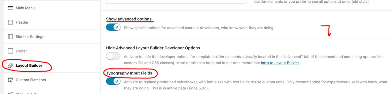
on that page here you can calculate that css for it – for maximum browser support, i use the min-max option – see image on the bottom
https://websemantics.uk/tools/fluid-responsive-property-calculator/
f.e.:

see an example page : https://webers-testseite.de/heading-with-fluid-font-size/
Hi,
Thank you for the update.
Have you tried adjusting the font size settings in the Enfold > General Styling > Typography tab? You can set different font sizes for various screen sizes. For mobile view, try adjusting the font size in the Very Small dropdown.
Best regards,
Ismael
Hi,
Try this CSS in your Enfold Theme Options ▸ General Styling ▸ Quick CSS field:
#top #header .mega_menu_title,
#top #header .mega_menu_title a {
    font-size: 12px;
}
Best regards,
Mike
Hi,
Try this CSS in your Enfold Theme Options ▸ General Styling ▸ Quick CSS field instead:
@media only screen and (max-width: 479px) {
#top #wrap_all #main h4.av-special-heading-tag,#top #wrap_all #main h6.av-special-heading-tag {
    font-size: 8px;
}
}
adjust the font size to suit
Best regards,
Mike
Hi,
Try this CSS in your Enfold Theme Options ▸ General Styling ▸ Quick CSS field:
@media only screen and (max-width: 767px) {
.html_av-overlay-side-classic #top .av-burger-overlay .avia-menu-text {
    font-size: 17px;
}
}
Please ensure to copy the code from the forum and not an email notification so the symbols are not converted.
After applying the css, please clear your browser cache and check.
Best regards,
Mike
Hi,
Did you remove the css above:
.av-special-heading-tag h4,h6 {
    font-size: 55px!important;
}
I don’t see a link to your site, please provide and tell us which title you are looking at that is an H4.
Best regards,
Mike
Hi,
Please see Enfold Theme Options ▸ General Styling ▸ Typography ▸ Advanced Options: Customize Typography Settings and set the font size for “small” & “very small”

Best regards,
Mike
Hey findweat,
Please try the following in Quick CSS under Enfold->General Styling:
@media only screen and (max-width: 767px) {
#top .widget_nav_menu li {
  font-size: 17px;
}
}
Best regards,
Rikard
Hello! Just want to ask why on mobile, my main sidebar (About Us, Inventory etc) font size is smaller than the supposed “dropdown” (Art, Asian etc) and how do I fix this?
I can add this: before writing on this Forum, I had tried adding this ccs
.av-special-heading-tag h4,h6 {
    font-size: 55px!important;
}
It works, but for all views: while I only want to change the mobile view
Hi,
Thank you for the update.
how to change the page titles (only on mobile view)
Are you referring to the Special Heading element? Please edit the element and adjust the settings under Styling > Font Sizes > Heading Font Sizes. You can toggle the device icons to change the font size for different screen sizes.
Best regards,
Ismael
Hey JoStudioDeRijp,
Thank you for the inquiry.
You can use this css code to adjust the font size of the hotspot content:
#top .avia-tooltip.av-tt-hotspot {
    font-size: 20px;
}
Best regards,
Ismael
Good morning
I would like to change (only for mobile view, without making any changes in desktop view) the font size for:
- main menu links
- page titles
Can you provide me with some css to do this? Thanks a lot
-
This topic was modified 1 year, 5 months ago by
 carlopal.
-
This topic was modified 1 year, 5 months ago by carlopal.
Hey Qgrafica_7,
Thank you for the inquiry.
You can add this css code to adjust the font size of the category sort, but it may become a little too small.
@media only screen and (max-width: 767px) {

  /* Add your Mobile Styles here */
  .avia-fullwidth-portfolio #js_sort_items a,
  .avia-fullwidth-portfolio #js_sort_items .text-sep {
    font-size: 8px;
  }
}
Best regards,
Ismael
thanks for the input. Thanks to that it has led me to this solution
table {
table-layout: fixed;
width: 100%;
}
td, th {
font-size: min(16px, 3vw);
}
td, th {
padding: 8px;
border: 1px solid #ddd;
}
now it works great. Thanks again.
OK,
I have set larger font sizes, but I don’t see any difference on smartphones. I’ve tried with several smartphones.
Best regards
Ms
Hi,
I would like to resize the font size of the text in the mobile view.
We would like it to be EXACTLY as it looks like on https://2024-liptonrogers-com.stackstaging.com/team/ with no “/” same colour and size font etc.
Hi,
Thanks for the link to your page, when I check I see this:

I recommend this css:
@media only screen and (max-width: 479px) {
	#top.home #wrap_all #full_slider_1 .av-slideshow-caption .avia-caption-content p {
		font-size: 12px;
	}
	#top.home #wrap_all #full_slider_1 .avia-caption-title {
		font-size: 15px;
	}
}
or this result for small screens (320px):

and this for normal screens (425px)

Please adjust to suit
Best regards,
Mike
This is what it looks like:
@media only screen and (max-width: 767px) {
#top #wrap_all .avia-slideshow .av-slideshow-caption.av-m1g8o6g7-f7efce2774fcf0ca4bccdacd45c3be64__0 .avia-caption-title {
font-size: 22px !important;
}
}
#top .avia-slideshow .av-slideshow-caption.av-m1g8o6g7-f7efce2774fcf0ca4bccdacd45c3be64__0 .avia-caption-content p {
font-size: 18px;
}
@media only screen and (max-width: 767px) {
.home #full_slider_1 .slideshow_caption {
left: 20%;
width: 80%;
padding: 0;
}
}
Hi,
Did you place the code inside this css media query?
@media only screen and (max-width: 767px) {
 // place the code here
}
You can also adjust the font size by editing the slide. Go to Styling > Font Sizes, then adjust the Caption Content Font Size > Font Size for small screens (480px to 767px, e.g., Tablet Portrait) settings. Click the device icon to adjust the font size for different screen sizes.
Best regards,
Ismael